

Abstract
On April 7, 2020, Wisconsin held its presidential primary election, and news reports showed long lines of voters due to fewer polling locations. We use county‐level variation in voting patterns and weekly county‐level COVID test data to examine whether in‐person voting increased COVID‐19 cases. We find a statistically significant association between in‐person voting density and the spread of COVID‐19 2–3 weeks after the election. In our main results, a 10% increase in in‐person voters per polling location is associated with an 18.4% increase in the COVID‐19 positive test rate 2–3 weeks later.
Keywords: absentee voting, coronavirus, COVID‐19, in‐person voting, pandemic, SARS‐CoV‐2, Wisconsin primary election
Abbreviations
- IVL
in‐person voters per polling location
- POIs
points‐of‐interest
- WDHS
Wisconsin Department of Health Services
- WEC
Wisconsin Elections Commission
1. INTRODUCTION
A headline on the New York Times website on April 7, 2020, read, “Wisconsin Primary Recap: Voters Forced to Choose Between Their Health and Their Civic Duty” (New York Times, 2020). The article referenced long lines when voting, especially in Milwaukee, where only five polling places were open. The lines were noted to be a serious cause for concern because the increased interactions could lead to increased transmission of SARS‐CoV‐2 and by extension COVID‐19 cases.
It is now well established that increased social interactions increase the probability of the transmission of the SARS‐CoV‐2 virus. Identifying the extent to which in‐person voting in the Wisconsin election contributed to the spread of SARS‐CoV‐2 virus has important policy implications in measuring the potential costs of voting in‐person during a pandemic, and by extension, the potential benefits of increased absentee voting (voting‐by‐mail). In particular, the Wisconsin Election Commission enabled County and Municipal Clerks to adjust the number of polling locations during the April 7th election. The results we provide here can inform similar future decisions.
We estimate the relationship between in‐person voting and the spread of COVID‐19 using county‐level data. At the county level, we use information on both the number of tests for COVID‐19 and number of positive test results from the Wisconsin Department of Health Services to examine the relationship between in‐person votes per polling location and the spread of COVID‐19. Our event‐study results indicate that trends in COVID‐19 cases in counties with higher and lower levels of in‐person voting per polling location were similar in the weeks leading up to the April 7th election. However, counties with higher levels of in‐person voting per polling location saw increases in the weekly positive rate of COVID‐19 tests and weekly new cases of COVID‐19 in the weeks after the April 7th election. Moreover, this relationship is concentrated in the counties in the upper tercile of the voters‐per‐location distribution. These findings are unlikely to be a function of differing trajectories by population density, differing county‐level demographics, or measures of social distancing behaviors. Furthermore, this relationship suggests that it may be prudent for policy makers and election clerks to take steps to either expand the number of polling locations, voting times, early voting opportunities, or encourage curbside and absentee voting in order to keep the population density of voters as low as possible.
To demonstrate that in‐person voting was a mechanism for spreading COVID‐19 we use cellphone location data, combined with information on in‐person voting and polling locations, to examine whether the April 7th election was related to increased visits to areas near polling locations relative to baseline behavior. Areas around polling locations experienced a drastic increase in visits on April 7th, with no evidence of changes in traffic to other locations on that day or changes in visits to areas near election locations on the days preceding or following April 7th. Additionally, we illustrate a clear relationship between in‐person votes cast and excess visitation to areas near voting locations. Spikes in foot traffic to highly localized areas provide a mechanism that supports the empirical relationship between in‐person voting and the spread of SARS‐CoV‐2.
As we are investigating a potential link between behavior and the virus's spread, we take a reduced‐form approach that builds on the general understanding that increased socialization is a primary vector for transmission of the virus. 1 Our strategy is very similar to other papers which examine associations between the virus and various social factors, including the existence of and compliance with social distancing orders, political orientation, public transportation, and occupation characteristics (e.g., Adolph et al., 2020; Allcott et al., 2020; Almagro & Orane‐Hutchinson, 2020; Andersen, 2020; Bursztyn et al., 2020; Courtemanche et al., 2020a, 2020b; Dave, Friedson, Matsuzawa, McNichols, & Sabia, 2020a; Feltham et al., 2020; Friedson et al., 2020; Harris, 2020; Kuchler et al., 2020; Mangrum & Niekamp, 2020). In particular, we build on work which examines the effects of potential “superspreader” events on COVID‐19 cases (e.g., Dave, Friedson, Matsuzawa, McNichols, Redpath, & Sabia, 2020b; Dave, Friedson, Matsuzawa, Sabia, & Safford, 2020c; Dave, Friedson, McNichols, & Sabia, 2020d).
In estimating the relationship between voting and the spread of SARS‐CoV‐2, as of May 15th, 2020, the Wisconsin Department of Health Services (WDHS) directly traced 71 confirmed cases of COVID‐19 to in‐person voting that occurred on April 7th. 2 While this association presents some evidence of SARS‐CoV‐2 spread in accordance with the Wisconsin election, the WDHS epidemiological investigation does not necessarily reflect a definitive relationship. In particular, the presence of “community spread of infection” means that people have been infected with the virus in an area, but they are not sure how or where they became exposed or infected. Conversely, the investigation also missed cases caused by in‐person voting activity that were not successfully tested and traced by the state's Department of Health (Associated Press, 2020). Hence, detailed contact tracing may not provide a full assessment of the impact that a particular activity (e.g., in‐person voting) has on the spread of SARS‐CoV‐2 and the number of COVID‐19 cases. Consequently, policy makers could be misled by limited studies using only test and trace methods to track a link between COVID‐19 and in‐person voting. Our aim is to offer a general estimate of the increased spread of infection, if any, related to in‐person voting during a pandemic, and by extension provide insights into the potential benefits of vote‐by‐mail.
2. DATA
The timing of Wisconsin's election, in conjunction with the spread of COVID‐19 throughout the state, makes it uniquely suited to offer relevant insights into the effects of voting on the spread of COVID‐19. First, voting took place during a “Safer at Home” order, where Wisconsin residents were restricted to essential activities only, allowing for better identification of the effect of in‐person voting (Evers & Palm, 2020). Second, the “Safer at Home” order was issued only 2 weeks prior to the date of the election, on March 23, 2020, making it difficult for all eligible voters to receive and return an absentee ballot before election day. 3 And third, the Wisconsin Elections Commission allowed County and Municipal Clerks to alter the voting setup and number of voting locations at their own discretion in the weeks leading up to the election. Among clerks who modified the voting locations available to their registered voters, nearly all sought to consolidate—a decision that almost certainly increased the in‐person voter density per voting location. Consolidation was particularly salient in urban areas. For example, the city of Green Bay, WI (in Brown County), which typically has 31 voting locations, had only two open during the April 7th election.
2.1. Voting data
We use voting data provided by the Wisconsin Elections Commission (WEC). The WEC maintains a publicly available database of official election results and voter participation metrics, all of which are available at the county level. 4 Of particular interest to this paper are the data on (1) total in‐person votes, (2) total absentee ballots requested, (3) total absentee ballots returned, (4) number of registered voters, and (5) number of voting locations. Total in‐person votes are the only item that is not directly reported by the WEC. To measure this, we use official county‐level vote data provided by the County Clerks for the State Supreme Court seat election, adjusting for the number of over/undervotes, and then from that number subtract the total absentee ballots returned. 5
According to a memorandum released by the WEC on March 30, 2020, County and Municipal Clerks expressed concern with hosting voters in buildings serving vulnerable portions of the population (e.g., nursing homes, senior centers). 6 As a result on March 12, 2020, the WEC gave County and Municipal Clerks the ability to consolidate polling places. The decision to consolidate polling locations poses a unique problem for Clerks: closing locations can create some insulation to the relatively vulnerable, but it also increases the likelihood of infection at the remaining locations due to the increase in voter density.
Between March 12, 2020 and April 4, 2020, County and Municipal Clerks in 22 counties (of 72) consolidated the number of polling locations offered to voters, the average reduction among these counties being approximately 15%. In total, Wisconsin used approximately 2200 voting locations for this election, each of which can be categorized by the venue's normal purpose. Statewide, approximately 90% of the voting locations were hosted in governmental buildings (e.g., city halls, fire stations), approximately 10% were hosted in social or commercial locations (e.g., churches, VFWs, grocery stores), and 5% were hosted in local primary, secondary, and postsecondary education buildings. 7
2.2. COVID‐19 data
We use COVID‐19 test data provided by the WDHS. The WDHS maintains a database reporting the number of laboratory‐confirmed COVID‐19 cases and the total number of tests performed, which is updated daily. The primary items of interest from this database are (1) total and new positive cases, (2) total and new negative cases, and (3) total and new COVID‐19 tests performed, each at the county level. While WDHS reports data for positive cases beginning on March 15, 2020, the data for negative and total tests begin on March 30, 2020. Thus, from March 30, 2020 to May 17, 2020 (the primary observation window of this study) we construct weekly measures of new COVID‐19 cases and the percent of total COVID‐19 tests that are positive.
We aggregate COVID‐19 testing data to the weekly level to account for within week patterns of testing that vary by day of week and to eliminate noise associated with daily reporting at the county‐level. We then construct weeks from these dates as follows for our results incorporating the number of tests.
| Week −1 | Week 0 | Week 1 | Week 2 |
| March 30–April 5 | April 6–April 12 | April 13–April 19 | April 20–April 26 |
| Week 3 | Week 4 | Week 5 | |
| April 27–May 3 | May 4–May 10 | May 11–May 17 |
Week 0 contains the week of the April 7th election. To utilize the additional data available for (1) total and new positive cases, we also estimate specifications only examining the number of positive cases. For these specifications, we are able to introduce two more pre‐election weeks, which we define as Week −3 (March 16–March 22) and Week −2 (March 23–March 29).
2.3. Demographics and social distancing measures
In addition, we supplement voting and COVID‐19 data with measures of social distancing and county‐level demographics.
We use SafeGraph Social Distancing Metrics data, which are collected from anonymized GPS pings derived from smartphone app usage. The dataset provides daily metrics of human movement at a granular level (precision within a 153 × 153 m grid). We use median home dwelling time, percent of devices completely home, and median distance traveled from home to provide a localized measure of social distancing. While SafeGraph data are reported at the Census Block Group level by day, we aggregate the data to the county by week level to match the level of COVID‐19 and voting data. 8
We also include a variety of other controls. From the US Census Bureau (2010 Census data), we control for county population and population density. From the 2018 5‐Year American Community Survey Estimates, we control for the percent of the population without a high school degree, the percent of the population with at least a bachelor's degree, the 2018 unemployment rate, the median household income, and the percent of the population age 65 or older.
2.4. Summary statistics
Table 1 offers summary statistics on our primary measures relevant to the empirical analysis presented below. Alongside state‐wide reporting, we also split the summary statistics by counties which have above versus below‐median numbers of in‐person votes per polling location and provide t‐statistics from difference‐in‐means tests between these two groups of counties. This split shows that COVID‐19 positive test rates are approximately twice as high (5.6% vs. 2.6%) in above‐median counties. Individuals in above‐median counties are 2.4 percentage points (62.2% vs. 64.6%) less likely to leave home and are approximately 7 percentage points (26.6% vs. 19.6%) more likely to have at least a Bachelor's degree. In addition, above‐median counties are higher income and have younger populations. There is a significant difference in population density between above‐median and below‐median in‐person vote counties (298.1 vs. 34.3).
TABLE 1.
Summary statistics
| All counties | Above‐median votes/polling location | Below‐median votes/polling location | |||||
|---|---|---|---|---|---|---|---|
| Mean | SD | Mean | SD | Mean | SD | T‐test | |
| Election variables | |||||||
| In‐person votes (k) per polling location | 0.171 | 0.095 | 0.240 | 0.089 | 0.102 | 0.024 | .000 |
| In‐person votes (10 k) | 0.591 | 0.632 | 0.918 | 0.756 | 0.263 | 0.119 | .000 |
| Absentee votes (10 k) | 1.581 | 2.986 | 2.803 | 3.847 | 0.359 | 0.255 | .000 |
| Polling locations open | 30.708 | 16.920 | 36.083 | 20.828 | 25.333 | 9.052 | .000 |
| COVID‐19 testing variables | |||||||
| Weekly positive COVID‐19 test rate | 0.041 | 0.061 | 0.056 | 0.069 | 0.026 | 0.047 | .000 |
| Cumulative COVID‐19 cases per 100 | 0.050 | 0.084 | 0.068 | 0.110 | 0.031 | 0.038 | .000 |
| Weekly new COVID‐19 cases per 100 | 0.013 | 0.025 | 0.018 | 0.032 | 0.008 | 0.013 | .000 |
| COVID‐19 case log growth rate | 0.673 | 1.667 | 0.532 | 1.223 | 0.814 | 2.009 | .057 |
| Demographic variables | |||||||
| % population with less than a H.S. degree | 8.400 | 2.532 | 7.497 | 1.812 | 9.303 | 2.814 | .000 |
| % population with at least a B.A. degree | 23.065 | 7.526 | 26.578 | 8.170 | 19.553 | 4.688 | .000 |
| Unemployment rate (2018) | 3.307 | 0.738 | 3.131 | 0.645 | 3.483 | 0.783 | .000 |
| Median household income ($k) | 58.009 | 9.129 | 61.087 | 8.977 | 54.930 | 8.210 | .000 |
| Percent of population age 65 or older | 20.161 | 4.339 | 18.489 | 3.991 | 21.832 | 4.025 | .000 |
| SafeGraph social distancing variables | |||||||
| Average time in dwelling | 727.827 | 117.732 | 765.657 | 115.795 | 689.996 | 107.212 | .000 |
| % leaving home | 63.390 | 3.524 | 62.166 | 3.474 | 64.614 | 3.132 | .000 |
| Average distance traveled | 10,007.035 | 3442.082 | 8896.539 | 3206.551 | 11,117.531 | 3314.342 | .000 |
| County‐week observations | 504 | 252 | 252 | ||||
| Counties | 72 | 36 | 36 | ||||
Notes: Data from the Wisconsin Department of Health Services, the Wisconsin Department of Health Services, the US Census, The American Community Survey, and SafeGraph. The t‐test column reports p‐values from a test of the difference in means between the above and below‐median votes per polling location counties.
3. METHODS
To understand the impact of in‐person voting on the spread of SARS‐CoV‐2 we focus on the percent of COVID‐19 tests that are positive in each county and week. We also extend our analysis to an investigation of the effect of voting metrics on the number of new COVID‐19 cases as well (see Section 4.2).
There are concerns that cases alone might not accurately measure the actual outbreak, as cases may be affected by the implementation of COVID‐19 testing and related capacity. Schmitt‐Grohé et al. (2020) document concerns that testing is not random and widespread. Almagro and Orane‐Hutchinson (2020) also recognizes this issue and as a result analyzes changes in the percentage of positive tests. 9
In assessing what the appropriate model specification and design is for this investigation, we recognize that there is a notable lag in the time between infection with the SAR‐CoV‐2 virus and its record (if any) in the WDHS database. According to Lauer et al. (2020), the median incubation period from infection with SARS‐CoV‐2 to onset of symptoms is approximately 5 days, with 97.5% of infected people who are symptomatic exhibiting symptoms within 11.5 days. Once symptoms occur, there are likely lags associated with seeking testing and acquiring lab results. The WDHS provides data on cases by date of symptom onset, which, in aggregate, allow us to estimate the average lag associated between onset of symptoms and a positive test showing up in the WDHS data. WDHS symptom onset data provides new cases information by self‐reported date of when an individual's symptoms began, rather than the date that positive test was recorded in the WDHS database following a positive PCR test. In general, symptom onset date is meaningful because this date will be closer to the date when infection occurred. Unfortunately, if symptoms onset date is missing, or if the patient was asymptomatic, rather than omitting the cases from the onset data base (or imputing it), WDHS assigns the date in which the positive diagnosis (PCR test) was recorded (e.g., these cases keep the recorded case date). This miscoding introduces bias to the measure, the extent of which is unknown.
Figure A4 plots the cumulative number of cases from the date of symptom onset and the date of COVID‐19 test reporting at the state level. Panel (a) of Figure A4 shows a notable relationship between these measures exists, while panel (b) identifies the distribution of time lag (in days) between symptom onset and positive case diagnosis. According to this measure the median lag from onset date to recorded positive date is 7.5 days across the time series. Taken collectively with a median incubation period of 5.1 days, we would expect any effects of the election on the COVID‐19 outbreak on new cases to become most pronounced around 12.6 days, or roughly 2 weeks, after the election.
Given these considerations, our primary analysis is an event study approach where we capture the impact of in‐person voting per location on the proportion of positive tests, or
| (1) |
where Positive Rate c,t is the proportion of positive cases in week t for each county c, IVL c is in‐person votes (in 1,000s) per polling location and Week t are weekly dummies, with the week of the election (April 7th) serving as the reference (omitted) category t = 0. Our independent variables of interest are the interactions between IVL c and Week t . The coefficients on these variables, δ t , provide estimates of the evolution of the in‐person votes per location in the week preceding the election and in the weeks after the election. Given the incubation period of COVID‐19, lags associated with seeking testing, and lags in labs acquiring results, we should not see a relationship between voting behavior and the COVID‐19 test rate prior to a week after the election.
We also include other time‐invariant county demographic controls in X c , which we describe above. Furthermore, we include county‐level social distancing measures, including the SafeGraph measures of social distancing aggregated to the county by week level and lagged by 1 week (e.g., average time in dwelling, percentage of time leaving home, and average distance traveled), and absentee votes per capita interacted with week, which captures differences in social distancing behaviors specifically related to voting (and voters) across counties and the corresponding effects over time. These measures are all represented in SD c,t . We also show that estimates are robust to including an interaction between county population density and week, which allows the evolution of COVID‐19 in each county to vary by population density. Based on Papke and Wooldridge (1996, 2008), we estimate models associated with Equation (1) using a fractional logistic regression model with robust SEs clustered at the county‐level. 10 We also estimate Equation (1) where we replace all time‐invariant county controls with county fixed effects. In these cases, we utilize OLS estimation, owing to the incidental parameters problem.
4. RESULTS
4.1. Results using COVID‐19 positive test rates
Table 2 and Figure 1a,b show results from our models described in Equation (1). Columns 1–3 of the table show logit coefficients, SEs in parentheses, and marginal effects in brackets from estimating fractional logit specifications. Moving from left to right, we systematically add in controls, with those in column 2 reporting our preferred specification. In column 1, we begin with a parsimonious model that accounts for time fixed effects and county demographic characteristics. 11 Column 2 adds social distancing measures, which include explicit measures of mobility tracked by cell‐phone data and absentee voting behaviors, and column 3 adds in controls for the number of tests performed that week. 12 In column 4, we change the regression to estimate an OLS model, including county fixed‐effects into the model to fully account for all time‐invariant differences between counties. As this estimation is conducted using OLS, the coefficients represent marginal effects, and we show SEs clustered at the county level in parentheses. In Figure 1a,b, we graphically display the marginal effects and related 95% confidence intervals of our preferred fractional logit specification in column 2 and the OLS fixed effects estimate in column 4.
TABLE 2.
Relationship between COVID‐19 positive test rates and in‐person voting per polling location
| Fractional logit | OLS | |||
|---|---|---|---|---|
| (1) | (2) | (3) | (4) | |
| IVL × Week −1 | 2.429* | 3.364 | 3.375 | 0.197 |
| (1.464) | (2.416) | (2.416) | (0.126) | |
| [0.1328] | [0.1664] | [0.1679] | ||
| IVL × Week 1 | 3.506* | 6.806** | 6.852** | 0.285* |
| (2.065) | (2.998) | (3.073) | (0.152) | |
| [0.1075] | [0.2935] | [0.2910] | ||
| IVL × Week 2 | 5.317* | 12.084*** | 12.148*** | 0.441** |
| (2.746) | (3.556) | (3.728) | (0.196) | |
| [0.1213] | [0.4333] | [0.4282] | ||
| IVL × Week 3 | 4.468* | 10.833*** | 10.815*** | 0.437*** |
| (2.319) | (2.744) | (2.757) | (0.149) | |
| [0.1240] | [0.4264] | [0.4202] | ||
| IVL × Week 4 | 2.851 | 6.300** | 6.206** | 0.208 |
| (2.093) | (2.832) | (2.898) | (0.133) | |
| [0.0435] | [0.2509] | [0.2409] | ||
| IVL × Week 5 | 4.558** | 9.449*** | 9.262*** | 0.241* |
| (2.077) | (2.604) | (2.609) | (0.125) | |
| [0.0632] | [0.3209] | [0.3067] | ||
| N | 504 | 504 | 504 | 504 |
| Time fixed effects | Y | Y | Y | Y |
| Demographic controls | Y | Y | Y | |
| Social distancing controls | Y | Y | Y | |
| Control for tests | Y | |||
| County fixed effects | Y | |||
Notes: Data sources are identical to Table 1. The table shows logit coefficients, SEs clustered at the county level in parentheses, and marginal effects in brackets for the first four columns and OLS coefficients and SEs clustered at the county level in the last column. In‐person voters per polling location are measured in 1000s of voters. Controls include county population, population density, the percent of the population without a high school degree, the percent of the population with at least a bachelor's degree, the 2018 unemployment rate, the median household income, and the percent of the population age 65 or older. The SafeGraph Social Distancing Controls include median home dwelling time, percent of devices completely home, and median distance traveled from home and are lagged by 1 week. Stars denote statistical significance levels: *10%; **5%; and ***1%.
FIGURE 1.
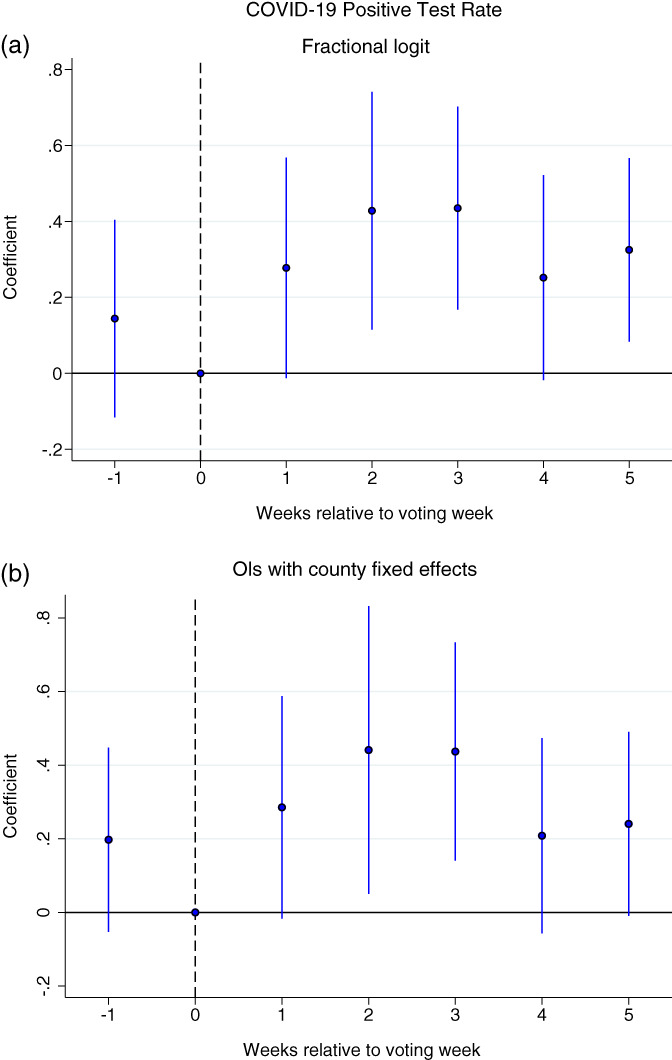
Event studies of relationship between in‐person voting and COVID‐19 spread COVID‐19 positive test rate. (a) and (b) plot the marginal effects and corresponding 95% confidence intervals from Table 2, columns 2 and 4, respectively
Across all models, we find an increase in the positive share of COVID‐19 cases in the weeks following the election in counties that had more in‐person votes per voting location, all else equal. Except for column 1, the most parsimonious model, the marginal effects are similar in size 2–3 weeks after the election, but begin to fade in subsequent weeks. The marginal effects 2 weeks after the election suggest that on average every additional 100 voters per location (a tenth of a unit increase in voters per location) is associated with an increase in the positive test rate in the preferred specification (column 2) of about 0.043 percentage points. Transforming this into an elasticity, a 10% difference in in‐person voters per polling location between counties is associated with approximately an 18% increase in the positive test rate.
4.2. Extension: COVID‐19 cases
Despite the aforementioned limitations of studying the spread of the SARS‐CoV‐2 virus using the number of positive COVID‐19 test cases reported (see Section 3), we nonetheless explore the effect of in‐person voting according to this measure. Doing so serves several purposes including (1) offering a robustness check of our preferred measure of positive test rates, (2) providing a point of comparison to several studies using this measure in other contexts (e.g., Courtemanche et al., 2020a, 2020b; Dave, Friedson, Matsuzawa, McNichols, & Sabia, 2020a; Friedson et al., 2020; Mangrum & Niekamp, 2020), and (3) introducing two additional weeks of data to the beginning of our time frame of study, a result that is due to the WDHS's reporting of only positive test results prior to March 30th. Due to the additional data, we are able to extend our observation period prior to the election by two additional weeks, thus introducing Week −2 (March 23–March 29) and Week −3 (March 16–March 22).
Given our interest in the number of positive COVID‐19 test cases, we focus on estimating several models according to
| (2) |
where Cases c,t represents one of three outcomes related to the number of positive cases in each county. The first dependent variable we examine is the cumulative number of total cases per hundred people for each county and week. Second, we examine the new weekly cases per capita, and third, we examine the log growth rate in cases, defined as ln(Total Cases c,t ) − ln(Total Cases c,t − 1). 13 For these three outcomes, we estimate OLS models. 14 For each dependent variable, we examine weekly cases first as defined by the date of test, and second by the date of symptom onset. The coefficients of interest in Equation (2) are again the β t , the coefficients on the interactions between IVL c and Week t . As noted above, we are able to examine two additional weeks in Equation (2) than in Equation (1) when not controlling for tests. The social distancing controls are identical to those in Equation (1), except that we do not include any time invariant county characteristics since they are absorbed by the county fixed effects χ c .
Table 3 and the corresponding graphs shown in Figure 2 report the results from our models described in Equation (2) using the WDHS's recorded date of the positive COVID‐19 test. Columns 1, 3, and 5 do not control for the number of COVID‐19 tests, while columns 2, 4, and 6 do control for tests. Across all specifications we find a similar pattern of results to those reported in Table 2: counties with greater voter density experienced a greater number of COVID‐19 cases, either measured by cases per hundred people, or case growth rate. In particular, estimates indicate that an additional 100 voters per location (a tenth of a unit increase in voters per location) is associated with a total of about 0.07 more total cases per 100 residents in the average county 5 weeks after the week of the election. In looking at new cases per capita, every 100 voters per location is associated with an additional 0.02 new cases per 100 people 3 weeks after the election. Notably, columns 2, 4, and 6 demonstrate that controlling for the number of COVID‐19 tests run in each county does not change the magnitudes of our coefficients, but does notably improve estimation precision. Describing the results in terms of SDs, an 1 SD increase in voters per location leads to about a 0.7 SD increase in total cumulative cases per hundred 5 weeks later and about a 0.4 SD increase in new cases per hundred 5 weeks later. 15
TABLE 3.
Relationship between COVID‐19 cases and in‐person voting per polling location
| Panel A | Panel B | Panel C | ||||
|---|---|---|---|---|---|---|
| Total cases per hundred | New cases per hundred | Ln growth rate | ||||
| (1) | (2) | (3) | (4) | (5) | (6) | |
| IPV/Loc × Week −3 | −0.043 | −0.025 | ||||
| (0.055) | (0.023) | |||||
| IPV/Loc × Week −2 | −0.030 | −0.018 | −0.479 | |||
| (0.039) | (0.020) | (5.297) | ||||
| IPV/Loc × Week −1 | −0.038* | −0.019 | 0.002 | 0.005 | −1.290 | −1.329 |
| (0.022) | (0.022) | (0.015) | (0.015) | (5.052) | (5.077) | |
| IPV/Loc × Week 1 | 0.065** | 0.046* | 0.031 | 0.029 | 3.126 | 3.264 |
| (0.032) | (0.027) | (0.024) | (0.024) | (3.304) | (3.327) | |
| IPV/Loc × Week 2 | 0.235** | 0.205** | 0.138 | 0.135 | 4.470 | 4.637 |
| (0.117) | (0.096) | (0.090) | (0.088) | (2.930) | (2.944) | |
| IPV/Loc × Week 3 | 0.439** | 0.392** | 0.194** | 0.189** | 7.154** | 7.147** |
| (0.208) | (0.158) | (0.092) | (0.087) | (3.383) | (3.364) | |
| IPV/Loc × Week 4 | 0.641** | 0.515** | 0.162* | 0.146* | 2.097 | 2.032 |
| (0.306) | (0.205) | (0.091) | (0.081) | (3.169) | (3.145) | |
| IPV/Loc × Week 5 | 0.784** | 0.607*** | 0.130** | 0.106** | 3.654 | 3.310 |
| (0.351) | (0.225) | (0.054) | (0.049) | (3.062) | (3.064) | |
| N | 648 | 504 | 648 | 504 | 576 | 504 |
| Time fixed effects | Y | Y | Y | Y | Y | Y |
| Social distancing controls | Y | Y | Y | Y | Y | Y |
| Controls for tests | Y | Y | Y | |||
| County fixed effects | Y | Y | Y | Y | Y | Y |
Notes: The data sources are identical to Table 2. Each regression is estimated using OLS using the same controls as the last column in Table 2. In‐person voters per polling location are measured in 1000s of voters. Total cases and new cases are measured per 100 county residents. This table shows coefficients and SEs clustered at the county level in parentheses. Stars denote statistical significance levels: *10%; **5%; and ***1%.
FIGURE 2.
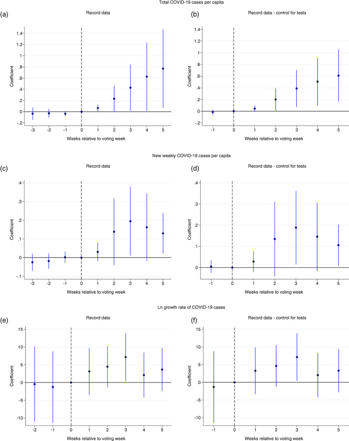
Event studies of relationship between in‐person voting and COVID‐19 spread total COVID‐19 cases per capita. Figures plot the coefficient estimates and corresponding 95% confidence intervals from Table 3
Lastly, Table 4 presents results utilizing date of symptom onset instead of the recorded date of the positive COVID‐19 test. 16 Given that symptoms can appear during the end of Week 0 (election week), for this analysis we use Week −1 as our reference week to allow for appropriate comparison. 17 Results of this analysis present a similar pattern to Table 3, however we find the differences in total cases begin to appear nearly immediately. Furthermore, new cases per 100 people are a near perfect mimic to the analogous estimated presented using the record date data (in column 3 of Table 3), but now leading by 1 week. Overall, patterns are consistent with both the patterns seen using the recorded positive case data and with how symptom‐based timing should manifest with COVID‐19 onset based on a clinical understanding of the disease (Lauer et al., 2020).
TABLE 4.
Relationship between COVID‐19 cases and in‐person voting per polling location
| Symptom onset data: COVID‐19 cases | |||
|---|---|---|---|
| Total cases per hundred | New cases per hundred | Ln growth rate | |
| IVL × Week −3 | −0.046 | −0.033* | |
| (0.056) | (0.019) | ||
| IVL × Week −2 | 0.009 | −0.011 | −3.708 |
| (0.026) | (0.014) | (4.306) | |
| IVL × Week 0 | 0.073* | 0.033 | 4.782** |
| (0.037) | (0.025) | (2.369) | |
| IVL × Week 1 | 0.224* | 0.109 | 4.915** |
| (0.115) | (0.073) | (2.371) | |
| IVL × Week 2 | 0.432** | 0.171** | 4.442* |
| (0.201) | (0.086) | (2.502) | |
| IVL × Week 3 | 0.638** | 0.193** | 6.077** |
| (0.291) | (0.090) | (2.842) | |
| IVL × Week 4 | 0.768** | 0.090 | 3.113 |
| (0.354) | (0.075) | (2.488) | |
| IVL × Week 5 | 0.924** | 0.147** | 4.463 |
| (0.398) | (0.060) | (2.685) | |
| N | 648 | 648 | 576 |
| Time fixed effects | Y | Y | Y |
| Social distancing controls | Y | Y | Y |
| County fixed effects | Y | Y | Y |
Notes: The data utilized in this table is based on symptom onset date. Each regression is estimated using OLS using the same controls as columns 1, 3, and 5 in Table 3. In‐person voters per polling location are measured in 1000s of voters. Total cases and new cases are measured per 100 county residents. This table shows coefficients and SEs clustered at the county level in parentheses. Stars denote statistical significance levels: *10%; **5%; and ***1%.
4.3. Robustness of estimates
In this section, we describe a series of robustness tests. First, even though we lag the Safe Graph social distancing measures, it is possible that they could be endogenous regressors. Thus, in Appendix Table A1 we investigate the robustness of estimates to excluding the SafeGraph social distancing controls. Results are highly robust to excluding these social distancing controls.
Second, although the main estimates presented in Tables 2 and 3 capture differences in population density across counties, one may be concerned that the evolution of COVID‐19 in each county may vary over time by population density. Hence, in Appendix Table A2 we investigate the robustness of estimates to including an interaction of county population density and week. Estimates are highly robust to this richer specification, suggesting that main results are not driven by the evolution of cases with respect to population density differences between counties.
In Figure 3a,b we investigate the sensitivity of the estimates in Tables 2 and 3 to systematically excluding each of the 72 counties in Wisconsin one at a time. Specifically, estimates in Figure 3a show results analogous to those presented in column 2 of Table 2 for the parameter estimate of the interaction between voter density and Week 3 after the election (e.g., 10.83) on the weekly positive test rate. Similarly, those presented in Figure 3b are analogous to those presented in column 2 of Table 3 for the parameter estimate of the interaction between voter density and Week 5 after the election (e.g., 0.607) for total COVID‐19 cases per hundred people. In each subfigure, we order regressions to exclude counties in ascending order of population. Overall the results are consistent to those presented in Tables 2 and 3, although estimated effects on total cases (Figure 3a) are somewhat smaller when Brown, Milwaukee, or Racine Counties are excluded from the sample. This is not unexpected given that these counties had some of the highest voter density locations in the state, and suggests that the effect in larger more urban areas was likely more pronounced than in the state overall and that effects may not be linear.
FIGURE 3.
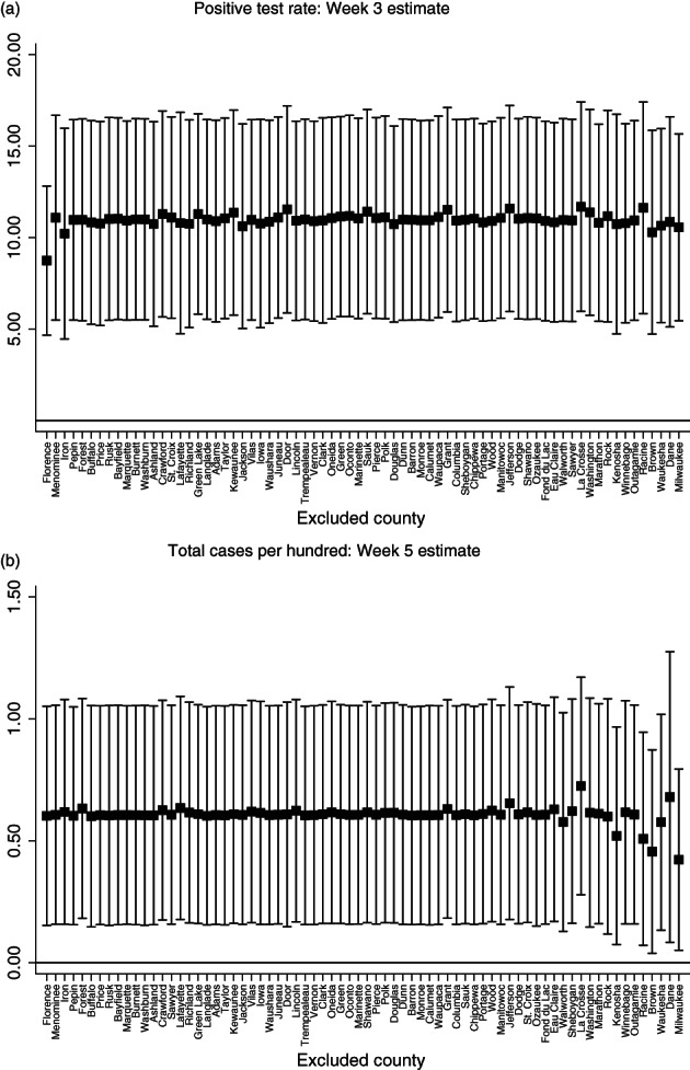
Relationship between in‐person voting and COVID‐19 spread: County exclusion analysis. (a) and (b) plot the 95% confidence intervals and corresponding estimates analogous to the parameter estimate IVL*Week3 presented in Table 2 column 2 and the parameter estimate IVL*Week5 presented in Table 3 column 2, respectively. However, we systematically exclude each of the 72 Wisconsin counties in ascending order of population
To further examine potential nonlinearity in the relationship between in‐person voter density and the spread of COVID‐19, we split our sample of counties into three subsamples: one for each tercile of in‐person voters per polling location (IVL). If transmission of the virus is focused in the most densely packed voting locations, then the positive effects of IVL on COVID‐19 should be driven by high IVL counties (tercile three). Implementing the same event study specification used to create Figure 2a, we separately estimate event studies for each tercile of IVL and plot estimates and SEs in Figure 4. Estimates suggest that the positive relationship between IVL and COVID‐19 is driven by counties with the highest voting density. While there is not a relationship between IVL and COVID‐19 in terciles one and two (where mean IVL ranges from 90 to 140), there is a strong relationship in tercile three where mean IVL is 280. These results suggest that it is the most densely packed voting locations that are contributing to COVID‐19 spread.
FIGURE 4.
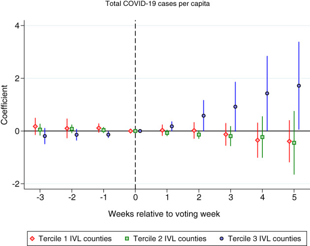
Event studies of relationship between in‐person voting and COVID‐19 differences by voter density tercile total COVID‐19 cases per capita. This figure plots coefficient estimates and corresponding 95% confidence intervals from three event study specifications similar to what is illustrated in Figure 2a. The sample is split into three terciles based on county level in‐person voters per polling location. Each regression is estimated using OLS using the same controls as in column 1 of Table 3. Total cases are measured per 100 county residents. In‐person voters per polling location are measured in 1000s of voters. SEs are clustered at the county level. Mean in‐person votes (k) per polling location is 0.089 in tercile 1, 0.14 in tercile 2, and 0.28 in tercile 3
5. IN‐PERSON VOTING AS A MECHANISM
Increased COVID‐19 transmission associated with in‐person voting should be driven by increased activity above and beyond baseline activity observed in a community during the time period surrounding the election. We observed a positive statistical relationship between county level in‐person voting per location and COVID‐19 spread, but can we also observe localized mobility behaviors consistent with this finding? In attempting to answer this question and, in doing so, more clearly link the relationship identified in Tables 2 and 3 to the April 7th election, it is useful to (1) demonstrate that behavioral differences in people's mobility (namely, activity levels) deviated from what was normal at and around the time of the election, (2) that observed differences in behavior were focused at or near polling locations specifically, and (3) that these differences were correlated with in‐person voting density across counties. This evidence would more clearly establish a behavioral link supporting the identified empirical relationship between in‐person voting and COVID‐19 outcomes, and, importantly, allow for the further exclusion of potentially unobserved correlated behaviors outside of voting.
To attempt to measure deviations in baseline levels of activity, we utilize smartphone location data: SafeGraph Weekly Patterns data and SafeGraph Core Places data. Similar to the SafeGraph Social Distancing Metrics discussed above, these datasets also use anonymized GPS pings from smartphones but provide device counts to specific Points‐of‐Interest (POIs) for every day of the week. SafeGraph provides a 6‐digit NAICS code and a text string of the business or building name for every POI (e.g., restaurants, churches, shopping malls, convenience stores, airports, and other commonly visited locations). After we merged this dataset with SafeGraph POI data, these integrated data provide the coordinates of approximately 79,000 POIs in Wisconsin. Hence, one can calculate the distance between each POI and the closest of the approximately 2,200 voting locations used in Wisconsin. Matching these three datasets allows for the measurement of increases in traffic to highly localized voting locations that would not be visible in Social Distancing Metrics, relative to increases in behavior to nonelection sites. Isolating behavioral changes to those directly associated with voting more clearly indicates that other systemic correlated behavioral changes are not potentially driving some or all of the findings.
Specifically, for approximately 79,000 POIs, the ratio of visits on a date (e.g., April 7th) to visits that occurred 7 days prior is calculated to estimate excess human activity above the baseline. Figure 5a displays the mean ratio of visits to 7 days prior by distance to the nearest poll. 18 The data points for April 7th (election day) imply that POIs less than 50 m from a voting poll received over 3.5 times more foot traffic than the previous Tuesday. While POIs 50–100 m and 100–200 m from a voting location also exhibit excess visitation, the ratio of visits to 7 days prior converges to one as the distance from a POI to the nearest polling location increases. Estimates of excess visitation on April 7th exhibit a strong distance gradient, firmly indicating that in‐person voting caused a highly localized increase in human activity above and beyond typical activity in the relevant time period of the election. Figure 5a also plots the estimates of excess visitation for April 6th and 8th, the days surrounding voting day. Averages of the ratio of visits to 7 days prior hover tightly around one for all distances, mitigating concerns that other events surrounding April 7th might drive results. 19
FIGURE 5.
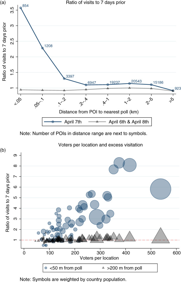
The impact of in‐person elections on visits to points of interest. Subfigure (a) displays the mean of the ratio of visits to 7 days prior for approximately 79,000 points of interest (POIs) in Wisconsin, split by April 7th (voting day) and 2 days sandwiching April 7th. Subfigure (b) illustrates that our key explanatory variable, voters per polling location, has a strong and positive relationship with excess visitation to POIs near polls. Data are from SafeGraph Core Places and Weekly Patterns, which use GPS pings from smartphones to track devices that enter a point of interest each day. POIs consist of restaurants, religious institutions, schools, and other commonly visited locations
Critically, we also observe a strong relationship between observed increases in localized human activity near polling locations and rates of in‐person votes cast. Figure 5b plots the mean of the ratio of visits to POIs on April 7th to visits 7 days prior relative to in‐person votes per location, by county. The estimates of excess visitation to POIs less than 50 m from a polling location have a remarkably positive relationship with voters per location, indicating more mobility in areas particularly close to a polling location. Focusing on POIs less than 50 m from a poll, counties with less than 200 voters per location averaged 1.8 times more foot traffic than the previous Tuesday while counties with over 300 voters per location averaged 5.8 times more than the previous Tuesday.
These figures show that people's level of activity changed considerably on April 7th, the change only corresponded with traveling to the area of polls, and the degree to which the behavioral changes occurred was highly correlated with in‐person voters per location. Hence, deviations in COVID‐19 transmission related to deviations in in‐person voting behaviors across locations do not appear to be related any other pattern of behavior. Instead, they appear to be attributable to traveling to and congregating in the area of polling locations themselves.
6. CONCLUSION
Using county level data from the entire state of Wisconsin, we analyze whether the election held in Wisconsin on April 7, 2020 is associated with the spread of COVID‐19.
Our results confirm the Wisconsin Department of Health Services findings on the link between the spread of COVID‐19 and voting using testing and tracing methods. However, the tracing investigation undertaken was not comprehensive, and our results indicate a notable association between the concentration of in‐person voters and positive test rates of COVID‐19. Specifically, results show that counties which had more in‐person voting per voting location (all else equal) had a higher rate of positive COVID‐19 tests than counties with relatively fewer in‐person voters. Furthermore, we also find a similar relationship between in‐person voter density voting and differences in COVID‐19 cases directly. Moreover, we show that our results are concentrated in the counties in the upper tercile of the voters‐per‐location distribution. These findings are unlikely to be a function of differing trajectories by population density, differing county‐level demographics, or measures of social distancing behaviors.
Our overall results suggest that a 10% increase in voters per polling location leads to about an 18% increase in the test‐positive rate. When examining the number of cumulative or new weekly cases, we find that an 1 SD increase in voters per polling location is associated with a 0.7 SD increase in total cases per 100 people and a 0.4 SD increase in new weekly cases per 100 people. 20
An important policy consideration among County and Municipal Clerks is that of location consolidation for forthcoming elections, and the results reported here may aid in their decision on the matter. As discussed in Section 2.1, when given the ability to modify the location of polling places at their own discretion, the overwhelming majority of clerks that made changes chose to consolidate locations, which likely led to increases in voter density per location. Our results show such an increase in density is associated with increase in the rate of positive COVID‐19 tests beginning 2 weeks following the election, consistent with the expected amount of time that would pass between transmission of SARS‐Cov‐2 on April 7th and increased COVID‐19 test results. Furthermore, we show that this finding is statistically significant at the 5% or 1% level across different specifications. Likewise, the data support the hypothesis that voter density per polling location will not vary with the positive rate in the week immediately preceding or during the election, again as expected, as neither parameter is significant as seen in Tables 2 and 3.
The relationship we find between COVID‐19 and voting provides an additional piece of evidence toward a causal link. Although our results are not definitive, they do suggest it may be prudent, to the extent possible during the COVID‐19 epidemic and weighed against other factors, for policy makers and election clerks to take steps to either expand the number of polling locations, voting times, early voting opportunities, or encourage curbside and absentee voting in order to keep the population density of voters as low as possible. The above recommendations could be particularly beneficial in areas with high voter density and long wait times, such as those often faced by urban voters and minority voters with substandard voting accessibility.
DATA ACKNOWLEDGMENT
We are grateful to SafeGraph for providing Social Distancing Metrics and patterns data. “SafeGraph, a data company that aggregates anonymized location data from numerous applications in order to provide insights about physical places. To enhance privacy, SafeGraph excludes census block group information if fewer than five devices visited an establishment in a month from a given census block group.”
Supporting information
Data S1. Online Appendix.
Data S2. Disclosure form.
ACKNOWLEDGMENTS
The authors wish to thank Dhaval Dave, Thomas Fujiwara, Mustafa Hussein, Catherine Maclean, John Mullahy, Nathan Tefft, and Dave Vaness for helpful comments. The authors also thank SafeGraph for providing data access and Gary Wagner and two anonymous referees for thoughtful suggestions. This research did not receive any specific grant from funding agencies in the public, commercial, or not‐for‐profit sectors.
Cotti, C. , Engelhardt, B. , Foster, J. , Nesson, E. & Niekamp, P. (2021) The relationship between in‐person voting and COVID‐19: Evidence from the Wisconsin primary. Contemporary Economic Policy, 39:760–777. 10.1111/coep.12519
Endnotes
The trajectory, number of cases, deaths, or the share of positive tests of the COVID‐19 pandemic are often modeled by larger structural models such as the highly publicized report from an Imperial College team, Flaxman et al. (2020), or alternatively, IHME, COVID‐19 Health Service Utilization Forecasting Team and Murray (2020). These are based to differing degrees on the “standard epidemiological model,” or SIR model. Please see Avery et al. (2020) for a COVID‐19 related survey of these models.
Notably, according to media reports on July 20th, 2020, a poll worker in Piedmont, Alabama who worked the runoff election on July 14th, 2020 tested positive for COVID‐19 shortly after election day. Up to 475 people cast ballots at that Calhoun County polling location and were potentially exposed. This situation is consistent with the hypothesis that large scale exposure to SARS‐CoV‐2 is at least plausible in a voting context and further supports the need for empirical investigation of the issue (Burkhalter (2020)).
On April 6, 2020 – the day before the election – Wisconsin governor Tony Evers issued an executive order that moved the election to June 9, 2020. Later that same day, the State Supreme Court ruled that the Governor cannot unilaterally move the date of an election, thus maintaining the in‐person voting.
See https://elections.wi.gov/ for more information on these data.
If a number of absentee ballots are returned but not counted (an outcome we are unable to observe), then our measure of in‐person voting exposure would be biased downward.
Some locations shared functions across categories (e.g. a town hall that houses a senior center), thus their collective representation exceeds 100%.
Social distancing measures are lagged 1 week to account for the delay in detecting a COVID‐19 infection after transmission.
Almagro and Orane‐Hutchinson (2020) analyze the percent of positive tests, rather than the number of new cases, stating “First, random testing has not been possible in NYC (refer to Wahlberg (2020) among many others discussing limited testing capacity), as only those with certain conditions are tested because of limited capacity. Second, Borjas (2020) points out that the incidence of different variables on positive results per capita is composed of two things: A differential incidence on those who are tested, but also a differential incidence on those with a positive result conditional on being tested. Therefore, we believe that the fraction of positive tests is the variable that correlates the most with the actual spread of the disease within a neighborhood throughout our sample.” (p. 2).
Papke and Wooldridge (1996, 2008) note that the usual least‐squares approach to estimating fractional response models suffers from a retransformation problem in using the estimated parameters to infer the magnitude of responses. The implication is that the usual marginal effects should be considered biased when calculated from estimates of the transformed model. They instead suggest estimation directly by quasi‐likelihood (e.g., fractional logistic regression).
Week 0, the week of the election, serves as a reference category.
While measures of testing may be endogenous, Almagro and Orane‐Hutchinson (2020) argue that including measures of testing are important as controls.
As some counties had zero confirmed cases during our sample period and the natural log of zero is undefined, we add 0.001 to total cases before calculating log growth rates.
These estimates are robust to weighting by county population.
Specifically, and .
These data suffer from issues of testing associated with the recorded case data but also have some concerns owing to systematic coding of symptom onset date as the date that the positive PCR test was recorded in situations where symptoms information is missing or the case was asymptomatic and may be less reliable than the test record data (see Section 3).
The election occurred on the second day of Week 0, so there is enough time for cases associated with the election to have onset dates during Week 0.
For additional clarity, Appendix Figure A2a displays visits to POIs in Wisconsin for each of the 14 days surrounding April 7th.
For further support, Appendix Figure A3 reports estimates from event study specifications that compare visits to POIs near versus far from polling locations.
These results are consistent with estimates of the infection rate (R(t)) for the entire state of Wisconsin following the election generated by the COVID Act Now project. In particular, this project uses a methodology for estimating the infection rate in the state based on real time Bayesian estimation of epidemic potential of emerging infectious diseases (Bettencourt & Ribeiro, 2008). After adjusting for the lag in case reporting, primary infection resulting should from the election should have appear in the state level data between April 14th and April 28th (Lauer et al., 2020). The COVID Act Now project estimates that the infection rate increased in Wisconsin overall from 1.07 on April 14th to 1.17 on April 28th, with a peak of 1.19 on April 25th (see https://covidactnow.org/us/wisconsin-wi?s=1115250).
REFERENCES
- Adolph, C. , Amano, K. , Bang‐Jensen, B. , Fullman, N. & Wilkerson, J . (2020) Pandemic politics: timing state‐level social distancing responses to COVID‐19 . medRxiv. [DOI] [PubMed]
- Allcott, H. , Boxell, L. , Conway, J. , Gentzkow, M. , Thaler, M. & Yang, D.Y . (2020) Polarization and public health: Partisan differences in social distancing during the Coronavirus pandemic . NBER Working Paper (w26946). [DOI] [PMC free article] [PubMed]
- Almagro, M. & Orane‐Hutchinson, A . (2020) The differential impact of COVID‐19 across demographic groups: Evidence from NYC (April 10, 2020).
- Andersen, M . (2020) Early evidence on social distancing in response to COVID‐19 in the United States . Working Paper.
- Associated Press . (2020) 52 positive cases tied to wisconsin election . Available at: https://apnews.com/article/b1503b5591c682530d1005e58ec8c267 [Accessed April 29, 2020].
- Avery, C. , Bossert, W. , Clark, A. , Ellison, G. & Ellison, S.F . (2020) Policy implications of models of the spread of coronavirus: perspectives and opportunities for economists . Tech. rep., National Bureau of Economic Research.
- Bettencourt, L. & Ribeiro, R. (2008) Real time Bayesian estimation of the epidemic potential of emerging infectious diseases. PLoS One, 3(5), e2185. [DOI] [PMC free article] [PubMed] [Google Scholar]
- Borjas, G.J. (2020) Demographic determinants of testing incidence and COVID‐19 infections in New York City neighborhoods . Tech. rep., National Bureau of Economic Research.
- Burkhalter, E . (2020) Piedmont poll worker in Tuesday's runoff tests positive for COVID‐19, hospitalized . Available at: http://alreporter.com/2020/07/20/piedmont-poll-worker-in-tuesdays-runoff-tests-positive-for-covid-19-hospitalized/ [Accessed August 25, 2020].
- Bursztyn, L. , Rao, A. , Roth, C. & Yanagizawa‐Drott, D . (2020) Misinformation during a pandemic . Working Paper (2020‐44).
- Courtemanche, C.J. , Garuccio, J. , Le, A. , Pinkston, J.C. & Yelowitz, A . (2020a) Did social‐distancing measures in Kentucky help to flatten the COVID‐19 curve? Working Paper.
- Courtemanche, C.J. , Garuccio, J. , Le, A. , Pinkston, J.C. & Yelowitz, A. (2020b) Strong social distancing measures in the United States reduced the COVID‐19 growth rate, while weak measures did not . Working Paper. [DOI] [PubMed]
- Dave, D. , Friedson, A.I. , Matsuzawa, K. , McNichols, D. & Sabia, J.J. (2020a) Did the Wisconsin supreme court restart a COVID‐19 epidemic? IZA Discussion Paper No. 13314.
- Dave, D.M. , Friedson, A.I. , Matsuzawa, K. , McNichols, D. , Redpath, C. & Sabia, J.J. (2020b) Did president Trump's Tulsa rally reignite COVID‐19? Indoor events and offsetting community effects . Tech. rep., National Bureau of Economic Research.
- Dave, D.M. , Friedson, A.I. , Matsuzawa, K. , Sabia, J.J. & Safford, S. (2020c) Black lives matter protests, social distancing, and COVID‐19 . Tech. rep., National Bureau of Economic Research.
- Dave, D.M. , Friedson, A.I. , McNichols, D. & Sabia, J.J. (2020d) The contagion externality of a superspreading event: the sturgis motorcycle rally and COVID‐19 . Tech. rep., National Bureau of Economic Research. [DOI] [PMC free article] [PubMed]
- Evers, T. & Palm, A . (2020) Emergency order #12 safer at home order . Available at: https://evers.wi.gov/Documents/COVID19/EMO12-SaferAtHome.pdf [Accessed August 25, 2020].
- Feltham, E.M. , Forastiere, L. , Alexander, M. & Christakis, N.A. (2020) No increase in COVID‐19 mortality after the 2020 primary elections in the USA . arXiv preprint arXiv:2010.02896.
- Flaxman, S. , Mishra, S. , Gandy, A. , Unwin, H. , Coupland, H. , Mellan, T. , et al. (2020) Report 13: estimating the number of infections and the impact of non‐pharmaceutical interventions on COVID‐19 in 11 European countries .
- Friedson, A.I. , McNichols, D. , Sabia, J.J. & Dave, D . (2020) Did California's shelter‐in‐place order work? Early coronavirus‐related public health effects . Tech. rep., National Bureau of Economic Research.
- Harris, J.E. (2020) The subways seeded the massive coronavirus epidemic in New York city . NBER Working Paper (w27021).
- IHME, COVID‐19 Health Service Utilization Forecasting Team & Murray, C. (2020) Forecasting COVID‐19 impact on hospital bed‐days, ICU‐days, ventilator‐days and deaths by US state in the next 4 months . medRxiv.
- Kahle, D. & Wickham, H. (2013) ggmap: spatial visualization with ggplot2. The R Journal, 5(1), 144–161 Available at: https://journal.r-project.org/archive/2013-1/kahle-wickham.pdf [Accessed August 25, 2020]. [Google Scholar]
- Kuchler, T. , Russel, D. & Stroebel, J. (2020) The geographic spread of COVID‐19 correlates with structure of social networks as measured by Facebook . Tech. rep., National Bureau of Economic Research. [DOI] [PMC free article] [PubMed]
- Lauer, S.A. , Grantz, K.H. , Bi, Q. , Jones, F.K. , Zheng, Q. , Meredith, H.R. , et al. (2020) The incubation period of coronavirus disease 2019 (COVID‐19) from publicly reported confirmed cases: estimation and application. Annals of Internal Medicine, 172(9), 577–582. [DOI] [PMC free article] [PubMed] [Google Scholar]
- Mangrum, D. & Niekamp, P . (2020) College student contribution to local COVID‐19 spread: evidence from university spring break timing . Working Paper.
- New York Times . (2020) Wisconsin primary recap: voters forced to choose between their health and their civic duty . Available at: https://www.nytimes.com/2020/04/07/us/politics/wisconsin-primary-election.htmln [Accessed August 25, 2020].
- Papke, L.E. & Wooldridge, J.M. (1996) Econometric methods for fractional response variables with an application to 401 (k) plan participation rates. Journal of Applied Econometrics, 11(6), 619–632. [Google Scholar]
- Papke, L.E. & Wooldridge, J.M. (2008) Panel data methods for fractional response variables with an application to test pass rates. Journal of Econometrics, 145(1–2), 121–133. [Google Scholar]
- Schmitt‐Grohé, S. , Teoh, K. & Uribe, M. (2020) COVID‐19: testing inequality in New York city . Tech. rep., National Bureau of Economic Research.
- Wahlberg, D . (2020) COVID‐19 testing capacity growing in Wisconsin, but some patients still can't get tested . Available at: https://bit.ly/2L8NufM [Accessed May 5, 2020].
Associated Data
This section collects any data citations, data availability statements, or supplementary materials included in this article.
Supplementary Materials
Data S1. Online Appendix.
Data S2. Disclosure form.