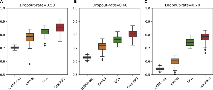
Figure 6.
GraphSCI recovers gene expression levels in bulk RNA-seq data
Box diagram (A–C) depict the Pearson correlation coefficient between simulated data or imputed data and original data. And the box represents the interquartile range, the horizontal line in the box is the median, and the whiskers represent 1.5 times the interquartile range.

