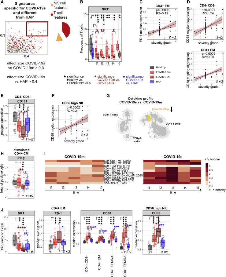
Figure 5.
Distinct signatures of COVID-19s are exclusive to the lymphocyte compartment
(A) Comparison of immune features derived from each leukocyte subpopulation between experimental groups. A dot plot displaying the ES calculated in HAP versus COVID-19s (x axis; threshold 0.4) compared with the ES calculated in COVID-19m versus COVID-19s (y axis; threshold 0.3). Each dot represents one immunological feature. The red box highlights immune features, which are different in COVID-19s and HAP, with a focus on changes within the T and NK cell fraction.
(B) Median frequencies and 25th and 75th percentiles of FlowSOM-generated NKT immune cell cluster.
(C) Correlation between median expression of PD-1 in CD4+ EM cells (TPs 1 and 2 pooled) against the severity grade of COVID-19 patients.
(D) Correlation between median expression of CD38 in CD4− CD8− (TCRγδ-enriched) and CD4+ EM T cells (TPs 1 and 2 pooled) against the severity grade of COVID-19 patients.
(E) Median expression and 25th and 75th percentiles of CD161 in FlowSOM-generated CD4− CD8− (TCRγδ-enriched) immune cell cluster.
(F) Correlation between median expression of CD95 in CD56high NK cells (TPs 1 and 2 pooled) against the severity grade of COVID-19 patients.
(G) Schematic overview of cytokine polarization profile comparing COVID-19s and COVID-19m. UMAP with FlowSOM overlay shows cytokine-producing T cells (features reaching an ES > 0.3 versus COVID-19m and > 0.4 versus HAP). One thousand T cells were subsetted from every sample from each cohort.
(H) Median frequency and 25th and 75th percentiles of IFN-γ-positive cells in FlowSOM-generated immune cell clusters shown in (G).
(I) Heatmap depicting the Z score of each T and NK cell related immune feature (highlighted in A) compared with HCs for every TP. Both negative and positive changes are visualized by intensity of red color scale. MFI, mean fluorescence intensity.
(J) Median frequencies or expression of indicated populations and markers. Box plots show the 25th and 75th percentiles.
∗p < 0.05, ∗∗p < 0.01, ∗∗∗p < 0.001, and ∗∗∗∗p < 0.0001, Mann-Whitney test, BH correction. See also Figure S5.

