Abstract
Physical distancing has been the primary strategy to control COVID-19 in the United States. We used mobility data from a large, anonymized sample of smartphone users to assess the relationship between neighbourhood income and physical distancing during the pandemic. We found a strong gradient between neighbourhood income and physical distancing. Individuals in high-income neighbourhoods increased their days at home substantially more than individuals in low-income neighbourhoods did. Residents of low-income neighbourhoods were more likely to work outside the home, compared to residents in higher-income neighbourhoods, but were not more likely to visit locations such as supermarkets, parks and hospitals. Finally, we found that state orders were only associated with small increases in staying home in low-income neighbourhoods. Our findings indicate that people in lower-income neighbourhoods have faced barriers to physical distancing, particularly needing to work outside the home, and that state physical distancing policies have not mitigated these disparities.
Physical distancing has been the primary strategy to limit the spread of COVID-19 in the United States. Physical distancing (also called ‘social distancing’) entails reducing contacts between non-household members to reduce opportunities for transmission from infected to susceptible individuals. To promote physical distancing, most US states closed schools, mandated business closures, and issued ‘stay-at-home’ orders directing residents to avoid unnecessary trips. These measures have been essential to prevent worst-case scenarios involving millions of deaths1–3.
Although there is evidence that new cases of COVID-19 declined as people stayed home2, evidence suggests unequal declines in the burden of COVID-19. While case data disaggregated by income are not available, COVID-19 case and death rates have risen fastest in low-income communities4,5. An association between lower neighbourhood income and COVID-19 risk is also consistent with data showing higher COVID-19 mortality among racial and ethnic minorities6, whose socioeconomic position is systematically lower, on average, than that of white Americans and who disproportionately reside in low-income neighbourhoods due to a long history of discriminatory housing policy7,8.
Financial constraints to physical distancing may have been an important factor contributing to higher COVID-19 burden among economically marginalized populations4. At businesses that have remained open during the pandemic, low-income workers have reported less ability to work from home relative to higher wage earners9. At these workplaces, most workers were not eligible for unemployment insurance unless they could document a COVID-19 diagnosis or exposure10. Although many states began closing businesses and ordering residents to stay home in the second half of March, businesses deemed essential remained open, and staffed predominantly by low-wage workers11,12. It was not until mid-April that some states began requiring people to wear masks in public spaces to reduce COVID-19 transmission, and some states still have not done so10. In this context, low-income workers have had to choose between staying home and losing their income or going to work and risking exposure to COVID-19 for themselves and their households and neighbours. Given that those in low-income households typically have little savings13, losing income could bring other health and safety risks, including homelessness and food insecurity.
Previous work14 has found that residents of low-income neighbourhoods were less likely than residents of higher-income neighbourhoods to stay home in response to COVID-19. In this article, we test two main hypotheses. First, we proposed that this gap in physical distancing was explained by work-related demands (hypothesis 1a) and not by visits to places other than work (hypothesis 1b). Second, we proposed that state policies that ordered non-essential businesses to close, and for residents to stay at home, increased the gap in physical distancing between low- and high-income neighbourhoods (hypothesis 2).
To test these hypotheses, we use longitudinal mobility data derived from smartphones during the first 4 months of the COVID-19 epidemic in the United States, when the largest mobility changes occurred and most states implemented physical distancing orders. Our analysis builds on previous work on neighbourhood income and COVID-related physical distancing by (1) differentiating between mobility due to work and non-work activities; (2) estimating the effects of state-level physical distancing orders and comparing these effects to overall changes in mobility and (3) conducting a series of analyses to interrogate the use of smartphone mobility data. We focus our analyses at the neighbourhood (census block group, BG) level because community-level physical distancing is thought to be a key driver of disparities in exposure to COVID-19. It is also the smallest available unit of geography for which de-identified mobility data are available.
Results
Sample characteristics appear in Table 1. The sample included mobility data from 210,288 census BGs and point-of-interest (POI) data from 20,119 beer, wine and liquor stores; 131,514 carryout restaurants; 23,470 convenience stores; 5,574 hospitals; 73,935 parks and playgrounds; 97,379 places of worship and 62,955 supermarkets.
Table 1 |.
Sample characteristics
| Income quintile | Income range (US$) | Census block groups (BGs) | Points of interest (POI) in SafeGraph sample | ||||||||||
|---|---|---|---|---|---|---|---|---|---|---|---|---|---|
| n | Sample devices | Population | Beer, wine and liquor stores | Carryout | Convenience stores | Hospitals | Parks and playgrounds | Places of worship | Supermarkets | ||||
| Mean | s.d. | Mean | s.d. | n | |||||||||
| 1 | Up to 40,870 | 50,085 | 68 | 47 | 1,265 | 701 | 3,845 | 15,508 | 3,546 | 684 | 11,639 | 24,823 | 13,747 |
| 2 | 40,870–54,305 | 44,527 | 83 | 61 | 1,423 | 819 | 4,340 | 30,800 | 6,088 | 1,723 | 13,685 | 23,572 | 16,324 |
| 3 | 54,306–69,769 | 41,473 | 93 | 77 | 1,527 | 952 | 4,319 | 33,284 | 6,211 | 1,568 | 15,175 | 21,121 | 13,957 |
| 4 | 69,770–93,749 | 37,803 | 104 | 99 | 1,679 | 1,134 | 4,133 | 29,540 | 4,698 | 997 | 16,138 | 16,425 | 10,939 |
| 5 | 93,750 and above | 36,400 | 106 | 120 | 1,737 | 1,271 | 3,482 | 22,382 | 2,927 | 602 | 17,298 | 11,438 | 7,988 |
| Full sample | 210,288 | 89 | 83 | 1,483 | 990 | 20,119 | 131,514 | 23,470 | 5,574 | 73,935 | 97,379 | 62,955 | |
Census BGs were the units of analysis for changes in the proportion of smartphone users staying home all day and going to work outside the home, for 6 January through 3 May 2020. BGs were assigned income quintiles based on the population-weighted quintiles for median household income for all US BGs in 2018. POI were the units of analysis for changes in non-work visits occurring between 6 January and 3 May 2020. POI were assigned income quintiles based on the typical visitor to each POI in January and February 2020. For more details, see Methods.
Days spent entirely at home.
We found an increase in physical distancing for all income levels from January–February 2020 to April 2020: days at home increased by 11.0 percentage points (t = 1,033.7, d.f. = 4,200,559, P < 0.001, 95% CI 11.1, 11.1) in the lowest income quintile (hereafter Q1 for quintile 1 and so on), 13.8 percentage points (t = 1,316.8, d.f. = 3,738,600, P < 0.001, 95% CI 13.8, 13.8) in Q2, 16.4 percentage points (t = 1,549.1, d.f. = 3,482,620, P < 0.001, 95% CI 16.4, 16.4) in Q3, 20.2 percentage points (t = 1,875.1, d.f. = 3,173,824, P < 0.001, 95% CI 20.2, 20.2) in Q4 and 27.1 percentage points (t = 2,445.6, d.f. = 3,055,123, P < 0.001, 95% CI 27.1, 27.1) in Q5. This increase in the highest income neighbourhoods was 16.0 percentage points greater (t = 1,055.2, d.f. = 17,650,726, P < 0.001, 95% CI 16.0, 16.1) than the increase observed in the lowest income neighbourhoods (Table 2, and Fig. 1).
Table 2 |.
Proportion of smartphone users who spent the entire day at home and proportion who worked outside the home
| Neighbourhood income quintile | Mean | Pre-post difference | ||||
|---|---|---|---|---|---|---|
| January-February 2020 | Versus Q1 (95% CI) t statistic residual d.f. | April 2020 | Versus Q1 (95% CI) t statistic residual d.f. | Estimate (95% CI) t statistic residual d.f. | Versus Q1 (95% CI) t statistic residual d.f. | |
| Spent entire day at home (%) | ||||||
| Q1 (lowest) | 26.9 | – | 38.0 | – | 11.0 (11.0, 11.1) 1,033.6 4,200,559 |
– |
| Q2 | 25.0 | −1.9 (−1.9, −1.9) −235.9 5,100,743 |
38.8 | 0.8 (0.8, 0.8) 59.0 2,827,868 |
13.8 (13.8, 13.8) 1,316.8 3,738,600 |
2.7 (2.7, 2.8) 190.0 17,650,726 |
| Q3 | 23.9 | −3.0 (−3.0, −3.0) −367.0 4,919,992 |
40.3 | 2.3 (2.3, 2.4) 168.8 2,713,572 |
16.4 (16.4, 16.4) 1,549.1 3,482,620 |
5.3 (5.3, 5.4) 363.6 17,650,726 |
| Q4 | 22.7 | −4.3 (−4.3, −4.3) −519.8 4,673,309 |
42.9 | 4.9 (4.9, 4.9) 349.4 2,549,737 |
20.2 (20.2, 20.2) 1,875.1 3,173,824 |
9.2 (9.1, 9.2) 609.2 17,650,726 |
| Q5 (highest) | 20.0 | −6.9 (−6.9, −7.0) −841.4 4,563,251 |
47.1 | 9.1 (9.1, 9.1) 634.5 2,442,488 |
27.1 (27.1, 27.1) 2,445.6 3,055,123 |
16.0 (16.0, 16.1) 1,055.2 17,650,726 |
| Worked outside the home (%) | ||||||
| Q1 (lowest) | 19.2 | – | 12.6 | – | −6.6 (−6.6, −6.6) −675.6 4,200,559 |
– |
| Q2 | 20.9 | 1.7 (1.7, 1.8) 185.9 4,993,994 |
12.1 | −0.5 (−0.5, −0.6) −60.4 2.834,330 |
−8.9 (−8.9, −8.9) −855.8 3,738,600 |
−2.3 (−2.3, −2.3) −155.1 17,650,726 |
| Q3 | 22.0 | 2.8 (2.7, 2.8) 284.0 4,645,169 |
11.7 | −0.9 (−0.9, −0.9) −103.8 2.736,195 |
−10.3 (−10.3, −10.3) −938.5 3,482,620 |
−3.7 (−3.7, −3.6) −246.3 17,650,726 |
| Q4 | 22.8 | 3.6 (3.6, 3.7) 355.0 4,144,150 |
11.1 | −1.5 (−1.5, −1.5) −163.8 2,591,434 |
−11.7 (−11.7 −11.7) −992.8 3,173,824 |
−5.1 (−5.1, −5.1) −332.6 17,650,726 |
| Q5 (highest) | 23.9 | 4.7 (4.7, 4.7) 432.6 3,790,206 |
10.2 | −2.4 (−2.4, −2.4) −262.0 2,504,288 |
−13.7 (−13.7, −13.7) −1,072.6 3,055,123 |
−7.1 (−7.1, −7.1) −456.4 17,650,726 |
All P values < 0.001. Dataset contained one observation per date (54 in the ‘pre’ period, 30 in the ‘post’ period) for each census BG. For census BGs per income quintile, see Table 1. We used two-sided t-tests to calculate differences in mean values during the pre (January–February 2020) and post (April 2020) periods. We used separate OLS regressions stratified by income level to calculate changes from pre to post within each income quintile. To calculate differences in those changes between income strata, we used OLS regressions interacting a post period indicator with income quintile, with Q1 as the reference group. For this reason, estimates of relative difference may deviate from each quintile’s estimated absolute difference minus Q1’s estimated absolute difference. Results are presented as percentage points.
Fig. 1 |. Proportion of smartphone users staying home all day.
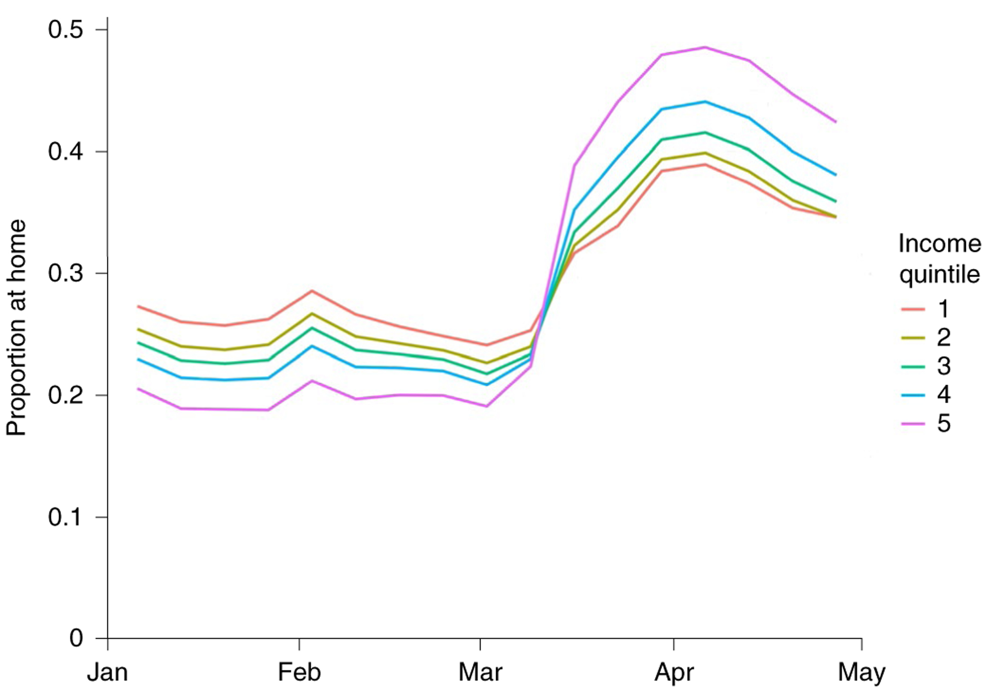
Income Q1 represents the lowest income group. Outcomes are presented as weekly averages. Period covered is 6 January to 3 May 2020. Sample comprises 210,288 census BGs with a mean of 89 active devices per BG per day.
Before these changes, people residing in the highest income neighbourhoods stayed home less than people residing in the lowest income neighbourhoods (t = 841.4, d.f. = 4,563,251, P < 0.001, 95% CI −6.9, −7.0). Afterwards, this relationship inverted (t = 634.45, d.f. = 2,442,488, P < 0.001, 95% CI 9.1, 9.1) (Table 2 and Fig. 1).
These levels and trends by neighbourhood income level are presented by level of urbanicity in Extended Data Fig. 1 and by US region in Extended Data Fig. 2.
Days working outside the home.
For each neighbourhood income quintile, we found reductions in working outside the home that corresponded with increases in physical distancing. Q5 worked outside the home more than Q1 at baseline (t = 432.7, d.f. = 3,790,206, P < 0.001, 95% CI 4.7, 4.7) and less during COVID-19 (t = −262.0, d.f. = 2,504,288, P < 0.001, 95% CI −2.4, −2.4). Reductions in working outside the home were largest among the highest income group, which reduced days at work by 13.7 percentage points (t = −1,072.6, d.f. = 3,055,123, P < 0.001, 95% CI −13.7, −13.7. This reduction was 7.1 percentage points greater (t = 456.4, d.f. = 17,650,726, P < 0.001, 95% CI 7.1, 7.1) than the reduction in the lowest income group, which reduced days at work by 6.6 percentage points (t = 675.6, d.f. = 4,200,559, P < 0.001, 95% CI 6.6, 6.6) (Table 2 and Fig. 2).
Fig. 2 |. Proportion of smartphone users working outside the home.
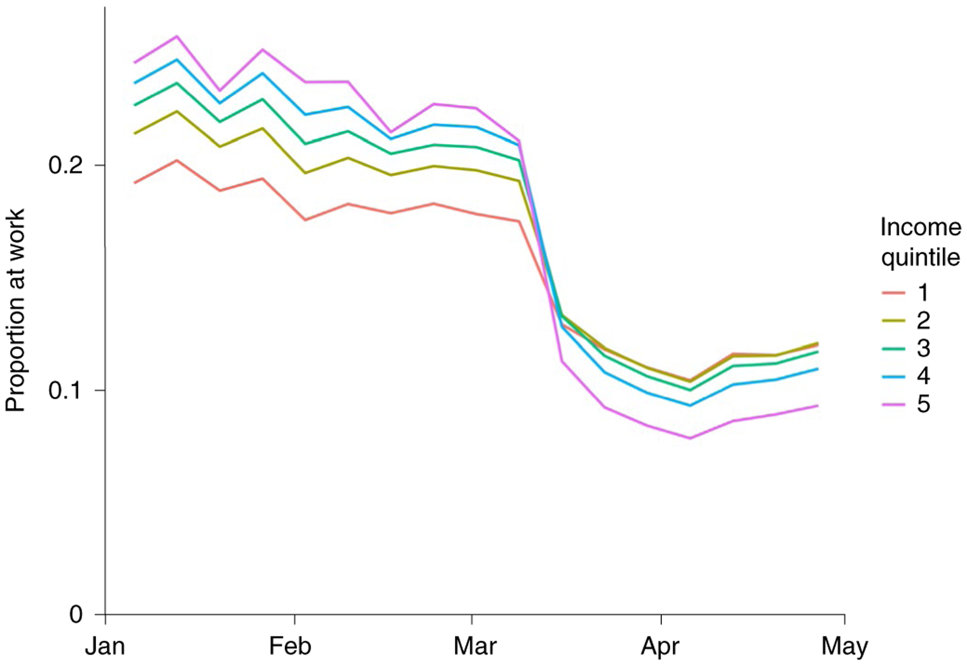
Income Q1 represents the lowest income group. Outcomes are presented as weekly averages. Period covered is 6 January to 3 May 2020. Sample comprises 210,288 census BGs with a mean of 89 active devices per BG per day.
Non-work activities outside the home.
Visits to all categories of non-work locations declined over the same period, as depicted in Fig. 3. For all categories, point-estimated reductions were greatest for locations serving the highest income residents, as displayed in Table 3. However, for carryout restaurants and supermarkets, locations serving the lowest income residents experienced the second-largest declines in visits: visits to carryout restaurants declined by 48.5% (t = 6,917.5, d.f. = 186,094, P < 0.001, 95% CI 47.2, 49.9) for Q1, versus 43.5% (t = 9,443.5, d.f. = 354,478, P < 0.001, 95% CI 42.6, 44.4) for Q4; visits to supermarkets declined by 32.3% (t = 4,100.7, d.f. = 164,962, P < 0.001, 95% CI 30.7, 33.8) for Q1, compared to 29.4% (t = 4,013.6, d.f. = 131,266, P < 0.001, 95% CI 28.0, 30.9) for Q4. Only for places of worship does Fig. 3 show an income gradient associated with greater reductions in visits. However, as displayed in Extended Data Fig. 3, visits did not appear to vary from weekday to weekends during the post period.
Fig. 3 |. Visits to non-work locations.
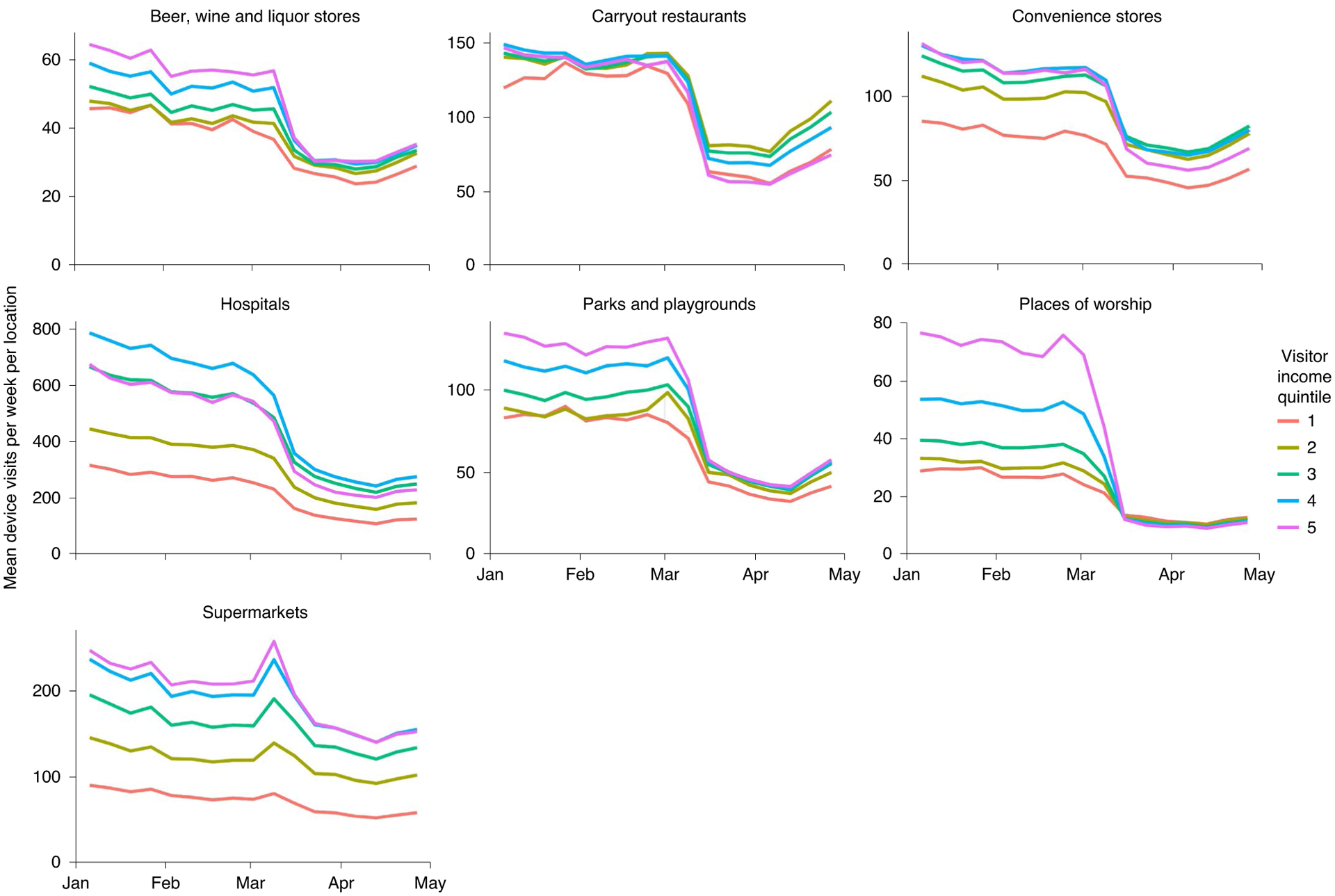
Note that visitor income is calculated for each point of interest on the basis of visitor home census BG from January and February 2020. Median visitor income quintile is based on the median of household income values from visitors, weighted by the number of visits per BG. Non-work visit counts were calculated at the point of interest level by subtracting visits assumed to be from workers (duration >4 h) from total visit counts and adjusting the remaining visits to account for variation in device-to-population ratio among visitors’ home BGs. The resulting counts were aggregated by week, location type and income quintile for this visualization. Period covered is 6 January to 3 May 2020. Sample comprises 414,946 POI.
Table 3 |.
Non-work activities outside the home: percentage point change in visits by category
| Neighbourhood income quintile of typical visitor | Percentage point change in visits (95% CI) t statistic residual d.f. | ||||||
|---|---|---|---|---|---|---|---|
| Beer, wine and liquor stores | Carryout restaurants | Convenience stores | Hospitals | Parks and playgrounds | Places of worship | Supermarkets | |
| Q1 (lowest) | −40.8 (−44.1, −37.6) −2,463.6 46,138 |
−48.5 (−49.9, −47.2) −6,917.5 186,094 |
−37.5 (−39.4, −35.5) −3,751.1 42,550 |
−58.6 (−65.0, −52.2) −1,793.6 8,206 |
−57.1 (−59.4, −54.8) −4,863 139,666 |
−60.1 (−61.2, −58.9) −10,320.6 297,874 |
−32.3 (−33.8, −30.7) −4,100.7 164,962 |
| Q2 | −35.1 (−37.1, −33.0) −3,352.7 52,078 |
−31.6 (−32.4, −30.9) −8,675.9 369,598 |
−33.3 (−34.7, −32.0) −4,726.5 73,054 |
−57.7 (−61.3, −54.1) −3,129.7 20,674 |
−50.9 (−52.7, −49.1) −5,557.6 164,218 |
−65.7 (−66.5, −64.8) −14,593.7 282,862 |
−24.8 (−26.0, −23.5) −3,831.4 195,886 |
| Q3 | −37.2 (−39.4, −35.1) −3,448.9 51,826 |
−35.9 (−36.6, −35.2) −10,406.6 399,406 |
−35.6 (−37.0, −34.3) −5,135.6 74,530 |
−60.9 (−64.7, −57.2) −3,181.9 18,814 |
−52.9 (−54.9, −50.8) −4,973.3 182,098 |
−73.6 (−75.3, −71.8) −8,153.6 253,450 |
−26.2 (−27.6, −24.8) −3,664.4 167,482 |
| Q4 | −42.5 (−45.8, −39.2) −2,531.5 49,594 |
−43.5 (−44.4, −42.6) −9,443.5 35,4478 |
−40.6 (−42.2, −39.0) −4,894.7 56,374 |
−63.9 (−68.9, −58.8) −2,474.5 11,962 |
−59.2 (−61.4, −57.0) −5,211.6 193,654 |
−81.6 (−82.9, −80.2) −11,467.1 197,098 |
−29.4 (−30.9, −28.0) −4,013.6 131,266 |
| Q5 (highest) | −46.9 (−49.6, −44.2) −3,376.4 41,782 |
−54.0 (−54.9, −53.1) −12,083 268,582 |
−48.7 (−50.8, −46.6) −4,560.5 35,122 |
−64.3 (−70.2, −58.4) −2,132.4 7,222 |
−62.9 (−64.7, −61.1) −6,752.7 207,574 |
−87.5 (−89.2, −85.9) −10,195.1 137,254 |
−34.0 (−35.6, −32.5) −4,308.9 95,854 |
All P < 0.001. To calculate differences from pre (6 January–1 March 2020) to post (6 April–3 May 2020) COVID-19 related changes, we used OLS regressions estimating post effects, stratified within each location category and visitor income quintile. Values were normalized against the pre period mean within each category and income quintile before modelling, to estimate proportional changes in visits from pre to post. These are reported here as percentages. The data source was SafeGraph Weekly Patterns (v.2). To identify non-work visits, we subtracted visits of >4 h from weekly visit totals. For sample size per category, see Table 1.
State policy effects.
Our difference-in-differences (DiD) model found that physical distancing orders increased the proportion of residents spending all day home for each neighbourhood income quintile: we estimated this effect at 2.5 percentage points for Q1 (t = 4.4, d.f. = 26,245, P < 0.001, 95% CI 1.3, 3.7), 2.8 percentage points for Q2 (t = 6.1, d.f. = 26,245, P < 0.001, 95% CI 1.8, 3.8), 2.9 percentage points for Q3 (t = 6.4, d.f. = 26,245, P < 0.001, 95% CI 1.9, 3.9), 2.9 percentage points for Q4 (t = 6.4, d.f. = 26,245, P < 0.001, 95% CI 2.1, 3.7) and 3.2 percentage points for Q5 (t = 4.6, d.f. = 26,245, P < 0.001, 95% CI 1.8, 4.6) (Table 4).
Table 4 |.
Difference-in-differences linear regression estimates: effects of physical distancing orders on staying home all day
| Neighbourhood income quintile | DiD estimate | 95% CI | t statistic | P value | Placebo test P value | Difference in DiD estimate relative to Q1 | 95% CI | t statistic | P value | Placebo test P value |
|---|---|---|---|---|---|---|---|---|---|---|
| Model 1: exposure = physical distancing order | ||||||||||
| Q1 (lowest) | 2.5 | (1.3, 3.7) | 4.4 | <0.001 | 0.004 | – | – | – | – | – |
| Q2 | 2.8 | (1.8, 3.8) | 6.1 | <0.001 | – | 0.3 | (−0.1, 0.7) | 1.2 | 0.22 | 0.31 |
| Q3 | 2.9 | (1.9, 3.9) | 6.4 | <0.001 | – | 0.3 | (0.2, 1.0) | 1.2 | 0.22 | 0.29 |
| Q4 | 2.9 | (2.1, 3.7) | 6.4 | <0.001 | – | 0.4 | (−0.4, 1.2) | 1.0 | 0.30 | 0.36 |
| Q5 (highest) | 3.2 | (1.8, 4.6) | 4.6 | <0.001 | – | 0.7 | (−0.5, 1.9) | 1.2 | 0.22 | 0.27 |
| Model 2: exposure = emergency declaration | ||||||||||
| Q1 (lowest) | −0.6 | (1.0, −0.2) | −2.6 | 0.01 | 0.02 | – | – | – | – | – |
| Q2 | −0.6 | (−1.0, −0.2) | −2.6 | 0.01 | – | 0 | (−0.2, 0.2) | −0.1 | 0.89 | 0.92 |
| Q3 | −0.6 | (−1.2, 0) | −2.1 | 0.03 | – | 0 | (−0.4, 0.4) | −0.1 | 0.91 | 0.94 |
| Q4 | −0.6 | (−1.2, 0) | −1.8 | 0.08 | – | 0 | (−0.4, 0.4) | 0 | 0.97 | 0.98 |
| Q5 (highest) | −0.2 | (−1.0, 0.6) | −0.5 | 0.62 | – | 0.4 | (−0.4, 1.2) | 1.1 | 0.29 | 0.33 |
Observations, 26,775. Residual d.f. = 26,245. Models are fully interacted OLS regressions estimating the effects of state policies on neighbourhoods in the lowest quintile for median household income, as well as the marginal effects of those policies on other income quintiles (interaction term). For placebo tests, the models were re-estimated 500 times each with simulated datasets in which the policy exposure was randomly reassigned across states, such that any estimated association was necessarily spurious. The placebo test P value reported is the proportion of iterations in which the placebo treatment produced a larger-magnitude t statistic than was estimated for the actual treatment. This metric is reported only for the Q1 estimated effect and estimated marginal effects relative to Q1. Time period is limited to dates before 20 April 2020, when the first state physical distancing order was lifted (South Carolina).
Physical distancing orders were not associated with additional increases in staying home at higher income levels, contrary to our second hypothesis: the marginal effects estimates for Q2–Q5 all showed P values greater than P = 0.05 (Q2, P = 0.22; Q3, P = 0.22; Q4, P = 0.30; Q5, P = 0.22). However, for all groups, the maximum estimated effects of state physical distancing orders were modest relative to the overall change in mobility observed during this period: the greatest 95% CI upper bound for any group was a 4.6 percentage point increase, estimated for the highest income quintile. The placebo test validated statistical significance at P < 0.05 of the main effect (treatment effects in the lowest income quintile) (placebo test P = 0.004).
By contrast, our DiD model found that emergency declarations were associated with a 0.6 percentage point decrease in days at home in the lowest income quintile (t = −2.6, d.f. = 26,245, P = 0.01, 95% CI −1.0, −0.2) (Table 4). The placebo test validated this result at P < 0.05 (placebo test P = 0.02). In the highest income quintile, we did not find effects of emergency declarations on days at home (estimate, −0.2, t = −0.5, d.f. = 26,245, P = 0.62, 95% CI −1.0, 0.6).
In the event study models, point-estimated increases in physical distancing were larger at higher income levels and mostly statistically significant at P < 0.05 for at least 1 week after implementation for physical distancing orders, as depicted in Fig. 4. In all quintiles, Fig. 4 shows visible increases in distancing over the 14 days before the implementation of physical distancing orders. The magnitude of these pre-implementation increases appeared largest in the highest income quintile.
Fig. 4 |. Event study linear regression analysis: effects of state physical distancing orders on staying home all day.
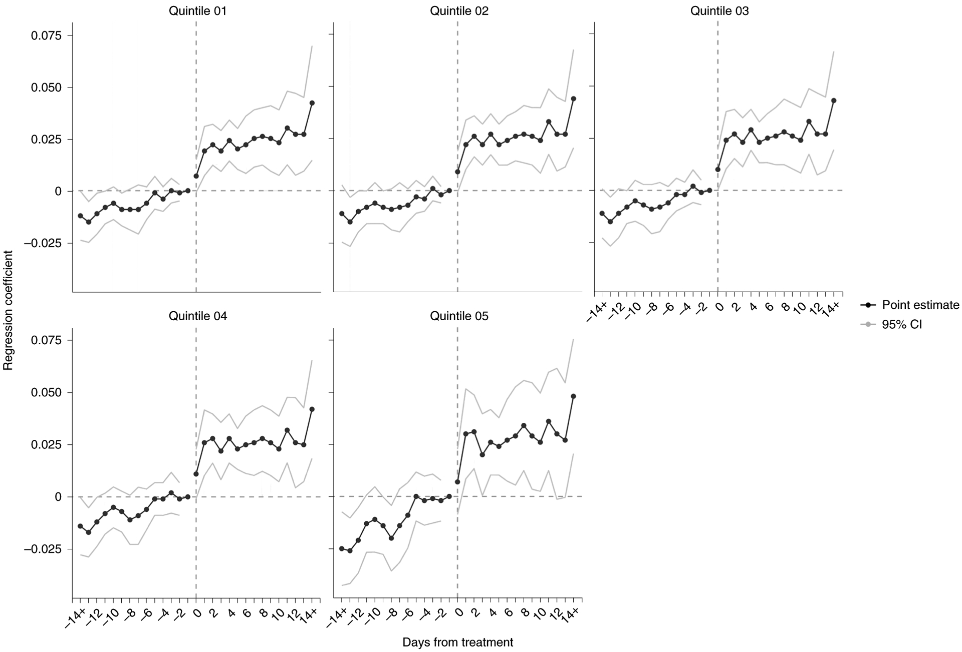
Each panel reports the result of an event study regression within a single income stratum. Models are similar to DiD models reported above, except that we replaced the binary policy indicator with binary indicators for living in intervention states in a series of 1-d periods up to 14 d before and after policy changes. The reference group was being in a comparison state or being in an intervention state on the day before policy enactment (day –1). Time period is limited to dates before 20 April 2020, when the first state physical distancing order was lifted (South Carolina). Sample comprises 210,288 census BGs with a mean of 89 active devices per block.
Discussion
Using data from a large national sample, we found that communities at all income levels increased physical distancing in response to COVID-19. However, consistent with our first hypothesis, we found that lower-income communities increased physical distancing less than higher-income communities. We found evidence that working outside the home contributed to these differences in physical distancing, and no evidence that non-work activities outside the home contributed to these differences. We found that physical distancing orders, and not emergency declarations, were associated with increased physical distancing during the study period. The magnitude of policy effects at every income level was modest compared to overall changes in physical distancing. We did not find differing effects of policies across income levels.
Understanding the link between small-area physical distancing patterns and COVID-19 transmission is difficult because most jurisdictions have only released COVID-19 case data at the county level. However, our findings indicate that income level is a strong determinant of whether individuals can take the most protective measures against COVID-19, that is, staying home entirely. During the initial months of the pandemic, higher-income communities rapidly reduced the proportion of days that residents spent working outside the home, but our analysis suggests that lower-income communities could not. These findings are consistent with surveys indicating that while lower-income individuals wish to adopt physical distancing principles, they are unable to work from home9, and with findings from Dimke and colleagues15, indicating that SafeGraph ‘time at home’ metrics increased more in BGs where more workers had occupations that generally allowed working from home. The lowest income individuals might have experienced even smaller declines in working outside the home, had they not also lost work at a higher rate during the pandemic16.
In their non-work time, lower-income communities appear to have curtailed activities at similar rates as higher-income communities. In other words, it does not appear that non-work activities contributed to differences in physical distancing across income levels. For one category of non-work locations—places of worship—we did find that visits declined less at lower income levels (Fig. 3). However, during the period influenced by COVID-19, we did not find the usual relationship between weekday and weekend visits to places of worship at any income level (Extended Data Fig. 3). Our pre-COVID findings were consistent with our expectation that a large proportion of visits to places of worship would occur on weekends, for attendance at religious services. In April 2020, visits to places of worship declined substantially across all income levels and we no longer observed this weekday versus weekend difference. This finding indicates that places of worship continued to receive visits during COVID-19, but typically not for large weekend services. Although places of worship serving the lowest income neighbourhoods displayed somewhat more activity in April 2020 than those serving higher income levels, and this activity could potentially reflect higher rates of attendance at religious services, it might, alternatively, reflect differences in how places of worship function in low-income communities. One possibility is that places of worship might have provided non-religious social services (for example, as food banks), though this question calls for additional research.
According to our findings, residents at all income levels had begun increasing physical distancing before implementation of physical distancing orders. However, these pretrends were steepest at the highest income level. Although event studies from Weill and colleagues found that high-income census tracts increased physical distancing in response to emergency declarations14, we did not find that emergency declarations increased days at home at any income level using a DiD design. One possible explanation for this difference is that Weill et al examined responses to emergency declarations using a 21-day postevent window. Nearly every state issued its emergency declaration in the first half of March 2020, at least 35 d before the end of the time period we studied, and the short-term effects of emergency declarations may have washed out over this longer time period. While the effects of emergency declarations and physical distancing orders are both important for understanding responses to state actions during COVID-19, we focused here on physical distancing orders because states continue to wrestle with decisions about these orders as policy levers to address COVID-19 risk. Like the other studies we have discussed, our findings indicate that state policies did little to level the disparities in distancing between low- and high-income communities in Spring 2020.
This observational study is subject to several limitations. SafeGraph data have not been validated against traditional data sources. Moreover, we lacked individual-level information on smartphone users, and therefore imputed user characteristics from BG data. Our sample was probably not representative of the overall population, since smartphone ownership varies, for example, by age and income17. In particular, our supplemental analyses found that where 15–17-year olds comprised a larger proportion of the population, the inversion in work-related behaviours at higher income levels was most pronounced (Extended Data Fig. 4). This finding raises the concern that teens from higher-income communities may be overrepresented in the SafeGraph sample and their daily activities, especially school attendance, might ordinarily be counted as work behaviours. In that event, the major inversion in mobility that we observed at higher income levels might be partially attributable to teens in higher-income communities staying home after their schools closed, and our results might overestimate the importance of income in determining adults’ ability to stay home. As the use of SafeGraph data continues for COVID-related research, future studies should further examine this potential source of bias.
We believe SafeGraph data track mobility trends more accurately than the absolute levels of the behaviours they measure. Trends in SafeGraph data appear to align with trends in data from similar smartphone location aggregation companies18, and weekly trends in these data align with Gallup survey data on physical distancing practices19. Our supplemental analyses suggested that trends in SafeGraph work data displayed the expected associations with unemployment levels (Extended Data Fig. 5) and were similar to trends in Google COVID-19 Community Mobility Reports workplace visits data (Extended Data Fig. 6). We found unexplained secular trends in the proportion of devices categorized as working, and the magnitude (not direction) of these trends varied by income level, but these did not appear to affect the main findings (Extended Data Fig. 7).
Nonetheless, SafeGraph data could systematically over- or undercount the number of smartphone users staying home or going to work, in part because SafeGraph does not obtain data from every device at regular intervals through the day. Instead, the data represent locations from an irregularly timed sample of timepoints for each device throughout the day. As a result, there are periods in which a device is assumed to be at its last known location. Moreover, devices that are powered off, immobile, or exhibit little movement may be omitted from the SafeGraph sample on a given day.
Along the same lines, SafeGraph’s method for detecting home location (that is, where users spent most nights over the previous 6 weeks) may not have kept pace with device owners’ housing circumstances during the COVID-19 pandemic. When individuals change residences, their days entirely spent at home at the new residence are likely to be misclassified as days away from home, for several weeks. Therefore, assuming housing instability was higher at lower income levels, our methods might undercount physical distancing behaviours at lower income levels. This consideration may be particularly important for studies tracking smartphone mobility metrics during longer stretches of the pandemic.
In our analysis of state policy effects, we did not compare combinations of physical distancing policies, since the variation in these strategies was too limited for the time period studied. These questions should be the focus of future research. New opportunities to study these effects will emerge as the COVID-19 pandemic continues and jurisdictions dynamically adjust their responses. Additionally, we did not account for the influence of local policies, such as stay-at-home orders and curfews that city and county governments issued. These policies could potentially explain some of the physical distancing trends that state policies did not. For example, if higher-income localities implemented stronger, earlier physical distancing orders, then these policy actions could explain some of the early distancing behaviours we observed.
The rapid inversion in the relationship between mobility and income during the COVID-19 pandemic illustrates how higher socioeconomic position affords greater opportunity to achieve good health. Staying home regularly was not an entrenched practice among higher-income individuals before COVID-19. On the contrary, spending days entirely at home was associated with worse health outcomes due to, for example, physical inactivity20,21, social isolation and less use of healthcare. During the COVID-19 crisis, however, staying at home became a health seeking behaviour. Although lower-income individuals had the knowledge and motivation to avoid exposure to COVID-19, as their reductions in non-work activities suggest, they were less able to stop reporting to work outside the home. Public policy did not correct these differences across income levels.
Financial barriers to physical distancing have probably contributed to a range of disparities in COVID-19 outcomes. Although governments have not published outcomes data by patient income level, outbreaks have been severe in US cities, such as New Orleans and Detroit, with especially high poverty rates. In Massachusetts, during the period studied here, the highest case counts per capita were found in Chelsea, Brockton, Lawrence and other cities with high poverty rates22. Moreover, since race, place and poverty are closely interrelated23, income-related disparities probably contribute to disproportionately high mortality rates for COVID-19 among African-Americans compared to other racial groups24,25. Connections among communities may matter as well; for instance, Jung et al. found a U-shaped relationship between county-level poverty and COVID-19 incidence, but only in high-density areas where high- and low-income residents might be most likely to cross paths26.
Our findings indicate that as states must focus more on measures that enable lower-income residents to protect themselves through physical distancing. Policy options include restricting evictions, banning utility shut-offs, making unemployment insurance more readily available, and mandating paid sick leave10. While these measures have not been adopted as widely as stay-at-home orders and non-essential business closures, they appear necessary to a more equitable COVID-19 response.
Methods
Data.
Mobility metrics.
We obtained mobility data from SafeGraph, a data company that aggregates anonymized location data from smartphone applications. A number of other studies have used SafeGraph data to examine US mobility during the COVID-19 pandemic14,15,26–30. We used data derived from an average sample of approximately 19 million smartphone devices observed per day for 50 states and the District of Columbia. We included observations from 6 January to 3 May 2020, excluding one date in February known to contain measurement errors. For physical distancing behaviours, SafeGraph aggregated these data for each calendar date at the US census BG level. BGs are smaller than census tracts and typically contain 600–3,000 people. There are 217,740 BGs in the United States, 99.6% of which were included in the SafeGraph data (n = 210,288).
We did not expect the SafeGraph sample to be representative of the general population, because smartphone ownership varies across socio-demographic characteristics, particularly age and income17. However, we found only a small, positive correlation (Pearson’s r = 0.02) between the device-to-population ratio and BG median household income.
Staying at home.
Our primary outcome of interest was the proportion of smartphone users who spent all day at home, for each date. SafeGraph inferred a smartphone user’s home location (a 152 × 152 m cell) on the basis of where their device was located overnight for most nights during the previous 6 weeks. A smartphone user was considered to be at home all day when their device was observed within the inferred home location and nowhere else on a given date. To aggregate users by home BG, SafeGraph cross-references these user home locations against BG spatial boundaries. Previous work has found that SafeGraph physical distancing metrics27, including the ‘days at home’ metric we use here14, display temporal trends that are similar to those observed in smartphone-derived data from Google, PlaceIQ and other sources.
Working outside the home.
For a secondary analysis, our outcome was the proportion of smartphone users who were inferred to have gone to work outside the home on a given day. The numerator included smartphone users whose behaviour was consistent with full- or part-time work (stopping at a location for at least 3 h between 8:00 and 18:00) or delivery work (stopping at four or more locations for less than 20 min each). While this metric does not attempt to count overnight work shifts and appears to undercount overall work (as suggested by relatively low overall proportions of smartphone users recorded as working—approximately 20–25% per day at baseline, whereas labour force participation among US adults is typically over 60%), our primary interest was temporal trends in work outside the home, not absolute levels of work outside the home.
Visits to non-work locations.
We used different SafeGraph datasets to measure trends in non-work visits to seven categories of places: parks and playgrounds, hospitals, supermarkets, carryout restaurants, places of worship, convenience stores and liquor stores. These data were obtained at the POI level (n = 414,946 unique POI, each representing one hospital, supermarket and so on). We assigned POI visitor income on the basis of the median BG income of visitors to each POI during January and February 2020, weighted by the number of visits from each BG. We adjusted those BG-level visit counts to account for variation in the device-to-population ratio for each BG. Next, we aggregated daily visit counts from 6 January to 3 May by POI category, income quintile, and week (starting Monday). To remove visits from workers, we subtracted the weekly count of visits lasting over 4 h.
State-level policies.
We used a publicly available database of state-level COVID response policies, including physical distancing measures10. These data were collected by tracking news coverage and verifying news reports against government websites. Policy measures instituted before 3 May 2020 were included in the analysis. For this analysis, we analysed the effects of a physical distancing policy indicator that combined (1) non-essential business closures and (2) stay-at-home orders. According to our measure, the policy exposure began as soon as either measure went into effect.
We used this indicator for three reasons. First, business closures and stay-at-home orders were not always readily distinguishable from one another. For example, although Connecticut and Kentucky adopted measures that officials referred to as stay-at-home orders, these orders did not mandate staying at home, but did require the closure of non-essential businesses. Second, many states adopted both of these measures, either at the same time or in close temporal proximity, creating strong collinearity in exposure. Third, both of these measures aim to address COVID-19 risk by reducing potential exposures outside the home, except for workers deemed essential.
On 19 March 2020, California issued a stay-at-home order and closed non-essential businesses, while Pennsylvania also closed non-essential businesses. By 3 May, 45 states and the District of Columbia had issued stay-at-home orders and/or non-essential business closures. Eleven states had implemented, and then lifted, at least one of these measures. Several of these states ceased business closures while keeping stay-at-home orders in place. Since the impact of these partial re-openings was unknown, to be conservative in our estimation of policy effects we restricted analyses of policy effects to dates previous April 20, when the first state physical distancing order (in South Carolina) was lifted. Our exploratory analyses indicated that the pre-April 20 period included the phase in which major increases in physical distancing occurred.
For comparison, we also examined the effects of emergency declarations, which previous studies have considered as possible policy determinants of physical distancing behaviours14,27. Every state passed an emergency declaration during the study period, starting with Washington (29 February). By 16 March, every state had passed an emergency declaration.
Other variables.
For each BG in the United States, we obtained median household income and used these data to calculate the population-weighted income quintile for each BG. These quintiles ranged from median household incomes of US$40,870 and below to US$93,750 and above (Table 1). Urbanicity was based on county-level classifications from the National Center for Health Statistics31, and we used state-level classifications from the US Census Bureau to assign regions.
Analysis.
Changes in mobility by neighbourhood income.
Physical distancing behaviours, as measured by the proportion of smartphone users staying home all day, was our primary outcome of interest. For each income quintile, we estimated changes relative to baseline comparing a pre period (6 January–29 February 2020) with a post period (1–30 April 2020) in ordinary least-squares (OLS) regression models. We also visualized time trends in staying home by income quintile, and the same trends disaggregated by urbanicity and region.
To assess how work contributed to physical distancing, we conducted similar analyses of trends in the proportion of smartphone users working outside the home.
To assess the role of non-work activities outside the home, we calculated changes in visits within each visitor income level and POI category over similar pre (6 January–1 March) and post (6 April–3 May) periods. We normalized these visit counts against preperiod means and report changes as the proportion of preperiod visits that occurred during the post period. For places of worship, we also conducted separate exploratory analysis of weekday and weekend visits, to assess whether these spaces were being used for religious services or for other functions.
We also conducted a series of supplemental analyses to investigate the properties of the SafeGraph data. These analyses disaggregated SafeGraph work behaviour by the share of the population in the 15–17 and 18–21 age categories (Extended Data Fig. 4) and by unemployment levels (Extended Data Fig. 5) within income quintiles. We also compared SafeGraph work behaviours to workplace visits, as measured by Google COVID-19 Community Mobility Reports (Extended Data Fig. 6). Next, we assessed 2019 versus 2020 trends in SafeGraph days at home and days at work measures (Extended Data Fig. 7).
Effects of state physical distancing orders on mobility by neighbourhood income.
To estimate the effects of state physical distancing orders, we used a DiD linear regression model with two-way fixed effects for every state and date. Fixed effects by state account for each state’s time-invariant characteristics, while fixed effects by date account for time-variant but state-invariant characteristics32. The treatment variable was a binary indicator set to one for each date in a given state after physical distancing orders went into effect, and otherwise set to zero. As noted above, all analyses of policy effects were restricted to dates before 20 April, when the first state physical distancing order was lifted.
To examine the differential effects of physical distancing orders across income levels, we interacted the income quintile indicator with every other covariate (that is, the model was fully interacted). The regression coefficients of interest were those corresponding to treatment in the lowest income quintile (the reference level) and the interaction terms treatment × income quintile for every other income quintile. These interaction terms estimated the difference between the treatment effect at each income quintile and the lowest income quintile. As a secondary analysis, we implemented the same model, substituting emergency declarations as the treatment exposure.
Next, we estimated event study models to assess trends in mobility in the days before and after states instituted physical distancing orders. This approach allows for testing the DiD model assumption that intervention and non-intervention groups had parallel pre-intervention time trends, as well as to examine temporal heterogeneity in policy effects. In the event study models, we replaced the binary policy indicator with binary indicators for living in intervention states in a series of 1-d periods up to 14 d before and after policy changes. The reference group was being in a comparison state or being in an intervention state on the day before policy enactment. We estimated these models separately for each income stratum and omitted interaction terms.
Before all policy effects modelling, we aggregated the SafeGraph data by date, state and income quintile. The simplest approach, that is, calculating the models using the BG-level data (>25 million rows), was too computationally demanding. Our approach aggregated to the geographical level where the treatment exposure varied (that is, the state) while preserving relationships between neighbourhood income levels and physical distancing outcomes. This approach is numerically equivalent to estimating the same model using BG-level data.
All DiD and event study models were weighted by device counts to account for the greater precision provided by observations based on more users. Since device counts observed during the pandemic were probably endogenous to the outcomes of interest, we weighted by the mean device count observed during January and February. We also clustered the models’ standard errors by state to account for serial autocorrelation. However, since cluster-robust standard errors may not be reliable in DiD analyses with small samples33, we conducted placebo tests to validate statistical significance in the main model. In these tests, we re-estimated the model with the policy exposure randomly reassigned across states, such that any estimated association was necessarily spurious. We then compared the t statistic of our original finding to those observed over 500 iterations of the placebo treatment to calculate an alternative P value.
We used OLS regression for all regressions. Although our outcome variable (the proportion of smartphone users staying home all day) was bounded (0, 1), OLS was an acceptable approach because very few observations approached these limits34. Analyses were conducted in R software.
Ethical review.
Since the mobility data were anonymized and other data were publicly available, the Boston University Medical Center institutional review board deemed this study exempt from review as non-human participants research.
Reporting Summary.
Further information on research design is available in the Nature Research Reporting Summary linked to this article.
Data availability
The smartphone mobility data that support the findings of this study are available from SafeGraph Inc., but restrictions apply to the availability of these data, which were used under licence for the current study and so are not publicly available. Data are, however, available from the authors upon reasonable request and with permission of SafeGraph Inc. Other datasets supporting the findings of this study are publicly available from the project GitHub repository: https://github.com/jonjaybu/nhincome_covid/.
Code availability
The computer code that supports the findings of this study is publicly available from the project GitHub repository: https://github.com/jonjaybu/nhincome_covid/.
Extended Data
Extended Data Fig. 1 |. Proportion of smartphone users staying home all day by level of urbanicity.
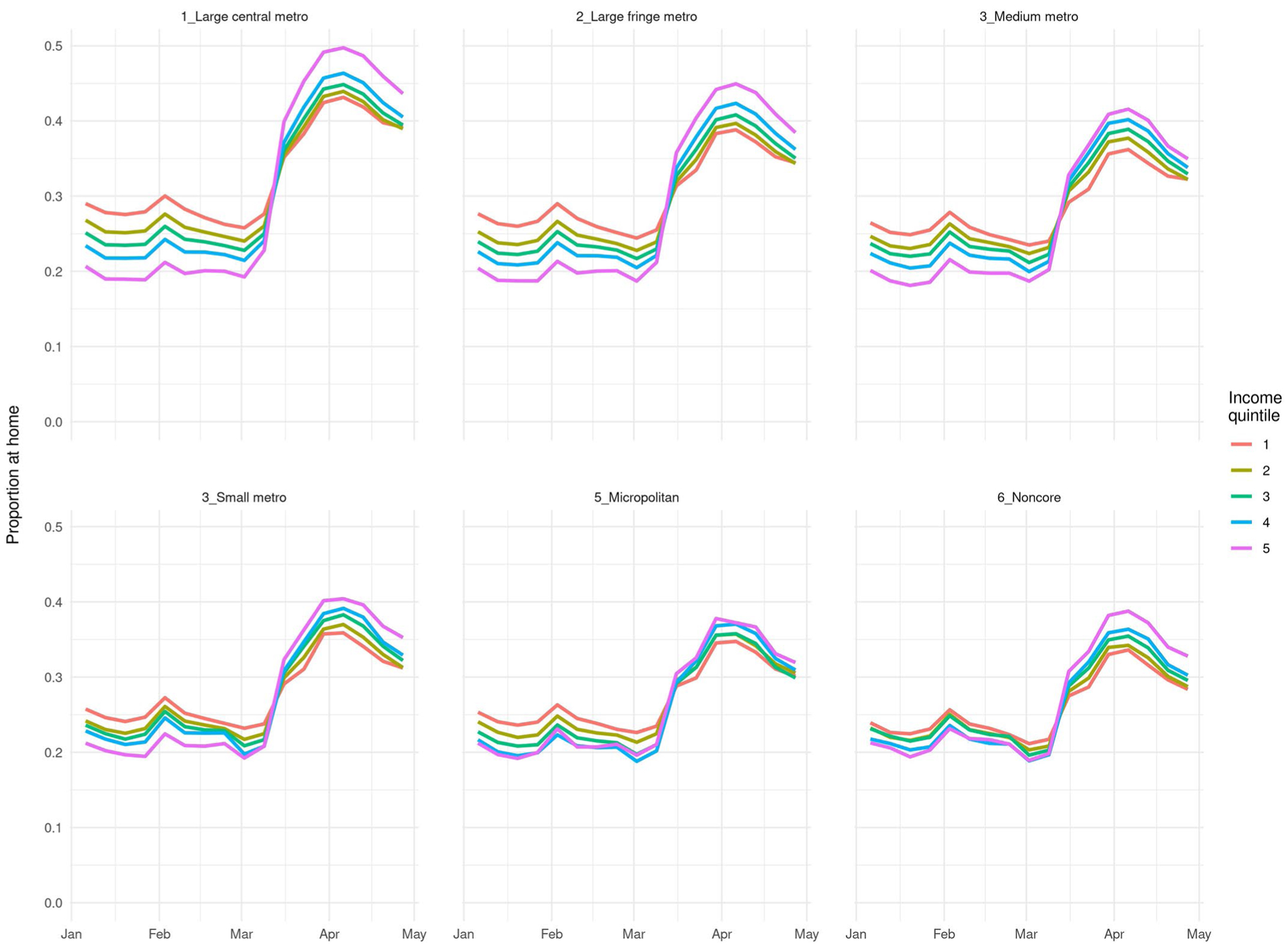
Notes: Income quintile 1 represents the lowest-income group. Outcomes are presented as weekly averages. Period covered is January 6, 2020, through May 3, 2020. Levels of urbanicity are National Center for Health Statistics classifications. Sample comprises 210,288 census block groups with mean 89 active devices per block group per day.
Extended Data Fig. 2 |. Proportion of smartphone users staying home all day by region.
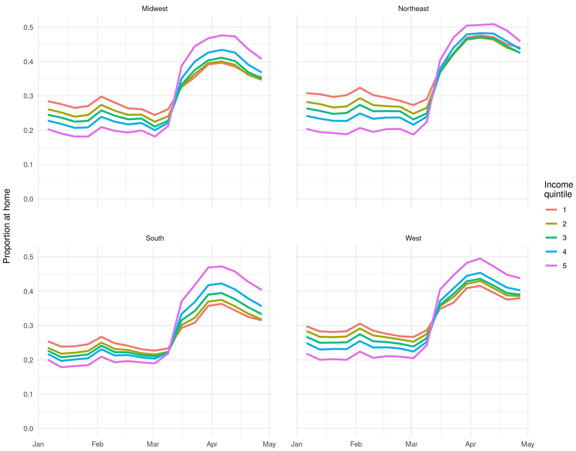
Notes: Income quintile 1 represents the lowest-income group. Outcomes are presented as weekly averages. Period covered is January 6, 2020, through May 3, 2020. Regions are U.S. Census Bureau classifications. Sample comprises 210,288 census block groups with mean 89 active devices per block group per day.
Extended Data Fig. 3 |. Visits to places of worship by weekday/weekend.
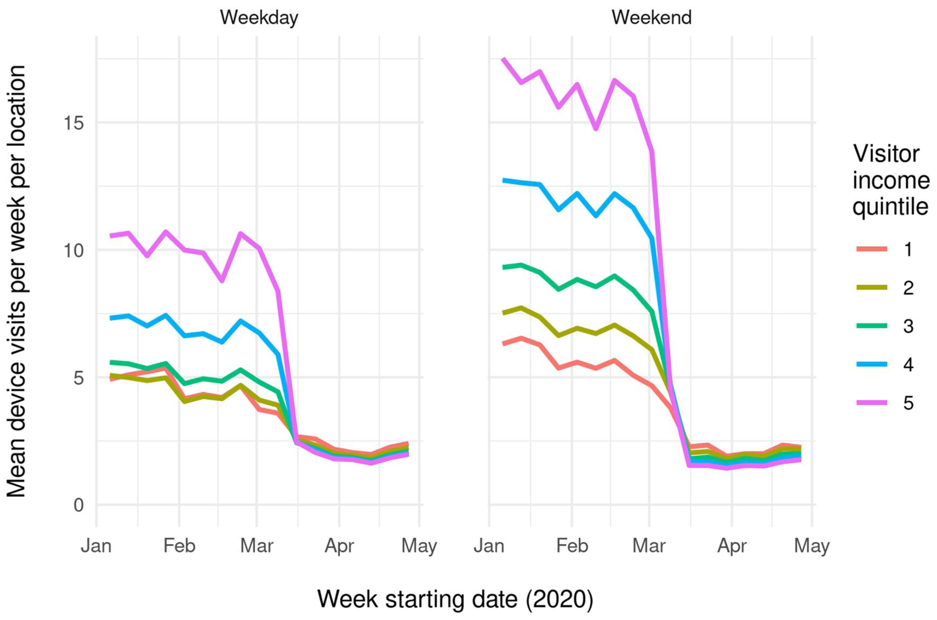
Notes: Visitor income is calculated for each place of worship (n = 97,379) based on visitor home census block group (BG) from January and February 2020. Median visitor income quintile is based on the median of household income values from visitors, weighted by the number of visits per BG. Unlike Fig. 4, this plot does not omit visits of > 4 hours, since data on visit duration were only available by week, not day/date. Counts were aggregated by week, weekday/weekend, and income quintile for this visualization.
Extended Data Fig. 4 |. Proportion of devices working outside the home, by income quintile and age composition.
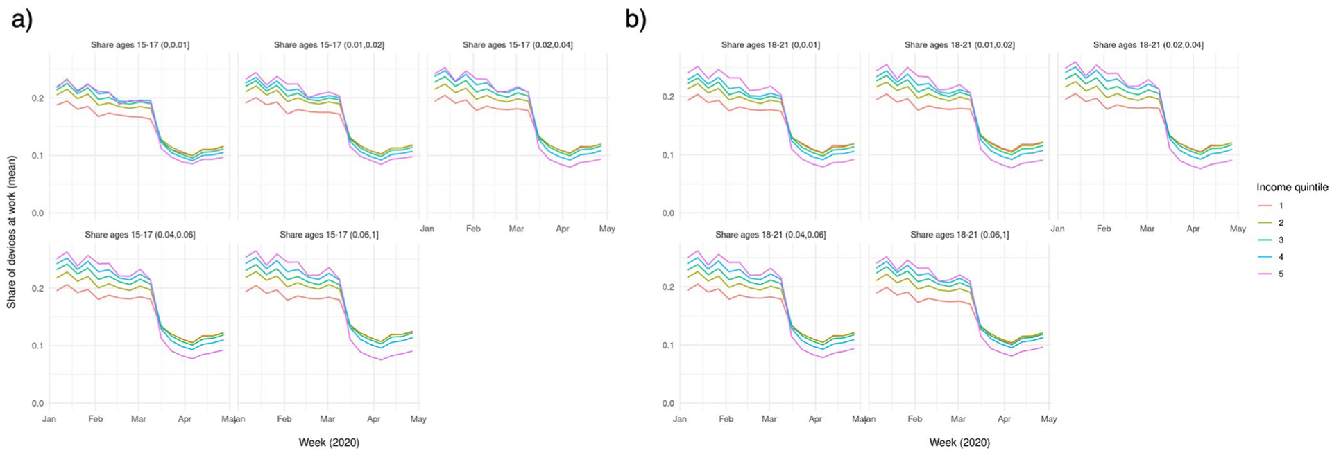
Notes. Age composition is the proportion of residents within each age category, based on 2018 American Community Survey estimates, for (a) ages 15–17 and (b) ages 18–21. Metrics are aggregated by week, income quintile, and age composition. Cut points do not represent quintiles. Sample comprises 210,288 census block groups with mean 89 active devices per block group per day.
Extended Data Fig. 5 |. SafeGraph physical distancing metrics, 2019 vs. 2020.
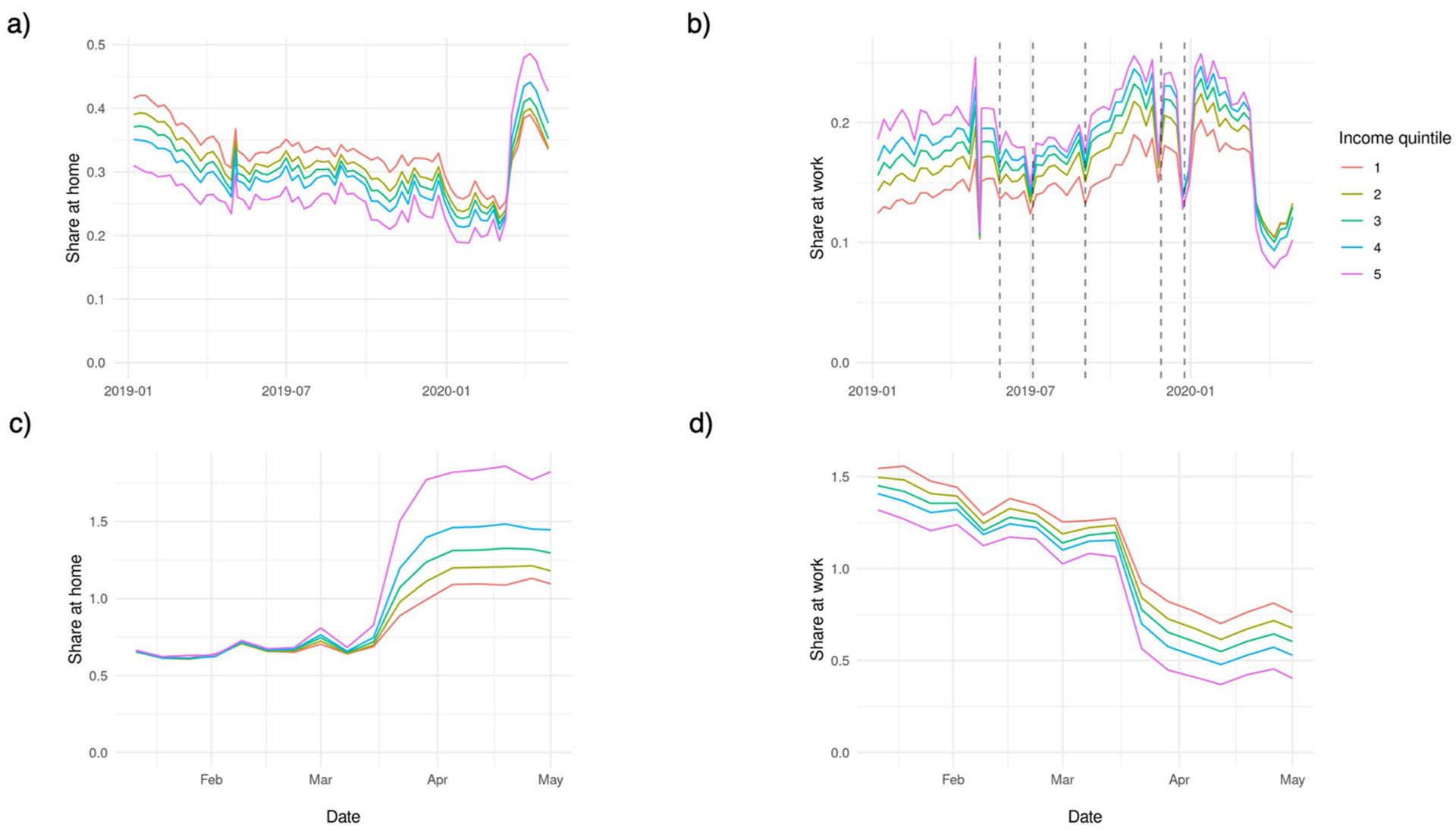
Notes. Figures compare 2019 and 2020 SafeGraph physical distancing metrics. Metrics are aggregated by week and income quintile. a, Proportion of devices at home all day, January 7, 2019 through May 3, 2020; (b) Proportion of devices working outside the home, January 7, 2019 through May 3, 2020, including dashed lines representing Memorial Day, 4th of July, Labor Day, Thanksgiving, and Christmas holidays; (c) Ratio of devices at home all day, comparing January 6-May 3, 2020 to the same weeks of 2019; (d) Ratio of devices working outside the home, comparing January 6-May 3, 2020 to the same weeks of 2019. Sample comprises 210,288 census block groups.
Extended Data Fig. 6 |. SafeGraph work behaviors vs. Google workplace mobility data.
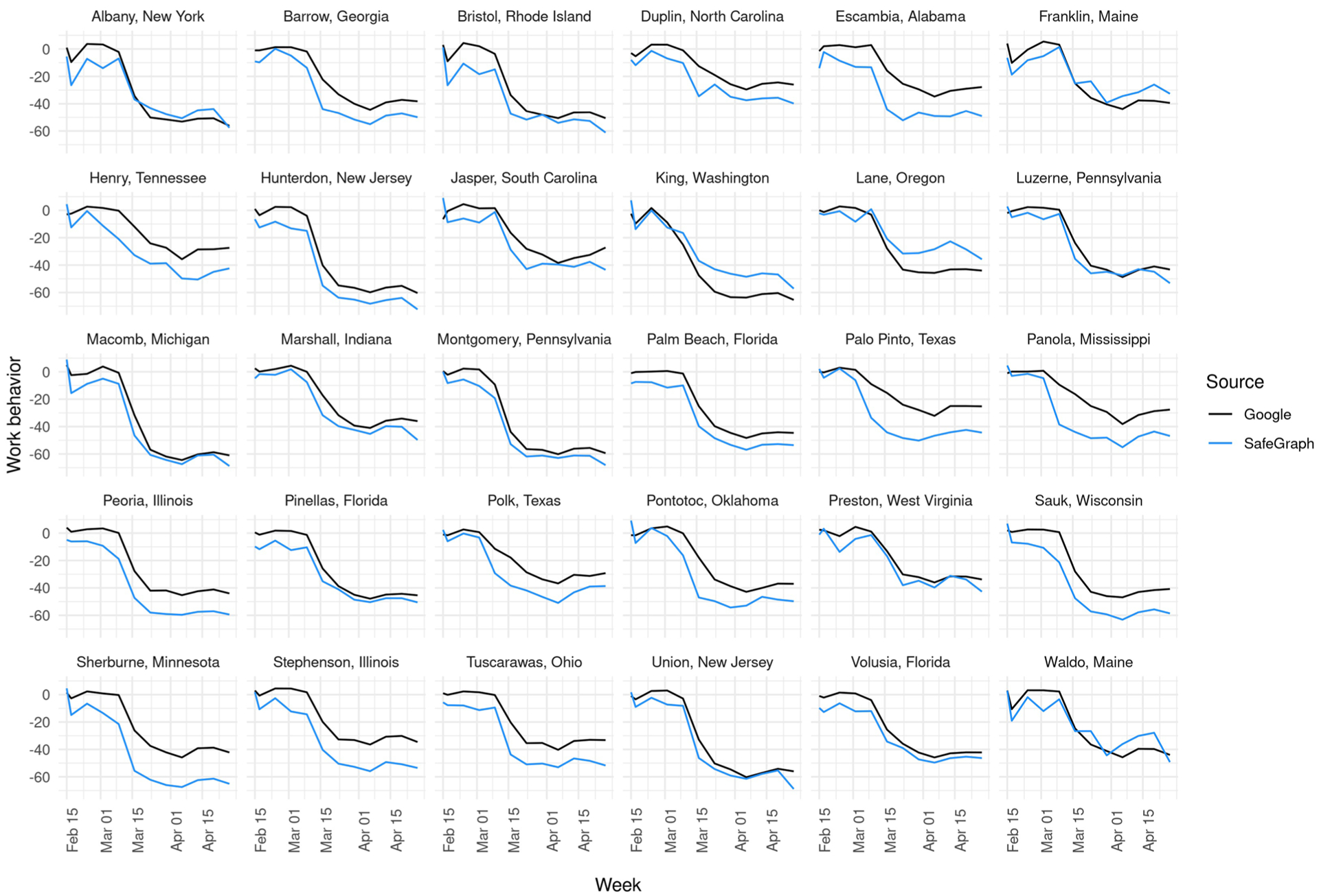
Notes. Comparison of SafeGraph work behaviors indicator (as used/explained in main manuscript) vs. Google COVID-19 Community Mobility Reports workplace visit metrics for the period of February 15, 2020, through May 1, 2020. SafeGraph data have been normalized using the same schema as Google data, as explained here: https://www.google.com/covid19/mobility/data_documentation.html?hl=en#about-this-data. Counties (n = 30) were randomly selected from counties with populations exceeding the median U.S. county population, because Google data were suppressed in some smaller counties and because estimates were expected to be more stable in larger counties. Google data were obtained from public sources using the tidycovid19 R package.
Extended Data Fig. 7 |. Proportion of devices working outside the home, by income quintile and unemployment level.
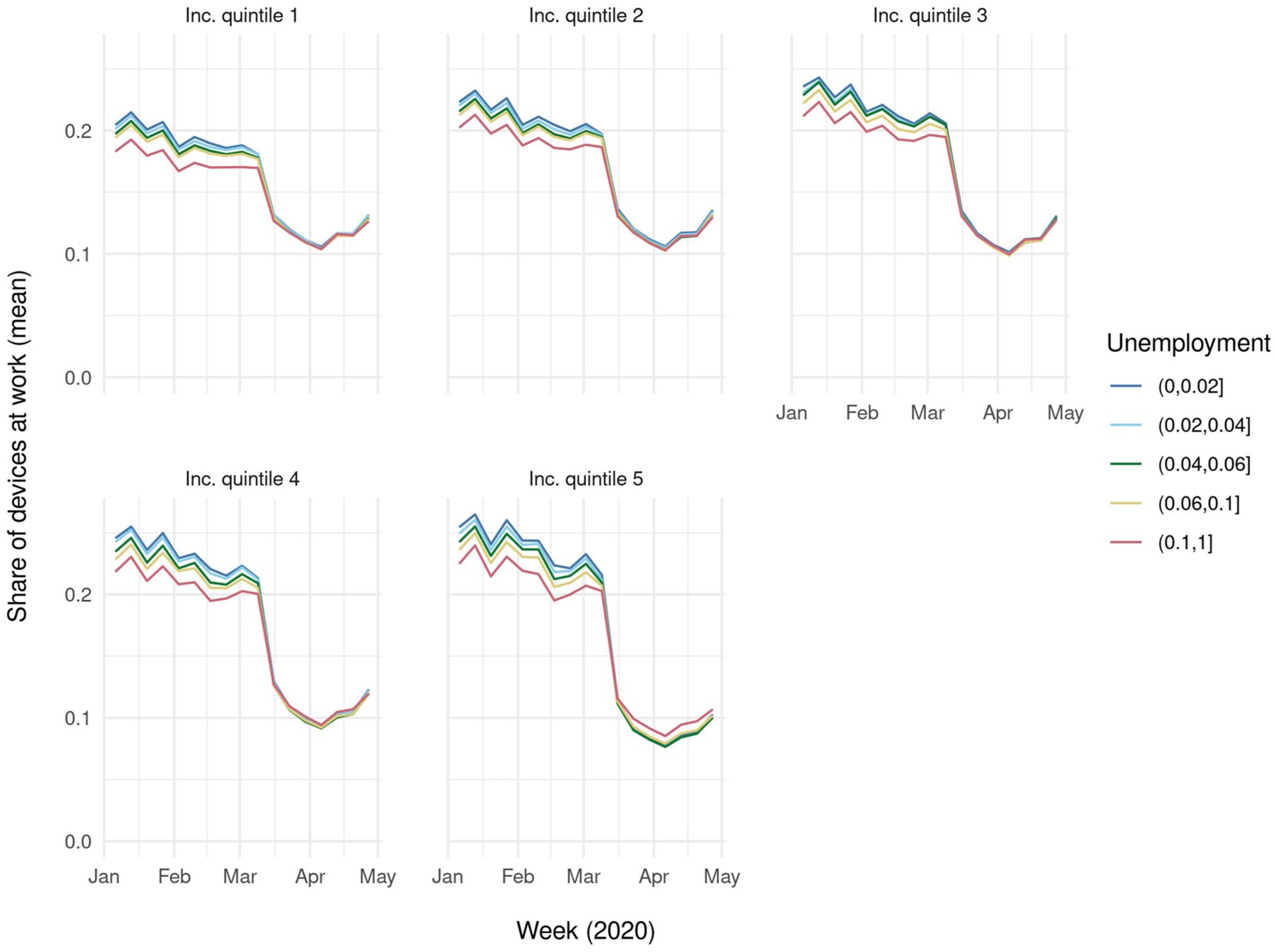
Notes. Unemployment is the proportion of working-age adults who are unemployed, based on 2018 American Community Survey estimates. Metrics are aggregated by week, income quintile, and unemployment level. Cut points do not represent quintiles. Sample comprises 210,288 census block groups with mean 89 active devices per block group per day.
Acknowledgements
We thank SafeGraph for donating data for research purposes and consulting on the use of the dataset. This research was supported by the Robert Wood Johnson Foundation Evidence for Action Program (Grant #77922), by the National Institute of Mental Health (K01MH121515) and by the National Center for Advancing Translational Sciences, National Institutes of Health, through the BU CTSI (1UL1TR001430). Its contents are solely the responsibility of the authors and do not necessarily represent the official views of the NIH or RWJF. The funders had no role in study design, data collection and analysis, decision to publish or preparation of the manuscript.
Footnotes
Competing interests
The authors declare no competing interests.
Extended data is available for this paper at https://doi.org/10.1038/s41562-020-00998-2.
Supplementary information is available for this paper at https://doi.org/10.1038/s41562-020-00998-2.
References
- 1.Hsiang S et al. The effect of large-scale anti-contagion policies on the COVID-19 pandemic. Nature 584, 262–267 (2020). [DOI] [PubMed] [Google Scholar]
- 2.Courtemanche C, Garuccio J, Le A, Pinkston J & Yelowitz A Strong social distancing measures in the United States reduced the COVID-19 growth rate. Health Aff. 10.1377/hlthaff.2020.00608 (2020). [DOI] [PubMed] [Google Scholar]
- 3.Ferguson NM et al. Report 9: Impact of Non-Pharmaceutical Interventions (NPIs) to Reduce COVID19 Mortality and Healthcare Demand (Imperial College London, 2020); https://www.imperial.ac.uk/media/imperial-college/medicine/sph/ide/gida-fellowships/Imperial-College-COVID19-NPI-modelling-16-03-2020.pdf [DOI] [PMC free article] [PubMed] [Google Scholar]
- 4.Chen JT & Krieger N Revealing the Unequal Burden of COVID-19 by Income, Race/ethnicity, and Hhousehold Crowding: US County vs. ZIP Code Analyses HCPDS Working Paper Vol. 19, No. 1 (Harvard Center for Population and Development Studies, 2020); https://cdn1.sph.harvard.edu/wp-content/uploads/sites/1266/2020/04/HCPDS_Volume-19_No_1_20_covid19_RevealingUnequalBurden_HCPDSWorkingPaper_04212020-1.pdf [Google Scholar]
- 5.Chen JT, Waterman PD & Krieger N COVID-19 and the Unequal Surge in Mortality Rates in Massachusetts, by City/town and ZIP Code Measures of Poverty, Household Crowding, Race/ethnicity and Racialized Economic Segregation HCPDS Working Paper Vol. 19, No. 1 (Harvard Center for Population and Development Studies, 2020); https://cdn1.sph.harvard.edu/wp-content/uploads/sites/1266/2020/05/20_jtc_pdw_nk_COVID19_MA-excess-mortality_text_tables_figures_final_0509_with-cover-1.pdf [Google Scholar]
- 6.Gross CP et al. Racial and ethnic disparities in population-level Covid-19 mortality. Preprint at J. Gen. Intern. Med 35, 3097–3099 (2020). [DOI] [PMC free article] [PubMed] [Google Scholar]
- 7.Chowkwanyun M & Reed AL Racial health disparities and Covid-19— caution and context. N. Engl. J. Med 383, 201–203 (2020). [DOI] [PubMed] [Google Scholar]
- 8.Williams DR & Collins C Racial residential segregation: aundamental cause of racial disparities in health. Public Health Rep. 116, 404–416 (2001). [DOI] [PMC free article] [PubMed] [Google Scholar]
- 9.Atchison CJ et al. Perceptions and behavioural responses of the general public during the COVID-19 pandemic: a cross-sectional survey of UK adults. Preprint at medrXiv 10.1101/2020.04.01.20050039 (2020). [DOI] [PMC free article] [PubMed] [Google Scholar]
- 10.Raifman J et al. COVID-19 US State Policy Database (US Government, 2020); https://github.com/USCOVIDpolicy/COVID-19-US-State-Policy-Database [Google Scholar]
- 11.Garfield R, Rae M, Claxton G & Orgera K Double Jeopardy: Low Wage Workers at Risk for Health and Financial Implications of COVID-19 (Kaiser Family Foundation, 2020); https://www.kff.org/coronavirus-covid-19/issue-brief/double-jeopardy-low-wage-workers-at-risk-for-health-and-financial-implications-of-covid-19/ [Google Scholar]
- 12.Blau FD, Koebe J & Meyerhofer PA Essential and Frontline Workers in the COVID-19 Crisis (Econofact, 2020); https://econofact.org/essential-and-frontline-workers-in-the-covid-19-crisis [Google Scholar]
- 13.Cramer R, O’Brien R, Cooper D & Luengo-Prado M A Penny Saved is Mobility Earned (Pew Charitable Trusts, 2009). [Google Scholar]
- 14.Weill JA, Stigler M, Deschenes O & Springborn MR Social distancing responses to COVID-19 emergency declarations strongly differentiated by income. Proc. Natl Acad. Sci. USA 117, 19658–19660 (2020). [DOI] [PMC free article] [PubMed] [Google Scholar]
- 15.Dimke C, Lee M & Bayham J Working from a distance: Who can afford to stay home during COVID-19? Evidence from mobile device data. Preprint at medrXiv 10.1101/2020.07.20.20153577 (2020). [DOI] [Google Scholar]
- 16.Wright AL, Sonin K, Driscoll J & Wilson J Poverty and Economic Dislocation Reduce Compliance with COVID-19 Shelter-in-place Protocols Becker Friedman Institute for Economics Working Paper No. 2020–40 10.2139/ssrn.3573637 (Univ. of Chicago, 2020). [DOI] [PMC free article] [PubMed] [Google Scholar]
- 17.Demographics of Mobile Device Ownership and Adoption in the United States (Pew Research Center, 2019); https://www.pewresearch.org/internet/fact-sheet/mobile/ [Google Scholar]
- 18.Klein B et al. Assessing changes in commuting and individual mobility in major metropolitan areas in the United States during the COVID-19 outbreak. Network Neuroscience Institute (2020); https://www.networkscienceinstitute.org/publications/assessing-changes-in-commuting-and-individual-mobility-in-major-metropolitan-areas-in-the-united-states-during-the-covid-19-outbreak [Google Scholar]
- 19.Kluch S The compliance curve: will people stay home much longer? Gallop Blog https://news.gallup.com/opinion/gallup/309491/compliance-curve-americans-stay-home-covid.aspx (2020). [Google Scholar]
- 20.Dewulf B et al. Associations between time spent in green areas and physical activity among late middle-aged adults. Geospat. Health 11, 225–232 (2016). [DOI] [PubMed] [Google Scholar]
- 21.Simonsick EM, Guralnik JM, Volpato S, Balfour J & Fried LP Just get out the door! Importance of walking outside the home for maintaining mobility: findings from the Women’s Health and Aging Study. J. Am. Geriatr. Soc 53, 198–203 (2005). [DOI] [PubMed] [Google Scholar]
- 22.Rivera L, Granberry P & Estrada-Martínez L COVID-19 and Latinos in Massachusetts (Gastón Institute Publications, 2020); https://scholarworks.umb.edu/gaston_pubs/253 [Google Scholar]
- 23.Tung EL, Cagney KA, Peek ME & Chin MH Spatial context and health inequity: reconfiguring race, place, and poverty. J. Urban Heal 94, 757–763 (2017). [DOI] [PMC free article] [PubMed] [Google Scholar]
- 24.Reyes C, Husain N, Gutowski C, St. Clair S & Pratt G Chicago’s coronavirus disparity: Black Chicagoans are dying at nearly six times the rate of white residents, data show. Chicago Tribune (7 April 2020). [Google Scholar]
- 25.Thebault R, Tran AB & Williams V African Americans are at higher risk of death from coronavirus. The Washington Post (7 April 2020). [Google Scholar]
- 26.Jung BJ, Manley J & Shrestha V Coronavirus Infections and Deaths by Poverty Status: Time Trends and Patterns Working Papers 2020–03 https://ideas.repec.org/p/tow/wpaper/2020-03.html (Towson Univ., Department of Economics, 2020). [Google Scholar]
- 27.Gupta S et al. Tracking Public and Private Response To the Covid-19 Epidemic NBER Working Papers Series (NBER, 2020). [Google Scholar]
- 28.Painter M & Qiu T Political beliefs affect compliance with COVID-19 social distancing orders. Preprint at SSRN 10.2139/ssrn.3569098 (2020). [DOI] [Google Scholar]
- 29.Andersen M Early evidence on social distancing in response to COVID-19 in the United States. Preprint at SSRN 10.2139/ssrn.3569368 (2020). [DOI] [Google Scholar]
- 30.Lasry A et al. Timing of community mitigation and changes in reported COVID-19 and community mobility—four U.S. metropolitan areas, February 26–April 1, 2020. Morb. Mortal. Wkly. Rep 69, 451–457. [DOI] [PMC free article] [PubMed] [Google Scholar]
- 31.Ingram DD & Franco SJ 2013 NCHS Urban–Rural Classification Scheme for Counties Vital and Health Statistics 166 (National Center for Health Statistics, 2014); https://www.cdc.gov/nchs/data/series/sr_02/sr02_166.pdf [PubMed] [Google Scholar]
- 32.Wing C, Simon K & Bello-Gomez RA Designing difference in difference studies: best practices for public health policy research. Annu. Rev. Public Health 39, 453–469 (2018). [DOI] [PubMed] [Google Scholar]
- 33.Bertrand M, Duflo E & Mullainathan S How much should we trust differences-in-differences estimates? Q. J. Econ 119, 249–275 (2004). [Google Scholar]
- 34.Chen K, Cheng Y, Berkout O & Lindhiem O Analyzing proportion scores as outcomes for prevention trials: a statistical primer. Prev. Sci 18, 312–321 (2017). [DOI] [PMC free article] [PubMed] [Google Scholar]
Associated Data
This section collects any data citations, data availability statements, or supplementary materials included in this article.
Data Availability Statement
The smartphone mobility data that support the findings of this study are available from SafeGraph Inc., but restrictions apply to the availability of these data, which were used under licence for the current study and so are not publicly available. Data are, however, available from the authors upon reasonable request and with permission of SafeGraph Inc. Other datasets supporting the findings of this study are publicly available from the project GitHub repository: https://github.com/jonjaybu/nhincome_covid/.


