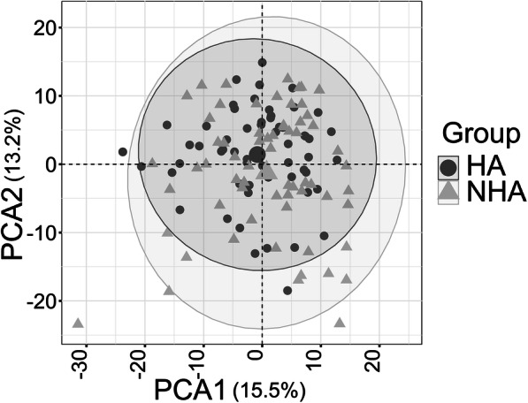
Fig. 2.

PCA plot comparing healthy (HA) and non-healthy (NHA) group using 505 urinary proteins as input data. The PCA plot includes all timepoints (two for most subjects). They are not averaged for a given subject. There is no separate cluster formation for the NHA (triangles) and HA (circles) datasets
