

Abstract
High-throughput single-cell sequencing technologies hold tremendous potential for defining cell types in an unbiased fashion using gene expression and epigenomic state. A key challenge in realizing this potential is integrating single-cell datasets from multiple protocols, biological contexts, and data modalities into a joint definition of cellular identity. We previously developed an approach called Linked Inference of Genomic Experimental Relationships (LIGER, https://github.com/MacoskoLab/liger) that uses integrative nonnegative matrix factorization to address this challenge. Here, we provide a step-by-step protocol for using LIGER to jointly define cell types from multiple single-cell datasets. The main steps of the protocol include data preprocessing and normalization, joint factorization, quantile normalization and joint clustering, and visualization. We describe how to jointly define cell types from single-cell RNA-seq (scRNA-seq) and single-nucleus ATAC-seq (snATAC-seq) data, but similar steps apply across a wide range of other settings and data types, including cross-species analysis, single-nucleus DNA methylation, and spatial transcriptomics. Our protocol contains examples of expected results, describes common pitfalls, and relies only on our freely available, open-source R implementation of LIGER. We also provide Rmarkdown tutorials showing the outputs from each individual code segment. The analysis process can be performed in 1–4 hours depending on dataset size and assumes no specialized bioinformatics training.
EDITORIAL SUMMARY
Here, the authors describe step-by-step procedures for integrating single cell sequencing datasets from different experiments or modalities to identify common and distinct cell types using the R-based software tool LIGER.
Introduction
Identifying the molecular features that define the types and functions of individual cells provides a tremendous opportunity for understanding the genomic blueprint of the human body. The classic approach to categorize cells relies on qualitative characterization, including gross morphology, the presence or absence of a few surface proteins, and broad cellular function. However, a more comprehensive definition of cell identity requires the inclusion of transcriptomic and epigenomic profiles of cells. In recent years, a variety of high-throughput single-cell sequencing technologies have emerged, measuring the gene expression, DNA methylation, and chromatin accessibility of different individual cells. These data modalities together enable researchers to revisit the conventional classifications of cell types and states in a quantitative, systematic, unbiased fashion. Such quantitative definition of cell identity promises to revolutionize our understanding of cell biology across a range of contexts, including neuroscience and developmental biology. A reference map of the molecular states of healthy cells will in turn allow for probing the causes of cellular abnormality and may ultimately inspire the development of novel targeted therapeutics. In order to achieve this goal, an analytical method capable of integrating various single-cell datasets is needed. Such an integration method must identify the features or properties that represent the “essential” aspects of a cell’s identity, rather than the “dispensable” properties that change across biological settings, modalities, protocols, or time.
In addition, when leveraging such datasets to define cell identity, we want to capture both discrete cell types and continuous variation such as cell states. For example, Saunders et al. found that glutamatergic and GABAergic neurons in the mouse cortex specialize in clearly distinguishable, discrete subtypes1. In contrast, the spiny projection neurons in the striatum show more continuous variations1.
Another important consideration is the ability to separate technical confounders from biological signals. Such confounding effects can include the presence of cell doublets created during the cell isolation process, differences in mitochondrial RNA and ribosomal protein content due to cell dissociation, and the presence of free-floating RNA from lysed cells. Failure to account for such factors can lead, for example, to erroneously defining a cell type or state predominantly by its mitochondrial RNA profile, in the absence of any significant biological difference from other cells of the same type.
Integrative analysis should also allow for identifying similarities and differences in corresponding cells across tissues, species, and conditions. For example, it will help to answer questions such as how one tissue differs from another in terms of cell type composition as well as cell-type-specific gene expression. We can also gain a deeper understanding of the cell types and cell-type-specific differences underlying diverse forms and functions across species. Moreover, biomedical researchers are often interested in the cell-type-specific gene expression patterns associated with risk, onset and progression of diseases.
To address these challenges, we developed LIGER2 (Figure 1). LIGER takes as input two or moresingle-cell datasets, from the same or different cellular measurement types. It identifies a set of shared- and dataset-specific latent factors (metagenes) that correspond to biological or technical signals. Each metagene is defined by a set of “gene factor loading” values that indicate the degree to which each gene contributes to the metagene. The “expression” of a metagene in each cell can then be calculated by adding the measured expression of each gene, weighted by the gene’s factor loading on that metagene. The weighted sum of each metagene within a cell is called a “cell factor loading” value; larger loading implies bigger role of the inferred metagene in a given cell. The collection of cell factor loading values for a particular cell serves as a sort of biological summary (a k-dimensional representation) of the cell’s expression profile. These metagenes and cell factor loadings are calculated through integrative nonnegative matrix factorization (iNMF)3. Researchers can then use iNMF results for joint identification of cell clusters. Once cell clusters have been identified, these are usually interpreted in terms of known and novel cell types by manually annotating clusters using known marker genes or applying statistical models to link clusters to cell types4.
Figure 1: Diagram of high-level protocol steps.
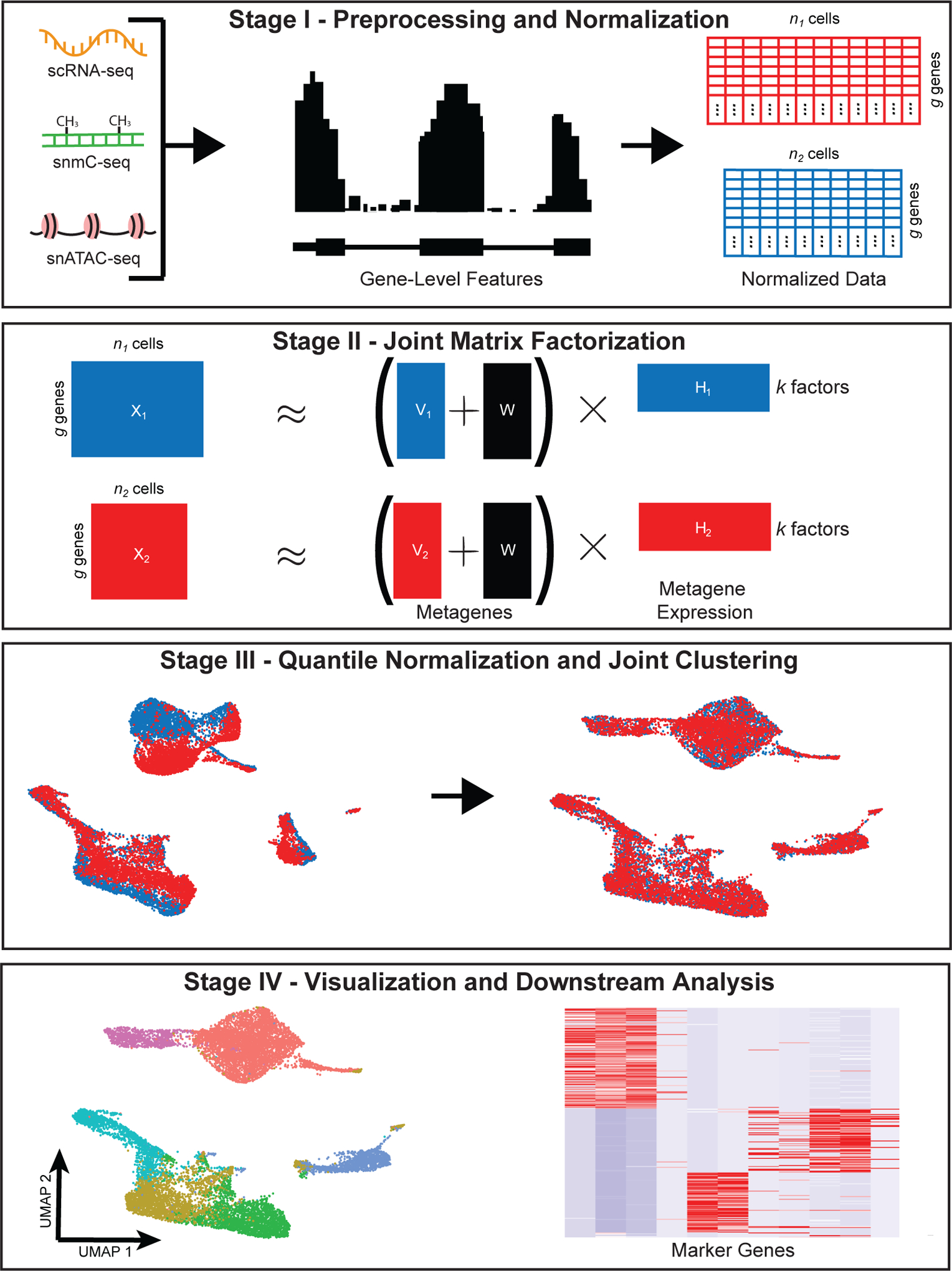
The diagram shows the four main stages of the LIGER workflow: preprocessing and normalization; joint matrix factorization; quantile normalization and joint clustering; and visualization and downstream analysis. Note that the datasets, colors and diagrams are merely generic schematics, and are not derived from the example datasets analyzed in subsequent figures.
Although large datasets of gene expression, DNA methylation, and chromatin accessibility at single-cell resolution are widely available, datasets measuring multiple modalities from the same individual cells have only recently become available5–7. Protocols for measuring multiple modalities from the same cell have not yet caught up with single-modality assays in terms of data quality, depth of coverage, number of cells, and number of publicly available datasets. Thus, computational techniques for leveraging single-cell datasets that measured different modalities in different cells are important for fully utilizing existing data, and we focus on this type of analysis in this protocol. Analyzing datasets that measure multiple modalities from the same cell is an exciting area of research, and one for which the analytical tools of LIGER will likely be useful--but we do not focus on this direction here.
Development of the protocol
In our previous paper2, we first used LIGER to jointly define cell types and their sex-specific differences in our newly generated data from mouse bed nucleus of the stria terminalis (BNST). Through the analysis of scRNA-seq data from BNST, we found significant sexual dimorphism in the gene expression patterns of multiple cell types. Secondly, we utilized LIGER to define cell types across species in mouse and human substantia nigra by integrating scRNA-seq datasets.
We also linked single-cell epigenomic and gene expression states by integrating transcriptomic and DNA methylation data from the mouse frontal cortex using LIGER. This joint analysis aided in the interpretation of populations difficult to identify from methylation data alone and increased the sensitivity for detecting rare cell types. It further allowed us to investigate the epigenetic regulation of gene expression for each jointly defined cell type.
In addition, we jointly defined cell populations using scRNA-seq profiles and spatial transcriptomic data (StarMAP)8 from the mouse frontal cortex. This joint analysis not only enabled inference of spatial information for gene expression profiles from dissociated cells, but also increased the sensitivity for identifying cell clusters from the in situ data.
In subsequent work, we jointly identified 56 neuronal cell types by applying LIGER to single-cell transcriptomic and epigenomic profiles from the mouse primary motor cortex, generated by the BRAIN Initiative Cell Census Network9. The comprehensive cell atlas contains over 600,000 high-quality cell samples of six different molecular modalities: full-length single-cell RNA-seq, 3’ end single-cell RNA-seq, full-length single-nucleus RNA-seq, 3’ end single-nucleus RNA-seq, single-nucleus methylcytosine-sequencing (snmC-seq), and single-nucleus ATAC-seq. This is to our knowledge the first time that single-cell transcriptomic, methylation, and chromatin accessibility data have all been used to jointly define cell types.
Applications of the method
Tran and Shekhar et al. recently used LIGER in their study of neuronal type-specific response to injury10. They focused on the adult mouse retinal ganglion cells (RGCs) and investigated the resilience of RGC types following optic nerve crush (ONC), a common model of traumatic axonal injury. The authors employed scRNA-seq to profile the injured RGCs at different time points post ONC. They used LIGER to develop a common taxonomy of cell types that was robust to time of injury, mouse strain, and batch effects. The capability of LIGER to distinguish shared features such as RGC type-specific expression pattern and dataset-specific features--such as injury-related changes--along the time course enabled discovery of RGC type-specific molecular signatures related to cell resilience and susceptibility to injury.
Additionally, Krienen et al. applied LIGER to probe interneuron cell types and their gene expression patterns across multiple species, including humans, macaques, marmosets, and mice11. The authors used LIGER to jointly define interneuron cell types across species and brain regions from Drop-Seq data. The resulting joint analysis revealed shared cell types across species; an interneuron cell type that appears in humans and monkeys but not mice; and species-specific gene expression differences within shared cell types.
Comparison with other methods
There are several existing methods for single-cell data integration, including Scanorama, Seurat, Conos, and Harmony. Scanorama is designed for scRNA-seq dataset integration and batch correction and was introduced by Hie et al. in 201912. Inspired by the idea of stitching images into a panoramic picture, the key strategy of this method is to identify the common cell types shared in all pairs of datasets by finding the mutual nearest neighbors in a low-dimensional space obtained by singular value decomposition. Then pairs of datasets are merged into a “cellular panorama” based on their matched cells. The panoramic stitching approach requires that each of the input datasets shares at least one cell type with at least one of the others.
The Kharchenko group developed a three-phase approach for clustering on networks of samples (Conos) from multiple scRNA-seq datasets13. The input datasets are filtered and normalized in Conos phase I. In phase II, pairwise comparison of the datasets using PCA embeddings is performed to obtain the initial mapping between the cells. In the last phase of Conos, a joint graph is constructed based on the inter-sample and intra-sample edges. The joint graph can be used for downstream analysis such as community detection, visualization, or label and expression value propagation.
Korsunsky and colleagues recently developed a multi-dataset integration algorithm, Harmony14. Harmony takes an initial PCA embedding of scRNA-seq expression matrices as input and learns a batch-corrected embedding that allows for downstream analysis, including visualization and clustering. This is accomplished by an iterative process of soft clustering, calculating the centroids of the resulting clusters, computing cluster-specific correction vectors based on the centroids, and correcting the cells’ principal components using the obtained correction vectors. The process is repeated until the devised objective, maximizing both the data integration and separation of cell types, is reached.
Scanorama, Harmony, and Conos are designed primarily for integrating multiple scRNA-seq datasets, but Seurat15 is the most similar method to LIGER in that it is intended for integrating multiple data modalities, including RNA, ATAC, and spatial transcriptomic data. However, there are some key differences. Seurat performs “label transfer” between reference and query datasets rather than joint cell type definition when integrating RNA and ATAC or spatial transcriptomic and dissociated data. Additionally, Seurat uses a completely shared latent space from canonical correlation analysis (CCA) to identify corresponding cells, rather than a space that includes dataset-specific differences. In contrast, LIGER’s dimensionality reduction strategy captures both shared signals and dataset-specific differences per cell type directly in the factorization. Additionally, the metagene factors learned by LIGER are often interpretable in terms of specific biological or technical sources of variation, whereas each of the principal components or canonical components calculated by Seurat often contains a mixture of signals. Finally, Seurat “corrects” the gene expression values using nearest neighbor relationships (“anchors”), whereas LIGER leaves the original expression data unchanged.
A recent systematic benchmarking analysis of 14 single-cell data integration methods recommended Harmony, LIGER, and Seurat as the top-performing and most robust approaches16. The study benchmarked the 14 approaches on 10 different single-cell datasets using multiple metrics of dataset alignment and cluster preservation, including kBET17, average silhouette width, and adjusted Rand index. Harmony, LIGER, and Seurat outperformed the other methods across a range of scenarios in their ability to align datasets while maintaining correct cell type distinctions.
Experimental design
The design of single-cell sequencing experiments is complex, involving many biological and experimental considerations beyond the scope of this protocol. However, we will highlight two salient issues that affect the joint cell type analysis we describe in this protocol. First, whenever possible, biological and technical batches should not be confounded. For example, in a cross-species analysis of mouse and human brain cells, both mouse and human RNA should be extracted using the same RNA isolation protocol; if mouse RNA is extracted from whole-cells, but only nuclear RNA is extracted from the human cells, the biological variable (species) is confounded by a technical variable (whole-cell versus nuclear extraction protocol). It may still be possible, using LIGER, to identify shared cell types and gene expression signatures using such a batch design, but disentangling biological from technical differences will be challenging. Similarly, if jointly defining cell types using scRNA-seq and snATAC-seq, use cells from the same tissue sample for both protocols. Otherwise, biological differences in cell composition or genotype may confound the joint analysis. For human studies comparing many individuals, genetic variation can be used to multiplex cells from multiple donors within a single batch, allowing reliable determination of cell-type-specific inter-individual variation without uncontrolled technical variables18.
A second consideration is the trade-off between the number of cells sequenced and sequencing depth per cell. Although the decision depends on the biological questions that the researcher wants to answer, it is generally preferable to sequence more cells rather than more reads per cell. A recent analysis found that, for droplet scRNA-seq protocols, sequencing more than 15,000 reads per cell provides only small benefit19. Sequencing large numbers of cells is especially important for characterizing rare cell types, such as the recently discovered pulmonary ionocyte20,21. However, some biological applications, such as studying alternative splicing22 or characterizing important low-expression genes such as G-protein coupled receptors and transcription factors, will require a high depth of coverage per cell. Furthermore, the choice of library preparation protocol may also influence the decision about cells vs. reads, because protocols (such as SMART-seq) that sample from all positions within a transcript benefit more from increased coverage than poly(A) priming protocols that capture only the ends of transcripts.
Limitations
LIGER should not be used when there is no biological similarity expected between datasets. For example, there is nothing to be gained by trying to integrate single-cell data from HeLa cells with data from HEK293 cells. Doing so will not yield significant biological insights and may result in false positive results, although LIGER is designed to minimize the false alignment of non-corresponding cell types. The field has not developed any rigorous quantitative metrics that indicate definitively when two datasets should be integrated. However, LIGER is designed for integrating datasets that share at least one cell type in common. In fact, LIGER still produces sensible results even when datasets do not share common cell types, but the analysis is not very informative in such cases. We show an example of such a dataset and describe how to recognize this situation in ‘Factor Curation’.
Box 2: Factor Curation.
A key benefit of iNMF over other dimensionality reduction techniques is the interpretability of the resulting metagenes in terms of biological or technical signals. By studying the gene loadings for each metagene, as represented by the W matrix, we can directly interpret the biological relevance of each factor and exclude potentially confounding technical or biological signals in downstream analyses. We can also gain insights into the biological interpretation of each factor. runGSEA can be used as a tool to analyze factor composition. If no parameters specifying gene sets are given, then the function will use all Reactome gene sets that contain at least one of the genes in the object. This allows a principled means of determining what biological or technical signal each factor represents. To run this function and view the results, type the following:
gsea_output <- runGSEA(ifnb_liger)
gsea_output[[1]][[4]][1:10,1:3]
From Table 2, we find overrepresentation of gene sets related to the interaction between the innate and adaptive immune systems in factor 4. The ER-Phagosome pathway is responsible for the release of cytokines as a part of the process of cross presentation. This supports the inclusion of the gene sets for cytokine signaling and interleukins, a type of cytokine. We also see that representation of GPCR ligand binding is significant, possibly meaning that the immune response is a result of non-immune signaling. From this information, we can hypothesize that cells that highly load factor 4 may be responsible for initiating an immune response, specifically that of a T lymphocyte due to the significance of interleukin signaling and cross presentation. Because we know factor 4 loads primarily on cluster 5, the cluster may represent T lymphocytes.
If we have a custom list of gene sets to study, we can pass those to runGSEA in the form of a named list of Entrez IDs. This input can easily be generated with the help of the msigdbr package. As an example, we will introduce a new, pre-factorized object to show clearer demonstrations. This object is composed of two datasets of interneurons and oligodendrocytes from the mouse frontal cortex1, two distinct cell types that should not align if integrated. We used this dataset in our previous paper as a “negative control” to test whether LIGER spuriously aligns distinct cell types. To read this preprocessed LIGER object, type in:
i_and_o <- readRDS(“i_and_o.RDS”)
Next, to pull out mitochondrial gene sets from the Gene Ontology cellular components subcategory and pass to runGSEA, type in:
m_set <- msigdbr(species = “Homo sapiens”, category = “C5”, subcategory = “CC”)
m_set <- m_set[grepl(“MITOCHON”, m_set$gs_name),]
m_set <- split(m_set$entrez_gene, f = m_set$gs_name)
gsea_output <- runGSEA(i_and_o, custom_gene_sets = m_set)
gsea_output[[1]][[16]][1:8]
After running GSEA on i_and_o’s factors, we find that factors 21 and 23 significantly overrepresent several gene sets associated with mitochondrial function.
We can also use plotFactors after running quantile_norm to directly compare raw and normalized gene loadings across the datasets. Because of the large number of charts generated by this function, it should be called into a PDF. To do this, type in:
pdf(“i_and_o_factors.pdf”)
plotFactors(i_and_o)
dev.off()
If we look at factor 21, in which mitochondrial gene sets are overrepresented, we can see that a majority of cells in both datasets have non-zero cell loading values on this factor (Figure 5). This is a common pattern in metagenes representing technical artifacts; biological signals often have much more specific and sparse loadings. Thus, it is likely that this factor captures a technical artifact related to mitochondrial genes and should be removed from the analysis.
To remove these factors from further analysis, we again run quantile_norm, with the dims.use parameter equal to the set difference of the list of all factors and technical artifacts. To perform quantile normalization and UMAP, type in:
i_and_o <- quantile_norm(i_and_o, dims.use = setdiff(1:40, c(21,23)))
i_and_o <- runUMAP(i_and_o, distance = ‘cosine’, n_neighbors = 30, min_dist = 0.3)
If we compare the final integration with and without the mitochondrial artifact factors, we find that the spurious alignment of the datasets decreases slightly after we remove the factors (Figure 6). This is because, without the artifacts, there is less overlap in expression between the datasets.
The protocol below cannot be used for extremely large datasets containing more than 2.1 billion nonzero elements, because such large sparse matrices cannot be loaded into R. Assuming the number of genes per cell in the scRNA datasets used as an example in this vignette, it would take approximately 14 million cells to exceed the 2.1 billion threshold, though the gene detection rate varies across protocols. For datasets of this size, other strategies, such as subsampling or online iNMF23, must be used.
Additionally, LIGER relies on corresponding features shared across all datasets to be analyzed. Thus, it cannot be directly applied to integrate single-cell gene expression data with single-cell morphological data, chromatin conformation data, or metabolomic data, whose features have no clearly defined relationship with the expression of individual genes.
Materials
Equipment
Hardware:
Any modern desktop workstation or laptop with internet connection will be sufficient. For minimal performance, we recommend using a dual-core CPU with at least 2 GB of RAM on the system for analyses. For larger datasets, more RAM will be required (see Timing section).
Software:
Operating system: Linux, Windows (10), or MacOS
RStudio: an integrated development environment (IDE) for R; or R command line (version 3.5 or greater). This software is available at https://rstudio.com/products/rstudio/download/.
LIGER: the actively maintained open-source program is freely available at https://github.com/MacoskoLab/liger.
(Optional) BEDOPS: an open-source command-line toolkit that performs highly efficient and scalable Boolean operations and management of genomic data of arbitrary scale. We recommend using bedmap, a subprogram of BEDOPS to calculate gene body counts from raw snATAC-seq data as we describe in Procedure 2. You can install this toolbox from https://bedops.readthedocs.io/en/latest/content/installation.html
Datasets:
We used published datasets from various sources to demonstrate how to use LIGER (Table 1). You can access the raw data and our pre-processed data directly from LIGER’s github page (https://github.com/MacoskoLab/liger).
Table 1.
Details of the published datasets used in the protocol.
| Datasets | Platform | Pre-processing | Number of cells | Identifier |
|---|---|---|---|---|
| Interneurons and oligodendrocytes from the mouse frontal cortex (scRNA-seq)1 | Drop-Seq | Downsampled the raw data to include all interneurons and a similar number of oligos | 5736 (out of 690,000) | http://dropviz.org/ |
| Human BMMCs (snATAC-seq)24 | 10x Genomics, Cell Ranger ATAC 1.1.0 | None | 6234 | GEO: GSE139369 |
| Human BMMCs (scRNA-seq)24 | 10x Genomics, Cell Ranger 3.0.0 | None | 12,602 | GEO: GSE139369 |
| Control and interferon-stimulated PBMCs (scRNA-seq)18 | 10x Genomics, Cell Ranger 1.2.0 | Downsampled the raw data to 3000 cells from each condition | 6000 | GEO: GSE96583 |
Equipment Setup
It takes ~15–30 min to install the LIGER toolbox, depending on whether users optionally install bedmap for snATAC preprocessing. We recommend that users install LIGER and perform analysis in RStudio. In an RStudio environment, the following commands can be run from an R script or directly in the built-in R console. The R commands are the same on Linux, Windows, and MacOS.
To install R packages from Github directly, the user should install the devtools package, a useful package for R package development, before installing LIGER. To install devtools from CRAN, run the following command:
install.packages(‘devtools’)
Next, to install LIGER from our GitHub repository, type in the following commands:
library(devtools)
install_github(‘MacoskoLab/liger’)
Procedure 1: Joint definition of cell types from multiple scRNA-seq datasets
CRITICAL This protocol demonstrates the R commands to run the LIGER package on a sample dataset consisting of two single-cell RNA-seq experiments. These commands can be run from the R command line interface or the RStudio integrated development environment.
Stage I: Preprocessing and Normalization (Timing ~30 sec)
1. For the first portion of this protocol, we will be integrating published data18 from control and interferon-stimulated peripheral blood mononuclear cells (PBMCs). To begin, directly load downsampled versions of the control and stimulated expression data by typing:
ctrl_dge <- readRDS(“ctrl_dge.RDS”);
stim_dge <- readRDS(“stim_dge.RDS”);
Note that the LIGER package also provides a function to read data directly from the 10X CellRanger pipeline. Although this is not required for the sample data in this protocol, this capability is useful for many real-world datasets. To process 10X CellRanger output, type the following:
library(liger)
matrix_list <- read10X(sample.dirs =c(“10x_ctrl_outs”, “10x_stim_outs”), sample.names = c(“ctrl”, “stim”), merge = F);
?TROUBLESHOOTING
2. With the digital gene expression matrices for both datasets, we can initialize a LIGER object using the createLiger function. A LIGER object serves as a container that saves both data (including raw and normalized count matrices) and analyses (such as metagene loadings, UMAP coordinates, and clustering results) for one or multiple single-cell datasets. Call this function by typing the following:
library(liger)
ifnb_liger <- createLiger(list(ctrl = ctrl_dge, stim = stim_dge))
ifnb_liger is a LIGER object and now contains two datasets in its raw.data slot, ctrl and stim. We can run the rest of the analysis on this LIGER object.
?TROUBLESHOOTING
3. Before we can perform matrix factorization to integrate the datasets, we must run several preprocessing steps to normalize expression data (function normalize) to account for differences in sequencing depth and efficiency between cells, identify highly variable genes (function selectGenes), and scale the data so that each gene has the same variance (function scaleNotCenter). Note that because nonnegative matrix factorization requires positive values, we do not center the data by subtracting the mean. We also do not log transform the data. To perform data preprocessing, call the three functions mentioned above:
ifnb_liger <- normalize(ifnb_liger)
ifnb_liger <- selectGenes(ifnb_liger)
ifnb_liger <- scaleNotCenter(ifnb_liger)
?TROUBLESHOOTING
Stage II: Joint Matrix Factorization (Timing ~3 min)
4. We are now ready to run integrative non-negative matrix factorization on the normalized and scaled datasets. Use the following command to perform iNMF:
ifnb_liger <- optimizeALS(ifnb_liger, k = 20)
The key parameter for this analysis is k, the number of matrix factors (analogous to the number of principal components in PCA). In general, we find that a value of k between 20 and 40 is suitable for most analyses and that results are robust for choice of k. Because LIGER is an unsupervised, exploratory approach, there is no single “right” value for k, and in practice, users also incorporate biological prior knowledge, such as the number of expected cell types and known cell type markers, when choosing k.
The optimization yields several low-dimensional matrices, including the H matrix of metagene expression levels for each cell, the W matrix of shared metagenes, and the V matrices of dataset-specific metagenes.
Please note that the time required for this step is highly dependent on the size of the datasets. The time and memory requirements scale linearly with the number of cells and number of variable genes (see Timing section for more details).
Stage III: Quantile Normalization and Joint Clustering (Timing ~2 min)
5. We can now use the resulting factors to jointly cluster cells and perform quantile normalization by dataset, factor, and cluster to fully integrate the datasets. All of this functionality is encapsulated within the quantile_norm function, which uses maximum factor assignment followed by refinement using a k-nearest neighbors graph. The quantile_norm procedure produces joint clustering assignments and a low-dimensional representation that integrates the datasets together. These joint clusters derived directly from iNMF can be used for downstream analyses in Steps 7–12. Perform quantile normalization as follows:
ifnb_liger <- quantile_norm(ifnb_liger)
6. (Optional) We can also run Louvain community detection, an algorithm commonly used for unsupervised clustering of single-cell data, on the normalized cell factors. The Louvain algorithm excels at merging small clusters into broad cell classes and thus may be more desirable in some cases than the maximum factor assignments produced directly by iNMF. To perform Louvain community detection, call the louvainCluster function:
ifnb_liger <- louvainCluster(ifnb_liger, resolution = 0.25)
Stage IV: Visualization and Downstream Analysis (Timing ~10 min)
7. To visualize the clustering of cells graphically, we can project the normalized cell factors to two or three dimensions. LIGER supports both t-SNE and UMAP for this purpose. Note that if both techniques are run, the object will only hold the results from the most recent. To perform UMAP or t-SNE with default parameter settings, type one of the following:
ifnb_liger <- runTSNE(ifnb_liger)
ifnb_liger <- runUMAP(ifnb_liger)
Important parameters of function runTSNE are as follows:
use.raw. This indicates whether to use non-aligned cell factor loadings (H slot) instead of quantile normalized cell factor loadings (H.norm slot). The default is FALSE.
dims.use. A list of integers indicates a set of factor loadings to use for computing t-SNE embedding. The default is 1:ncol(H.norm).
use.pca. This indicates whether to perform an initial PCA step for Rtsne. The default is FALSE.
theta. A number passed to Rtsne, indicating the trade-off value. Larger theta value leads to less accuracy. Setting theta to 0.0 results in exact t-SNE computation. The default is 0.5.
perplexity. An integer passed to Rtsne, indicating how many nearest neighbours are taken into account when constructing the embedding in the low-dimensional space. The default value is 30.
method. This function supports two methods for estimating t-SNE embeddings: Rtsne (Barnes-Hut implementation of t-SNE) and fftRtsne (FFT-accelerated Interpolation-based t-SNE). The default is Rtsne.
fitsne.path. A path to the FIt-SNE installation directory (e.g., ‘/path/to/dir/FIt-SNE’). The default is NULL.
Important parameters of function runUMAP are as follows:
k. An integer indicating the numbers of dimensions to reduce to. The default is 2.
distance. This indicates the metric used to measure distance in the input space. The default is “euclidean”. Other alternatives include “cosine”, “manhattan”, and “hamming”.
n_neighbors. An integer indicating the number of neighboring points used in local approximations of manifold structure. Larger values will result in more global structure being preserved at the loss of detailed local structure. In general, this parameter should often be in the range 5 to 50. The default is 10.
min_dist. A number that controls how tightly the embedding is allowed to compress points together. Larger values ensure embedded points are more evenly distributed, while smaller values allow the algorithm to optimise more accurately with regard to local structure. Sensible values are in the range 0.001 to 0.5. The default is 0.1.
The LIGER package implements a variety of utilities for visualization and analysis of clustering, gene expression across datasets, and comparisons of cluster assignments. We will describe how to apply several in the following steps.
8. plotByDatasetAndCluster plots two images using the coordinates generated by t-SNE or UMAP in the previous step. The first plot colors cells by dataset of origin, and the second colors cells by joint cluster assignment. The plots provide visual confirmation that the datasets are well aligned and the clusters are consistent with the structure of the data as revealed by UMAP and t-SNE (Figure 2). To call this function, type the following:
plotByDatasetAndCluster(ifnb_liger, axis.labels = c(‘UMAP 1’, ‘UMAP 2’))
Figure 2: Visualizing LIGER results using UMAP and t-SNE.
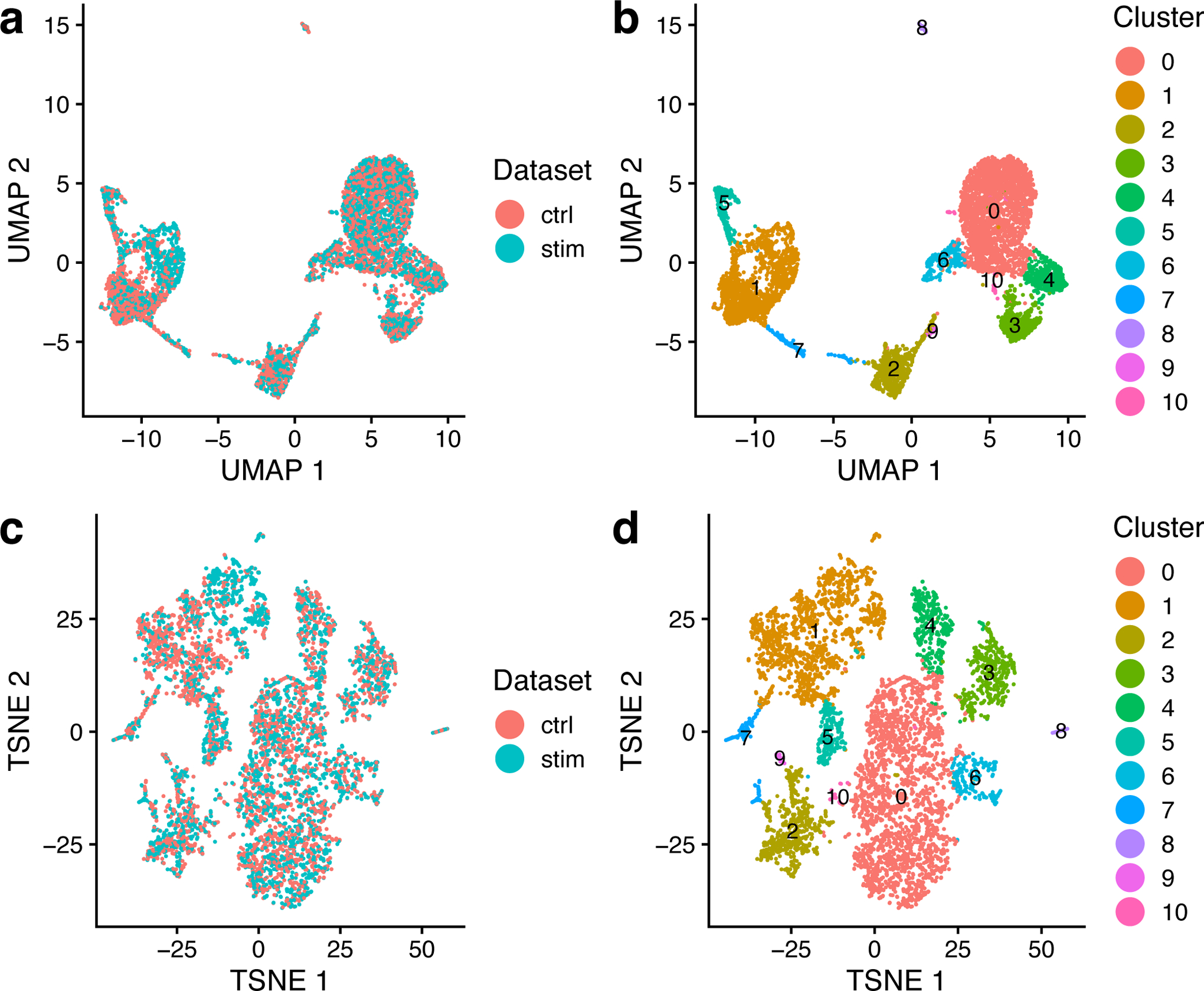
a,b, UMAP plots of a LIGER analysis of 3000 control and 3000 interferon-beta stimulated PBMCs profiled by scRNA-seq, colored by dataset (a) and LIGER joint cluster assignment (b). c,d, t-SNE plots of the same LIGER analysis, colored by dataset (c) and LIGER joint cluster assignment (d). The parameters k and λ were specified as 20 and 5, as shown in the protocol.
A key advantage of using iNMF instead of other dimensionality reduction approaches such as PCA is that the dimensions are individually interpretable. For example, a single dimension of the space often captures a particular cell type. Furthermore, iNMF identifies both shared and dataset-specific features along each dimension, giving insight into how corresponding cells across datasets are both similar and different. The function plotGeneLoadings allows us to visualize how each gene contributes to each metagene or factor (gene loadings) and how each cell expresses each metagene or factor (factor loadings). To plot cell factor loadings and gene loading values for Factor 4, type the following:
gene_loadings <- plotGeneLoadings(ifnb_liger, do.spec.plot = FALSE, return.plots = TRUE)
gene_loadings[[4]]
The loading pattern of Factor 4 shows that it specifically loads on Cluster 3 (Figure 3, top). We can also see both the shared markers and dataset-specific genes that characterize this dimension (Figure 3, bottom).
Figure 3: LIGER enables metagene and dataset specific analysis of PBMC data.
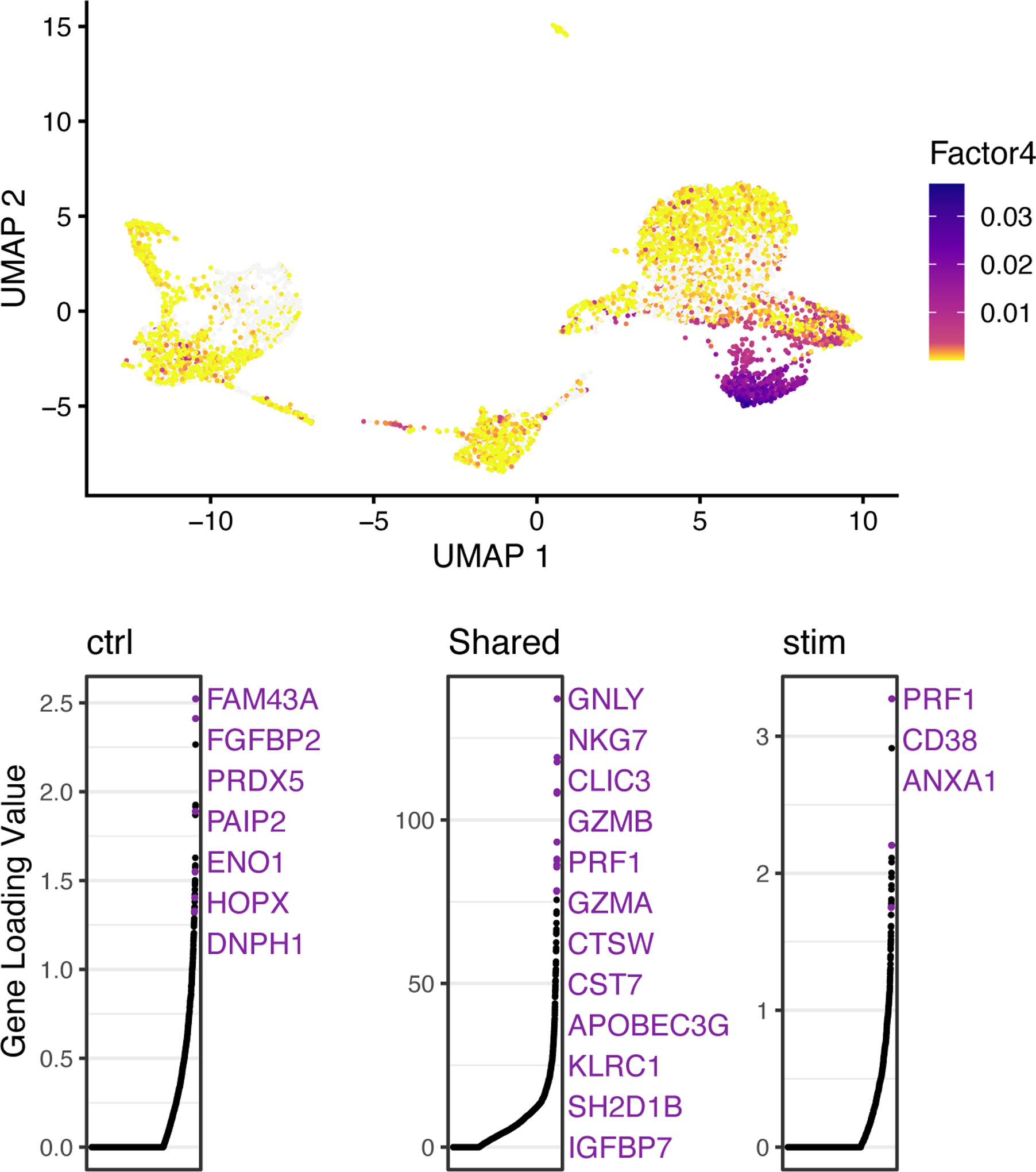
UMAP plots showing factor loading values for each cell (top) and gene loadings (on a particular metagene; bottom) for Factor 4, which specifically loads on Cluster 3. In gene loading plots, gene names are sorted in decreasing order of magnitude of their factor loading contribution and correspond to colored points in scatterplots. The gene names in purple represent the top-loading genes. Plots are organized to show the dataset-specific metagene values for control cells, the shared metagene values common to all datasets and the dataset-specific metagene values for interferon-stimulated cells.
The iNMF latent space and cluster assignments given by LIGER using the default parameter settings are often satisfactory. Thus, we recommend running the whole LIGER pipeline at least once before spending too much time on parameter tuning. However, tuning key parameters can sometimes improve results. We find the following steps to be occasionally helpful: (1) try different values of k and lambda for the core function optimizeALS (Box 1); (2) inspect the biological relevance of each factor and exclude technical or biological confounding signals (Box 2); (3) quantitatively assess alignment and clustering results (Box 3). Finally, we note that because LIGER is an unsupervised method and no ground truth is available, there is no single “correct answer” for any of these of these parameter selection steps.
Box 1. Selecting hyperparameters.
LIGER results depend on two key hyperparameters: k, the number of factors, and lambda, the penalty term associated with dataset-specific factors. The number of factors k is the most important hyperparameter, and we rarely modify lambda from its default setting of 5. We provide heuristics to guide the selection of k and lambda, which are implemented in the functions suggestK, suggestLambda, suggestNewK, and suggestNewLambda. These heuristics, though sometimes helpful, are no substitute for biological insight. Also, in some cases, the position of the “elbow” in the curve from suggestK is somewhat subjective. Because LIGER is an unsupervised, exploratory approach, there is no single “right” value for any hyperparameter, and in practice, users also incorporate biological prior knowledge, such as the number of expected cell types and known cell type markers, when choosing them. Also, as a general suggestion, we recommend starting with a value of k in the range 20–40 and simply running an initial analysis, rather than trying to determine the perfect k before looking at the results.
We recommend utilizing suggestNewK and suggestNewLambda, respectively, after running an initial factorization. These functions use the initial factorization to rapidly update the factorization for new hyperparameter values. To suggest k and lambda, type the following:
suggestNewK(ifnb_liger)
suggestNewLambda(ifnb_liger, k = 20)
We demonstrate these functions on the PBMC dataset from Procedure 1. The plot generated by suggestNewLamda demonstrates that maximum alignment is reached at small values of lambda, so the default value lambda=5 or less is a reasonable choice for this dataset (Figure 4, a). We select the value k = 20 at which the increase in median KL divergence becomes negligible, using the plot generated by suggestNewK (Figure 4, b). With these parameters, we can run optimizeALS, LIGER’s implementation of integrative non-negative matrix factorization algorithm, again.
Box 3. Metrics for confirming results.
We provide several metrics to assess the performance of LIGER. calcARI, based on the Adjusted Rand Index, and calcPurity can be used to compare the clustering generated by LIGER with some other clustering, such as known cell types or clustering results from another method. Both functions return a value between 0 and 1, with 0 representing total disagreement and 1 representing identical clusterings. To calculate these two metrics, type in:
known_clustering <- readRDS(“known_clustering.RDS”)
calcARI(ifnb_liger, known_clustering)
calcPurity(ifnb_liger, known_clustering)
We can also use another set of metrics, alignment and agreement, to measure the performance of LIGER. The first metric, agreement, quantifies the similarity of each cell’s neighborhood when a dataset is analyzed separately using NMF versus jointly with other datasets using iNMF. High agreement indicates that cell-type relationships are preserved with minimal distortion in the joint analysis. Agreement is calculated by building a k-nearest neighbor graph by performing regular NMF on each dataset separately, then comparing with another k-nearest neighbor graph built using the quantile normalized iNMF space. High agreement is achieved when the nearest neighbors from the individual dataset graphs are preserved in the iNMF space. Although it can theoretically approach a maximum of 1, representing complete preservation of geometry, it generally reaches 0.2 to 0.3. To calculate dataset agreement, type the following:
calcAgreement(ifnb_liger)
The second metric, alignment, measures the uniformity of mixing for two or more samples in the aligned latent space. This metric is high when datasets are well-aligned, and low when datasets do not overlap, ranging from 0 to 1. To calculate dataset alignment, type the following:
calcAlignment(ifnb_liger)
Here we show a real-world example of how to evaluate integration results generated from datasets that show excellent and poor alignment, respectively. Before calculating the metrics, we recommend visual inspection following Steps 7–8 from Procedure 1 first. We show here side-by-side UMAP representations of the oligos/interneurons dataset and the PBMC dataset from Protocol 1 (Figure 7). The plot on the left indicates the poor alignment between the oligos and interneurons. To generate this plot, type in:
plotByDatasetAndCluster(i_and_o, return.plots = T)[[1]]
plotByDatasetAndCluster(ifnb_liger, return.plots = T)[[1]]
In this plot, we see very limited overlap between the interneuron and oligos datasets, whereas the control and stimulated PBMC datasets are almost perfectly aligned. If you see a plot like the one on the left, it is likely that you are trying to integrate datasets that have no common biology. In addition to visually inspecting the t-SNE or UMAP plot, you can next use the function calcAlignment to calculate a metric quantifying the degree of alignment. To call this function again, type the following:
calcAlignment(i_and_o)
calcAlignment(ifnb_liger)
Returning to our example above, the oligodendrocytes and interneurons dataset gives a poor alignment score of 0.161, whereas ifnb_liger has a near-perfect alignment score of 0.947.
9. LIGER employs the Wilcoxon rank-sum test to perform differential analysis, using the runWilcoxon function. Note that this analysis is performed using the original normalized counts, without performing “batch correction”. However, we use the joint clusters defined from the aligned latent space to define the groups of cells to compare. Generally, we want to test the significance of each gene in one group versus in another group. The definition of the groups differs according to the scenario the users choose. For example, if the user wants to identify shared cluster markers across datasets, we perform one-vs-all Wilcoxon rank-sum tests for each cluster using cells from all datasets (Figure 8, top panel). Importantly, we are also able to identify genes with cluster-specific dataset differences, because we do not “batch correct” the original data to remove all differences across datasets (Figure 8, bottom panel). This means that adhering to the guidance provided in the Experimental design section is crucial to interpreting these dataset differences—if batch and biology differences are confounded, it may be difficult to know whether such dataset-specific genes are biologically significant.
Figure 8: Diagram of differential expression analysis strategies to find shared cluster markers and cluster-specific dataset differences.
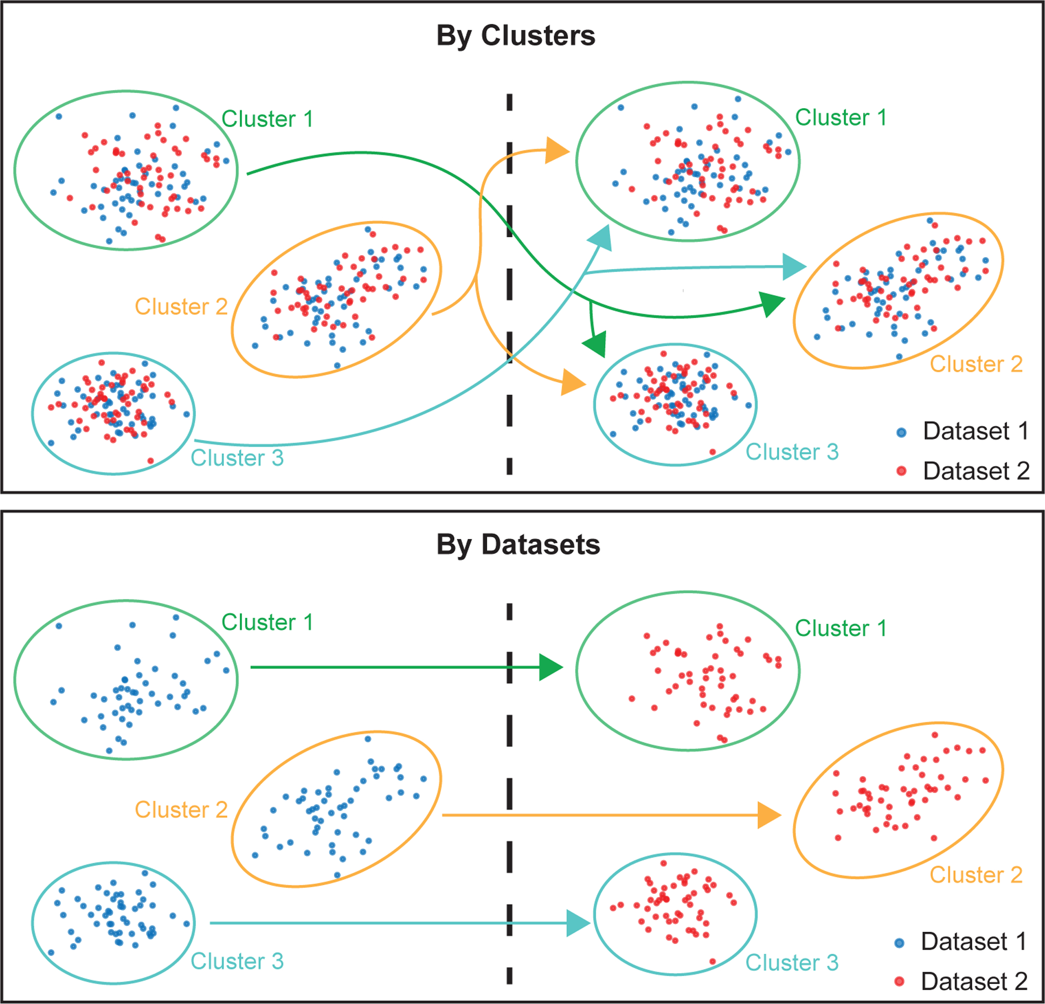
This diagram shows the strategy used by the function runWilcoxon to construct two groups of cells (shown on the left and right sides of the dotted lines), which are then used to calculate p-values for differential gene expression according to the Wilcoxon rank-sum test. The diagram highlights the differences when setting parameter compare.method to “clusters” (top) and “datasets” (bottom). The arrows indicate groups of cells that are compared in each case. When the parameter compare.method is set to “clusters”, the runWilcoxon function will compare each joint cluster (ovals in three different colors, with labels “Cluster 1” to “Cluster 3”) to all other joint clusters using cells from all datasets (both red and blue cells within each oval). The genes with significant p-values in this case represent cluster markers that are shared across datasets. When the parameter compare.method is set to “datasets”, the runWilcoxon function will compare cells from each dataset (e.g., red vs. blue) within the same joint cluster. Genes with significant p-values in this case represent cluster-specific expression differences across datasets. Note that, in both cases, normalized expression counts are used for the Wilcoxon rank-sum test--the original counts are not “batch corrected” before performing the test, because doing so would remove all dataset differences, which are often biologically significant. Because the cluster labels are obtained from the LIGER joint latent space and thus represent corresponding cell populations across datasets, such comparisons on the original normalized counts are meaningful.
We provide parameters that allow the user to select which datasets to use (data.use) and whether to compare across clusters or across datasets within each cluster (compare.method). The function returns a table of data that allows us to determine the significance of each gene’s differential expression, including log fold change (logFC), area under the curve (auc) and p-value (pval) (Table 3).
Table 3:
Wilcoxon test results indicating shared cluster markers across datasets. Column headings: first column – row index; feature – name of the gene; group – name of the cluster label; avgExpr – mean value of the gene in group of cells under consideration; logFC – log fold change between observations in the two groups of cells being compared; statistic – Wilcoxon rank sum U-statistic; auc – area under the receiver operating characteristic curve; pval – nominal P-value, from two-tailed Gaussian approximation of U-statistic; padj – Benjamini-Hochberg adjusted P-value; pct_in – Percent of observations in the group with non-zero feature value; pct_out – Percent of observations out of the group with non-zero feature value.
| feature | group | avgExpr | logFC | statistic | auc | pval | padj | pct_in | pct_out | |
|---|---|---|---|---|---|---|---|---|---|---|
| 1 | RP11–206L10.2 | 0 | −23.014 | 0.001 | 3205755.245 | 0.500 | 0.939 | 0.959 | 100 | 100 |
| 2 | RP11–206L10.9 | 0 | −23.015 | 0.001 | 3205753.245 | 0.500 | 0.939 | 0.959 | 100 | 100 |
| 3 | LINC00115 | 0 | −23.015 | −0.037 | 3198099.603 | 0.499 | 0.128 | 0.258 | 100 | 100 |
| 4 | NOC2L | 0 | −21.807 | 0.267 | 3259657.500 | 0.508 | 0.025 | 0.073 | 100 | 100 |
| 5 | KLHL17 | 0 | −23.003 | 0.006 | 3206668.940 | 0.500 | 0.740 | 0.824 | 100 | 100 |
| 6 | PLEKHN1 | 0 | −23.014 | −0.035 | 3198107.603 | 0.499 | 0.128 | 0.258 | 100 | 100 |
Identify differentially expressed gene markers for all clusters by typing the following:
cluster.results <- runWilcoxon(ifnb_liger, compare.method = “clusters”)
dataset.results <- runWilcoxon(ifnb_liger, compare.method = “datasets”)
head(cluster.results)
Important parameters of runWilcoxon are as follows:
data.use. This selects which dataset (or set of datasets) to be included. The default is ‘all’, meaning all datasets are used.
compare.method. This indicates whether to compare across clusters or across datasets within each cluster. Setting compare.method to “clusters” compares each feature’s normalized counts between clusters combining all datasets, which gives us the most specific features for each cluster. On the other hand, setting compare.method to “datasets” gives us the features most differentially expressed across datasets for every cluster.
10. The number of marker genes identified by runWilcoxon varies and depends on the datasets used. The function outputs a data frame that the user can then filter to select markers that are statistically and biologically significant. For example, one strategy is to filter the output by taking markers which have padj (Benjamini-Hochberg adjusted p-value) less than 0.05 and logFC (log fold change between observations in-group versus out-group) larger than 3. Filter genes based on adjusted p-value and log fold change by typing the following:
cluster.results <- cluster.results[cluster.results$padj < 0.05,]
cluster.results <- cluster.results[cluster.results$logFC > 3,]
11. We can then re-sort the markers by padj value in ascending order and choose the top 100 for each cell type. For example, we can subset and re-sort the output for Cluster 3 and take the top 20 markers (Table 4). To do this, type the following:
wilcoxon.cluster_3 <- cluster.results[cluster.results$group == 3, ]
wilcoxon.cluster_3 <- wilcoxon.cluster_3[order(wilcoxon.cluster_3$padj), ]
head(wilcoxon.cluster_3)
Table 4:
Top shared cluster markers from the Wilcoxon test on IFNB dataset. Column headings: first column – row index; feature – name of the gene; group – name of the cluster label; avgExpr – mean value of the gene in group of cells under consideration; logFC – log fold change between observations in the two groups of cells under consideration; statistic – Wilcoxon rank-sum U-statistic; auc – area under the receiver operating characteristic curve; pval – nominal p value, from two-tailed Gaussian approximation of U-statistic; padj – Benjamini-Hochberg adjusted p value; pct_in – Percent of observations in the group with non-zero feature value; pct_out – Percent of observations out of the group with non-zero feature value.
| feature | group | avgExpr | logFC | statistic | auc | pval | padj | pct_in | pct_out | |
|---|---|---|---|---|---|---|---|---|---|---|
| 41861 | GNLY | 3 | −5.282466 | 16.147323 | 2379942 | 0.9647642 | 0 | 0 | 100 | 100 |
| 46904 | CLIC3 | 3 | −12.962070 | 9.485599 | 1946458 | 0.7890417 | 0 | 0 | 100 | 100 |
| 47130 | PRF1 | 3 | −12.260573 | 9.830082 | 1970124 | 0.7986352 | 0 | 0 | 100 | 100 |
| 49239 | GZMB | 3 | −7.840488 | 13.697178 | 2231966 | 0.9047789 | 0 | 0 | 100 | 100 |
| 52832 | NKG7 | 3 | −6.594620 | 14.433185 | 2324832 | 0.9424243 | 0 | 0 | 100 | 100 |
| 48310 | KLRC1 | 3 | −18.000059 | 4.916239 | 1606731 | 0.6513252 | 1.839405e-289 | 4.099114e-286 | 100 | 100 |
12. We can visualize the expression profiles of individual genes, such as the differentially expressed genes that we just identified, using the function plotGene. This allows us to visually confirm the cluster- or dataset-specific expression patterns of marker genes. By default, plotGene takes the normalized expression value (from the norm.data slot) for a chosen gene across all cells. The user can also choose to visualize raw or scaled data instead by specifying use.raw or use.scaled parameters. We also include another parameter zero.color that sets the color for cells not expressing the gene. By default, this color is set to light gray (#F5F5F5) so that cells with no expression are less visible and clearly distinguishable from cells with low but non-zero expression.
The UMAP plots of PRF1 expression indicate that this gene is a specific marker for Cluster 3, with high expression values in this cell group and low values elsewhere (Figure 9). We can also see that the distributions are very similar between the control and interferon-stimulated datasets, indicating that LIGER has properly aligned these two datasets. We can also use plotGene to inspect genes with expression that differs within a cluster across datasets (Figure 10). Plot the gene expression profile of PRF1 by typing the following:
plotGene(ifnb_liger, “PRF1”)
Figure 9: Marker gene identified by LIGER shows consistent cell-type-specific expression across datasets.
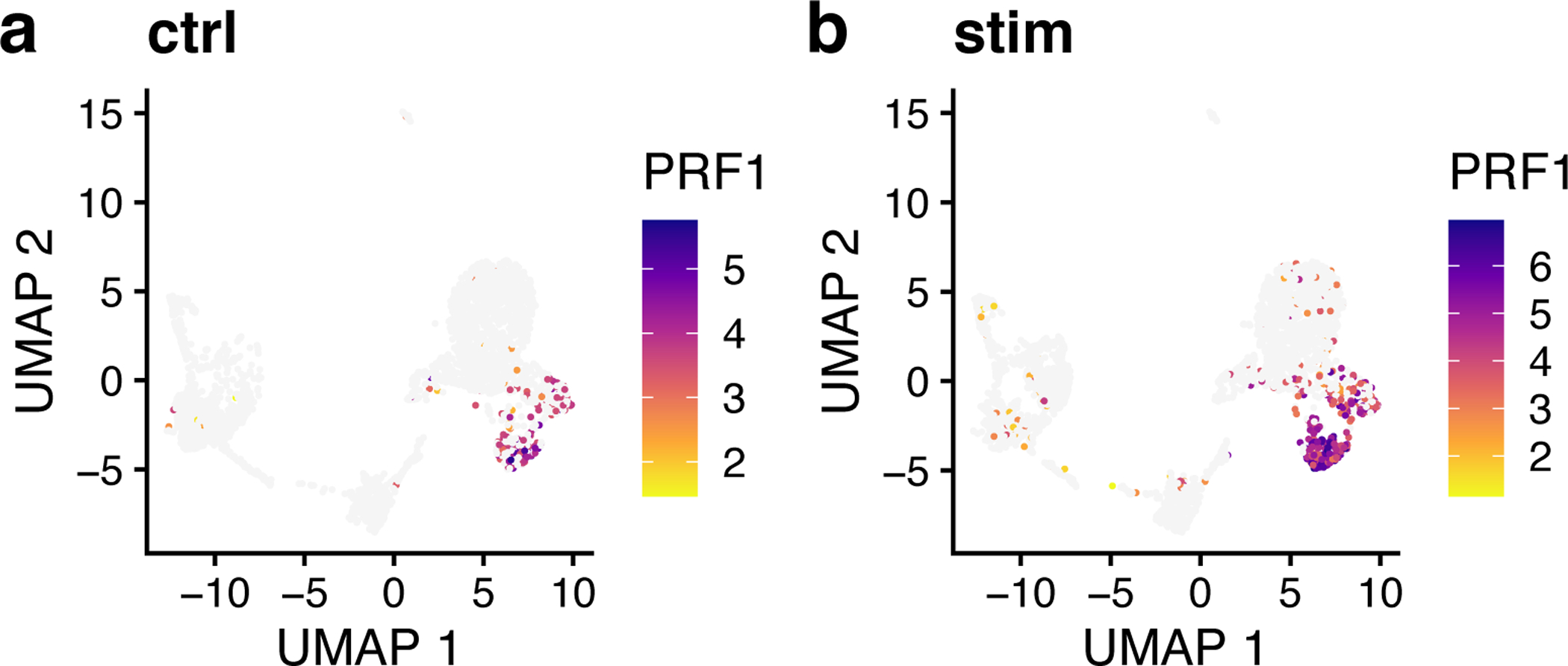
a,b, UMAP representations of expression for gene PRF1, a marker gene of cluster 3, in control (a) and interferon-beta stimulated (b) PBMCs exhibit similar distributions.
Figure 10: Marker genes identified by LIGER show expression differences across datasets.
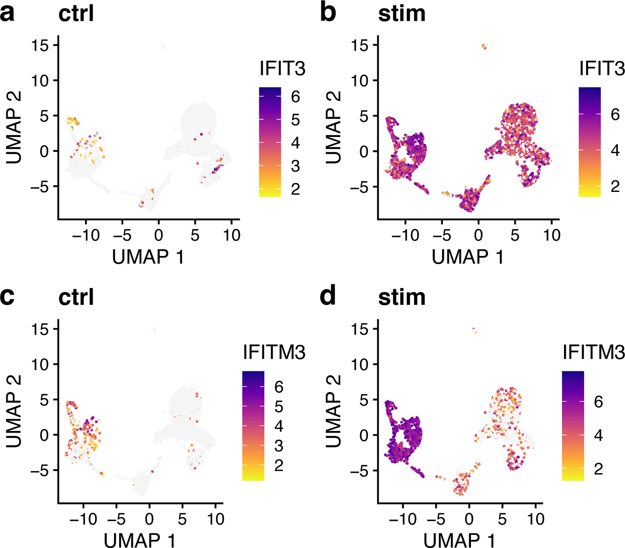
a,b, UMAP representations of expression for gene IFIT3, a marker gene of the interferon-stimulated dataset, shows low expression in control (a) and high expression in IFNB-stimulated (b) PBMCs. c,d, UMAP representations of expression for gene IFITM3, a marker gene of stimulation in clusters 1, 2, 5 and 7, in control (c) and IFNB-stimulated (d) PBMCs similarly shows more expression in interferon-stimulated cells.
Procedure 2: Joint definition of cell types from scRNA-seq and snATAC-seq data
CRITICAL In this section, we will demonstrate LIGER’s ability to jointly define cell types by leveraging multiple single-cell modalities. We integrate published human bone marrow mononuclear cell (BMMC) data24 profiled by scRNA-seq and snATAC-seq to enable cell type definitions that incorporate both gene expression and chromatin accessibility data. Such joint analysis allows not only the taxonomic categorization of cell types, but also a deeper understanding of their underlying regulatory networks. The pipeline for jointly analyzing scRNA-seq and snATAC-seq is similar to that for integrating multiple scRNA-seq datasets in that both rely on joint matrix factorization and quantile normalization. The main differences are: (1) snATAC-seq data needs to be processed into gene-level values; (2) highly variable gene selection (see Step 3 of Procedure 1) is performed on the scRNA-seq data only; and (3) downstream analyses can use both gene-level and intergenic information from the ATAC-seq data.
Stage I: Preprocessing and Normalization (Timing ~50 minutes)
CRITICAL In order to jointly analyze scRNA and snATAC-seq data, we first need to transform the snATAC-seq data--a genome-wide epigenomic measurement--into gene-level counts which are comparable to gene expression data from scRNA-seq (Box 4).
Box 4. ATAC-seq gene counting strategy.
Before integrating the data from scRNA-seq and snATAC-seq, two distinct single-cell modalities that generate data of different types, it is critical to make them comparable by transforming the snATAC-seq data (a genome-wide epigenomic measurement) into gene-level counts. Most previous single-cell studies have used an approach inspired by traditional bulk ATAC-seq analysis: identifying chromatin accessibility peaks, then summing together all peaks that overlap each gene. This strategy is also appealing because the 10X CellRanger ATAC pipeline, a commonly used commercial single-nucleus ATAC data preprocessing package, automatically outputs such peak counts. However, we find this peak summing strategy undesirable because: (1) peak calling is performed using all cells, which biases against rare cell populations; (2) gene body accessibility is often more diffuse than that of specific regulatory elements, and thus may be missed by peak calling algorithms; and (3) information from reads outside of peaks is discarded, further reducing the amount of data in the already sparse measurements. Instead of summing peak counts, we find that the simplest possible strategy seems to work well: counting the total number of ATAC-seq reads within the gene body and promoter region (typically 3 kb upstream) of each gene in each cell.
CRITICAL We show below how to perform pre-processing for snATAC-seq data generated by the 10X Chromium system, the most widely used snATAC-seq platform. The input for this process is the file fragments.tsv output by CellRanger, which contains all ATAC reads that passed filtering steps. We describe the details of running this preprocessing workflow for only one sample. Users should re-run the counting step (Steps 1–4) multiple times for more than one snATAC-seq sample.
CRITICAL Commands listed in Steps 1 and 2 need to be run through the Command Line Interface instead of the R Console or IDE (RStudio). We also employ the bedmap command from the BEDOPS tool to make a list of cell barcodes that overlap each gene and promoter. The gene body and promoter indexes are .bed files, which indicate gene and promoter coordinates. Since bedmap expects sorted inputs, the fragment output from CellRanger and gene body and promoter coordinates should all be sorted.
1. We must first sort fragments.tsv by chromosome, start, and end position using the sort command line utility. The -k option lets the user sort the file on a certain column; including multiple -k options allows sorting by multiple columns simultaneously. The n behind -k stands for ‘numeric ordering’. Here the sorted .bed file order is defined first by lexicographic chromosome order (using the parameter -k1,1), then by ascending integer start coordinate order (using parameter -k2,2n), and finally by ascending integer end coordinate order (using parameter -k3,3n). Note that this step may take a while, since the input fragment file is usually very large (for example, a typical fragment file of 4–5 GB can take about 40 minutes).
To begin, open the command line interface. Sort the raw CellRanger output by typing the following:
sort -k1,1 -k2,2n -k3,3n GSM4138888_scATAC_BMMC_D5T1.fragments.tsv > atac_fragments.sort.bed
Gene body and promoter locations should also be sorted using the same strategy for sorting fragment output files. To do this, type the following:
sort -k 1,1 -k2,2n -k3,3n hg19_genes.bed > hg19_genes.sort.bed
sort -k 1,1 -k2,2n -k3,3n hg19_promoters.bed > hg19_promoters.sort.bed
2. Use the bedmap command to determine which fragments overlap each gene body and promoter:
bedmap --ec --delim “\t” --echo --echo-map-id hg19_promoters.sort.bed atac_fragments.sort.bed > atac_promoters_bc.bed
bedmap --ec --delim “\t” --echo --echo-map-id hg19_genes.sort.bed atac_fragments.sort.bed > atac_genes_bc.bed
Important flags are as follows:
--delim. This changes output delimiter from ‘|’ to specified delimiter between columns, which in our case is “\t”.
--ec. Adding this will check input files to make sure that they are properly formatted and sorted.
--echo. Adding this will print each line from the reference file in output. The reference file in our case is gene or promoter index.
--echo-map-id. Adding this will list IDs of all overlapping elements from mapping files, which in our case are cell barcodes from fragment files.
3. We then import the bedmap outputs into the R Console or RStudio. Note that the as.is option in read.table is specified to prevent the conversion of character columns to factor columns.
Call this function by typing the following:
genes.bc <- read.table(file = “atac_genes_bc.bed”, sep = “\t”, as.is = c(4,7), header = FALSE)
promoters.bc <- read.table(file = “atac_promoters_bc.bed”, sep = “\t”, as.is = c(4,7), header = FALSE)
Cell barcodes are then split and extracted from the outputs. We recommend filtering barcodes that have a total number of reads lower than a certain threshold, for example, 1500. This threshold can be adjusted according to the size and quality of the samples. Construct the cell barcode profile by typing the following:
bc <- genes.bc[,7]
bc_split <- strsplit(bc,”;”)
bc_split_vec <- unlist(bc_split)
bc_unique <- unique(bc_split_vec)
bc_counts <- table(bc_split_vec)
bc_filt <- names(bc_counts)[bc_counts > 1500]
barcodes <- bc_filt
4. We can then use LIGER’s makeFeatureMatrix function to calculate accessibility counts for the gene body and promoter individually. This function takes the output from bedmap and efficiently counts the number of fragments overlapping each gene and promoter. We could count the genes and promoters in a single step, but choose to calculate them separately in case it is necessary to look at gene or promoter accessibility individually in downstream analyses. To call this function from LIGER, type the following:
library(liger)
gene.counts <- makeFeatureMatrix(genes.bc, barcodes)
promoter.counts <- makeFeatureMatrix(promoters.bc, barcodes)
Next, these two count matrices need to be re-sorted by gene symbol. We then add the matrices together, yielding a single matrix of gene accessibility counts in each cell. Note that we also append the sample name to each cell barcode to avoid duplicate cell names across experiments. Sort and merge count matrices by typing the following:
gene.counts <- gene.counts[order(rownames(gene.counts)), ]
promoter.counts <- promoter.counts[order(rownames(promoter.counts)),]
D5T1 <- gene.counts + promoter.counts
colnames(D5T1) <- paste0(“D5T1_”, colnames(D5T1))
?TROUBLESHOOTING
5. Once the gene-level snATAC-seq counts are generated, the read10X function from LIGER can be used to read scRNA-seq count matrices output by CellRanger. You can pass in a directory (or a list of directories) containing raw outputs (for example, “/Sample_1/outs/filtered_feature_bc_matrix”) to the parameter sample.dirs. Next, a vector of names to use for the samples (sample.dirs) should be passed to parameter sample.names as well. LIGER can also use data from any other scRNA-seq protocol, as long as it is provided in a genes x cells R matrix format. To run this function, type the following:
bmmc.rna <- read10X(sample.dirs = list(“/path_to_sample”), sample.names = list(“rna”))
6. We can now create a LIGER object with the createLiger function. We also remove unneeded variables to conserve memory. Create a LIGER object by typing the following:
bmmc.data <- list(atac = D5T1, rna = bmmc.rna)
int.bmmc <- createLiger(bmmc.data)
rm(genes.bc, promoters.bc, gene.counts, promoter.counts, D5T1, bmmc.rna)
?TROUBLESHOOTING
7. Preprocessing steps are needed before running matrix factorization. Each dataset is normalized to account for differences in total gene-level counts across cells using the normalize function. Next, highly variable genes from each dataset are identified and combined for use in downstream analysis. Note that by setting the parameter datasets.use to 2, genes will be selected only from the scRNA-seq dataset (the second dataset) by the selectGenes function. We recommend not using the ATAC-seq data for variable gene selection because the statistical properties of the ATAC-seq data are very different from scRNA-seq, violating the assumptions made by the statistical model we developed for selecting genes from RNA data. Finally, the scaleNotCenter function scales normalized datasets without centering by the mean, giving the nonnegative input data required by iNMF. To perform data preprocessing, call the three functions mentioned above by typing:
int.bmmc <- normalize(int.bmmc)
int.bmmc <- selectGenes(int.bmmc, datasets.use = 2)
int.bmmc <- scaleNotCenter(int.bmmc)
?TROUBLESHOOTING
Stage II: Joint Matrix Factorization (Timing ~10 min)
8. We next perform joint matrix factorization (iNMF) on the normalized and scaled RNA and ATAC data. This step calculates metagenes--sets of co-expressed genes that distinguish cell populations--containing both shared and dataset-specific signals. The cells are then represented in terms of the “expression level” of each metagene, providing a low-dimensional representation that can be used for joint clustering and visualization. To run iNMF on the scaled datasets, use the optimizeALS function with proper hyperparameter settings (described below) by typing the following:
int.bmmc <- optimizeALS(int.bmmc, k = 20)
The important parameters are as follows:
k. Integer value specifying the inner dimension of factorization, or number of factors. Higher k is recommended for datasets with more biological complexity. For example, k = 20 is suitable for the PBMC datasets we analyze here, but analyzing cortical neurons (which are highly diverse) may require a higher k such as k = 40. We find that a value of k in the range 20 – 40 works well for most datasets. Because this is an unsupervised, exploratory analysis, there is no single “right” value for k, and in practice, users choose k from a combination of biological prior knowledge and other information.
lambda. This is a regularization parameter. Larger values penalize dataset-specific effects more strongly, causing the datasets to be better aligned, but possibly at the cost of higher reconstruction error. The default value is 5. We recommend using this value for most analyses, but find that it can be lowered to 1 in cases where the dataset differences are expected to be relatively small, such as scRNA-seq data from the same tissue but different individuals.
thresh. This sets the convergence threshold. Lower values cause the algorithm to run longer. The default is 1e-6.
max.iters. This variable sets the maximum number of iterations to perform. The default value is 30.
Stage III: Quantile Normalization and Joint Clustering (Timing ~2 min)
9. Using the metagene factors calculated by iNMF, we then assign each cell to the factor on which it has the highest loading, giving joint clusters that correspond across datasets. We then perform quantile normalization by dataset, factor, and cluster to fully integrate the datasets. To do this, type the following:
int.bmmc <- quantile_norm(int.bmmc)
Important parameters of quantile_norm are as follows:
knn_k. This sets the number of nearest neighbors for the within-dataset KNN graph. The default is 20.
quantiles. This sets the number of quantiles to use for quantile normalization. The default is 50.
min_cells. This indicates the minimum number of cells to consider a cluster as shared across datasets. The default is 20.
dims.use. This sets the indices of factors to use for quantile normalization. The user can pass in a vector of indices indicating specific factors. This is helpful for excluding factors capturing biological signals such as the cell cycle or technical signals such as mitochondrial genes. The default is all k of the factors.
do.center. This indicates whether to center when scaling cell factor loadings. The default is FALSE. This option should be set to TRUE when cell factor loadings have a mean above zero, as with dense data such as DNA methylation.
max_sample. This sets the maximum number of cells used for quantile normalization of each cluster and factor. The default is 1000.
refine.knn. This indicates whether to increase robustness of cluster assignments using KNN graph. The default is TRUE. Disabling this option makes the function run faster but may increase the amount of spurious alignment in divergent datasets.
eps. This sets the error bound of the nearest neighbor search. The default is 0.9. Lower values give more accurate nearest neighbor graphs but take much longer to compute. We find that this parameter affects result quality very little.
ref_dataset. This indicates the name of the dataset to be used as a reference for quantile normalization. By default, the dataset with the largest number of cells is used.
10. The quantile_norm function gives joint clusters that correspond across datasets, which are often satisfactory and sufficient for downstream analyses. However, if desired, after quantile normalization, users can additionally run the Louvain algorithm for community detection by running the louvainCluster function. Several tuning parameters, including resolution, k, and prune control the number of clusters produced by this function. For this dataset, we use a resolution of 0.2, which yields 16 clusters (Figure 11). To run this function, type the following:
int.bmmc <- louvainCluster(int.bmmc, resolution = 0.2)
Figure 11: LIGER enables joint clustering of BMMC data across modalities.
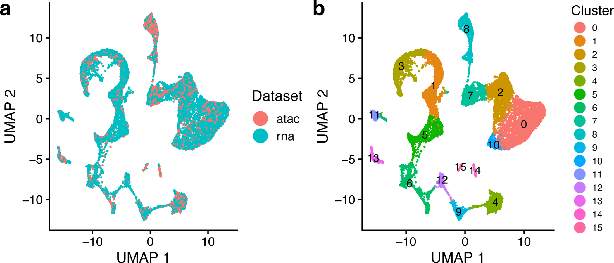
a,b, UMAP plots of a LIGER analysis of 12,602 scRNA-seq profiles and 6,234 nuclei profiled by snATAC-seq, showing 16 joint clusters, colored by technology (a) and LIGER cluster assignment (b). The parameters k and λ were specified as 20 and 5, as shown in the protocol.
Stage IV: Visualization and Downstream Analysis (Timing variable)
11. The clustering results can be visualized using t-SNE or UMAP. To perform UMAP on the shared factor loadings, type the following:
int.bmmc <- runUMAP(int.bmmc, distance = ‘cosine’, n_neighbors = 30, min_dist = 0.3)
We find that often for datasets containing continuous variation such as cell differentiation, UMAP better preserves global relationships, whereas t-SNE works well for displaying discrete cell types, such as those in the brain. The UMAP algorithm (called by the runUMAP function) scales readily to large datasets. The runTSNE function also includes an option to use FItSNE, a highly scalable implementation of t-SNE that can efficiently process large datasets. For the BMMC dataset, we expect to see continuous lineage transitions among the differentiating cells, so we use UMAP to visualize the data in two dimensions (Figure 11).
12. Visualize each cell, colored by cluster or dataset by typing the following:
plotByDatasetAndCluster(int.bmmc, axis.labels = c(‘UMAP 1’, ‘UMAP 2’))
The iNMF latent space and cluster assignments given by LIGER using the default parameter settings are often satisfactory and sufficient. If desired, the users can do some further optimization referring to our description in Procedure 1 Step 8 and also Box 1–3.
13. LIGER employs the Wilcoxon rank-sum test to identify marker genes as we described in Procedure 1. To identify marker genes for each cluster combining snATAC and scRNA profiles, type:
int.bmmc.wilcoxon <- runWilcoxon(int.bmmc, data.use = ‘all’, compare.method = ‘clusters’)
14. The number of marker genes identified by runWilcoxon varies and depends on the datasets used. The function outputs a data frame that the user can then filter to select markers that are statistically and biologically significant. For example, one strategy is to filter the output by taking markers which have padj (Benjamini-Hochberg adjusted p-value) less than 0.05 and logFC (log fold change between observations in group versus out) larger than 3. Set filters based on padj and logFC by typing the following:
int.bmmc.wilcoxon <- int.bmmc.wilcoxon[int.bmmc.wilcoxon$padj < 0.05,]
int.bmmc.wilcoxon <- int.bmmc.wilcoxon[int.bmmc.wilcoxon$logFC > 3,]
We can then sort the markers by padj value in ascending order and choose the top markers for each cell type. For example, we can subset and re-sort the output for Cluster 1 and take the top 20 markers. To do this, type these commands:
wilcoxon.cluster_1 <- int.bmmc.wilcoxon[int.bmmc.wilcoxon$group == 1, ]
wilcoxon.cluster_1 <- wilcoxon.cluster_1[order(wilcoxon.cluster_1$padj), ]
markers.cluster_1 <- wilcoxon.cluster_1[1:20, ]
15. We also provide functions to check these markers by visualizing their expression profiles across datasets. We can use the plotGene function to visualize the expression or accessibility of a marker gene, which is helpful for visually confirming putative marker genes or investigating the distribution of known markers across the sequenced cells. Such plots can also confirm that datasets are properly aligned.
For instance, we can plot S100A9, which the Wilcoxon test identified as a marker for Cluster 1, and MS4A1, a marker for Cluster 4. To generate such plots by the function plotGene, type the following:
S100A8 <- plotGene(int.bmmc, “S100A9”, axis.labels = c(‘UMAP 1’, ‘UMAP 2’), return.plots = TRUE)
MS4A1 <- plotGene(int.bmmc, “MS4A1”, axis.labels = c(‘UMAP 1’, ‘UMAP 2’), return.plots = TRUE)
plot_grid(S100A8[[2]],MS4A1[[2]],S100A8[[1]],MS4A1[[1]], ncol=2)
The UMAP plots of expression and chromatin accessibility indicate that S100A9 and MS4A1 are indeed specific markers for Cluster 1 and Cluster 4, respectively, with high values in these cell groups and low values elsewhere (Figure 12). Furthermore, we can see that the distributions of these markers are strikingly similar between the RNA and ATAC datasets, indicating that LIGER has properly integrated the two data types.
Figure 12: Expression and chromatin accessibility of marker genes selected by LIGER show consistency across modalities.
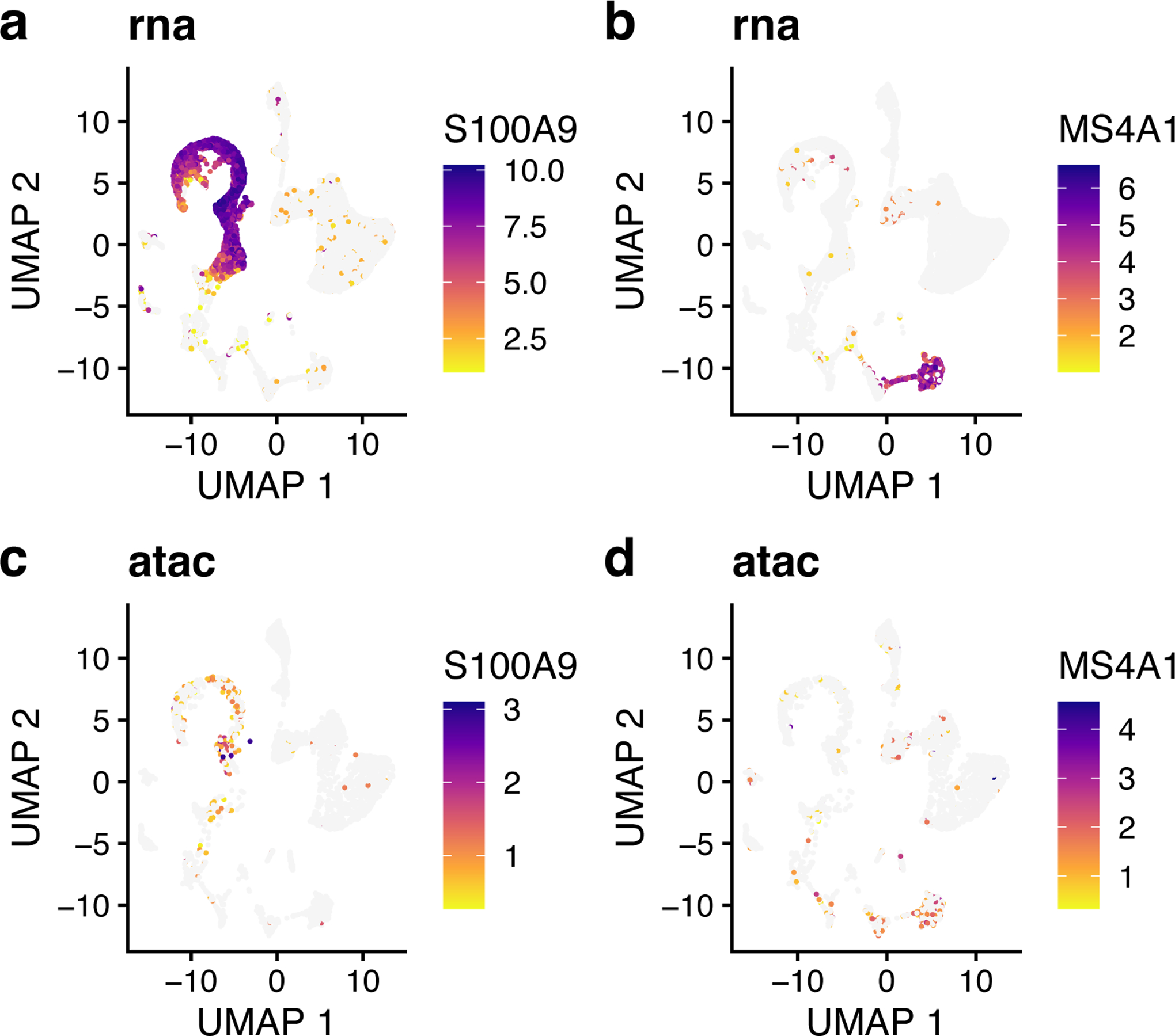
a,b, UMAP representations of expression for genes S100A9 (a) and MS4A1 (b). c,d, UMAP representations of chromatin accessibility for genes S100A9 (c) and MS4A1 (d), which show highly similar chromatin accessibility distributions compared to their expression (a, b).
16. To further interpret iNMF dimensions and identify shared and dataset-specific features along each dimension, we provide a function called plotGeneLoadings that allows visual exploration of such information as we described in Procedure 1. It is recommended to call this function into a PDF file due to the large number of plots produced. To do this, type the following:
pdf(‘Gene_Loadings.pdf’)
plotGeneLoadings(int.bmmc, return.plots = FALSE)
dev.off()
Alternatively, the function can return a list of plots by setting the parameter return.plots to TRUE. You can then choose to visualize any specific factors you are interested in. For example, to visualize the factor loading of Factor 7, type in:
gene_loadings <- plotGeneLoadings(int.bmmc, do.spec.plot = FALSE, return.plots = TRUE)
gene_loadings[[7]]
The loading pattern of Factor 7 shows that Factor 7 specifically loads on Cluster 4 (Figure 13, top). We also see both the shared markers (including MS4A1, which we already inspected above) and dataset-specific genes that characterize this dimension (Figure 13, bottom). For example, CCR6 and NCF1 are the top dataset-specific genes in the ATAC and RNA datasets, respectively. To inspect these genes, we plotted their expression and accessibility, which confirm that these genes show clear differences in expression and accessibility distribution (Figure 14). CCR6 shows nearly ubiquitous chromatin accessibility but is expressed only in clusters 2 and 4. The accessibility is highest in these clusters, but the ubiquitous accessibility suggests that the expression of CCR6 is somewhat decoupled from its accessibility, likely regulated by other factors. Conversely, NCF1 shows high expression in clusters 1, 3, 4 and 9, despite no clear enrichment in chromatin accessibility within these clusters 4 and 9. This may again indicate decoupling between the expression and chromatin accessibility of NCF1. Another possibility is that the difference is due to technical effects--the gene body of NCF1 is short (~15KB), and short genes are more difficult to capture in snATAC-seq than in scRNA-seq because there are few sites for the ATAC-seq transposon to insert.
Figure 13: Metagenes and metagene expression levels for BMMC data.
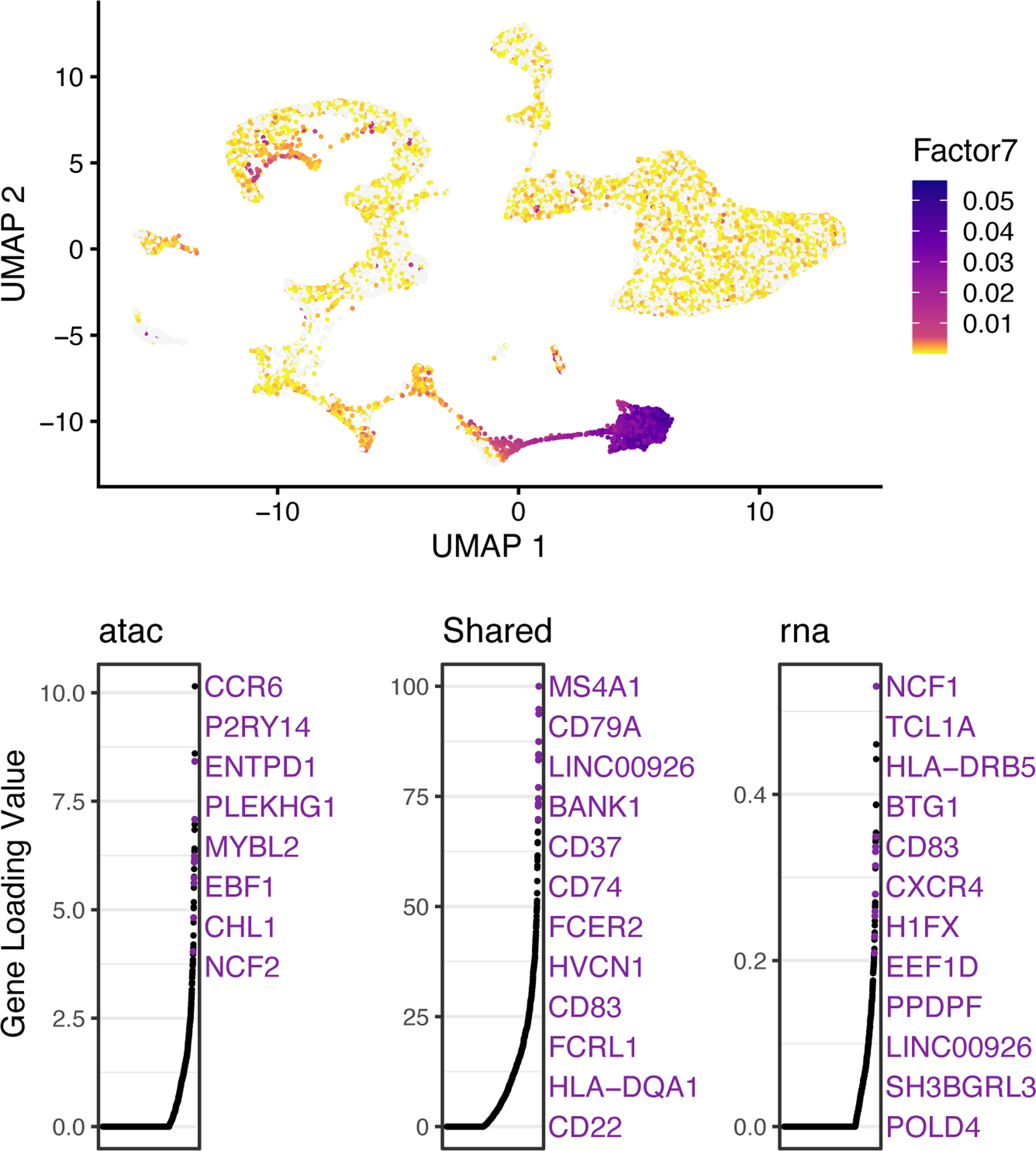
UMAP plots showing metagene expression levels (top) and gene loading values (bottom) for Factor 7. The top panel shows that cells in Cluster 4 show high values of Factor 7, indicating that Factor 7 specifically defines Cluster 4. In gene loading plots, gene names are sorted in decreasing order of magnitude of their factor loading contribution and correspond to colored points in scatterplots. Plots are organized to show the metagene specific to snATAC-seq (left), the shared metagene common to all datasets (middle) and the metagene specific to scRNA-seq profiles (right).
Figure 14: Genes showing expression and accessibility differences.
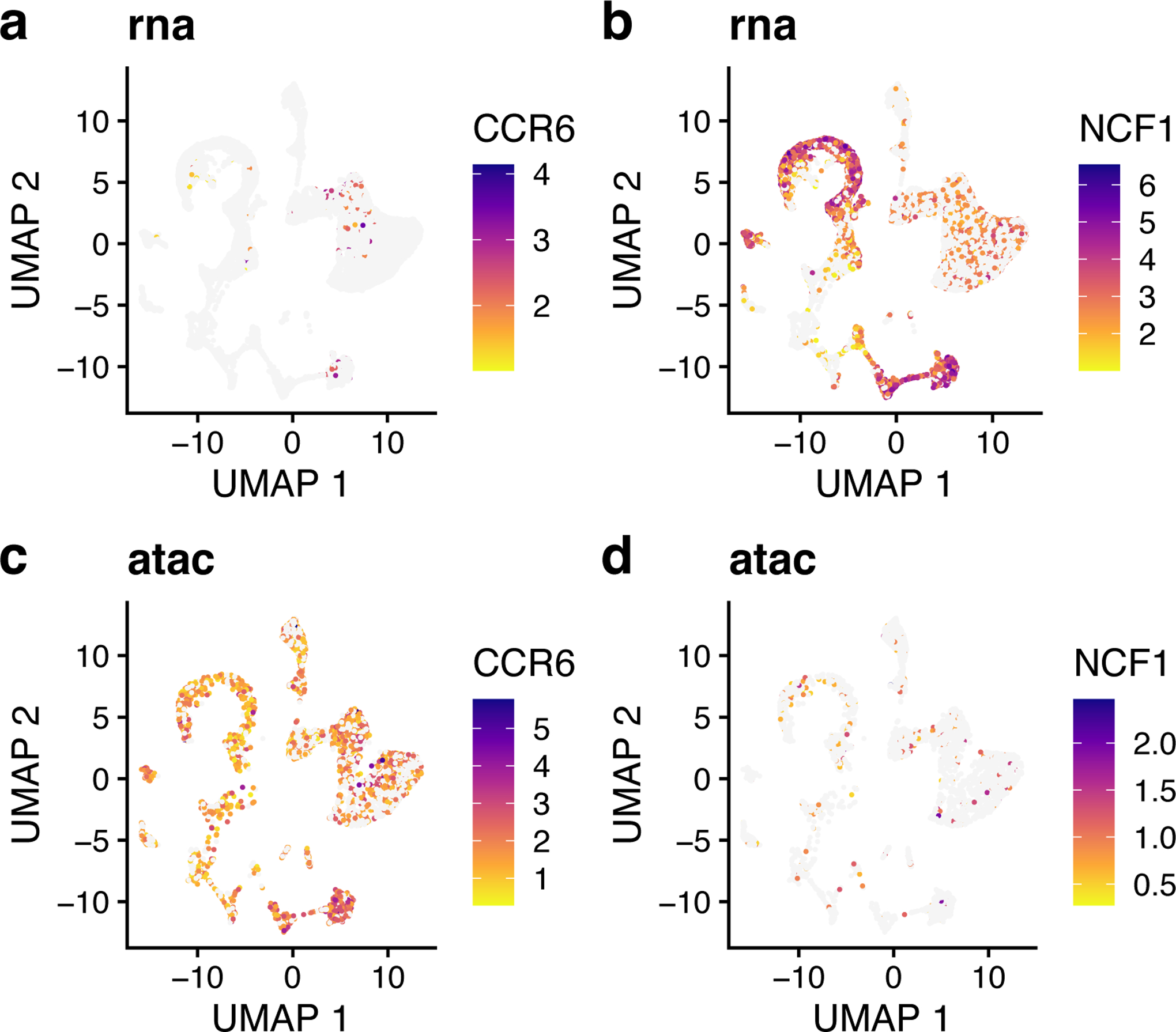
a,b, UMAP representation of expression for CCR6 (a) and NCF1 (b). c,d, UMAP representation of chromatin accessibility of CCR6 (c) and NCF1 (d), which both show distinct chromatin accessibility distributions compared to their expression.
17. Single-cell measurements of chromatin accessibility and gene expression provide an unprecedented opportunity to investigate epigenetic regulation of gene expression. Ideally, such investigation would leverage paired ATAC-seq and RNA-seq from the same cells, but such simultaneous measurements are not generally available. However, using LIGER, it is possible to computationally infer “pseudo-multi-omic” profiles by linking scRNA-seq profiles--using the jointly inferred iNMF factors--to the most similar snATAC-seq profiles. After this imputation step, we can perform downstream analyses as if we had true single-cell multi-omic profiles. For example, we can identify putative enhancers by correlating the expression of a gene with the accessibility of neighboring intergenic peaks across the whole set of single cells.
To achieve this, we first need a matrix of accessibility counts within intergenic peaks. The CellRanger pipeline for snATAC-seq outputs such a matrix by default, so we will use this as our starting point. The count matrix, peak genomic coordinates, and source cell barcodes output by CellRanger are stored in a folder named filtered_peak_matrix in the output directory. Load these outputs and convert them into a peak-level count matrix by typing these commands:
barcodes <- read.table(‘/outs/filtered_peak_bc_matrix/barcodes.tsv’, sep = ‘\t’, header = FALSE, as.is = TRUE)$V1
peak.names <- read.table(‘/outs/filtered_peak_bc_matrix/peaks.bed’, sep = ‘\t’, header = FALSE)
peak.names <- paste0(peak.names$V1, ‘:’, peak.names$V2, ‘-’, peak.names$V3)
pmat <- readMM(‘/outs/filtered_peak_bc_matrix/matrix.mtx’)
dimnames(pmat) <- list(peak.names, barcodes)
18. The peak-level count matrix is usually large, containing hundreds of thousands of peaks. We next filter this set of peaks to identify those showing cell-type-specific accessibility. To do this, we perform the Wilcoxon rank-sum test and pick the peaks that are differentially accessible within a specific cluster. Before running the test, however, we need to: (1) subset the peak-level count matrix to include the same cells as the gene-level counts matrix; (2) replace the original gene-level counts matrix in the LIGER object by peak-level counts matrix; and (3) normalize peak counts to sum to 1 within each cell. To perform these steps, type the following:
int.bmmc.ds <- int.bmmc
pmat <- pmat[ ,intersect(colnames(pmat),colnames(int.bmmc@raw.data[[‘atac’]]))]
int.bmmc.ds@raw.data[[‘atac’]] <- pmat
int.bmmc.ds <- normalize(int.bmmc.ds)
Then perform the Wilcoxon test to identify the differentially expressed peaks for each joint cluster:
peak.wilcoxon <- runWilcoxon(int.bmmc.ds, data.use = 1, compare.method = ‘clusters’)
?TROUBLESHOOTING
19. We can now use the results of the Wilcoxon test to retain only peaks showing differential accessibility across our set of joint clusters. Here we kept peaks with Benjamini-Hochberg adjusted p-value < 0.05 and log fold change > 2. To set these filters, type the following:
peak.wilcoxon <- peak.wilcoxon[peak.wilcoxon$padj < 0.05,]
peak.wilcoxon <- peak.wilcoxon[peak.wilcoxon$logFC > 2,]
peak.sel <- unique(peak.wilcoxon$feature)
int.bmmc.ds@raw.data[[‘atac’]] = int.bmmc.ds@raw.data[[‘atac’]][peaks.sel, ]
Stage IV: linking genes to putative regulatory elements and visualization in genome browser
20. Using this set of differentially accessible peaks, we now impute a set of “pseudo-multi-omic” profiles by inferring the intergenic peak accessibility for scRNA-seq profiles based on their nearest neighbors in the joint LIGER space. LIGER provides a function named imputeKNN that performs this task, yielding a set of profiles containing both gene expression and chromatin accessibility measurements for the same single cells. To call this function, type in:
int.bmmc.ds <- imputeKNN(int.bmmc.ds, reference = ‘atac’)
Important parameters of imputeKNN are as follows:
reference. Dataset containing values to impute into query dataset(s). For example, setting reference = ‘atac’ uses the values in dataset ‘atac’ to predict chromatin accessibility values for scRNA-seq profiles.
queries. Dataset(s) to be augmented by imputation. For example, setting queries = ‘rna’ predicts chromatin accessibility values for scRNA-seq profiles.
knn_k. The maximum number of nearest neighbors to use for imputation. The imputation algorithm simply builds a k-nearest neighbor graph using the aligned LIGER latent space, then averages values from the reference dataset across neighboring cells. The default value is 20.
weight. This indicates whether to use KNN distances to weight datasets (TRUE) or to average equally among all neighbors (FALSE). The default is TRUE.
norm. This indicates whether to normalize data after imputation. The default is TRUE.
scale. This indicates whether to scale data after imputation. The default is FALSE.
21. Now that we have both the (imputed) peak-level count matrix and the (observed) gene expression count matrix for the same cells, we can evaluate the relationships between pairs of genes and peaks, linking genes to putative regulatory elements. We use a simple strategy to identify such gene-peak links: Calculate correlation between gene expression and peak accessibility of all peaks within 500 KB of a gene, then retain all peaks showing statistically significant correlation with the gene. Perform this analysis with the linkGenesAndPeaks function by typing the following:
gmat <- int.bmmc@norm.data[[‘rna’]]
pmat <- int.bmmc.ds@norm.data[[‘rna’]]
regnet <- linkGenesAndPeaks(gene_counts = gmat, peak_counts = pmat, dist = ‘spearman’, alpha = 0.05, path_to_coords = ‘some_path/gene_coords.bed’)
rm(int.bmmc.ds, gmat, pmat)
Important parameters of linkGenesAndPeaks are as follows:
gene_counts. A gene expression matrix (genes by cells) of normalized counts. This matrix has to share the same column names (cell barcodes) as the matrix passed to peak_counts.
peak_counts. A peak-level matrix (peaks by cells) of normalized accessibility values, such as the one resulting from imputeKNN. This matrix must share the same column names (cell barcodes) as the matrix passed to gene_counts.
genes.list. A list of the gene symbols to be tested. If not specified, this function will use all the gene symbols from the matrix passed to gene_counts by default.
dist. This indicates the type of correlation to calculate -- one of “spearman” (default), “pearson”, or “kendall”.
alpha. Significance threshold for correlation p-value. Peak-gene correlations with p-values below this threshold are considered significant. The default is 0.05.
path_to_coords. The path to the gene coordinates file (in .bed format). We recommend passing in the same bed file used for making gene body and promoter count matrices in Procedure 2 Step 1.
22. The output of this function is a sparse matrix with peak names as rows and gene symbols as columns, with each element indicating the correlation between peak i and gene j (or 0 if the gene and peak are not significantly linked). For example, we can subset the results for marker gene S100A9, which is a marker gene of Cluster 1 identified in Procedure 2 Step 15, and rank these peaks by their correlation. To do this, type the following:
S100A9 <- regnet[, ‘S100A9’]
S100A9 <- S100A9[abs(S100A9) > 0]
View(S100A9[order(abs(S100A9), decreasing = TRUE)])
23. We also provide a function makeInteractTrack to export the peaks-genes correlation matrix in Interact Track format, which can then be loaded into a genome browser to visualize the predicted links between genes and correlated peaks. Call this function by typing:
makeInteractTrack(regnet, genes.list = ‘S100A9’, path_to_coords = ‘some_path/gene_coords.bed’)
Important parameters of this function are as follows:
corr.mat. A peaks x genes sparse matrix containing inferred gene-peak links (as output by linkGenesAndPeaks).
genes.list. A vector of the gene symbols to be included in the output Interact Track file. If not specified, this function will use all of the gene symbols in corr.mat by default.
path_to_coords. The path to the gene coordinates file (in .bed format). We recommend using the same .bed file used for making the barcodes list in Procedure 2 Step 1.
output_path. The path to the directory in which the Interact Track file will be stored. The default is the working directory.
The output of this function will be an Interact Track file named ‘Interact_Track.bed’ containing linkage information of the specified genes and correlated peaks stored in the given directory. The user can then upload this file as a custom track using this page (https://genome.ucsc.edu/cgi-bin/hgCustom) and display it in the UCSC Genome browser.
For example, the two peaks most correlated to S100A9 expression are shown in the UCSC genome browser (Figure 15). One of the peaks overlaps with the transcription start site (TSS) of S100A8, a neighboring gene that is co-expressed with S100A9, while another peak overlaps with the TSS of S100A9 itself. The last peak, chr1:153358896–153359396, does not overlap with a gene body and shows strong H3K27 acetylation across ENCODE cell lines, indicating that this is likely an intergenic regulatory element.
Figure 15:
UCSC genome browser view showing the correlations between three candidate chromatin accessible regions and target gene S100A9. The locations of three peaks are shown as short black strips within the row “Regions”, and the correlations are illustrated by dotted arcs. H3K27 acetylation and DNasel hypersensitivity across ENCODE cell lines are also shown at the bottom.
To further inspect the correlation between chr1:153358896–153359396 and S100A9, we plotted the accessibility of this peak and the expression of S100A9 (Figure 16). We can see that the two are indeed very correlated and show strong enrichment in clusters 1 and 3. Thus, the intergenic peak likely serves as a cell-type-specific regulator of S100A9.
Figure 16: Expression and correlated accessibility for S100A9 and nearby intergenic peak.
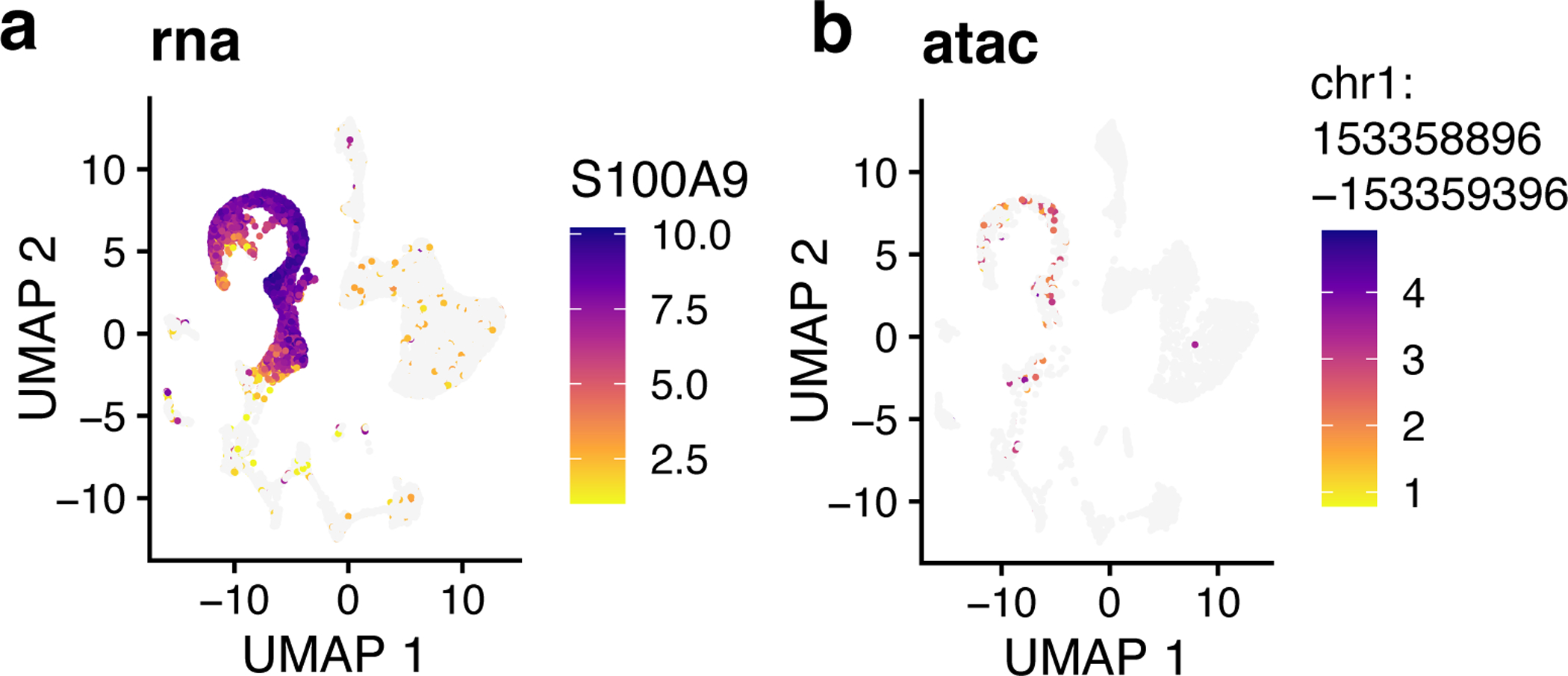
a, UMAP representation of imputed chromatin accessibility of gene S100A9. b, UMAP representation of chromatin accessibility for peak chr1:153358896–153359396.
Timing
The estimated times listed below are specifically for the example datasets used in the tutorial. The time required for all steps depends on the number of cells and number of variable genes selected, so larger datasets will take longer than the times reported here. The most time-consuming steps are matrix factorization (Stage II) and downstream analysis of snATAC data (Stage IV).
Protocol Timing
- Procedure 1 – Joint definition of cell types from multiple scRNA-seq datasets
- Step 1–3, Stage I, preprocessing and normalization: ~30 sec
- Step 4, Stage II, joint matrix factorization: ~3 min
- Step 5 and 6, Stage III, quantile normalization and joint clustering: ~2 min
- Step 7 and 8, Stage IV, dimensional reduction and visualization: ~30 sec
- Step 9–12, Stage IV, differential analysis and marker genes selection: ~10 min
- Procedure 2 – Joint definition of cell types from scRNA-seq and snATAC-seq data
- Step 1–4, Stage I, creation of gene-level counts matrix: ~50 min
- Step 5–7, Stage I, preprocessing and normalization: ~2 min
- Step 8, Stage II, joint matrix factorization: ~10 min
- Step 9 and 10, Stage III, quantile normalization and joint clustering: ~2 min
- Step 11 and 12, dimensional reduction and visualization: ~3 min
- Step 13–16, Stage IV, differential analysis and marker genes selection: ~10 min
- Step 17–19, Stage IV, creation of accessibility counts matrix and peak filtering: ~20 min
- Step 20–23, Stage IV, linking genes to putative regulatory elements and visualization in genome browser: ~40 min
To give users a better sense of the time and memory requirements of LIGER, we benchmarked the runtime and peak memory usage on datasets of increasing size sampled from the mouse cerebral cortex dataset of Saunders et al1. The runtime and peak memory usage both scale linearly with the size of the input data (Figure 17).
Figure 17: Runtime and peak memory usage for joint factorization of scRNA-seq datasets using LIGER.
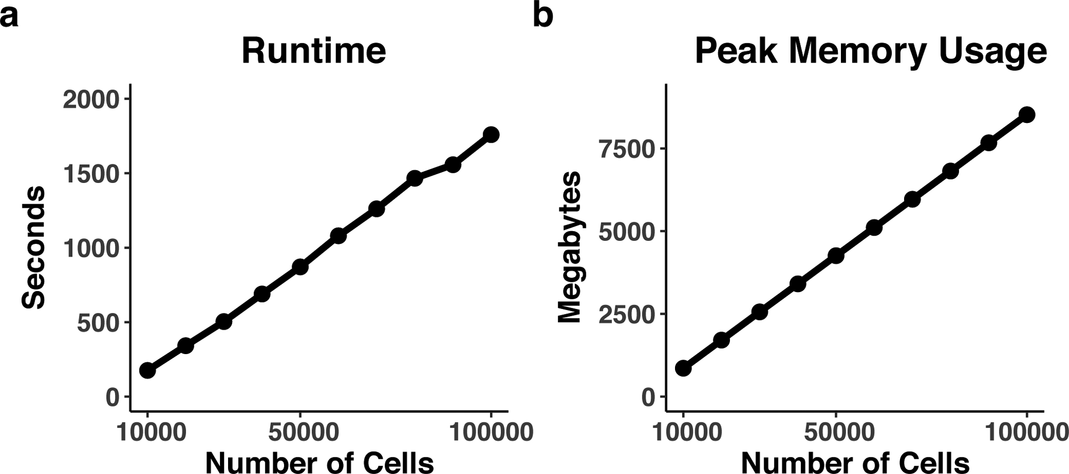
We benchmarked LIGER runtime and memory usage using frontal and posterior cortex datasets from the mouse brain.The number of cells range from 10,000 to 100,000. A total of 1109 highly variable genes were selected. The parameters k and λ were specified as 40 and 5. a,b, The runtime (a) and peak memory usage (b) were recorded for the optimizeALS function. KL_div, median KL divergence.
Anticipated Results
Running the LIGER pipeline (Procedure 1 Steps 1–8, Procedure 2 Steps 1–11) will produce a joint low-dimensional representation, a joint clustering result, and dimensionality reduction coordinates. These results can then be used to identify marker genes for the identified joint clusters and investigate how the marker genes vary across datasets. The visualization functions in the LIGER package can further be used to explore the joint cell clusters and their marker genes, as well as the metagenes identified by the LIGER factorization.
TROUBLESHOOTING
Troubleshooting advice can be found in Table 5.
Table 5:
Troubleshooting table
| Step | Problem | Possible reason | Solution |
|---|---|---|---|
| 1 (Procedure 1) 4 (Procedure 2) |
Error: ‘xxx’ is not an exported object from ‘namespace:liger’ | The user installed a different package which has the same name via CRAN with the command “install.packages(‘liger’)” | Remove your current installation of “liger” and install our package with the command “devtools::install_github(‘MacoskoLab/liger’)” |
| 1 (Procedure 1) 4 (Procedure 2) |
Error: Failed to install ‘liger’ from GitHub: Failed to install ‘xxx’ from GitHub: (converted from warning) cannot remove prior installation of package ‘xxx’ | This error arises when the user is trying to update installed packages before installing LIGER. It is due to incompatibility between old and new versions of some dependencies | Remove your current installation of the packages that are mentioned in the error message and re-install them before the installation of LIGER |
| 2 (Procedure 1) 6 (Procedure 2) |
Error in .rowNamesDF<-(x, value = value) : invalid ‘row.names’ length | This error arises when an input matrix has only a few cells (for example, 1 or 2) left after removing cells not expressing any measured genes | The user can consider removing all the cells from that dataset since it doesn’t make sense to perform subsequent analyses (such as iNMF factorization) when one dataset contains only one or two cells only |
| 3 (Procedure 1) 7, 18 (Procedure 2) |
Error: unable to find an inherited method for function ‘normalize’ for signature “liger” | This error arises when some unrelated software packages also define a “normalize” function. Under certain conditions, if you load one of those packages first, it will overwrite the “normalize” function from LIGER | Use double colon “::” to access the “normalize” function from LIGER package, e.g., “liger:: normalize(liger_object)” |
Figure 4: Parameter selection of the number of factors k and the tuning parameter λ.
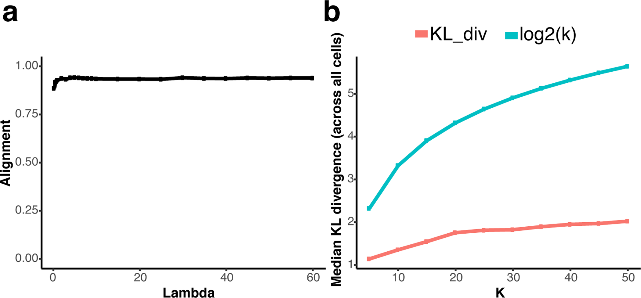
a,b, As increases in λ (a) and k (b) result in smaller relative increases in metrics of their effectiveness, the “elbow” of the graph can be interpreted as the optimal hyperparameter value.
Figure 5: Plots of raw and normalized loading of Factor 21.
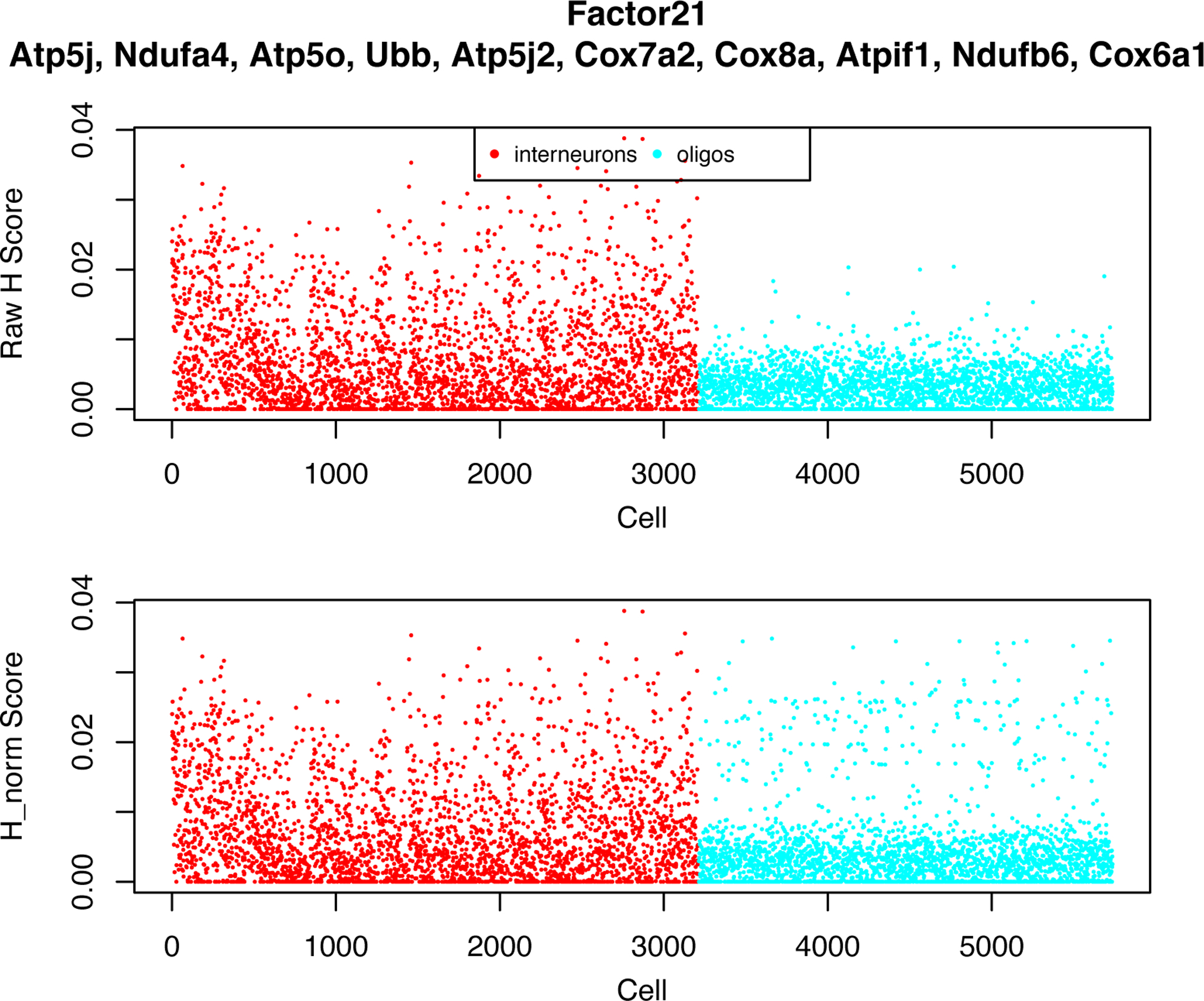
Scatter plots, with factor loadings values as y axis and cells as x axis, for both unaligned (raw) and aligned (normalized) factor loadings of Factor 21. The datasets aligned are interneurons (3212 cells) and oligodendrocytes (2524 cells) from the mouse frontal cortex.
Figure 6: Spurious alignment between datasets decreases after removing mitochondrial artifact factors.
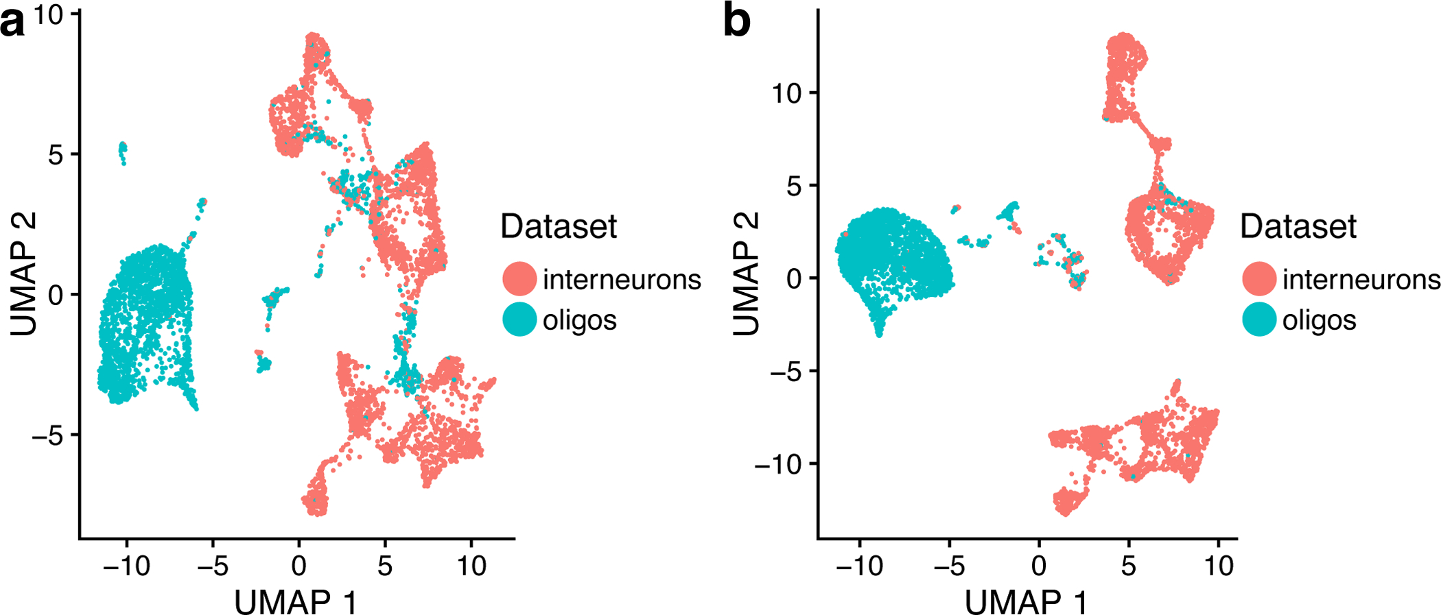
a,b, UMAP plots of a LIGER analysis of 3212 interneurons and 2524 oligodendrocytes, with (a) and without (b) factors 21 and 23, colored by datasets.
Figure 7: Distinct cell types show poor alignment compared to alignment of control and stimulated PBMC datasets.
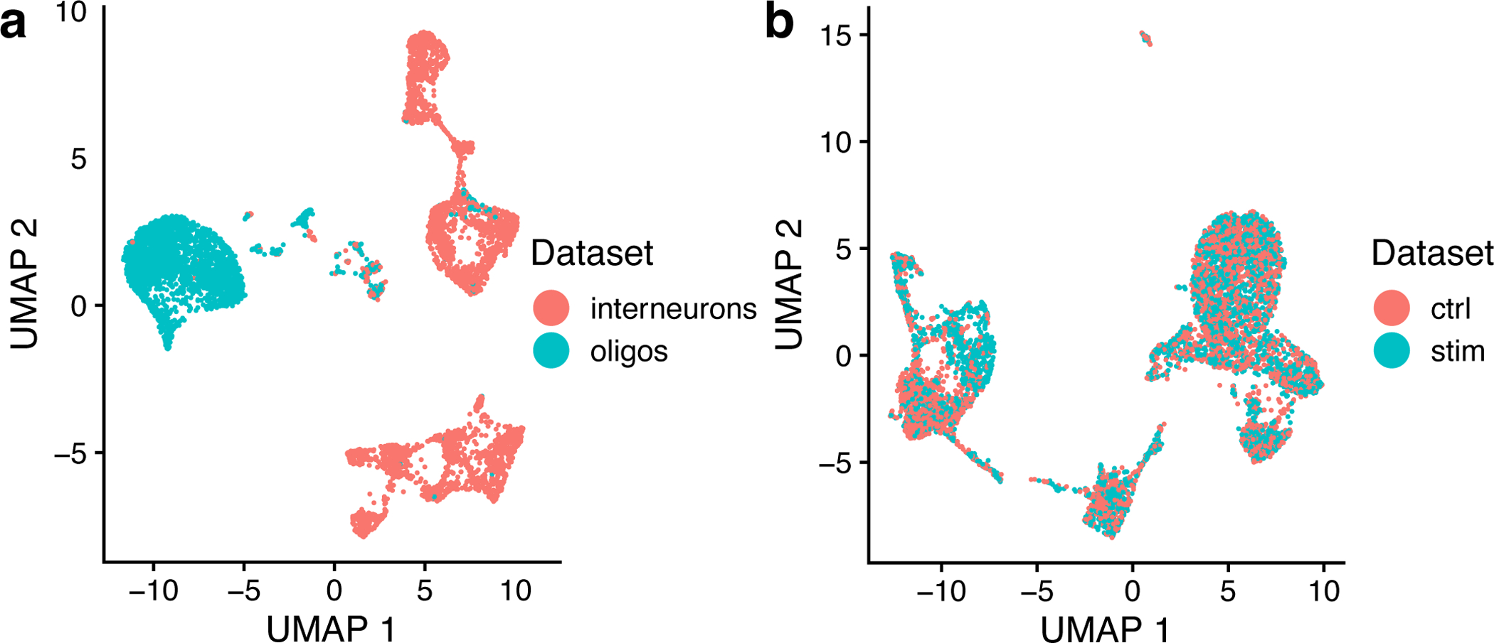
a, UMAP plot of a LIGER analysis of two distinct cell types, interneurons (3212 cells) and oligodendrocytes (2524 cells), showing poor alignment. b, UMAP plot of a LIGER analysis of 3000 control and 3000 interferon-stimulated PBMCs showing well-mixed alignments.
Table 2:
Gene sets enriched in factor 4 of IFNB LIGER result. First column – rank of each pathway in the increasing order of padj; pathway – the name of the pathway; pval – the calculated significance of gene set enrichment for the pathway; padj – Benjamini-Hochberg adjusted P-value.
| pathway | pval | padj | |
|---|---|---|---|
| 1 | Immune System | 0.000100 | 0.007639 |
| 2 | Innate Immune System | 0.000100 | 0.007639 |
| 3 | Immunoregulatory interactions between a Lymphoid and a non-Lymphoid cell | 0.000100 | 0.007639 |
| 4 | Antigen processing-Cross presentation | 0.000100 | 0.007639 |
| 5 | Adaptive Immune System | 0.000200 | 0.007639 |
| 6 | Cytokine Signaling in Immune system | 0.000200 | 0.007639 |
| 7 | Signaling by Interleukins | 0.000200 | 0.007639 |
| 8 | GPCR ligand binding | 0.000200 | 0.007639 |
| 9 | ER-Phagosome pathway | 0.000201 | 0.007639 |
| 10 | TNFR2 non-canonical NF-kB pathway | 0.000402 | 0.013750 |
Acknowledgments
This work was supported by NIH grants R01 AI149669-01 and R01 HG010883-01 (JDW) and U19 1U19MH114821 (EZM).
Footnotes
Data availability
- scRNA-seq data composed of two datasets of interneurons and oligodendrocytes from the mouse frontal cortex, from Saunders, A. et.al., 20181. Data available at http://dropviz.org/.
Code availability
The code is freely available at https://github.com/MacoskoLab/liger. The code is also available by an assigned DOI at http://doi.org/10.5281/zenodo.3765403.
Competing interests
A patent application on LIGER has been submitted by The Broad Institute, Inc. and The General Hospital Corporation with EZM, JDW and VK as inventors.
References
- 1.Saunders A et al. Molecular Diversity and Specializations among the Cells of the Adult Mouse Brain. Cell 174, 1015–1030.e16 (2018). [DOI] [PMC free article] [PubMed] [Google Scholar]
- 2.Welch JD et al. Single-Cell Multi-omic Integration Compares and Contrasts Features of Brain Cell Identity. Cell 177, 1873–1887.e17 (2019). [DOI] [PMC free article] [PubMed] [Google Scholar]
- 3.Yang Z & Michailidis G A non-negative matrix factorization method for detecting modules in heterogeneous omics multi-modal data. Bioinformatics 32, 1–8 (2016). [DOI] [PMC free article] [PubMed] [Google Scholar]
- 4.Zhang AW et al. Probabilistic cell-type assignment of single-cell RNA-seq for tumor microenvironment profiling. Nat. Methods 16, 1007–1015 (2019). [DOI] [PMC free article] [PubMed] [Google Scholar]
- 5.Cao J et al. Joint profiling of chromatin accessibility and gene expression in thousands of single cells. Science 361, 1380–1385 (2018). [DOI] [PMC free article] [PubMed] [Google Scholar]
- 6.Chen S, Lake BB & Zhang K High-throughput sequencing of the transcriptome and chromatin accessibility in the same cell. Nat. Biotechnol 37, 1452–1457 (2019). [DOI] [PMC free article] [PubMed] [Google Scholar]
- 7.Clark SJ et al. scNMT-seq enables joint profiling of chromatin accessibility DNA methylation and transcription in single cells. Nat. Commun 9, 781 (2018). [DOI] [PMC free article] [PubMed] [Google Scholar]
- 8.Wang X et al. Three-dimensional intact-tissue sequencing of single-cell transcriptional states. Science 361, (2018). [DOI] [PMC free article] [PubMed] [Google Scholar]
- 9.Yao Z et al. An integrated transcriptomic and epigenomic atlas of mouse primary motor cortex cell types. bioRxiv 2020.02.29.970558 (2020) doi: 10.1101/2020.02.29.970558. [DOI] [Google Scholar]
- 10.Tran NM et al. Single-Cell Profiles of Retinal Ganglion Cells Differing in Resilience to Injury Reveal Neuroprotective Genes. Neuron 104, 1039–1055.e12 (2019). [DOI] [PMC free article] [PubMed] [Google Scholar]
- 11.Krienen FM et al. Innovations in Primate Interneuron Repertoire. bioRxiv 709501 (2019) doi: 10.1101/709501. [DOI] [Google Scholar]
- 12.Hie B, Bryson B & Berger B Efficient integration of heterogeneous single-cell transcriptomes using Scanorama. Nat. Biotechnol 37, 685–691 (2019). [DOI] [PMC free article] [PubMed] [Google Scholar]
- 13.Barkas N et al. Joint analysis of heterogeneous single-cell RNA-seq dataset collections. Nat. Methods 16, 695–698 (2019). [DOI] [PMC free article] [PubMed] [Google Scholar]
- 14.Korsunsky I et al. Fast, sensitive and accurate integration of single-cell data with Harmony. Nat. Methods 16, 1289–1296 (2019). [DOI] [PMC free article] [PubMed] [Google Scholar]
- 15.Stuart T et al. Comprehensive Integration of Single-Cell Data. Cell 177, 1888–1902.e21 (2019). [DOI] [PMC free article] [PubMed] [Google Scholar]
- 16.Tran HTN et al. A benchmark of batch-effect correction methods for single-cell RNA sequencing data. Genome Biol 21, 12 (2020). [DOI] [PMC free article] [PubMed] [Google Scholar]
- 17.Büttner M, Miao Z, Wolf FA, Teichmann SA & Theis FJ A test metric for assessing single-cell RNA-seq batch correction. Nat. Methods 16, 43–49 (2019). [DOI] [PubMed] [Google Scholar]
- 18.Kang HM et al. Multiplexed droplet single-cell RNA-sequencing using natural genetic variation. Nat. Biotechnol 36, 89–94 (2018). [DOI] [PMC free article] [PubMed] [Google Scholar]
- 19.Svensson V, da Veiga Beltrame E & Pachter L Quantifying the tradeoff between sequencing depth and cell number in single-cell RNA-seq. bioRxiv 762773 (2019) doi: 10.1101/762773. [DOI] [Google Scholar]
- 20.Montoro DT et al. A revised airway epithelial hierarchy includes CFTR-expressing ionocytes. Nature 560, 319–324 (2018). [DOI] [PMC free article] [PubMed] [Google Scholar]
- 21.Plasschaert LW et al. A single-cell atlas of the airway epithelium reveals the CFTR-rich pulmonary ionocyte. Nature 560, 377–381 (2018). [DOI] [PMC free article] [PubMed] [Google Scholar]
- 22.Welch JD, Hu Y & Prins JF Robust detection of alternative splicing in a population of single cells. Nucleic Acids Res 44, e73 (2016). [DOI] [PMC free article] [PubMed] [Google Scholar]
- 23.Gao C & Welch JD Iterative Refinement of Cellular Identity from Single-Cell Data Using Online Learning. BioRxiv (2020). [Google Scholar]
- 24.Granja JM et al. Single-cell multiomic analysis identifies regulatory programs in mixed-phenotype acute leukemia. Nature Biotechnology vol. 37 1458–1465 (2019). [DOI] [PMC free article] [PubMed] [Google Scholar]
Related links
Key references using this protocol
- Welch JD et al. Cell 177, 1873–1887.e17 (2019): 10.1016/j.cell.2019.05.006 [DOI] [PMC free article] [PubMed] [Google Scholar]
- Yao Z et al. An integrated transcriptomic and epigenomic atlas of mouse primary motor cortex cell types. bioRxiv (2020): 10.1101/2020.02.29.970558 [DOI] [Google Scholar]
Key data used in this protocol
- Saunders A et al. Cell 174, 1015–1030.e16 (2018): 10.1016/j.cell.2018.07.028 [DOI] [PMC free article] [PubMed] [Google Scholar]
- Kang H et al. Nat. Biotechnol 36, 89–94 (2018): 10.1038/nbt.4042 [DOI] [PMC free article] [PubMed] [Google Scholar]
- Granja J et al. Nat. Biotechnol 37, 1458–1465 (2019): 10.1038/s41587-019-0332-7 [DOI] [PMC free article] [PubMed] [Google Scholar]