. 2021 May 14;10:e67077. doi: 10.7554/eLife.67077

Figure 1. Gene expression and splicing changes in response to environmental perturbation (A) Study Design.

We reprogramed LCLs from six donors into IPSCs, which were further differentiated into CMs. We treated all cell lines with 28 treatments and two vehicle controls, performing RNA-seq 6 hr after treatment. Three individuals per cell line were treated on one plate, and each plate was performed in duplicate, for a total of 12 plates. (B) Shallow Sequencing. Number of differentially expressed genes (DEGs) per treatment in each cell type from the shallow sequencing. Treatments in bold were selected for deep sequencing. (C) Deep Sequencing. Number of DEGs and differentially spliced genes (DSGs) per treatment in each cell type from the deep sequencing step. (D) Normalized stacked barplot of the number of genes that are only differentially spliced and those that are both differentially spliced and differentially expressed, for each treatment and cell type. (E) Dotplot generated by ClusterProfiler depicting the top enriched GO terms of CM DEGs and DSGs across environments.

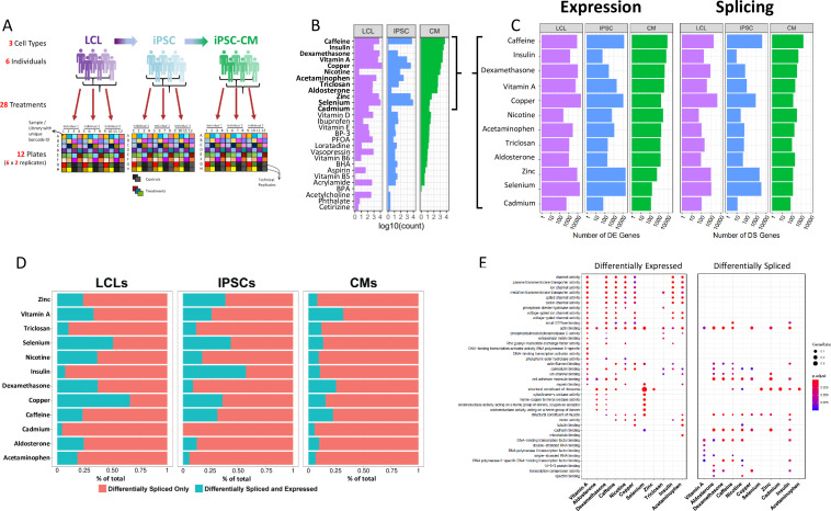
Figure 1.

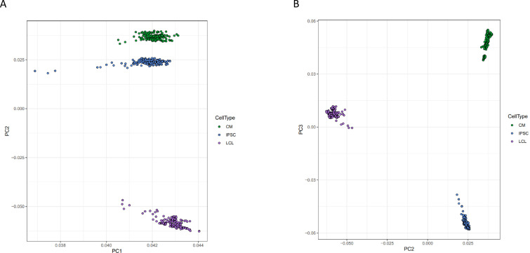
Figure 1—figure supplement 1. Principal component analysis of gene expression.

Figure 1—figure supplement 1.

Principal components analysis was performed on normalized gene expression reads. Each point represents a deep-sequenced library, colored by cell type, for A PC1 vs PC2 and B PC2 vs PC3.
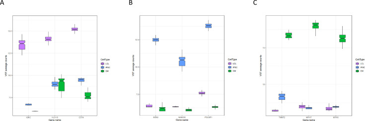
Figure 1—figure supplement 2. Expression of marker genes.

Figure 1—figure supplement 2.

Normalized expression of three marker genes for each cell type from all deep-sequenced libraries are plotted by cell type.
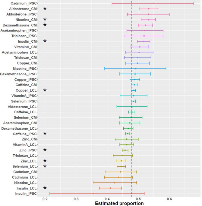
Figure 1—figure supplement 3. Direction of differential splicing.

Figure 1—figure supplement 3.

Forest plot of the proportion of differential splicing events which result in intron retention as opposed to intron excision. An asterisk indicates a significance at FDR <10%.
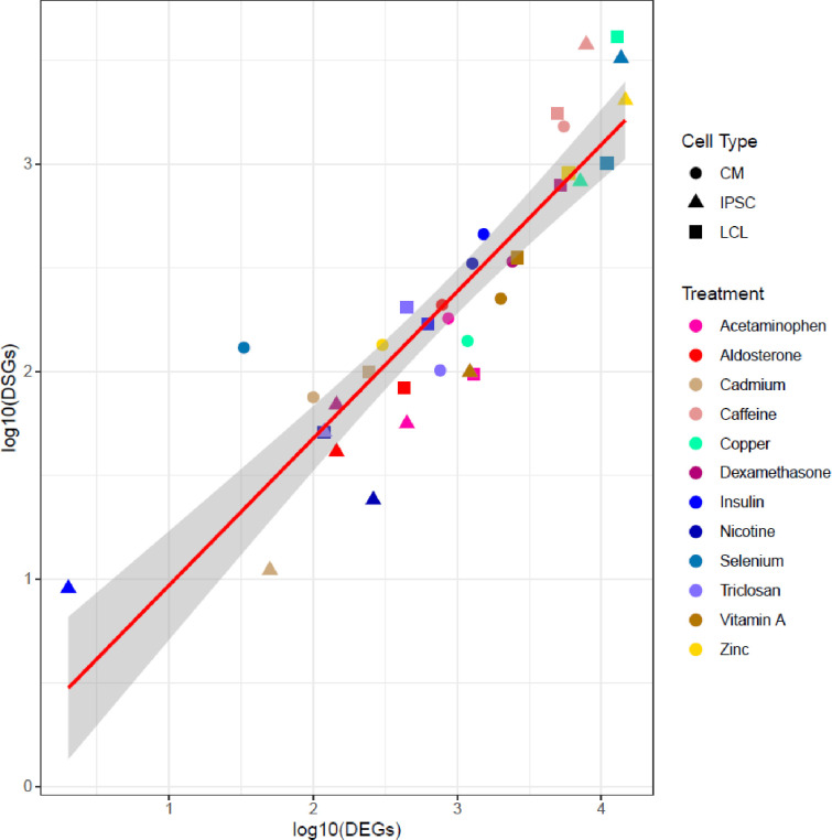
Figure 1—figure supplement 4. Correlation between number of DEGs and DSGs.

Figure 1—figure supplement 4.

Scatterplot between the number of differentially expressed (DEGs) and differentially spliced (DSGs) genes. Each dot represents a unique cell type-environment, with shape and color representing cell type and treatment, respectively.
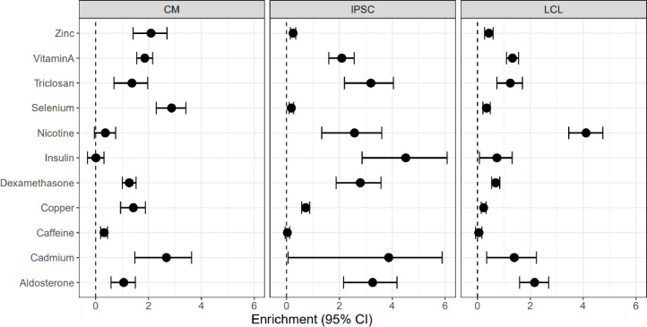
Figure 1—figure supplement 5. Enrichment of DSGs in DEGs.

Figure 1—figure supplement 5.

Enrichment odds ratios and 95% confidence intervals have been log-transformed.
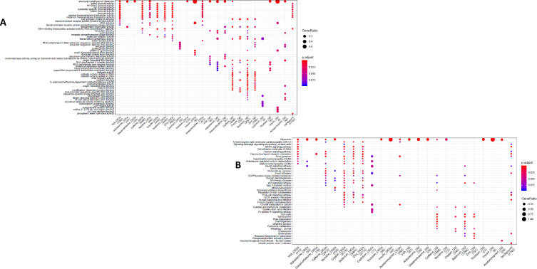
Figure 1—figure supplement 6. GO and KEGG enrichment dotplot for IPSCs.

Figure 1—figure supplement 6.

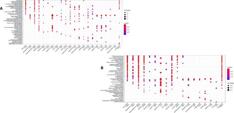
Dotplot generated by ClusterProfiler depicting the top enriched GO (A) and KEGG (B) terms of CM DEGs and DSGs across environments, as well as within a background list composed by all tested genes.
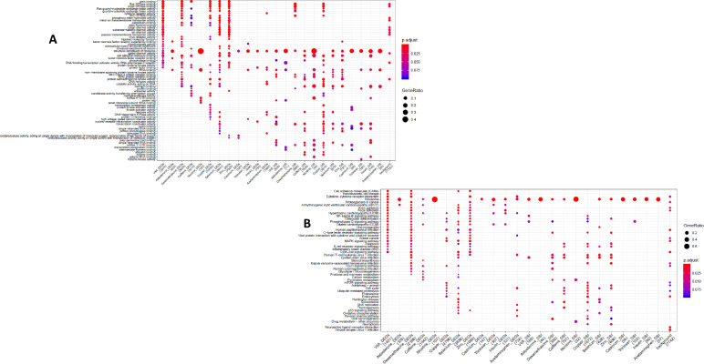
Figure 1—figure supplement 7. GO and KEGG enrichment dotplot for LCLs Dotplot generated by ClusterProfiler depicting the top enriched GO (A) and KEGG (B) terms of CM DEGs and DSGs across environments, as well as within a background list composed by all tested genes.

Figure 1—figure supplement 7.

Figure 1—figure supplement 8. KEGG and DGN enrichment dotplot for CMs Dotplot generated by ClusterProfiler depicting the top enriched KEGG (A) and DGN (B) terms of CM DEGs and DSGs across environments, as well as within a background list composed by all tested genes.

Figure 1—figure supplement 8.