

Abstract
Hawkes processes are used in statistical modeling for event clustering and causal inference, while they also can be viewed as stochastic versions of popular compartmental models used in epidemiology. Here we show how to develop accurate models of COVID-19 transmission using Hawkes processes with spatial-temporal covariates. We model the conditional intensity of new COVID-19 cases and deaths in the U.S. at the county level, estimating the dynamic reproduction number of the virus within an EM algorithm through a regression on Google mobility indices and demographic covariates in the maximization step. We validate the approach on both short-term and long-term forecasting tasks, showing that the Hawkes process outperforms several models currently used to track the pandemic, including an ensemble approach and an SEIR-variant. We also investigate which covariates and mobility indices are most important for building forecasts of COVID-19 in the U.S.
Keywords: COVID-19 forecasting, Hawkes processes, Mobility indices, Spatial covariate, Demographic covariate, Epidemic modeling
1. Introduction
Mathematical modeling and forecasting are playing a pivotal role in the ongoing SARS-CoV-2 (COVID-19) pandemic. In mid-March 2020, a report out of Imperial College London (Ferguson et al., 2020) forecasted severe consequences in the U.S. and U.K. in the absence of significant public health interventions. Governments responded by closing schools, non-essential businesses and releasing general stay-at-home (shelter-in-place) orders in both nations. In the U.S., state and local policymakers are using mathematical models and projections to inform decisions about when and how to relax public health measures that have been put in place. By and large, compartmental models that explicitly incorporate transmission characteristics of infectious diseases have been favored over other statistical modeling approaches. High profile Susceptible-Exposed-Infected-Removed (SEIR) models include those out of the Institute for Health Metrics and Evaluation (IHME) (COVID, Murray, et al., 2020), Columbia University (Pei & Shaman, 2020), MIT (Smith et al., 2020), The Johns Hopkins University (Kinsey et al., 0000), and UCLA (Zou et al., 2020) (in the case of the UCLA model, an SEIR-variant with an unreported compartment is fit using least-squares to reported infection and recovery data). Other strategies apart from SEIR models are CMU-TimeSeries1 and GT-DeepCOVID.2 CMU-TimeSeries uses an auto-regressive time series model fit to case counts and deaths. GT-DeepCOVID is a purely data-driven approach using end-to-end deep learning models to predict mortality every week. Our goal in this paper is to show that Hawkes processes, widely used in the statistical learning community to model contagion patterns in event data are well suited for modeling and forecasting COVID-19 case and mortality data. We will highlight several advantages, including being highly flexible in accommodating auxiliary spatio-temporal features such as county-level demographics and temporal mobility patterns. Yet, mathematically they are connected to compartmental models (Rizoiu, Mishra, Kong, Carman, & Xie, 2018) and allow for explicit incorporation of transmission dynamics (which we briefly review in the following section). Furthermore, extensive research has been conducted on incorporating machine learning techniques into the point process framework. Non-parametric Hawkes processes can be constructed where the triggering kernel is learned (Zhou, Zha, & Song, 2013) and, more recently, fully neural network-based point processes have been developed (Mei and Eisner, 2017, Omi et al., 2019). Sparse linear combinations of Hawkes processes were a winning solution in the 2017 NIJ Crime Forecasting Challenge (Mohler & Porter, 2018). In some instances, a mixture of Hawkes processes may be needed to model more complex event contagion with high dimensional marks through Dirichlet processes (Du et al., 2015, Xu and Zha, 2017). Hawkes processes can also be used for causal inference on networks (Xu, Farajtabar, & Zha, 2016) and recent efforts have also focused on training point processes through reinforcement learning (Li et al., 2018, Upadhyay et al., 2018). Hawkes processes also can take as input auxiliary covariates (Mohler et al., 2018, Reinhart and Greenhouse, 2018, Sancetta, 2018), including spatio-temporal features to model earthquake occurrences (Han et al., 2020, Molyneux et al., 2018, Schoenberg, 2016, Zhuang et al., 2014) and environmental and demographic variables to model crime (Mohler et al., 2018, Reinhart and Greenhouse, 2018). We believe all of these methods have potential applications to modeling infectious diseases that are highly complex due to heterogeneity in the population, environment, and disparate public policies across regional and local jurisdictions. Despite these advantages, to our knowledge, the only U.S. state where a Hawkes process is being used to inform COVID-19 policy is in New Jersey (a collaboration with Facebook AI Research).3
The outline of the paper is as follows. In Section 2, we introduce our Hawkes process model whose productivity (reproduction number) is dynamic and depends on spatio-temporal covariates. Unlike recently introduced models that incorporate covariates into the background rate of a Hawkes process (Mohler et al., 2018, Reinhart and Greenhouse, 2018), our Hawkes process model may be viewed as a convolution of lagged mobility with an inter-infection time distribution to estimate the intensity of secondary infections in the future. This is important as phased reopening in the U.S. leads to mobility changes, the effects of which are not realized in the case and mortality data until days or weeks later. Hence the model can be used to forecast changes in transmission and new cases in real-time as mobility changes (see Fig. 1). We estimate the intensity and dynamic reproduction number of the virus within an EM algorithm through a regression on Google mobility indices and demographic covariates in the maximization step. In Section 3, we validate the approach on both short-term and long-term forecasting tasks, showing that the Hawkes process outperforms several models from “The COVID-19 Forecast Hub Network4 ”. These models include SEIR models from Columbia University (Pei & Shaman, 2020), Johns Hopkins University Applied Physics Lab (Kinsey et al., 0000), and an ensemble model from Berkeley that uses combined linear and exponential predictors with spatial covariates (Altieri et al., 2021). We also investigate which covariates and mobility indices are most important for building forecasts of COVID-19 in the U.S. In Section 4, we discuss directions for future research and how the machine learning community may be able to help improve Hawkes process models of COVID-19 as the pandemic continues to unfold.
Fig. 1.

The framework of the Hawkes process model for COVID-19 transmission. Demographic features at the county level impact the reproduction number of the Hawkes process. Lagged changes in mobility impact future secondary infections through a convolution with the inter-infection distribution . The output of the model includes (1) forecasts of future cases and mortality through simulation of the Hawkes process intensity, (2) an estimate of the dynamic reproduction number of the virus, and (3) regression results that allow for interpretation of the covariates that influence transmission differences across counties.
2. Hawkes process model of COVID-19 transmission
This section introduces a Hawkes process with spatio-temporal covariates for modeling COVID-19 case and death data. We then discuss the connection of the model to compartment models used in epidemiology and develop an expectation–maximization algorithm for inference.
2.1. Incorporating covariates into the Hawkes process
We propose a novel Hawkes process model that simultaneously estimates the intensity of events and tracks the dynamic reproduction number of the virus. Given the timestamps (or dates), , of daily reported positive test cases or deaths, we model the rate of new cases (or deaths) in each country as follows:
| (1) |
where is the background rate modeling imported infections, is the inter-infection time distribution, are mobility indices on day , and are static demographic features. The time-varying reproduction number is a function of mobility indices and demographic features. It can be interpreted as the average number of secondary infections caused by a primary infection. Because we are modeling reported infections rather than time of exposure, we introduce the parameter to capture a potential lag between a mobility change and the time of a reported primary infection. Here, we combine the spatial and temporal covariates, and we model the dynamic reproduction number through a Poisson regression (Eq. (2)) where the coefficients are shared across the counties:
| (2) |
Our approach is related to those in recent preprints that incorporate mobility into compartment models (Kinsey et al., 0000, Miller et al., 2020), however those approaches typically involve large-scale Monte Carlo simulations when performing inference. As we will show, the Hawkes process likelihood can be maximized without simulation via an efficient expectation–maximization algorithm.
2.2. Mathematical connection between Hawkes processes and compartmental models
Here we briefly review several variations of the Hawkes process in Eq. (1) that can be connected to SEIR-type compartment models. The first variant is the SIR-Hawkes process. This model captures the long-term evolution of a pandemic by incorporating a pre-factor that accounts for the dynamic decrease in the number of susceptible individuals (Rizoiu et al., 2018):
| (3) |
Here is the cumulative number of infections that have occurred up to time and is the total population size. The point process governed by Eq. (3) is a continuous-time analog of a discrete stochastic SIR model when is specified to be exponential (Rizoiu et al., 2018). When is chosen to be gamma distributed, the Hawkes process also can approximate staged compartment models, like SEIR, if the average waiting time in each compartment is equal (Lloyd, 2001). More complex parametric (or non-parametric) inter-infection time distributions may be employed within the Hawkes process framework when a SIR or SEIR model cannot capture disease dynamics. In the early exponential growth stage of an epidemic, before finite population effects play a role, the Hawkes process in Eq. (1) without the prefactor can be used to model new infections arising from SIR and SEIR models, as will be small.
While a prefactor in the Hawkes process involving the cumulative number of infections is necessary to model long-term disease dynamics, in the early stages of transmission a linear Hawkes process can be used (as the prefactor will be close to 1),
| (4) |
To illustrate this, we simulate a SEIR differential equation,
| (5) |
where the parameters are chosen similar to those of COVID-19 estimates reported in Bertozzi et al., 2020, Imai et al., 2020. In particular we let , , , and and note that these parameters are not from any specific locations. We then fit the linear Hawkes process model in Eq. (4) to new infections, , generated by the SEIR model. We use a non-parametric histogram estimator for and find a close fit between the Hawkes process and the SEIR model in Fig. 2.
Fig. 2.
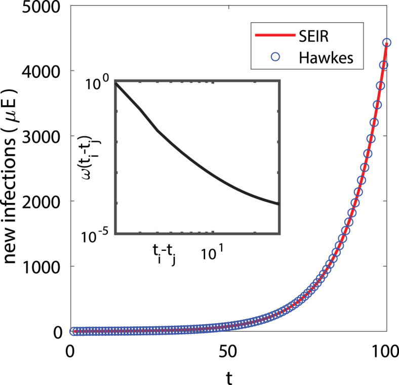
(Main figure) The  plot shows new infections () from the SEIR differential equation , , , , where , , , , and . The
  squares show the linear Hawkes process fit to the SEIR curve of new infections. Inset: Non-parametric histogram estimate for .
In Rizoiu et al. (2018), the rate of events in a SIR-Hawkes process is established to be equal in expectation to new infections in the SEIR model after marginalizing out recovery events that are unobserved in a Hawkes process. In Fig. 2, we show that in the early stage of spreading, the rate in a linear Hawkes process can also be used to approximate new infections .
2.3. EM algorithm for parameter inference
We use an expectation–maximization (EM) algorithm to estimate the model in Eq. (1), which has been widely used for Hawkes Process estimation (Marsan and Lengline, 2008, Marsan and Lengliné, 2010, Veen and Schoenberg, 2008). First, we introduce latent random variables, , that represent the event that secondary infection is caused by primary infection in county . We let represent the event that case is imported. The complete data log-likelihood is then given by,
| (6) |
Here we use a Weibull distribution (Cowling et al., 2010, Hellewell et al., 2020, Obadia et al., 2012) with shape and scale to model inter-infection times, which we find accurately models the present data.
As the branching structure of the process is unobservable, we optimize the complete data log-likelihood in Eq. (6) by iteratively alternating between an expectation step where the branching probabilities are estimated and a maximization step where model parameters are updated by maximizing Eq. (6). The EM-algorithm is equivalent to a projected gradient ascent on the likelihood of the Hawkes process (Lewis & Mohler, 2011).
2.3.1. Expectation step
During the expectation step, we estimate the latent variables for each county. Given the parameters , , and estimated from the last iteration, the probabilities that case was caused by case (Eq. (7a)) or was imported (Eq. (7b)) are given by:
| (7a) |
| (7b) |
Note that the rate in Eq. (1) is considered to be an aggregation of triggering kernels from all previous historical events (i.e., all ) and the background rate . Therefore, we can consider the probability of case caused by case , , as the contribution of primary infection in the event rate at time , i.e., , and can be seen as the contribution of the background rate.
2.3.2. Maximization step
We then maximize the complete data log-likelihood with respect to the model parameters, conditioned on the estimated branching structure . During estimation, we do not include event pairs when is within days of the last day of the dataset, as the offspring events have not yet been realized and the inclusion of these incomplete data biases parameter estimates. We choose as the incubation period for COVID-19 is thought to extend to 14 days given by the Clinical Care Guidance from the CDC: https://www.cdc.gov/coronavirus/2019-ncov/hcp/clinical-guidance-management-patients.html. For simplicity, the summation over in the likelihood function, Equation , is replaced with in the description for the maximization step. Here, represents the number of events that are within ().
Given the latent variable , the maximization of Eq. (6) can be decoupled into three independent optimization problems. Starting with the coefficient from Poisson regression, the maximization of likelihood function can be rewritten as the following:
| (8) |
Because the last days are removed from the dataset and we assume that all possible offspring pairs (i, j) have been observed, we can therefore approximate the integrals for the inter-infection time in Eq. (6) as is done in Schoenberg (2013) by noting that . The optimization problem is therefore a Poisson regression, where we regress the observations against the covariates :
| (9) |
The same optimization strategy can be applied on the shape and scale parameters, and . The optimization problem can then be solved as a weighted maximum likelihood estimation for the Weibull shape and scale parameters:
| (10) |
where is the weight of each inter-infection time observation .
Third, the background rate is determined analytically:
| (11) |
Pseudocode for the EM algorithm is presented in the Algorithm 1.

We note that the EM algorithm of the Hawkes process is also connected to the dynamic reproduction number estimator of Wallinga and Teunis (2004), as the latter can be viewed as a 1-iteration EM algorithm where a histogram estimator is used for with initial guess . More details are discussed in the following section.
2.4. Connection of EM algorithm for Hawkes process and dynamic R estimator of Wallinga and Teunis
Here we make the connection between the EM algorithm for the Hawkes process and the popular dynamic reproduction number estimator of Wallinga and Teunis (Cauchemez et al., 2006, Obadia et al., 2012, Wallinga and Teunis, 2004). The dynamic estimator of Wallinga and Teunis is constructed as follows. The probability that individual at time was infected by individual at time is defined to be,
| (12) |
where the distribution of inter-infection times is typically modeled as Weibull, Gamma, or log-normal (Obadia et al., 2012). The expected total number of individuals that infects is then given by:
| (13) |
Wallinga and Teunis then obtain an estimate of the dynamic reproduction number by averaging overall observed cases where the time of infection occurred on the day :
| (14) |
(here is the number of observed infections on day ).
On the other hand, for the Hawkes process the intensity (rate) of infections is modeled as
| (15) |
where and are the inter-infection time distribution and dynamic reproduction number respectively. Rather than modeling as dependent on mobility, we can instead model as a piece-wise constant function:
| (16) |
Here the are intervals discretizing time, is the number of such intervals, and is the estimated reproduction rate in the interval .
Given initial guesses for the model parameters and , the EM algorithm for the Hawkes process iteratively updates the parameters and branching probabilities by alternating between the
E-step update:
| (17) |
| (18) |
and M-step update:
| (19) |
| (20) |
| (21) |
where is the total length of the observation period, is the total number of events in interval , and the is estimated via weighted MLE (for either a Gamma, Weibull or log-normal) using the inter-event times as observations and branching probabilities as weights. We also drop event pairs when is within days of the last day of the datasets in consideration of the incubation period.
Finally, we can compare Eq. (17) to Eq. (12). The dynamic estimator in Eq. (12) is what you obtain with 1 step of the EM algorithm in Eq. (17) with initial guess , and 1 day chosen as the bin width for the histogram estimator.
2.5. Hawkes process forecasting
We forecast future events using the branching process representation of the Hawkes process. We first simulate immigrant events through the Poisson process based on the background rate. For each event in the history of the process, we then simulate a Poisson random variable with mean representing the number of secondary infections caused by event . For each of these infections, we simulate the time of infection by drawing inter-event times from the estimated Weibull distribution. For example, for an event on day 4, it may cause a secondary infection on day 22 if we draw a sample as 18 from the Weibull distribution. Events falling in the future (past the forecasting date) are then used to update the forecasted intensity through Eq. (1). We simulate multiple realizations of this process ( times in our application) to estimate a mean intensity forecast along with confidence intervals.
3. Experiments and results
In this section, we first provide details on the datasets and baseline models used in our experiments. We then discuss the experimental results of several COVID-19 retrospective forecasting tasks at the U.S. county level. The source code and dataset are included in the supplemental material and are available online in an anonymous repository.5
3.1. Datasets
3.1.1. Covid-19 daily cases and deaths reported by The New York Times
The New York Times (NYT) (The New York Times, Coronavirus in the U.S.: Latest Map and Case Count, 2020)6 releases a daily report of the cumulative numbers of COVID-19 cases in the United States at the county level and over time. While NYT data closely tracks data aggregated by a project at Johns Hopkins University (Dong, Du, & Gardner, 2020), NYT county-level reporting started earlier and is therefore used in this study. In total, there are 3217 counties with cases and/or deaths in the dataset. The time series data are compiled from state and local government health departments. To have sufficient data for statistical inference, we select the counties with confirmed cases greater than and equal to (denoted by ) and the counties with at least death (denoted by ) by 11/10/2020 when the dataset is curated. In total, there are 2824 and 2545 counties in these two datasets. Parameter sharing may improve models in counties with fewer data through variance reduction but can potentially bias estimates in more populated counties with more cases.
We, therefore, assess model performance over different subsets of counties grouped by case volume. We first rank counties by the number of confirmed cases and deaths by the cut-off date, 11/30/2020, and we then evaluate forecasting accuracy on the top-10% of counties (denoted by ), the top-25% counties (denoted by ), and counties between the top-25% and top-50% quantiles (denoted by ).
In Fig. 3, Fig. 3, we present the distribution of the cumulative confirmed cases and deaths at three different quantiles up to the cut-off date 11/30/2020. As the counties at the top-50% have more than 1,000 confirmed cases and ten deaths, some urban counties, mostly at the top-10%, had already surpassed 10,000 confirmed cases and accumulated more than 300 deaths. In Fig. 4, Fig. 4, we show the daily reported confirmed cases and deaths of top-3 counties in and from and , respectively. Given different demographics and different COVID-19 regulations, each state went through different phases. For example, while Cook, IL seemed to contain the first spike after May, the confirmed cases in Los Angeles, CA seem steadily increase and only slow down after July. The daily death toll of Maricopa, AZ only hit its record high only after August unlike Los Angeles, CA, which had already had their first wave in terms of deaths in April. Overall, the deaths are increasing as the U.S. heads into the winter months. Such differences in infection rates suggest that different public health and social measures may need to be tailored county by county. Therefore, the proposed county-level forecasting model may aid local government policymakers in understanding the demographic and mobility factors that play a role in the local reproduction of the virus.
Fig. 3.

Distribution of cumulative cases reported at 11/30/2020 at different quantiles.
Fig. 4.

Example of the daily # of confirmed cases/deaths.
3.1.2. Google mobility index reports
We use Google daily mobility index reports at the county level (Google, 2020) to estimate a dynamic reproduction number that tracks changes in movement patterns due to stay-at-home orders (and their staged removal). In total, there are mobility types, including grocery & pharmacy, parks, transit stations, retail & recreation, residential, and workplaces. Mobility indices for each category and county are calculated with respect to a baseline value for that day of the week The baseline day of the week is the median value from the 5-week period from 01/03/2020 to 02/06/2020. That is, the values are the relative number of visitors for counties in each category. Note that during the model training, we introduce the parameter to capture a potential lag between a mobility change and the time of a reported primary infection. We use the mobility in training data from the previous days to infer the reproduction number as we make forecasts. If the forecast target is more than , we would use the most recent value from the day of the week in the training data.
We drop “workplace” mobility from our analysis due to high collinearity with “residential” mobility. Some mobility data are missing when data is sparse for a given date. To deal with missing values, we adopt multivariate feature imputation,7 which estimates each missing mobility entry as a function of other mobility types on the same day in the same county. We show some heatmaps of mobility patterns across counties and time in Fig. 5, where a major change can be observed coinciding with stay-at-home orders (the first state-wide stay-at-home order was issued on 03/21/2020). Also, the reopening phase in most of the counties can be seen after May. For counties hit by COVID-19 the most (i.e., those in the top-10%), we can also observe some strict regulations in the “Retail and recreation” areas and better compliance with stay-at-home orders based on high mobility in the “Residential” area.
Fig. 5.

Heat map of mobility indices across counties in and over time.
3.1.3. County-level demographic covariates
We incorporate spatial demographic features that may be predictive of symptomatic cases of COVID-19 (which are more likely to result in testing and mortality). The dataset is available in a curated form (Altieri et al., 2021) and is derived from CDC and census datasets. The data is at the county level and includes population, median age, number of hospitals and ICU beds, percentage of smokers and diabetes, and heart disease mortality.
In Fig. 6, we present two examples of spatial demographic features at the county-level used to model variations in the reproduction number. In Fig. 6(a) we observe that both the east and west coasts of the United States are more densely populated compared to midwestern and western regions. Diabetes percentage (shown in Fig. 6(b)), on the other hand, is mostly higher in southern regions of the U.S.
Fig. 6.

Examples of spatial demographic and health features at the county-level.
3.2. Baseline models and experimental setup for retrospective forecasting comparison
We compare the Hawkes process model in Eq. (1) with several models including an SEIR model used in a pandemic tracking dashboard8 out of Columbia University (Pei & Shaman, 2020) (denoted by ), a geospatial SEIR Model from the Johns Hopkins University Applied Physics Lab (Kinsey et al., 0000) (denoted by ), and an ensemble model with linear and exponential predictors from the University of California, Berkeley (Altieri et al., 2021) (denoted by ). Note that all three competing models are tested directly from the released source code, and we follow the same experimental protocol as our proposed model. A simplified Hawkes process, denoted by , where the reproduction number is held constant, is used for comparison to demonstrate the effectiveness of tracking the reproduction number dynamically. We also compare our full Hawkes process model, denoted by , to a Hawkes process, , with only mobility features to determine the marginal improvement of adding demographics.
We backtest the six competing models on the and datasets using the “walk-forward” validation approach. In particular, for 7-day forecasts, we first train the models based on cases and deaths before the first cut-off date, 04/15/2020, and then forecast through 04/21/2020. We then slide the forecasting window, training on data before 4/22/2020 and forecasting from 04/22/2020 to 04/28/2020. We repeat this process until the final date of 05/19/2020 (a similar approach is used for 14 and 28-day forecasts). The multivariate imputation models are also trained in the same walk forward fashion to avoid possible data leakage. The hyper-parameter of the lag parameter ranges from 7, 14, 21, and 28 days in our experiments. For each of the forecasts, we simulate them times, and the point estimate is made through the average.
We evaluate the models according to mean absolute error, , averaged across counties and forecasting windows of the same length, along with percentage error, . Mean absolute error () and the percentage error () are calculated as follows:
| (22) |
where , and are the number of reported events and predicted events, respectively. We also compare the ranking quality of the competing models using Normalized Discounted Cumulative Gain () (Järvelin & Kekäläinen, 2002), which can be used to evaluate the power of recommendations for counties with potential COVID-19 spikes in the near future.
3.3. Experimental results
In Table 1, Table 2, we present the experimental results for 7, 14, and 28 days window forecasts of for all models applied to both confirmed cases () and deaths (), and in Table 3, Table 4, we report the results for . In terms of and , both of our proposed models, and , outperform the models, and , by a large margin in all three forecasting periods and across quantile subsets of the data. The improvements of and can also be seen in the simplistic baseline Hawkes process, . This suggests that the Hawkes process approach has good potential for modeling infectious disease due to the self-exciting properties that lie in the COVID-19 cases.
Table 1.
on predicted confirmed cases .
| Model | 7-days |
14-days |
28-days |
||||||
|---|---|---|---|---|---|---|---|---|---|
| 809.40 | 415.88 | 55.30 | 1664.90 | 857.93 | 117.86 | 3432.57 | 1779.56 | 252.43 | |
| 238.30 | 134.83 | 33.86 | 585.81 | 324.32 | 88.87 | 1963.52 | 1090.36 | 207.81 | |
| 404.49 | 212.80 | 37.45 | 883.69 | 459.77 | 89.85 | 2085.88 | 1116.91 | 229.33 | |
| 224.35 | 120.61 | 24.02 | 569.49 | 300.06 | 55.45 | 1803.63 | 935.83 | 165.92 | |
| 211.59 | 114.34 | 22.44 | 519.00 | 271.86 | 49.83 | 1573.58 | 835.59 | 136.60 | |
| 210.72 | 114.69 | 22.38 | 522.92 | 276.28 | 49.86 | 1611.48 | 893.65 | 132.79 | |
The best performance is marked in bold.
Table 2.
on predicted confirmed cases .
| Model | 7-days |
14-days |
28-days |
||||||
|---|---|---|---|---|---|---|---|---|---|
| 15.56 | 7.89 | 1.12 | 30.66 | 15.55 | 2.20 | 56.85 | 29.37 | 4.41 | |
| 10.96 | 5.83 | 1.16 | 19.10 | 10.58 | 2.31 | 78.17 | 42.99 | 8.56 | |
| 8.23 | 4.55 | 1.00 | 16.07 | 8.70 | 1.83 | 29.55 | 16.56 | 3.98 | |
| 8.49 | 4.59 | 1.04 | 17.38 | 9.18 | 1.98 | 47.13 | 24.29 | 4.32 | |
| 7.19 | 4.07 | 1.01 | 13.40 | 7.55 | 1.78 | 33.30 | 18.23 | 3.74 | |
| 7.24 | 4.07 | 1.01 | 13.68 | 7.53 | 1.77 | 35.99 | 19.18 | 3.60 | |
The best performance is marked in bold.
Table 3.
on predicted confirmed cases .
| Model | 7-days |
14-days |
28-days |
||||||
|---|---|---|---|---|---|---|---|---|---|
| 91.00 | 90.40 | 84.07 | 94.41 | 94.63 | 92.83 | 95.76 | 96.17 | 96.94 | |
| 10.23 | 12.08 | 41.09 | 24.60 | 29.42 | 90.24 | 41.19 | 47.74 | 515.17 | |
| 19.61 | 20.12 | 35.58 | 28.05 | 27.90 | 69.61 | 47.91 | 49.24 | 97.86 | |
| 11.52 | 11.31 | 14.36 | 17.33 | 17.02 | 19.60 | 41.25 | 40.06 | 39.11 | |
| 11.72 | 10.75 | 15.44 | 13.92 | 15.10 | 15.08 | 38.77 | 38.20 | 46.38 | |
| 10.16 | 10.35 | 12.95 | 15.30 | 13.45 | 16.91 | 41.96 | 33.33 | 41.31 | |
The best performance is marked in bold.
Table 4.
on predicted confirmed cases .
| Model | 7-days |
14-days |
28-days |
||||||
|---|---|---|---|---|---|---|---|---|---|
| 72.56 | 72.25 | 45.10 | 81.93 | 81.96 | 73.62 | 90.21 | 90.53 | 87.16 | |
| 23.39 | 26.35 | 18.05 | 19.23 | 19.27 | 24.74 | 73.77 | 78.90 | 173.88 | |
| 17.64 | 16.08 | 14.71 | 15.63 | 13.93 | 20.22 | 15.36 | 13.20 | 36.19 | |
| 17.97 | 16.99 | 15.81 | 20.03 | 20.71 | 16.17 | 48.79 | 44.15 | 28.17 | |
| 16.77 | 15.59 | 13.80 | 20.40 | 17.38 | 13.72 | 33.03 | 52.51 | 22.04 | |
| 17.53 | 16.92 | 14.05 | 18.18 | 15.23 | 16.93 | 38.31 | 44.78 | 17.66 | |
The best performance is marked in bold.
We found that adding mobility indices improves , where forecasting accuracy of also increases across the subsets and all forecasting windows. For example, the improvements on over can go up to 13%, 11%, and 18% for 28 days forecast when is applied to , , and in , respectively. A similar decrease on can be observed when is applied to three quantile subsets in , where outperforms by 29%, 25%, and 13% in , respectively. In terms of , stays ahead of with only one exception at of in 28 days forecasting. This shows that by modeling the reproduction number through daily mobility indices we can enhance the forecasting accuracy and obtain more precise estimations on the spikes in the future.
By adding demographic features, we can marginally boost the and of over in some cases. In general, the variation, , also shows similar improvements over the competing models. In particular, has the best enhancement over at in for 28 days forecast, which is 20%. This demonstrates that the major forecasting power comes from the joint modeling of mobility indices in the reproduction number while the choices of the background rate and inter-infection distribution may only play a minor part.
Moreover, we notice that model is a competitive baseline in where it has better accuracy in a few cases, such as and and for 28 days forecast. A possible explanation for its advantage could be the CDC-recommended parameters that have been introduced to aid the model training, especially for recovery and deaths compartments in its SEIR model. Those parameters include case fatality ratio, case hospitalization ratio, time between death and reporting, etc. However, introducing such pre-trained parameters from CDC may not be practical in real-time forecasting and may potentially bring in the data leakage issue.
In Table 5, Table 6, we present the results for the ranking evaluation. Generally, the proposed models have a better performance when applied to confirmed cases for most quantile subsets. In terms of on the dataset, the baseline Hawkes process, , performs better in some cases, but the proposed method consistently comes in second for most forecasting windows. By generating rankings with good qualities, can serve as a recommender system for the hotspot counties, and the public health policymakers can tailor strategies specifically for each region to contain the virus. We also note that we are estimating inter-event distributions of observed cases (ignoring asymptomatic cases). Therefore these are observed or “effective” inter-event distributions rather than true inter-infection distributions based on longitudinal data. We believe this approach is justified by the model’s performance in forecasting observed cases (and this approach is taken in other applications, like seismology, where some earthquakes are not observed).
Table 5.
on predicted confirmed cases .
| Model | 7-days |
14-days |
28-days |
||||||
|---|---|---|---|---|---|---|---|---|---|
| 0.7225 | 0.7039 | 0.8232 | 0.6946 | 0.6793 | 0.8412 | 0.6696 | 0.6614 | 0.8589 | |
| 0.9626 | 0.9526 | 0.8620 | 0.9418 | 0.9402 | 0.8704 | 0.9015 | 0.8843 | 0.8739 | |
| 0.9283 | 0.9279 | 0.8600 | 0.9269 | 0.9216 | 0.8768 | 0.9013 | 0.8957 | 0.8813 | |
| 0.9738 | 0.9757 | 0.8680 | 0.9697 | 0.9704 | 0.8926 | 0.9414 | 0.9419 | 0.8879 | |
| 0.9706 | 0.9728 | 0.8673 | 0.9715 | 0.9755 | 0.8956 | 0.9502 | 0.9521 | 0.8958 | |
| 0.9734 | 0.9759 | 0.8672 | 0.9752 | 0.9758 | 0.8932 | 0.9493 | 0.9503 | 0.8918 | |
The best performance is marked in bold.
Table 6.
on predicted confirmed cases .
| Model | 7-days |
14-days |
28-days |
||||||
|---|---|---|---|---|---|---|---|---|---|
| 0.6746 | 0.6607 | 0.7057 | 0.6823 | 0.6529 | 0.7666 | 0.7003 | 0.6837 | 0.8050 | |
| 0.9126 | 0.9010 | 0.7451 | 0.9095 | 0.8945 | 0.7849 | 0.8696 | 0.8240 | 0.8043 | |
| 0.9161 | 0.9160 | 0.7301 | 0.9217 | 0.9222 | 0.7797 | 0.9074 | 0.9095 | 0.8278 | |
| 0.9506 | 0.9493 | 0.7548 | 0.9475 | 0.9469 | 0.8011 | 0.9293 | 0.9297 | 0.8212 | |
| 0.9491 | 0.9476 | 0.7598 | 0.9446 | 0.9457 | 0.8007 | 0.9299 | 0.9315 | 0.8195 | |
| 0.9504 | 0.9474 | 0.7597 | 0.9502 | 0.9514 | 0.7963 | 0.9368 | 0.9372 | 0.8176 | |
The best performance is marked in bold.
3.3.1. Importance of covariates
In Table 7, Table 8, we show the dynamic reproduction number coefficients of estimated from the Poisson regression component (Eq. (2)) when applied to and , respectively. The -value is calculated from the Poisson regression analysis in the M-step after the EM algorithm reaches convergence. The absolute value of the coefficients indicates the magnitude of the correlation between the reproduction number and the features. With the exception of population estimation in , the coefficients of all variables are statistically significant at the 10−7 level or below. The dynamic reproduction number is positively correlated with “Retail and recreation” while negatively correlated with “Residential”, meaning that as mobility shifted away from commercial areas towards residences, the reproduction number decreased. In terms of spatial covariates, the reproduction number is positively correlated with “Population density” and “# of ICU beds”. This suggests that the regions hit the hardest by COVID-19 are primarily urban areas, where most intensive treatment units are situated. The reproduction number is also negatively correlated with the percent of the population with“ Diabetes” and “Heart disease mortality rate”. Several possible explanations for this observation include that high-risk individuals are more cautious or tend to live in areas with fewer cases, potentially with less population.
Table 7.
Model coefficients ().
| Covariate | coef | pValue |
|---|---|---|
| Retail/recreation | 0.1303 | 0 |
| Grocery/pharmacy | 0.0029 | |
| Transit stations | −0.0102 | |
| Parks | −0.0355 | 0 |
| Residential | −0.1063 | 0 |
| Population density | 0.0220 | 0 |
| # ICU beds | 0.0110 | |
| # hospitals | 0.0106 | |
| Median age | −0.0049 | |
| Population est. | −0.0214 | 0 |
| Smokers % | −0.0361 | 0 |
| Heart disease mort. | −0.0453 | 0 |
| Diabetes % | −0.0589 | 0 |
The first 5 covariates are mobility indices, followed by static demographic covariates and two types of coefficients are sorted, respectively.
Table 8.
Model coefficients ().
| Covariate | coef | pValue |
|---|---|---|
| Retail/recreation | 0.1047 | |
| Grocery/pharmacy | 0.0746 | |
| Transit stations | 0.0276 | |
| Residential | −0.0929 | |
| Parks | −0.1294 | 0 |
| # ICU beds | 0.0423 | |
| Population density | 0.0409 | 0 |
| Population est. | 0.0062 | |
| Median age | −0.0157 | |
| Heart disease mort. | −0.0250 | |
| # hospitals | −0.0423 | |
| Diabetes % | −0.1041 | |
| Smokers % | −0.1448 | |
The first 5 covariates are mobility indices, followed by static demographic covariates and two types of coefficients are sorted, respectively.
3.3.2. COVID-19 forecasting and reproduction number analysis
In Fig. 7, we present an example of days projection made through from 10/28/2020 - 11/25/2020 for both and . We can observe that has very promising results in making projections, especially for the short term future, When the number of forecasting windows increases, the forecasting error increase as the task also being more difficult. Moreover, the narrow confidence interval calculated through 100 Hawkes processes simulations suggests that the the proposed model can make relatively stable forecasting. Lastly, based on the projections, the number of confirmed cases soon would hit over 500,000 in the top counties, including Los Angeles, CA, Cook, IL, etc. It is imperative to have a robust framework to help governments to design strategies to combat COVID-19 or, even more, prioritize vaccine distribution.
Fig. 7.

Forecasting for 28 days from 10/28/2020–11/25/2020 .
In Fig. 8, Fig. 9, we find that the estimated dynamic reproduction number closely tracks lagged mobility, where the optimal lag parameter is determined as days for and days for . The top-2 counties in have estimated reproduction numbers initially above 2.5. After stay-at-home orders (around 04/11/2020), mobility in residential areas increased. On the other hand, mobility in retail and recreation decreased, and the reproduction number fell to around , which explains why curves were relatively “flat” in many areas in the U.S. after the lockdown. However, as most states reopened and lifted the restrictions, the reproduction number increased after a large population resumed their daily routine, which can be also be observed by the increased mobility in retail and recreation after July. Lastly, to validate the reproduction numbers, we also compare our results to the ones estimated by Stanford University9 and our estimation matched their findings, which are around 1.5–2.5 initially and 0.5–1.5 up to the beginning of December in 2020.
Fig. 8.

Estimated R of confirmed cases and lagged mobility changes ( days).
Fig. 9.

Estimated R of deaths and lagged mobility changes ( days).
3.3.3. Example of estimated event intensities and weekly forecasts
In Fig. 10, we present examples of the estimated intensities for the following four models: , , , and , and we compare them with the number of cases/death in Cook, IL/Los Angles, CA, respectively. Note that we add , a Hawkes model in which only demographics are used. In these models, and include mobility indices to estimate the reproduction number dynamically, and and have a constant reproduction number for each county. Comparing and , the marginal variance between the intensities suggests that demographic features may not significantly affect modeling the reproduction number in the present data. On the other hand, and yield different fitted intensities compared to and , indicating that mobility is playing an important role.
Fig. 10.

Example of the fitted effect from mobility and demographics.
In Fig. 11, we present an example of weekly forecasts for all models except , which has relatively poor performance. In addition, we compare the forecasts against the true number of cases/deaths of Los Angeles, CA/Cook, IL, respectively, to provide a graphical presentation of the model fits. All models can successfully capture the trend of the number of events, especially the valley around June and July and the spike in November. However, the Hawkes process forecasts are more accurate than and .
Fig. 11.

Example of the weekly forecasts.
3.3.4. Dynamic background rate modeling
In this section, we investigate a potential improvement to the model by incorporating a dynamic background rate . For this purpose we again use mobility as a covariate and estimate the background rate through Poisson regression, where . The reasoning behind this choice is that imported case volume is correlated with mobility, especially in transit stations. Estimation for the corresponding parameter, , is achieved through maximum likelihood estimation (MLE) corresponding to Poisson regression in the M-step of the EM algorithm. This new approach can be seen as a variation of our model that we denote as . We apply this variation of our on the New York Times (NYT) dataset, and we explore the improvements in the forecasting task for 7 and 14 days.
In Table 9, we summarize the performance of the Hawkes model with dynamic background rate, where indicate improvements over the best model from the previous experiments in bold.
Table 9.
Performance and improvements of on and .
| data | evl | 7-days |
14-days |
||||||
|---|---|---|---|---|---|---|---|---|---|
| 206.66 | (1.93%) | 113.95 | (0.34%) | 509.88 | (1.76%) | 271.20 | (0.24%) | ||
| 11.57 | - | 10.44 | - | 14.44 | - | 15.44 | - | ||
| 0.9761 | (0.24%) | 0.9768 | (0.09%) | 0.9735 | - | 0.9739 | - | ||
| 7.12 | (0.98%) | 4.03 | (0.98%) | 13.67 | - | 7.69 | - | ||
| 18.07 | - | 16.87 | - | 16.39 | - | 16.61 | - | ||
| 0.9492 | - | 0.9475 | - | 0.9515 | (0.14%) | 0.9520 | (0.06%) | ||
The performances which have an improvement over the best model from the previous experiments are marked in bold and the improvement (%) over the best models from previous performance is included.In this table, “evl” is the evaluation metrics and “dataset” is the set of COVID reports on which we apply the model.
In Table 9, we can see some marginal improvements over the previous best models, especially for confirmed cases. Further improvements may be possible by monitoring cross-county and cross-state travel patterns, which would be a good direction for future investigation.
3.4. State-level comparison to COVID-19 Forecast Hub
The COVID-19 Forecast Hub10 is a repository that aggregates COVID-19 forecasts from a number of university and research groups following standardized data and forecasting formats. Specifically, such an ensemble was created by calculating each prediction quantile’s arithmetic average for all eligible models for a given location. Recently, the COVID-19 Forecast Hub (Ray et al., 2020) has also introduced an ensemble model that combines the various models submitted to the hub into a single ensemble forecast. Compared to other standalone models, it has demonstrated superior performance in forecasting deaths due to COVID-19 after May 2020 in the 50 states. To better validate our Hawkes process framework, in this section, we compare our model with several individual submissions and the ensemble model from the COVID-19 Forecast Hub.
Several differences between our county-level experiments in the previous sections and the format of COVID-19 Forecast Hub submissions are worth noting. In particular, COVID-19 Forecast Hub forecasts are at the state level, and some team contributions vary significantly in terms of the number of submissions, which locations are included, and whether cases and/or deaths are forecasted. In addition to the differences between the source of COVID-19 reports,11 we also note that only a few teams have complete submissions at each county. Therefore, to fairly compare and contribute to the ensemble model, we adapt our framework by training our models at the state level using reports from the Johns Hopkins University dataset, from 02/15/2020 to 03/21/2021. Also, we incorporate Google mobility index for each state12 and with state-wise demographics13 to model the event intensities, reproduction number, and the background rate in Eq. (1).
3.4.1. Weighted Interval Score
The COVID-19 Forecast Hub uses a quantile-based metric to evaluate forecasts, the weighted interval score (), which considers the uncertainty in the predictive distribution (Bracher, Ray, Gneiting, & Reich, 2021). Given a predictive distribution in the format of quantiles, can be seen as a measure of closeness between the entire distribution and the ground truth. To evaluate with , we first calculate a single interval score .
| (23) |
where is the indicator function, and are the values at and quantiles. We then calculate the weighted sum of interval scores by summarizing accuracy across the entire predictive distribution. The overall is defined as a linear combination of interval scores:
| (24) |
where and . In this manuscript, we use and as in Bracher et al. (2021).
3.4.2. Selection criteria and comparison results
We first select the models which have passed the screening process in the COVID-19 Forecast Hub (Cramer et al., 2021) based on the following criteria: (1) inclusion of forecasts for at least 25 states for deaths; (2) a complete set of quantiles; and (3) at least 19 eligible weeks. We further retain models that have a better score than the baseline proposed by the COVID-19 Forecast Hub (Cramer et al., 2021). The forecasting evaluation starts with the week of 05/04/2020 - 05/10/2020 and then moves forward weekly until 03/15/2021 - 03/21/2021. In each weekly submission, each team makes forecasts for 1 to 4 weeks ahead. One challenge is that each model has a different number of states and forecasting weeks in the submission. Therefore, following a similar fashion in Cramer et al. (2021), we calculate the relative evaluation metric for a fair comparison.
For each state-week combination, we first divide ’s and by each models’ evaluation results, respectively. We then report the geometric mean of relative scores from all state-week combinations in Table 10. Note that all hyper-parameters are selected based on the best performance from the previous week for each state-week combination. Therefore, if the value is less than 1, we can suggest an improvement in terms of the error measurement on average.
Table 10.
Relative and on the JHU dataset.
| Model |
|
|||||||
|---|---|---|---|---|---|---|---|---|
| Relative |
Relative |
|||||||
| 1 wk | 2 wk | 3 wk | 4 wk | 1 wk | 2 wk | 3 wk | 4 wk | |
| 1.00 | 1.00 | 1.00 | 1.00 | 1.00 | 1.00 | 1.00 | 1.00 | |
| Covid19Sim-Simulator |  |
 |
 |
 |
 |
 |
 |
 |
| COVIDhub-baseline |  |
 |
 |
 |
 |
 |
 |
 |
| Karlen-pypm |  |
 |
 |
 |
 |
 |
 |
 |
| COVIDhub-ensemble |  |
 |
 |
1.01 |  |
 |
 |
1.01 |
| Model |
|
|||||||
| Relative |
Relative |
|||||||
| 1 wk | 2 wk | 3 wk | 4 wk | 1 wk | 2 wk | 3 wk | 4 wk | |
| 1 | 1 | 1 | 1 | 1 | 1 | 1 | 1 | |
| Covid19Sim-Simulator |  |
 |
1.05 | 1.39 |  |
1.07 | 1.22 | 1.61 |
| MOBS-GLEAM_COVID |  |
 |
 |
1.25 |  |
 |
1.08 | 1.32 |
| UA-EpiCovDA |  |
 |
 |
1.15 | 1.19 | 1.17 | 1.15 | 1.49 |
| COVIDhub-baseline |  |
 |
1.11 | 1.36 | 1.36 | 1.35 | 1.67 | |
| GT-DeepCOVID |  |
1.01 | 1.21 |  |
1 | 1.05 | 1.18 | |
| IHME-CurveFit |  |
 |
1.12 | 1.64 |  |
 |
1.12 | 1.64 |
| CMU-TimeSeries |  |
 |
1.01 | 1.08 | 1.21 | 1.23 | 1.39 | 1.44 |
| YYG-ParamSearch |  |
1.03 | 1.19 | 1.72 | 1.07 | 1.24 | 1.29 | 1.89 |
| COVIDhub-ensemble | 1.05 | 1.08 | 1.2 | 1.52 | 1.5 | 1.42 | 1.56 | 1.94 |
The best performance is marked in bold and the performances that has outperformed are marked in  . In this table, “N wk” represents the forecasting for N weeks ahead, and “” and “” are the confirmed cases and deaths collected by Johns Hopkins University, respectively. All the metadata information for the competing models can be found in the following url: https://github.com/reichlab/covid19-forecast-hub/tree/master/data-processed.
In terms of confirmed cases (denoted as ), has consistently outperformed the selected models in and except for the COVIDhub-ensemble in the 4th weeks window ahead. Overall, besides , COVIDhub-ensemble has the most competitive results. COVIDhub-baseline and COVIDhub-ensemble model are designed by the COVID-19 Forecasts Hub (Cramer et al., 2021). Here, COVIDhub-baseline serves as a reference point and is generated by the median number of cases from the most recent week, and COVIDhub-ensemble aggregates all the submissions to generate an ensemble forecast.
For the COVID-19 Forecast Hub to generate an accurate ensemble, diverse modeling perspectives can be beneficial. The promising results in indicate that forecasts for confirmed cases can benefit from modeling with a Hawkes process incorporating dynamic covariates. Given that many forecasting groups are using compartmental models, we believe that can potentially enhance the forecasting accuracy of ensemble forecasts through both its accuracy and diversity. Note that all the weekly forecasts were updated in the anonymous repository.14
We note that, in the retrospective evaluation, our model may be slightly favored. Data available when prospective forecasting models were created may have been subject to reporting lags or have been updated at a later date. To completely reconstruct such data is a non-trivial task, therefore we acknowledge this as a limitation of the present work.
4. Conclusion
We showed how Hawkes processes could be combined with spatio-temporal covariates to model COVID-19 transmission and forecast future cases and deaths accurately. The model is competitive with several models used to forecast the pandemic, achieving improved MAE and NDCG scores on a majority of the experiments we conducted. We hope that this work will encourage more research into Hawkes process models of disease spreading that incorporate more advanced features and statistical learning principles. As vaccinations are rolled out across the U.S. (given recent FDA approval), local impacts on dynamic reproduction can be flexibly accommodated by our model and used to obtain more accurate and timely forecasts.
One potential direction for future research is investigating the combination of Hawkes process forecasts with compartmental models for improved ensembles. Our results using data from the COVID-19 Forecast Hub indicate this could be a promising direction. Another potential direction for future research is extending the work here to neural network-based point process models (Mei and Eisner, 2017, Omi et al., 2019). These models may be able to capture more complicated relationships between mobility patterns, demographics, and transmission. The challenges of such an approach include the potential for over-fitting with added parameters and determining how best to realistically model transmission in a neural point process (analogous to the SIR-Hawkes process), which will be important if neural point processes are to be used in long-term forecasting.
Declaration of Competing Interest
The authors declare that they have no known competing financial interests or personal relationships that could have appeared to influence the work reported in this paper.
Acknowledgments
This research was supported by NSF grants SCC-1737585, ATD-1737996 and ATD-2124313.
Footnotes
COVID-19 Forecast Hub has used reports from Johns Hopkins University, and we use reports from the New York Times in our previous application.
Supplementary material related to this article can be found online at https://doi.org/10.1016/j.ijforecast.2021.07.001.
Appendix A. Supplementary data
The following is the Supplementary material related to this article.
The source code and datasets presented in the paper are included in the supplementary data.
References
- Altieri N., Barter R.L., Duncan J., Dwivedi R., Kumbier K., Li X., et al. Curating a COVID-19 data repository and forecasting county-level death counts in the United States. Harvard Data Science Review. 2021 doi: 10.1162/99608f92.1d4e0dae. URL https://hdsr.mitpress.mit.edu/pub/p6isyf0g. [DOI] [Google Scholar]
- Bertozzi A.L., Franco E., Mohler G., Short M.B., Sledge D. The challenges of modeling and forecasting the spread of COVID-19. Proceedings of the National Academy of Sciences. 2020;117(29):16732–16738. doi: 10.1073/pnas.2006520117. arXiv:https://www.pnas.org/content/117/29/16732.full.pdf, URL https://www.pnas.org/content/117/29/16732. [DOI] [PMC free article] [PubMed] [Google Scholar]
- Bracher J., Ray E.L., Gneiting T., Reich N.G. Evaluating epidemic forecasts in an interval format. PLoS Computational Biology. 2021;17(2) doi: 10.1371/journal.pcbi.1008618. [DOI] [PMC free article] [PubMed] [Google Scholar]
- Cauchemez S., Boëlle P.-Y., Donnelly C.A., Ferguson N.M., Thomas G., Leung G.M., et al. Real-time estimates in early detection of SARS. Emerging Infectious Diseases. 2006;12(1):110. doi: 10.3201/eid1201.050593. [DOI] [PMC free article] [PubMed] [Google Scholar]
- COVID I., Murray C.J., et al. Forecasting COVID-19 impact on hospital bed-days, ICU-days, ventilator-days and deaths by US state in the next 4 months. MedRxiv. 2020 [Google Scholar]
- Cowling B.J., Lau M.S., Ho L.-M., Chuang S.-K., Tsang T., Liu S.-H., et al. The effective reproduction number of pandemic influenza: prospective estimation. Epidemiology (Cambridge, Mass.) 2010;21(6):842. doi: 10.1097/EDE.0b013e3181f20977. [DOI] [PMC free article] [PubMed] [Google Scholar]
- Cramer E.Y., Lopez V.K., Niemi J., George G.E., Cegan J.C., Dettwiller I.D., et al. Evaluation of individual and ensemble probabilistic forecasts of COVID-19 mortality in the US. MedRxiv. 2021 [Google Scholar]
- Dong E., Du H., Gardner L. An interactive web-based dashboard to track COVID-19 in real time. The Lancet Infectious Diseases. 2020 doi: 10.1016/S1473-3099(20)30120-1. [DOI] [PMC free article] [PubMed] [Google Scholar]
- Du, N., Farajtabar, M., Ahmed, A., Smola, A. J., & Song, L. (2015). Dirichlet-Hawkes processes with applications to clustering continuous-time document streams. In Proceedings of the 21th ACM SIGKDD International conference on knowledge discovery and data mining (pp. 219–228).
- Ferguson N.M., Laydon D., Nedjati-Gilani G., Imai N., Ainslie K., Baguelin M., et al. Impact of non-pharmaceutical interventions (NPIs) to reduce COVID-19 mortality and healthcare demand. 2020. DOI. 2020;10:77482. doi: 10.1007/s11538-020-00726-x. [DOI] [PMC free article] [PubMed] [Google Scholar]
- Google N.M. Google; 2020. COVID-19 community mobility report. URL https://www.google.com/covid19/mobility/ [Google Scholar]
- Han P., Zhuang J., Hattori K., Chen C.-H., Febriani F., Chen H., et al. Assessing the potential earthquake precursory information in ulf magnetic data recorded in kanto, Japan during 2000–2010: distance and magnitude dependences. Entropy. 2020;22(8):859. doi: 10.3390/e22080859. [DOI] [PMC free article] [PubMed] [Google Scholar]
- Hellewell J., Abbott S., Gimma A., Bosse N.I., Jarvis C.I., Russell T.W., et al. Feasibility of controlling COVID-19 outbreaks by isolation of cases and contacts. The Lancet Global Health. 2020 doi: 10.1016/S2214-109X(20)30074-7. [DOI] [PMC free article] [PubMed] [Google Scholar]
- Imai N., Cori A., Dorigatti I., Baguelin M., Donnelly C.A., Riley S., et al. Imperial College London; 2020. Report 3: transmissibility of 2019-nCoV; pp. 1–6. [Google Scholar]
- Järvelin K., Kekäläinen J. Cumulated gain-based evaluation of IR techniques. ACM Transactions on Information Systems (TOIS) 2002;20(4):422–446. [Google Scholar]
- Kinsey, M., Tallaksen, K., R.F., O., Asher, L., Costello, C., & Kelbaugh, M., et al. (0000). Bucky model: a spatial SEIR model for simulating COVID-19 at the county level. The Johns Hopkins University Applied Physics Laboratory LLC. URL https://buckymodel.com/.
- Lewis E., Mohler G. A nonparametric EM algorithm for multiscale Hawkes processes. Journal of Nonparametric Statistics. 2011;1(1):1–20. [Google Scholar]
- Li S., Xiao S., Zhu S., Du N., Xie Y., Song L. Advances in neural information processing systems. 2018. Learning temporal point processes via reinforcement learning; pp. 10781–10791. [Google Scholar]
- Lloyd A.L. Destabilization of epidemic models with the inclusion of realistic distributions of infectious periods. Proceedings of the Royal Society of London, Series B. 2001;268(1470):985–993. doi: 10.1098/rspb.2001.1599. [DOI] [PMC free article] [PubMed] [Google Scholar]
- Marsan D., Lengline O. Extending earthquakes’ reach through cascading. Science. 2008;319(5866):1076–1079. doi: 10.1126/science.1148783. [DOI] [PubMed] [Google Scholar]
- Marsan D., Lengliné O. A new estimation of the decay of aftershock density with distance to the mainshock. Journal of Geophysical Research: Solid Earth. 2010;115(B9) [Google Scholar]
- Mei H., Eisner J.M. Advances in neural information processing systems. 2017. The neural Hawkes process: A neurally self-modulating multivariate point process; pp. 6754–6764. [Google Scholar]
- Miller A.C., Foti N.J., Lewnard J.A., Jewell N.P., Guestrin C., Fox E.B. Mobility trends provide a leading indicator of changes in SARS-CoV-2 transmission. MedRxiv. 2020 [Google Scholar]
- Mohler G., Carter J., Raje R. Improving social harm indices with a modulated Hawkes process. International Journal of Forecasting. 2018;34(3):431–439. [Google Scholar]
- Mohler G., Porter M.D. Rotational grid, PAI-maximizing crime forecasts. Statistical Analysis and Data Mining: The ASA Data Science Journal. 2018;11(5):227–236. [Google Scholar]
- Molyneux J., Gordon J., Schoenberg F. Assessing the predictive accuracy of earthquake strike angle estimates using nonparametric Hawkes processes. Environmetrics. 2018;29(2) [Google Scholar]
- Obadia T., Haneef R., Boëlle P.-Y. The R0 package: a toolbox to estimate reproduction numbers for epidemic outbreaks. BMC Medical Informatics and Decision Making. 2012;12(1):147. doi: 10.1186/1472-6947-12-147. [DOI] [PMC free article] [PubMed] [Google Scholar]
- Omi T., Aihara K., et al. Advances in neural information processing systems. 2019. Fully neural network based model for general temporal point processes; pp. 2120–2129. [Google Scholar]
- Pei S., Shaman J. Initial simulation of SARS-CoV2 spread and intervention effects in the continental US. MedRxiv. 2020 [Google Scholar]
- Ray E.L., Wattanachit N., Niemi J., Kanji A.H., House K., Cramer E.Y., et al. Ensemble forecasts of coronavirus disease 2019 (COVID-19) in the us. MedRXiv. 2020 [Google Scholar]
- Reinhart A., Greenhouse J. Self-exciting point processes with spatial covariates: modelling the dynamics of crime. Journal of the Royal Statistical Society. Series C. Applied Statistics. 2018;67(5):1305–1329. [Google Scholar]
- Rizoiu, M.-A., Mishra, S., Kong, Q., Carman, M., & Xie, L. (2018). SIR-Hawkes: linking epidemic models and Hawkes processes to model diffusions in finite populations. In Proceedings of the 2018 world wide web conference (pp. 419–428).
- Sancetta A. Estimation for the prediction of point processes with many covariates. Economic Theory. 2018;34(3):598–627. [Google Scholar]
- Schoenberg F.P. Facilitated estimation of ETAS. Bulletin of the Seismological Society of America. 2013;103(1):601–605. [Google Scholar]
- Schoenberg F.P. A note on the consistent estimation of spatial-temporal point process parameters. Statistica Sinica. 2016:861–879. [Google Scholar]
- Smith M., Yourish K., Almukhtar S., Collins K., Ivory D., McCann A., et al. Coronavirus in the US: Latest map and case count. The New York Times. 2020 [Google Scholar]
- 2020. The new york times, coronavirus in the U.S.: Latest map and case count. URL https://www.nytimes.com/interactive/2020/us/coronavirus-us-cases.html. [Google Scholar]
- Upadhyay U., De A., Rodriguez M.G. Advances in neural information processing systems. 2018. Deep reinforcement learning of marked temporal point processes; pp. 3168–3178. [Google Scholar]
- Veen A., Schoenberg F.P. Estimation of space–time branching process models in seismology using an em–type algorithm. Journal of the American Statistical Association. 2008;103(482):614–624. [Google Scholar]
- Wallinga J., Teunis P. Different epidemic curves for severe acute respiratory syndrome reveal similar impacts of control measures. American Journal of Epidemiology. 2004;160(6):509–516. doi: 10.1093/aje/kwh255. [DOI] [PMC free article] [PubMed] [Google Scholar]
- Xu, H., Farajtabar, M., & Zha, H. (2016). Learning granger causality for Hawkes processes. In International conference on machine learning (pp. 1717–1726).
- Xu H., Zha H. Advances in neural information processing systems. 2017. A Dirichlet mixture model of Hawkes processes for event sequence clustering; pp. 1354–1363. [Google Scholar]
- Zhou, K., Zha, H., & Song, L. (2013). Learning triggering kernels for multi-dimensional Hawkes processes. In International conference on machine learning (pp. 1301–1309).
- Zhuang J., Ogata Y., Vere-Jones D., Ma L., Guan H. Seismic imaging, fault damage and heal. De Gruyter; 2014. Statistical modeling of earthquake occurrences based on external geophysical observations: With an illustrative application to the ultra-low frequency ground electric signals observed in the Beijing region; pp. 351–378. [Google Scholar]
- Zou D., Wang L., Xu P., Chen J., Zhang W., Gu Q. Epidemic model guided machine learning for COVID-19 forecasts in the United States. MedRxiv. 2020 [Google Scholar]
Associated Data
This section collects any data citations, data availability statements, or supplementary materials included in this article.
Supplementary Materials
The source code and datasets presented in the paper are included in the supplementary data.