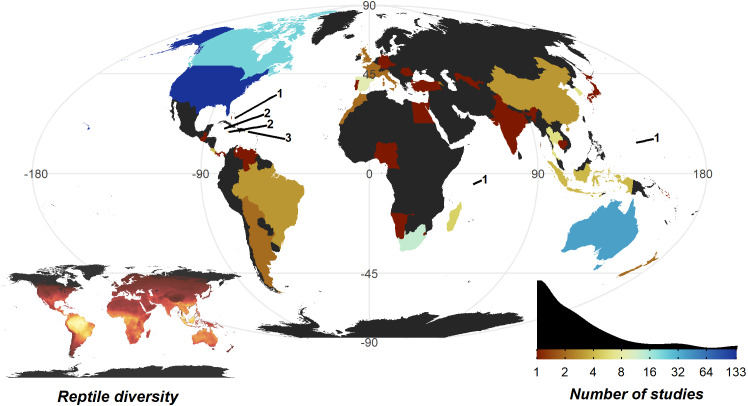
Figure 4. Number of studies undertaken in each country.
Colour scale is detailed in the insert density plot bottom right [blues indicating more studies, reds indicating fewer studies, grey indicating zero studies], showing the distribution of per country study counts. Count of studies is shown on a log scale to help differentiate between countries with fewer studies, a diverging colour scheme was selected to highlight the high-count outliers. Smaller territories are highlighted with a label denoting the number of studies. Insert map bottom left, shows the distribution of reptile species globally, ranging from zero species (black) to 182 species (yellow); the heatmap was generated using GARD data (Roll et al., 2017).

