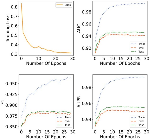
Fig. 3.

Convergence analysis of KG4SL. In the first subgraph, the orange line represents the change of training loss during the training process. In the other three subgraphs, the blue-dotted line represents the variation trend of three metrics (AUC, F1 and AUPR) during the training process. The red-dashed line displays the values of the above metrics for validation set as the increase of epochs. The green dash-dot line denotes the results for test set. At the first 10 epochs, the training loss drops rapidly and the three metrics for training set, validation set and test set increase with a uniform trend. Although at the 20th epoch, the training loss and three metrics begin to converge
