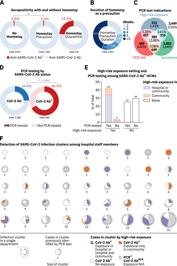
Fig. 4.
Effectiveness of measures to track and prevent SARS-CoV-2 transmission in hospital staff. a SARS-CoV-2 serostatus among staff reporting to have stayed at home for at least two weeks either as a precaution (middle circle) or quarantined (right circle) in comparison to staff members not staying at home (left circle). Participants who indicated to have been quarantined or stayed at home for at least two weeks without reporting to have worked from home were considered quarantined. b HCWs who stayed home as a precaution for at least two weeks grouped by the duration of their homestay. c Total numbers and percentages of anti-SARS-CoV-2 Ab+ HCWs who self-reported on (1) having been tested by PCR, (2) experienced at least one symptom depicted in Fig. 3B, or (3) had a high-risk exposure. d Numbers and percentages of anti-SARS-CoV-2 Ab+ and Ab− staff who were tested for SARS-CoV-2 infection by PCR. e Percentages of anti-SARS-CoV-2 Ab+ HCWs who were tested for SARS-CoV-2 infection by PCR or reported a high-risk exposure in (1) the hospital or the hospital and their community (blue) or (2) their community only (orange). f Analysis of SARS-CoV-2 infection clusters and their detection among HCWs in the hospital. Each pie chart represents one infection cluster and clusters are separated by departments. Inner pie charts represent high-risk exposure types reported by Ab+ study participants in each cluster (blue, orange and white). Grey areas in inner pie charts represent individuals who were PCR-tested at the hospital but did not participate in this study. Grey circles around each pie chart represent the cluster’s fraction of COVID-19 cases previously identified by PCR testing. Numbers below the pie charts indicate the amount of SARS-CoV-2-infected HCWs in each cluster. Study participants reporting a positive PCR test in the study questionnaire were assumed to be identical to those registered at the occupational health office. HCWs who were PCR-tested at the hospital complex but did not participate in the study were added to the respective clusters as recognized cases (grey areas in inner pie charts). p values in a, e were calculated using Fisher’s exact test

