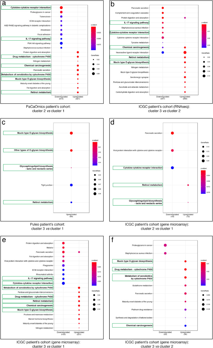
Fig. 5.
KEGG enrichment pathway analysis of prognostic clusters. Dot-plot representations of the top 10 downregulated (left) and upregulated (right) enriched pathways comparing different clusters as follows: (a) cluster 2 vs cluster 1 in PaCaOmics patient's cohort, (b) cluster 3 vs cluster 2 in ICGC patient's cohort (RNA-seq), (c) cluster 3 vs cluster 1 in Puleo patient's cohort, and (d) cluster 2 vs cluster 1, (e) cluster 3 vs cluster 1, (f) cluster 2 vs cluster 1 in ICGC patient's cohort (gene microarray). Dot color gradient corresponds to p-adjusted values of the enrichment score while circle size is proportional to gene ratio in the corresponding pathway. Green squares highlight the best common enriched pathways between clusters. For the complete enriched biological processes and associated statistics, see Supplementary Table S2 (For interpretation of the references to color in this figure legend, the reader is referred to the web version of this article).

