Abstract
Background
Visual communication strategies are becoming increasingly prevalent for conveying information to health professionals as well as to the general public. The potential of social media for rapid knowledge dissemination using infographics was recognized early in the coronavirus disease (COVID-19) pandemic by health professionals.
Objective
The purpose of this study was to describe a coalition of health professionals’ approach to developing infographics about COVID-19 vaccines and the reach and engagement of those infographics when shared through social media.
Methods
Infographics were created by a core team within the coalition following a stepwise approach. Each underwent a multistep review process, readability evaluation, and translation into Spanish. Infographics were then shared through multiple social media platforms. They were grouped into 1 of 3 categories for this analysis: COVID-19 vaccine series, myth debunkers, or other.
Results
All infographics had greater outreach, impressions, and engagement on Twitter than they did on other platforms. When comparing the 3 groups, no 1 infographic type was consistently performing higher than the others.
Conclusion
Each infographic reached thousands to tens of thousands of people. We do not know whether those who viewed these infographics changed their perspective on vaccination, so we are unable to draw a conclusion about their impact on vaccine hesitancy based on this study alone.
Background
In March 2020, in the face of the coronavirus disease (COVID-19) health care crisis, a group of physicians in the Chicago metropolitan area wrote a letter to Illinois Governor J.B. Pritzker about the importance of acting swiftly in the implementation of social distancing to protect their patients, families, and communities.1 This group of colleagues and friends went on to form a grassroots coalition known as the Illinois Medical Professionals Action Collaborative Team (IMPACT). They were joined by other health professionals including nurses, a pharmacist, scientists, and experts in data analysis.2 IMPACT’s ongoing mission “is to activate change that maximally supports Illinois health care workers and the communities they serve by promoting improved quality of health care, personal welfare, and patient and provider safety. Supporting health care workers by definition includes supporting their families, their patients, their communities, and the public good.”3 In addition to statements and open letters to public officials, the coalition collaborates with partners to increase the reach of messaging, shares stories through the IMPACT blog4 and IMPACTful chats,5 and has received media recognitioxn on both a local6 , 7 and national level.8 , 9
IMPACT also has a core team of members responsible for the development of infographics10 to combat misinformation. These infographics reach thousands of people each on Facebook alone and are also shared on other social media platforms such as Twitter and Instagram.
The potential of social media for rapid knowledge dissemination using infographics was recognized early in the COVID-19 pandemic by health professionals.11 , 12 A randomized, placebo-controlled trial conducted by researchers at Indiana University examining whether digital infographics can improve individuals’ trust in science, reduce misinformation believability, and encourage preventive behaviors such as handwashing, social distancing, or vaccination is underway at the time of this submission.13 These results are pending. Another group of researchers evaluated exposure to a corrective graphic on social media and misperceptions COVID-19 prevention strategies.14 They found that lowered misperceptions about science lasted greater than 1 week after viewing an infographic and that the impact of this style of communication was consistent whether the infographic was shared by the World Health Organization (WHO) or an anonymous Facebook user. Furthermore, the effect was the same whether the infographic was shared preemptively or in response to misinformation.
Before the COVID-19 pandemic, infographics shared within the medical community were shown to improve Altmetric scores and abstract views of scientific papers, suggesting increased engagement with content through the use of this visual medium.15 There are also best practices established for this target audience of other members of the scientific or medical community,16 though not all of these strategies may be applicable to patient-facing communication. However, experience with infographics as part of a larger multimedia strategy to combat vaccine hesitancy has been described in the literature.17 In graphic strategies specifically, a survey of young adults aged 18-26 years conducted at the Minnesota State Fair evaluated visual communication about the human papillomavirus vaccine. In this survey study, infographics or humorous graphics were slightly preferred to photos of patients or the disease itself.18 Still, few materials use visual aids to convey important information about vaccines.19
Health care workers consistently rank high in the Gallup poll of most trusted professionals and saw a boost in these ratings in 2020.20 However, they often do not engage for fear of harassment, lack of time, or both. IMPACT’s strategy allowed for amplification of health care worker voices through social media to address vaccine hesitancy and improve vaccine access for at-risk communities in Illinois.
Objective
The purpose of this study was to describe the IMPACT team’s approach to developing infographics about COVID-19 vaccines and the reach and engagement of those infographics when shared through social media.
Methods
Development of infographics was completed by a core team comprising student interns, a physician lead, and IMPACT cofounders. The process for creating each infographic relied on a stepwise approach originally described by Mark Smiciklas.21 Initial steps include identifying the purpose, intended audience, key message to be conveyed, information needed to provide that message, relevant symbols or graphics, and sources for the information. Discerning ease of readability, synthesizing a story, determining composition were completed next, as well as color palette, typography, and selection of title, subtitle, and images. Sources were cited within the infographic, and a placeholder to include the publication date was included on the upper right-hand corner.
Ideas for infographic purpose and key messages were proposed by IMPACT members or based on responses to a needs assessment conducted by the question probe, “What are the Top Reasons for Vaccine Hesitancy Among Healthcare Workers in your Area?,” circulated through 2 national and 1 Chicago-based closed Facebook groups for women physicians. This needs assessment was distributed in December 2020. Responses from the approximately 100 participants were categorized, with the 2 most prevalent reasons for hesitancy being fertility concerns and that the vaccine was “too rushed” or “too new.” IMPACT members generated additional topic ideas on the basis of questions coming up in interactions with patients, communities, or social networks and in response to news or misinformation circulating online.
Infographics were built in the program Venngage.22 Information was gathered from trusted government sites such as CDC.gov, FDA.gov, HHS.gov, and peer-reviewed sources and then distilled into key points. The key points were edited for a lay audience with eighth grade literacy, scored using the program Readable,23 and edited to fit the text to sizable for an image shared on Instagram. This sizing format was selected on the basis of Instagram being the social media platform with the most restrictive sizing requirements of the platforms on which these infographics would later be shared.
Once an infographic draft was created by an individual member of the core team, it was shared with the team lead and advisor for initial review. After this review, it was posted to a private conversation in chat tool channel on the application Slack24 for review by the full infographics core team. On completion of that second review, a final review by a larger group within the coalition took place within a separate private Slack channel. The larger group consisted of additional physicians, researchers, a pharmacist, a health communication expert, and a community outreach liaison. Furthermore, the team had access to a local epidemiologist in the general IMPACT membership who was available for questions, as well as a partnership with epidemiologists from Dear Pandemic.25 After the incorporation of any changes or feedback, the finalized infographics went to a separate Spanish language infographics team for translation. The translated infographics were returned to the core team for sizing. Finalized infographics were uploaded to IMPACT’s webpage. The time required for individual steps in this process varied. Cofounders at times requested an expedited turnaround on an infographic, and in these cases, the full process from request to posting took approximately 5 days (day 1: discussion of initial idea; day 2: development of draft and editing; day 3: review by core team and editing; day 4: review by larger group on Slack channel, editing, and sending to team for Spanish translation; day 5: receive finalized version and posting to social media), but more commonly an infographic was posted 10 days after requested, with more time allotted to the development of the draft and review by the core team.
Infographics were shared on the following platforms: Twitter, Instagram, Facebook, and LinkedIn. Initial social media posts were made to Twitter on the basis of character count limitations. The infographics were then posted to Instagram and Facebook using an automated push between the 2 accounts. These platforms allowed higher character count captions. Each caption included approximately 3 main points from the infographic and 2 additional points with less formal wording and use of emoji pictograms. Hashtags (e.g., #6FeetApartAndMasked, #ThisIsOurShot) and tagging of IMPACT members, partners, and the coalition itself were included to encourage further amplification. Infographics were posted in real time as they were finalized rather than through a scheduling tool to target peak times. This was done in an effort to minimize delays in sharing correct information.
For the purpose of this study, all infographics posted to the IMPACT website between March 29, 2020 and June 16, 2020 were reviewed by 2 infographics core team members and 1 additional IMPACT member to determine if they provided information about COVID-19 vaccines. Each infographic was then categorized as one of the following styles: myth debunkers, COVID-19 vaccine series, or other. Myth debunkers were infographics with a format that followed the fact, myth, fallacy, fact refutation strategy for combating misinformation described in The Debunking Handbook.26 They also shared a common color palette and typography. The COVID-19 vaccine series infographics feature a cartoon image of a young woman asking a question about vaccines. Again, this series used a consistent color palette and typography. The other category included infographics about COVID-19 vaccines that did not fit either of these 2 main categories. Color palette, typography, and overall design varied in this category. Examples of each style of infographic can be found in Table 1 .
Table 1.
Infographic reach and engagement
| Infographic title | Infographic type | Infographic image | Published date | Twitter analytics |
Facebook analytics |
Instagram analytics |
Total |
||||
|---|---|---|---|---|---|---|---|---|---|---|---|
| Impressions | Shares | Reach | Shares | Impressions | Reach | Shares | Reach | ||||
| How Do the New COVID-19 mRNA Vaccines Work? | Vaccine series |  |
January 1, 2021 | 18,559 | 26 | 23,121 | 50 | 373 | 300 | 46 | 41,980 |
| mRNA COVID-19 Vaccines Are NOT Associated With Infertility | Myth debunkers |  |
January 27, 2021 | 19,172 | 26 | 8302 | 49 | 344 | 309 | 11 | 27,783 |
| What’s the Difference Between the Current COVID-19 Vaccines? | Vaccine series | 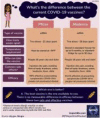 |
February 18, 2021 | 15,465 | 31 | 878 | 8 | 472 | 389 | 46 | 16,732 |
| mRNA COVID-19 Vaccine Timeline Did NOT Sacrifice Safety | Myth debunkers |  |
December 19, 2020 | 9093 | 15 | 1787 | 5 | 360 | 306 | 12 | 11,186 |
| How Were the mRNA COVID-19 Vaccines Developed so Quickly? | Vaccine series | 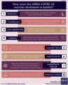 |
January 23, 2021 | 6985 | 16 | 1193 | 5 | 287 | 226 | 15 | 8404 |
| The COVID-19 Vaccines Will NOT Give You COVID-19 | Myth debunkers | 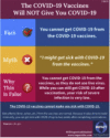 |
February 12, 2021 | 6401 | 13 | 671 | 4 | 263 | 213 | 4 | 7285 |
| Can You Tell Me About the New Janssen (Johnson & Johnson) Vaccine? | Vaccine series | 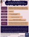 |
8411 | 14 | 1875 | 10 | 318 | 252 | 17 | 10,538 | |
| STILL Wear A Mask In Most Instances After COVID-19 Vaccination | Myth debunkers | 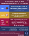 |
March 5, 2021 | 1901 | 7 | 820 | 6 | 288 | 225 | 3 | 2946 |
| Take The First Shot Available To You | Other |  |
March 12, 2021 | 6886 | 13 | 524 | 5 | 423 | 356 | 20 | 7766 |
| How Does the Johnson and Johnson Viral Vector Vaccine Work? | Vaccine series |  |
April 27, 2021 | 8081 | 11 | 766 | 6 | 368 | 308 | 14 | 9155 |
| You Should STILL Get the COVID-19 Vaccine After Having COVID-19 | Myth debunkers |  |
March 31, 2021 | 8343 | 11 | 1789 | 8 | 199 | 155 | 6 | 10,287 |
| New CDC Guidance for Fully Vaccinated | Other | 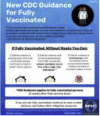 |
10,378 | 13 | 736 | 5 | 231 | 216 | 9 | 11,330 | |
| Why Should My 12-15-Year-Old Receive the COVID-19 Vaccine? | Other | 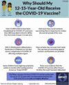 |
May 12, 2021 | 15,590 | 44 | 17,246 | 42 | 302 | 235 | 47 | 33,071 |
| Do I Really Need to Get My Second Vaccine Dose? | Other |  |
17,369 | 31 | 1765 | 8 | 274 | 255 | 8 | 19,389 | |
| Asking About Vaccine Status Does NOT Violate HIPAA | Myth debunkers | 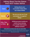 |
16,945 | 44 | 3108 | 23 | 595 | 525 | 128 | 20,578 | |
Abbreviations used: CDC, Centers for Disease Control and Prevention; COVID-19, coronavirus disease 2019; HIPAA, Health Insurance Portability and Accountability Act (of 1996); mRNA, messenger RNA.
Analytics for each infographic were retrieved from Twitter, Instagram, and Facebook to determine overall reach, impressions, and engagement on each platform. Impressions refer to the total views an infographic received. Outreach refers to the number of unique individuals or accounts a post has reached. An individual viewing 1 infographic on 3 separate occasions would generate 3 impressions with 1 reach. Analytics were collected on June 23, 2021 to allow for a minimum of 7 days between the time of posting and data collection.
Results
Of the 49 infographics the IMPACT team shared between March 19, 2020 and June 16, 2021, there were 15 infographics about COVID-19 vaccines and 1 infographic with information on where to obtain a COVID-19 vaccine. All 16 (100%) of the infographics pertaining to COVID-19 vaccines were also available in Spanish. There were 5 infographics from the COVID-19 vaccine series, 6 myth debunkers, and 4 in the other category.
Social media analytics for each individual infographic are presented in Table 1. All infographics combined had a total reach of 238,430. The 5 COVID-19 vaccine series, 6 myth busters, and 4 other had a total reach of 86,809; 80,065; and 71,556; respectively.
The infographic with the greatest total reach was pertaining to how the messenger RNA vaccines were developed. This was the highest performing infographic in impressions and reach on both Twitter and Facebook. The highest performing infographic on Instagram explained that asking about COVID-19 vaccine status does not violate Health Insurance Portability and Accountability Act (of 1996). The top 3 infographics in total reach included 1 each from the COVID-19 vaccine series, myth debunkers, and the other category.
The infographic with the least total reach was about continuing to wear masks after receiving a COVID-19 vaccine. This was released at a time when that direction was still consistent with Centers for Disease Control and Prevention (CDC) recommendations but at the time of this submission is only consistent with WHO, not CDC, guidance.
All infographics had greater outreach, impressions, and engagement on Twitter than they did on the other 2 platforms. No 1 infographic type was consistently higher performing than the others.
Discussion
Overall, the IMPACT infographics with information about COVID-19 vaccines reached thousands of people in the past 6 months. There was no 1 highest performing style of infographic among the 3 styles shared.
There are several limitations to using social media analytics as an indication of which infographics best resonated with our audience. Analytics were collected for all infographics on the same date rather than at the same time point after posting. This may have contributed to the first infographic shared in December 2020 having the greatest reach. The time-of-day infographics were posted was variable, meaning some may have been posted at peak times for social media traffic and, therefore, received a greater number of views, whereas others may have been posted at slower times. However, all infographics were posted during typical business hours on Central Time in an effort to reach our primary audience, individuals in the state of Illinois. Furthermore, most of these infographics shared, retweeted, or quote tweeted by IMPACT team members with often had greater numbers of followers than the IMPACT social media accounts itself (e.g., @MDaware with 52,700 followers, @FutureDocs with 40,100 followers, as compared with @IMPACT4HC <2000 followers on Twitter). This was encouraged through the use of an amplifier, or private group direct message, which included IMPACT members, so they could quickly find tweets from IMPACT that they may have missed on their feed. Owing to shares and retweets from these personal accounts with extensive reach, and the use of an amplifier to encourage engagement from members, it is unlikely that the time of original posting was a major driver of total reach. In addition to variability in traffic at the time of posts influencing the number of individuals who may have encountered them on a social media newsfeed, other content on social media (e.g., major new stories and current events) as well as algorithm preferences on social media platforms could have influenced the likelihood that an individual would encounter these posts. Another possibility is that related major new stories or announcements can enhance engagement. One example of this phenomenon might be the infographic with the second greatest reach, “Why Should My 12-15-Year-Old Receive the COVID-19 Vaccine?,” which was ready for posting within hours of CDC providing guidance on this same topic and was shared widely. We did not have a systematic way to capture the popularity of related new stories or competing misinformation at the time each infographic was posted, which further limited our ability to interpret our analytics.
The aforementioned amplifier may help explain the effectiveness for Twitter for our group specifically, and we would encourage other groups trying to expand their outreach to consider the use of an amplifier. In addition to keeping coalition members active on Twitter abreast of posts originating from our own group, it allowed for rapid direct messaging to the group about new stories and other content that might be appropriate to address with future infographics, IMPACTful chats, or blog posts.
Other factors that may have contributed to Twitter being a higher performing platform for our coalition included the ability to tag up to 10 accounts per post on Twitter, the nature of sharing on this platform including an option to share or quote-tweet to a personal timeline, as opposed to other platforms that encourage sharing to a Stories function only accessible to the sharer’s followers for 24 hours from the time it is shared, and the presence of a greater number of active IMPACT members and support from other organizations and allies on that platform. Similarly, the sharing of infographics with the group Physician Mommies Chicago on Facebook may have driven additional engagement on that platform as compared with Instagram.
Our ability to calculate outreach was limited, and true outreach would be expected to be higher than the metrics collected, as individuals may have shared infographics with their own networks in a way that was not capture-able (i.e., shared a screenshot or pdf, instead of sharing the original social media post or link from the website).
Although we know these infographics reached a large number of people, we do not know whether those who viewed them changed their perspective on vaccination, so we are unable to conclude, on the basis of this study alone, that the IMPACT infographics have an impact on vaccine hesitancy. However, anecdotally, individual health care workers both within and outside the coalition have provided feedback that they have used the infographics in conversations with patients and found them to be effective. The IMPACT team has used some of the same images and messaging in presentations to local schools in the Chicagoland area, which were positively received on the basis of feedback provided after those sessions.
Not all engagement was positive engagement. Although this was extremely infrequent on the infographics posts, we know from recent research that nearly 1 in 4 physicians who use social media report being personally attacked or harassed and that a common theme of these attacks is that they are frequently tied to advocacy work, including vaccine advocacy.27 This can be as extreme as death threats. The sharing of infographics first through the IMPACT coalition social media accounts rather than as an individual member may have been a factor in limiting negative or threatening engagement.
Despite these risks, pharmacists are increasingly exploring infographics and social media use in their clinical practice, education, and research.28 Infographics represent another strategy for simplifying complex information and making it accessible to our patients and wider lay audiences, a critical skill for pharmacists. There is great opportunity for pharmacists to use infographics as individuals, in organizations, or as part of multidisciplinary efforts or teams such as the one described in this article.
Future directions for research on the role of infographics in combating COVID-19 vaccine hesitancy might include patient surveys to determine a change in perception of vaccines before and after viewing an infographic, patient surveys to determine whether information presented in a visual format influenced their decision to receive a vaccine, health care worker surveys to evaluate whether they found infographics helpful to include in their counseling when encountering patients with vaccine hesitancy, or a host of other questions.
As a new organization, IMPACT did not have a specific key performance indicator in mind nor is there 1 clear industry target for this type of communication; but with organic only efforts (i.e., no paid promotion), the fact that most infographics had more reach than the number of followers of the IMPACT account on an individual social media platform is highly encouraging. Based on the experience IMPACT has had with infographics thus far, we anticipate these will continue to be used by the coalition in the future for both COVID-19 vaccine information and other public health concerns.
Conclusion
IMPACT infographics with information about COVID-19 vaccines reached thousands of people. There was no one highest performing style of infographic among the three styles shared.
Acknowledgments
The authors thank past and present members of the Illinois Medical Professionals Action Collaborative Team for contributing ideas to be addressed in infographics and sharing them among their networks.
Biographies
ShannonM. Rotolo, PharmD, Clinical Pharmacy Specialist, Department of Pharmacy, University of Chicago Medicine, Chicago, IL
Shikha Jain, MD, Assistant Professor, Medicine; Director of Communication Strategies in Medicine; and Associate Director of Oncology Communication and Digital Innovation, Department of Medicine, University of Illinois at Chicago, Chicago, IL
Serena Dhaon,BS, Medical Student, College of Osteopathic Medicine, Midwestern University Chicago, Downers Grove, IL
Jack K. Dokhanchi, BS, Integrative Microbiota and Physiology Laboratory Manager, Department of Kinesiology & Community Health, University of Illinois at Urbana-Champaign, Urbana, IL
Elzbieta Kalata, MD, Medical Student, College of Medicine, University of Illinois at Chicago, Chicago, IL
Tejal Shah, MD, Endocrinologist, Crystal Lake, IL
Lisa J. Mordell, MS, Clinical Research Coordinator, Department of Medicine, University of Chicago Medicine, Chicago, IL
Marla L. Clayman, PhD, MPH, Research Health Scientist, Center for Healthcare Organization and Implementation Research (CHOIR), Veterans Health Administration, Bedford, MA; and Adjunct Associate Professor, Schools of Medicine and Communication, Northwestern University, Chicago, IL
Alexandra Kenefake,MBS, Medical Student, College of Medicine, University of Illinois at Chicago, Chicago, IL
Laura J. Zimmermann, MD, MS, Associate Professor, Preventive Medicine and Internal Medicine, Rush Medical College, Rush University, Chicago, IL
Eve Bloomgarden, MD, Assistant Professor, Division of Endocrinology, Feinberg School of Medicine, Northwestern University, Chicago, IL
Vineet M. Arora, MD, MAPP, Dean, Medical Education; and Herbert T. Abelson Professor of Medicine, Pritzker School of Medicine, University of Chicago Medicine, Chicago, IL
Footnotes
Disclosure: The authors declare no relevant conflicts of interest or financial relationships.
ORCIDsShannon M. Rotolo: http://orcid.org/0000-0003-1577-6656
Shikha Jain: http://orcid.org/0000-0002-5684-7898
Marla L. Clayman: http://orcid.org/0000-0001-8491-3672
Alexandra Kenefake: http://orcid.org/0000-0002-1090-2062
References
- 1.Illinois Medical Professional Action Collaborative Team IMPACT timeline. https://www.impact4hc.com/impact-timeline Available at:
- 2.Illinois Medical Professional Action Collaborative Team IMPACT team. https://www.impact4hc.com/team Available at:
- 3.Illinois Medical Professional Action Collaborative Team About us. https://www.impact4hc.com/whoweare Available at:
- 4.Illinois Medical Professional Action Collaborative Team IMPACT blog. https://www.impact4hc.com/impactblog Available at:
- 5.Illinois Medical Professional Action Collaborative Team IMPACTful chats. https://www.impact4hc.com/impactful-chats Available at:
- 6.Vevea B. Johnson & Johnson shot to boost Illinois and Chicago COVID-19 vaccine supply by about 50% https://www.wbez.org/stories/johnson-and-johnson-shot-to-boost-illinois-and-chicago-covid-19-vaccine-supply-by-about-50/0a0c6136-409d-4983-bb84-8141e73b33ab Available at:
- 7.Buckley M. Health care workers, students spending free time as volunteers giving COVID-19 vaccination shots. ‘This is one of the most therapeutic things’. Chicago Tribune. http://www.chicagotribune.com/coronavirus/ct-covid-vaccine-volunteers-20210212-4ar63uhar5cpzngp2lqaqqi2wy-story.html Available at:
- 8.Dockterman E. These moms work as doctors and scientists. But they’ve also taken on another job: fighting COVID-19 misinformation online. https://time.com/5947557/covid-19-vaccine-misinformation-moms/ Available at:
- 9.Yong E. Where year two of the pandemic will Take US. The Atlantic website. https://www.theatlantic.com/health/archive/2020/12/pandemic-year-two/617528/ Available at:
- 10.Illinois Medical Professional Action Collaborative Team IMPACT infographics. https://www.impact4hc.com/impact-infographics Available at:
- 11.Chan A.K.M., Nickson C.P., Rudolph J.W., Lee A., Joynt G.M. Social media for rapid knowledge dissemination: early experience from the COVID-19 pandemic. Anaesthesia. 2020;75(12):1579–1582. doi: 10.1111/anae.15057. [DOI] [PMC free article] [PubMed] [Google Scholar]
- 12.Hamaguchi R., Nematollahi S., Minter D.J. Picture of a pandemic: visual aids in the COVID-19 crisis. J Public Health (Oxf) 2020;42(3):483–485. doi: 10.1093/pubmed/fdaa080. [DOI] [PMC free article] [PubMed] [Google Scholar]
- 13.Agley J., Xiao Y., Thompson E.E., Golzarri-Arroyo L. COVID-19 misinformation prophylaxis: protocol for a randomized trial of a brief informational intervention. JMIR Res Protoc. 2020;9(12) doi: 10.2196/24383. [DOI] [PMC free article] [PubMed] [Google Scholar]
- 14.Vraga E.K., Bode L. Addressing COVID-19 misinformation on social media preemptively and responsively. Emerg Infect Dis. 2021;27(2):396–403. doi: 10.3201/eid2702.203139. [DOI] [PMC free article] [PubMed] [Google Scholar]
- 15.Huang S., Martin L.J., Yeh C.H., et al. The effect of an infographic promotion on research dissemination and readership: a randomized controlled trial. CJEM. 2018;20(6):826–833. doi: 10.1017/cem.2018.436. [DOI] [PubMed] [Google Scholar]
- 16.Hernandez-Sanchez S, Moreno-Perez V, Garcia-Campos J, Marco-Lledó J, Navarrete-Muñoz EM, Lozano-Quijada C. Twelve tips to make successful medical infographics [e-pub ahead of print]. Med Teach. https://doi.org/10.1080/0142159X.2020.1855323. [DOI] [PubMed]
- 17.Finnegan G., Holt D., English P.M., et al. Lessons from an online vaccine communication project. Vaccine. 2018;36(44):6509–6511. doi: 10.1016/j.vaccine.2018.05.007. [DOI] [PubMed] [Google Scholar]
- 18.Teoh D., Shaikh R., Schnaith A., et al. Evaluation of graphic messages to promote human papillomavirus vaccination among young adults: a statewide cross-sectional survey. Prev Med Rep. 2019;13:256–261. doi: 10.1016/j.pmedr.2019.01.002. [DOI] [PMC free article] [PubMed] [Google Scholar]
- 19.Vivion M., Hennequin C., Verger P., Dubé E. Supporting informed decision-making about vaccination: an analysis of two official websites. Public Health. 2020;178:112–119. doi: 10.1016/j.puhe.2019.09.007. [DOI] [PubMed] [Google Scholar]
- 20.Saad L. U.S. ethics ratings rise for medical workers and teachers. https://news.gallup.com/poll/328136/ethics-ratings-rise-medical-workers-teachers.aspx Available at:
- 21.Smiciklas M. IN: Que Biz-Tech; Indianapolis: 2012. The Power of Infographics: Using Pictures to Communicate and Connect with Your Audiences. [Google Scholar]
- 22.Vengage. Better communication in 3 easy steps. Available at: https://venngage.com/. Accessed September 1, 2021.
- 23.Added Bytes; Horsham, UK: 2011. Readable (2021) [Web-based Software] [Google Scholar]
- 24.Slack Technologies L.L.C. Slack. https://slack.com/ Available at:
- 25.Dear pandemic. https://dearpandemic.org Available at:
- 26.Center for Climate Change Communication, George Mason University The debunking Handbook 2020. https://sks.to/db2020 Available at:
- 27.Pendergrast T.R., Jain S., Trueger N.S., Gottlieb M., Woitowich N.C., Arora V.M. Prevalence of personal attacks and sexual harassment of physicians on social media. JAMA Intern Med. 2021;181(4):550–552. doi: 10.1001/jamainternmed.2020.7235. [DOI] [PMC free article] [PubMed] [Google Scholar]
- 28.Barlow B., Webb A., Barlow A. Maximizing the visual translation of medical information: a narrative review of the role of infographics in clinical pharmacy practice, education, and research. J Am Coll Clin Pharm. 2021;4(2):257–266. [Google Scholar]


