

Abstract
Livability, resilience, and justice in cities are challenged by climate change and the historical legacies that together create disproportionate impacts on human communities. Urban green infrastructure has emerged as an important tool for climate change adaptation and resilience given their capacity to provide ecosystem services such as local temperature regulation, stormwater mitigation, and air purification. However, realizing the benefits of ecosystem services for climate adaptation depend on where they are locally supplied. Few studies have examined the potential spatial mismatches in supply and demand of urban ecosystem services, and even fewer have examined supply–demand mismatches as a potential environmental justice issue, such as when supply–demand mismatches disproportionately overlap with certain socio‐demographic groups. We spatially analyzed demand for ecosystem services relevant for climate change adaptation and combined results with recent analysis of the supply of ecosystem services in New York City (NYC). By quantifying the relative mismatch between supply and demand of ecosystem services across the city we were able to identify spatial hot‐ and coldspots of supply–demand mismatch. Hotspots are spatial clusters of census blocks with a higher mismatch and coldspots are clusters with lower mismatch values than their surrounding blocks. The distribution of mismatch hot‐ and coldspots was then compared to the spatial distribution of socio‐demographic groups. Results reveal distributional environmental injustice of access to the climate‐regulating benefits of ecosystem services provided by urban green infrastructure in NYC. Analyses show that areas with lower supply–demand mismatch tend to be populated by a larger proportion of white residents with higher median incomes, and areas with high mismatch values have lower incomes and a higher proportion of people of color. We suggest that urban policy and planning should ensure that investments in “nature‐based” solutions such as through urban green infrastructure for climate change adaptation do not reinforce or exacerbate potentially existing environmental injustices.
Keywords: cities, climate change adaptation, regulating ecosystem services, resilience, spatial analysis, urban ecosystem services
Introduction
Climate change, urban green infrastructure, and ecosystem services
Climate change is already impacting cities and both current and future risks affect communities unequally (Pelling and Garschagen 2019). Beause of the concentration of people and infrastructure in urban areas (Bouwer 2010, Dickson et al. 2012, Depietri and McPhearson 2017, Depietri et al. 2018), cities face disproportionate current and future risks from increased heat, heat waves, and more frequent and intense flooding by extreme weather events. In addition, climate change is expected to have detrimental effects on air quality (Ebi and McGregor 2008, Kinney 2008, Jacob and Winner 2009), worsening the impact of air pollution on human health (Rosenzweig et al. 2010, Revi et al. 2014). Urban green infrastructure (UGI) is increasingly being implemented as an alternative to traditional engineered approaches for improving urban resilience to climate change impacts (Nilon et al. 2017). In this paper, we take a broad definition of UGI as the network of planned and unplanned green spaces that provide ecosystem services through the support of ecological functions, also described as a type of urban ecological infrastructure (Childers et al. 2019). By focusing on the strategic role of green spaces and ecosystem services in urban planning, UGI falls within the umbrella term of nature‐based solutions (NBS) (Kabisch et al. 2017), defined as “actions to protect, sustainably manage and restore natural or modified ecosystems, which address societal challenges (e.g., climate change, food and water security, or natural disasters) effectively and adaptively, while simultaneously providing human well‐being and biodiversity benefits” (Cohen‐Shacham et al. 2016:xii). As a pioneer city embracing UGI as a promising climate adaptation tool, New York City (NYC) has built green roofs, installed thousands of bioswales, planted a million trees, and invested in other forms of UGI in the last decade to combat water quality, urban flooding, heat, and air‐quality challenges (Campbell et al. 2014, McPhearson et al. 2013a , New York City 2017, 2019). Many other cities are doing the same from Philadelphia, Pennsylvania to Portland, Oregon, to Chinese cities embracing the “sponge” cities concept to deploy UGI as a stormwater solution (Wang et al. 2018, City of Philadelphia n.d., The City of Portland n.d.).
The ecosystem services (ES) conceptual framework has been widely used to articulate the climate regulatory benefits of UGI in urban climate adaptation and resilience planning (Demuzere et al. 2014, Hansen and Pauleit 2014, Hansen et al. 2015, McPhearson et al. 2015, Geneletti et al. 2020). ES are broadly defined as “the direct and indirect contributions of ecosystems to human well‐being” (Groot et al. 2012), and are commonly classified in categories such as provisioning, regulating, cultural, and habitat ES (Millennium Ecosystem Assessment 2003, The Economics of Ecosystems and Biodiversity (TEEB) 2008, Gómez‐Baggethun et al. 2013). Regulating ES, including local temperature regulation, runoff mitigation, and air purification are three of the most important services in UGI planning for urban climate resilience and adaptation (Hansen et al. 2015, Kabisch et al. 2017).
UGI and ES are spatially explicit. UGI studies focusing on parks (Rigolon 2016, Rigolon et al. 2018) or vegetation (Nesbitt et al. 2019) have shown that the distribution of green assets across the city is uneven. Consequently, the (uneven) distribution of UGI affects the supply of ES. Different ES require different spatial relations between the service‐providing areas and their targeted beneficiaries (Fisher et al. 2009, Burkhard et al. 2014, Andersson et al. 2015). For example, most ES under the provisioning category (e.g. food or timber production) may have a decoupled spatial relation between the service providing area and their beneficiaries, given that the service can be transported. However, some ES, such as the three regulating services considered key for urban resilience (local temperature regulation, stormwater runoff mitigation, and air purification), cannot be actively transported. In these cases, ES providing and benefiting areas need to overlap spatially for their benefits to be delivered. Thus, local demand for regulating ES, including local temperature regulation, stormwater runoff mitigation, and air purification needs to be met at the local level (Burkhard et al. 2014, Hamstead et al. 2016). Recognizing potential mismatches between where ES are supplied and where demand is higher is essential when planning and creating policy for UGI investments to ensure that benefits are provided where they are most needed so that investments can maximize impact (Burkhard et al. 2012, McPhearson et al. 2013b , Keeler et al. 2019a ).
Although the mapping of ES supply is more developed in ES research, mapping ES demand is a relatively new concept that tends to be overlooked or taken for granted (Burkhard et al. 2014, Wolff et al. 2015, Cortinovis and Geneletti 2018, Keeler et al. 2019a ). In NYC, for example, the supply of ES has been mapped by Kremer et al. (2016), but the spatial dynamics between supply and demand have yet to be considered. Assessing the supply of regulating ES is challenged by a lack of observational data, leading ES researchers to rely on process‐based modeling to estimate the potential benefits that ecosystems could provide (Wolff et al. 2015). In this paper, we follow (Burkhard and Maes 2017:185) and define ES supply as “the capacity of ecosystems to provide ecosystem services.” The demand of regulating ES is usually conceptualized as “need for risk reduction” (Wolff et al. 2015), and, with a similar dearth of observational data, tends to rely on proxy indicators in assessments.
Environmental justice of ecosystem services distribution
Considering supply as the potential benefits that ecosystems could provide, and demand as the need for these benefits based on the urge to alleviate environmental risks, the distribution of mismatches between supply and demand is an important step in revealing potential distributional environmental injustices. Certain socio‐demographic groups are, through historical racism and other legacies of environmental and social injustice, more prone to having their needs for regulating ES unsatisfied (Kabisch and Haase 2014, Rigolon 2016, Rigolon et al. 2018). Distributional environmental justice has been broadly defined as “the spatial distribution of environmental goods and ills amongst people” (Ernstson 2013:8). Initially focused on the allocation of toxic activities such as dumpsites and industrial facilities close to low‐income communities and communities of color (Bullard 2008, Brender et al. 2011), environmental justice has evolved as a body of research and advocacy to incorporate the exposure to environmental hazards such as flooding or extreme heat (Maantay and Maroko 2009, Jenerette et al. 2011, Collins et al. 2018, Herreros‐Cantis et al. 2020) and the unequal investments in beneficial interventions such as UGI and open spaces (Miyake et al. 2010, Kabisch and Haase 2014, Rigolon 2016, Rigolon et al. 2018). Distributional environmental justice in the United States is intimately linked to the planning and housing policies undertaken by public and private institutions during the 20th century and that caused communities of color, especially African American, to remain segregated, underserved, and discriminated against (Rothstein 2017, Nelson et al. n.d.). A prime example of these practices is known as red lining, a process by which banks systematically neglected to provide loans and mortgages in neighborhoods based on racial composition. While the mortgages were neglected by banks, the drawing of the red‐lining maps was performed by the Home Owners’ Loan Corporation, a federally backed institution. The effects of red lining have been linked to current distributional injustices in several American cities and are spatially correlated with the distribution of green spaces and environmental hazards in communities of color (Grove et al. 2018, Hoffman et al. 2020).
Assessments on UGI’s distributional justice often compare differences in distance to green areas, green surface proportion, or recreational quality of parks between different socio‐demographic groups (Rigolon 2016). However, the links between distributional environmental justice and ES remains poorly studied. We suggest that linking these two areas of study adds an important dimension of ecological functioning to simpler examinations of the spatial distribution of UGI, such as parks or urban greenery. For example, Graça et al. (2017) analyzed the relationship between several ES supply indicators and socio‐demographic factors including age distribution, education level, building’s age and tenancy. However, this study did not consider ES demand and its effect on the relevance of the distribution of ES supply. Baró et al. (2019) analyzed the distributional justice of regulating ES supply in Barcelona through the i‐tree model, also without considering ES demand. A supply–demand assessment was carried out for the same city in Baró et al. (2016), but environmental justice was not considered in this prior study. These examples are not intended to lessen the impact of such research, rather to note the need to address the supply and demand perspective as well as the environmental justice perspective together as two important and consistently missing dimensions in urban ecosystem services research. In contrast to the regulating services we examine here, several studies have focused on the justice aspects of cultural ES (Amorim Maia et al. 2020, Łaszkiewicz and Sikorska 2020, Suárez et al. 2020).
Here, we bring environmental justice dimensions and the differential need for ES together in the same study to understand not only how ES demand compares with supply across space, but also how socio‐demographic indicators used in distributional justice studies can bring justice perspectives and concerns more fully into ES research and practice. Understanding whether the distribution of UGI and their ES benefit communities most in need is a key starting point for improving UGI planning to address issues of social inequity and environmental injustice (Marshall and Gonzalez‐Meler 2016). Depriving neighborhoods from regulating ES may lead to further perpetuation of historical inequalities (Reckien et al. 2017), especially as the impacts of climate change in cities increase risk of flooding or heat waves in vulnerable communities and thus create new environmental justice challenges (Depietri et al. 2018, Pelling and Garschagen 2019).
Research objectives
We use New York City (NYC) as a case study where both environmental justice and ecosystem services research has been well explored, but to date poorly explicitly linked. Additionally, data availability, recent investments in UGI, ongoing climate impacts, and historical environmental injustices make NYC a useful empirical case to investigate the environmental justice implications of potential ES supply–demand mismatches. Here we conceptually and empirically link urban ES supply and demand with questions of distributional environmental justice.
This study has two main objectives: First, we generate ES demand maps for each of the regulation ES considered key for climate change adaptation and resilience, including local temperature regulation, runoff mitigation, and air purification. In addition, we follow previously published methods (Kremer et al. 2016) to map ES supply, with minor adjustments and improvements. Second, we analyze the distributional justice of current ES in NYC by comparing the distribution of supply–demand mismatch hotspots with the distribution of different socio‐demographic groups across the city. Combining these spatial analytical approaches, we provide a quantitative assessment of distributional injustices with respect to regulating ES provided by UGI in NYC.
The ES studied in this research are a subset of the many that multifunctional UGI may provide (Gómez‐Baggethun et al. 2013, Keeler et al. 2019b ). However, we focus on temperature regulation, runoff mitigation, and air quality regulation because these are common goals for city investments in UGI for climate change risk reduction (Kabisch et al. 2017) including in NYC (Depietri et al. 2018).
Methods
Study area
With over eight million residents and a population density that reaches over 10,000 people/km2, NYC is the largest and most dense city in the United States. This makes NYC an epicenter for examining climate change impacts given studies that suggest environmental challenges are expected to worsen in the context of climate change (González et al. 2019). For example, projections indicate that NYC’s mean temperatures could rise by as much as 7.5°F by 2080 (Horton et al. 2010).
NYC is composed of five different boroughs (Manhattan, Queens, Bronx, Brooklyn, and Staten Island) and 59 community districts. Community districts (CDs) are a key planning unit for multiple city government agencies, because local decision making is usually carried out at this administrative scale (Kremer et al. 2016, New York City's Mayor Community Affairs Unit (NYCMCAU) n.d.). In this study, we analyze supply–demand mismatches at the census block level, which is the smallest spatial unit with population data available. The City of New York has a total of 38,768 census blocks, with a mean area of 2.05 ha. Additionally, 30,131 of the city’s census blocks are inhabited, with a mean population of 271 people and a mean population density of 176 people per hectare.
A formerly redlined city (Fig. 1), NYC has a legacy of environmental injustice that has been studied both quantitatively and qualitatively. For example, Miyake et al. (2010) found that factors such as recreational quality and park acreage showed a significant relationship with socio‐demographic factors, concluding that people of color had access to only smaller and lower‐quality parks. Other studies have focused on the responses, effects, and drivers of the zoning of noxious land uses and activities that drive environmental injustice in the city (Brown et al. 2003, Sze 2006).
Fig. 1.
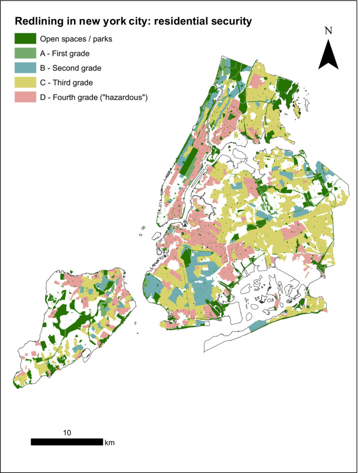
Red lining map of New York City created by the Home Owners’ Loan Corporation during the 1930s. Residential neighborhoods were given a mortgage security grade that reflected the security of a potential investment made by banks and other mortgage lenders. While grade A refers to low risk areas, grade D refers to areas qualified as “hazardously” risky. Data and description obtained from (Nelson et al. n.d.).
In terms of green space, NYC has a high density of natural land cover, but it is unequally distributed in space at the borough level (Table 1). The distribution of different races and ethnicities is also uneven across the five boroughs of the city (Table 2). Figs. 2, 3 show the distribution of race and income at the census block level. The overlap of race and income at this finer resolution with the distribution of green spaces demonstrates the uneven distribution of green space across socio‐demographic groups.
Table 1.
Percentage of each land cover category per borough in New York City according to the land cover classification developed in 2010 by MacFaden et al. (2012).
| Manhattan | Queens | Bronx | Brooklyn | Staten Island | |
|---|---|---|---|---|---|
| Tree canopy | 19 | 18 | 23 | 16 | 29 |
| Grass/shrub | 7 | 19 | 16 | 13 | 27 |
| Bare earth | 0 | 2 | 1 | 1 | 2 |
| Water body | 1 | 1 | 1 | 1 | 2 |
| Building | 32 | 19 | 19 | 26 | 11 |
| Road | 18 | 17 | 16 | 15 | 11 |
| Other (impervious) | 21 | 24 | 24 | 28 | 19 |
Table 2.
Proportion of each race/ethnicity per borough in New York City according to the decennial census 2010 (U.S. Census Bureau n.d. a, b).
| Race/ethnicity | Manhattan | Queens | Bronx | Brooklyn | Staten Island |
|---|---|---|---|---|---|
| White | 0.480 | 0.276 | 0.109 | 0.357 | 0.640 |
| Hispanic/Latino | 0.254 | 0.275 | 0.535 | 0.198 | 0.173 |
| Black/African American | 0.129 | 0.177 | 0.301 | 0.319 | 0.095 |
| American Indian/Native Alaskan | 0.001 | 0.003 | 0.002 | 0.002 | 0.001 |
| Asian | 0.112 | 0.228 | 0.034 | 0.104 | 0.074 |
| Native Hawaiian/Pacific Islander | 0.000 | 0.000 | 0.000 | 0.000 | 0.000 |
| Other race | 0.003 | 0.014 | 0.006 | 0.004 | 0.002 |
| Two or more races | 0.019 | 0.025 | 0.012 | 0.016 | 0.014 |
Fig. 2.
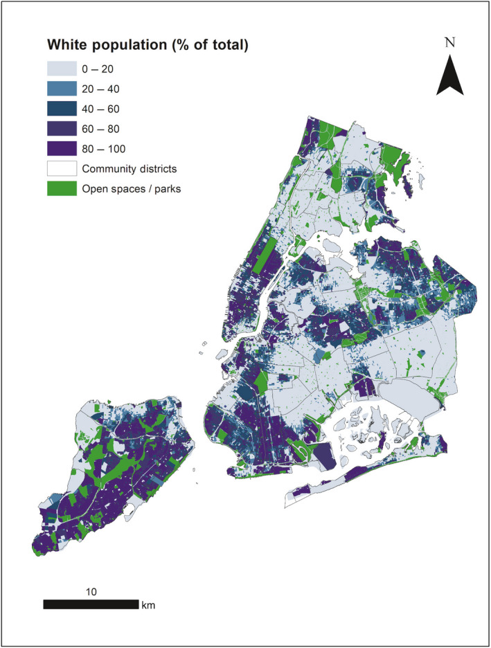
Ratio of total population classified as white according to the 2010 decennial census, per census block (U.S. Census Bureau n.d. a, b). Additionally, the distribution of parks in New York City (Department of Information Technology & Telecommunications (DoITT) n.d.) is included to depict the spatial correlation between race and public green space visually.
Fig. 3.

Median income per census block according to the American Community Survey 5‐yr estimates 2013–2017 (U.S. Census Bureau n.d. a, b), with the distribution of public green (Department of Information Technology & Telecommunications (DoITT) n.d.) spaces overlapped. Values range from 0 (no income) to 1.0 (maximum estimated income in New York City).
Despite the importance given to UGI and the city’s role as a global leader in the inclusion of ES thinking in its planning policies (Hansen et al. 2015), the environmental justice implications of potential supply–demand mismatches for ES have not been examined at a citywide, continuous scale. Additionally, though the supply of specific ES has been studied in NYC (Kremer et al. 2016), the role of ES demand has not been explored. This NYC case study aims to develop an empirical approach based on previously published conceptual papers that can help prioritize investments in UGI for climate adaptation in areas where they are most needed. We provide a methodological template for use in other cities facing similar challenges and considering or implementing similar UGI solutions.
Mapping ES demand
Our goal in mapping ES demand is to identify the areas in the city with the highest need for each regulating ES (Burkhard et al. 2014). We define demand for ES as “need for risk reduction” following Wolff et al. (2015) and follow methods elaborated by Baró et al. (2016) to map ES demand, as they did in Barcelona. Methods consist of developing a cross‐tabulation matrix that combines two risk factors to generate a demand index that ranges from 0 (not relevant demand) to 1 (very highly relevant demand). The factors considered for each ES are population density per census block (exposure) and a service‐specific hazard factor. As in Baró et al. (2016), we assume the role of population density in the exposure to hazards as constant.
For local temperature regulation, the service‐specific hazard factor for the cross‐tabulation matrix was land surface temperature (Table 3). Break values for demand within the matrix were defined using the heat index thresholds developed by the National Weather Service and referenced in “NYC’s Risk Landscape: A Guide to Hazard Mitigation” available in the NYC Emergency Management portal (National Weather Service (NWS) n.d., New York City Emergency Management (NYCEM) n.d.). The heat index provides thresholds of different degrees of risk due to exposure to heat based on apparent temperature, which combines temperature and relative humidity (Table 4). Relative humidity across NYC was assumed as 70% after calculating the average relative humidity for the months of June, July, and August during the years 1987–2017 for the meteorological data retrieved from the NOAA NYC weather stations located in Central Park (70%), Kennedy airport (71%), and LaGuardia airport (65%) (National Oceanic and Atmospheric Administration (NOAA) n.d.). Land surface temperature was obtained from Landsat 7’s band 6_1 (low gain thermal band, sampled on a 60 × 60 m resolution). As in Imhoff et al. (2010), a series of scenes were compiled to generate an “average summer day” in NYC. The scenes (n = 13) were selected considering the year (2008–2012, in order to be consistent with the land‐cover cartography used in the study, developed in 2010), month (June, July, and August) and cloud cover (only scenes with cloud cover lower than 10% were considered). Table 5 shows the dates and extreme values recorded in each scene. Besides creating an “average summer day,” this methodology allowed for filling the gaps caused by the sensor failure of Landsat 7 through the calculation of mean values per cell.
Table 3.
Cross‐tabulation matrix used to determine the demand for the ecosystem service “local temperature regulation” at the census block level.
| Population density (inhabitants/ha) | Temperature (Fahrenheit) | |||||
|---|---|---|---|---|---|---|
| <75 | 75–80 | 80–85 | 85–95 | 95–100 | >100 | |
| <5 | 0 | 0 | 0 | 0 | 0 | 0 |
| 5–50 | 0 | 0.2 | 0.2 | 0.4 | 0.4 | 0.6 |
| 50–100 | 0 | 0.2 | 0.4 | 0.4 | 0.6 | 0.8 |
| 100–200 | 0 | 0.4 | 0.4 | 0.6 | 0.6 | 0.8 |
| 200–400 | 0 | 0.4 | 0.6 | 0.6 | 0.8 | 0.8 |
| >400 | 0 | 0.6 | 0.8 | 0.8 | 0.8 | 1 |
Population density and temperature are used as exposure and hazard indicators to define the need for mitigating the risks associated with extreme heat. The break values for population density are extracted from Baró et al. (2016), while the break values for temperature are based on the thresholds defined by the heat index used by New York City Emergency Management (NYCEM n.d.). The temperature breaks in Celsius are 23.89°C (75°F), 26.67°C (80°F), 29.44°C (85°F), 35.00°C (95°F), and 37.78°C (100°F).
Table 4.
Temperature intervals for different likelihoods of heat disorders due to prolonged exposure or strenuous activity under relative humidity conditions of 70% (NWS n.d., New York City Emergency Management n.d.).
| Temperature interval | 80–85°F | 85–95°F | 95–100°F | >100°F |
|---|---|---|---|---|
| Heat stress risk | Caution—possible fatigue with prolonged exposure and/or physical activity | Extreme caution—sunstroke, heat cramps and heat exhaustion possible with prolonged exposure and/or physical activity | Danger—sunstroke, heat cramps and heat exhaustion likely, and heatstroke possible with prolonged exposure and/or physical activity | Extreme danger—heat/sunstroke highly likely with continued exposure |
Table 5.
Summary of the Landsat 7 scenes used to elaborate an average summer land surface temperature map.
| Date of scene | Minimum temperature value in raster (°C) | Maximum temperature value in raster (°C) |
|---|---|---|
| 29 July 2008 | 10.0 | 46.7 |
| 7 June 2009 | 12.9 | 47.6 |
| 25 July 2009 | 10.6 | 43.7 |
| 10 August 2009 | 17.2 | 40.6 |
| 26 August 2009 | 12.3 | 42.4 |
| 3 July 2010 | 15.1 | 55.0 |
| 20 August 2010 | 12.9 | 43.7 |
| 29 August 2010 | 10.0 | 52.2 |
| 15 July 2011 | 0.5 | 50.5 |
| 22 July 2011 | 16.7 | 41.9 |
| 23 August 2011 | −0.2 | 48.4 |
| 15 June 2012 | 13.4 | 48.4 |
| 1 July 2012 | 17.2 | 45.9 |
For runoff mitigation, we mapped demand considering the percentage of impervious surfaces per census block as a hazard factor (Table 6). We chose this because of the lack of accessible data and resources to develop a reliable modeling approach of the simulate runoff in NYC (Rosenzweig et al. 2020). Impervious surface is known to impact the water cycle by increasing the amount and speed of runoff generated (Shuster et al. 2005). In addition, this indicator has been previously used to assess demand for flood protection (Liquete et al. 2013). An equal interval approach is taken to define the break values, setting maximum demand when impervious surface exceeds 80%. The information on the proportion of impervious surface per census block was gathered by using the land cover map developed by MacFaden et al. (2012).
Table 6.
Cross‐tabulation matrix used to determine the demand for the ecosystem service “runoff mitigation” at the census block level.
| Population density (inhabitants/ha) | Impervious surface (%) | |||||
|---|---|---|---|---|---|---|
| <10 | 10–20 | 20–40 | 40–60 | 60–80 | >80 | |
| <5 | 0 | 0 | 0 | 0 | 0 | 0 |
| 5–50 | 0 | 0.2 | 0.2 | 0.4 | 0.4 | 0.6 |
| 50–100 | 0 | 0.2 | 0.4 | 0.4 | 0.6 | 0.8 |
| 100–200 | 0 | 0.4 | 0.4 | 0.6 | 0.6 | 0.8 |
| 200–400 | 0 | 0.4 | 0.6 | 0.6 | 0.8 | 0.8 |
| >400 | 0 | 0.6 | 0.8 | 0.8 | 0.8 | 1 |
Population density and % of the block's surfaces being impervious are used as exposure and hazard indicators to define the need for mitigating the risks associated with urban flooding. The break values for population density are extracted from Baró et al. (2016), and the break values for impervious surfaces were set using an equal interval (20%) from 0 to 100%.
To define demand for air purification, data on predicted average concentrations of NO2 and O3 in 2010 were used to estimate the air pollution hazard. These data was retrieved from the data set New York City Community Air Survey (NYCCAS) Air Pollution Rasters (Department of Health and Mental Hygiene 2017). NO2 and O3 were chosen because of data availability to calculate ES supply, but future iterations of this project may incorporate other pollutants, such as particulate matter, if possible. We assessed each pollutant separately rather than combining both compounds in one single service for two reasons. To begin with, the data available for these pollutants were not temporally consistent. For NO2, the data provide yearly average concentrations, and for O3 only summer concentrations are provided. In addition, the pollutants considered have complex dynamics that determine their occurrence. For example, O3 is a secondary pollutant that results from the interaction between NOx, VOCs, and specific meteorological conditions (Pun et al. 2003). Because of this, conflating both pollutants as if they both occurred at the same time scale is not appropriate. Data were resampled from their original resolution (300 × 300 m) to 1 m using a bilinear interpolation method to generate mean concentration per census block. Break values were defined considering the maximum tolerable concentrations allowed by the National Ambient Air Quality Standards (U.S. Envirinmental Protection Agency (EPA) 2014). These quality standards (53 ppb for mean annual NO2 and 70 ppb for 8‐h O3) were used in the matrix to set the break value for the highest demand index, and then we equally subdivided this number to define the lower demand break points (Tables 7, 8).
Table 7.
Cross‐tabulation matrix used to determine the demand for the ecosystem service “Air purification (NO2)” at the census block level.
| Population density (inhabitants/ha) | NO2 concentration (ppb) | |||||
|---|---|---|---|---|---|---|
| <9 | 9–18 | 18–25 | 25–36 | 36–53 | >53 | |
| <5 | 0 | 0 | 0 | 0 | 0 | 0 |
| 5–50 | 0 | 0.2 | 0.2 | 0.4 | 0.4 | 0.6 |
| 50–100 | 0 | 0.2 | 0.4 | 0.4 | 0.6 | 0.8 |
| 100–200 | 0 | 0.4 | 0.4 | 0.6 | 0.6 | 0.8 |
| 200–400 | 0 | 0.4 | 0.6 | 0.6 | 0.8 | 0.8 |
| >400 | 0 | 0.6 | 0.8 | 0.8 | 0.8 | 1 |
Population density and mean annual NO2 concentration are used as exposure and hazard indicators to define the need for mitigating the risks associated with NO2 pollution. The break values for population density are extracted from Baró et al. (2016), and the NO2 concentration breaks consider the National Ambient Air Quality Standards (U.S. EPA 2014).
Table 8.
Cross‐tabulation matrix used to determine the demand for the ecosystem service “Air purification (O3)” at the census block level.
| Population density (inhabitants/ha) | O3 concentration (ppb) | |||||
|---|---|---|---|---|---|---|
| <10 | 10–20 | 20–30 | 30–40 | 40–70 | >70 | |
| <5 | 0 | 0 | 0 | 0 | 0 | 0 |
| 5–50 | 0 | 0.2 | 0.2 | 0.4 | 0.4 | 0.6 |
| 50–100 | 0 | 0.2 | 0.4 | 0.4 | 0.6 | 0.8 |
| 100–200 | 0 | 0.4 | 0.4 | 0.6 | 0.6 | 0.8 |
| 200–400 | 0 | 0.4 | 0.6 | 0.6 | 0.8 | 0.8 |
| >400 | 0 | 0.6 | 0.8 | 0.8 | 0.8 | 1 |
Population density and mean O3 concentration during the summer are used as exposure and hazard indicators to define the need for mitigating the risks associated with O3 pollution. The break values for population density are extracted from Baró et al. (2016), and the O3 concentration breaks consider the National Ambient Air Quality Standards (U.S. EPA 2014).
Mapping ES supply
To map ES supply, we followed the methods originally developed in Kremer et al. (2016). In this study, the supply of ES in NYC was mapped by relying on a raster‐based approach that combined a high‐resolution (1 × 1 m) land cover map (MacFaden et al. 2012) with other sources of secondary data to create supply indicators for each ES (Table 9). The methods and data used are presented in Appendix S1: Section S1 and mimic the procedure presented in Kremer et al. (2016). A minor adjustment was done to the methodology for mapping the supply of the local temperature regulation ES. Instead of using one single Landsat scene to calculate the reduced temperature due to the natural land cover, the “average summer day” data generated in the demand assessment was used to avoid relying on a single temperature record.
Table 9.
Summary of the supply indicators used for each ecosystem service.
| Ecosystem service | Supply indicator | Reference |
|---|---|---|
| Local temperature regulation | “Local climate indicator”—ratio between the local land surface temperature and the mean surface temperature of the green areas in the city | Schwarz et al. (2011) |
| Runoff mitigation | Water infiltration coefficient based on the curve number method | Cronshey (1986) |
| Air purification (NO2 and O3) | g·m−2·yr−1 absorbed by vegetation according to literature | Yang et al. (2008) |
We then generated a series of 1 × 1 m raster maps showing a normalized supply value ranging from 0 (no supply at all) to 1 (maximum supply). In order to compare ES supply with demand, it is important that supply data is aggregated to the census block level. An average supply value was calculated by considering the area within each census block and an additional 400 m service area generated through the Network Analyst extension available in ArcGIS 10 (ESRI, Redlands, CA, USA). To generate service areas for each census block, we built a network data set with the walkable roads of the data set “NYC Street Centerline” (Department of Information Technology and Telecommunications 2014). A 400‐m service area incorporates the idea that the residents of a given census block may be able to access ecosystem services supplied outside of their block and benefit from them. For example, residents are often exposed to urban flooding, air quality, or heat hazards while walking or biking to a supermarket or to work or school. We chose a 400‐m area as a conservative approach, because this is the lowest distance normally considered in walkability assessments (Miyake et al. 2010).
Comparing supply and demand: the spatial supply–demand mismatch
Each census block in NYC was assigned a value for supply and for demand that ranged from 0 to1. For supply, the value represents the potential benefits provided by ecosystems on a normalized scale. For demand, the value indicates relevant need for risk reduction associated with the specific ES mapped.
To assess the mismatch between supply and demand across the city, we generated a supply–demand mismatch value per census block. In Burkhard et al. (2012), a supply–demand subtraction is suggested to represent the “budget” of each ES per land cover. This subtraction serves as a proxy for the deviation between the ES provided and the relevance of their need. Consequently, mismatch was calculated in this paper by subtracting the supply index from the demand index. Results ranged from 1 to −1, with 1 indicating the highest (negative) mismatch (maximum possible demand and absence of supply). That is, higher values represent areas in which the demand reflects a more relevant need for ES, but supply is low in comparison with other parts of the study area.
Comparing supply–demand mismatch and socio‐demographic groups
In the final step we compared the distribution of mismatch values to that of two socio‐demographic indicators, including (1) the percentage of different races and ethnicities, and (2) the normalized median annual household income. When comparing the distribution of race and mismatch, we initially analyzed the distribution of people of color. In the context of this paper, we define people of color as those residents that are included in the U.S. Census categories Hispanic/Latino, Black/African American, Asian, Alaskan/Native American, and Hawaiian/Pacific Islander. From here we then proceeded to analyze the distribution of the three most represented minority racial groups (Black/African American, Hispanic/Latino, and Asian) separately. Data on races and ethnicities per census block was retrieved from the Decennial Census 2010 through the data set titled “P9—Hispanic or Latino, and not Hispanic or Latino by race” (U.S. Census Bureau n.d. a, b) (Fig. 4). This data set presents a breakdown of the population per census block per ethnicity (Hispanic and not Hispanic) and race (White, Black/African American, Asian, Native American/Alaskan, and Hawaiian/Pacific Islander). Data were incorporated into the geometries of the city's census blocks obtained from the TIGER/LINE database via the data set “Special Release—Census Blocks with Population and Housing Unit Counts” in (U.S. Census Bureau n.d. a, b).
Fig. 4.

Map showing the dominant race (race with highest percentage) per census block according to the 2010 decennial census (U.S. Census Bureau n.d. a, b).
Median normalized income was retrieved from the American Community Survey (ACS) 5‐yr estimates data set (2013–2017) (U.S. Census Bureau n.d. a, b). We relied on ACS for income data because it was not assessed in the 2010 decennial census (U.S. Census Bureau 2018). Since 2010, the ACS and the decennial census serve different purposes. The decennial census aims to generate an accurate population count that also captures age, sex, and race/ethnicity. The ACS, on the other hand, focuses on estimating socio‐demographic indicators based on a sample population that is smaller than that of the decennial census. While 100% of households are supposed to receive the decennial census form, only one in six households are sampled on a yearly basis to capture socio‐demographic data. We used both data sets because, although income data does not exist in the decennial census 2010, it provides race/ethnicity data with higher accuracy. This data set was collected at a census block group level and was disaggregated into census block level through a spatial join, assuming that all the blocks within each group have the same median income.
To compare income and racial distribution across supply–demand mismatches, census blocks were spatially grouped by performing a hotspots analysis. Hotspots analysis is a widely adopted method in ecosystem services studies (Karimi et al. 2015, Morelli et al. 2017, Lorilla et al. 2019, Wang et al. 2019, Zen et al. 2019) because of its capacity to identify neighboring features that constitute an area with similarly outlying values. These areas may be targeted by different specific policies if they behave as hotspots (extremely high values) or coldspots (extremely low). The hotspots analysis was carried out in ArcMap 10.1 using the “Getis‐Ord Gi*” tool (Environmental Systems Research Institute (ESRI) n.d.) to assess the mismatch value per ecosystem service. This procedure groups census blocks into spatial clusters based on their deviation from the values. Five cluster classes were identified (C1–C5, translating, respectively, into clusters with very significantly low, significantly low, nonsignificant, significantly high, and very significantly high mismatch values). The mean sociodemographic attributes per cluster class were then compared using a series of ANOVA analyses in R (version 3.6.1) (R Core Team 2020).
Results
Spatial mismatch in ES supply and demand
Results show wide spatial variation in the supply, demand, and supply–demand mismatch per U.S. Census block (Fig. 5). ES supply across NYC varies according to the distribution of green space, with supply being highest in Staten Island, northwest Bronx, southern Brooklyn and eastern and southeastern Queens. For example, for local temperature regulation and air purification, the census blocks located between Central Park and Riverside Park and those that surround Prospect Park show higher supply values. ES demand is highest in most of Manhattan, central Bronx, central Queens, central Brooklyn, and the neighborhood of Greenpoint. Demand for local temperature regulation and runoff mitigation appear to have a similar distribution, likely due to the expected correlation between the hazard factors used in both services (Yuan and Bauer 2007).
Fig. 5.

Supply, demand, and mismatch maps at the census block level for the ecosystem service (ES) local temperature regulation. A composite figure; the rest of the ecosystem services assessed can be found in Appendix S1: Fig. S2.
Average values of supply, demand and supply–demand mismatch were calculated for each of the city’s CDs to compare the quantitative distribution of ES across NYC (Appendix S1: Fig. S3). A data set with the demand, supply, and mismatch values per CD is available in the Supporting Information file DataS1: Supply_Demand_Mismatch_Community_Districts. Even though supply, demand, and mismatch values of each ES follow similar paths, their trajectories are not identical, and have different mean values per CD. For instance, the supply for ES air purification has a higher value than for other ES, such as runoff mitigation. The summation of all the ES assessed is represented in Fig. 6, including neighborhood‐scale examples.
Fig. 6.

Accumulated mismatch value of the four ecosystem services assessed and close ups. Important spatial nuances can be differentiated. For example, Midtown Manhattan (1) shows relatively low mismatch values because of the low population of census blocks occupied by office buildings, whereas the Upper East and West Side show high mismatch values, despite their wealthy population. In Bronx (2), a clear gradient by which central Bronx presents higher values than the edges of the borough. In Queens (3), the influence of parks in reducing the mismatch value of nearby blocks is visible in blocks like those situated in the center of the image.
Although supply for each of the ES assessed reaches its highest values in the CDs that fully overlap with major parks and natural areas (such as Central Park, Prospect Park, Pelham Bay Park and Forest Park), as well as the CDs located in Staten Island, demand shows opposite values. Given the absence of population, parks that showed high supply values show low or null demand. This is expected, of course, because low population density drives demand, meaning lower demand in Staten Island as well as in CD 105‐Midtown (Manhattan), where the prevalence of office buildings reduces the number of residents in this area. Due to its high supply values and low demand, the CDs located in Staten Island show the lowest mismatch values among the inhabited CDs of the city.
Population density shows a consistent influence in the increase of demand for each ES, whereas the effect of the ES specific hazard factors on demand varies. As we show in Table 10, the hazard factor increases consistently across demand values only for the ES runoff mitigation and air purification—NO2. For the ES local temperature regulation and air purification—O3, the mean temperature per census block and the ozone concentrations are lower in the census blocks with higher demand.
Table 10.
Mean population density and hazard factor per demand value for each ecosystem service (ES).
| Demand for ES | ||||||
|---|---|---|---|---|---|---|
| 0 | 0.2 | 0.4 | 0.6 | 0.8 | 1 | |
| Local temperature regulation | ||||||
| Population density (inhabitants/ha) | 0.2 | 29.7 | 71.0 | 203.6 | 618.3 | |
| Mean temperature (°F) | 85.3 | 82.6 | 86.5 | 86.7 | 85.3 | |
| Runoff mitigation | ||||||
| Population density (hab/ha) | 1.5 | 35.54 | 89.1 | 213.7 | 543.7 | 592.6 |
| Mean percentage impervious | 30.3 | 25.8 | 37.4 | 47.2 | 48.2 | 84.3 |
| Air purification (NO2) | ||||||
| Population density (hab/ha) | 0.5 | 41.9 | 105.3 | 251.5 | 604.7 | |
| Mean NO2 (ppb) | 22.8 | 17.8 | 22.0 | 25.6 | 28.2 | |
| Air purification (O3) | ||||||
| Population density (hab/ha) | 0.7 | 23.9 | 61.0 | 199.4 | 618.77 | |
| Mean O3 (ppb) | 31.9 | 25.9 | 33.5 | 32.7 | 29.8 | |
A demand of 1 was reached only in the service runoff mitigation.
hab, inhabitants.
Distributional environmental justice of ecosystem services in NYC
Spatial clusters of mismatch hotspots and coldspots are shown in Fig. 7. The differences in racial composition between mismatch clusters are significant and show that the average percentage of people of color is higher in the hotspots than in the coldspots (Fig. 8). On the other hand, the mean normalized income is lower in the mismatch hotspots. If we consider the three most represented races within people of color, Black/African American and Hispanic/Latino residents are increasingly present in higher mismatch clusters and their percentage is lowest in C1 (areas with the lowest mismatch), whereas Asian residents show no clear trend (Fig. 9).
Fig. 7.

Census blocks classified into hotspots and coldspots according to the Z‐score obtained in the cluster analysis for the ecosystem service (ES) local temperature regulation. Clusters range from C1 (extreme lows, or coldspots) to C5 (extreme highs, or hotspots). Even though break values between different categories were set using a Jenks distribution, values 2.58 and −2.58 were set manually in order to keep a minimum degree of significance (P < 0.01). C3 corresponds to those census blocks that obtained a Z‐score between 2.58 and −2.58, meaning that their P value is >0.01. A composite figure with the rest of the ES assessed can be found in Appendix S1: Fig. S4.
Fig. 8.

Average proportion of people of color over the total population and relative income per mismatch cluster for the service local temperature regulation. Clusters range from C1 (extreme lows, or coldspots) to C5 (extreme highs, or hotspots). C3 refers to census blocks that do not belong to a high or low cluster based on statistical significance at P > 0.01. Latin and Greek letters indicate statistical significance across the clusters as per the ANOVA tests carried out. All the statistical significance tests returned P values below 0.001. A composite figure with the rest of the ecosystem services assessed can be found in Appendix S1: Fig. S5.
Fig. 9.

Average proportion of disaggregated people of color, per mismatch cluster for the service local temperature regulation. Latin and Greek letters and numbers indicate statistical significance across the clusters as per the ANOVA tests carried out. All the statistical significance tests returned P values below 0.001, except for the proportion of residents being Asian when comparing C2–C3, C2–C4, C4–C5, and C4–C3 (P < 0.01). A composite figure with the rest of the ecosystem services assessed can be found in Appendix S1: Fig. S6.
Discussion
Key findings—links with underlying injustices in NYC
The combination of ES supply and demand mapping shows consistent patterns of distributional environmental injustice across communities with different racial and income characteristics. Mismatch coldspots (low mismatch outliers) are inhabited by people with higher incomes and characterized by lower percentages of people of color. As mismatch clusters shift from lower to higher supply–demand mismatch values, the proportion of people of color increases, and median income decreases. Hispanic/Latino inhabitants showed the most explicit trends of living in mismatch hotspots (high ES demand, low ES supply), with the proportion of Black/African American residents also being higher in mismatch hotspots. These results demonstrate that communities of color in NYC face a distributional injustice through lack of similar levels of access to the benefits provided by UGI in NYC when compared to predominantly white areas of the city.
The results of our analysis corroborate those obtained in other studies that examine relationships between environmental hazards, urban greenery, and socio‐demographic variables such as race and income in American cities. For example, Hoffman et al. (2020) observed a consistent pattern in 108 formerly redlined cities where historically segregated neighborhoods showed higher surface temperatures and a less abundant tree canopy. Although the practice of redlining was banned in the late 1960s, the racial and economic differences between redlined and nonredlined neighborhoods remain visible (Jones 2017, Mitchell and Franco 2018) and have been maintained through zoning, public housing allocation, and subsidies distribution (Rothstein 2017), as well as public disinvestment processes (Stein 2019). Studies focused on green spaces and parks also have shown a consistently unequal distribution that especially affects Hispanic populations (Miyake et al. 2010, Rigolon 2016, Rigolon et al. 2018) and found that the presence of urban vegetation is strongly correlated with income and education (Nesbitt et al. 2019).
Here, our supply–demand mismatch approach also brings environmental justice considerations into a single methodological approach that combines measures of access to ecological benefits and exposure to environmental hazards. By relying on ES supply assessments instead of simply the distribution or quantity of urban green spaces, this study adds a new layer of ES complexity by considering the spatial variability of ecosystems’ capacity to deliver benefits based on their ecological functions. Additionally, the mapping of supply–demand mismatch incorporates the idea that social need is not constant across space. Hence, mismatch mapping provides deeper insights about the areas in highest need of intervention and investment than a supply‐only mapping exercise (Keeler et al. 2019a ). We suggest that this approach could be a powerful planning tool for shifting NYC’s current greening and hazard mitigation policies (New York City Department of Environmental Protection 2010, New York City 2017, 2019) in ways that enhance the impact of UGI implementation for benefiting areas most in need, and in ways that do not reproduce past injustices.
Location‐based prioritization for UGI development is not new in NYC, given the limitation in resources and the need to maximize the cost efficiency of investments. However, the inclusion of justice or equity in the criteria used to site interventions varies across the city's plans. For example, the NYC Cool Neighborhoods Program (New York City 2017) specifies that new street tree investments need to be prioritized in areas that are not only hotter, but also that show higher social vulnerability to heat. Other programs, however, fail to incorporate explicit notions of environmental justice in their prioritization criteria. For instance, a recently passed tax abatement bill for green roofs establishes that buildings located in priority CDs may be subject to enhanced tax abatement (New York State Senate 2019). In this case, priority CDs are defined in relation to combined sewer overflow sewersheds and lack of green space, but do not use socio‐demographic indicators to identify areas in higher need. The city’s green infrastructure plan acknowledges the need to focus on “environmental justice communities that need the additional public health and other sustainability benefits of green infrastructure” (New York City Department of Environmental Protection 2010:17), but does not specify how those communities may be identified. With this study, we hope that greening and resilience programs like these can benefit from a framework capable of highlighting the areas where ES mismatch is highest and describing their socio‐demographic characteristics. With such insights, greening policies should be able to develop interventions that address the distributional injustices of UGI benefits in NYC while mitigating environmental hazards.
Research limitations and future iterations
Our approach for mapping ES demand was developed in accordance with the conceptualization of demand as “need for risk reduction” suggested by Wolff et al. (2015) and the cross‐tabulation matrix developed by Baró et al. (2016). We used a traditional environmental justice lens, where risk is dependent on exposure to a hazard. The distribution of risk was then compared to the socio‐demographic characteristics of differently exposed populations in order to assess the distributional justice of ES. This methodology is promising in that it is relatively simple to reproduce, and able to incorporate other social vulnerability indicators such as those considered by the Social Vulnerability Index of the Center for Disease Control and Prevention (Flanagan et al. 2018).
In addition, the results from mapping ES demand are driven by the hazard indicators chosen, the data used to quantify them, and the break values used in the cross‐tabulation matrices. Mean temperature and concentrations of O3 and NO2 in the census blocks with the highest demand for each service are low compared to the highest break values considered in the cross‐tabulation matrix. For example, the mean temperature in the census blocks with highly relevant demand for local temperature regulation is 85.3°F, and the maximum temperature considered in the cross‐tabulation matrix was >100°F. With such a low hazard factor, the only way census blocks can reach a demand value of 0.8 is with a higher population density. Thus, the interaction between hazards and population density drives demand index values. In future iterations, the thresholds defining ES demand breaks could be further developed in coordination with local authorities to consider the distribution of the values of the variables assessed. Further, we note that the supply, distribution, demand, and value of ES are influenced by other social and technological factors at the local scale (Andersson et al. 2015, Keeler et al. 2019b ). The presence of technological or infrastructural services, as well as the configuration of the built environment, may influence the need for ES. For example, this study identified the major part of Manhattan as a mismatch hotspot, including the neighborhoods of the Upper West Side and the Upper East Side. These neighborhoods, which have predominantly wealthy, white populations, are characterized by a densely built environment with high‐rise residential buildings and a wider adoption of residential air conditioning units than the rest of the city (Klein Rosenthal et al. 2014, Ito et al. 2018). Although taller buildings can contribute to an enhanced urban heat island effect (Ortiz et al. 2018), these may also be less affected by the cooling effect of street trees, and the widespread use of air conditioning may further reduce the need for ES in an area that was initially flagged as a mismatch hotspot. Hence, the effect of technological factors in the (supply and) demand for ES needs to be further considered in future iterations of this approach in order to ensure that the areas most in need for risk reduction are properly identified.
Regarding the assessment ES mismatch, it is important to point out the uncertainties that arise from comparing supply and demand in this study. To begin with, this approach maps mismatches by subtracting the normalized indicators for supply and demand, which are based on a combination of biophysical variables. Hence, this approach compares the relative values of supply and demand, or where demand is maximum and supply is minimum. Because this subtraction is carried out between directly noncomparable units, the resulting mismatch should not be understood as a scalar variable in which a mismatch of 0 means that 100% of the demand is being met by the supplied ES. Secondly, some of the risk indicators used to assess ES demand have an uncertain degree of influence by green areas. For example, the surface temperature data used already shows the impact of vegetation in lowering surface temperatures. This leads to an issue of double‐counting when subtracting the supply of ES, because their effect is already accounted for. This uncertainty stems from the fact that, although ES supply is mapped using process‐based models that represent biophysical processes, ES demand relies on actual measurements of temperature and air quality.
Although we follow other empirical studies that employ similar procedures to develop our ES demand and supply indicators (Burkhard et al. 2009, 2012, 2014, Kandziora et al. 2013, Burkhard and Maes 2017), the methods to calculate them need to be further integrated in order to ensure comparability. We propose two ways to ensure comparability in future studies. A first option is to rely on process‐based modeling consistently for mapping both supply and demand. In this case, ES demand would be mapped as the populations that remain at risk after accounting for ES supply, which would be quantified by comparing the outcomes of simulating temperature, flooding, or air quality models with and without vegetation (see examples in Nowak et al. 2014, Glenis et al. 2018, Ortiz et al. 2018). A second, more complex, but widely needed option would be to combine or replace the modeling approaches used in ES supply mapping with actual measurements by relying on sensor networks that monitor the performance of UGI through time (Laney et al. 2015, Nitoslawski et al. 2019) in order to identify the actual performance of ES in moderating impacts of environmental hazards empirically.
Lack of data availability results in assumptions that unavoidably add uncertainty. For example, because of the lack of a continuous metric or a monitoring network, a constant relative humidity was assumed across the study area based on the three meteorological stations available. Regarding air purification, other relevant pollutants such as PM10 were not considered because of a lack of concentration data. The supply and demand for the ES local temperature regulation was assessed using surface temperature data because of the nonexistence of high‐resolution local air temperature data, even though the differences between surface and air temperature are acknowledged (Bauer 2020). The lack of urban flooding observations in NYC means we, like others (Liquete et al. 2013), quantify ES demand for flood risk reduction using impervious surface data as a proxy indicator for flood risk.
It is important to recognize that indicators considered in this study to quantify ES supply, while widely used in ES literature (Haase et al. 2014), are simple representations of a complex reality that is affected by several factors at different scales. ES mapping approaches such as ours would benefit from incorporating the specific expertise of research fields that specialize in the underlying dynamics of each ES. For example, Eisenman et al. (2019) calls for ES scholars to incorporate epidemiological expertise when addressing the effect of urban ecosystems on air quality, which are known to be extremely complex and can also cause disservices through allergies or halogenated volatile organic compounds.
Environmental justice of this approach
There are important aspects that need to be considered in order to ensure that the approach presented in this paper effectively contributes to the planning of UGI with an environmental justice lens. To begin with, interaction with local stakeholders, government officials, and community organizations is important to ensure that assessment of ES is relevant, and that the methods used are in accordance with the city’s requirements. In addition, some local communities may prefer certain ES over others based on their own perceived needs or values (Wilkerson et al. 2018, Keeler et al. 2019b ). Hence, a participatory process based on surveys, questionnaires, or participatory mapping would improve this research by defining weights with communities for each of the ES and environmental risks assessed. For instance, in Kremer et al. (2016), supply for several ES was aggregated into a single map using different weighting scenarios in a spatial multi‐criteria analysis. In Depietri et al. (2018), a multihazard risk mapping in the city of NYC relied on local experts to develop a weighting criteria for different risk indicators. Incorporating participatory approaches, however, opens new questions regarding the procedural and recognitional justice (Walker 2009, Langemeyer and Connolly 2020) of UGI planning, including who should be consulted, who would be left out of the consultation, or how will participants be remunerated?
Conclusion
We provide a comprehensive, citywide and high‐resolution understanding of the environmental justice implications of ES currently provided by UGI in NYC in relation to climate change adaptation and resilience priorities in the city. ES supply was mapped through a process‐based model that quantifies supply based on a series of ecological proxies, while demand was framed as “need for risk reduction” and relied on social and physical factors. Results show that areas with a lower supply–‐demand mismatch tend to be populated by a larger proportion of white residents with higher median incomes, and areas with higher mismatch values, where need is high and supply is low, are present a population with lower incomes and a higher proportion of people of color. Analyses reveal clear examples of distributional environmental injustice in access to the climate‐regulating benefits of ecosystem services provided by UGI in the city. Without improved analysis of current mismatches in supply and demand for critical climate regulatory ES, greening investments may exacerbate or even replicate historical and current environmental injustices and inequalities in American cities. Given the magnitude of the investments being made in NYC, but paralleled in many other cities globally, UGI development for climate change adaptation through ES delivery may be a critical opportunity to reduce the environmental justice burden on low‐income and minority communities. We suggest that similar studies should be conducted in other cities and urban policy and planning should ensure that investments in such “nature‐based” solutions for climate change adaptation do not reinforce or exacerbate potentially existing environmental injustices.
Supporting information
Appendix S1
Data S1
Acknowledgments
Research was supported by the U.S. National Science Foundation (NSF) through the Urban Resilience to Extreme Weather‐Related Events Sustainability Research Network (NSF grant SES 1444755), the U.S. NSF Accel‐Net program NATURA (grant 1927167), and U.S. NSF Convergence program (grant 1934933). Research was also partially funded through the 2015–2016 BiodivERsA COFUND call for research proposals, with the national funders the Swedish Research Council for Environment, Agricultural Sciences, and Spatial Planning; the Swedish Environmental Protection Agency; the German Aerospace Center; the National Science Centre; the Research Council of Norway; the Spanish Ministry of Economy and Competitiveness; and the SMARTer Greener Cities project through the Nordforsk Sustainable Urban Development and Smart Cities grant program.
Herreros‐Cantis, P., and McPhearson T.. 2021. Mapping supply of and demand for ecosystem services to assess environmental justice in New York City. Ecological Applications 31(6):e02390. 10.1002/eap.2390
Corresponding Editor: Erik J. Nelson.
Open Research
The data used as input for the manuscript are publicly available across different institutional websites. NYC Open Data was queried to obtain data sets with landcover data, https://data.cityofnewyork.us/Environment/Landcover‐Raster‐Data‐2010‐3ft‐Resolution/9auy‐76zt air pollutants concentration, https://data.cityofnewyork.us/Environment/NYCCAS‐Air‐Pollution‐Rasters/q68s‐8qxv and street centerlines. https://data.cityofnewyork.us/City‐Government/NYC‐Street‐Centerline‐CSCL‐/exjm‐f27b Land surface temperature imagery was retrieved through USGS Earth Explorer using the criteria for date and cloud cover specified within our Methods: Mapping ES demand section. Census block geometries were retrieved from the Special Release from the TIGER/LINE source, https://www.census.gov/geographies/mapping‐files/time‐series/geo/tiger‐line‐file.2010.html and racial data were merged to the geometries using the table “P9—Hispanic or Latino, and not Hispanic or Latino by race,” which can be obtained through the Census Data platform through an advanced search by filtering the request for Race, 2010, census blocks data. https://data.census.gov/cedsci/ Finally, data on income from the American Community Survey, as well as census block group geometries, were obtained through the TIGER/LINE FTP archive. https://www2.census.gov/geo/tiger/TIGER_DP/2017ACS/, State code = 36
Literature Cited
- Amorim Maia, A. T., Calcagni F., Connolly J. J. T., Anguelovski I., and Langemeyer J.. 2020. Hidden drivers of social injustice: uncovering unequal cultural ecosystem services behind green gentrification. Environmental Science & Policy 112:254–263. [Google Scholar]
- Andersson, E., McPhearson T., Kremer P., Gomez‐Baggethun E., Haase D., Tuvendal M., and Wurster D.. 2015. Scale and context dependence of ecosystem service providing units. Ecosystem Services 12:157–164. [Google Scholar]
- Baró, F., Calderón‐Argelich A., Langemeyer J., and Connolly J. J. T.. 2019. Under one canopy? Assessing the distributional environmental justice implications of street tree benefits in Barcelona. Environmental Science & Policy 102:54–64. [DOI] [PMC free article] [PubMed] [Google Scholar]
- Baró, F., Palomo I., Zulian G., Vizcaino P., Haase D., and Gómez‐Baggethun E.. 2016. Mapping ecosystem service capacity, flow and demand for landscape and urban planning: A case study in the Barcelona metropolitan region. Land Use Policy 57:405–417. [Google Scholar]
- Bauer, T. J.2020. Interaction of urban heat island effects and land‐sea breezes during a New York City heat event. Journal of Applied Meteorology and Climatology 59:477–495. [Google Scholar]
- Bouwer, L. M.2010. Have disaster losses increased due to anthropogenic climate change? Bulletin of the American Meteorological Society 92:39–46. [Google Scholar]
- Brender, J. D., Maantay J. A., and Chakraborty J.. 2011. Residential proximity to environmental hazards and adverse health outcomes. American Journal of Public Health 101:S37–S52. [DOI] [PMC free article] [PubMed] [Google Scholar]
- Brown, P., Mayer B., Zavestoski S., Luebke T., Mandelbaum J., and McCormick S.. 2003. The health politics of asthma: environmental justice and collective illness experience in the United States. Social Science & Medicine 57:453–464. [DOI] [PubMed] [Google Scholar]
- Bullard, R. D.2008. Dumping in Dixie: race, class, and environmental quality. Third edition. Westview Press, Boulder, Colorado, USA. [Google Scholar]
- Burkhard, B., Kandziora M., Hou Y., and Müller F.. 2014. Ecosystem service potentials, flows and demands—concepts for spatial localisation, indication and quantification. Landscape Online 34:1–32. [Google Scholar]
- Burkhard, B., Kroll F., Müller F., and Windhorst W.. 2009. Landscapes' capacities to provide ecosystem services—A concept for land‐cover based assessments. Landscape Online 15:1–22. [Google Scholar]
- Burkhard, B., Kroll F., Nedkov S., and Müller F.. 2012. Mapping ecosystem service supply, demand and budgets. Ecological Indicators 21:17–29. [Google Scholar]
- Burkhard, B., and Maes J.. 2017. Mapping ecosystem services. Advanced Books 1:378. [Google Scholar]
- Campbell, L. K., Monaco M., Falxa‐Raymond N., Lu J., Newman A., Rae R. A., and Svendsen E. S.. 2014. Million TreesNYC: the integration of research and practice. Pages 1–43. New York City and Parks and Recreation, New York, NY. [Google Scholar]
- Childers, D. L., Bois P., Hartnett H. E., McPhearson T., Metson G., and Sanchez C. A.. 2019. Urban ecological infrastructure: an inclusive concept for the non‐built urban environment. Elementa: Science of the Anthropocene 7:1–14. [Google Scholar]
- City of Philadelphia . n.d. Green city, clean waters. https://www.phila.gov/water/sustainability/greencitycleanwaters/Pages/default.aspx
- Cohen‐Shacham, E., Walters G., Janzen C., and Maginnis S., editors. 2016. Nature‐based solutions to address global societal challenges. IUCN International Union for Conservation of Nature, Gland, Switzerland. [Google Scholar]
- Collins, T. W., Grineski S. E., and Chakraborty J.. 2018. Environmental injustice and flood risk: a conceptual model and case comparison of metropolitan Miami and Houston, USA. Regional Environmental Change 18:311–323. [DOI] [PMC free article] [PubMed] [Google Scholar]
- Cortinovis, C., and Geneletti D.. 2018. Ecosystem services in urban plans: What is there, and what is still needed for better decisions. Land Use Policy 70:298–312. [Google Scholar]
- Cronshey, R.1986. Urban hydrology for small watersheds. U.S. Department of Agriculture, Soil Conservation Service, Engineering Division, Washington, DC, USA. [Google Scholar]
- Demuzere, M., Orru K., Heidrich O., Olazabal E., Geneletti D., Orru H., Bhave A. G., Mittal N., Feliu E., and Faehnle M.. 2014. Mitigating and adapting to climate change: multi‐functional and multi‐scale assessment of green urban infrastructure. Journal of Environmental Management 146:107–115. [DOI] [PubMed] [Google Scholar]
- Department of Health and Mental Hygiene . 2017. NYCCAS air pollution rasters. https://data.cityofnewyork.us/Environment/NYCCAS‐Air‐Pollution‐Rasters/q68s‐8qxv
- Department of Information Technology & Telecommunications (DoITT) . n.d. Open Space (Parks). https://data.cityofnewyork.us/Recreation/Open‐Space‐Parks‐/g84h‐jbjm
- Department of Information Technology & Telecommunications . 2014. NYC Street Centerline. https://data.cityofnewyork.us/City‐Government/NYC‐Street‐Centerline‐CSCL‐/exjm‐f27b
- Depietri, Y., Dahal K., and McPhearson T.. 2018. Multi‐hazard risks in New York City. Natural Hazards and Earth System Sciences 18:3363–3381. [Google Scholar]
- Depietri, Y., and McPhearson T.. 2017. Integrating the grey, green, and blue in cities: nature‐based solutions for climate change adaptation and risk reduction. Pages 91–109 in Kabisch N., Korn H., Stadler J., and Bonn A., editors. Nature‐based solutions to climate change adaptation in urban areas: linkages between science, policy and practice. Springer International Publishing, Cham, Switzerland. [Google Scholar]
- Dickson, E., Baker J. L., Hoornweg D., and Tiwari A.. 2012. Urban risk assessments. The World Bank, Washington, DC. [Google Scholar]
- Ebi, K. L., and McGregor G.. 2008. Climate change, tropospheric ozone and particulate matter, and health impacts. Environmental Health Perspectives 116:1449–1455. [DOI] [PMC free article] [PubMed] [Google Scholar]
- Eisenman, T. S., Churkina G., Jariwala S. P., Kumar P., Lovasi G. S., Pataki D. E., Weinberger K. R., and Whitlow T. H.. 2019. Urban trees, air quality, and asthma: an interdisciplinary review. Landscape and Urban Planning 187:47–59. [Google Scholar]
- Ernstson, H.2013. The social production of ecosystem services: a framework for studying environmental justice and ecological complexity in urbanized landscapes. Landscape and Urban Planning 109:7–17. [Google Scholar]
- Environmental Systems Research Institute (ESRI) . n.d. Hot Spot analysis (Getis‐Ord Gi*)—Help | ArcGIS Desktop. https://desktop.arcgis.com/en/arcmap/10.3/tools/spatial‐statistics‐toolbox/hot‐spot‐analysis.htm
- Fisher, B., Turner R. K., and Morling P.. 2009. Defining and classifying ecosystem services for decision making. Ecological Economics 68:643–653. [Google Scholar]
- Flanagan, B. E., Hallisey E. J., Adams E., and Lavery A.. 2018. Measuring community vulnerability to natural and anthropogenic hazards: the Centers for Disease Control and Prevention's social vulnerability index. Journal of Environmental Health 80:34–36. [PMC free article] [PubMed] [Google Scholar]
- Geneletti, D., Cortinovis C., Zardo L., and Esmail B. A.. 2020. Planning for ecosystem services in cities. Springer Nature, Cham. [Google Scholar]
- Glenis, V., Kutija V., and Kilsby C. G.. 2018. A fully hydrodynamic urban flood modelling system representing buildings, green space and interventions. Environmental Modelling & Software 109:272–292. [Google Scholar]
- Gómez‐Baggethun, E., Gren Å., Barton D. N., Langemeyer J., McPhearson T., O'Farrell P., Andersson E., Hamstead Z., and Kremer P.. 2013. Urban ecosystem services. Pages 175–251 in Elmqvist T., Fragkias M., Goodness J., Güneralp B., Marcotullio P. J., McDonald R. I., Parnell S., Schewenius M., Sendstad M., Seto K. C., and Wilkinson C., editors. Urbanization, biodiversity and ecosystem services: challenges and opportunities: a global assessment. Springer, Dordrecht, The Netherlands. [Google Scholar]
- González, J. E., et al. 2019. New York City panel on climate change 2019 report chapter 2: New methods for assessing extreme temperatures, heavy downpours, and drought. Annals of the New York Academy of Sciences 1439:30–70. [DOI] [PubMed] [Google Scholar]
- Graça, M. S., Gonçalves J. F., Alves P. J. M., Nowak D. J., Hoehn R., Ellis A., Farinha‐Marques P., and Cunha M.. 2017. Assessing mismatches in ecosystem services proficiency across the urban fabric of Porto (Portugal): the influence of structural and socioeconomic variables. Ecosystem Services 23:82–93. [Google Scholar]
- Groot, R. D., et al. 2012. Integrating the ecological and economic dimensions in biodiversity and ecosystem service valuation. Pages 9–40 in Kumar P., editor. The economics of ecosystems and biodiversity: ecological and economic foundations. Routledge, London. [Google Scholar]
- Grove, M., Ogden L., Pickett S., Boone C., Buckley G., Locke D. H., Lord C., and Hall B.. 2018. The legacy effect: understanding how segregation and environmental injustice unfold over time in Baltimore. Annals of the American Association of Geographers 108:524–537. [Google Scholar]
- Haase, D., et al. 2014. A quantitative review of urban ecosystem service assessments: concepts, models, and implementation. Ambio 43:413–433. [DOI] [PMC free article] [PubMed] [Google Scholar]
- Hamstead, Z. A., Kremer P., Larondelle N., McPhearson T., and Haase D.. 2016. Classification of the heterogeneous structure of urban landscapes (STURLA) as an indicator of landscape function applied to surface temperature in New York City. Ecological Indicators 70:574–585. [Google Scholar]
- Hansen, R., Frantzeskaki N., McPhearson T., Rall E., Kabisch N., Kaczorowska A., Kain J.‐H., Artmann M., and Pauleit S.. 2015. The uptake of the ecosystem services concept in planning discourses of European and American cities. Ecosystem Services 12:228–246. [Google Scholar]
- Hansen, R., and Pauleit S.. 2014. From multifunctionality to multiple ecosystem services? A conceptual framework for multifunctionality in green infrastructure planning for urban areas. Ambio 43:516–529. [DOI] [PMC free article] [PubMed] [Google Scholar]
- Herreros‐Cantis, P., Olivotto V., Grabowski Z. J., and McPhearson T.. 2020. Shifting landscapes of coastal flood risk: environmental (in)justice of urban change, sea level rise, and differential vulnerability in New York City. Urban Transformations 2:9. [Google Scholar]
- Hoffman, J. S., Shandas V., and Pendleton N.. 2020. The effects of historical housing policies on resident exposure to intra‐urban heat: a study of 108 US urban areas. Climate 8:12. [Google Scholar]
- Horton, R., Gornitz V., Bowman M., and Blake R.. 2010. Chapter 3: Climate observations and projections. Annals of the New York Academy of Sciences 1196:41–62. [DOI] [PubMed] [Google Scholar]
- Imhoff, M. L., Zhang P., Wolfe R. E., and Bounoua L.. 2010. Remote sensing of the urban heat island effect across biomes in the continental USA. Remote Sensing of Environment 114:504–513. [Google Scholar]
- Ito, K., Lane K., and Olson C.. 2018. Equitable access to air conditioning: a city health department's perspective on preventing heat‐related deaths. Epidemiology 29:749–752. [DOI] [PubMed] [Google Scholar]
- Jacob, D. J., and Winner D. A.. 2009. Effect of climate change on air quality. Atmospheric Environment 43:51–63. [Google Scholar]
- Jenerette, G. D., Harlan S. L., Stefanov W. L., and Martin C. A.. 2011. Ecosystem services and urban heat riskscape moderation: water, green spaces, and social inequality in Phoenix, USA. Ecological Applications 21:2637–2651. [DOI] [PubMed] [Google Scholar]
- Jones, J.2017. The racial wealth gap: How African‐Americans have been shortchanged out of the materials to build wealth. https://www.epi.org/blog/the‐racial‐wealth‐gap‐how‐african‐americans‐have‐been‐shortchanged‐out‐of‐the‐materials‐to‐build‐wealth/.
- Kabisch, N., and Haase D.. 2014. Green justice or just green? Provision of urban green spaces in Berlin, Germany. Landscape and Urban Planning 122:129–139. [Google Scholar]
- Kabisch, N., Korn H., Stadler J., and Bonn A., editors. 2017. Nature‐based solutions to climate change adaptation in urban areas: linkages between science, policy and practice. Springer International Publishing, Cham, Switzerland. [Google Scholar]
- Kandziora, M., Burkhard B., and Müller F.. 2013. Interactions of ecosystem properties, ecosystem integrity and ecosystem service indicators—a theoretical matrix exercise. Ecological Indicators 28:54–78. [Google Scholar]
- Karimi, A., Brown G., and Hockings M.. 2015. Methods and participatory approaches for identifying social‐ecological hotspots. Applied Geography 63:9–20. [Google Scholar]
- Keeler, B. L., Dalzell B. J., Gourevitch J. D., Hawthorne P. L., Johnson K. A., and Noe R. R.. 2019a. Putting people on the map improves the prioritization of ecosystem services. Frontiers in Ecology and the Environment 17:151–156. [Google Scholar]
- Keeler, B. L., et al. 2019b. Social‐ecological and technological factors moderate the value of urban nature. Nature Sustainability 2:29. [Google Scholar]
- Kinney, P. L.2008. Climate change, air quality, and human health. American Journal of Preventive Medicine 35:459–467. [DOI] [PubMed] [Google Scholar]
- Klein Rosenthal, J., Kinney P. L., and Metzger K. B.. 2014. Intra‐urban vulnerability to heat‐related mortality in New York City, 1997–2006. Health & Place 30:45–60. [DOI] [PMC free article] [PubMed] [Google Scholar]
- Kremer, P., Hamstead Z. A., and McPhearson T.. 2016. The value of urban ecosystem services in New York City: a spatially explicit multicriteria analysis of landscape scale valuation scenarios. Environmental Science & Policy 62:57–68. [Google Scholar]
- Laney, C. M., Pennington D. D., and Tweedie C. E.. 2015. Filling the gaps: sensor network use and data‐sharing practices in ecological research. Frontiers in Ecology and the Environment 13:363–368. [Google Scholar]
- Langemeyer, J., and Connolly J. J. T.. 2020. Weaving notions of justice into urban ecosystem services research and practice. Environmental Science & Policy 109:1–14. [Google Scholar]
- Łaszkiewicz, E., and Sikorska D.. 2020. Children's green walk to school: an evaluation of welfare‐related disparities in the visibility of greenery among children. Environmental Science & Policy 110:1–13. [Google Scholar]
- Liquete, C., Zulian G., Delgado I., Stips A., and Maes J.. 2013. Assessment of coastal protection as an ecosystem service in Europe. Ecological Indicators 30:205–217. [Google Scholar]
- Lorilla, R. S., Kalogirou S., Poirazidis K., and Kefalas G.. 2019. Identifying spatial mismatches between the supply and demand of ecosystem services to achieve a sustainable management regime in the Ionian Islands (Western Greece). Land Use Policy 88:104171. [Google Scholar]
- Maantay, J., and Maroko A.. 2009. Mapping urban risk: Flood hazards, race, & environmental justice in New York. Applied Geography 29:111–124. [DOI] [PMC free article] [PubMed] [Google Scholar]
- MacFaden, S. W., O'Neil‐Dunne J. P. M., Royar A. R., Lu J. W. T., and Rundle A. G.. 2012. High‐resolution tree canopy mapping for New York City using LIDAR and object‐based image analysis. Journal of Applied Remote Sensing 6:063567. [Google Scholar]
- Marshall, K. A., and Gonzalez‐Meler M. A.. 2016. Can ecosystem services be part of the solution to environmental justice? Ecosystem Services 22:202–203. [Google Scholar]
- McPhearson, T., Andersson E., Elmqvist T., and Frantzeskaki N.. 2015. Resilience of and through urban ecosystem services. Ecosystem Services 12:152–156. [Google Scholar]
- McPhearson, P. T., Maddox D., Gunther B., and Bragdon D.. 2013a. Local assessment of New York City: biodiversity, green space, and ecosystem. Pages 355–383 in Elmqvist T., Fragkias M., Goodness J., Güneralp B., Marcotullio P. J., McDonald R. I., Parnell S., Schewenius M., Sendstad M., Seto K. C., and Wilkinson C., editors. Cities and biodiversity outlook: urbanization, biodiversity and ecosystem services: challenges and opportunities. Springer, Dordrecht. [Google Scholar]
- McPhearson, T., Kremer P., and Hamstead Z. A.. 2013b. Mapping ecosystem services in New York City: applying a social–ecological approach in urban vacant land. Ecosystem Services 5:11–26. [Google Scholar]
- Millennium Ecosystem Assessment . 2003. Ecosystems and human well‐being: a framework for assessment. Island Press, Washington, D.C., USA. [Google Scholar]
- Mitchell, B., and Franco J.. 2018. HOLC “redlining” maps: the persistent structure of segregation and economic inequality. NCRC, Washington, DC, USA. [Google Scholar]
- Miyake, K. K., Maroko A. R., Grady K. L., Maantay J. A., and Arno P. S.. 2010. Not just a walk in the park: Methodological improvements for determining environmental justice implications of park access in New York City for the promotion of physical activity. Cities and the Environment 3:1–17. [DOI] [PMC free article] [PubMed] [Google Scholar]
- Morelli, F., Jiguet F., Sabatier R., Dross C., Princé K., Tryjanowski P., and Tichit M.. 2017. Spatial covariance between ecosystem services and biodiversity pattern at a national scale (France). Ecological Indicators 82:574–586. [Google Scholar]
- Nelson, R. K., Winling L., Marciano R., and Conolly N.. n.d. Mapping inequality. https://dsl.richmond.edu/panorama/redlining/
- Nesbitt, L., Meitner M. J., Girling C., Sheppard S. R. J., and Lu Y.. 2019. Who has access to urban vegetation? A spatial analysis of distributional green equity in 10 US cities. Landscape and Urban Planning 181:51–79. [Google Scholar]
- New York City . 2017. Cool neighborhoods NYC: a comprehensive approach to keep communities safe in extreme heat. https://www1.nyc.gov/assets/orr/pdf/Cool_Neighborhoods_NYC_Report_FINAL.pdf
- New York City . 2019. OneNYC 2050: Building a strong and fair city—full report. The City of New York, New York, NY, USA. 354. [Google Scholar]
- New York City Department of Environmental Protection . 2010. NYC green infrastructure plan: a sustainable strategy for clean waterways. New York City Department of Environmental Protection, New York, New York, USA. [Google Scholar]
- Nilon, C. H., et al. 2017. Planning for the future of urban biodiversity: a global review of city‐scale initiatives. BioScience 67:332–342. [Google Scholar]
- Nitoslawski, S. A., Galle N. J., Van Den Bosch C. K., and Steenberg J. W. N.. 2019. Smarter ecosystems for smarter cities? A review of trends, technologies, and turning points for smart urban forestry. Sustainable Cities and Society 51:101770. [Google Scholar]
- National Oceanic and Atmospheric Administration (NOAA) . n.d. Automated Surface Observing System (ASOS) | National Centers for Environmental Information (NCEI) formerly known as National Climatic Data Center (NCDC). https://www.ncdc.noaa.gov/data‐access/land‐based‐station‐data/land‐based‐datasets/automated‐surface‐observing‐system‐asos
- Nowak, D. J., Hirabayashi S., Bodine A., and Greenfield E.. 2014. Tree and forest effects on air quality and human health in the United States. Environmental Pollution 193:119–129. [DOI] [PubMed] [Google Scholar]
- National Weather Service (NWS) . n.d. Heat safety tips and resources. NOAA's National Weather Service. https://www.weather.gov/safety/heat [Google Scholar]
- New York State Senate . 2019. New York State Senate Bill S5554B. https://www.nysenate.gov/legislation/bills/2019/s5554/amendment/b
- New York City Emergency Management (NYCEM) . n.d. Plan for hazards—hazard mitigation. NYCEM. https://www1.nyc.gov/site/em/ready/hazard‐mitigation.page [Google Scholar]
- New York City's Mayor Community Affairs Unit (NYCMCAU) . n.d. About commmunity boards. https://www1.nyc.gov/site/cau/community‐boards/about‐commmunity‐boards.page
- Ortiz, L. E., Gonzalez J. E., Wu W., Schoonen M., Tongue J., and Bornstein R.. 2018. New York City impacts on a regional heat wave. Journal of Applied Meteorology and Climatology 57:837–851. [Google Scholar]
- Pelling, M., and Garschagen M.. 2019. Put equity first in climate adaptation. Nature 569:327–329. [DOI] [PubMed] [Google Scholar]
- Pun, B. K., Seigneur C., and White W.. 2003. Day‐of‐week behavior of atmospheric ozone in three U.S. cities. Journal of the Air & Waste Management Association 53:789–801. [DOI] [PubMed] [Google Scholar]
- R Core Team 2020. R: a language and environment for statistical computing. R Foundation for Statistical Computing, Vienna, Austria. https://www.R‐project.org/. [Google Scholar]
- Reckien, D., Creutzig F., Fernandez B., Lwasa S., Tovar‐Restrepo M., Mcevoy D., and Satterthwaite D.. 2017. Climate change, equity and the sustainable development goals: an urban perspective. Environment and Urbanization 29:159–182. [Google Scholar]
- Revi, A., Satterthwaite D. E., Aragón‐Durand F., Corfee Morlot J., Kiunski R. B. R., Pelling M., Roberts D. C., and Solecki W.. 2014. Urban areas. Pages 535–612 in Field C. B. et al., editors. Climate change 2014: Impacts, adaptation, and vulnerability. Part A: Global and sectoral aspects. Contribution of Working Group II to the Fifth Assessment Report of the Intergovernmental Panel on Climate Change. Cambridge University Press, Cambridge, UK. [Google Scholar]
- Rigolon, A.2016. A complex landscape of inequity in access to urban parks: a literature review. Landscape and Urban Planning 153:160–169. [Google Scholar]
- Rigolon, A., Browning M., and Jennings V.. 2018. Inequities in the quality of urban park systems: an environmental justice investigation of cities in the United States. Landscape and Urban Planning 178:156–169. [Google Scholar]
- Rosenzweig, B., et al. 2020. The value of urban flood modeling. Earth's Future 9:1–9. [Google Scholar]
- Rosenzweig, C., Solecki W., Hammer S. A., and Mehrotra S.. 2010. Cities lead the way in climate‐change action. Nature 467:909–911. [DOI] [PubMed] [Google Scholar]
- Rothstein, R.2017. The color of law: A forgotten history of how our government segregated America. Liveright Publishing Corporation, New York, New York, USA. [Google Scholar]
- Schwarz, N., Bauer A., and Haase D.. 2011. Assessing climate impacts of planning policies—An estimation for the urban region of Leipzig (Germany). Environmental Impact Assessment Review 31:97–111. [Google Scholar]
- Shuster, W. D., Bonta J., Thurston H., Warnemuende E., and Smith D. R.. 2005. Impacts of impervious surface on watershed hydrology: a review. Urban Water Journal 2:263–275. [Google Scholar]
- Stein, S.2019. Capital city: Gentrification and the real estate state. Verso Books, Brooklyn, NY, USA. [Google Scholar]
- Suárez, M., Barton D. N., Cimburova Z., Rusch G. M., Gómez‐Baggethun E., and Onaindia M.. 2020. Environmental justice and outdoor recreation opportunities: a spatially explicit assessment in Oslo metropolitan area, Norway. Environmental Science & Policy 108:133–143. [Google Scholar]
- Sze, J.2006. Noxious New York: The racial politics of urban health and environmental justice. MIT Press, Cambridge, Massachusetts, USA. [Google Scholar]
- The Economics of Ecosystems and Biodiversity (TEEB) . 2008. The economics of ecosystems & biodiversity: an interim report. European Communities, Brussels. [Google Scholar]
- The City of Portland . n.d. Green infrastructure. https://www.portlandoregon.gov/bes/34598
- U.S. Census Bureau . 2018. Differences between the ACS and the decennial census. Page 4 in Understanding and using American Community Survey data. U.S. Government Printing Office, Washington D.C., USA. [Google Scholar]
- U.S. Census Bureau . n.d.a Explore census data. https://data.census.gov/cedsci/
- U.S. Census Bureau . n.d.b When to use 1‐year, 3‐year, or 5‐year estimates. https://www.census.gov/programs‐surveys/acs/guidance/estimates.html
- U.S. Environmental Protection Agency (EPA) . 2014. NAAQS table. Other policies and guidance. https://www.epa.gov/criteria‐air‐pollutants/naaqs‐table
- Walker, G.2009. Beyond distribution and proximity: exploring the multiple spatialities of environmental justice. Antipode 41:614–636. [Google Scholar]
- Wang, H., Mei C., Liu J., and Shao W.. 2018. A new strategy for integrated urban water management in China: Sponge city. Science China Technological Sciences 61:317–329. [Google Scholar]
- Wang, J., Zhou W., Pickett S. T. A., Yu W., and Li W.. 2019. A multiscale analysis of urbanization effects on ecosystem services supply in an urban megaregion. Science of the Total Environment 662:824–833. [DOI] [PubMed] [Google Scholar]
- Wilkerson, M. L., Mitchell M. G. E., Shanahan D., Wilson K. A., Ives C. D., Lovelock C. E., and Rhodes J. R.. 2018. The role of socio‐economic factors in planning and managing urban ecosystem services. Ecosystem Services 31:102–110. [Google Scholar]
- Wolff, S., Schulp C. J. E., and Verburg P. H.. 2015. Mapping ecosystem services demand: a review of current research and future perspectives. Ecological Indicators 55:159–171. [Google Scholar]
- Yang, J., Yu Q., and Gong P.. 2008. Quantifying air pollution removal by green roofs in Chicago. Atmospheric Environment 42:7266–7273. [Google Scholar]
- Yuan, F., and Bauer M. E.. 2007. Comparison of impervious surface area and normalized difference vegetation index as indicators of surface urban heat island effects in Landsat imagery. Remote Sensing of Environment 106:375–386. [Google Scholar]
- Zen, M., Candiago S., Schirpke U., Egarter Vigl L., and Giupponi C.. 2019. Upscaling ecosystem service maps to administrative levels: beyond scale mismatches. Science of the Total Environment 660:1565–1575. [DOI] [PubMed] [Google Scholar]
Associated Data
This section collects any data citations, data availability statements, or supplementary materials included in this article.
Supplementary Materials
Appendix S1
Data S1
Data Availability Statement
The data used as input for the manuscript are publicly available across different institutional websites. NYC Open Data was queried to obtain data sets with landcover data, https://data.cityofnewyork.us/Environment/Landcover‐Raster‐Data‐2010‐3ft‐Resolution/9auy‐76zt air pollutants concentration, https://data.cityofnewyork.us/Environment/NYCCAS‐Air‐Pollution‐Rasters/q68s‐8qxv and street centerlines. https://data.cityofnewyork.us/City‐Government/NYC‐Street‐Centerline‐CSCL‐/exjm‐f27b Land surface temperature imagery was retrieved through USGS Earth Explorer using the criteria for date and cloud cover specified within our Methods: Mapping ES demand section. Census block geometries were retrieved from the Special Release from the TIGER/LINE source, https://www.census.gov/geographies/mapping‐files/time‐series/geo/tiger‐line‐file.2010.html and racial data were merged to the geometries using the table “P9—Hispanic or Latino, and not Hispanic or Latino by race,” which can be obtained through the Census Data platform through an advanced search by filtering the request for Race, 2010, census blocks data. https://data.census.gov/cedsci/ Finally, data on income from the American Community Survey, as well as census block group geometries, were obtained through the TIGER/LINE FTP archive. https://www2.census.gov/geo/tiger/TIGER_DP/2017ACS/, State code = 36