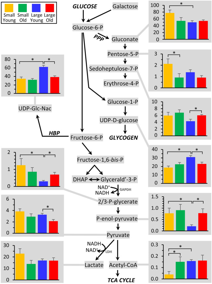
Fig. 3.
Metabolomics of glycolysis and associated pathways. The glycolytic pathway is shown at center, with all metabolites that were measured highlighted in gray. Those metabolites that exhibited significant differences between groups (Fig. 2) are shown as bar graphs, using the same color scheme as Figs. 1 and 2. Graphs show means ± SEM of relative metabolite abundance (arbitrary units), with significant differences between groups indicated by asterisks

