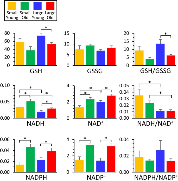
Fig. 6.
Metabolomics of redox. Those metabolites that exhibited significant differences between groups (Fig. 2) are shown as bar graphs, using the same color scheme as other figures. Graphs show means ± SEM of relative metabolite abundance (arbitrary units), with significant differences between groups indicated by asterisks. Note that although redox ratios (e.g., GSH/GSSG) are shown, these are for illustrative purposes only, since different electrospray ionization efficiencies for each metabolite render such ratios non-quantitative

