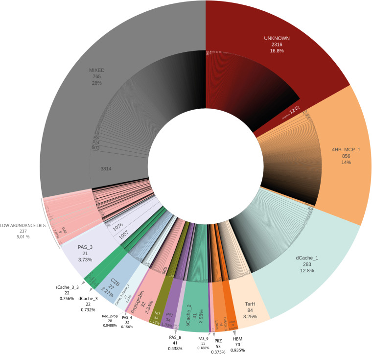
FIG 3.
Visual representation of the abundance of the LBD families. The outer donut of the chart represents the distribution of each LBD type and its relative abundance (in percentage of sequences), and the number of clusters with at least 90% of their sequences sharing the same LBD type, as defined by the Pfam signature. The LBDs are sorted according to the number of clusters within each LBD type. The inner donut of the chart represents all the clusters included within each LBD category, indicating the number of sequences contained in each subfamily. All singletons are merged in the last section of each LBD type (e.g., LBDs classified as “Unknown” have 1,242 singletons, that is, clusters containing only one sequence). “Mixed clusters” are those that do not reach the 90% threshold of sequences with the same Pfam model per cluster. “Low-abundance LBDs” include those LBD types that group into fewer than 12 “compact clusters.”

