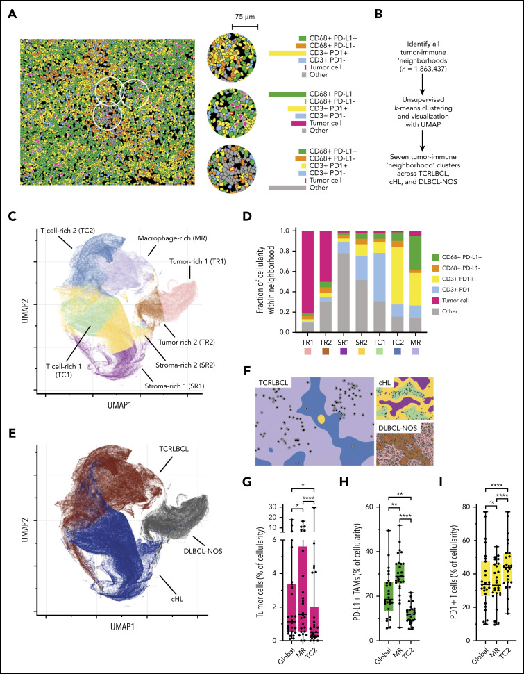
Figure 4.
Spatially defined immune cell neighborhoods distinguish TCRLBCL from cHL and DLBCL-NOS. (A) Representative cell phenotype map generated from a 5-marker mIF panel (CD3, PAX5, CD68, PD-1, and PD-L1), which highlights PD-L1+ TAMs, PD-L1− TAMs, PD-1+ T cells, PD-1− T cells, malignant B cells, and other cell types (original magnification, ×20). Circles surround the cellular neighborhoods of 3 representative “anchor” cells (yellow with red outline). Neighborhoods are defined by calculating the fractional composition of cell types <75 μm radial distance surrounding each anchor cell. (B) Neighborhood analysis workflow, which included unsupervised k-means clustering of all cell neighborhoods (n = 1 863 437) defined across cases of TCRLBCL (n = 26), cHL (n = 19), and DLBCL-NOS (n = 18) and assigned to 1 of 7 neighborhood clusters. (C) UMAP plot of pooled neighborhood data from TCRLBCL, cHL, and DLBCL-NOS cases with the 7 clusters color-coded. (D) Fractional composition of cell types within each of 7 defined clusters, color-coded. (E) UMAP plot from panel C colored according to the underlying pathologic diagnosis and demonstrating segregation of cell-neighborhoods from cases of TCRLBCL (red), cHL (blue), and DLBCL-NOS (black) into distinct regions. (F) Projections of color-coded neighborhoods (according to panel C) onto the original mIF images for representative cases of TCRLBCL (left, same case as shown in panel A), cHL (top right panel), and DLBCL-NOS (bottom right panel). Malignant cells are denoted by circles. (G-I) Percentage of global and neighborhood-specific cellularity in TCRLBCL comprised of malignant B cells (G), PD-L1+ TAMs (H), and PD-1+ T cells (I). (G-I) Individual cases (●) and the median (line), 25th and 75th percentiles (boxes), and extreme values (whiskers) are indicated. Statistical comparisons by the Friedman test with Dunn’s test for multiple comparisons. *P < .05; **P < .01; ****P < .0001.

