

Abstract
Although Excel 2016 may be the most common graphing software, it is often confusing to use effectively. In the field of applied behavior analysis, graphs are crucial for analyzing data and sharing results. Multiple-baseline design graphs are one of the most popular graphs used by behavior analysts, but they often fall short of meeting established quality standards. This tutorial extends prior tutorials to provide detailed instructions on how to create a multiple-baseline design graph that not only meets quality standards but also includes phase change lines built into the graph and an acceptable x/y-axis ratio. This tutorial is applicable for both Windows and macOS platforms.
Keywords: Graphing, Excel, Multiple-baseline design, Phase change lines
The multiple-baseline design is one of the foundational experimental designs in applied behavior analysis (ABA). In fact, the design has been a pillar of our analyses since Baer, Wolf, and Risley (1968) described it in their defining paper on ABA. It is also one of the most frequently used designs in ABA (Coon & Rapp, 2018; Cooper, Heron, & Heward, 2020). Reviewers report that the multiple-baseline design is found in 69% to 80% of studies (Hammond & Gast, 2010; Smith, 2012). Because this design is used by behavior analysts to analyze functional relations between variables, it is important that the multiple-baseline graphs meet quality standards (Cooper et al., 2020; Kubina, Kostewicz, Brennan, & King, 2017). Kubina et al. (2017) summarized these quality standards and reviewed several thousand graphs across 11 journals, and, unfortunately, the majority of those did not meet the quality standards necessary for accurate visual analysis.
Behavior analysts often rely on Microsoft Excel to create their single-subject design graphs. In fact, several task analyses have been published to assist behavior analysts in graph development (e.g., Carr & Burkholder, 1998; Deochand, 2017; Dixon et al., 2009). Recently, Chok (2019) published a task analysis using Excel 2016 to graph designs commonly used in functional analysis. Dubuque (2015), Deochand (2017), and Fuller and Dubuque (2019) published task analyses describing a novel approach to creating phase change lines. In the past, phase change lines needed to be moved by the user as data were added to the graph. All three task analyses allow the user to continue adding data to a graph while the phase change lines and labels move with the newer data. We found Dubuque’s task analysis to be clearer in adding phase change lines to a graph.
Chok’s (2019) task analysis was written for Excel 2016 based on the Microsoft Windows operating system, but it did not include Excel 2016 for macOS, and it did not address how to create a multiple-baseline design graph. Additionally, Chok did not describe how to create graphs that encompass the essential elements for line graphs, particularly how to achieve an acceptable x/y ratio to improve the quality features (Kubina et al., 2017) of a line graph. This is critical for visual analysis, as Cooper et al. (2020) posited, “the legibility of a graph is enhanced by a balanced ratio between the height and width” (p. 142). Cooper et al. and Kubina et al. (2017) proposed additional quality features that included (a) an x/y ratio range from 5:8 to 3:4, (b) outward-facing tick marks, (c) axis labels, (d) phase/condition change lines, (e) condition labels, (f) visible data points, and (g) data paths that do not cross the phase/condition change lines. Fuller and Dubuque’s (2019) task analysis included Excel for Windows and macOS, but it did not provide instruction on how to integrate phase change lines in a multiple-baseline design graph. Deochand, Costello, and Fuqua (2015) published a tutorial that included developing multiple-baseline designs; however, their tutorial was limited to Excel 2013.
This tutorial extended the extant task analyses by Chok (2019), Dubuque (2015), and Fuller and Dubuque (2019) in three ways. First, we provide step-by-step instructions and example data sets for creating multiple-baseline design graphs in Excel 2016 for Windows and macOS. Second, we describe how to incorporate the phase change lines and label techniques as initially described by Dubuque (2015) and Fuller and Dubuque (2019). Third, we explain how to achieve the quality features described by Cooper et al. (2020) and Kubina et al. (2017) that are vital for accurate visual analyses.
Task Analysis
Prepare the Spreadsheet for the Graphs
Create the spreadsheet.
Open Microsoft Excel.
Type the data from the panels in Fig. 1 into the Excel spreadsheet, following the column and row headings. Figure 1 shows three panels next to each other to allow the viewer to easily view the data. The first panel of Fig. 1 includes the data for Graph 1; the second panel includes the data for Graph 2; the third panel includes the data for Graph 3. There is no content in rows 17 and 33, hence they are omitted from the screenshots of the Excel table.
Fig. 1.

Raw Data for Multiple-Baseline Design Graphs (Step 1). Note. From left to right, panels 1, 2, and 3.
Create Graph 1
-
2.
Create the graph (see Fig. 2).
Fig. 2.

Create Graph (Step 2)
Highlight cells A1 through C16 (see Fig. 1, panel 1).
-
b.
Click the “Insert” tab in the top menu bar.
-
c.
In the “Charts” box, click the “Insert Line or Area Chart” button (the button with diagonal overlapping lines).
-
d.
Hover over the different graphs to see their labels and select the graph labeled “Line with Markers.”
-
3.
Delete the legend, grid lines, and chart title.
Click the legend once.
Press the Delete key.
Click once on one of the grid lines, which will highlight all of them.
Press the Delete key.
Click the chart title.
Press the Delete key.
-
4.
Remove the fill colors and border from the chart area (see Fig. 3).
Right-click near the upper-right corner of the chart area.
Select “Format Chart Area.”
Select “Fill & Line” (the paint can icon).
Under the “Fill” heading, select “No fill.”
Under the “Border” heading, select “No line.”
-
5.
Remove the fill colors and border from the plot area.
Right-click any spot of the plot area.
Select “Format Plot Area.”
Select “Fill & Line.”
Under the “Fill” heading, select “No fill.”
Under the “Border” heading, select “No line.”
-
6.
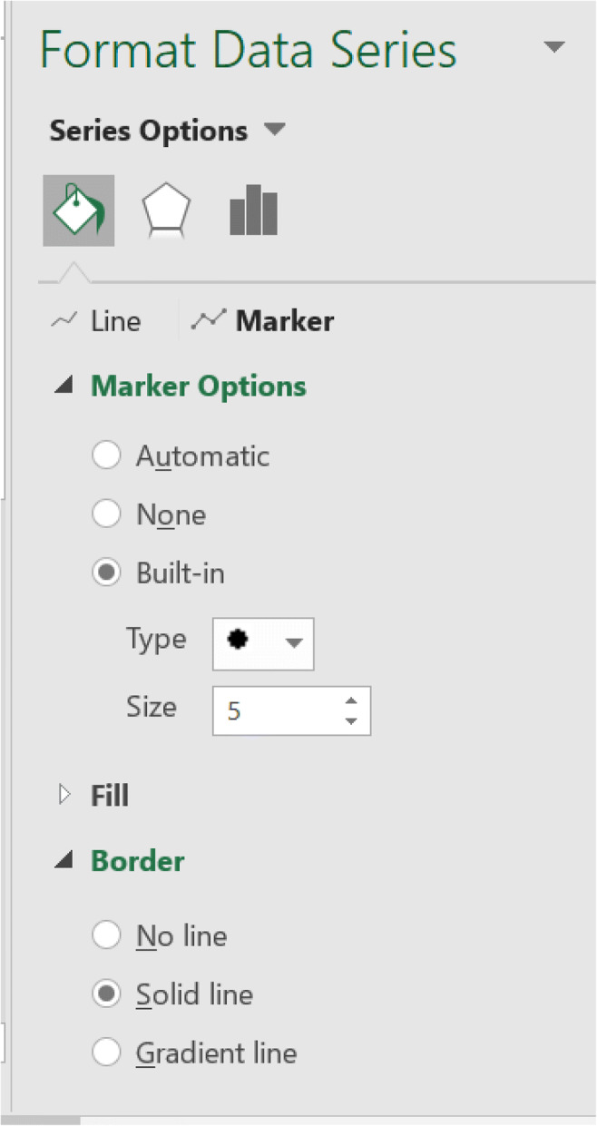
Edit the marker style (see Fig. 4).
Right-click any segment of the line on the graph.
Click “Format Data Series.”
Select “Fill & Line.”
Select the “Marker” tab.
Select “Marker Options.”
Select the suboption “Built-In.”
Choose the circle marker type.
-
7.
Edit the marker fill and border colors.
Remain in the “Format Data Series” window under the “Fill & Line” button and “Marker” option.
Scroll down to “Fill.”
Select “Solid fill.”
Click the paint can icon to the left of the “Color” title, which will display a graphic of colors.
Select the color “Black, Text 1.”
Scroll down to “Border.”
Select “Solid line.”
Click the icon of the pen, which will display a graphic of colors.
Select “Black, Text 1.”
-
8.
Edit the line color.
Remain in the “Format Data Series” window; return to the “Fill & Line” submenu.
Select the option “Line.”
Select “Solid Line.”
If the color does not automatically change to black, go back to Steps 7g and 7h to change the color.
-
9.
Return to the graph.
Click the X in the upper-right corner of the “Format Data Series” window to return to the graph.
Click the plot area.
Select the “Design” tab (Windows) under the “Chart Tools” heading, or “Chart Design” tab (macOS).
Select “Add Chart Element.”
Hover over “Axes.”
Select “More Axis Options.”
Find the “Format Axis” window.
Select the “Axis Options” subheading (the bar graph icon).
Select “Tick Marks.”
Select “Major Type” as “Outside.”
Select “Labels.”
Select “Next to Axis” for “Label Position” if not already selected.
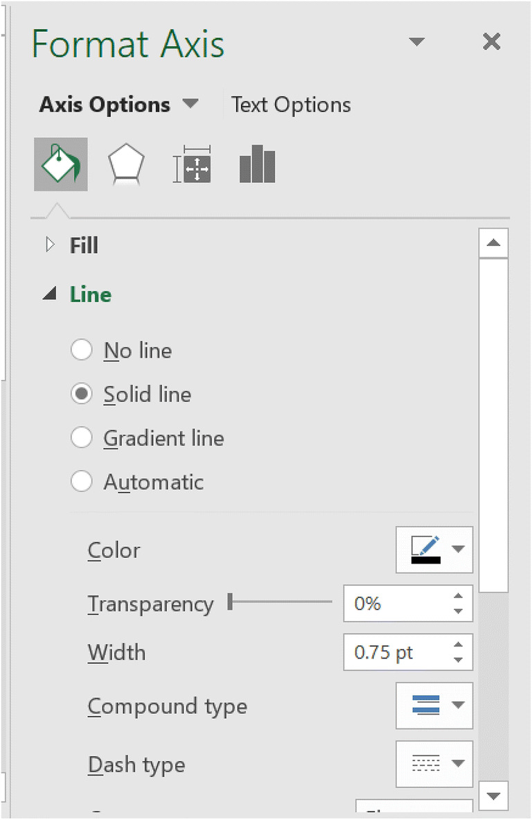
Click the “Fill & Line” button (the paint can icon).
Under the “Line” heading, click “Solid line.”
If the color does not automatically change to black, go back to Steps 7g and 7h to change the color.
-
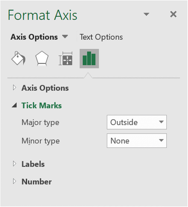
11.
Add tick marks to the y-axis.
While in the “Format Axis” window, click once on the y-axis.
Select the “Axis Options” button.
Under the “Tick marks” heading. Change “Major Type” from “None” to “Outside.”
-
12.
Return to the graph.
-
13.
Edit the x-axis font color.
Click once on the x-axis.
Under the “Home” tab, click the button with the letter “A.”
Select “Automatic.”
-
14.
Edit the y-axis font color.
Click once on the y-axis.
Under the “Home” tab, hover over the button with the letter “A” and a red line underneath the “A.” The label should read “Font Color.” Click the button.
Select “Automatic.”
-
15.
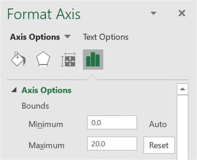
Edit the y-axis bounds (Fig. 9).
Right-click once on the y-axis.
Click “Format Axis.”
Under “Axis Options” and the subheading “Bounds,” change the value of “Maximum” to 20.
Under the subheading “Units,” change the value of “Major” to 4. This change allows for the creation of a chart with an appropriate x/y ratio as indicated by Cooper et al. (2020) and Kubina et al. (2017).
-
16.
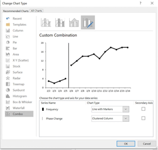
Create a combined graph. Steps 16 and 17 are from Dubuque (2015, pp. 208–209).
For Windows, right-click on the phase change line data series. For macOS, press Control, then click (or just right-click, if your mouse has that feature) on the phase change data point on the graph.
For Windows, select the “Change Series Chart Type” option. For macOS, select “Change Chart Type” (see Fig. 10).
For Windows, under “Combo,” select the “Clustered Column” option from the “Phase Change” drop-down box and click “OK” (see Fig. 11).
-
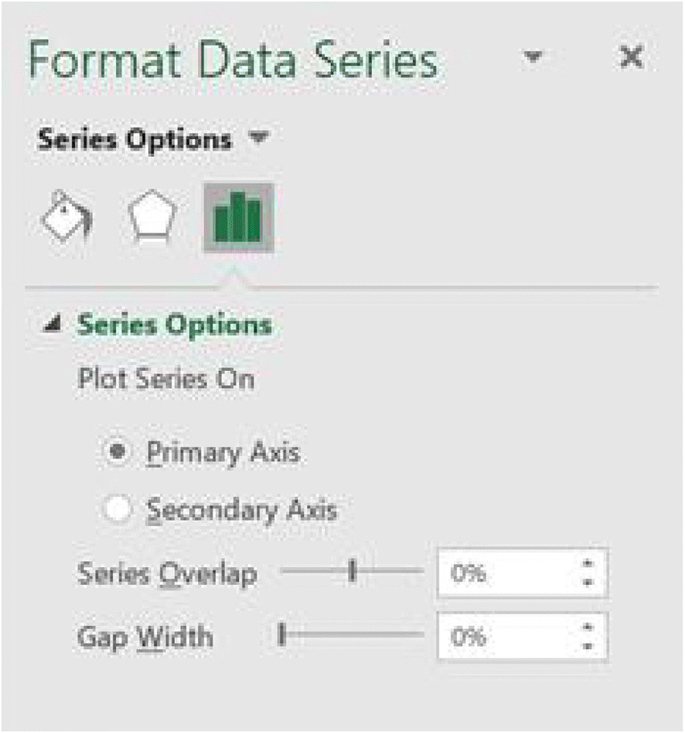
17.
Add phase change lines.
For Windows, right-click on the phase change line data series. For macOS, press Control, then click (or just right-click) the newly created line on the graph.
Click the “Format Data Series” option.
Under “Series Option,” change the “Gap Width” value to 0% (see Fig. 12).
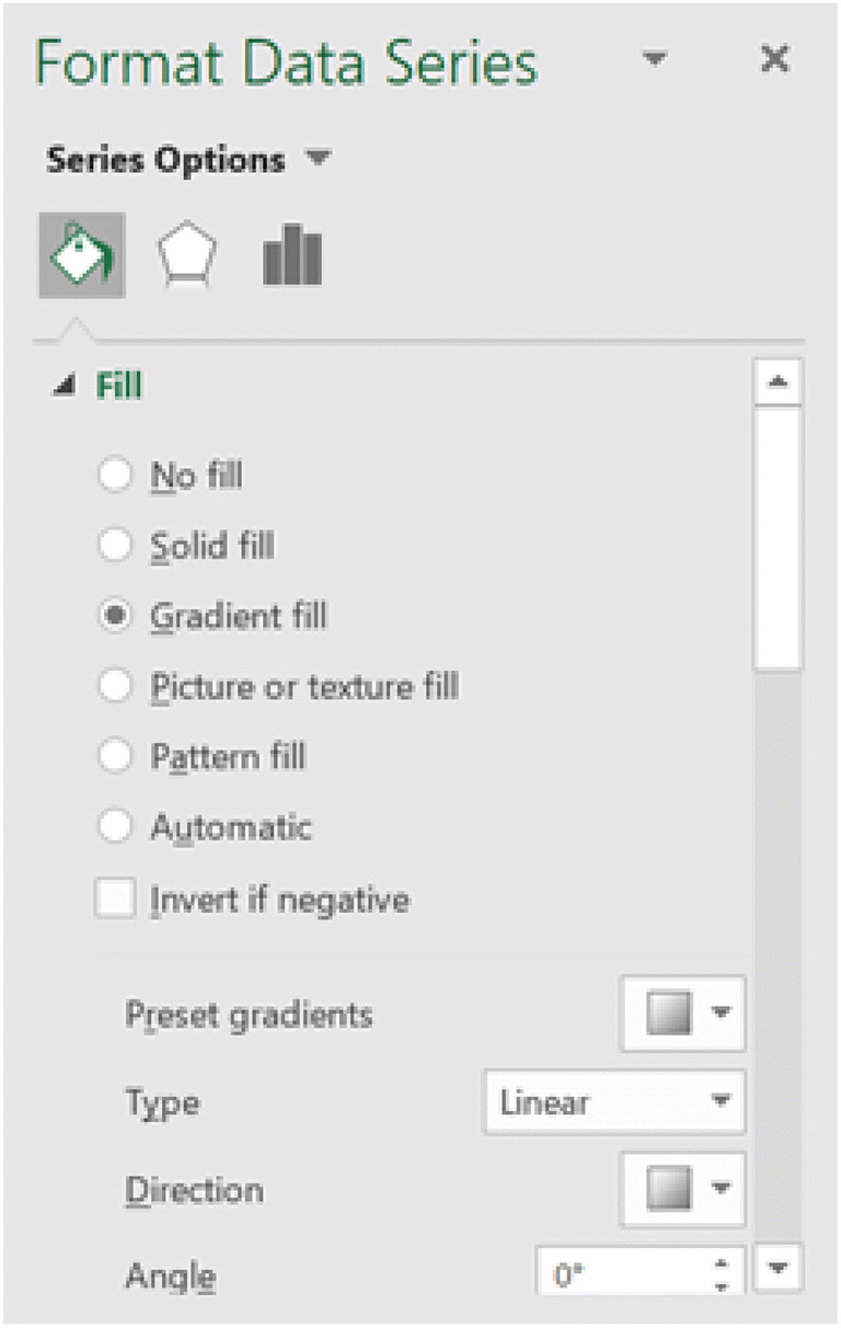
Under “Fill & Line,” select the “Gradient Fill” radio button (see Fig. 13).
Under the “Type” drop-down box, select the “Linear” option.
Under the “Direction” drop-down box, select the “Linear Left” option and change the angle to 0% (Windows) or 180° (macOS).
Add or delete the gradient stops so that only three stops are shown.
Change the first gradient stop so that its color is black, its position is 0%, and its transparency is 0% (see Fig. 14, panel 1).
Change the second gradient stop so that its color is black, its position is 6%, and its transparency is 0% (see Fig. 14, panel 2).
Change the third gradient stop so that its color is black, its position is 7%, and its transparency is 100% (see Fig. 14, panel 3). The thickness of the phase change line can be adjusted by modifying the gradient stop position in this step and the previous step—for example, setting the second gradient stop to 8% and the third gradient stop to 9%.
If necessary, remove any borders or shadows that may have been added to the phase change data series by default.
For Windows, right-click on the data point that is immediately to the right of the phase change line. For macOS, click the data point immediately to the right of the phase change line (typically twice) until only that data point is highlighted, then press Control, then click (or right-click).
Select “Format Data Point.”
Click “Fill & Line.”
Under the “Line” heading, select “No line.”
-
19.
Adjust the x/y-axis ratio (see Fig. 17).
Click the outside border of the graph.
Click the “Format” tab under the “Chart Tools” heading.
Change “Height” to 3 and “Width” to 4.8.
This will give a 5:8 ratio, which is recommended for single-case research graphs.
-
20.
Save the graph as a template (see Fig. 18).
For Windows, right-click on the graph. For macOS, press Control, then click (or right-click).
Select “Save as Template.”
Use the text “Multiple Baseline” for the file name when saving the template file.
Fig. 3.

Format Chart Area (Step 4)
Fig. 4.
Edit Marker Style (Step 6)
Fig. 5.

Edit x-Axis Tick Marks (Steps 10a–10e)
Fig. 6.
Edit x-Axis Tick Marks (Steps 10f–10i) Part 1
Fig. 7.

Edit x-Axis Tick Marks (Steps 10f–10i) Part 2
Fig. 8.
Edit x-Axis Tick Marks (Steps 10l–10n)
Fig. 9.
Edit y-Axis Bounds (Step 15)
Fig. 10.

Change Chart Type in Windows (Top Panel) and macOS (Bottom Panel; Step 16b)
Fig. 11.
Change Chart Type (Step 16c)
Fig. 12.
Edit Phase Change Line (Step 17c)
Fig. 13.
Edit Phase Change Line (Step 17d)
Fig. 14.

Edits for First, Second, and Third Gradient Stops (Steps 17h–17j). Note. From left to right, panels 1, 2, and 3.
Fig. 15.

Add a Line Break (Steps 18a and 18b)
Fig. 16.

Add a Line Break (Steps 18c and 18d)
Fig. 17.

Adjust the x/y-Axis Ratio (Step 19)
Fig. 18.

Save the Graph as a Template (Step 20)
Create Graph 2
-
21.
Create the second graph.
Select cells A18 through C32 (see Fig. 1, panel 2).
Select “Insert.”
For Windows, click the arrow in the bottom-right corner of the “Charts” menu. For macOS, select “Templates,” then “Multiple Baseline.”
For Windows, select “All Charts.”
For Windows, select the “Templates” folder.
For Windows, select the “Multiple Baseline” template.
For Windows, right-click on the data point on the right side of the gap between data points to the left of the phase change line. For macOS, click the right side of the gap between data points to the left of the phase change line (typically twice) until only that data point is highlighted, press Control, then click (or right-click).
Select “Format Data Point.”
Under the “Fill & Line” icon, scroll to “Line” and select “Solid line.”
Edit the line color to be black if necessary.
For Windows, right-click on the data point immediately to the right of the phase change line. For macOS, click the data point immediately to the right of the phase change line (typically twice) until only that data point is highlighted, press Control, then click (or right-click).
Select “Format Data Point.”
Under the “Fill & Line” icon, scroll to “Line” and select “No line.”
Create Graph 3
-
23.
Create the third graph.
Select cells A34 through C48 (see Fig. 1, panel 3).
Select “Insert.”
For Windows, click the arrow in the bottom-right corner of the “Charts” menu. For macOS, select “Templates,” then “Multiple Baseline.”
For Windows, select “All Charts.”
For Windows, select the “Templates” folder.
For Windows, select the “Multiple Baseline” template.
-
24.
Edit the line breaks if necessary.
For Windows, right-click on the data point on the right side of the gap between data points to the left of the phase change line. For macOS, click the right side of the gap between data points to the left of the phase change line (typically twice) until only that data point is highlighted, press Control, then click (or right-click).
Select “Format Data Point.”
Under the “Fill & Line” icon, scroll to “Line” and select “Solid line.”
Edit the line color to be black if necessary.
For Windows, right-click on the data point immediately to the right of the phase change line. For macOS, click the data point immediately to the right of the phase change line (typically twice) until only that data point is highlighted, right-click or press Control, then click (or right-click).
Select “Format Data Point.”
Under the “Fill & Line” icon, scroll to “Line” and select “No line.”
Group the Graphs
-
25.
Align and group the graphs.
Align the graphs horizontally and vertically (so that each subsequent participant’s graph is below the previous participants’ graphs).
Hold down the Ctrl (Windows) or Command (macOS) key.
Click once on the chart area of each graph while holding down the Ctrl (Windows) or Command (macOS) key.
Right-click once.
Select “Group,” then select “Group” again (see Fig. 19).
-
26.
Connect the phase change lines between graphs.
Click once on the grouped graphs.
For Windows, under the “Drawing Tools” heading, select “Format.” For macOS, select the “Shape Format” tab, and select “Shapes.”
For Windows, locate the “Insert Shapes” panel on the left side of the menu on the top of the screen.
Select the “Connector: Elbow” shape (see Fig. 20).
Orient the connector so it connects the phase change line in the first graph to the phase change line in the second graph.
For Windows, return to or remain on the “Format” menu from the “Drawing Tools” heading (see Fig. 21). For macOS, press Control, then click (or right-click) and select “Format Shape.”
For Windows, in the “Shape Styles” box, select “Shape Outline.”
For Windows, choose the color “Automatic” to change the color of the connector to black. For macOS, click the “Fill & Line” icon, scroll to “Line,” and next to “Color,” select the drop-down menu and select black.
For Windows, select “Shape Outline” again and click “Weight.” Adjust the weight of the line to match that of the phase change line. The weight chosen for this template is 1 pt. For macOS, using the drop-down menu next to “Width,” adjust the width to match that of the phase change line. The weight chosen for this template is 1.25 pt.
Connect the other lines as needed.
-
27.
Create the x-axis label.
Click a spreadsheet cell outside of the charts.
Click the “Insert” tab.
Find the “Text” panel.
Select the “Text Box” option.
Draw the text box on the spreadsheet away from the graphs.
Type in the x-axis label (e.g., “Date of Session”).
Select the text box by clicking it once.
Drag the text box to the bottom of the third graph.
-
28.
Create the y-axis label.
Click a spreadsheet cell outside of the charts.
Click the “Insert” tab.
Find the “Text” panel.
Select the “Text Box” option.
Draw the text box on the spreadsheet away from the graphs.
Type in the y-axis label (e.g., “Frequency”).
-
29.
Rotate the y-axis label.
Right-click on the text box.
Select “Format Shape.”
Select “Size & Properties.”
Select “Text Box.”
Click the drop-down menu under “Text Direction.”
Select “Rotate All Text 270o.”
Click the X in the upper-right corner of the “Format Shape” window to return to the spreadsheet.
Adjust the text box so the letters of the label fit and are not broken up, if necessary.
Click the text box.
Drag it to the left of the y-axis on the second graph.
-
30.
Remove the border and background color of the axis labels.
Click the desired text box once to select it.
For Windows, right-click on the same text box. For macOS, press Control, then click (or right-click) the same text box.
For Windows, select “Format Shape.” For macOS, select “Format Text Effect.”
Select “Fill & Line.”
Under the “Fill” heading, select “No fill.”
Under the “Border” (Windows) heading or “Line” (macOS), select “No line.”
Repeat as necessary for the remaining text boxes.
-
31.
Create the intervention phase labels.
Click a spreadsheet cell outside of the charts.
Click the “Insert” tab.
Find the “Text” panel.
Select the “Text Box” option.
Draw each text box on the spreadsheet away from the graphs.
Type in the phase label (e.g., “Baseline” and “Intervention”).
Select the text box by clicking it once.
Drag the text box to the top of the first graph to align with the corresponding phase (e.g., “Baseline” and “Intervention”).
-
32.
Remove the border and background color of the phase labels.
Click the desired text box to select it.
For Windows, right-click on the same text box. For macOS, press Control, then click (or right-click) the same text box.
For Windows, select “Format Shape.” For macOS, select “Format Text Effect.”
Select “Fill & Line.”
Under the “Fill” heading, select “No fill.”
Under the “Border” heading (Windows) or “Line” (macOS), select “No line.”
Repeat as necessary for the remaining text boxes.
Hold down the Ctrl (Windows) or Command (macOS) key.
Click once on the graph and once on each of the elbow connectors while holding down the Ctrl (Windows) or Command (macOS) key.
For Windows, click “Format” under “Drawing Tools.” For macOS, click the “Shape Format” tab, select “Arrange,” then select “Group” (Fig. 22).
For Windows, select “Group,” and then select “Group” again.
Hold down the Ctrl (Windows) or Command (macOS) key.
Click once on the graph and once on each of the text boxes (x-axis label, y-axis label, and intervention phase labels).
For Windows, click “Format” under “Drawing Tools.” For macOS, click the “Shape Format” tab, select “Arrange,” then select “Group” (Fig. 22).
For Windows, select “Group,” and then select “Group” again.
Fig. 19.

Group the Graphs (Step 25e)
Fig. 20.

Access the Connector: Elbow Shape in Windows (Top Panel) and macOS (Bottom Panel; Step 26d)
Fig. 21.

Access the Connector: Elbow Shape in Windows (Top Panel) and macOS (Bottom Panel; Steps 26f–26i)
Fig. 22.

macOS Group Chart Elements (Steps 33c and 33g)
Fig. 23.

Final Multiple-Baseline Graph (Step 33)
Discussion
The previous task analysis provides updated instructions for creating multiple-baseline design graphs in Excel 2016. These instructions should be applicable for both Windows and macOS users; however, if users have not updated their software, it is possible that some steps may not match the features or menus in older versions of Excel. This task analysis not only includes instructions on how to add phase change lines to a multiple-baseline graph but also details how to make each graph achieve an appropriate x/y-axis ratio and includes the quality features described by Cooper et al. (2020) and Kubina et al. (2017; e.g., axis labels, phase/condition change labels, outward-facing tick marks), which are integral for accurate visual analysis. Furthermore, the task analysis delineates the creation of other common behavior-analytic graphing conventions, including tick marks, colors, and axis labels.
A limitation of this task analysis is that it allows users to create only one type of phase change line. If users need to use dashed or dotted phase change lines, they will need to explore other resources that are available to learn how to add those to their graphs. Another limitation is the length of the task analysis, which may appear cumbersome to novice Excel users. However, it is our hope that including all graph details in one task analysis will lower users’ overall response effort when creating a multiple-baseline design graph, as they will not have to search for multiple task analyses to complete a single graph. In the future, behavior analysts will need to update task analyses to match the changing interfaces in Excel. Additionally, further task analyses should be developed as other software (e.g., Google Sheets) provide more complex graphing capabilities.
This task analysis furthers the work of Dubuque (2015), Chok (2019), and Fuller and Dubuque (2019) by detailing how to add phase change lines to multiple-baseline design graphs and how to alter graphs to have an appropriate x/y-axis ratio; additionally, these instructions are applicable for both Windows and macOS users. Although Dixon et al. (2009) and Deochand et al. (2015) provided multiple-baseline design graph task analyses, they were for outdated versions of Excel. For the practitioner, it is important that updated task analyses are available for use to demonstrate treatment effectiveness to clients and consumers. Visual analysis is a critical component of ABA and can only be done correctly if a viewer is looking at a graph that meets quality standards. By synthesizing and elaborating on previously published task analyses, this article provides an updated task analysis for making quality multiple-baseline design graphs. Those in the behavior-analytic community can use this resource to more easily graph their data in order to share their important work with parents, stakeholders, and research communities.
Acknowledgements
This study was completed in partial fulfillment of the requirements of a master of science degree in applied behavior analysis by Zoey B. Watts. The authors would like to thank Katharine Roberts for her assistance with this project.
Declarations
The authors declare that no relevant conflicts of interest influenced the nature of the present discussion and review article.
Footnotes
Publisher’s Note
Springer Nature remains neutral with regard to jurisdictional claims in published maps and institutional affiliations.
References
- Baer, D. M., Wolf, M. M., & Risley, T. R. (1968). Some current dimensions of applied behavior analysis. Journal of Applied Behavior Analysis, 1(1), 91–97. 10.1901/jaba.1968.1-91. [DOI] [PMC free article] [PubMed]
- Carr, J. E., & Burkholder, E. O. (1998). Creating single-subject design graphs with Microsoft Excel®. Journal of Applied Behavior Analysis, 31(2), 245–251. 10.1901/jaba.1998.31-245.
- Chok, J. T. (2019). Creating functional analysis graphs using Microsoft Excel® for PCs. Behavior Analysis in Practice, 12(1), 265–292. 10.1007/s40617-018-0258-4. [DOI] [PMC free article] [PubMed]
- Coon, J. C., & Rapp, J. T. (2018). Application of multiple baseline designs in behavior analytic research: Evidence for the influence of new guidelines. Behavioral Interventions, 33(2), 160–172. 10.1002/bin.1510.
- Cooper JO, Heron TE, Heward WL. Applied behavior analysis. 3. 2020. [DOI] [PMC free article] [PubMed] [Google Scholar]
- Deochand, N. (2017). Automating phase change lines and their labels using Microsoft Excel®. Behavior Analysis in Practice, 10(3), 279–284. 10.1007/s40617-016-0169-1. [DOI] [PMC free article] [PubMed]
- Deochand, N., Costello, M. S., & Fuqua, R. W. (2015). Phase-change lines, scale breaks, and trend lines using Excel 2013. Journal of Applied Behavior Analysis, 48(2), 478–493. 10.1002/jaba.198. [DOI] [PubMed]
- Dixon, M. R., Jackson, J. W., Small, S. L., Horner-King, M. J., Mui Ker Lik, N., Garcia, Y., & Rosales, R. (2009). Creating single-subject design graphs with Microsoft Excel® 2007. Journal of Applied Behavior Analysis, 42(2), 277–293. 10.1901/jaba.2009.42-277. [DOI] [PMC free article] [PubMed]
- Dubuque, E. M. (2015). Inserting phase change lines into Microsoft Excel® graphs. Behavior Analysis in Practice, 8(2), 207–211. 10.1007/s40617-015-0078-8. [DOI] [PMC free article] [PubMed]
- Fuller, T. C., & Dubuque, E. M. (2019). Integrating phase change lines and labels into graphs in Microsoft Excel®. Behavior Analysis in Practice, 12(1), 293–299. 10.1007/s40617-018-0248-6. [DOI] [PMC free article] [PubMed]
- Hammond, D., & Gast, D. L. (2010). Descriptive analysis of single subject research designs: 1983–2007. Education and Training in Autism and Developmental Disabilities, 45(2), 187–202 https://www.jstor.org/stable/23879806.
- Kubina, R. M., Kostewicz, D. E., Brennan, K. M., & King, S. A. (2017). A critical review of line graphs in behavior analytic journals. Educational Psychology Review, 29(3), 583–598. 10.1007/s10648-015-9339-x.
- Smith, J. D. (2012). Single-case experimental designs: A systematic review of published research and current standards. Psychological Methods, 17(4), 1–70. 10.1037/a0029312. [DOI] [PMC free article] [PubMed]