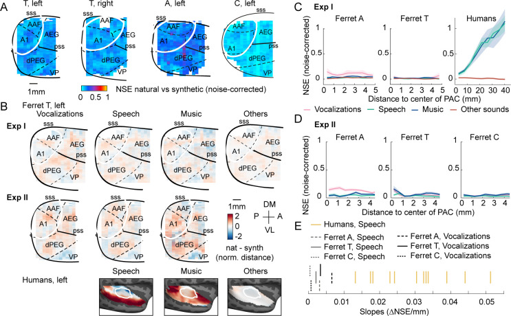
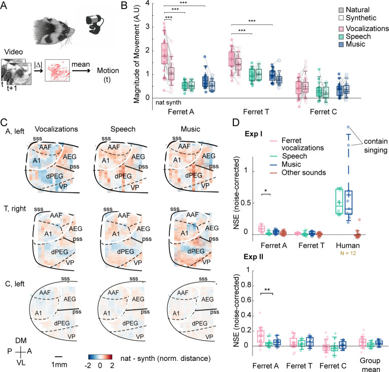
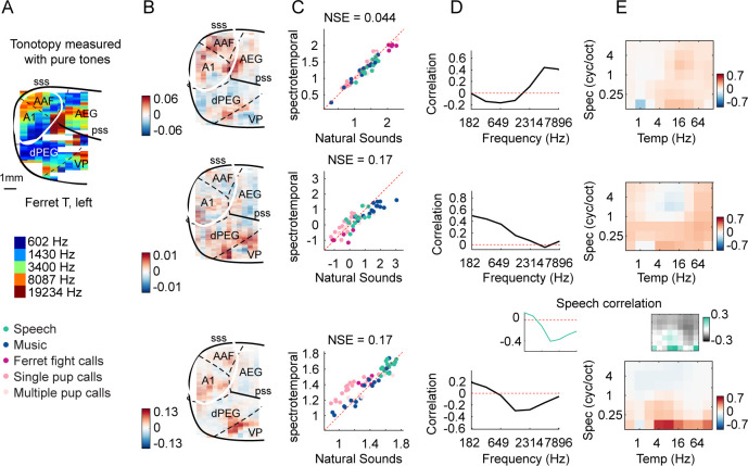
Figure 4. Testing the importance of ecological relevance.
Experiment II measured responses to a larger number of ferret vocalizations (30 compared with 4 in experiment I), as well as speech (14) and music (16) sounds. (A) Map showing the dissimilarity between natural and spectrotemporally matched synthetic sounds from experiment II for each recorded hemisphere, measured using the noise-corrected normalized squared error (NSE). NSE values were low across auditory cortex, replicating experiment I. (B) Maps showing the average difference between responses to natural and synthetic sounds for vocalizations, speech, music, and others sounds, normalized for each voxel by the standard deviation across all sounds. Results are shown for ferret T, left hemisphere for both experiments I and II (see Figure 4—figure supplement 1C for all hemispheres). For comparison, the same difference maps are shown for the human subjects, who were only tested in experiment I. (C) NSE for different sound categories, plotted as a function of distance to primary auditory cortex (binned as in Figure 2F). Shaded area represents 1 standard error of the mean across sounds within each category (Figure 4—figure supplement 1D plots NSEs for individual sounds). (D) Same as panel (C) but showing results from experiment II. (E) The slope of NSE vs. distance-to-primary auditory cortex (PAC) curves for individual ferrets and human subjects. Ferret slopes were measured separately for ferret vocalizations (black lines) and speech (gray lines) (animal indicated by line style). For comparison, human slopes are plotted for speech (each yellow line corresponds to a different human subject).


