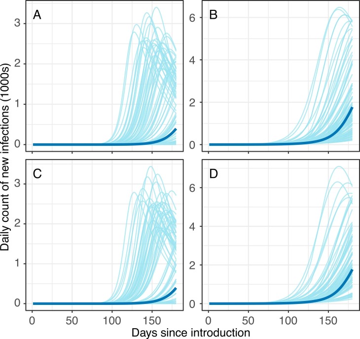
Fig. 3.
Pre-intervention epidemic curves in the (A, C) urban poor subpopulation and (B, D) less socioeconomically vulnerable subpopulation. Gray lines represent 100 random draws from the curves that have 150-day cumulative infection counts in the interquartile range. Blue lines represent curves that are associated with median 150-day cumulative infection counts. Top row panels (A-B) reflect results from assumption of 19% severity among symptomatic cases and bottom row panels (C-D) reflect results from assumption of 15% severity among symptomatic cases.

