Abstract
Available COVID-19 data shows higher shares of cases and deaths occur among Black Americans, but reporting of data by race is poor. This paper investigates disparities in county-level mortality rates across counties with higher and lower than national average Black population shares using nonlinear regression decomposition and estimates potential differential impact of social distancing measures. I find counties with Black population shares above the national share have mortality rates 2 to 3 times higher than in other counties. Observable differences in living conditions, health, and work characteristics reduce the disparity to approximately 1.25 to 1.65 overall, and explain 100% of the disparity at 21 days after the first case. Though higher rates of comorbidities in counties with higher Black population shares are an important predictor, living situation factors like single parenthood and population density are just as important. Higher rates of co-residence with grandchildren explain 11% of the 21 day disparity but do not appear important by 42 days, suggesting families may have been better able to protect vulnerable family members later in the epidemic. To analyze differential effects of social distancing measures use two approaches. First, I exploit the timing of interventions relative to the first case among counties that began their epidemic at the same time. Second, I use event study analysis to analyze within-county changes in mortality. Findings for social distancing measures are not always consistent across approaches. Overall, I find no evidence that school closures were less effective in counties with larger Black population shares, and some estimates suggest closures may have disproportionately helped more diverse counties and counties with high rates of grandparent and grandchild co-residence. Conversely, stay at home orders are less clearly associated with mortality in any counties, reaching peak unemployment did not reduce mortality in any models, and some estimates indicate reaching peak unemployment before the first case was associated with higher mortality rates, especially in more diverse counties.
Keywords: COVID-19, Health disparities
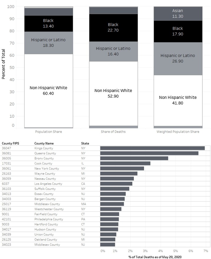
The Centers for Disease Control and Prevention (CDC) released racial and ethnic breakdowns in COVID-19 mortality for the first time on April 16th, 2020. There were striking disparities in these data. The first two bars in Fig. 1 display the population shares and shares of deaths by race and ethnicity. In this comparison, Black Americans make up 13.4% of the national population but account for 22.7% of COVID-19 deaths. The third bar provides the CDC's weighted population shares, which reflect the racial and ethnic composition of the population in areas where outbreaks are occurring.1 Using this adjustment, Black Americans account for 17.9% of the population in areas with outbreaks. As shown in the lower panel of Fig. 1, 20 counties account for nearly 50% of all deaths and are more racially diverse than the national population.
Fig. 1.
Share of COVID-19 deaths vs. share of population.
Yet, even within states and cities that reported deaths by race, striking disparities exist (Stafford et al., 2020). In a May 6th New England Journal of Medicine Perspective article, Chowkwanyun and Reed (2020) called for both “caution and context” in interpreting racial disparities in COVID-19 cases and mortality. They argue the need for research that places disparities in context of differences in socioeconomic and place-based factors that may explain race-based disparities. This study attempts to address this need.
Data is lacking to study deaths by race at a sufficient level of geographical granularity. Instead, I analyze disparities in COVID-19 mortality across counties with shares of Black residents above and below the national average, and examine the extent to which observable county differences in living situations, work circumstances, and health status and access explain them. I also offer analyses using alternative metrics to assign counties to groups including the average of county Black population shares, the median of county Black population shares, and the average of county Black non-Hispanic population shares. I use cumulative mortality reported as of June 30th, 2020, a time when only 217 counties had not yet reported a confirmed case, and compare with estimates at 21 days and 42 days after the first case to assess whether differences in timing of outbreaks may contribute to point-in-time disparities. My study period encompasses unprecedented public health and policy interventions to control the spread, including closures of K12 schools, non-essential businesses, and stay-at-home orders and their variants. I investigate whether these interventions have different impacts on COVID-19 mortality across counties with higher proportions of Black residents.
1. Existing studies of disparities Table 1
Table 1.
Listing of county covariates and data sources.
| Group | Variable name | Source |
|---|---|---|
| Health conditions and access | ||
| All Cause Mortality Risk, Ages 45–65 | Institute for Health Metrics and Evaluation (IHME) | |
| All Cause Mortality Risk, Ages 65–85 | Institute for Health Metrics and Evaluation (IHME) | |
| Population below poverty level | 2018 American Community Survey 5-Year Estimates | |
| Uninsured rate | Small Area Health Insurance Estimates (SAHIE) Program | |
| ICU Beds per capita | Kaiser Health News Analysis of CMS Data | |
| Population under age 30 | 2018 American Community Survey 5-Year Estimates | |
| Population age 55 to 84 | 2018 American Community Survey 5-Year Estimates | |
| Population age 85 and older | 2018 American Community Survey 5-Year Estimates | |
| Share of Medicare beneficiaries received pneumococcal vaccine | CMS Mapping Medicare Disparities Tool | |
| Share of Medicare beneficiaries had lung cancer screening | CMS Mapping Medicare Disparities Tool | |
| Share of Medicare beneficiaries with 3 or more comorbidities | CMS Mapping Medicare Disparities Tool | |
| Share of Medicare beneficiaries with tobacco use | CMS Mapping Medicare Disparities Tool | |
| Share of Medicare beneficiares with diabetes | CMS Mapping Medicare Disparities Tool | |
| Living situation | ||
| Population living in apartments | 2018 American Community Survey 5-Year Estimates | |
| Population density | 2018 American Community Survey 5-Year Estimates | |
| Population living in urban cluster | 2010 Decennial Census | |
| Population in prison or other correctional facility | 2010 Decennial Census | |
| Population grandparents co-residing with grandchild | 2018 American Community Survey 5-Year Estimates | |
| Population in skilled nursing facility | Long Term Care Focus | |
| Population single parents | 2018 American Community Survey 5-Year Estimates | |
| Population under age 18 attending school | 2018 American Community Survey 5-Year Estimates | |
| Work circumstances | ||
| Population in essential professional occupations* | 2018 American Community Survey 5-Year Estimates | |
| Population in non-essential professional occupations* | 2018 American Community Survey 5-Year Estimates | |
| Population in science occupations* | 2018 American Community Survey 5-Year Estimates | |
| Population in law and related occupations* | 2018 American Community Survey 5-Year Estimates | |
| Population in health practitioner occupations* | 2018 American Community Survey 5-Year Estimates | |
| Population in other health occupations* | 2018 American Community Survey 5-Year Estimates | |
| Population in firefighting occupations* | 2018 American Community Survey 5-Year Estimates | |
| Population in law enforcement occupations* | 2018 American Community Survey 5-Year Estimates | |
| Population in essential service occupations* | 2018 American Community Survey 5-Year Estimates | |
| Population in non-essential service occupations* | 2018 American Community Survey 5-Year Estimates | |
| Population in industrial and natural resources occupations* | 2018 American Community Survey 5-Year Estimates | |
| Population in construction occupations* | 2018 American Community Survey 5-Year Estimates | |
| Population in essential technical occupations* | 2018 American Community Survey 5-Year Estimates | |
| Population in transportation occupations* | 2018 American Community Survey 5-Year Estimates | |
| Population worked from home | 2018 American Community Survey 5-Year Estimates | |
| Population with 4 year college degree | 2018 American Community Survey 5-Year Estimates | |
| Population without high school diploma | 2018 American Community Survey 5-Year Estimates | |
All data sources are publicly available. Full citations for all data sources are reported in the Appendix. Variables marked with an * are based on occupational classification by Almagro and Orane-Hutchinson (2020).
My analysis of disparities builds on prior published research by Millett et al. (2020), who analyzed COVID-19 diagnosed cases and mortality as of April 13th across counties with Black population shares above and below the national average of 13%. My main models use the same method to define county groups, and I offer sensitivity analyses using alternative groupings. They find a risk ratio of 1.18 (95% CI: 1.00 to 1.40) after adjusting for cross-county differences in age composition. Few of differences in predictors between county groups were statistically significant, and thus estimates were not reported. DiMaggio et al. (2020) use spatial modelling approach and find an increase proportion of Black residents was associated with a five-fold increase in positive testing results. Yet, it is difficult to interpret this magnitude because the authors state it is with respect to a one unit increase in “a scaled standardized measure”. Reported descriptive statistics indicate the measure was a proportion relative to population and thus a one unit increase would be an unrealistic margin. Nonetheless, this study finds significant disparities even after adjusting for other covariates.
Several working papers document disparities in reported cases using data from New York City. Borjas (2020) finds the probability of a positive test is higher in zip codes where Black persons comprise a larger share of the population. He argues this disparity is likely underestimated because these same areas had lower testing rates. Almagro and Orane-Hutchinson (2020) classify occupations to identify whether zip codes with higher shares of essential workers, healthcare workers, transportation workers, and other occupational groups less able to socially distance high higher numbers of cases. They find disparities still exist between neighborhoods with more black persons relative to less diverse neighborhoods after controlling for occupational differences.
Quinn et al. (2011) study racial disparities during the prior H1N1 epidemic using survey data about exposure and ability to socially distance that may be especially relevant to the current pandemic (Bibbins-Domingo, 2020). They find Black and Hispanic persons were significantly less able to socially distance due to greater reliance on public transportation, lessor ability to work from home, and less access to childcare separate from other children. Their empirical results provide support for the arguments Blumenshine et al. (2008) make about likely disparities in the event of a hypothetical influenza outbreak stemming from differences in exposure, susceptibility, and treatment across racial and ethnic groups. Blendon et al. (2008) also examine differential vulnerability by race and ethnicity to a hypothetical influenza outbreak. Using survey data, they find one-third of African Americans said they would not have anyone to take care of them if they were sick, and African Americans were more likely than whites to say they would struggle to adhere to public health recommendations to stay home due to financial problems and fear of job loss. Together, these studies suggest the effects of social distancing measures, like stay-at-home orders and school closures, may disproportionately protect white persons from disease and disproportionately harm communities of color.
While prior studies have analyzed the likely disparate impact of school closures on achievement (Kuhfeld et al., 2020, Sen and Tucker, 2020), and disparities in COVID related unemployment (Montenovo et al., 2020, Couch et al., 2020), less is known about whether and how policy actions taken to “flatten the curve” in March and April may have affected disparities in COVID-19 mortality. Recent research indicates social distancing measures played a large role in slowing growth in cases in the spring in counties that adopted them relative to counties that did not (Courtemanche et al., 2020). Presumably earlier interventions were likely more successful and recent research appears to support this assertion (Pei et al., 2020). If so, given that the earliest affected communities were more diverse than the nation as a whole but many states and counties adopted social distancing measures around the same time, it is possible these measures reduce mortality overall but exacerbated national disparities because state and local governments in less diverse communities were able to act earlier.
To this literature I contribute updated estimates of disparities in mortality based on the same county groupings as Millett et al. (2020). I provide a regression decomposition analysis to better understand the way in which cross-county differences in heath status and access, work circumstances, and living situations contribute to estimated disparities. I then provide the first evidence of differential impacts of social distancing measures.
2. Methods
2.1. How and when to measure mortality
I measure mortality as the cumulative number of deaths reported per 1000 persons using USAFACTS data usafacts (2020). This rate is sometimes called the “crude” mortality rate. While imperfect, this metric is preferred to the case-fatality rate because it is less reliant upon case diagnosis, though counties that have low testing rates likely also under-report deaths Rajgor et al. (2020). County population estimates come from the American Community Survey 5 Year Estimates Detailed Tables accessed using the Census API.
Initially, I compare mortality rates calculated from these data on June 30th, which encompasses the end of the 2019–2020 academic year in nearly all districts and is likely a long enough horizon following social distancing measures put in place in April to capture dynamic effects on mortality. However, measuring mortality on the same date ignores the staggered timing of the epidemic across counties.
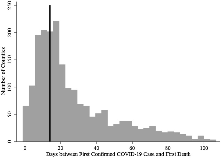
Ideally, one would want to observe the first case in each county (or within relevant radius) with certainty. Fig. 2 displays the distribution of time elapsed between first confirmed case and first death. WHO estimates indicate patients who eventually die after COVID-19 infection do so between 2 and 8 weeks after the onset of symptoms, and onset of severe illness occurs within approximately 1 week of symptoms (WHO, 2020). Approximately 20% of counties reported first cases fewer than 14 days before the first death, and some report deaths 1 to 2 days before reporting a first case.2 For these counties, I impute the date of first case as 14 days before the date of first death. I choose 14 days because, based on the WHO estimate, this would be the earliest that a case ending in death is symptomatic. Although the asymptomatic incubation period can last an additional 14 days, I opt against a longer assumed lead time because at this time the program of testing in the US was not widespread enough to reliably capture asymptomatic cases. My goal is to produce policy-relevant estimates, so when comparing counties in states that adopted social distancing measures “early” and “late”, I assume acting 14 days before the first death may be possible, but acting earlier may not.
Fig. 2.
Timing of confirmed cases and reported deaths.
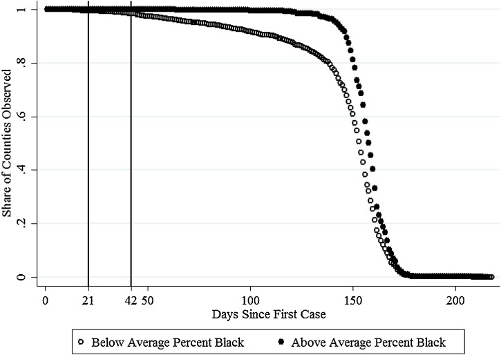
Even with a precise measure of first case timing, the question of when to compare mortality remains. Fig. 3 displays the share of counties observed by days since the first case. This share falls more rapidly for lower % Black counties, meaning more of these counties are in the earlier phases of their epidemics. Therefore, comparing counties on the same calendar date, while outbreaks are still in progress, without appropriately accounting for differences in epidemic duration, may lead to over-estimates of disparities. So, in addition to comparing cumulative mortality as of June 30th, I also produce separate estimates at 21 and 42 days after the first case. While the later date (or an even later day) may be preferable, as shown in Fig. 3 the share of lower % Black counties observed falls below the share of higher % Black counties observed around six weeks (42 days).
Fig. 3.
Counties observed by days since first death.
My preferred analyses exclude counties that have not yet reported a case because I expect the factors that predict initial introduction to differ from the factors that predict mortality in communities where the disease is already present. As of June 30th, only 103 of 3144 counties (3.3%) had yet to report a case or a death.
2.2. Measuring race at the county level
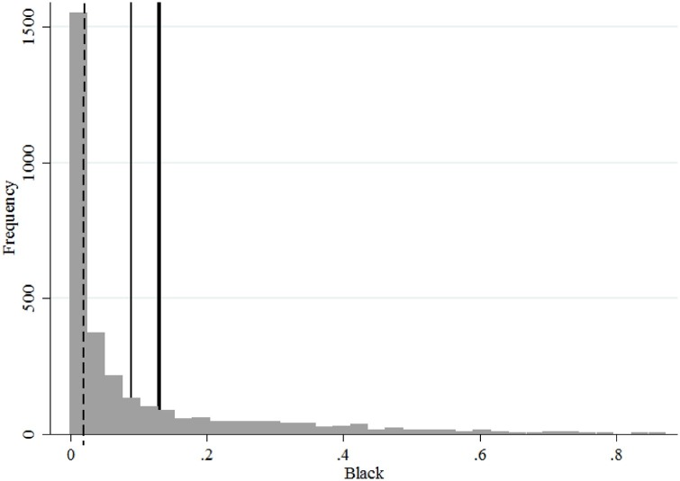
Following Millett et al. (2020), I group counties based on whether the share of county population that is Black is above the national population share of black Americans, which is 13%. Although this encompasses only one measure of racial diversity – share of population that is Black – as shown in Fig. 1 Black Americans appear to have the worst mortality rate relative to population share and are the focus on this analysis. Evidence of disparities between Hispanic or Latinx and non-Hispanic persons was less consistent early in the epidemic at the time of initial social distancing measures. I control for the share of county population that is Hispanic throughout, and I offer robustness checks that define high and low % Black relative to the average county share rather than national population share, the median county share, and the average county Black and non-Hispanic share. Appendix Fig. A.1 provides a histogram of the distribution of Black Population shares and marks the cutoff points for the definition employed in the main text and robustness checks.
Fig. A.1.
Distribution of black population shares across counties. Reference lines denote the median county Black population share at 0.02, the average county share at 0.09, and the national Black population share of 0.13.
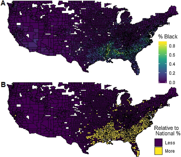
The top panel of Fig. 4 shows the Black population shares by county and the lower panel provides the locations of counties with population shares greater or less than the national population share of 13%. As shown, the majority of counties with above average Black population shares are located in southern and southern Atlantic regions, and in urban areas (Los Angeles, Chicago, Milwaukee, Detroit).
Fig. 4.
Location of above and below average % black counties. Black population shares are based on 2018 American Community Survey 5 Year Estimates using the single race measure. Counties are defined as having a Black population share less than the national Black population share if the county share is below 13%.
2.3. Covariates and data sources
The CDC names three groups of factors that may explain differential COVID-19 incidence and mortality by race: living conditions, work circumstances, and underlying health conditions and access to care (NCIRD, 2020). These are similar to Blumenshine et al. (2008)'s measures of differential exposure, susceptibility and treatment. Table 1 reports the measures I collected, grouped into the CDC categories, and the source of the data for each. All data come from publicly available sources and the data files and scripts used to prepare them are available for replication of my findings or use in other research.
Under health measures, mortality risk variables capture the probability of death during the age range conditional upon being alive at the beginning of the age range. I opt to measure ICU beds rather than ventilators because mechanical ventilation may be contraindicated for COVID-19 patients (Möhlenkamp and Thiele, 2020). Importantly, the pneumococcal vaccine measure is not intended to measure possible immunity to COVID-19 related pneumonia. Instead, I use this measure as a proxy for both access to and attitudes towards preventive healthcare.
In living situation measures, apartments include all persons living in structures with 2 or more units.3 Population density captures the average population per square mile, whereas urban cluster measures persons living in areas with at least 25,000 people but less than 50,000. I use Decennial Census data to measure the share of population in prison or other correctional facilities because the American Community Survey (ACS) does not provide estimates of the group quarters population at the county level. For the same reason, I use data from Long Term Care Focus for 2017 estimates of the nursing home population. Both of these institutional settings are vulnerable to outbreaks. I also include the share of persons who are single parents and the share who are under age 18 and attending school. Single parent households may rely more heavily on childcare centers or grandparent care even after school closures and be more prone to exposure. If there is any reduction in mortality due to school closures, it should be larger in counties with higher shares of school-aged children.
The work circumstances measures follow occupational definitions in Almagro and Orane-Hutchinson (2020). To these, I add a measure of population working from home based on the ACS question about commuting to work in the past week. This does not capture the incidence of working from home during the pandemic, but I expect communities with higher rates of remote work prior to the pandemic were able to shift more people to remote work and do so earlier. Also, I include measures of educational attainment in the work circumstances category, but these could also be interpreted as contributing to health conditions, for example due to the association between education and adherence to medical advice for managing chronic disease conditions (DiMatteo, 2004).
Of the 3041 county equivalent areas eligible for analysis, complete data on all covariates is unavailable for 331. In the full set of counties, the mortality rate as of June 30th in higher % Black counties is 3.19 times the rate in lower % Black counties (95% CI: 2.32–4.06). In the subset of counties with complete covariate data, the estimated disparity falls to 2.95 (95% CI: 2.17–3.74). So, missing data for covariates may reduce point estimates, but the reduction appears to be within the margin of error.
2.4. The role of social distancing interventions
In March and April, state and local governments took dramatic action to reduce the spread of COVID-19. Prior research indicates interventions that occur earlier in the course of a local outbreak are more effective (Kelso et al., 2009). I construct measures of the timing of the first district in the county closed schools or a statewide school closure occurred, whichever is first. Similarly I construct measures of the timing of county and state stay-at-home orders (or equivalent directives), and the week of peak unemployment claims. Based on these timing measures and the imputed date of first case described above, I construct binary indicators of whether the measure was taken prior to the first reported case.
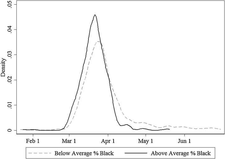
Fig. 5 illustrates the differences in timing of first case, with imputations described above, across the high and low % Black county groups depicted in Fig. 4. Although the average and median date of first case were earlier across counties with larger Black populations, there is substantial overlap in the distributions. So, despite similar timing of social distancing measures across states in March, there are sufficient numbers of counties in both groups that had and had not yet experienced a first case when state measures were introduced.
Fig. 5.
Timing of first case in high and low % black counties. Classification of counties is based on 2018 American Community Survey 5 Year Estimates and using the single race measure. Timing of first case was imputed to 14 days prior to the first reported death for any counties reporting deaths less than 14 days after the first case.
2.5. Estimation
For ease of exposition and clarity in notation, I present regression equations assuming mortality can be modelled as a simple linear function of observable covariates. Below I explain a nonlinear model is more appropriate, and outline the rational for my chosen estimator.
To estimate the extent to which observable county differences contribute to disparate mortality across high and low % Black counties I follow the conventional approach in the discrimination literature. I first estimate the following simple regression equation, where is equal to 1 for higher % Black counties and 0 for lower % Black counties, and is the county COVID-19 mortality rate per 1000 persons:
| (1) |
Next, I add all covariates intended to capture differences in living situations, work circumstances, and underlying health conditions and access to care to obtain a regression adjusted estimate of the disparity.
| (2) |
I also control for the natural log of time elapsed since first case, , and the share of county population that is Hispanic, . When the estimation sample includes counties measured at 21 and 42 days after the first case, the duration measure is omitted because duration of exposure is constant across counties by construction.
The estimates of from Eq. (1) and from Eq. (2) provide the unadjusted and regression-adjusted estimates of differential mortality in higher % Black relative to lower % Black counties, and can be interpreted as the portion of the disparity that is “unexplained” by observed county differences. Notably, even if the estimated disparity, falls or no longer indicates a measurable difference between more and less diverse counties this is not reason to dismiss the raw differences in mortality. Any differences in covariates between higher and lower % Black counties are in and of themselves disparities and reflect racial inequality.
The foregoing approach constrains the effects of covariates on mortality to be the same across high and low % Black counties. To relax this assumption, I use regression decomposition methods as follows:
| (3) |
The difference in mortality rates among high and low % Black counties, , is parsed into the portion attributable to differences in county characteristics (differences in “endowments”), and differential effects of characteristics (differences in “coefficients”), . Again, these differences in characteristics are not randomly assigned and are themselves a product of racial disparities. My intent is to identify characteristic differences that may lend themselves to short-run policy interventions to address disparate mortality.
To estimate differential effects of school closures, stay-at-home orders and economic shut downs as captured by peak unemployment claims, I begin with a standard event study specification:
| (4) |
Eq. (4) models the mortality rate as function of leads and lags of the social distancing policy, , with day and county fixed effects and . The vector of coefficients captures any pre-trends in the week before policy implementation and the dynamic effects of the policy. I include leads to 8 days before and lags through day 42 after implementation and estimate the model for all counties with complete covariates from March 1st through June 30th. For counties that have not yet reported a case but do report by June 30th, I assume a mortality rate of 0 so the model is estimated on a balanced panel of county-date observations. To determine whether a given policy had a different impact in counties with higher Black populations than in counties with lower Black populations, I estimate Eq. (4) separately for each set of counties.
Eq. (4) is a within-county estimator and by necessity drops any counties that do not have any deaths during the study period. This results in a loss of observations for 34% of counties. If social distancing policies work, and if they work best among counties that implement them early in their epidemic (before the first case or first death), then these counties will be more likely to be excluded from the estimation and the results will be biased against finding any reduction in mortality rates. Also the counterfactual assumption for this model is the trend in place prior to the intervention would have continued absent the intervention. Yet the number of deaths at any point, and the arguably the efficacy of any intervention, depends critically upon where a community is in their outbreak. Many counties had yet to experience any deaths when they closed schools and implemented stay at home orders. So, based on the evolution of the outbreak, deaths were likely to rise after mid March with or without an intervention.
The ideal experiment would involve comparing the same county at the same point in their outbreak with and without an intervention in place. To approximate this experiment, I construct a panel data set for the counties observed through 42 days after the first case, aligning them by days relative to the first case rather than calendar date. Because there are no deaths prior to 14 days after the first case, the pretrends in the outcome are equal by construction. I then compare counties that did and did not have an intervention in place prior to the first case by estimating the following equation:
| (5) |
is a vector of outbreak-time dummies, one for each day 21 through 42 since the first case. differentiates between counties that have a larger Black share of population than the national average. captures the timing of each intervention (school closure, stay at home order, and peak unemployment claims) relative to the first case as either before the first case, after but within two weeks of the first case, and more than two weeks after the first case. Each and are interacted with each other and the outbreak-time dummies , and in a full set of three-way interactions. The coefficient vector captures the mortality differences at each day since the first case in higher % Black counties that did not adopt before the first case relative to lower % Black counties that also did not adopt before the first case. estimates the effect of early adoption of in less diverse counties, and estimates any differential effect in more diverse counties. represents the county-level controls for differences in living, work, and health characteristics, and are calendar date of the first case fixed effects. These fixed effects capture differences in what was known and the social attitude of the pandemic at the time each county begins its outbreak.
I estimate Eq. (5) three times, once for each social distancing measure as . To control for potential policy interactions, the regression includes dummy variables and equal to 1 for days when the state had the other two policies in place.
The estimation of Eqs. (1), (2), (4), and (5) must account for the fact that the mortality rate distribution is heavily skewed to the right. As of June 30th, the average mortality rate is 0.17 per 1000 but 50% of counties have rates below 0.05, and 34% have rates of 0. Economists often use log transformations to satisfy assumptions of normality required for unbiased OLS estimates. For mortality, this would require either dropping observations with rates of zero or adding a small constant before transformation. Instead, I use the Poisson pseudo-maximum likelihood (PPML) estimator as suggested by Silva and Tenreyro, 2006, Silva and Tenreyro, 2011 for continuous outcomes. I verify the PPML estimator fits the actual mortality rate data better than the log transformation for non-zero mortality rate counties. PPML allows for the inclusion of counties that do not have any deaths yet. This is crucial because selecting on counties with deaths may systematically exclude counties early in their outbreaks, and counties that have fewer risk factors, better health system infrastructure, or more successful social distancing measures.
Decompositions after linear regression rely on the fact that the average of the dependent variable is equal to the predicted value at the means of the covariates. For Poisson regression, the average value of the dependent variable is equal to the average of the predicted probabilities (Fairlie, 1999). For this reason, nonlinear decomposition methods are needed. Nonlinear decomposition has been widely used to study disparities in binary and county outcomes such as smoking behavior, obesity and overall health (Averett et al., 2014, Amin and Lhila, 2016, Walsh and Cullinan, 2015, Zhang et al., 2015). Nonlinear decomposition also differs from linear regression decomposition in that the estimated portion of the difference in outcomes attributable to each of the covariates depends on the order in which the covariates are added to the model and on the choice of reference category for categorical predictors. The first problem, known as “path dependence” is generally solved either by random ordering of covariates and bootstrapping or by using weights (Fairlie, 2005, Fairlie, 2017, Yun, 2004). I use the weighting method, employing Stata package mvdcmp as it is more computationally efficient Powers et al. (2011). There are no categorical predictors in Eq. (2) and therefore no normalization of categorical predictors is needed.
All estimates are reported with Eiker-White robust standard errors clustered at the state level Silva and Tenreyro (2006), Eicker (1963), White (1980) unless noted.4 I report disparities estimates (Eq. (2)) as conditional and unconditional predicted mortality rates for each county group, and the ratios of these rates. I report estimated effects of social distancing measures (Eqs. (4) and (5)) graphically as means of the marginal effects.
3. Results
3.1. Adjusted and unadjusted disparities estimates
Table 2 reports the raw and regression adjusted mortality rates per 1000 persons in high and low % Black counties after estimating Eqs. (1) and (2), and the associated relative rates, based on total deaths reported as of June 30th. Without adjusting for county characteristics, the mortality rate in higher % Black counties is 2.95 times higher than in lower % Black counties (95% CI: 2.17–3.74). After adjusting for observable county differences, the estimated disparity falls to 1.24 (95% CI: 0.91–1.47) indicating differences in living, health, and work environment are important contributors to the disparity. The estimated disparity does not change significantly if the number of cases per 1000 persons is added to the model, and estimates change little when the twenty counties with the highest numbers of deaths shown in Fig. 1 are omitted.
Table 2.
Estimated cumulative mortality as of June 30th, rates per 1000 population.
| All counties |
Controlling for cases |
Without Top 20 counties |
||||
|---|---|---|---|---|---|---|
| Regression |
Regression |
Regression |
||||
| Unadjusted | Adjusted | Unadjusted | Adjusted | Unadjusted | Adjusted | |
| Above Ave. | 0.366** | 0.196** | 0.329** | 0.203** | 0.331** | 0.186** |
| % Black | (0.052) | (0.019) | (0.045) | (0.018) | (0.049) | (0.019) |
| Below Ave. | 0.124** | 0.163** | 0.127** | 0.155** | 0.119** | 0.148** |
| % Black | (0.016) | (0.016) | (0.018) | (0.015) | (0.014) | (0.014) |
| Relative | 2.954** | 1.244 | 2.584** | 1.309 | 2.785** | 1.261 |
| Rate | (0.402) | (0.167) | (0.347) | (0.160) | (0.446) | (0.174) |
| 2710 | 2710 | 2710 | 2710 | 2690 | 2690 | |
Estimates are predicted rates after Poisson regression reported with robust standard errors clustered at the state level. Regression adjusted estimates include all covariates listed in Table 1 and the natural log of time elapsed since first case (in days). Statistical significance of predicted rates is with respect to a null hypothesis of 0. Statistical significance of relative rates is with respect to a null hypothesis of 1.0.
.
To determine the extent to which these disparities may be due to counties being at different points in their epidemics as of June 30th, I re-estimate using cross sections of counties observed at 21 and 42 days after their first reported cases. The estimates are reported in Table 3 . Both unadjusted relative rate estimates are smaller than the June 30th estimates in Table 2 whereas regression adjusted relative rates are slightly larger, but none are significantly different from the June 30 estimates. The mortality rate was approximately 2 times greater in high % Black counties at 21 days since the first reported case and the disparity appears to grow from 21 to 42 days but the differences in relative rates are not statistically significant. In summary, all unadjusted estimates indicate raw mortality rates are at least twice as high in high % Black counties and accounting for observable differences across counties reduces the gap to 30 to 65%.
Table 3.
Estimated cumulative mortality at 21 and 42 days after 1st case.
| At 21 days |
At 42 days |
|||
|---|---|---|---|---|
| Regression |
Regression |
|||
| Unadjusted | Adjusted | Unadjusted | Adjusted | |
| Above Average | 0.031** | 0.023** | 0.127** | 0.076** |
| % Black | (0.011) | (0.004) | (0.028) | (0.009) |
| Below Average | 0.014** | 0.016** | 0.048** | 0.058** |
| % Black | (0.002) | (0.002) | (0.006) | (0.007) |
| Relative Rate | 2.224** | 1.466 | 2.651** | 1.314 |
| (0.772) | (0.265) | (0.574) | (0.220) | |
| 2710 | 2710 | 2710 | 2710 | |
Estimates are predicted rates after Poisson regression reported with robust standard errors clustered at the state level. Regression adjusted estimates include all covariates listed in Table 1 and the natural log of time elapsed since first case (in days). Statistical significance of predicted rates is with respect to a null hypothesis of 0. Statistical significance of relative rates is with respect to a null hypothesis of 1.0.
.
3.2. Decomposition results and the relative contributions of covariates
Table 4 reports the results of nonlinear regression decomposition using the June 30th, 21 day and 42 day samples. As of June 30th, observed county differences explain 78% of the estimated disparity, but at 21 days they explain over 100%. Using the covariate groupings in Table 1, differences in living characteristics explain 66% of the disparity at June 30th, and most of the disparity on June 30th and at both points in time. Estimates indicate equalizing all differences in health characteristics would actually widen the disparity.
Table 4.
Regression decomposition, overall results.
| As of June 30th | At 21 days | At 42 days | |
|---|---|---|---|
| Total Disparity | 0.242 | 0.017* | 0.079** |
| (0.027) | (0.008) | (0.016) | |
| Due to Differences | 0.190** | 0.019* | 0.068** |
| in All Characteristics | (0.041) | (0.009) | (0.026) |
| % of Total Due to Characteristics: | 78.432% | 112.48% | 86.357% |
| % Due to Living: | 66.311% | 107.494% | 96.987% |
| % Due to Work: | 33.224% | 33.646% | 19.791% |
| % Due to Health: | 21.103% | 28.663% | 30.421% |
| Due to Differences | 0.052 | 0.002 | 0.011 |
| in Returns | (0.042) | (0.009) | (0.026) |
| % of Total Due to Returns: | 21.568% | 12.476% | 13.643% |
| 2710 | 2710 | 2710 | |
Estimates are based on nonlinear regression decomposition using Poisson regression following Powers et al. (2011). Total disparities and the portions due to differences in characteristics and differential returns to characteristics can be interpreted as differences in deaths per 1000 persons.
.
.
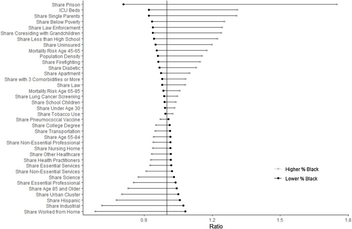
Fig. 6 summarises the differences in mean characteristics across high and low % Black counties using ratios of the group mean to the grand mean across all counties. Again, these differences should be thought of as disparities in and of themselves and should not be interpreted as reasons to dismiss or rationalize the racial mortality gap. Points larger than 1 indicate the characteristic is more prevalent in the group, and dots to the left indicate it is less. For example, across higher % Black counties the average share of population who are grandparents coresiding with grandchildren is 1.24 times larger than the average across all counties, whereas the shares of school children are approximately equal across high and low % Black counties.
Fig. 6.
Differences in characteristics, ratios of characteristic group mean to grand mean. Differences are reported in ratios to allow for viewing on the same scale. All differences are statistically significant except for share of population residing in a nursing home and share of Medicare beneficiaries who received a lung cancer screening. Means and standard errors are reported in tabular form in the Appendix, Table A.4.
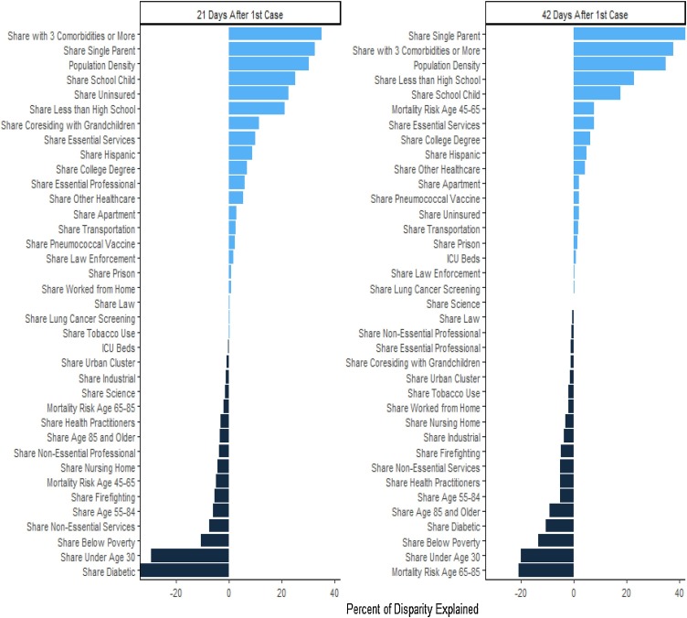
Fig. 7 shows the role of the differences characteristics reflected in Fig. 6 in explaining disparities at 21 days and 42. Bar lengths reflect the percentage of the total disparity each characteristic explains. Bars extending to the right of zero indicate characteristics where cross county differences widen the mortality disparity, and bars extending to the left reflect characteristics where differences reduce the disparity.
Fig. 7.
Share of disparity explained by characteristics. Percentages are based on nonlinear regression decomposition after Poisson regression (Powers et al., 2011).
At both 21 and 42 days, the higher rate of comorbidities in higher % Black counties explains a substantial portion of the disparity. Estimates imply if comorbidities in higher % Black counties were reduced to levels in lower % Black counties, the 21 day disparity would fall by 35% and the 42 day disparity would fall by 37%. However, holding comorbidities constant, the estimates imply reducing the higher rate of diabetes in diverse counties would actually increase disparities.
Interestingly, at 21 days the share uninsured explains 22% of the disparity, but by 42 days is no longer an important predictor. This could reflect improved health access for the uninsured later in the outbreak. Hospitals may not legally discriminate against the uninsured, though “patient dumping” is possible (Annas, 1986). Instead the estimates more likely reflect growing awareness of the seriousness of the illness among patients that overcomes the financial risk of paying for expenses out of pocket. ICU beds appear unimportant at both times even though they were the characteristic with the second largest disparity in Fig. 6. Also, controlling for all other characteristics, the large differences in poverty rates across higher and lower % Black counties do not appear to widen the disparity.
As indicated in Table 4, most of the other important drivers of disparities are characteristics of living situation. Differences in single parenthood rates appear nearly as important as comorbidities at 21 day and more important at 42 days. This may be because single parents were more likely to continue using childcare after schools closed or to rely on grandparent care. Survey research among parents indicates 24% experienced a disruption in regular childcare over this time period and of those that experienced a disruption, 20% reported use of grandparent care as a replacement (Patrick et al., 2020). Co-residence with grandparents explains 11% of the disparity at 21 days but none at 42 days. There are many possible explanations for this change. Families may have successfully changed behavior to protect vulnerable persons within their homes, they could have changed living arrangements, or interactions with non-resident grandparents may have risen to address childcare disruptions and equalized the risk across co-resident and non-resident arrangements. Alternatively, it may be these vulnerable family members were disproportionately represented among the early fatalities.
Although shares of school children are only slightly larger in higher % Black counties, as shown in Fig. 6, the small difference appears to explain 25% of the 21 day and 18% of the 42 day disparity. However, this could also reflect differences in the timing of school closures across communities.
Differences in work characteristics explain little of the disparity, or operate in unexpected directions. For example, differences in the shares of essential services occupations contribute to the disparity but as shown in Fig. 6, there are more essential service employees in lower % Black counties. Similarly, differences in non-essential services reduce the disparity but there are more non-essential workers in lower than higher % Black counties. One would expect having more non-essential workers would lead to more complete economic shut downs and reduced mortality, and conversely, more essential workers would increase exposure and thus mortality.
3.3. Differential effects of social distancing measures
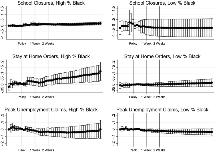
Fig. 8 displays the results of the traditional event study analysis (estimation of Eq. (4)). The only estimates that display slower growth in mortality rates are the estimated effects of school closures in counties with a lower Black population share, though these estimates are very imprecise, and the decline seems to occur implausibly early. Other estimates are also too imprecise to draw strong conclusions, but the pattern of estimates indicates deaths may have declined after reaching peak unemployment in both groups of counties.
Fig. 8.
Event study analysis of social distancing measures. Estimates are marginal effects on the predicted mortality rates after PPML estimation of Eq. (4). Confidence intervals are based on heteroskedasticity robust standard errors clustered at the state level.
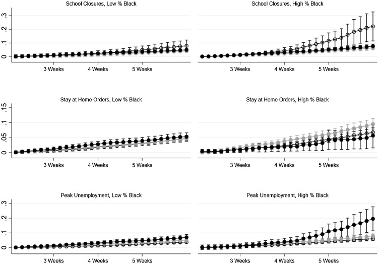
Fig. 9 displays the results of estimating Eq. (5). Now the -axis of each graph denotes days since the first case rather than relative to the policy. These estimates tell a different story. For school closures, there is a clear difference between early and late adoption in high % Black counties and the point estimates suggest the effect is larger than in lower % Black counties. Differences across counties that adopted stay-at-home orders before and after the first case are smaller and do not appear to be systematic, but reaching peak unemployment before the first case appears to be associated with higher subsequent mortality rates in higher % Black counties. This could be because unemployment benefits were more likely to expire near the peak of the epidemic in counties that reached peak unemployment earlier.
Fig. 9.
Analysis of social distancing measure adoption relative to first case. Estimates are marginal effects on the predicted mortality rates after PPML estimation of Eq. (5).
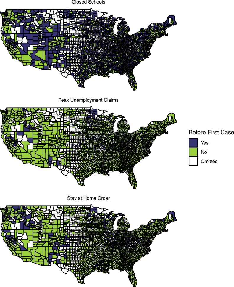
Although the results in Fig. 9 are provocative, they do not necessarily reflect causal associations. Adoption of social distancing measures was far from random. States with Republican governors adopted measures later, or not at all (Adolph et al., 2020). With the exception of school closings, few southern states adopted measures before the first case, as shown in Fig. 10 . The most interesting results are across early and late policy adoption, which does not vary within county, and as explained earlier many counties that had cases did not have any deaths through 42 days after the first case and so would be excluded from a county fixed effects model. Although the estimates control for the timing of the first case to attempt to capture differences in voluntary behavioral responses as awareness of the pandemic spread and medical treatment innovations that reduced mortality rates, late-adopting counties provide a less convincing counterfactual if they are dissimilar from early-adopting counties. For example, Painter and Qiu (2020) use geolocation information from cell phone and debit card data and conclude individual adherence to social distancing measures may have been worse in majority Republican counties, many of which are located in late adopting states. Conversely, counties that waited to adopt measures may have seen a lessor impact because individuals were already altering behavior based on information in the news and voluntary behavioral responses.
Fig. 10.
Timing of social distancing measures relative to first case in counties.
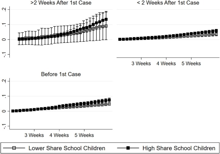
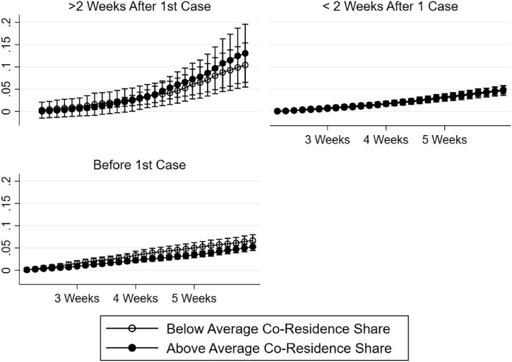
To evaluate the plausibility of causal effects implied by Fig. 9, I offer two robustness checks. I focus on the results for school closures because these measures exhibit the best spatial variation as shown in Figs. 10, and 4 indicates differences in the population shares of school children across higher and lower % Black counties are important contributors to the overall disparity. First, if school closures had a causal effect on mortality rates, I hypothesize the effects should be largest in counties with higher shares of school children. Second, I hypothesize effects should be larger in counties where more school children reside with older adults. To test these hypotheses, I modify Eq. (5) replacing the indicator with variables that differentiate between counties that have above and below average shares of school children and above and below average co-resident shares. The results of these analyses are presented graphically in Appendix Figs. A.2 and A.3 . My first hypothesis is not clearly supported. School closures reduce mortality rates in counties with higher and lower shares of school children. The point estimates indicate the gap in mortality rates may be smaller in counties that closed schools earlier but the differences are not statistically significant. Results are clearer for grandparent co-residence. Though the magnitudes of the differences in marginal effects are small, many of the three way interactions are statistically significant and negative and mortality rates appear to be lower in counties with higher shares of co-residence than in counties with lower shares of co-residence when schools close before the first case.
Fig. A.2.
Differential effects of school closures by population share of school children. Estimates are marginal effects on the predicted mortality rates after PPML estimation of Eq. (5).
Fig. A.3.
Differential effects of school closures by population share of co-resident grandparents and grandchildren. Estimates are marginal effects on the predicted mortality rates after PPML estimation of Eq. (5).
4. Discussion and conclusion
This paper investigated disparities in COVID-19 mortality rates across counties with shares of Black residence above and below the national average. Estimated disparities are large, indicating mortality rates 2 to 3 times higher in counties with above average Black population shares before adjusting for differences in health conditions and access, living situations, and work circumstances. Point-in-time estimates of disparities are similar to estimates at the same time relative to first case, indicating disparities are not simply the result of outbreaks occurring earlier among communities of color. However, the factors that explain disparities and the overall proportion of disparity explained do change as the outbreak progresses, making it important to compare counties at the same time relative to the first case. Differences in county characteristics fully explain the disparity at 21 days after the first case, but explain only 86% at 42 days. Across all specifications, higher rates of comorbidities, single parenthood, population density, shares of school children, and lower educational attainment in higher % Black relative to lower % Black counties consistently explain large proportions of the disparity. At 21 days after the first case, higher rates of co-residence between grandparents and grandchildren is among the more important factors explaining disparities.
This paper also provided the first estimates of possible differential effects of social distancing measures. There is no evidence that school closures were less effective at reducing COVID-19 mortality in counties with higher Black population shares than counties with lower and they may have been more effective. Conversely, there is no consistent evidence of an effect of lockdowns on mortality, and reaching peak unemployment before or soon after the first case is associated with higher mortality, especially in counties with higher Black population shares. Although identification rests on comparing counties that experienced their first cases at the same time, I cannot rule out the possibility that counties that closed schools, locked down, or reach peak unemployment claims earlier were fundamentally different from those that intervened later or not at all. The conventional event study estimates indicate interventions may not have reduced mortality in either high or low % Black counties.
A similar study of school closures using conventional event study analyses does not find evidence of a reduction in cases (Courtemanche et al., 2020), and my own robustness checks using conventional methodology do not reveal significant within county reductions in mortality yet analyses using the timing relative to first case do. I believe the difference in estimates arises because the timing of interventions in the course of an outbreak matters (Pei et al., 2020). Also, recent research indicates children are more likely to be asymptomatic carriers of COVID-19 and while tests were scarce in the spring and testing was reserved for symptomatic cases they may have been less likely to be diagnosed and thus any reduction in cases among children due to school closures would likely go undetected but differences in mortality rates would be evident. Research based on mobility inferred from cell phone data indicate school closures likely had the largest impact on behavior Gupta et al. (2020). My estimates suggest early school closures reduced mortality most among counties with high rates of co-resident grandparents and grandchildren. The rate of coresidence is over 30% higher in counties with larger Black populations than in lower % Black counties. This may be a mechanism through which school closures help more diverse communities.
Logically, closing schools when the number of cases is already high will not significantly reduce exposure. In fact, it could even increase exposure by leading families to resort to back-up childcare arrangements that may include vulnerable extended family members, like grandparents. Analysis of pre-pandemic time diary data indicates that 35% of elementary school children and 20% of teens spent time with grandparents every week (Dunifon et al., 2018). These patterns likely changed in response to the pandemic but not all families can eliminate contact with grandparents. Time between grandparents and grandchildren may have increased in multigenerational households and single parent families when schools and childcare centers closed.
The findings in this paper present a challenging policy dilemma. Other studies conclude social distancing measures likely disadvantage minority racial groups more than majority groups (Montenovo et al., 2020, Couch et al., 2020, Kuhfeld et al., 2020, Sen and Tucker, 2020). The results of this analysis suggest school closures could disproportionately protect minority populations. School closures are a particularly costly intervention for society as a whole, and may exacerbate shortages of healthcare workers. Prior research in both the UK and US estimates school closures may result in absenteeism across approximately 13% of the workforce, and 30% of healthcare workers (Sadique et al., 2008, Bayham and Fenichel, 2020). A cost-benefit simulation study of school closures during the H1N1 outbreak in Pennsylvania concluded closing schools would have resulted in substantial net losses (Brown et al., 2011).
If the effect of school closures on mortality operates primarily through protecting co-resident grandparents or other older adults, one approach to mitigating the possible negative effects of reopening schools could be to encourage separation of multi-generational households. Prior research shows multi-generational co-residence rates increase in response to economic hardship and for provision of informal caregiving to aging parents (Livingston and Parker, 2010, Keene and Batson, 2010). Expanding coverage of home and community-based care services under Medicaid may reduce inter-generational co-residence (Hamman et al., 2019). States could also subsidize Supplemental Security Income payments for recipients age 65 and older living independently and prioritize multi-generational households in affordable housing programs. Yet, these solutions may have less impact on minority households if schools and childcare centers remain closed and there are no interventions to help family replace grandparent care with other care. Grandparents were the the primary caregivers for an estimated 2.9 million children in 2008, and these grandparents are disproportionately Black and Hispanic (Livingston and Parker, 2010).
The fall 2020 school year is already underway and many schools have opted for models that allow parents to choose online or in-person formats. In the New York City School System, which is the largest district in the country, approximately 30% of students had opted into fully remote instruction as of August 28th (O’Connell-Domenech, 2020). Whereas 25% of the student population is Black, Black students comprise only 20% of students opting for remote learning. White students are also under-represented in the remote learning group. Asian students have the highest opt-in rate. Though opt-in patterns across districts may change, currently districts with higher levels of economic need have lower opt-in rates.
For students who attend in-person, schools should reconsider of truancy enforcement. Truancy rates have fallen among African American youth since 2008, but African American students in elementary through 8th grade are more likely to be referred to administration for tardies or truancy (Maynard et al., 2017, Skiba et al., 2011). Even well-intended school programs and policies aimed at closing achievement gaps, like tying sports eligibility to attendance, may need re-evaluation to avoid presenteeism among all students, and students living in multi-generational households in particular (Cuffe et al., 2017).
This paper is subject to several limitations. The epidemic is still in progress. Although existing data show COVID-19 is more prevalent and deadly in diverse communities, disparities emerge at 21 days and remain relatively constant through 42 days, it is unclear whether lower % Black communities will eventually catch up. Also, existing data may be incomplete and inaccurate. USAFACTS deaths data are updated to reflect revisions to deaths and include probable deaths. Data were last extracted on August 26th so many of the revisions to data through June have been completed, but further revisions may lead to differences in findings. To allow for transparency and replication of results, all data for this study are available.
Currently, deaths and cases data are not reported separately by race at the county level, or even for all states. This means all estimates compare higher and lower % Black counties, rather than mortality rates by race within counties. I do provide robustness checks in the Appendix based on alternative groupings and results are similar, but having deaths by race could allow for more convincing methods of adjusting for county differences and assessing differential policy impacts.
As discussed, the timing of reported cases is suspect. I offer an imputation based on WHO estimates of time elapsed from symptom onset to death, and findings are robust to exclusion of counties with imputed first case dates. Because timing is suspect, my preferred policy analysis does not make use of pre-post policy variation in mortality rates within the same county as is typically done in quasi-experimental econometric models. I do provide traditional event study estimates in the appendix and note that they do not provide evidence of any reduction in mortality rates due to school closures. However, these estimates cannot differentiate between counties that adopted social distancing measures at different times in their outbreaks. My results indicate the timing of interventions relative to first case matters a lot.
Author statement
This is solo authored work produced without any graduate or undergraduate research assistance. All aspects of the paper are my own work.
Footnotes
Weighted population distributions take county-level population counts by race and Hispanic origin and multiply by the corresponding number of COVID-19 deaths. Weighted counts are aggregated to the national level. The methodology is explained in cdctechnotes (2020).
Reporting has improved since the spring. In earlier versions of this paper, approximately 50% of counties reported first deaths within 14 days of the first case. The current results rely on case and deaths reported as of August 26th.
In earlier versions of this paper I created separate measures for larger apartment buildings and results are consistent with the collapsed measure.
The mvdcmp package allows for detailed decomposition results and asymptotic standard errors but not clustering of standard errors. As a robustness check of precision when standard errors are corrected for heteroskedasticity, I use Stata package nldecompose by Sinning et al. (2008) which produces the overall decomposition results based on Poisson regressions with bootstrapped standard errors clustered at the state level. Estimation of variance-covariance matrices was often not possible for Eq. (5) with robust clustered standard errors.
Appendix A
A.1 Data sources citations
Breakstone, C. D., & Anderson, T. S. (2017) Census data API user guide.
https://www.census.gov/content/dam/Census/data/developers/api-user-guide/api-guide.pdf
Centers for Medicare & Medicaid Services. Mapping Medicare Disparities Tool. https:
www.cms.gov/About-CMS/Agency-Information/OMH/OMH-Mapping-Medicare-Disparities
Institute for Health Metrics and Evaluation (IHME). United States Life Expectancy and Age-specific Mortality Risk by County 1980–2014. Seattle, United States: Institute for Health Metrics and Evaluation (IHME), 2017. http://ghdx.healthdata.org/record/ihme-data/united-states-life-expectancy-and-age-specific-mortality-risk-county-1980–2014
Schulte, F., Lucas, E., Rau, J., Szabo, L. & Hancock, J. (2020) Millions of older Americans live in counties with no ICU beds as pandemic intensifies. https://khn.org/news/as-coronavirus-spreads-widely-millions-of-older-americans-live-in-counties-with-no-icu-beds/
Shaping Long Term Care in America Project at Brown University funded in part by the National Institute on Aging (1P01AG027296).
U.S. Census Bureau; American Community Survey, 2018 American Community Survey 5-Year Estimates, Tables B01001, B02001, B03003, B06009, B08101, B10050, B17001, B25024, B25014, C24010; generated by Mary K. Hamman; using api.census.gov; https://api.census.gov; (20 May 2020).
U.S. Census Bureau; Decennial Census, 2010 Decennial Census, Tables H001001, H002004, P001001, PCT20; generated by Mary K. Hamman; using api.census.gov; https://api.census.gov; (20 May 2020).
U.S. Census Bureau; Small Area Health Insurance Estimates Program (SAHIE), SAHIE Data Tools; generated by Mary Hamman; using SAHIE Interactive Tool; https://www.census.gov/data-tools/demo/sahie; (20 May 2020).
A.2 Alternative county groupings
All main text results group counties based on whether their Black population shares are above or below the share of national population that is Black, which is 13%. In this section I reproduce disparities estimates from the main text Table 3 group counties relative to the average of county Black population shares of 9% and the median of 2%. These cutoffs are displayed below in Fig. A.1 .
Tables A.1 and A.2 reflect the expected pattern of disparities estimates based on the cutoffs. Estimated disparities at 21 days are generally smaller than the estimates in Table 3 using the cutoff of 13%. However, the estimates at 42 days using the average of county shares (9%) are highly similar and even the unadjusted relative rate using the median cutoff reflects a mortality rate twice as high in the more diverse counties.
Table A.1.
Estimated cumulative mortality at 21 and 42 days after 1st case, using average of county black population shares to define above and below.
| At 21 days |
At 42 days |
|||
|---|---|---|---|---|
| Regression |
Regression |
|||
| Unadjusted | Adjusted | Unadjusted | Adjusted | |
| Above Average | 0.027** | 0.021** | 0.117** | 0.075** |
| % Black | (0.009) | (0.003) | (0.026) | (0.009) |
| Below Average | 0.014** | 0.016** | 0.045** | 0.056** |
| % Black | (0.002) | (0.002) | (0.005) | (0.007) |
| Relative Rate | 1.911** | 1.273 | 2.608** | 1.327 |
| (0.652) | (0.211) | (0.557) | (0.208) | |
| 2710 | 2710 | 2710 | 2710 | |
Estimates are predicted rates after Poisson regression reported with robust standard errors clustered at the state level. Regression adjusted estimates include all covariates listed in Table 1 and the natural log of time elapsed since first case (in days). Statistical significance of predicted rates is with respect to a null hypothesis of 0. Statistical significance of relative rates is with respect to a null hypothesis of 1.0.
.
Table A.2.
Estimated cumulative mortality at 21 and 42 days after 1st case, using median of county black population shares to define above and below.
| At 21 days |
At 42 days |
|||
|---|---|---|---|---|
| Regression |
Regression |
|||
| Unadjusted | Adjusted | Unadjusted | Adjusted | |
| Above Average | 0.020** | 0.017** | 0.084** | 0.065** |
| % Black | (0.005) | (0.002) | (0.016) | (0.007) |
| Below Average | 0.015** | 0.019** | 0.040** | 0.062** |
| % Black | (0.002) | (0.003) | (0.005) | (0.009) |
| Relative Rate | 1.352 | 0.927 | 2.099* | 1.054 |
| (0.378) | (0.149) | (0.450) | (0.156) | |
| 2710 | 2710 | 2710 | 2710 | |
Estimates are predicted rates after Poisson regression reported with robust standard errors clustered at the state level. Regression adjusted estimates include all covariates listed in Table 1 and the natural log of time elapsed since first case (in days). Statistical significance of predicted rates is with respect to a null hypothesis of 0. Statistical significance of relative rates is with respect to a null hypothesis of 1.0.
.
.
Using non-Hispanic Black population shares results in estimates that are highly similar to using the share of all Black persons, including Black persons who also identify as Hispanic. The disparities based on Black non-Hispanic population share are shown in Table A.3 .
Table A.3.
Estimated cumulative mortality at 21 and 42 days after 1st case, using average of county non-hispanic black population shares to define above and below.
| At 21 days |
At 42 days |
|||
|---|---|---|---|---|
| Regression |
Regression |
|||
| Unadjusted | Adjusted | Unadjusted | Adjusted | |
| Above Average | 0.028** | 0.021** | 0.118** | 0.076** |
| % Black | (0.009) | (0.003) | (0.026) | (0.009) |
| Below Average | 0.014** | 0.016** | 0.045** | 0.056** |
| % Black | (0.002) | (0.002) | (0.005) | (0.007) |
| Relative Rate | 1.929 | 1.288 | 2.623** | 1.356** |
| (0.378) | (0.215) | (0.560) | (0.214) | |
| 2710 | 2710 | 2710 | 2710 | |
Estimates are predicted rates after Poisson regression reported with robust standard errors clustered at the state level. Regression adjusted estimates include all covariates listed in Table 1 and the natural log of time elapsed since first case (in days). Statistical significance of predicted rates is with respect to a null hypothesis of 0. Statistical significance of relative rates is with respect to a null hypothesis of 1.0.
.
A.3 Policy analysis by population share of school children and grandparent co-residence
Table A.4.
Means and standards errors of county characteristics across more and less diverse counties.
| Characteristic | Lower % black |
Higher % black |
||
|---|---|---|---|---|
| Mean | SE | Mean | SE | |
| Share Hispanic | 0.096 | 0.003 | 0.071 | 0.003 |
| Share Apartment | 0.149 | 0.002 | 0.169 | 0.006 |
| Population Density | 3.837 | 0.032 | 4.622 | 0.066 |
| Share Urban Cluster | 0.248 | 0.005 | 0.189 | 0.008 |
| Share Prison | 0.025 | 0.001 | 0.054 | 0.004 |
| Share Coresiding with Grandchildren | 0.020 | 0.000 | 0.026 | 0.000 |
| Share Nursing Home | 0.003 | 0.000 | 0.003 | 0.000 |
| Share Single Parent | 0.065 | 0.000 | 0.092 | 0.001 |
| Share School Children | 0.228 | 0.001 | 0.240 | 0.002 |
| Share Essential Professional | 0.060 | 0.000 | 0.049 | 0.001 |
| Share Non-Essential Professional | 0.096 | 0.000 | 0.089 | 0.001 |
| Share Science | 0.003 | 0.000 | 0.003 | 0.000 |
| Share Law | 0.003 | 0.000 | 0.003 | 0.000 |
| Share Health Practitioners | 0.016 | 0.000 | 0.015 | 0.000 |
| Share Other Healthcare | 0.026 | 0.000 | 0.024 | 0.000 |
| Share Firefighting | 0.008 | 0.000 | 0.010 | 0.000 |
| Share Law Enforcement | 0.005 | 0.000 | 0.007 | 0.000 |
| Share Essential Services | 0.043 | 0.000 | 0.039 | 0.000 |
| Share Non-Essential Services | 0.011 | 0.000 | 0.010 | 0.000 |
| Share Industrial | 0.019 | 0.000 | 0.012 | 0.001 |
| Share Transportation | 0.020 | 0.000 | 0.019 | 0.000 |
| Share College Degree | 0.149 | 0.001 | 0.140 | 0.003 |
| Share Less than High School | 0.087 | 0.001 | 0.112 | 0.002 |
| Share Worked from Home | 0.022 | 0.000 | 0.014 | 0.000 |
| Mortality Risk Age 45–65 | 0.126 | 0.001 | 0.156 | 0.001 |
| Mortality Risk Age 65–85 | 0.518 | 0.001 | 0.556 | 0.002 |
| Share Below Poverty | 0.140 | 0.001 | 0.188 | 0.003 |
| Share Uninsured | 0.107 | 0.001 | 0.136 | 0.002 |
| ICU Beds | 0.012 | 0.000 | 0.017 | 0.001 |
| Share Under Age 30 | 0.370 | 0.001 | 0.386 | 0.002 |
| Share Age 55–84 | 0.305 | 0.001 | 0.282 | 0.002 |
| Share Age 85 and Older | 0.024 | 0.000 | 0.019 | 0.000 |
| Share Pneumococcal Vaccine | 0.121 | 0.001 | 0.116 | 0.001 |
| Share Lung Cancer Screening | 0.004 | 0.000 | 0.004 | 0.000 |
| Share with 3 Comorbidities or More | 0.522 | 0.002 | 0.578 | 0.002 |
| Share Tobacco Use | 0.096 | 0.001 | 0.099 | 0.001 |
| Share Diabetic | 0.263 | 0.001 | 0.308 | 0.002 |
| 2158 | 2158 | 552 | 552 | |
Means are counties defined by the proportion of black residents being higher or lower than the national population share of 13%.
References
- Adolph C., Amano K., Bang-Jensen B., Fullman N., Wilkerson J. 2020. Pandemic Politics: Timing State-Level Social Distancing Responses to Covid-19. medRxiv. [DOI] [PubMed] [Google Scholar]
- Almagro M., Orane-Hutchinson A. 2020. The Determinants of the Differential Exposure to Covid-19 in New York City and Their Evolution Over Time. SSRN Scholarly Paper ID 3573619. [DOI] [PMC free article] [PubMed] [Google Scholar]
- Amin V., Lhila A. Decomposing racial differences in adolescent smoking in the US. Econ. Hum. Biol. 2016;22:161–176. doi: 10.1016/j.ehb.2016.05.001. [DOI] [PubMed] [Google Scholar]
- Annas G.J. Your money or your life: ‘dumping’ uninsured patients from hospital emergency wards. Am. J. Public Health. 1986;76(1):74–77. doi: 10.2105/ajph.76.1.74. [DOI] [PMC free article] [PubMed] [Google Scholar]
- Averett S.L., Stacey N., Wang Y. Decomposing race and gender differences in underweight and obesity in South Africa. Econ. Hum. Biol. 2014;15:23–40. doi: 10.1016/j.ehb.2014.05.003. [DOI] [PubMed] [Google Scholar]
- Bayham J., Fenichel E.P. Impact of school closures for covid-19 on the us health-care workforce and net mortality: a modelling study. Lancet Public Health. 2020 doi: 10.1016/S2468-2667(20)30082-7. [DOI] [PMC free article] [PubMed] [Google Scholar]
- Bibbins-Domingo K. 2020. This Time Must be Different: Disparities During the Covid-19 Pandemic. [DOI] [PMC free article] [PubMed] [Google Scholar]
- Blendon R.J., Koonin L.M., Benson J.M., Cetron M.S., Pollard W.E., Mitchell E.W., Weldon K.J., Herrmann M.J. Public response to community mitigation measures for pandemic influenza. Emerg. Infect. Dis. 2008;14(5):778. doi: 10.3201/eid1405.071437. [DOI] [PMC free article] [PubMed] [Google Scholar]
- Blumenshine P., Reingold A., Egerter S., Mockenhaupt R., Braveman P., Marks J. Pandemic influenza planning in the united states from a health disparities perspective. Emerg. Infect. Dis. 2008;14(5) doi: 10.3201/eid1405.071301. [DOI] [PMC free article] [PubMed] [Google Scholar]
- Borjas G.J. National Bureau of Economic Research; 2020. Demographic Determinants of Testing Incidence and Covid-19 Infections in New York City Neighborhoods. Tech. Rep. [Google Scholar]
- Brown S.T., Tai J.H., Bailey R.R., Cooley P.C., Wheaton W.D., Potter M.A., Voorhees R.E., LeJeune M., Grefenstette J.J., Burke D.S., et al. Would school closure for the 2009 h1n1 influenza epidemic have been worth the cost?: A computational simulation of pennsylvania. BMC Public Health. 2011;11(1):353. doi: 10.1186/1471-2458-11-353. [DOI] [PMC free article] [PubMed] [Google Scholar]
- 2020. Center for Disease Control and Prevention, Technical Notes.https://www.cdc.gov/nchs/nvss/vsrr/covid19/tech_notes.htm [Google Scholar]
- Chowkwanyun M., Reed A.L., Jr. Racial health disparities and covid-19–caution and context. N. Engl. J. Med. 2020 doi: 10.1056/NEJMp2012910. [DOI] [PubMed] [Google Scholar]
- Couch K.A., Fairlie R.W., Xu H., et al. 2020. The Impacts of Covid-19 on Minority Unemployment: First Evidence From April 2020 CPS Microdata. Available at SSRN 3604814. [DOI] [PMC free article] [PubMed] [Google Scholar]
- Courtemanche C., Garuccio J., Le A., Pinkston J., Yelowitz A. Strong social distancing measures in the united states reduced the covid-19 growth rate: study evaluates the impact of social distancing measures on the growth rate of confirmed covid-19 cases across the united states. Health Aff. 2020:10–1377. doi: 10.1377/hlthaff.2020.00608. [DOI] [PubMed] [Google Scholar]
- Cuffe H.E., Waddell G.R., Bignell W. Can school sports reduce racial gaps in truancy and achievement? Econ. Inq. 2017;55(4):1966–1985. [Google Scholar]
- DiMaggio C., Klein M., Berry C., Frangos S. Blacks/African American communities are at highest risk of covid-19: spatial modeling of New York city zip code-level testing results. Ann. Epidemiol. 2020 doi: 10.1016/j.annepidem.2020.08.012. [DOI] [PMC free article] [PubMed] [Google Scholar]
- DiMatteo M.R. Variations in patients’ adherence to medical recommendations: a quantitative review of 50 years of research. Med. Care. 2004:200–209. doi: 10.1097/01.mlr.0000114908.90348.f9. [DOI] [PubMed] [Google Scholar]
- Dunifon R.E., Near C.E., Ziol-Guest K.M. Backup parents, playmates, friends: grandparents’ time with grandchildren. J. Marriage Fam. 2018;80(3):752–767. [Google Scholar]
- Eicker F. Asymptotic normality and consistency of the least squares estimators for families of linear regressions. Ann. Math. Stat. 1963:447–456. [Google Scholar]
- Fairlie R.W. The absence of the African-American owned business: an analysis of the dynamics of self-employment. J. Labor Econ. 1999;17(1):80–108. [Google Scholar]
- Fairlie R.W. An extension of the blinder-oaxaca decomposition technique to logit and probit models. J. Econ. Soc. Meas. 2005;30(4):305–316. [Google Scholar]
- Fairlie R.W. The Stanford Institute for Economic Policy Research; 2017. Addressing Path Dependence and Incorporating Sample Weights in the Nonlinear Blinder-Oaxaca Decomposition Technique for Logit, Probit and Other Nonlinear Models. Tech. Rep. [Google Scholar]
- Gupta S., Nguyen T.D., Rojas F.L., Raman S., Lee B., Bento A., Simon K.I., Wing C. National Bureau of Economic Research; 2020. Tracking Public and Private Response to the Covid-19 Epidemic: Evidence From State and Local Government Actions. Tech. Rep. [Google Scholar]
- Hamman M.K., Helppie-McFall B., Hochfellner D. University of Wisconsin Madison Center for Financial Security Retirement and Disability Research Center; 2019. Incentives for Home and Community Based Care Under the Affordable Care Act. Tech. Rep. [Google Scholar]
- Keene J.R., Batson C.D. Under one roof: a review of research on intergenerational coresidence and multigenerational households in the united states. Sociol. Compass. 2010;4(8):642–657. [Google Scholar]
- Kelso J.K., Milne G.J., Kelly H. Simulation suggests that rapid activation of social distancing can arrest epidemic development due to a novel strain of influenza. BMC Public Health. 2009;9(1):117. doi: 10.1186/1471-2458-9-117. [DOI] [PMC free article] [PubMed] [Google Scholar]
- Kuhfeld M., Soland J., Tarasawa B., Johnson A., Ruzek E., Liu J. 2020. Projecting the Potential Impacts of Covid-19 School Closures on Academic Achievement. [Google Scholar]
- Livingston G., Parker K. Pew Research Center Washington; DC: 2010. Since the Start of the Great Recession, More Children Raised by Grandparents. Tech. Rep. [Google Scholar]
- Möhlenkamp S., Thiele H. Herz; 2020. Ventilation of Covid-19 Patients in Intensive Care Units; p. 1. [DOI] [PMC free article] [PubMed] [Google Scholar]
- Maynard B.R., Vaughn M.G., Nelson E.J., Salas-Wright C.P., Heyne D.A., Kremer K.P. Truancy in the United States: examining temporal trends and correlates by race, age, and gender. Child. Youth Serv. Rev. 2017;81:188–196. doi: 10.1016/j.childyouth.2017.08.008. [DOI] [PMC free article] [PubMed] [Google Scholar]
- Millett G.A., Jones A.T., Benkeser D., Baral S., Mercer L., Beyrer C., Honermann B., Lankiewicz E., Mena L., Crowley J.S., et al. Assessing differential impacts of covid-19 on black communities. Ann. Epidemiol. 2020 doi: 10.1016/j.annepidem.2020.05.003. [DOI] [PMC free article] [PubMed] [Google Scholar]
- Montenovo L., Jiang X., Rojas F.L., Schmutte I.M., Simon K.I., Weinberg B.A., Wing C. National Bureau of Economic Research; 2020. Determinants of Disparities in Covid-19 Job Losses. Tech. Rep. [Google Scholar]
- 2020. National Center for Immunization and Respiratory Diseases (NCIRD), Division of Viral Diseases, COVID-19 in Racial and Ethnic Minority Groups.https://www.cdc.gov/coronavirus/2019-ncov/need-extra-precautions/racial-ethnic-minorities.html [Google Scholar]
- O’Connell-Domenech . 2020. DOE Says Over 365,000 Students Have Opted for Fully Remote Learning this Fall, amNewYork.https://www.amny.com/education-2/doe-says-over-365000-students-have-opted-for-fully-remote-learning-this-fall/ [Google Scholar]
- Painter M., Qiu T. 2020. Political Beliefs Affect Compliance With Covid-19 Social Distancing Orders. Available at SSRN 3569098. [Google Scholar]
- Patrick S.W., Henkhaus L.E., Zickafoose J.S., Lovell K., Halvorson A., Loch S., Letterie M., Davis M.M. Well-being of parents and children during the covid-19 pandemic: a national survey. Pediatrics. 2020 doi: 10.1542/peds.2020-016824. [DOI] [PubMed] [Google Scholar]
- Pei S., Kandula S., Shaman J. 2020. Differential Effects of Intervention Timing on Covid-19 Spread in the United States. medRxiv. [DOI] [PMC free article] [PubMed] [Google Scholar]
- Powers D.A., Yoshioka H., Yun M.-S. mvdcmp: Multivariate decomposition for nonlinear response models. Stata J. 2011;11(4):556–576. [Google Scholar]
- Quinn S.C., Kumar S., Freimuth V.S., Musa D., Casteneda-Angarita N., Kidwell K. Racial disparities in exposure, susceptibility, and access to health care in the US H1N1 influenza pandemic. Am. J. Public Health. 2011;101(2):285–293. doi: 10.2105/AJPH.2009.188029. [DOI] [PMC free article] [PubMed] [Google Scholar]
- Rajgor D.D., Lee M.H., Archuleta S., Bagdasarian N., Quek S.C. The many estimates of the covid-19 case fatality rate. Lancet Infect. Dis. 2020 doi: 10.1016/S1473-3099(20)30244-9. [DOI] [PMC free article] [PubMed] [Google Scholar]
- Sadique M.Z., Adams E.J., Edmunds W.J. Estimating the costs of school closure for mitigating an influenza pandemic. BMC Public Health. 2008;8(1):135. doi: 10.1186/1471-2458-8-135. [DOI] [PMC free article] [PubMed] [Google Scholar]
- Sen A., Tucker C.E. 2020. Social Distancing and School Closures: Documenting Disparity in Internet Access Among School Children. Available at SSRN 3572922. [Google Scholar]
- Silva J.S., Tenreyro S. The log of gravity. Rev. Econ. Stat. 2006;88(4):641–658. [Google Scholar]
- Silva J.S., Tenreyro S. Further simulation evidence on the performance of the poisson pseudo-maximum likelihood estimator. Econ. Lett. 2011;112(2):220–222. [Google Scholar]
- Sinning M., Hahn M., Bauer T.K. The blinder-oaxaca decomposition for nonlinear regression models. Stata J. 2008;8(4):480–492. [Google Scholar]
- Skiba R.J., Horner R.H., Chung C.-G., Rausch M.K., May S.L., Tobin T. Race is not neutral: a national investigation of African American and Latino disproportionality in school discipline. School Psychol. Rev. 2011;40(1):85–107. [Google Scholar]
- Stafford K., Hoyer M., Morrison A. AP NEWS; 2020. Racial Toll of Virus Grows Even Starker as More Data Emerges.https://apnews.com/8a3430dd37e7c44290c7621f5af96d6b [Google Scholar]
- 2020. Coronavirus Live Map: Us Coronavirus Cases by County.https://usafacts.org/visualizations/coronavirus-covid-19-spread-map/ [Google Scholar]
- Walsh B., Cullinan J. Decomposing socioeconomic inequalities in childhood obesity: evidence from Ireland. Econ. Hum. Biol. 2015;16:60–72. doi: 10.1016/j.ehb.2014.01.003. [DOI] [PubMed] [Google Scholar]
- White H. A heteroskedasticity-consistent covariance matrix estimator and a direct test for heteroskedasticity. Econom.: J. Econ. Soc. 1980:817–838. [Google Scholar]
- World Health Organization; 2020. Report of the Who-China Joint Mission on Coronavirus Disease 2019 (Covid-19) Tech. Rep. [Google Scholar]
- Yun M.-S. Decomposing differences in the first moment. Econ. Lett. 2004;82(2):275–280. [Google Scholar]
- Zhang H., d’Uva T.B., Van Doorslaer E. The gender health gap in china: a decomposition analysis. Econ. Hum. Biol. 2015;18:13–26. doi: 10.1016/j.ehb.2015.03.001. [DOI] [PubMed] [Google Scholar]


