

Abstract
The wide spread of the novel COVID-19 virus all over the world has caused major economical and social damages combined with the death of more than two million people so far around the globe. Therefore, the design of a model that can predict the persons that are most likely to be infected is a necessity to control the spread of this infectious disease as well as any other future novel pandemic. In this paper, an Internet of Things (IoT) sensing network is designed to anonymously track the movement of individuals in crowded zones through collecting the beacons of WiFi and Bluetooth devices from mobile phones to triangulate and estimate the locations of individuals inside buildings without violating their privacy. A mathematical model is presented to compute the expected time of exposure between users. Furthermore, a virus spread mathematical model as well as iterative spread tracking algorithms are proposed to predict the probability of individuals being infected even with limited data.
Keywords: COVID-19, contagious map, tracking, modeling, virus spread, pandemic
I. Introduction
COVID-19 is a novel virus that was first reported in Wuhan, China on December 2019. Since then, and in just few months, the infections spread all over the globe and reached almost all countries. By the time this paper is written, 106,221,177 persons have been confirmed to be infected and 2,316,455 persons died [1]. The pandemic outbreak had catastrophic social, psychological and economical effects. In particular, The United Nations (UN) [2] states that “The COVID-19 pandemic is far more than a health crisis: it is affecting societies and economies at their core”.
This novel corona virus mainly travels through fluid droplets that cause person-to-person transmission [3]. The relatively long incubation period of the virus was one of the main causes of the fast outbreak causing the healthcare system to collapse in several countries [4].
To avoid the dramatic impact of COVID-19, several attempts have been conducted to understand and control the pandemic spread [5]. The most common measures taken by most of the countries include total or partial lock-down, schools closure and social gathering prohibiting. Also, individuals are encouraged to follow hygienic and social distancing measures. Although, such measures remain very important, the daily growth of the number of infected persons shows that they are not sufficient.
Several ideas have been proposed to make use of smart cities [6], [7], Internet of Things (IoT) and Artificial Intelligence (AI) [8], [9] to achieve early detection of outbreaks. In particular, this can be done using IoT sensors and drones equipped with infrared cameras. AI has also been used to combat the pandemic by making disease surveillance [10], risk prediction [11], medical diagnosis and screening.
Some work exploited deep learning techniques to detect the symptoms of infections. For example, a three-dimensional deep learning method, named COVNet based on volumetric chest CT images, is investigated in [12]. Interpreting pulmonary CT images using convolutional neural networks (CNN), ResNet-18 was proposed in [13] to distinct the manifestations of COVID-19 disease. However, a key characteristic of COVID-19 is that it might be infectious even before the appearance of symptoms, which makes prediction more effective than detection.
Furthermore, to control the pandemic, some countries made use of smart phone applications that track the movement of individuals to warn the healthy ones with the proximity of suspected infected cases. However, the implementation of such applications is very challenging since it requires permissions to GPS or Bluetooth access for every subscribed user. In particular, according to [14], a flood of COVID-19 applications are tracking us today and certain number of them might be pervasive and invasive. Some of these applications make use of mobile phones Bluetooth to detect the proximity of other users such as “COVIDSafe” in Australia, “eRouska” in Czech, “StopCovid” in France, “CovidRadar” in Mexico, etc. In particular, Bluetooth is used to swap encrypted tokens with nearby phones for proximity tracking purposes. Another set of applications track the phone’s locations using GPS or nearby cell towers such as “ViruSafe” in Bulgaria, “GH COVID-19” Tracker In Ghana, “Rakning C-19” in Iceland, etc. Another group uses decentralized privacy-preserving proximity tracing (DP-3T) protocol such as “Ketju” in Finland and “Swiss Contact Tracing App” in Switzerland, etc.
Most of the other applications use combinations of these techniques to track users such as “Stopp Corona”, in Austria, “Corona-Warn-App” in Germany, “Aarogya Setu” in India, “HSE Covid-19” in Ireland, “Immuni” in Italy, “Ehteraz” in Qatar, etc. To identify individuals not respecting quarantine, some other countries such as China are collecting personal and private information such as citizens’ identity, location, and even online payment history [14].
Consequently, there is no doubt that these applications can be of great help in tracing the virus spread. But, with such huge amount of private data, it is inevitable for some of these contact-tracing apps to have data leaks which might create a dramatic privacy problem [15]. Also, these apps might serve as an excuse for abuse and disinformation for some countries. One of the major challenges facing such applications is the social stigma. In particular, many persons avoid using these applications for two main reasons. The first is the lack of transparency of some of these applications and the potential malicious use of the collected private data [15]. The second, as indicated in [16], [17], is that for many persons, shame can be worse than the infection itself.
Therefore, the design of a transparent, anonymous and private tracking system emerges as a necessity to be able to collect the required data to track the virus spread. Most of the above mentioned applications classify the users into “infected” or “not infected” or sometimes “potentially infected”. However, to the best of the author’s knowledge no previous applications give the users the probability of being infected even when never getting close to someone with a confirmed infection. Therefore, in this paper, an IoT based anonymous proximity tracking model is proposed. A mathematical model is designed to estimate the missing data. A mathematical virus spread model is proposed to make use of this data to find the probability of each person becoming infected over time.
Note that although COVID-19 pandemic started almost a year ago, the use of the proposed model is still very necessary for the following reasons:
-
•
The proposed model can track the virus spread and help faster control of the pandemic in the coming period.
-
•
With the scheduled public facilities reopening, the spread has high chances of spiking again (which already happened in several countries). Therefore, the use of the proposed model is necessary for the follow-up during this phase.
-
•
As expected by the World Health Organization (WHO), multiple second virus spread waves are occurring and more might follow as well. Since such waves can cause a number of infections larger even than the initial ones, such model can be of great interest in avoiding large virus spread.
-
•
This model can also be used to track other pandemic spreads after making the adequate configuration tunings.
-
•
The pandemic is still spreading in several countries where this model can be used to control it and slow it down.
The main contributions of this work can be summarized as follows:
-
•
Design of a private pandemic proximity tracking system.
-
•
Investigation of a mathematical model that can estimate missing collected data to enable data augmentation.
-
•
Design of a mathematical model and iterative algorithm that can track the spread of the virus and provide the probability of being infected, immune or contagious, for each individual.
-
•
Design of an iterative algorithm to approximate the model configuration parameters for accurate predictions.
The rest of this paper is organized as follows. The system model is presented in Section II. Sections III and IV investigate the proposed proximity tracking and virus spread models. Simulation results are presented in Section IV to validate and verify the findings of the paper. Finally, Section V concludes the paper.
II. System Model
The prediction of virus spread requires the collection of a large amount of accurate tracking data. Therefore, several applications have been designed to track users using different technologies and methods. Some of these applications are designed by small groups of coders (Such as COVID Symptom app in UK) while others might have global operations and designed by governments (Such as Ehteraz app in Qatar) and large corporates (For example, google and apple smartphones have added exposure Notifications services that can be enabled to allow contact tracing apps to notify the user of his/her exposure to COVID-19). Due to the lack of transparency, such applications might raise a lot of privacy concerns [15].
As detailed in Fig. (1), the proposed model consists of three layers:
-
•
Data Collection Layer: This layer allows the anonymous collection of the location and proximity data using low cost IoT sensing network.
-
•
Data validation and augmentation layer: Whenever the tracking data is missing, the data is augmented using a specially designed mathematical model. This might be beneficial if a limited number of sensors are available and the users cannot always be tracked. Also, by comparing the distribution of the average collected data with the mathematical model, the data can be validated.
-
•
Virus Spread Tracking Layer: By making use of the collected and computed data, the time of exposure between each pair of individuals is computed. Also, by defining three exposure levels (High, medium and low), and by fitting the system configuration parameters, a mathematical model is proposed to compute the probability of each person being infected, not infected or immune.
All three layers operate together to ensure low-cost, anonymous, efficient, transparent, private and accurate estimation of infection tracking.
FIGURE 1.

Virus spread tracking model layers.
III. Proximity Tracking Model
A. Data Collection
The proposed pandemic tracking system is based on the anonymous continuous monitoring of users in public crowded zones using IoT wireless sensor networks. The tracking is performed to ensure the individual’s health safety while preserving their privacy and without any required permission form users. Since most of the smartphone users keep the Bluetooth and/or WiFi active even when going in public areas, the smartphones will regularly send wireless beacons trying to identify potential networks [18]. Therefore, by installing low cost wireless devices such as ESP32 at locations that are most likely to be visited by a large number of people (supermarkets, train stations, bus stops,...), both WiFi and Bluetooth beacons can be automatically collected. These beacons include the unique MAC addresses of the users that can be used to build an anonymous movement tracking data. In particular, collecting MAC addresses using Bluetooth and WiFi smartphones beacons has already shown its efficiency in tracking cars for traffic enhancement applications [18].
To guarantee accurate tracking, each set of sensors should be placed in very specific locations according to the zones architectures and characteristics. This network should focus more on the crowded parts of zones such as cashiers where it is very necessary to get accurate readings of the accurate positions using wireless beacons triangulation (blue areas in Fig. 2). For the non-crowded parts of the building, it would be enough to just detect the presence of users using a single sensing device (orange areas in Fig. 2). Even when adopting such strategy in the design of the IoT sensing network, there must be some dead-areas where none of the installed sensing devices will have a reach (red areas in Fig. 2). Therefore, the investigated mathematical model can predict these readings using mathematical expectations.
FIGURE 2.

IoT proximity tracking model.
Note also that the proposed individuals tracking system need to cover a massive amount of public zones on large widespread areas. Thus, the designed wireless sensor networks (WSNs) should incorporate low-cost, energy efficient and robust devices that are setup in optimized locations. Fortunately, advances in the development of small-sized and low-cost sensors with wireless data transfer capabilities such as ESP32, have led to their deployment in a wide-range of fields prompting the design and development of WSNs that are effective and reliable for such applications [19]. However, the design, architecture and the localization of the WSN nodes are beyond the scope of this paper.
B. Mathematical Model
Deriving a mathematical expression of the exposure time between each pair of users is very crucial to get an efficient tracking system. In particular, it is not always possible and efficient to get the exact position of each person in all the public zones at all times. Therefore, the proposed mathematical model can approximate the exposure time between two users just by knowing that they are at the same zone. Also, this exposure time can be approximated based only on the probability of the users going into a specific public zone. Note also that the derived mathematical model can also be used to verify the validity of the reported data by comparing the average distribution of the collected and derived exposure times. However, such approaches are beyond the scope of this paper.
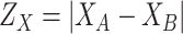
Since the exposure time between two users has a direct relation to the distance separating them, the distribution of the distance between two randomly positioned users in a zone is investigated in the sequel. This expression can be used to approximate the amount of time each user spent in close proximity to an infected person so that he/she can get infected.
Assume two users
 and
and
 are randomly positioned in an indoor public zone. The positions coordinates for the users
 and
and
 are denoted
 and
and
 , respectively. The public zone is assumed to have a rectangular shape with dimensions
 . All the areas inside the public zone are assumed initially to have the same average number of persons passing by, i.e. there is no specific part of the building that is more crowded than the others. Therefore, both the horizontal coordinates
 and
and
 , and the vertical coordinates,
 and
and
 can be be assumed to follow independent uniform random distribution in
 and
and
 , respectively.
The Euclidean distance between
 and
and
 denoted by
 is an important metric that can reveal the approximate time of exposure by analysing its distribution. This distance is given by
 |
where
 and
and
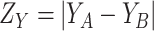 . Since
 and
and
 are independent, it can be shown that the absolute value of the difference between the horizontal coordinates of user
 and
and
 denoted by
 is characterized by the probability density function (PDF)
 and the cumulative distribution function (CDF)
 expressed by
 |
Similarly,
 has a PDF
 and CDF
 expressed by
 |
Since
 and
and
 are defined as functions of independent variables (
 ), it follows that
 and
and
 are also independent. Therefore, the CDF of
 denoted by
 can be obtained as follows
 |
where
 denotes the distance threshold that satisfies
 i.e. The distance between two persons in the building cannot be larger than the largest diagonal of the building itself.
Without loss of generality,
 is assumed to be smaller or equal to
 . Consequently, depending on whether
 is smaller or equal to
 ,
,
 and
and
 , the integral in (6) can have different expressions for three different cases. The first case when
 , the second case when
 and the third case when
 .
.
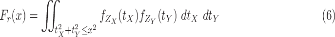
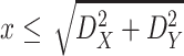
Theorem 1
The probability that two users
and
uniformly distributed in a building of size
are separated by a distance smaller than
is given by
where
Proof
See Appendix A.
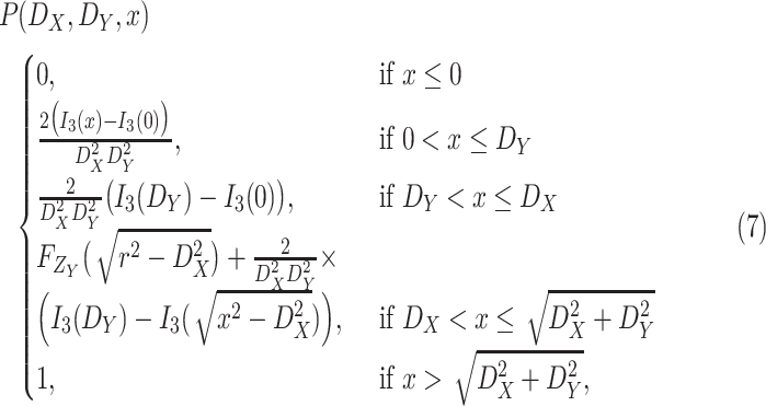

Note that the derived expression of
 for the first case in (7) is, generally, enough to evaluate the probability of being close enough to get infected since the risk distances are most of the times much smaller than
 . However, it is also necessary to investigate the two other cases for two main reasons. First, the second and third cases analysis might be necessary in the case of the investigation of small crowded parts of the building. Also, the derived distance distribution can be used to verify the validity of the reported data by the devices.
For the users distribution model to be accurate, it has to take into account that a substantial amount of time is spent in small crowded parts of the buildings such as the cashier or metro ticket printer. Therefore, it is assumed that each user spends
 ratio of the time in the crowded part of the building with dimensions assumed to be equal to
 percent of the original building dimensions.1
Consequently, the probability that the distance
 between a user
 and a user
 to be smaller than
 in a zone
 with size
 is given by
 |
Therefore, if the users
 and
and
 spend a duration
 together at the same zone
 , the average exposure time within a distance smaller than
 , i.e. the average amount of time they spend close to each others with a distance smaller than
 is given by
 |
The exposure time expression in (10) is a key parameter defining the spread of the virus. Therefore, the next sections tune this expression for each user and at each day depending on his probability of joining zones. Then, this expression is used to predict the probability of infection for each individual.
IV. Virus Spread Model
A. Exposure Risk Levels
Several research papers have investigated how fluids carrying pathogens travel from our respiratory tracts to infect other persons [20]. These fluids originating from the mucous coating the lungs and vocal chords include large fluid droplets visible at the naked eye or smaller aerosol particles. Analyzing the physics behind this transmission is very important to understand how pathogens in general and corona virus in particular spreads when having a direct contact with such droplets coming from an infected person or just by touching a contaminated surface.
In particular, particles ejected while sneezing, coughing, talking, and even breathing have been shown to be able to cause pathogen transmission [21]–[25]. Most of these works focuse on large droplets that are generally expelled during coughing [26]–[31] and sneezing [30], [32], [33]. Some others investigated smaller particles emitted during sneezing and coughing as well as during breathing [34]–[36] and talking [35], [37], [38]. Despite their small size, these particles can carry several types of respiratory pathogens [39]–[41].
Depending on the used assumptions, models and ways of transmission, most of these studies confirm that these and droplets can travel up to 1 m for some references and up to 2 m for some others. Therefore, in the latest WHO recommendations for COVID-19, it is advised to keep a 1 m [42] distance away from persons suspected to be infected. Also, the Centers for Disease Control and Prevention recommends a 2 m distance separation. [43].
Another recent article by a team from MIT [44] claims that 2 m might not be enough and that there is another possible way of COVID-19 transmission. In fact, under the right temperature and humidity conditions, a sneeze can release not only droplets but also a gas that can travel much more than 2 m. In particular, by analyzing the turbulent gas cloud dynamics, properties of the exhaled gas and respiratory transmission, it has been shown that the 1 m or 2 m separations underestimate the distance the gas cloud and its pathogenic load might travel. Also, it is stated that this cloud can travel up to 7 or 8 m.
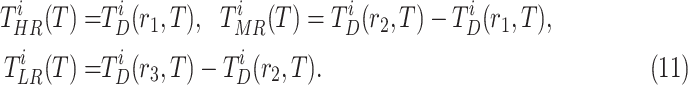
Consequently, as shown in Fig. 3, three risk level areas are defined in this paper
-
•
High risk level (HRL): where the distance between the two users is smaller than
 m. Area colored in red in Fig. 3.
 -
•
Medium risk level (MRL): where the distance between the two users is between
 m and
m and
 m. Area colored in orange in Fig. 3.
 -
•
Low risk level (LRL): where the distance between the two users is between
 m and
m and
 m. Area colored in green in Fig. 3.
FIGURE 3.

Contagious zones in a public zone.
B. Exposure Time
By using the three risk distances defined above, the probability of infection of each person can be expressed as a function of the time of exposure with each other person in the community. Therefore, given that two users
 and
and
 spent
spent
 seconds together in a public zone
 , the terms
 ,
,
 and
and
 are defined as the average time of exposure between user
 and user
 in a high risk, medium risk and low risk levels, respectively. From (10), it follows that the average exposure times are given by
 |
More precisely, the average times of exposure from time
 to
to
 in public zone,
 , between user
 and user
 in HRL, MRL and LRL are denoted as
 ,
,
 ,
,
 , respectively. To compute these values, discrete time intervals of duration
 are considered. These intervals are used to introduce the probability of both users being together in zone
 and to differentiate between the arrival rate of each user in a particular time of the day to a particular zone.
 |
where
 and
and
 denote the probability that user
 and user
 are in zone
 at time interval
 , respectively. Also,
 is expressed as
 |
where
 denotes the probability that user
 is in a public zone at discrete time
 and
and
 denotes the probability that user
 is in zone
 given that he is in a public zone.
The probability
 is a parameter that should reflect how often an individual goes to public zones and the distribution of this probability over the different times of the day. Therefore,
 is expressed by
 |
where
 denotes the ratio of time user
 spends in public zones and
 denotes the ratio of people going to public zones at the time interval
 that should satisfy
 . These parameters can be obtained from real measurements or using surveys. However, in this paper, these parameters are designed to follow realistic distributions.
Also, a user
 does not have the same chances of visiting all the public zones. In particular, each user has always a preferred set of zones that are most probable to be visited. Therefore, a preference vector of zones
 is defined for each user
 as the ordered list of zone indexes by preference.
Let
 denote the set of all
 public zones user
 might go to. The probability of a user visiting the different zones in
 is modeled as an exponentially decreasing discrete vector controlled by a preference factor
 .2 i.e. given that user
 is in a public zone, his probability of being in his
 preferred zone (zone
 is given by
 |
The sum of all
 should be equal to one since if user
 is in a public zone, it has to be in one of the zones in
 . Therefore,
 |
C. Data Augmentation
The derived time of exposure expressions in (12) are based on the random positions assumptions of users inside buildings, the arrival rate of the users to the different buildings and the arrival rate of users each time of the day to the public zones. Using the wireless sensors, all these information can be accurately collected to make an accurate computation of the exposure time without the need of any of these statistical models. However, some of this data might be occasionally unavailable for any reason such as lack of equipment, connectivity issues or reaching a connection dead-zone. In such cases, the statistical models are used to replace the missing data.
In particular, if the arrival rates to public zones during the day for users
 and
and
 are available, but, the exact locations are not, the statistical random positioning assumptions inside the buildings can be used to compute
 . Similarly, if the wireless sensors detected that a user is in the building during a period of time but the positions are available only for limited time intervals, the missing positions can either be interpolated if the missing time is short or positions’ statistical model can be used instead.
This also applies to the arrival rates of the different users which would have a gradually increasing accuracy while running the system by learning the habits and preferences of each user.
D. Infection Map Construction
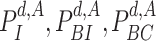
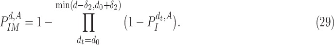
To analyse the spread of the virus based on the pairwise time of exposure expressions defined in (12), four different probabilities are defined for a user
 at day
 :
:
-
•
 : The probability of catching the infection at exactly day
 .
. -
•
 : The probability of being infected at day
 .
. -
•
 : The probability of being contagious at day
 .
. -
•
 : The probability of being immune at day
 .
.
Let,
 denote the number of days from catching the infection to becoming contagious. Also,
 denotes the maximum number of days an individual can remain contagious after his infection.
First, lets assume, without loss of generality that only two users,
 and B, are potentially in zone
 . Let
. Let
 and
and
 denote the time index for the begin and the end of day
 , respectively. Given that user
 is confirmed to be contagious, the probability that user
 gets infected should be proportional to the time of exposure. Also, this probability should be more sensitive to the time of exposure at high risk compared to medium risk and low risk. Furthermore, this probability should depend on the amount of time of exposure needed to get infected. Therefore, the probability that user
 gets infected at day
 in zone
 given that user
 is infected is modeled by
 |
where
 and
and
 are parameters that satisfy
 , are proportional to the virus concentration and reflect the effect of the exposure in HRL, MRL and LRL, respectively. Since the concentration of the pathogen loaded droplets in each zone of risk is proportional to the surface of the investigated zone, these parameters have also to satisfy
 |
Consequently,
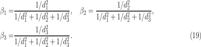 |
Furthermore, the parameter
 is a very critical parameter that reflects how much time a user has to stay in a contagious zone to get infected. This parameter depends on several variables such as how much social distancing is applied, how many persons are using facial masks, how frequently people are disinfecting their hands, etc. Special techniques are proposed in this paper to estimate
 using realistic reported data as detailed in the sequel.
Note that the expression in (17) is based on virus droplets concentrations for each zone and medical contagious interpretations. However, such model is very hard to practically verify as this would require bringing a group of people and infecting them in purpose to analyze the effect of the time of exposure in the contagious. Such scenario is therefore neither practically nor ethically feasible to implement.
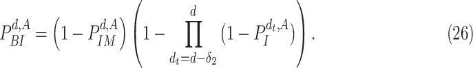
The probability in (17) takes into account only the infections that occur in zone
 . Therefore, the probability of infection of user
 given that user
 is contagious at day
 becomes equal to the complement of the probability of not being infected in any zone
 . Consequently,
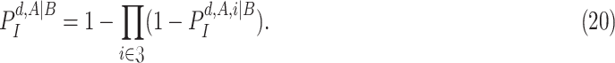 |
To generalize the expression in (20) to the non conditional case, the probability of
 being contagious should be considered i.e.
 |
To get the expression of
 , the probability of being immune is first investigated. In particular, since a user
 becomes immune at day
 if he was infected at any day from
 (first day in the investigated period) till
 , the probability
 is expressed as
 |
Also, a user does not become contagious immediately after getting the virus but after
 days and for as long as
 days. Furthermore, a user can be contagious only if not immune. Consequently, the probability of being contagious
 becomes equal to
 |
Therefore, in a population of two users
 and
and
 , from (20), (21) and (23), the probability of
 getting infected becomes equal to
 |
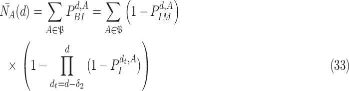
Finally, to generalize the expression in (24) to a multi-user scenario with a population
 , the fact that
 can get the infection from multiple users has to be taken into account. In fact, the probability of
 not getting an infection at day
 is equal to the probability of not getting an infection from any user
 . where
 denotes the set of all users in population
 except user
 , since a user cannot get the infection from himself. Consequently, for the multi-user scenario, (24) becomes
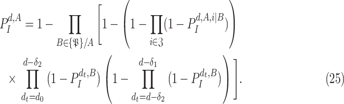 |
By analyzing the expression in (25), it can be seen that it actually presents an iterative definition of the probability of getting the infection at day
 ,
,
 based on all the probabilities of getting the infection from day
 till day
 for all the users in
 (see Fig. 4). This relation is made possible by exploiting the high risk, medium risk and low risk exposure times between each pair of users as indicated in (17).
FIGURE 4.

Iterative infection probability computation flowchart.
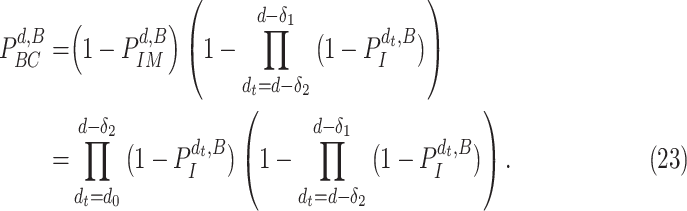
In particular, the computation of time of exposure between each pair of users in each public zone and in each risk zone is performed using (12). These values are then used to design and estimate a virus spread map. In particular, if a set of users are confirmed to get the infection at day
 , the proposed model should be able to update the probability of any other user in the community to be infected.
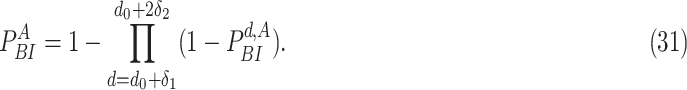
Furthermore, since a user stays infected for
 days, the probability of being infected
 is equivalent to the probability of not being immune and getting the infection at least once from day
 till day
 . Therefore,
 |
To transform the relation in (25) into a virus spread map, the iterative algorithm in Alg. 1 is proposed. The inputs of this algorithm are the set of confirmed infections at each day
 denoted by
 , the set of confirmed non infected persons at each day
 denoted by
 and the movement tracking map denoted
 of all the users (or their distances distributions) that allow the computation of the times of exposure as detailed in (7) and (12). The outputs of the algorithm are the probability of getting the infection, being infected, being immune and being contagious for each user
 and for each day
 in the investigated period
 .
.
Algorithm 1

-
1:
Input:
 and
and

-
2:
Ouput:
 and
and

-
3:
-
4:
for
 do
do -
5:
for
 do
do -
6:
if
 then
then -
7:
Add
 to
to

-
8:
Update

-
9:
Update
-
10:
end if
-
11:
if
 then Update
 end if
 -
12:
end for
-
13:
end for
-
14:
for
 do
do -
15:

-
16:
if
 then
then -
17:
-
18:
else
-
19:

-
20:
end if
-
21:
for
 do
do -
22:
Compute
 using
using
 as in (25) by replacing
 with
with
 .
. -
23:
Compute
 by replacing
 with
with
 in (22).
 -
24:
Compute
 by replacing
 with
with
 in (23).
 -
25:
Compute
 by replacing
 with
with
 in (30).
 -
26:
end for
-
27:
end for
During the initialization phase of Alg. 1 from line 3 to line 13, the initial and last days
 and
and
 are first identified from the investigated period
 . Then, since every person can catch a confirmed infection only once, line 9 makes sure that each user is confirmed to be not infected for all the days preceding his day of infection. Also, if a user
 is infected at day
 , the probability of his infection
 is updated to 1 (line 8). Similarly, if he is not infected, his probability of infection is updated to 0 (line 11).
During the second phase of the algorithm, a loop is created from day
 till
till
 . In particular, since the investigated period is from
 till
till
 , the first infection couldn’t happen before
 . Therefore, the first contagion cannot happen before
 . For each day in this loop, the set of users with known (
 ) and unknown (
 ) probability of infection are defined. The set
 is always defined as the total population except the users that either have confirmed infection
 or confirmed non-infection
 at that particular day (line 15 of Alg. 1). However, the set of users with known probabilities
 is defined as the full population set
 (line 19 Alg. 1) except in the first iteration where the only known set is the union of
 and
and
 (line 17 Alg. 1).
Consequently, for each day
 and for each user
 in the set of individuals with unknown infection probabilities
 , the probability of getting the infection
 is computed as in (25). The obtained result is then used to evaluate the probability of being immune
 as in (22), then the probability of being contagious
 as in (23) and finally to compute the probability of being infected
 as in (30). All this is done by replacing replacing
 with
with
 .
.
E. Parameters Fitting
Several parameters are used in the configuration of the proposed model. For an accurate prediction and infection detection, an accurate estimation of these parameters has to be performed. Fortunately, most of them can be directly extracted from the collected data. However, the most critical parameter that needs special attention is the virus spread factor
 which reflects the efficiency of the social distancing and the viral control strategy. Therefore, it is very difficult to evaluate and estimate as it may vary from time to time and from country to country.
Consequently, two methods are presented to estimate the spread factor
 either based on the average number of users infected by a single person denoted by
 or based on the curve of active cases over time.
1). Infection Spread Based Estimation of

The reproduction number of an infectious disease denoted
 is a parameter widely used to evaluate the speed of spread of viruses. It is equal to the average number of persons that will get the disease directly from one infected individual during all his infection period. Its values can reach up 18 for very contagious diseases such as measles, and it is around 3 for COVID-19.
Therefore, the objective in the sequel is to derive an analytical expression of
 that can be used to fit
 so that
 matches the reported values. To compute
 , the investigated population has to first be assumed to start with only one confirmed infected person
 . The average number of infected persons due to
 over the investigated period can be therefore considered as
 .
.
In case
 got the infection at day
 , the probability that
 is contagious at day
 in (23) becomes
 |
Consequently, and since only
 is considered as the source of contagion, the probability that
 getting the infection at day
 becomes
 |
It follows that the probability that
 is immune at day
 is given by
 |
From (30) and by combining the probability of being immune in (29) and the probability of getting the infection in (28), the probability of
 being infected due to
 at day
 becomes
 |
where
 .
.
From (30), it follows that the probability that
 got infected at any time because of
 is equal to the probability of being infected at any day d. i.e. the complement of the probability that
 was never infected3
 |
Finally,
 becomes the expectation of
 over all the population
 i.e.
i.e.
 |
It is true that the exact value of
 is not available but form (17) it can be noted that increasing
 makes users need more time to get infected. Therefore, increasing
 reduces the expected number of active cases. Consequently,
 is a decreasing function of
 and therefore a bisection algorithm similar to Alg. 1 can be used to get the required
 .
.
2). Active Cases Based Estimation of

Estimating a single spread factor for all the investigated duration might be challenging as this factor might change over time. Therefore, an iterative algorithm is proposed in this part to estimate
 so that to match with the actual active cases numbers. In particular, the probability of a user
 being infected at day
 denoted by
 is computed in (30). Therefore, the expected number of active cases at day
 is given by
 |
Estimating
 separately for each day might result in a very unstable prediction for many reasons such as the sudden variation in the number of tests and identifying new full groups of infected persons. Therefore, the investigated period
 is divided into a set of
 days each. The fitting is then performed so that the expected number of cases at the end of each considered group is as close as possible to the reported one. Consequently, the fitting is performed for a vector of spread factors denoted
 of length equal to the number of day groups
 .
.
To estimate the adequate
 , the Active Spread Factor Estimation (ASFE) algorithm is presented in Alg. 2. The ASFE algorithm starts by defining the first and last investigated days
 and
and
 as well as the number of day groups
 (line 3). for each group
 from 1 to
 , the set of investigated days is defined by
 |
For each set
 , the bisection (Bisect) algorithm in Alg. 3 is used to estimate
 and the set of probabilities
 . Where
 denotes the probabilities of infection, being infected, being immune and being contagious for all the investigated period and for all the investigated population. Note that to predict the infections in a group of days
 , all the probabilities starting from day
 are used as stated in (25). However, only the probabilities in the days that belong to
 change in
 . Therefore,
 is created iteratively group by group using the Bisect algorithm. The Bisect algorithm is called with the minimum and maximum potential spread factors and their corresponding errors are set to
 to make sure that the algorithm computes their errors in the beginning.
Algorithm 2

-
1:
Input:
 and
and

-
2:
Ouput:
 and
and
-
3:

-
4:
for
 do
do -
5:

-
6:

-
7:
end for
Algorithm 3 Bisect
-
1:

-
2:
Input:

-
3:
Ouput:

-
4:
-
5:
if
 then
then -
6:

-
7:
while
 do
do -
8:

-
9:
-
10:
end while
-
11:
if
 then
then
 end if
 -
12:
end if
-
13:
if
 then
then -
14:

-
15:
while
 do
do -
16:

-
17:
-
18:
end while
-
19:
if
 then
then
 end if
 -
20:
end if
-
21:
-
22:
if
 then
then -
23:
if
 then
then -
24:
-
25:
else
-
26:
-
27:
end if
-
28:
-
29:

-
30:
else
-
31:
Return

-
32:
end if
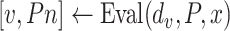
The Bisect algorithm makes use of the function
 that calculates all the probabilities
 given the initial
 and the spread factor
 during the set of days
 as in Alg. 1. The expected number of active cases at the end of the investigated group of days
 is computed as the expectation of the probability of being infected over all the population. Finally, the difference between the reported number of active cases and the computed one is returned as
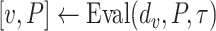
 . Note that Eval makes use of
 for all the days since
 but updates it only for the days in
 .
.
For each group of days
 , a lookup for the adequate
 is done using Bisect algorithm in Alg. 3 from
 to
to
 . since the expected number of active cases is a decreasing function of
 , the error
 when using
 should be positive (Expected number higher than the reported one). Similarly, the error
 when using
 should be negative. To make sure that the interval
 contains the desired
 , the Bisect algorithm starts by computing
 and
and
 and making sure that
 (line 7) and
 (line 15). Otherwise,
 is reduced to
 and/or
 up to 10 times (
 ).
).
In case the extension of
 or
or
 times didn’t make the system satisfy the initial constraints, then
 that had the smallest error is reported. In particular, this is done to avoid rare divergence cases that may occur due to some extreme conditions or sometimes because of a large number of deaths that is not taken into consideration in this model.
Once the initial conditions are satisfied, the error
 is computed for the potential
 denoted
 . Then, at each iteration,
 is set to
 if
if
 and to
 if
if
 till reaching either the maximum number of iterations
 or the minimum absolute error (
 ). Once one of these conditions is reached the Bisect algorithm returns
 and
and
 (line 31).
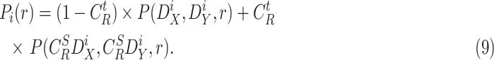
Note that the spread factor
 numerically estimated using the proposed algorithm in Alg. 3 can make the model prediction more accurate. In particular, the proposed model can fit to the case where the spread is very fast and where two individuals need a very limited amount of time to share the virus (
 and
and
 ). This model can also fit to the extreme case where the disease is very slowly spreading by setting
 to zero. Furthermore, once a large amount of data is available, the spread factor can be even analyzed as a user specific parameter which reflects the measures of protection against the pandemic each user is applying. However, such feature is beyond the scope of this paper due to the lack of the relevant data.
V. Numerical Results
To validate the findings of this paper, this section presents simulated results for COVID-19 pandemic spread using Matlab© R2019a by investigating the accuracy of the derived time of exposure for different configuration parameters. The functionality of the virus spread mapping is then discussed and the efficiency of the parameters fitting algorithms are then presented.
In particular, indoor public zones with random users positions are simulated in Fig. 5 and Fig. 6 to verify the validity of the derived probability and time of exposure. In the second part, sample realistic spread models are generated in Fig. 7, Fig. 8 and Fig. 9 to track the virus spread in sample community configurations. Finally, in the third part, using realistic community configurations and approximations, and by using the actual number of active cases in few countries, the efficiency of the proposed model in fitting into the real reported data is checked in Fig. 10 and Fig. 11.
FIGURE 5.

Effect of the Zone dimension on the distance distribution.
FIGURE 6.

Effect of the time spent in crowded zones on the distance distribution.
FIGURE 7.

Number of active cases evolution for different configurations.
FIGURE 8.

Evolution of the probability of being infected or immune over time.
FIGURE 9.

Example of virus spread tracking for one week.
FIGURE 10.

Evolution of the number of active cases over time.
FIGURE 11.

Evolution of the spread factor over time.
A. Time of Exposure
Fig. 5 presents the effect of the indoor public zone dimensions on the distance distribution between a couple of users when
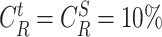 , i.e. 10% of the time is spent in a crowded zone with 10% the size of the full building. First, it can be seen that the derived distribution expression has a perfect match with the simulated distribution with different dimensions’ configurations. Also, note that the bigger is the building, the smaller is the risk for the users to have short distances separating them for a long period of time.
In particular, the average distance separating two users under these configurations are around 4 m, 9 m, 19 m and 28 m when the length and width of the zone are equal to 10 m, 20 m, 40 m and 60 m, respectively. This average distance is proportional to the dimension of the zone and is almost equal to half the length of the zone under these configurations. Also, even-though the average distance separating two users is relatively high, chances of getting close to an infected person is not low and can also increase with the number of users in the building, the dimension of the crowded parts and the time spent there.
Fig. 6 presents the effect of the time spent in crowded zones and also their dimensions (
 ) on the distance distribution and on the exposure time when
 m. First, it can be seen that the distance between users follows a distribution with two peaks, the first around one to two meters and the second around four to five meters. The bigger distance peak is due to the exposure in the full public zone and the peak in the smaller distance is due to the exposure in the more crowded part of the zone such as a cashier.
Therefore, the longer is the time spent in these crowded parts and the bigger are these parts, the higher will be the distribution peak for low distances. i.e. the users will have more chances of getting close to each others for a long period of time. In particular, the average distance between two users when
 of the time is spent in a crowded zone of size equivalent to
 of the total zone size is equal to
 compared to
 when this percentage becomes 30%. Although this average doesn’t seem to be varying a lot with the dimension and time spent in crowded parts, the distribution itself drastically changes especially for low distances.
B. Virus Infection Tracking
For all the next simulations, the arrival rate during the day is generated in way that makes it close to the reported “popular times” for few public places reported by google maps which is based on the visits to the place. In particular, the arrival rate is obtained by interpolating and averaging the reported distributions of few popular visited places by making sure the integral of such distribution over the day is equal to 1.
Also, the average time spent by a user is generated as a random variable following an exponentially decreasing distribution (with a decreasing factor 0.8) from 0 hours to 16 hours. i.e., users can stay up to 16 hours per day in public zones but with much less probability compared to staying for only limited duration. Furthermore, the users preference factor
 is set to 0.8.4
Fig. 7 presents the effect of the spread factor on the expected number of active cases evolution over time. A population of 1000 persons is considered to be spread over 5 zones with dimensions
 and
and
 uniformly distributed from 50 m to 100 m. The spread factor
 is varied from 0.01 to 6. Note that when the spread factor is very low (
 ), the users can catch the virus very quickly. Therefore, almost all the population became infected in less than 10 days. However, the expected number of active cases peak is reached slower with higher spread factors. In particular, when
 , the peak is reached at day 110 with only 11 infections at the same day. Consequently, the bigger is
 , the slower is the pandemic spread and the more efficient would be the healthcare system.
Fig. 8 presents the evolution of the probability of being infected and the probability of being immune but for each user separately. The users are assumed to be divided into 5 groups of 200 persons in each and 5 persons of each group go to the public zones of other groups. The spread factor is set to
 . It can be seen that at the end of the simulated period, almost all the users became immune. Also, each user has a different probability distribution depending on his group and from whom he could get the infection.
To visualize the virus spread, a small community is simulated for one week in Fig. 9. This community is assumed to be composed of 5 groups with 10 persons in each. One out of the 10 persons in each group is assumed to also move in another group simultaneously. Each group of users is assumed to randomly visit five public zones of size
 .
.
At day 1, only 2 out of the 50 persons are assumed to get confirmed infections; user 8 in group 1 and user 21 in group 3. Since user 8 and 21 became infected at day 1, they will not become contagious before day three when they start spreading the virus over the persons they came close to. In particular, even-though these two infected person came in contact with several users in their groups, the proposed model did not predict any other user to have any chance of infection in any group till day 3 when they became contagious.
At day 3, user 21 spread the virus over several members of his group, as it can be seen in Fig. 9, not all the members of group 3 had the same probability of being infected since they are modeled to have different average times spent in public zones and they might go to different zones.
User 21 is assumed to go to both the zones of group 1 and 5 which caused the infection of user 39. Again, user 21 spread the disease in his group only 2 days after his infection (starting from day 5). Furthermore, note that the contagions becomes more and more spread over time. In particular, even if a member of a group did not catch the virus in the previous days from the confirmed infected persons, he starts to get some chances of infection due to other new non-confirmed but probable cases.
C. Fitting to Real Scenarios
Simulating the proposed model for a large population is challenging as it is infeasible to track all the distances between each pair of users, all times. Therefore, three complementary solutions are adopted to scale the proposed model for large populations:
-
•
The population is divided into groups of smaller sizes where the tracking can be performed. Also, few random users are allowed to move occasionally from one group to another.
-
•
The second solution is to only take into consideration long exposure duration to favour the creation of sparse tracking matrices that can help manage the large amount of data investigated.
-
•
Since the proposed model is probabilistic, the expected number of infected persons should be proportional to the number of persons,
 . In particular, by assuming that the total population is divided into perfectly isolated towns of almost equal sizes and initial number of infections, the total number of expected cases becomes proportional to the number of towns. Therefore, the simulation is performed with a relatively small population of 500.000 and the number of cases is scaled up proportionally to the investigated population (
 in Italy for example).
As detailed above, a population of 50.000 persons is investigated and the number of cases is scaled up proportionally to the total population. This population is divided into 10 groups of 5.000 each. Also 5 public zones are considered for each group. Half of the users are assumed to visit zones of two groups, one fifth is assumed to visit zones of 3 groups and 10% of the users visit the zones of 4 groups. The public zones dimensions are uniformly distributed between
 and
and
 .
.
Although the curves presented in Fig. 7 are realistic (have a similar shape to most of the reported data of active cases in the world), it is challenging to fit them to real active cases curve by updating the spread factor, the arrival rate and the other configuration parameters. In particular, fitting errors appear especially in the long run due to the modifications in population behavior and in the government strategy itself during the investigated period. Also, the application rate of social distancing changes over time.
Therefore, the investigated period (257 days from 22 January 2020) in Fig. (10) and Fig. (11) is divided into groups of 5 days each. The number of active cases in United Kingdom (UK), Italy and France are computed by subtracting the number of deaths and the number of recoveries from the number of reported cases obtained from the Harvard Dataverse COVID-19 Daily Cases dataset in [45].
The spread factor is then fit automatically using Alg. 2 for each group of days separately. This allows having accurate active cases curve which results in accurate prediction of the infection map.
Fig. (10) presents both the real number of active cases curve for UK, Italy and France as well as the the number generated by the proposed spread factor fitting algorithm.
To have a fair comparison, day 1 for each country is considered as the first day when the number of active cases is bigger or equal to 10 out of the 50.000 investigated population, i.e. 100 active cases per million. Therefore, the investigated periods are from 23/03/2020, from 13/03/2020 and from 21/03/2020, for UK, Italy and France, respectively.
First, it can be seen that the proposed model can fit with very low errors with the real reported data for different countries. Also, to have such close curves, the spread factor had to vary over time for the different countries.
In particular, Fig. (11) reveals the spread factor obtained from Alg. 2 which states that the three countries had almost the same spread factor in the first 30 days of the investigated period. That’s why the three investigated countries have almost the same virus spread curve shape in the beginning. Starting from day 40, note that the spread factor is, most of the times, higher for Italy, compared to France and UK, and also higher for France compared to UK. This indeed explains the reduction in the number of cases in Italy compared to the two other countries and the lower increase for France compared to UK. Note also that starting from day 118 (which corresponds to 18/05/2020), Italy ended the lockdown which made the spread factor slowly decrease till coming back to close values to France and UK. Also, note that the raise in the spread factor in the first 40 days is explainable by the application of the lockdown in the three investigated countries.
The results obtained from Fig. (10) and Fig. (11) can first be beneficial in evaluating the measures performed by each country. More importantly, it can help getting more accurate prediction of the probability of infection of each member of community as in Fig. (9).
VI. Conclusion
To alleviate the dramatic effect of the COVID-19 pandemic, a private IoT proximity tracking model is proposed in this paper. The proposed model aims to protect the health of individuals while preserving their privacy. In particular, this is done by making use of a low-cost sensor network that anonymously collects Bluetooth and WiFi beacons to create an anonymous movement tracking map of all the users in the public zones. This map is used to compute the exposure time between each couple of users. A mathematical movement model is also used to populate the data. Furthermore, a virus spread model is investigated in order to extract the probability of each individual being infected at each day. This probability is computed using a novel iterative algorithm that allows the estimation of the system parameters and virus spread accurately. The accuracy of the proposed model can be further enhanced by also using 3G, 4G, 5G, ZigBee, and other protocols whenever possible. Finally, the authors believe that the findings of this paper, if implemented, might be of great interest in combating COVID-19 pandemic and other potential novel contagious diseases while preserving the privacy of the community.
Acknowledgment
The statements made herein are solely the responsibility of the authors.
Biographies

Ala Gouissem received the bachelor’s and master’s degrees in telecommunications from the Higher School of Communications of Tunisia (Sup’Com), in 2011 and 2013, respectively, and the Ph.D. degree in computer science from the University of Burgundy, Dijon, France, in 2017. He is currently with the Computer Science and Engineering Department, Qatar University, Qatar, where he is also a Postdoctoral Researcher. His current research interests include general areas of signal processing, security, wireless communications, energy-saving, and especially the statistical approaches of cooperative communication, OFDM transmissions, compressive sensing, and data centers architectures.

Khalid Abualsaud (Senior Member, IEEE) is currently with the Computer Science and Engineering, Qatar University, Qatar. He has more than 25 years of professional experience in information technology. He teaches courses in hardware and software systems. His research interests include health systems, wireless sensors for IoT applications, cybersecurity, cloud computing, and computer network protocols. His research work has been presented in international conferences and journals. He participated actively in organizing several IEEE international conferences in Qatar, namely, ICIoT2020, IEEE WCNC’2016, PLM’2015, AICCSA’2014, RelMiCS’2011, and AICCSA’2008. He received several awards from different local and international organizations. He is active in getting research funding from different sources, including the Qatar National Research Foundation, the Supreme Committee for Delivery and Legacy (FIFA’2022), and some other organizations in Qatar. He is also a LPI of NPRP 10-1205-160012 research project which achieved significant outcomes. He has served as a Technical Program Committee (TPC) Member and Chair for various reputable IEEE conferences. Recently, he served as a Guest Editor in Connected Healthcare Special Issue for IEEE Network. He is also an Associate Editor of IET Quantum Communication Journal.

Elias Yaacoub received the B.E. degree in electrical engineering from the Lebanese University, in 2002, and the M.E. degree in computer and communications engineering and Ph.D. degree in electrical and computer engineering from the American University of Beirut (AUB), in 2005 and 2010, respectively. He worked as a Research Assistant with the American University of Beirut from 2004 to 2005 and the Munich University of Technology in spring 2005. From 2005 to 2007, he worked as a Telecommunications Engineer with Dar Al-Handasah, Shair and Partners. From November 2010 to December 2014, he worked as a Research Scientist/R and D Expert with the Qatar Mobility Innovations Center (QMIC), where he led the Broadband Wireless Access Technology Team. Afterward, he joined the Strategic Decisions Group (SDG), where he worked as a Consultant till February 2016. Then, he joined the Arab Open University (AOU) as an Associate Professor and a Coordinator of the M.Sc. Program in Information Security and Forensics. From February 2018 to August 2019, he worked as an Independent Researcher/Consultant, and he was also affiliated with AUB as a part-time Faculty Member. He has been an Associate Professor with the Computer Science and Engineering Department, Qatar University, since August 2019. His research interests include wireless communications, resource allocation in wireless networks, intercell interference mitigation techniques, antenna theory, sensor networks, and physical layer security.

Tamer Khattab (Senior Member, IEEE) received the B.Sc. and M.Sc. degrees in electronics and communications engineering from Cairo University, Giza, Egypt, and the Ph.D. degree in electrical and computer engineering from The University of British Columbia (UBC), Vancouver, BC, Canada, in 2007. From 1994 to 1999, he was with IBM wtc, Giza, Egypt, as a Development Team Member, then a Development Team Lead. From 2000 to 2003, he was with Nokia (formerly Alcatel Canada Inc.), Burnaby, BC, Canada, as a Senior Member of the technical staff. From 2006 to 2007, he was a Postdoctoral Fellow with The University of British Columbia, where he was involved in prototyping advanced Gbits/sec wireless LAN baseband transceivers. He joined Qatar University (QU) in 2007, where he is currently a Professor of electrical engineering. He is also a Senior Member of the technical staff with the Qatar Mobility Innovation Center (QMIC), a research and development center owned by QU and funded by the Qatar Science and Technology Park (QSTP). In addition to more than 150 high-profile academic journal and conference publications, he has several published and pending patents. His research interests include physical layer security techniques, information theoretic aspects of communication systems, radar and RF sensing techniques, and optical communication.

Mohsen Guizani (Fellow, IEEE) received the B.S. (Hons.) and M.S. degrees in electrical engineering and the M.S. and Ph.D. degrees in computer engineering from Syracuse University, Syracuse, NY, USA, in 1984, 1986, 1987, and 1990, respectively. He is currently a Professor with the Computer Science and Engineering Department, Qatar University, Qatar. Previously, he served in different academic and administrative positions at the University of Idaho, Western Michigan University, the University of West Florida, the University of Missouri-Kansas City, the University of Colorado–Boulder, and Syracuse University. He is the author of nine books and more than 600 publications in refereed journals and conferences. He has guest edited a number of special issues in IEEE journals and magazines. His research interests include wireless communications and mobile computing, computer networks, mobile cloud computing, security, and smart grid. He is also a Senior Member of ACM. He was the recipient of the 2017 IEEE Communications Society Wireless Technical Committee (WTC) Recognition Award, the 2018 AdHoc Technical Committee Recognition Award for his contribution to outstanding research in wireless communications and Ad Hoc Sensor Networks, and the 2019 IEEE Communications and Information Security Technical Recognition (CISTC) Award for outstanding contributions to the technological advancement of security. Throughout his career, he received three teaching awards and four research awards. He was the Chair of the IEEE Communications Society Wireless Technical Committee and the TAOS Technical Committee. He also served as a member, the Chair, and the General Chair for a number of international conferences. He is also the Editor-in-Chief of the IEEE Network. He serves on the editorial boards for several international technical journals, and the Founder and the Editor-in-Chief of Wireless Communications and Mobile Computing (Wiley) journal. He served as the IEEE Computer Society Distinguished Speaker and is also the IEEE ComSoc Distinguished Lecturer.
Appendix A: Proof of Theorem 1
A. Case 1
First, if
 satisfies
 , the CDF
 becomes
 |
It can be shown that
 is expressed as follows
 |
Consequently,
 becomes
 |
where
 is defined as follows
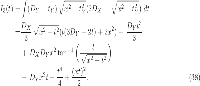 |
B. Case 2
When
 satisfies
 , the CDF of
 can be computed similar to case 1 but while integrating
 only till
 and not till
 . Therefore,
 becomes
 |
C. Case 3
In this case,
 is bigger than the biggest dimension of the building (
 ). i.e.
 satisfies
 . Consequently, the CDF of
 becomes
 |
Funding Statement
This work was supported by the Qatar National Research Fund (a member of The Qatar Foundation) through the National Priorities Research Program (NPRP) Award under Grant NPRP 10-1205-160012.
Footnotes
Only two areas are considered here. However, this system also applies to a large number of areas with different crowding levels. The number of areas with close crowding levels can be accurately estimated using the sensed data.
The bigger is
 , the higher is the probability for the individual to visit only limited number of zones.
Note that the first day
 can get the infection is
 . Also, since
 remains contagious till
 , if
, if
 gets infected at day
 , user
 might remain infected till day
 .
.
Note that in practice, such information should be available from the sensing devices and, most of the times, no mathematical distribution and modeling shall be used.
References
- [1].Worldometer. (2020). COVID-19 Corna-virus Pandemic. Accessed: Oct. 17, 2020. [Online]. Available: https://www.worldometers.info/coronavirus/
- [2].United Nations. (2020). A UN Framework for the Immediate Socio-Economic Response to COVID-19. Accessed: Oct. 17, 2020. [Online]. Available: https://unsdg.un.org/sites/default/files/2020-04/UN-framework-for-the-immediate-socio-economic-response-to-COVID-19.pdf
- [3].Paules C. I., Marston H. D., and Fauci A. S., “Coronavirus infections—More than just the common cold,” Jama, vol. 323, no. 8, pp. 707–708, 2020. [DOI] [PubMed] [Google Scholar]
- [4].Bai Y., Yao L., Wei T., Tian F., Jin D.-Y., Chen L., and Wang M., “Presumed asymptomatic carrier transmission of COVID-19,” Jama, vol. 323, no. 14, pp. 1406–1407, 2020. [DOI] [PMC free article] [PubMed] [Google Scholar]
- [5].Pham Q. V., Nguyen D. C., Huynh-The T., Hwang W. J., and Pathirana P. N., “Artificial intelligence (AI) and big data for coronavirus (COVID-19) pandemic: A survey on the state-of-the-arts,” IEEE Access, vol. 8, pp. 130820–130839, 2020. [DOI] [PMC free article] [PubMed] [Google Scholar]
- [6].Allam Z. and Jones D. S., “On the coronavirus (COVID-19) outbreak and the smart city network: Universal data sharing standards coupled with artificial intelligence (AI) to benefit urban health monitoring and management,” Healthcare, vol. 8, no. 1, p. 46, Feb. 2020. [DOI] [PMC free article] [PubMed] [Google Scholar]
- [7].Allam Z., Cities and the Digital Revolution: Aligning Technology and Humanity. Springer, 2019. [Google Scholar]
- [8].Nguyen T. T., “Artificial intelligence in the battle against coronavirus (COVID-19): A survey and future research directions,” 2020, arXiv:2008.07343. [Online]. Available: https://arxiv.org/abs/2008.07343
- [9].Chamola V., Hassija V., Gupta V., and Guizani M., “A comprehensive review of the COVID-19 pandemic and the role of IoT, drones, AI, blockchain, and 5G in managing its impact,” IEEE Access, vol. 8, pp. 90225–90265, 2020. [Google Scholar]
- [10].Metabiota. (2019). Artificial Intelligence Against COVID-19: An Early Review. Accessed: Oct. 17, 2020. [Online]. Available: https://towardsdatascience.com/artificial-intelligence-against-covid19-an-early-review-92a8360edaba
- [11].DeCaprio D., Gartner J., Burgess T., Garcia K., Kothari S., Sayed S., and McCall C. J., “Building a COVID-19 vulnerability index,” 2020, arXiv:2003.07347. [Online]. Available: http://arxiv.org/abs/2003.07347
- [12].Li L., Qin L., Xu Z., Yin Y., Wang X., Kong B., Bai J., Lu Y., Fang Z., Song Q., and Cao K., “Artificial intelligence distinguishes COVID-19 from community acquired pneumonia on chest CT,” Radiology, vol. 296, no. 2, pp. E65–E71, 2020. [DOI] [PMC free article] [PubMed] [Google Scholar]
- [13].Butt C., Gill J., Chun D., and Babu B. A., “Deep learning system to screen coronavirus disease 2019 pneumonia,” Appl. Intell., vol. 2020, pp. 1–7, Apr. 2020, doi: 10.1007/s10489-020-01714-3. [DOI] [PMC free article] [PubMed] [Google Scholar]
- [14].Patrick H. O., Tate R.-M., and Bobbie J.. (2020). A Flood of Coronavirus Apps are Tracking US. Now it’s Time to Keep Track of Them. Accessed: Oct. 17, 2020. [Online]. Available: https://www.technologyreview.com/2020/05/07/1000961/launching-mittr-covid-tracing-tracker/
- [15].Simko L., Calo R., Roesner F., and Kohno T., “COVID-19 contact tracing and privacy: Studying opinion and preferences,” 2020, arXiv:2005.06056. [Online]. Available: http://arxiv.org/abs/2005.06056
- [16].IANS, Outlook. (2020). Can we Afford to Indulge in Victim Shaming. Accessed: Oct. 17, 2020. [Online]. Available: https://www.outlookindia.com/newsscroll/can-we-afford-to-indulge-in-victim-shaming/1777076
- [17].Kuhn A., NPR. (2020). South Korea’s Tracking Of COVID-19 Patients Raises Privacy Concerns. Accessed: Oct. 17, 2020. [Online]. Available: https://www.npr.org/2020/05/02/849535944/south-koreas-tracking-of-covid-19-patients-rai [Google Scholar]
- [18].Brahim M. B. and Menouar H., “V2X-based traffic flow calculation with support of unique identifier randomization,” in Proc. 2nd IEEE Int. Conf. Comput. Commun. (ICCC), Oct. 2016, pp. 1226–1232. [Google Scholar]
- [19].Mohamed R. E., Saleh A. I., Abdelrazzak M., and Samra A. S., “Survey on wireless sensor network applications and energy efficient routing protocols,” Wireless Pers. Commun., vol. 101, no. 2, pp. 1019–1055, Jul. 2018. [Google Scholar]
- [20].Asadi S., Wexler A. S., Cappa C. D., Barreda S., Bouvier N. M., and Ristenpart W. D., “Aerosol emission and superemission during human speech increase with voice loudness,” Sci. Rep., vol. 9, no. 1, pp. 1–10, Dec. 2019. [DOI] [PMC free article] [PubMed] [Google Scholar]
- [21].Tellier R., “Review of aerosol transmission of influenza A virus,” Emerg. Infectious Diseases, vol. 12, no. 11, p. 1657, 2006. [DOI] [PMC free article] [PubMed] [Google Scholar]
- [22].Weber T. P. and Stilianakis N. I., “Inactivation of influenza a viruses in the environment and modes of transmission: A critical review,” J. Infection, vol. 57, no. 5, pp. 361–373, Nov. 2008. [Online]. Available: http://www.sciencedirect.com/science/article/pii/S0163445308002922 [DOI] [PMC free article] [PubMed] [Google Scholar]
- [23].Tellier R., “Aerosol transmission of influenza a virus: A review of new studies,” J. Roy. Soc. Interface, vol. 6, no. 6, pp. S783–S790, Dec. 2009. [DOI] [PMC free article] [PubMed] [Google Scholar]
- [24].Tang J., “Investigating the airborne transmission pathway—Different approaches with the same objectives,” Indoor Air, vol. 25, pp. 24–119, 04 2015. [DOI] [PMC free article] [PubMed] [Google Scholar]
- [25].Wei J. and Li Y., “Airborne spread of infectious agents in the indoor environment,” Amer. J. Infection Control, vol. 44, no. 9, pp. S102–S108, Sep. 2016. [DOI] [PMC free article] [PubMed] [Google Scholar]
- [26].Yang S., Lee G. W. M., Chen C.-M., Wu C.-C., and Yu K.-P., “The size and concentration of droplets generated by coughing in human subjects,” J. Aerosol Med., vol. 20, no. 4, pp. 484–494, Dec. 2007. [DOI] [PubMed] [Google Scholar]
- [27].Lindsley W. G., Pearce T. A., Hudnall J. B., Davis K. A., Davis S. M., Fisher M. A., Khakoo R., Palmer J. E., Clark K. E., Celik I., Coffey C. C., Blachere F. M., and Beezhold D. H., “Quantity and size distribution of cough-generated aerosol particles produced by influenza patients during and after illness,” J. Occupational Environ. Hygiene, vol. 9, no. 7, pp. 443–449, Jul. 2012. [DOI] [PMC free article] [PubMed] [Google Scholar]
- [28].Lindsley W. G., Reynolds J. S., Szalajda J. V., Noti J. D., and Beezhold D. H., “A cough aerosol simulator for the study of disease transmission by human cough-generated aerosols,” Aerosol Sci. Technol., vol. 47, no. 8, pp. 937–944, Aug. 2013. [DOI] [PMC free article] [PubMed] [Google Scholar]
- [29].Lindsley W. G., Blachere F. M., Beezhold D. H., Thewlis R. E., Noorbakhsh B., Othumpangat S., Goldsmith W. T., Mcmillen C. M., Andrew M. E., Burrell C. N., and Noti J. D., “Viable influenza a virus in airborne particles expelled during coughs versus exhalations,” Influenza Other Respiratory Viruses, vol. 10, no. 5, pp. 404–413, Sep. 2016. [DOI] [PMC free article] [PubMed] [Google Scholar]
- [30].Bourouiba L., Dehandschoewercker E., and Bush J. W. M., “Violent expiratory events: On coughing and sneezing,” J. Fluid Mech., vol. 745, pp. 537–563, Apr. 2014. [Google Scholar]
- [31].Zayas G., Chiang M. C., Wong E., MacDonald F., Lange C. F., Senthilselvan A., and King M., “Cough aerosol in healthy participants: Fundamental knowledge to optimize droplet-spread infectious respiratory disease management,” BMC Pulmonary Med., vol. 12, no. 1, pp. 1–12, Dec. 2012. [DOI] [PMC free article] [PubMed] [Google Scholar]
- [32].Scharfman B. E., Techet A. H., Bush J. W. M., and Bourouiba L., “Visualization of sneeze ejecta: Steps of fluid fragmentation leading to respiratory droplets,” Experim. Fluids, vol. 57, no. 2, p. 24, Feb. 2016. [DOI] [PMC free article] [PubMed] [Google Scholar]
- [33].Han Z. Y., Weng W. G., and Huang Q. Y., “Characterizations of particle size distribution of the droplets exhaled by sneeze,” J. Roy. Soc. Interface, vol. 10, no. 88, Nov. 2013, Art. no. 20130560. [DOI] [PMC free article] [PubMed] [Google Scholar]
- [34].Edwards D. A., Man J. C., Brand P., Katstra J. P., Sommerer K., Stone H. A., Nardell E., and Scheuch G., “Inhaling to mitigate exhaled bioaerosols,” Proc. Nat. Acad. Sci. USA, vol. 101, no. 50, pp. 17383–17388, Dec. 2004. [DOI] [PMC free article] [PubMed] [Google Scholar]
- [35].Papineni R. S. and Rosenthal F. S., “The size distribution of droplets in the exhaled breath of healthy human subjects,” J. Aerosol Med., vol. 10, no. 2, pp. 105–116, Jan. 1997. [DOI] [PubMed] [Google Scholar]
- [36].Fabian P., McDevitt J. J., DeHaan W. H., Fung R. O. P., Cowling B. J., Chan K. H., Leung G. M., and Milton D. K., “Influenza virus in human exhaled breath: An observational study,” PLoS ONE, vol. 3, no. 7, Jul. 2008, Art. no. e2691. [DOI] [PMC free article] [PubMed] [Google Scholar]
- [37].Duguid J. P., “The size and the duration of air-carriage of respiratory droplets and droplet-nuclei,” Epidemiology Infection, vol. 44, no. 6, pp. 471–479, Sep. 1946. [DOI] [PMC free article] [PubMed] [Google Scholar]
- [38].Loudon R. G. and Roberts R. M., “Droplet expulsion from the respiratory tract,” Amer. Rev. Respiratory Disease, vol. 95, no. 3, pp. 435–442, 1967. [DOI] [PubMed] [Google Scholar]
- [39].Liljeroos L., Huiskonen J. T., Ora A., Susi P., and Butcher S. J., “Electron cryotomography of measles virus reveals how matrix protein coats the ribonucleocapsid within intact virions,” Proc. Nat. Acad. Sci. USA, vol. 108, no. 44, pp. 18085–18090, Nov. 2011. [DOI] [PMC free article] [PubMed] [Google Scholar]
- [40].Rossman J. S. and Lamb R. A., “Influenza virus assembly and budding,” Virology, vol. 411, no. 2, pp. 229–236, Mar. 2011. [Online]. Available: http://www.sciencedirect.com/science/article/pii/S0042682210007476 [DOI] [PMC free article] [PubMed] [Google Scholar]
- [41].Fennelly K. P., Jones-López E. C., Ayakaka I., Kim S., Menyha H., Kirenga B., Muchwa C., Joloba M., Dryden-Peterson S., Reilly N., Okwera A., Elliott A. M., Smith P. G., Mugerwa R. D., Eisenach K. D., and Ellner J. J., “Variability of infectious aerosols produced during coughing by patients with pulmonary tuberculosis,” Amer. J. Respiratory Crit. Care Med., vol. 186, no. 5, pp. 450–457, Sep. 2012. [DOI] [PMC free article] [PubMed] [Google Scholar]
- [42].World Health Organization. (2020). Corona-Virus Disease (COVID-19) Advice for the Public. Accessed: Oct. 17, 2020. [Online]. Available: https://bit.ly/31fMUWz
- [43].Travelers From Countries With Widespread Sustained (Ongoing) Transmission Arriving in the United States, Centers for Disease Control and Prevention Website, Atlanta, GA, USA, 2020. [Google Scholar]
- [44].Bourouiba L., “Turbulent gas clouds and respiratory pathogen emissions: Potential implications for reducing transmission of COVID-19,” Jama, vol. 323, no. 18, pp. 1837–1838, Mar. 2020. [DOI] [PubMed] [Google Scholar]
- [45].Lab C. D.. (2020). World COVID-19 Daily Cases With Basemap. [Online]. Available: https://doi.org/10.7910/DVN/L20LOT [Google Scholar]