

Abstract
In this paper, we conduct mathematical and numerical analyses for COVID-19. To predict the trend of COVID-19, we propose a time-dependent SIR model that tracks the transmission and recovering rate at time  . Using the data provided by China authority, we show our one-day prediction errors are almost less than
  . The turning point and the total number of confirmed cases in China are predicted under our model. To analyze the impact of the undetectable infections on the spread of disease, we extend our model by considering two types of infected persons: detectable and undetectable infected persons. Whether there is an outbreak is characterized by the spectral radius of a
  matrix. If
  , then the spectral radius of that matrix is greater than 1, and there is an outbreak. We plot the phase transition diagram of an outbreak and show that there are several countries on the verge of COVID-19 outbreaks on Mar. 2, 2020. To illustrate the effectiveness of social distancing, we analyze the independent cascade model for disease propagation in a configuration random network. We show two approaches of social distancing that can lead to a reduction of the effective reproduction number
  .
.
Keywords: COVID-19, SARS-CoV-2, Coronavirus, time-dependent SIR model, undetectable infection, herd immunity, superspreader, independent cascade, social distancing.
I. Introduction
At the beginning of December 2019, the first COVID-19 victim was diagnosed with the coronavirus in Wuhan, China. In the following weeks, the disease spread widely in China mainland and other countries, which causes global panic. The virus has been named “SARS-CoV-2,” and the disease it causes has been named “coronavirus disease 2019 (abbreviated “COVID-19”). There have been 80,151 people infected by the disease and 2,943 deaths until Mar. 2, 2020 according to the official statement by the Chinese government. To block the spread of the virus, there are some strategies such as city-wide lockdown, traffic halt, community management, social distancing, and propaganda of health education knowledge that have been adopted by the governments of China and other countries in the world.
Unlike the Severe Acute Respiratory Syndrome (SARS) and other infectious diseases, one problematic characteristic of COVID-19 is that there are asymptomatic infections (who have very mild symptoms). Those asymptomatic infections are unaware of their contagious ability, and thus get more people infected before they are detected [1]. The transmission rate can increase dramatically in this circumstance. According to the recent report from WHO [2], only  of COVID-19 patients have a fever, and
  of them have a dry cough. If we use body temperature as a means to detect COVID-19 infected cases, then more than
  of infected persons cannot be detected.
Due to the recent development of the epidemic, we are interested in addressing the following important questions for COVID-19:
-
(Q1)
Is it possible to contain COVID-19? Are the commonly used measures, such as city-wide lockdown, traffic halt, community management, and propaganda of health education knowledge, effective in containing COVID-19?
-
(Q2)
If COVID-19 can be contained, when will be the peak of the epidemic, and when will it end?
-
(Q3)
How do the undetectable infections affect the spread of disease?
-
(Q4)
If COVID-19 cannot be contained, what is the ratio of the population that needs to be infected in order to achieve herd immunity?
-
(Q5)
How effective are the social distancing approaches, such as reduction of interpersonal contacts and canceling mass gatherings in controlling COVID-19?
For (Q1), we analyze the cases in China and aim to predict how the virus spreads in this paper. Specifically, we propose using a time-dependent susceptible-infected-recovered (SIR) model to analyze and predict the number of infected persons and the number of recovered persons (including deaths). In the traditional SIR model, it has two time-invariant variables: the transmission rate  and the recovering rate
  . The transmission rate
  means that each individual has on average
  contacts with randomly chosen others per unit time. On the other hand, the recovering rate
  indicates that individuals in the infected state get recovered or die at a fixed average rate
  . The traditional SIR model neglects the time-varying property of
  and
and  , and it is too simple to precisely and effectively predict the trend of the disease. Therefore, we propose using a time-dependent SIR model, where both the transmission rate
  and the recovering rate
  are functions of time
  . Our idea is to use machine learning methods to track the transmission rate
  and the recovering rate
  , and then use them to predict the number of the infected persons and the number of recovered persons at a certain time
  in the future. Our time-dependent SIR model can dynamically adjust the crucial parameters, such as
  and
and  , to adapt accordingly to the change of control policies, which differs from the existing SIR and SEIR models in the literature, e.g., [3], [4], [5], [6], [7], and [8]. For example, we observe that city-wide lockdown can lower the transmission rate substantially from our model. Most data-driven and curve-fitting methods for the prediction of COVID-19, e.g., [9], [10], and [11] seem to track data perfectly; however, they are lack of physical insights of the spread of the disease. Moreover, they are very sensitive to the sudden change in the definition of confirmed cases on Feb. 12, 2020 in the Hubei province. On the other hand, our time-dependent SIR model can examine the epidemic control policy of the Chinese government and provide reasonable explanations. Using the data provided by the National Health Commission of the People's Republic of China (NHC) [12], we show that the one-day prediction errors for the numbers of confirmed cases are almost less than
  except for Feb. 12, 2020, which is unpredictable due to the change of the definition of confirmed cases.
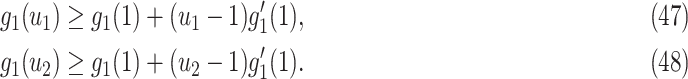
For (Q2), the basic reproduction number  , defined as the expected number of additional infections (secondary cases) by one typical infected person before it recovers in a wholly susceptible population during the infection period [13], [14], is one of the commonly used metrics to check whether the disease will become an outbreak, and what proportion of the population needs to be vaccinated to eradicate the disease. In fact, at any given time, different proportions of the population are immune to any given disease. For this, the effective reproduction number
  is used to quantify the instantaneous spread of disease in the partially susceptible population [14]. Knowing
  and
and  in advance can help governments make more accurate epidemic prevention policies. In the classical SIR model,
  is simply
  as an infected person takes (on average)
  days to recover, and during that period time, it will be in contact with (on average)
  persons. In our time-dependent SIR model, the effective reproduction number at time
  , denoted by
  , is defined as
  . If
. If  , the disease will spread exponentially and infects a certain fraction of the total population. On the contrary, the disease will eventually be contained. Therefore, by observing the change of
  with respect to time or even predict
  in the future, we can check whether certain epidemic control policies are effective or not. Using the data provided by the National Health Commission of the People's Republic of China (NHC) [12], we show that the turning point (peak), defined as the day that the effective reproduction number is less than 1, is predicted to be Feb. 17, 2020. Moreover, the disease in China will end in about 6 weeks after its peak in our (deterministic) model if the current contagious disease control policies are maintained in China. In that case, the total number of confirmed cases is predicted to be around 80,000 cases in China under our (deterministic) model.
For (Q3), we extend our SIR model to include two types of infected persons: detectable infected persons (type 1) and undetectable infected persons (type 2). With probability  (resp.
  ), an infected person is of type 1 (resp. 2), where
  . Type 1 (resp. 2) infected persons have the transmission rate
  (resp.
  ) and the recovering rate
  (resp.
  ). The basic reproduction number in this model is
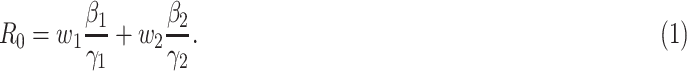 |
In practice, type 1 infected persons have a lower transmission rate than that of type 2 infected persons (as type 1 infected persons can be isolated). For such a model, whether the disease is controllable is characterized by the spectral radius of a  matrix. If the spectral radius of that matrix is larger than 1, then there is an outbreak. On the other hand, if it is smaller than 1, then there is no outbreak. One interesting result is that the spectral radius of that matrix is larger (resp. smaller) than 1 if the basic reproduction number
  in (1) is larger (resp. smaller) than 1. The curve that has the spectral radius equal to 1 is known as the percolation threshold curve in a phase transition diagram [15]. Using the historical data from Jan. 22, 2020 to Mar. 2, 2020 from the GitHub of Johns Hopkins University [16], we extend our study to some other countries, including Japan, Singapore, South Korea, Italy, and Iran. Our numerical results show that there are several countries, including South Korea, Italy, and Iran, that are above the percolation threshold curve, and they are on the verge of COVID-19 outbreaks on Mar. 2, 2020. In comparison with other time-dependent epidemic models in the literature (see, e.g., the well-known tsiR model [17], [18] and the recent Science article [19]), our model further considers the effect of undetectable infected persons (see also the comments in [19] on the preprint version of our paper [20]). A preprint version of our time-dependent SIR model [20] has been cited by Oliver Wyman (one of the well-known global management consulting firms) as one of the two key references in their white paper of COVID-19 Pandemic Navigator Core Model [21]. There they further include government response actions and Google COVID-19 Community Mobility reports for analyzing the effect of undetectable infected persons. This shows the potential to further extend our model to yield more accurate predictions.
The British prime minister, Boris Johnson, once suggested having a sufficiently high fraction of individuals infected by COVID-19 and recovered from the disease to achieve herd immunity. To address the question in (Q4), we argue that herd immunity corresponds to the reduction of the number of susceptible persons in the SIR model, and herd immunity can be achieved after at least  fraction of individuals being infected and recovered from the COVID-19.
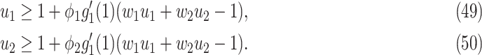
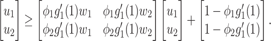
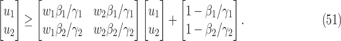
For (Q5), we consider two commonly used approaches for social distancing: (i) allowing every person to keep its interpersonal contacts up to a fraction of its normal contacts, and (ii) canceling mass gatherings. For the analysis of social distancing, we have to take the social network (and its network structure) into account. For this, we consider the independent cascade (IC) model for disease propagation in a random network specified by a degree distribution  . The IC model has been widely used for the study of the influence maximization problem in viral marketing (see, e.g., [22]). In the IC model, an infected node can transmit the disease to a neighboring susceptible node (through an edge) with a certain propagation probability. Repeatedly continuing the propagation, we have a subgraph that contains the set of infected nodes in the long run. By relating the propagation probabilities in the IC model to the transmission rates and recovering rates in the SIR model, we show two results for social distancing: (i) for the social distancing approach that allows every person to keep its interpersonal contacts up to (on average) a fraction
  of its normal contacts, the effective reproduction number is reduced by a factor of
  , and (ii) for the social distancing approach that cancels mass gatherings by removing nodes with the number of edges larger than or equal to
  , the effective reproduction number is reduced by a factor of
  , where
  is the excess degree distribution of
  .
.
The rest of the paper is organized as follows: In Section II, we propose the time-dependent SIR model. We then extend the model to the SIR model with undetectable infected persons in Section III. In Section IV, we consider the independent cascade model for disease propagation in a random network specified by a degree distribution. In Section V, we conduct several numerical experiments to illustrate the effectiveness of our models. In Section VI, we put forward some discussions and suggestions to control COVID-19. The paper is concluded in Section VII.
II. The Time-dependent SIR Model
A. Susceptible-Infected-Recovered (SIR) Model
In the typical mathematical model of infectious disease, one often simplify the virus-host interaction and the evolution of an epidemic into a few basic disease states. One of the simplest epidemic model, known as the susceptible-infected-recovered (SIR) model [15], includes three states: the susceptible state, the infected state, and the recovered state. An individual in the susceptible state is one who does not have the disease at time  yet, but may be infected if one is in contact with a person infected with the disease. The infected state refers to an individual who has a disease at time
  and may infect a susceptible individual potentially (if they come into contact with each other). The recovered state refers to an individual who is either recovered or dead from the disease and is no longer contagious at time
  . Also, a recovered individual will not be back to the susceptible state anymore. The reason for the number of deaths is counted in the recovered state is that, from an epidemiological point of view, this is basically the same thing, regardless of whether recovery or death does not have much impact on the spread of the disease. As such, they can be effectively eliminated from the potential host of the disease [23]. Denote by
  and
and  the numbers of susceptible persons, infected persons, and recovered persons at time
  . Summing up the above SIR model, we believe it is very similar to the COVID-19 outbreak, and we will adopt the SIR model as our basic model in this paper.
In the traditional SIR model, it has two time-invariant variables: the transmission rate  and the recovering rate
  . The transmission rate
  means that each individual has on average
  contacts with randomly chosen others per unit time. On the other hand, the recovering rate
  indicates that individuals in the infected state get recovered or die at a fixed average rate
  . The traditional SIR model neglects the time-varying property of
  and
and  . This assumption is too simple to precisely and effectively predict the trend of the disease. Therefore, we propose the time-dependent SIR model, where both the transmission rate
  and the recovering rate
  are functions of time
  . Such a time-dependent SIR model is much better to track the disease spread, control, and predict the future trend.
B. Differential Equations for the Time-Dependent SIR Model
For the traditional SIR model, the three variables  and
and  are governed by the following differential equations (see, e.g., the book [15]):
 |
We note that
 |
where  is the total population. Let
  and
and  be transmission rate and recovering rate at time
  . Replacing
  and
and  by
by  and
and  in the differential equations above yields
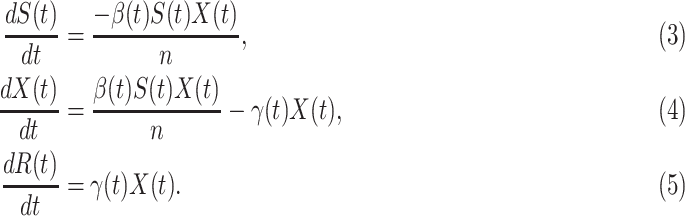 |
The three variables  and
and  still satisfy (2).
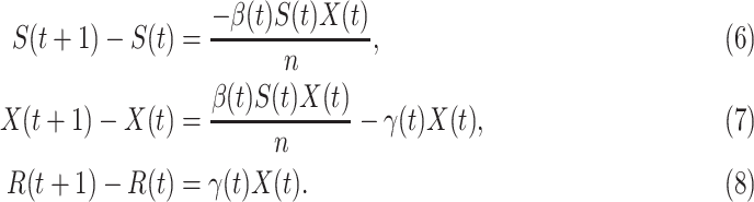
Now we briefly explain the intuition of these three equations. Equation (3) describes the difference of the number of susceptible persons  at time
  . If we assume the total population is
  , then the probability that a randomly chosen person is in the susceptible state is
  . Hence, an individual in the infected state will contact (on average)
  people in the susceptible state per unit time, which implies the number of newly infected persons is
  (as there are
  people in the infected state at time
  ). On the contrary, the number of people in the susceptible state will decrease by
  . Additionally, as every individual in the infected state will recover with rate
  , there are (on average)
  people recovered at time
  . This is shown in (5) that illustrates the difference of
  at time
  . Since three variables
  and
and  still satisfy (2), we have
 |
which is the number of people changing from the susceptible state to the infected state minus the number of people changing from the infected state to the recovered state (see (4)).
C. Discrete Time Time-Dependent SIR Model
Due to the COVID-19 data is updated in days [12], we revise the differential equations in (3), (4), and (5) into discrete time difference equations:
 |
Again, the three variables  and
and  still satisfy (2).
In the beginning of the disease spread, the number of confirmed cases is very low, and most of the population are in the susceptible state. Hence, for our analysis of the initial stage of COVID-19, we assume  , and further simplify (7) as follows:
 |
From the difference equations above, one can easily derive  and
and  of each day. From (8), we have
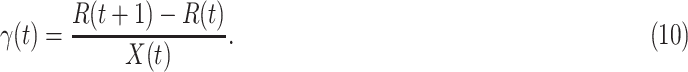 |
 |
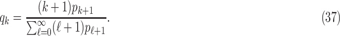
Given the historical data from a certain period  , we can measure the corresponding
  by using (10) and (11). With the above information, we can use machine learning methods to predict the time varying transmission rates and recovering rates.
D. Tracking Transmission Rate  and Recovering Rate
  by Ridge Regression
In this subsection, we track and predict  and
and  by the commonly used Finite Impulse Response (FIR) filters in linear systems. Denote by
  and
and  the predicted transmission rate and recovering rate. From the FIR filters, they are predicted as follows:
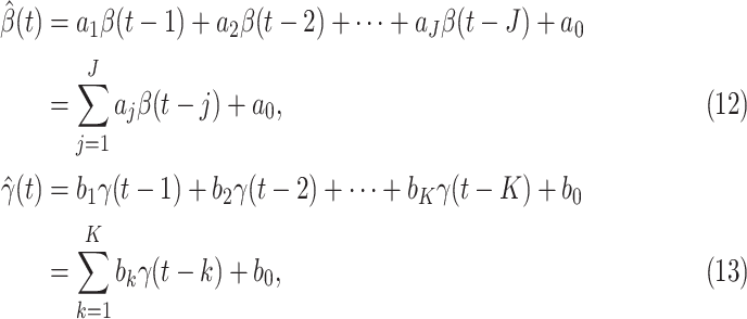 |
where  and
and  are the orders of the two FIR filters (
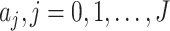 , and
, and  are the coefficients of the impulse responses of these two FIR filters.
There are several widely used machine learning methods for the estimation of the coefficients of the impulse response of an FIR filter, e.g., ordinary least squares (OLS), regularized least squares (i.e., ridge regression), and partial least squares (PLS) [24]. In this paper, we choose the ridge regression as our estimation method that solves the following optimization problem:
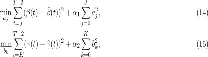 |
where  and
and  are the regularization parameters.
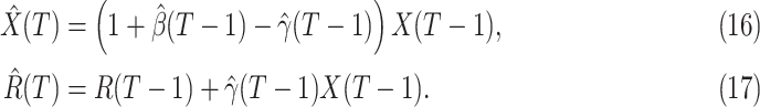
E. Tracking the Number of Infected Persons  and the Number of Recovered Persons
  of the Time-Dependent SIR Model
In this subsection, we show how we use the two FIR filters to track and predict the number of infected persons and the number of recovered persons in the time-dependent SIR model. Given a period of historical data  , we first measure
  by (10) and (11). Then we solve the ridge regression (with the objective functions in (14) and (15) and the constraints in (12) and (13)) to learn the coefficients of the FIR filters, i.e.,
  and
and  . Once we learn these coefficients, we can predict
  and
and  at time
  by the trained ridge regression in (12) and (13).
Denote by  (resp.
  ) the predicted number of infected (resp. recovered) persons at time
  . To predict
  and
and  at time
  , we simply replace
  and
and  by
by  and
and  in (8) and (9). This leads to
 |
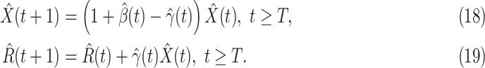
To predict  and
and  for
for  , we estimate
  and
and  by using (12) and (13). Similar to those in (16) and (17), we predict
  and
and  as follows:
 |
The detailed steps of our tracking/predicting method are outlined in Algorithm 1.
Algorithm 1: Tracking Discrete Time Time-dependent SIR Model
Input:
 , Regularization parameters
  and
and  , Order of FIR filters
  and
and  , Prediction window
  .
.Output:
 ,
,  , and
, and  .
.-
1:
Measure
 using (11) and (10) respectively.
 - 2:
- 3:
-
4:
Estimate the number of infected persons
 and recovered persons
  on the next day
  using (16) and (17) respectively.
 -
5:
while
 do
do - 6:
- 7:
-
8:
end while


We note that this deterministic epidemic model is based on the mean-field approximation for  and
and  . Such an approximation is a result of the law of large numbers. Therefore, when
  and
and  are relatively small, the mean-field approximation may not be as accurate as expected. In those cases, one might have to resort to stochastic epidemic models, such as Markov chains.
III. The SIR Model with Undetectable Infected Persons
According to the recent report from WHO [2], only  of COVID-19 patients have a fever, and
  of them have a dry cough. This means there exist asymptomatic infections. Recent studies in [7] and [25] also pointed out the existence of the asymptomatic carriers of COVID-19. Those people are unaware of their contagious ability, and thus get more people infected. The transmission rate can increase dramatically in this circumstance. If there is no method like mass testing to detect those asymptomatic infections, those people will be undetectable.
An undetectable infected person in this paper is defined as an infected person that is not yet detectable or detected under the current epidemic prevention policies. To take the undetectable infected persons into account, we propose the SIR model with undetectable infected persons in this section. We assume that there are two types of infected persons. The individuals who are detectable (with obvious symptoms) are categorized as type 1 infected persons, and the asymptomatic individuals who are undetectable are categorized as type 2 infected persons. For an infected individual, it has probability  to be type 1 and probability
  to be type 2, where
  . Besides, those two types of infected persons have different transmission rates and recovering rates, depending on whether they are under treatment or isolation or not. We denote
  and
and  as the transmission rate and the recovering rate of type 1 at time
  . Similarly,
  and
and  are the transmission rate and the recovering rate for type 2 at time
  .
.
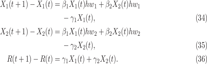
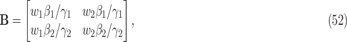
A. The Governing Equations for the SIR Model With Undetectable Infected Persons
Now we derive the governing equations for the SIR model with two types of infected persons. Let  (resp.
  ) be the number of type 1 (resp. type 2) infected persons at time
  . Similar to the derivation of (7), (8) in Subsection II-C, we assume that
  in the initial stage of the epidemic and split
  into two types of infected persons. We have the following difference equations:
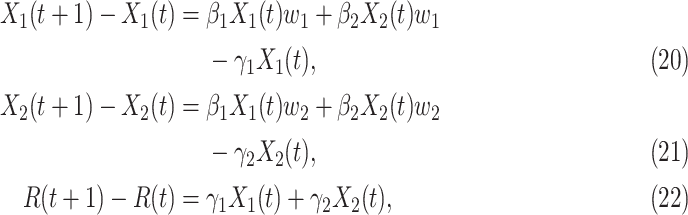 |
where  ,
,  ,
,  , and
, and  are constants. It is noteworthy that those constants can also be time-dependent as we have in Section II. However, in this section, we set them as constants to focus on the effect of undetectable infected persons. Rewriting (20) and (21) in the matrix form yields the following matrix equation:
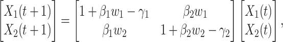 |
where  . Let
. Let  be the transition matrix of the above system equations, i.e.,
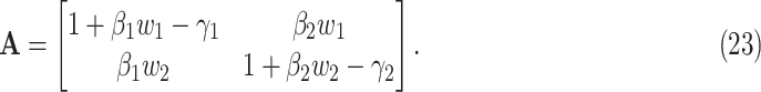 |
It is well-known (from linear algebra) such a system is stable if the spectral radius (the largest absolute value of the eigenvalue) of  is less than 1. In other words,
  and
and  will converge gradually to finite constants when
  goes to infinity. In that case, there will not be an outbreak. On the contrary, if the spectral radius is greater than 1, there will be an outbreak, and the number of infected persons will grow exponentially with respect to time
  (at the rate of the spectral radius).
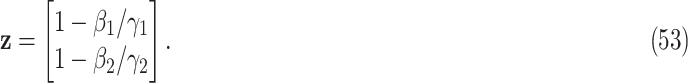
In addition,  and
and  can be further written in a time-dependent form. If we assume
  , according to (20) and (21), we can derive the following expression,
 |
According to (24), if  ,
,  , and
, and  are assumed to be constants over a period of time, we can measure the change of
  over time, which is
 |
The ratio between  and
and  will change with the government's epidemic prevention policy due to the progress of the epidemic. Usually, after a new epidemic prevention policy is promulgated, the policy will have a significant impact on the ratio of
  and
and  over a period of time, and thus
  usually appears in the form of a step function.
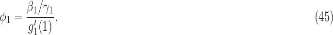
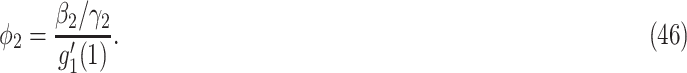
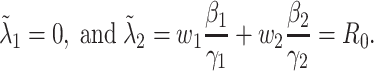
B. The Basic Reproduction Number
To further examine the stability condition of such a system, we let
 |
Note that  is simply the basic reproduction number of a newly infected person as an infected person can further infect on average
  (resp.
  ) persons if it is of type 1 (resp. type 2) and that happens with probability
  (resp.
  ). In the following theorem, we show that there is no outbreak if
  and there is an outbreak if
  . Thus,
  in (26) is known as the percolation threshold for an outbreak in such a model [15].
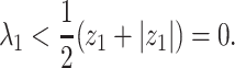
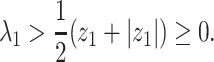
Theorem 1: —
If
, then the spectral radius of
in (23) is less than 1 and there is no outbreak of the epidemic. On the other hand, if
, then the spectral radius of
in (23) is larger than 1 and there is an outbreak of the epidemic.
Proof: —
(Theorem 1)
First, we note that
and
are recovering rates and they cannot be larger than 1 in the discrete-time setting, i.e., it takes at least one day for an infected person to recover. Thus, the matrix
is a positive matrix (with all its elements being positive). It then follows from the Perron-Frobenius theorem that the spectral radius of the matrix is the larger eigenvalue of the
matrix.
Now we find the larger eigenvalue of the matrix
. Let
be the
identify matrix and
Then
Let
and
It is straightforward to show that the two eigenvalues of
are
and
Note that
. In view of (27), the larger eigenvalue of the transition matrix
is
.
If
, we know that
,
, and
. Thus, we have from (29) that
. In view of (31), we conclude that
This shows that
and the spectral radius of
is less than 1.
On the other hand, if
, then
and we have from (31) that
This shows that
and the spectral radius of
is larger than 1.


The relation between the system parameters and the phase transition will be shown in Subsection V-F.
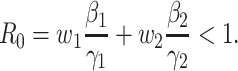
C. Herd Immunity
Herd immunity is one way to resist the spread of a contagious disease if a sufficiently high fraction of individuals are immune to the disease, especially through vaccination. One interesting strategy, once suggested by Boris Johnson, the British prime minister, is to have a sufficiently high fraction of individuals infected by COVID-19 and recovered from the disease to achieve herd immunity. The question is, what will be the fraction of individuals that need to be infected to achieve herd immunity for COVID-19.
To address such a question, we note that herd immunity corresponds to the reduction of the number of susceptible persons in the SIR model. In our previous analysis, we all assume that every person is susceptible to COVID-19 at the early stage and thus 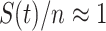 . For the analysis of herd immunity, we assume that there is a probability
  that a randomly chosen person is susceptible at time
  . This is equivalent to that
  fraction of individuals are immune to the disease. Under such an assumption, we then have
 |
In view of the difference equation for  in (7), we can rewrite (20)-(22) to derive the governing equations for herd immunity as follows:
 |
In comparison with the original governing equations in (20)-(22), the only difference is the change of the transmission rate of type 1 (resp. type 2) from  to
to  (resp. from
  to
to  ). Thus, herd immunity effectively reduces the transmission rates by a factor of
  . As a direct consequence of Theorem 1, we have the following corollary.
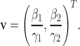
Corollary 2: —
For a contagious disease modeled by our SIR model with two types of infected persons that has
in (26) greater than 1, herd immunity can be achieved after at least
fraction of individuals being infected and recovered from the contagious disease, where

For more discussions on the effect of a possible limited immunity and its impact on herd immunity for COVID-19, we refer to the recent paper [26]. There the authors discussed possible consequences of reaching the COVID-19 herd immunity threshold in the absence of a vaccine. In particular, it is stated in [26] that depletion in healthcare resources will lead not only to elevated COVID-19 mortality but also to increased all-cause mortality.
IV. The Independent Cascade (IC) Model for Disease Propagation in Networks
Our analysis in the previous section does not consider how the structure of a social network affects the propagation of a disease. There are other widely used policies, such as social distancing, that could not be modeled by our SIR model with undetectable infected persons in Section III. To take the network structure into account, in this section, we consider the independent cascade (IC) model for disease propagation. The IC model was previously studied by Kempe, Kleinberg, and Tardos in [22] for the influence maximization problem in viral marketing. In the IC model, there is a social network modeled by a graph  , where
  is the set of nodes, and
  is the set of edges. An infected node can transmit the disease to a neighboring susceptible node (through an edge) with a certain propagation probability. As there are two types of infected persons in our model, we denote by
  (resp.
  ) the propagation probability that a type 1 (resp. type 2) infected node transmits the disease to an (immediate) neighbor of the infected node. Once a neighboring node is infected, it becomes a type 1 (type 2) infected node with probability
  (resp.
  and it can continue the propagation of the disease to its neighbors. Continuing the propagation, we thus form a subgraph of
  that contains the set of infected nodes in the long run. Call such a subgraph the infected subgraph. One interesting question is how one controls the spread of the disease so that the total number of nodes in the infected subgraph remains small even when the total number of nodes is very large.
A. The Infected Tree in the Configuration Model
The exact network structure, i.e., the adjacency matrix of the network  , is in general very difficult to obtain for a large population. However, it might be possible to learn some characteristics of the network, in particular, the degree distribution of the nodes. The configuration model (see, e.g., the book [15]) is one family of random networks that are specified by degree distributions of nodes. A randomly selected node in such a random network has degree
  with probability
  . The edges of a node are randomly connected to the edges of the other nodes. As the edge connections are random, the infected subgraph appears to be a tree (with high probability) if one follows an edge of an infected node to propagate the disease to the other nodes in such a network. The tree assumption is one of the most important properties of the configuration model. Another crucial property of the configuration model is the excess degree distribution. The probability that one finds a node with degree
  along an edge connected to that node is
 |
Thus, excluding the edge coming to the node, there are still  edges that can propagate the disease. This is also the reason why
  is called the excess degree distribution. Note that the excess distribution
  is in general different from the degree distribution
  . They are the same when
  is the Poisson degree distribution. In that case, the configuration model reduces to the famous Erdös-Rényi random graph.
As the infected subgraph is a tree in the configuration model, we are interested to know whether the size of the infected tree is finite. We say that there is no outbreak if the size of the infected tree of an infected node is finite with probability 1. Let  (resp.
  ) be the probability that the size of the infected tree of a type 1 (resp. type 2) node is finite via a specific one of its neighbors. Then,
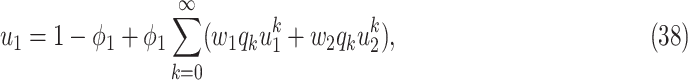 |
 |
To see the intuition of (38), we note that either the neighbor is infected or not infected. It is not infected with probability  . On the other hand, it is infected with probability
  . Then with probability
  (resp.
  ), the infected neighbor is of type 1 (reps. type 2). Also, with probability
  , the neighbor has additional
  edges to transmit the disease. From the tree assumption, the probability that these
  edges all have finite infected trees is
  (resp.
  ) if the infected neighbor is of type 1 (reps. type 2). The equation in (39) follows from a similar argument.
Let
 |
be the moment generating function of the excess degree distribution. Then we can simplify (38) and (39) as follows:
 |
 |
From (41) and (42), we can solve  and
and  by starting from
  and
and
 |
 |
It is easy to show (by induction) that  and
and  . Thus, they converge to some fixed point solution
  and
and  of (41) and (42).
B. Connections to the Previous SIR Model
Now we show the connections to the SIR model in Section III by specifying the propagation probabilities  and
and  .
.
Suppose that one end of a randomly selected edge is a type 1 node. Then this type 1 node will infect  persons on average from the SIR model in Section III. Since the average excess degree is
 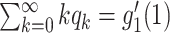 , the average number of neighbors infected by this type 1 node is
  . In order for a type 1 node to infect the same average number of nodes in the SIR model in Section III, we have
 |
Similarly for  , we have
 |
With the propagation probabilities  and
and  specified in (45) and (46), we have the following stability result.
Theorem 3: —
For the IC model (for disease propagation) in a random network constructed by the configuration model, suppose that the propagation probabilities
and
are specified in (45) and (46). Then the size of the infected tree is finite with probability 1 if
Under such a condition, there is no outbreak.
Proof: —
(Theorem 3)
Let
and
. It suffices to show that
is the unique solution for the system of equations in (41) and (42) if
. We prove this by contradiction. Suppose that there is a solution of (41) and (42) that either
or
when
.
Since the moment generating function in (40) is a convex function, we have from the first order Taylor's expansion for
and
that
Note that
. Replacing (47) and (48) into (41) and (42), we have
Writing these two equations in the matrix form yields
This can be further simplified by using (45) and (46). Thus, we have
Let
and
We now rewrite (51) in the following matrix form:
It is straightforward to see that the two eigenvalues of
are
Moreover, the eigenvector corresponding to the eigenvalue
is
Recursively expanding (54) for
times yields
Since
, both
and
converge to the zero vectors as
. Letting
in (55) yields
. This contradicts to the assumption that either
or
.


C. Social Distancing
Social distancing is an effective way to slow down the spread of a contagious disease. One common approach of social distancing is to allow every person to keep its interpersonal contacts up to (on average) a fraction  of its normal contacts (see, e.g., [27], [28]). In our IC model, this corresponds to that every node randomly disconnects one of its edges with probability
  .
.
As in the previous subsection, we let  (resp.
  ) be the probability that the size of the infected tree of a type 1 (resp. type 2) node is finite via a specific one of its neighbors. Then,
 |
To see (56), note that a neighboring node of an infected node can be infected only if (i) the edge connecting these two nodes is not removed (with probability  ), and (ii) the disease propagates through the edge (with the propagation probability
  ). This happens with probability
  . Then with probability
  (resp.
  ), the infected neighbor is of type 1 (reps. type 2). Also, with probability
  , the neighbor has additional
  edges to transmit the disease. From the tree assumption, the probability that these
  edges all have finite infected trees is
  (resp.
  ) if the infected neighbor is of type 1 (reps. type 2). The equation in (57) follows from a similar argument.
In comparison with the two equations in (38) and (39), we conclude that this approach of social distancing reduces the propagation probabilities  and
and  to
to  and
and  , respectively. As a direct consequence of Theorem 3, we have the following corollary.
Corollary 4: —
Suppose that a social distancing approach allows every person to keep its interpersonal contacts up to (on average) a fraction
of its normal contacts. For the IC model (for disease propagation) in a random network constructed by the configuration model, the size of the infected tree is finite with probability 1 if
Under such a condition, there is no outbreak.

Another commonly used approach of social distancing is canceling mass gatherings. Such an approach aims to eliminate the effect of “superspreaders” who have lots of interpersonal contacts. For this, we consider a disease control parameter  and remove nodes with the number of edges larger than or equal to
  in our IC model. Analogous to the derivation of (38) and (39), we have
 |
To see (59), we note that a type 1 infected person only infects a finite number of persons along an edge if (i) the disease does not propagate through the edge (with probability  ), (ii) the disease propagates through the edge and the neighboring node is removed (with probability
  ), and (iii) the disease propagates through the edge and the neighboring node only infects a finite number of persons (with probability
  ). The argument for (60) is similar.
Analogous to the stability result of Theorem 3, we have the following stability result for a social distancing approach that cancels mass gatherings.
Theorem 5: —
Consider a social distancing approach that cancels mass gatherings by removing nodes with the number of edges larger than or equal to
. For the IC model (for disease propagation) in a random network constructed by the configuration model, suppose that the propagation probabilities
and
are specified in (45) and (46). Then the size of the infected tree is finite with probability 1 if
Under such a condition, there is no outbreak.
Proof: —
(Theorem 5)
As in the proof of Theorem 3, we let
and
. It suffices to show that
is the unique solution for the system of equations in (59) and (60) if the inequality in (61) is satisfied. We prove this by contradiction. Suppose that there is a solution of (59) and (60) that either
or
when the inequality in (61) is satisfied.
Since
is a convex function for
and
, we have
. It then follows from (59) and (60) that
Writing these two equations in the matrix form and using (45) and (46) yields
where
is the matrix in (52). Note that
is simply the expected excess degree. Following the same argument as that in Theorem 3, one can easily show that
and
when the inequality in (61) is satisfied. This contradicts to the assumption that either
or
.

Unfortunately, it is difficult to obtain an explicit expression for  to prevent an outbreak in (61). For this, we will resort to numerical computations in the next section.
V. Numerical Results
A. Dataset
In this section, we analyze and predict the trend of COVID-19 by using our time-dependent SIR model in Section II and the SIR model with undetectable infected persons in Section III. For our analysis and prediction of COVID-19, we collect our dataset from the National Health Commission of the People's Republic of China (NHC) daily Outbreak Notification [12]. NHC announces the data as of 24:00 the day before. We collect the number of confirmed cases, the number of recovered persons, and the number of deaths from Jan. 15, 2020 to Mar. 2, 2020 as our dataset. The confirmed case is defined as the individual with positive real-time reverse transcription polymerase chain reaction (rRT-PCR) result. It is worth noting that in the Hubei province, the definition of the confirmed case has been relaxed to the clinical features since Feb. 12, 2020, while the other provinces use the same definition as before.
B. Parameter Setup
For our time-dependent SIR model, we set the orders of the FIR filters for predicting  and
and  as 3, i.e.,
  . The stopping criteria of the model is set to
  . Since the numbers of infected persons before Jan. 27, 2020 are too small to exhibit a clear trend (which may contain noises), we only use the data after Jan. 27, 2020 as our training data for predicting
  and
and  .
.
We use the scikit-learn library [29] (a third-party library of Python 3) to compute the ridge regression. The regularization parameters of predicting  and
and  are set to 0.03 and
  respectively. Since the transmission rate
  is nonnegative, we set it to 0 if it is less than 0. Then, we use Algorithm 1 to predict the trend of COVID-19.
We note there are limitations for our prediction model to yield good results:
-
1.
Our model is a deterministic epidemic model. It is based on the mean-field approximation for
 and
and  . Such an approximation is a result of the law of large numbers. Therefore, when
  and
and  are relatively small, the mean-field approximation may not be as accurate as expected. In those cases, one might have to resort to stochastic epidemic models, such as Markov chains. We will leave it as our future work.
 -
2.
The data can be extremely noisy at the beginning. As such, choosing a good starting day to train the ridge regression for prediction is quite important.
-
3.
The recovering rates of several countries might not yet show a clear trend on Mar. 2, 2020. As such, it is difficult to predict the recovering rates for these countries. One remedy for this is to use a constant recovering rate of
 days, which is the median recovery/death estimate by medical professionals. Another approach is to wait for a clear trend for the recovering rate. The reasons for the low recovering rate and the unclear trend of recovering rate are the lack of specific drugs and the shortage of medical resources. Please refer to Section VI for more discussions on this issue.
C. Time Evolution of the Time-Dependent SIR Model
In Figure 1, we show the time evolution of the number of infected persons and the number of recovered persons. The circle-marked solid curves are the real historical data by Mar. 2, 2020, and the star-marked dashed curves are our prediction results for the future. The prediction results imply that the disease will end in 6 weeks, and the number of the total confirmed cases would be roughly 80,000 if the Chinese government remains their control policy, such as city-wide lockdown and suspension of works and classes.
Fig. 1.

Time evolution of the time-dependent SIR model of the COVID-19. The circle-marked solid curve with dark orange (resp. green) color is the real number of infected persons  (resp. recovered persons
  ), the star-marked dashed curve with light orange (resp. green) color is the predicted number of infected persons
  (resp. recovered
  persons).
In Figure 2, we show the measured  and
and  from the real historical data. We can see that
  decreases dramatically, and
  increases slightly. This is a direct result of the Chinese government that tries to suppress the transmission rate
  by city-wide lockdown and traffic halt. On the other hand, due to the lack of effective drugs and vaccines for COVID-19, the recovering rate
  grows relatively slowly. Additionally, there is a definition change of the confirmed case on Feb. 12, 2020 that makes the data related to Feb. 11, 2020 have no reference value. We mark these data points for
  and
and  with the gray dashed curve.
Fig. 2.

Measured transmission rate  and recovering rate
  of the COVID-19 from Jan. 15, 2020 to Feb. 19, 2020. The two curves are measured according to (11) and (10) respectively.
In an epidemic model, one crucial question is whether the disease can be contained and the epidemic will end, or whether there will be a pandemic that infects a certain fraction of the total population  . To answer this, one commonly used metric is the basic reproduction number
  that is defined as the average number of additional infections by an infected person before it recovers in a wholly susceptible population [13]. In the classical SIR model,
  is simply
  as an infected person takes (on average)
  days to recover, and during that period time, it will be in contact with (on average)
  persons. In our time-dependent SIR model, the effective reproduction number at time
  , denoted by
  , is defined as
  . If
. If  , the disease will spread exponentially and infects a certain fraction of the total population
  . On the contrary, the disease will eventually be contained. Therefore, by observing the change of
  with respect to time or even predicting
  in the future, we can check whether certain epidemic control policies are effective or not.
In Figure 3, we show the measured effective reproduction number  , and the predicted effective reproduction number
  . The blue circle-marked solid curve is the measured
  and the purple star-marked dashed curve is the predicted
  (from Feb. 15, 2020). It is clear that
  has decreased dramatically since Jan. 28, 2020, and it implies that the control policies work in China. More importantly, it shows that the turning point is Feb. 17, 2020 when
  . In the following days after Feb. 17, 2020,
  will decrease exponentially, and that will lead to the end of the epidemic in China. Our model predicts precisely that
  will go less than 1 on Feb. 17, 2020 by 3 days in advance (Feb. 14, 2020). The results show that our model is very effective in tracking the characteristics of
  and
and  .
.
Fig. 3.

Effective reproduction number  of the time-dependent SIR model of the COVID-19 in China. The circle-marked solid curve with blue color is the
  based on the given data from Jan. 27, 2020 to Feb. 20, 2020, the star-marked dashed curve with purple color is the predicted
  based on the data from Jan. 27, 2020 to Feb. 15, 2020, and the dashed line with red color is the percolation threshold 1 for the effective reproduction number.
D. One-Day Prediction
To show the precision of our model, we demonstrate the prediction results for the next day (one-day prediction) in Figure 4. It contains the predicted number of infected persons  (orange star-marked dashed curve), the predicted number of recovered persons
  (green star-marked dashed curve), and the real number of infected and recovered persons (dark orange and dark green circle-marked solid curves) every day. The unpredictable days due to the change of the definition of the confirmed case on Feb. 12, 2020. are marked as gray. The predicted curves are extremely close to the measured curves (obtained from the real historical data). In this figure, we also annotate the predicted number of infected persons
  and the predicted number of recovered persons
  on Mar. 3, 2020.
Fig. 4.

One-day prediction for the number of infected and recovered persons. The unpredictable points due to the change of definition of the confirmed case are marked as gray. The circle-marked solid curve with dark orange (resp. green) color is the real number of infected persons  (resp. recovered persons
  ), the star-marked dashed curve with light orange (resp. green) color is the predicted number of infected persons
  (resp. recovered persons
  ).
).
We further examine our prediction accuracy in Figure 5. The error rates are all within  except for the predicted number of recovered persons
  on Feb. 1, Feb. 3, and Feb. 5, 2020. The gray dashed line stands for the unpredictable points due to the change of definition of the confirmed case. However, from the prediction results after Feb. 16, 2020, we find that our model can still keep tracking
  and
and  accurately and overcome the impact of the change of the definition.
Fig. 5.

Errors of the one-day prediction of the number of infected and recovered persons. The unpredictable points due to the change of definition of the confirmed case on Feb. 12, 2020 are marked as the gray dash line.
E. Basic Reproduction Numbers of Several Other Countries
In addition to the dataset for China, we also measure the effective reproduction number  on Mar. 31, 2020 for several countries from the datasets in [16]. This is shown in the last column of Table I. As the data for the cumulative numbers of recovered persons for these countries are noisy, we also show the estimated
  under various assumptions of the average time to recover
  . The
. The  values for the five countries, including United States of America, the United Kingdom, France, Iran, and Spain are very high. On the other hand, it seems that Italy is gaining control of the spread of the disease after the Italian government announces the lockdown and forbids the gatherings of people on Mar. 10, 2020. Also, both Germany and Republic of Korea are capable of controlling the spread of the disease.
TABLE I. The Estimated  under Various Assumptions of the Average Time to Recover (
 ) from COVID-19, and the Measured
  on Mar. 31, 2020.
| Country | Estimated  when the average time to recover when the average time to recover  is is |
 on Mar. 31, 2020 on Mar. 31, 2020 |
||||
|---|---|---|---|---|---|---|
| 14 Days | 21 Days | 28 Days | 35 Days | 42 Days | ||
| United States of America | 2.13 | 3.20 | 4.26 | 5.33 | 6.39 | 12.59 |
| The United Kingdom | 1.89 | 2.83 | 3.77 | 4.72 | 5.66 | 8.90 |
| France | 2.58 | 3.86 | 5.15 | 6.44 | 7.73 | 4.76 |
| Iran | 1.25 | 1.88 | 2.51 | 3.14 | 3.76 | 4.51 |
| Spain | 1.63 | 2.45 | 3.27 | 4.08 | 4.90 | 3.47 |
| Italy | 0.79 | 1.19 | 1.59 | 1.98 | 2.38 | 3.08 |
| Germany | 1.49 | 2.24 | 2.98 | 3.73 | 4.48 | 2.80 |
| Republic of Korea | 0.44 | 0.66 | 0.88 | 1.11 | 1.33 | 1.68 |
F. The Effects of Type II Infected Persons
In this subsection, we show how undetectable (type 2) infected persons affect the epidemic. In particular, we are interested in addressing the question of whether the existence of undetectable infected persons (type 2) can cause an outbreak.
To carry out our numerical study, we need to fix some variables in the system of difference equations in (20)-(22). For the transmission rate (resp. recovering rate) of type 1 infected persons, i.e.,  (resp.
  ), we set it to be the measured
  (resp.
  ) on Mar. 1, 2020 in China. The rationale behind this is that type 1 infected persons were detected and they were under treatment and isolation after Mar. 1, 2020 in China. Also, as there is no medicine for COVID-19, we may assume that these two types of infected persons have the same recovering rate, i.e,
  . In view of the system equation in (20)-(22), there are still two free variables
  and
and  , where
  is the probability that an infected person is of type 2 and
  is the transmission rate of type 2.
In Figure 6, we illustrate how  and
and  affect the outbreak of the COVID-19. Such a figure is known as the phase transition diagram in [15]. The black curve in Figure 6 is the curve when the spectral radius of the transition matrix
  in (23) equals to 1. This curve represents the percolation threshold of COVID-19. If
  and
and  fall above the black curve (in the orange zone), then there will be an outbreak. On the contrary, if
  and
and  fall below the black curve (in the yellow zone), then there will not be an outbreak. As shown in Figure 6, we would like to point out the importance of detecting an infected person. As long as more than
  of those infected persons can be actually detected and properly isolated and treated, it is possible to contain the spread of the disease even if the transmission rate of type 2 infected persons, i.e.,
  , is as high as 0.7. On the other hand, suppressing the transmission rate of type 2 infected persons can also be effective in controlling the disease while the detection rate is not that high. For example, wearing masks and washing hands can be an effective epidemic prevention mechanism to reduce
  .
.
Fig. 6.

Phase transition diagram of an outbreak with respect to  and
and  . The black curve is the percolation threshold. The orange area means the disease will be an outbreak while the yellow area means the disease is under control.
In the following experiments, we extend our study to other countries, including Japan, Singapore, South Korea, Italy, and Iran. We collect the historical data from Jan. 22, 2020 to Mar. 2, 2020 from the GitHub of Johns Hopkins University [16]. For these countries, the transmission rates  and the recovering rates
  (measured from the time-dependent SIR model in Section II) during the initial period with a rapid increase of the number of confirmed cases can be viewed as
  and
and  . This is because during that period of time, there is no epidemic prevention intervention, and all the infected persons are basically not detected. It is interesting to note that different countries might have different
  and
and  . On the other hand, only
  of COVID-19 cases have a fever from the report of WHO [2]. If we use body temperature as a means to detect an infected person, then only
  of COVID-19 cases can be detected. For this, we set
  .
.
With  and
and  specified in the previous study for China, we plot the phase transition diagram in Figure 7 in terms of the two variables
  and
and  . Again, the black curve is the curve when the spectral radius of the transition matrix
  in (23) equals to 1. Such a curve represents the percolation threshold of a COVID-19 outbreak. If
  and
and  fall above the black curve (in the orange zone), then there will be an outbreak. On the contrary, if
  and
and  fall below the black curve (in the yellow zone), then there will not be an outbreak. The countries with large confirmed cases, including Japan, Singapore, South Korea, Italy, and Iran, are marked in Figure 7. From Figure 7, we observe that both Singapore and Japan are below the percolation threshold. But Japan is much closer to the percolation threshold. On the other hand, both South Korea and Italy are above the percolation threshold, and they are on the verge of a potential outbreak on Mar. 2, 2020. These two countries must implement epidemic prevention policies urgently. Not surprisingly, on Mar. 10, 2020, the Italian government announces the lockdown and forbids the gatherings of people. It is worth mentioning that there are two marks for Iran in the Figure. The one above the percolation threshold is the one without adding the number of deaths into the number of recovered persons. The other one below the percolation threshold is the one that adds the number of deaths into the number of recovered persons. For some unknown reason, the death rate in Iran is higher than the other countries. The high death rate seems to prevent an outbreak in Iran.
Fig. 7.

Phase transition diagram of an outbreak with respect to  and
and  . The black curve is the percolation threshold. The orange area means the disease will be an outbreak, while the yellow area means the disease is under control.
In order to show that  can change significantly over time to reflect the change of the government's epidemic prevention policy, we plot in Figure 8 the estimated
  from Feb. 23, 2020 to Mar. 18, 2020 in South Korea. Using the same experimental settings in this section, we set
  ,
,  , and
, and  to the measured values in the previous study for China, and set
  to the measured value in South Korea. We set 5 days as a time interval and leverage the recursive formula in (25) to estimate the value of
  over time. In each time interval,
  is obtained by minimizing the sum of the squared residuals under (25) [29]. As shown in Figure 8, we can see that
  in the first three time intervals, starting from Feb. 23, 2020, increase significantly. If we compare this result with the dataset provided by Our World in Data [30], we can find that South Korea began to conduct a large number of COVID-19 testing on the public on Feb. 24, 2020, and increased the number of testing every day onward. Therefore, we can infer that epidemic prevention policy like mass testing can effectively increase the probability of
  and greatly reduce the proportion of undetectable persons. From the above discussions, we know that
  can reflect the impact on a new epidemic prevention policy. Also, mass testing has a significant effect on reducing the proportion of undetectable persons.
Fig. 8.

The estimated  as a function of 5-day intervals in South Korea.
G. The Effects of Social Distancing
In this subsection, we show the numerical results of the social distancing approach that cancels mass gatherings by removing nodes with the number of edges larger than or equal to  . As shown in Theorem 5, the effective reproduction number is reduced by a factor of
  , where
  is the excess degree distribution of
  . For this experiment, we use the dataset collected by [31] from Facebook. This dataset represents the verified Facebook page (with blue checkmark) networks of the artist category. The blue checkmark means Facebook has confirmed that an account is the authentic presence of the public figure, celebrity, or global brand it represents. Each node in the network represents the page, and edges between two nodes are mutual likes among them. This dataset is composed of 50,515 nodes and 819,306 edges. Some other properties are listed as follow: mean degree 32.4, max degree 1,469, diameter 11, and clustering coefficient 0.053. In Figure 9, we show the log-log plots of the degree distribution and the excess degree distribution of this dataset. The degree distribution appears to be a (truncated) Pareto distribution with the exponent 1.69 (the slope in the figure).
Fig. 9.

The degree distribution and the excess degree distribution of the Facebook dataset.
In Figure 10, we plot the reduction ratio  as a function of
  . The ratio is between 0 and 1, and it is monotonically increasing in
  . The reduction ratio represents how large a gathering is forbidden to reduce the corresponding ratio of
  . Using the
  values (on Mar. 31, 2020) in the last column of Table I, we also show that the minimum
  s to prevent an outbreak in Italy, U.S., and South Korea are 63, 195, and 435, respectively; moreover, the affected fraction of tail distributions are
  ,
,  , and
, and  , respectively. In particular, if canceling mass gathering is the only measure used for controlling COVID-19 in the U.S. with the
  value of 12.59 on Mar. 31, 2020, then one can prevent an outbreak by “removing” all the nodes with degrees larger than or equal to 63 (in the Facebook dataset), and the removal might affect
  of the nodes in the Facebook dataset.
Fig. 10.

The reduction ratio  as a function of
  . The minimum
  s to prevent an outbreak in Italy, U.S., and South Korea are 63, 195, and 435, respectively.
VI. Discussions and Suggestions
As of Mar. 2, 2020, it seems that COVID-19 has been gradually controlled in China since the prevention policies, such as city-wide lockdown was issued in China in Jan. 2020. Although the policies such as traffic halt, small community management, and city-wide lockdown can effectively reduce the transmission rates  and
and  ; however, these relatively extreme policies not only restrict the right of personal freedom but also affect the normal operation of society. These extreme policies forced several companies and factories to halt production, which impacts all sectors of the economy. Therefore, to strike a balance between the prevention of disease and ensuring the normal operation of society is crucial, and it is important to suggest the so-called “optimal” control policies.
For this, we would like to put forward some discussions and suggestions for controlling the spread of COVID-19 based on the observation made from the results of our system models. From our results in Theorem 1, Corollary 2, Theorem 3, Corollary 4, and Theorem 5, we know that there is no outbreak for a disease if the effective reproduction number
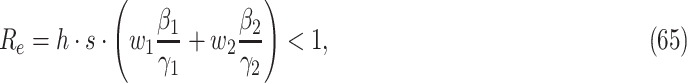 |
where  is the herd immunity reduction factor in Corollary 2 when
  fraction of individuals are immune to the disease,
  is the social distancing reduction factor in Corollary 4 or Theorem 5,
  (resp.
  ) is the probability that an infected person can (resp. cannot) be detected, and
  and
and  (resp.
  and
and  ) are the transmission rate and the recovering rate of an infected person who can (resp. cannot) be detected. For COVID-19,
  and
and  as an infected person, once detected, can be treated (to shorten the recovery time) and isolated (to reduce the transmission rate). As
  , it is thus preferable to have a much larger
  than
than  .
.
To prevent an outbreak, one should minimize the value on the left-hand side of (65). Here we discuss several approaches for that.
-
1.
Increasing the recovering rate
 : the most effective way to increase
  is to find anti-virus drugs; however, it takes time. Hence, we should focus on the other approaches to control the spread of the disease in this stage.
 -
2.
Reducing the herd immunity reduction factor
 : the most effective way for this is to find vaccines to reduce the fraction of susceptible persons. Once again, it takes time, and we should focus on the other approaches to control the spread of the disease in this stage.
 -
3.
Decreasing the transmission rate
 [32]: once an infected person is detected, it should be isolated to avoid extra infection on society and lower the transmission rate
  . Quarantine of the persons who are suspected to be in contact with infected persons could also lower the transmission rates
  and
and  .
. -
4.
Increasing the detection probability
 (and thus reducing
  ): mass testing can certainly increase
  . In fact, South Korea did an outstanding job of drive-thru testing. If mass testing is not possible due to the limitation of medical resources, then measuring body temperature can also be an effective alternative, as
  of the confirmed cases of COVID-19 have a fever. In addition to this, one can also track the travel history, occupation, contact, and cluster (TOCC) of the confirmed cases to narrow the range of the possible sources. These sources might contain undetectable infected persons, and testing the close contacts of these possible sources can thus increase
  by detecting undetectable infected persons.
 -
5.
Decreasing the transmission rate
 : propaganda of health education knowledge can reduce the transmission rate
  substantially. For example, wearing masks in public and enclosed space, washing hands, avoiding touching your mouth, eyes, and nose are good ways to not only protect ourselves from being infected by the undetectable infected persons but also avoid infecting others.
 -
6.
Reducing the social distancing reduction factor
 : as shown in Corollary 4 and Theorem 5, there are two practical approaches that can reduce the social distancing reduction factor
  : (i) allowing every person to keep its interpersonal contacts up to a fraction of its normal contacts, and (ii) canceling mass gatherings.
VII. Conclusion and Future Work
In this paper, we conducted mathematical and numerical analyses for COVID-19. Our time-dependent SIR model is not only more adaptive than traditional static SIR models, but also more robust than direct estimation methods. Our numerical results show that one-day prediction errors for the number of infected persons  and the number of recovered persons
  are within (almost)
  for the dataset collected from the National Health Commission of the People's Republic of China (NHC) [12]. Moreover, we are capable of tracking the characteristics of the transmission rate
  and the recovering rate
  with respect to time
  , and precisely predict the future trend of the COVID-19 outbreak in China.
To address the impact of undetectable infections in COVID-19, we extended our SIR model by considering two types of infected persons: detectable infected persons and undetectable infected persons. Whether there is an outbreak in such a model is characterized by the spectral radius of a  matrix that is closely related to the basic reproduction number
  . In addition to our numerical analysis for China, we further extended our study to other countries, including Japan, Singapore, South Korea, Italy, and Iran.
To understand the effects of social distancing approaches, including the reduction of interpersonal contacts and canceling mass gatherings, we analyzed the IC model for disease propagation in the configuration model. By relating the propagation probabilities in the IC model to the transmission rates and recovering rates in the SIR model, we showed these social distancing approaches can lead to a reduction of the effective reproduction number  .
.
Last but not least, based on the experimental results, some discussions and suggestions on epidemic prevention are proposed from the perspective of our models. One possible future work is to extend our deterministic SIR model to stochastic models so that super-spreading events (that show the high stochasticity under low prevalence [33]) can be included in the analysis. By doing so, one can further improve the precision of the prediction results.
Biographies

Yi-Cheng Chen received the B.S. degree in electrical engineering from National Taiwan University of Science and Technology, Taipei, Taiwan, in 2018. He is currently working toward the M.S. degree with the Institute of Communications engineering, National Tsing-Hua University, Hsinchu, Taiwan.

Ping-En Lu (Graduate Student Member, IEEE) received the B.S. degree in communication engineering from the Yuan Ze University, Taoyuan, Taiwan, in 2015. He is currently working toward the Ph.D. degree with the Institute of Communications Engineering, National Tsing Hua University, Hsinchu, Taiwan. He won the ACM Multimedia 2017 Social Media Prediction (SMP) Challenge with his team in 2017. His research interests are in network science, efficient clustering algorithms, network embedding, and deep learning algorithms.

Cheng-Shang Chang (Fellow, IEEE) received the B.S. degree from National Taiwan University, Taipei, Taiwan, in 1983, and the M.S. and Ph.D. degrees from Columbia University, New York, NY, USA, in 1986 and 1989, respectively, all in electrical engineering.
From 1989 to 1993, he was employed as a Research Staff Member with the IBM Thomas J. Watson Research Center, Yorktown Heights, NY, USA. Since 1993, he has been with the Department of Electrical Engineering, National Tsing Hua University, Hsinchu, Taiwan, where he is a Tsing Hua Distinguished Chair Professor. He is the author of the book Performance Guarantees in Communication Networks (Springer, 2000) and the coauthor of the book Principles, Architectures and Mathematical Theory of High Performance Packet Switches (Ministry of Education, 2006). His current research interests are concerned with network science, big data analytics, mathematical modeling of the internet, and high-speed switching. Dr. Chang served as an Editor for Operations Research from 1992 to 1999, an Editor for the IEEE/ACM Transactions on Networking from 2007 to 2009, and an Editor for the IEEE Transactions on Network Science and Engineering from 2014 to 2017. He is currently serving as an Editor-at-Large for the IEEE/ACM Transactions on Networking. He is a member of IFIP Working Group 7.3. He received an IBM Outstanding Innovation Award in 1992, an IBM Faculty Partnership Award in 2001, and Outstanding Research Awards from the National Science Council, Taiwan, in 1998, 2000, and 2002, respectively. He also received Outstanding Teaching Awards from both the College of EECS and the university itself in 2003. He was appointed as the first Y. Z. Hsu Scientific Chair Professor in 2002. He received the Merit NSC Research Fellow Award from the National Science Council, R.O.C., in 2011. He also received the Academic Award in 2011 and the National Chair Professorship in 2017 from the Ministry of Education, R.O.C. He was the recipient of the 2017 IEEE INFOCOM Achievement Award.

Tzu-Hsuan Liu received the B.S. degree in communication engineering from National Central University, Taoyuan, Taiwan, in 2018. She is currently working toward the M.S. degree with the Institute of Communications Engineering, National Tsing Hua University, Hsinchu, Taiwan. Her research interest is in 5G wireless communication.
Funding Statement
This work was supported by the Ministry of Science and Technology (MOST) of Taiwan (R.O.C.) under Project MOST108-2221-E007-016-MY3.
Contributor Information
Yi-Cheng Chen, Email: yichengchen@gapp.nthu.edu.tw.
Ping-En Lu, Email: j94223@gmail.com.
Cheng-Shang Chang, Email: cschang@ee.nthu.edu.tw.
Tzu-Hsuan Liu, Email: carinaliu@gapp.nthu.edu.tw.
References
- [1].Nishiura H., et al. , “Estimation of the asymptomatic ratio of novel coronavirus infections (covid-19),” Int. J. Infectious Dis., vol. 94, p. 154, 2020. [DOI] [PMC free article] [PubMed] [Google Scholar]
- [2].“Coronavirus disease (covid-19) outbreak,” Jan. 2020. [Online]. Available: https://www.who.int/emergencies/diseases/novel-coronavirus-2019
- [3].Nesteruk I., “Statistics based predictions of coronavirus 2019-ncov spreading in mainland china,” MedRxiv, 2020. [Google Scholar]
- [4].Chen Y., Cheng J., Jiang Y., and Liu K., “A time delay dynamical model for outbreak of 2019-ncov and the parameter identification,” 2020, arXiv:2002.00418. [Google Scholar]
- [5].Peng L., Yang W., Zhang D., Zhuge C., and Hong L., “Epidemic analysis of Covid-19 in china by dynamical modeling,” 2020, arXiv:2002.06563. [Google Scholar]
- [6].Zhou T., et al. , “Preliminary prediction of the basic reproduction number of the wuhan novel coronavirus 2019-ncov,” J. Evidence-Based Med., 2020. [DOI] [PMC free article] [PubMed] [Google Scholar]
- [7].Maier B. F. and Brockmann D., “Effective containment explains sub-exponential growth in confirmed cases of recent covid-19 outbreak in mainland china,” 2020, arXiv:2002.07572. [DOI] [PMC free article] [PubMed] [Google Scholar]
- [8].Lin Q., et al. , “A conceptual model for the outbreak of coronavirus disease 2019 (Covid-19) in Wuhan, China with individual reaction and governmental action,” Int. J. Infectious Dis., vol. 93, pp. 211–216, Apr. 2020. [DOI] [PMC free article] [PubMed] [Google Scholar]
- [9].Zhao S., et al. , “Preliminary estimation of the basic reproduction number of novel coronavirus (2019-ncov) in china, from 2019 to 2020: A data-driven analysis in the early phase of the outbreak,” Int. J. Infectious Dis., vol. 92, pp. 214–217, Mar. 2020. [DOI] [PMC free article] [PubMed] [Google Scholar]
- [10].Zeng T., Zhang Y., Li Z., Liu X., and Qiu B., “Predictions of 2019-ncov transmission ending via comprehensive methods,” 2020, arXiv:2002.04945. [Google Scholar]
- [11].Hu Z., Ge Q., Jin L., and Xiong M., “Artificial intelligence forecasting of covid-19 in china,” 2020, arXiv:2002.07112. [DOI] [PMC free article] [PubMed] [Google Scholar]
- [12].“Outbreak notification,” Jan. 2020. [Online]. Available: http://www.nhc.gov.cn/xcs/yqtb/list_gzbd.shtml
- [13].Anderson R. M. and May R. M., “Vaccination and herd immunity to infectious diseases,” Nature, vol. 318, no. 6044, pp. 323–329, 1985. [DOI] [PubMed] [Google Scholar]
- [14].Zhao S., et al. , “Modelling the effective reproduction number of vector-borne diseases: The yellow fever outbreak in Luanda, Angola 2015–2016 as an example,” PeerJ, vol. 8, p. e8601, 2020. [DOI] [PMC free article] [PubMed] [Google Scholar]
- [15].Newman M., Networks: An Introduction. Oxford, U.K.: Univ. Press, 2010. [Google Scholar]
- [16].CSSEGISandData and J. H. University, “COVID-19 Data Repository by the Center for Systems Science and Engineering (CSSE) at Johns Hopkins University,” Feb. 2020. [Online]. Available: https://github.com/CSSEGISandData/COVID-19
- [17].Finkenstädt B. F. and Grenfell B. T., “Time series modelling of childhood diseases: A dynamical systems approach,” J. Roy. Statistical Soc.: Ser. C (Appl. Statist.), vol. 49, no. 2, pp. 187–205, 2000. [Google Scholar]
- [18].Becker A. D. and Grenfell B. T., “tsir: An r package for time-series susceptible-infected-recovered models of epidemics,” PloS One, vol. 12, no. 9, pp. 1–10, 09 2017. [Online]. Available: https://doi.org/10.1371/journal.pone.0185528 [DOI] [PMC free article] [PubMed] [Google Scholar]
- [19].Dehning J., Zierenberg J., Spitzner F. P., Wibral M., Neto J. P., Wilczek M., and Priesemann V., “Inferring change points in the spread of COVID-19 reveals the effectiveness of interventions,” >Science, vol. 369, no. 6500, Jul. 2020, Art. no. eabb9789. [DOI] [PMC free article] [PubMed] [Google Scholar]
- [20].Chen Y.-C., Lu P.-E., Chang C.-S., and Liu T.-H., “A time-dependent sir model for covid-19 with undetectable infected persons,” 2020, arXiv:2003.00122. [DOI] [PMC free article] [PubMed] [Google Scholar]
- [21].Wyman O., “Covid-19 pandemic navigator core model: Overview of methodology and use cases,” Apr. 2020. [Online]. Available: https://hlc-hlc21901.s3-us-west-2.amazonaws.com/public/Whitepercent20Paperpercent%20OWpercent20Pandemicpercent20Navigatorpercent20Corepercent20Model.pdf
- [22].Kempe D., Kleinberg J., and Tardos É., “Maximizing the spread of influence through a social network,” in Proc. 9th ACM SIGKDD Int. Conf. Knowl. Discovery Data Mining. ACM, 2003, pp. 137–146. [Google Scholar]
- [23].Ng A. Y., Zheng A. X., and Jordan M. I., “Stable algorithms for link analysis,” in Proc. 24th Ann. Int. ACM SIGIR Conf. Res. Develop. Inf. Retrieval, 2001, pp. 258–266. [Google Scholar]
- [24].Dayal B. S. and MacGregor J. F., “Identification of finite impulse response models: methods and robustness issues,” Ind. Eng. Chem. Res., vol. 35, no. 11, pp. 4078–4090, 1996. [Google Scholar]
- [25].Ganyani T., et al. , “Estimating the generation interval for Covid-19 based on symptom onset data,” medRxiv, 2020. [DOI] [PMC free article] [PubMed] [Google Scholar]
- [26].Randolph H. E. and Barreiro L. B., “Herd immunity: Understanding Covid-19,” Immunity, vol. 52, no. 5, pp. 737–741, 2020. [DOI] [PMC free article] [PubMed] [Google Scholar]
- [27].Chen C.-J., Epidemiology: Principles and Methods. Linking Publishing Company, 1999. [Google Scholar]
- [28].Becker N. G., Modeling to Inform Infectious Disease Control.. Boca Raton, FL, USA: CRC Press, 2015. [Google Scholar]
- [29].Pedregosa F., et al. , “Scikit-learn: Machine learning in Python,” J. Mach. Learn. Res., vol. 12, pp. 2825–2830, 2011. [Google Scholar]
- [30].E. O.-O. Max Roser, Hannah Ritchie and J. Hasell, “Coronavirus pandemic (covid-19),” Our World Data, 2020, https://ourworldindata.org/coronavirus
- [31].Rozemberczki B., Davies R., Sarkar R., and Sutton C., “Gemsec: Graph embedding with self clustering,” in Proc. 2019 IEEE/ACM Int. Conf. Adv. Social Netw. Anal. Mining 2019. 2019, pp. 65–72. [Online]. Available: https://snap.stanford.edu/data/gemsec-Facebook.html [Google Scholar]
- [32].Li Q., et al. , “Early transmission dynamics in Wuhan, China, of novel coronavirus–infected pneumonia,” New England J. Med., to be published, 2020, doi: 10.1056/NEJMoa2001316. [DOI] [PMC free article] [PubMed] [Google Scholar]
- [33].Althouse B. M., et al. , “Stochasticity and heterogeneity in the transmission dynamics of SARS-COV-2,” 2020, arXiv:2005.13689. [Google Scholar]