

Abstract
Although high-throughput data allow researchers to interrogate thousands of variables simultaneously, it can also introduce a significant number of spurious results. Here we demonstrate that correlation analysis of large datasets can yield numerous false positives due to the presence of outliers that canonical methods fail to identify. We present Correlations Under The InfluencE (CUTIE), an open-source jackknifing-based method to detect such cases with both parametric and non-parametric correlation measures, and which can also uniquely rescue correlations not originally deemed significant or with incorrect sign. Our approach can additionally be used to identify variables or samples that induce these false correlations in high proportion. A meta-analysis of various omics datasets using CUTIE reveals that this issue is pervasive across different domains, although microbiome data are particularly susceptible to it. Although the significance of a correlation eventually depends on the thresholds used, our approach provides an efficient way to automatically identify those that warrant closer examination in very large datasets.
Keywords: correlation analysis, statistics, microbiome, multiomic analysis
Introduction
Studies using high-throughput assays can measure thousands of variables simultaneously, which results in an extremely large number of correlations between them [1–8]. Specific data points can sometimes exert a disproportionate effect when estimating the significance of a correlation [9], to the extent that their removal from the analysis leads to a non-significant result. This phenomenon has been previously characterized—Pearson’s r is known to be sensitive to these influential observations [10, 11]. Despite the bias that such points induce on a correlation, they are rarely considered during analysis [12, 13]. With the rapid growth in dataset size (both in dimensionality and in number of samples), integrated analyses that combine genomics, metabolomics, proteomics and other omic datasets yield millions of correlations [14, 15]. Thus, tools are needed to identify influential points in an automated manner.
Although influential observations can be visually inspected [11], this approach is suitable only when the number of correlations is small and, more importantly, is open to subjective interpretation. Various methods have thus been proposed to detect correlations driven by specific data points, including Cook’s distance (or Cook’s D), DFFITS, DSR, log-transformations or non-parametric methods [16]. However, each of those approaches has important limitations. Metrics that measure an individual observation’s effect on the regression line (e.g., Cook’s D, DFFITS and DSR) are not symmetric with respect to the choice of ‘x’ and ‘y’ variables. The log-transform can be employed to reduce the effect of skewness when using Pearson’s correlation, although selective log-transformation of a subset of variables is difficult due to the lack of a consistent procedure for choosing which variables to transform. Non-parametric methods such as Spearman and Kendall can be used to rank-transform the data and attempt to limit the effect of influential observations, although they are less powerful than Pearson and should only be used when data strongly violate the assumptions of linear regression [16]. In addition, current approaches to detect influential observations have been limited to identify cases in which the removal of a data point converts a significant correlation into a non-significant one, but the opposite case (i.e., non-significant correlations that become significant after removing influential points) has, to the best of our knowledge, not been previously studied. Further, the sign of a statistically significant correlation can also be affected by influential points, again a scenario that has not been addressed so far. Therefore, methods that can work with both parametric and non-parametric metrics, that do not exhibit these limitations, and which can be efficiently computed with large datasets, are highly desirable.
Here we propose Correlations Under The InfluencE (CUTIE), a novel algorithm and open-source software tool to automatically detect influential observations in high-dimensional data. CUTIE performs a leave-one-out resampling of each pairwise correlation and determines whether the resultant correlation retains its statistical significance based on the resampled P value. We can also identify true correlations that incorrectly appear to be not significant due to influential observations, and cases where the correlation sign depends on the presence or absence of such observations, neither of which have been previously studied. We demonstrate that CUTIE can accurately detect false correlations in simulated datasets and that real datasets often contain large numbers of such correlations that our method can identify.
Results
A classification of correlations based on influential data points
We are interested in identifying correlations that initially appear ‘true’ based on some test of statistical significance, but which can be deemed non-significant after the removal of a data point (Figure 1A). For the purpose of our study, correlations will be defined as belonging to one of four possible classes: true positives (TPs), canonical correlations that truly reflect a significant association between two variables; false positives (FPs), correlations that appear significant but are in fact driven by an influential observation; true negatives (TNs), when two variables exhibit no significant association, and false negatives (FNs), when failure to find a significant existing correlation is due to an influential observation (Figure 1B). Given a set of correlations, CUTIE examines if those initially deemed significant are truly so (Figure 1C, left) and whether those not considered significant should in fact be (Figure 1C, right). CUTIE can additionally identify correlations in which the sign of the correlation changes when influential observations are removed (Figure 1D).
Figure 1.
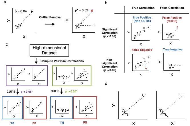
Visual description of CUTIE algorithm and correlation classes. A, CUTIE performs leave-one-out validation by recomputing a new P value when each point is removed. Starting with the example scatterplot (left), non-outlier points will not induce a large change in P value when removed, but CUTIEs (FPs) will have a large increase in P value (right) when the outlier is removed. B, Conceptual illustration of the four major classes of correlations. A correlation that is initially significant (P < 0.05) can be considered heuristically ‘true’ (TP) or ‘false’ (FP). Similarly, a correlation that is initially non-significant (P > 0.05) can be classified as ‘true’ (FN, or FN) or ‘false’ (TN). C, Flowchart of analysis; both statistically significant and non-significant correlations are evaluated for the presence of outliers. D, Conceptual illustration of reverse-sign correlations; CUTIE is able to detect reverse-sign correlations, where the omission of a single point induces a sign change in the correlation coefficient, even though the resultant correlation remains statistically significant.
CUTIE accurately identifies influential observations in simulated datasets
We generated simulated datasets to evaluate CUTIE’s ability to distinguish these four types of correlations and compared CUTIE with Cook’s D, DFFITS and DSR, three of the most common parametric regression diagnostics (see Methods and Supplementary Figure 1) [17, 18]. To assess the performance of these metrics, we constructed power curves. Power curves depict the proportion of correlations classified as true (either TP if P < 0.05 or FN if P > 0.05, as defined in Figure. 1B) as a function of effect size of the Pearson’s r of the data. With respect to FP simulations, CUTIE correctly classifies all of them as FP when r ≥ 0.29. Not using CUTIE in these cases would result in an error rate of 100% for those correlations (Figure 2A, blue line). Cook’s D and CUTIE exhibit comparable performance on these scatterplots (green and blue lines overlap completely) with the exception of r = 1, which Cook’s D does not flag as an FP. For correlations that were initially not significant (Figure 2A, red line), the curve remains mostly flat except from r = 0.24 to r = 0.28, indicating borderline situations where the removal of a point transforms a not significant correlation into a significant one. Cook’s D also incorrectly flags correlations as FN at a greater rate than CUTIE (purple line rises earlier than red line). In simulated data of FNs, CUTIE can effectively rescue 100% of the strongest correlations among those initially non-significant (P > 0.05), as shown by the red line between r = 0.29 and r = 0.52 (Figure 2B). Although these correlations were initially deemed not significant, CUTIE can identify the underlying significant correlation if the outlier point was removed. Cook’s D is also able to rescue these correlations, although incorrectly rescues correlations of lesser strength that would not have been significant using Pearson’s correlation alone (the purple line rises earlier than the red one).
Figure 2.
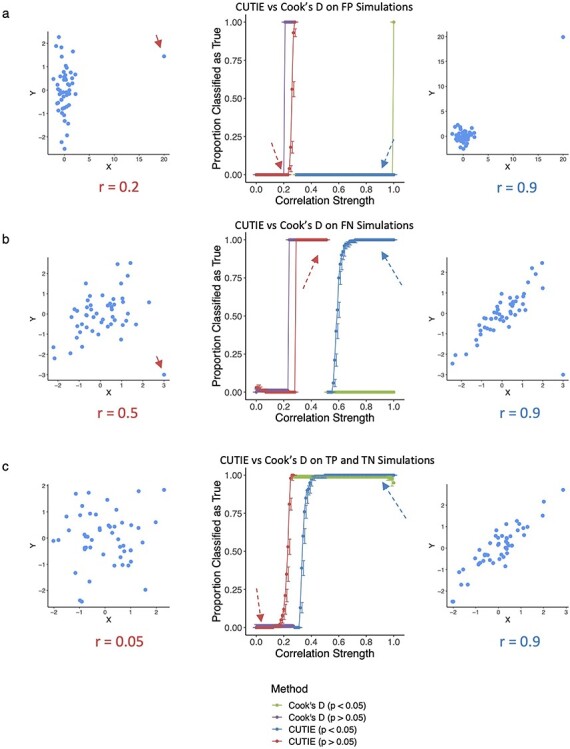
CUTIE can identify FP correlations and rescue FN correlations. A–C, Power curves for simulated scatterplots; correlation strength on the x-axis and a fraction of correlations on the y-axis indicating if the correlation is true (1) or false (0). The blue line represents initially significant correlations (P < 0.05), red statistically non-significant (P > 0.05). Each line is annotated with representative scatterplots, with influential points highlighted using solid red arrows. Dashed arrows indicate the correlation strength on the power curve that each scatterplot represents. In (a), CUTIE perfectly avoids classifying FP correlations as true and in (b), CUTIE rescues the strongest FN correlations. In (c), we can observe the loss of power associated with the removal of a point (blue line), and similarly a stochastic increase of statistical significance that results from omission of a point (red line) as r approaches the significance threshold of 0.28 (for this sample size).
Although CUTIE can rescue FN effectively, we can also observe borderline situations where the removal of a point transforms a significant correlation into a non-significant one, as observed in the blue curve between r = 0.52 and r = 0.7 (Figure 2B). Using Cook’s D, however, would result in an over-labeling of FPs due to the presence of influential points in strong FN correlations, as shown by the divergence of blue and green lines at r = 0.56. This ability of CUTIE to not label FN scatterplots as false correlations is an important benefit of our method over Cook’s D.
When CUTIE is presented with data simulating TP and TN correlations, CUTIE correctly prioritizes the stronger correlations as true in both the initially not significant and initially significant set of correlations (Figure 2C). However, because the removal of a point reduces the significance of a correlation (as the power of the test has diminished), CUTIE arrives at the seemingly contradictory result that a weaker correlation (e.g., r = 0.28) is a ‘true’ correlation (a FN), whereas a stronger correlation (r = 0.29) is a ‘false’ correlation (a FP) (Figure 2C). Although this is a caveat of subsampling, CUTIE is still able to identify correctly the majority of TP and TN correlations as such (nearly 100% at r < 0.15 and r > 0.4). To help address this issue, CUTIE includes an optional fold-value parameter (see Methods) by requiring a specified factor change in the new resampled P value to be classified as a FP. Of note, although Cook’s D avoids border cases at both P < 0.05 and P > 0.05 (green and purple lines are flat, respectively), we observed that Cook’s D has a drop in accuracy when presented with perfectly correlated data (r = 1), an issue that does not affect CUTIE.
When comparing CUTIE and Cook’s D to DFFITS and DSR, we noticed that DFFITS and DSR appear to be widely inaccurate (Supplementary Figure 2). In comparison to Cook’s D (reproduced in Supplementary Figure 2A), both DFFITS (Supplementary Figure 2A) and DSR (Supplementary Figure 2C) incorrectly classify the majority of initially significant correlations as false (green line nearly flat at 0) and the majority of initially non-significant correlations as true (purple line approaches 1).
Non-parametric statistics and effect of sample size
We next compared the performance of CUTIE against non-parametric methods. We found in simulations of TP and TN correlations, Spearman and Kendall are inconsistent with respect to a fixed Pearson correlation strength. In particular, examining the window between r = 0.2 and r = 0.5, Spearman and Kendall correlation coefficients may or may not be statistically significant, as seen by the overlapping blue and red lines in Supplementary Figure 3A. Moreover, it can be shown that Spearman and Kendall fail to protect against FPs in highly skewed datasets: simulations of FPs where all points located at (x, y) and one single point at (x + a, y + b) will have r = 1, and although Spearman and Kendall will incorrectly tag those as significant (Supplementary Figure 3B), CUTIE can correctly identify and filter such cases. In the case of FN correlations, we can see that CUTIE combined with Spearman and Kendall are able to rescue some correlations, but less accurately than CUTIE with Pearson (Supplementary Figure 3C). Complete analysis of all simulations across different sample sizes with both P value and effect size threshold criterion can be found in Supplementary Data.
We further analyzed the impact of varying sample size on CUTIE’s performance (Supplementary Figure 4A). As a larger sample size lowers the effect size needed to induce statistical significance, the curves shift to the left of the power plot as sample size increases while maintaining their overall shape. For instance, at n = 25, due to the lower sample size, a stronger correlation coefficient (around 0.35) is needed for statistical significance, whereas with n = 50 the threshold lies around 0.3 and at n = 100 the threshold decreases to 0.2. This is visualized in the graphs by where the line transitions from red to blue. Given the sensitivity of the P value to sample size, CUTIE can also be run using correlation coefficient instead of P value as a decision threshold when performing resampling. As expected, increasing the sample size tightens the power curve with respect to the threshold value chosen, with r = 0.5 by default; this metric was chosen based on an agreed-upon convention that r = 0.5 is a ‘medium’ effect size (Supplementary Figure 4B) [19]. For example, at n = 25, all correlations with r < 0.2 are classified as false and r > 0.75 are classified as true, but this range changes to r < 0.4 and r > 0.55 at n = 100.
Application to omics datasets uncovers the prevalent effect of influential observations
To demonstrate the prevalence of influential observations in real datasets and the usefulness of CUTIE to identify them, we analyzed previously published data representative of three different domains: microbiome [20], microarray gene expression [21], and health statistics from the World Health Organization (WHO) [22]. For each dataset, we first used Pearson’s r to obtain a set of candidate positive (i.e., statistically significant, P < 0.05) and negative (i.e., statistically non-significant, P > 0.05) correlations. We then ran each dataset through CUTIE and compared the results obtained versus those using Cook’s D. Figure 3A shows the absolute number of correlations belonging to each class and for each dataset. In the microbiome dataset (279,378 total possible correlations), 96% of the correlations were initially statistically non-significant (purple and green bars combined, i.e. TN and FN, respectively), while the remaining 4% were statistically significant (blue and red bars combined, i.e. TP and FP, respectively). However, when assessing the proportion of those 4% that were FPs, CUTIE flagged 89% (FP/FP+TP, or size of the red bar divided by the combined size of the blue and red bars) of the initially significant correlations as false positives (Fig. 3A, left; 10,722 correlations tagged as FP by CUTIE). Cook's D performed similarly to CUTIE in this dataset, identifying 97% of the initially significant correlations (blue and red bars) as false positives (red bar only). Among the 96% of the total correlations that were initially non-significant correlations (purple and green bars combined), CUTIE identified 3% (FN/FN+TN, or green bar as a fraction of green and purple combined) of them (8,804 correlations) as false negatives. Cook's D is not traditionally used to identify false negative correlations, and so only false positives are shown in the plot. Applying this analogous analysis to other data types, we found that in the gene expression data (499,500 correlations), CUTIE identified 14% of the initial significant correlations as FPs (i.e. the red bar is 14% of the blue and red combined) and 19% of the initially non-significant correlations as FNs (the green bar is 19% of the green and purple combined), while Cook's D could only identify 3.4% as false positives (Fig. 3A, center). In the WHO data (62,481 correlations), CUTIE tagged 15% of the initially significant correlations as FPs and 22% of the initially non-significant correlations as FNs (Fig. 3A, right). Cook’s D, on the other hand, labeled 21% of the putative positive correlations as false. Importantly, in all three datasets, we identified cases where Cook’s D falsely labeled a visually strong correlation as a FP, and in two of the three datasets, we identified cases where Cook’s D did not flag a FP that was correctly labeled with CUTIE (Figure 3B). There were no cases where CUTIE tagged a correlation as FP but Cook’s D did not. We then tested whether the proportion of CUTIEs would change based on the statistic used (Pearson versus Spearman/Kendall) and whether a multiple adjustments tool [false discovery rate (FDR] was used. Complete analyses of three representative datasets across all statistics with and without FDR-adjustment are shown in Figure 3C (see Supplementary Data for raw values).
Figure 3.
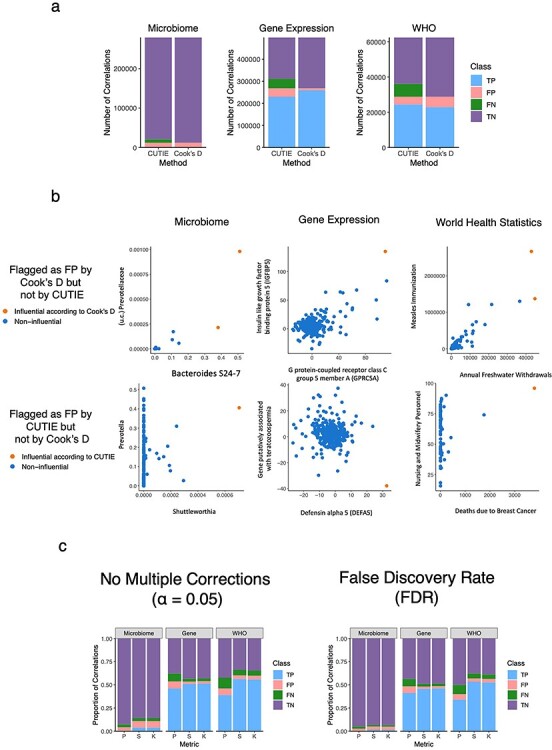
Proportion of TP, FP, TN and FN correlations in three representative real-world datasets as identified by CUTIE. a, Comparison of CUTIE with Cook’s D in all three datasets. The colors correspond to the fraction of total pairwise correlations belonging to each class (purple = TN, blue = TP, red = FP and green = FN) according to CUTIE. The total number of correlations computed in each dataset are 279 378, 499 500, and 62 481 from left to right. b, Examples of correlations from each domain where CUTIE and Cook’s D disagree in terms of classifying FPs. c, The number of correlations belonging to each class for each dataset using three different measures of correlation (Pearson, Spearman, and Kendall), with and without FDR-adjustment.
The effect of influential observations is domain-dependent
Because data types generated from different fields often have distinctive characteristics, we then analyzed 19 datasets broadly belonging to different research areas: microbiome [20, 22–25], gene expression [5, 22, 26–28], multiomic studies that include more than one assay/data type [20, 29, 30], and an ‘other’ category including epidemiological measures and baseball metrics, and airline delay statistics [22, 31]. These datasets contain on the order of thousands of variables, resulting in millions of correlations, and sample sizes ranging from the dozens to thousands. Barplots illustrating the distribution of classes of correlations are shown in Supplementary Figure 5. We compare the data types by plotting the positive (P) rate (Figure 4A), FDR (FDR = FP/P, Figure 4B), and false omission rate (FOR = FN/N, Figure 4C) values for each statistic across the datasets, grouping datasets by the data type from which they originate. We found that gene expression and health statistics tend to have the largest proportion of positives regardless of statistic, whereas microbiome and multiomic studies exhibit the lowest positive rates (Figure 4A). This low rate of positives is exacerbated by the relatively high FDRs (Figure 4B) and low false omission rates (Figure 4C) for microbiome and multiomic studies compared with the other two data types. For the panels describing Pearson, P < 0.005 via analysis of variance, complete data for generation of these barplots are presented in Supplementary Data.
Figure 4.
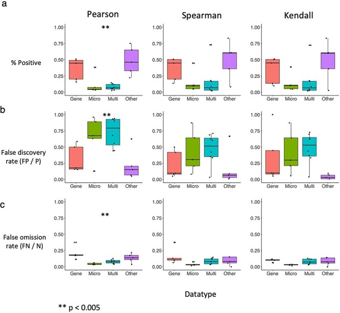
Boxplots indicating the distribution of positive, false discovery and false omission rates per statistic and per data type. Each panel shows for a given statistic (column) the distribution of a particular rate (rows). a, Positive rates i.e., the fraction of total correlations with P < 0.05 for each data type using Pearson, Spearman and Kendall (left to right). b, FDRs (FP/P) and c, False omission rates (FN/N) according to CUTIE. Microbiome data exhibits the lowest positive rates and highest FDRs consistently across statistics.
We next assessed the degree of overlap of different statistics in identifying specific correlations as CUTIEs. In Supplementary Figure 6, we present UpSetR [32] plots illustrating the overlap (or lack thereof) of correlations classified as FP and FN in four representative datasets from each category from the meta-analysis above. We found that Pearson generally had the largest number of FPs and FNs. Additionally, Spearman and Kendall were largely concordant, which is perhaps unsurprising as they are both rank-based non-parametric statistics. It is notable that Pearson and these non-parametric statistics share little overlap. This indicates that statistic choice has a large influence on the results and thus careful attention should be paid to the distribution of the data and the assumptions of the metric used.
These overall trends observed in large-scale analysis are also noticeable in specific datasets and have potentially important consequences for experimental validation of biological targets. For example, Kristensen et al. [26] analyzed the correlation between microRNAs and downstream genes in a study of spatial expression in colon cancer cells, and found, among others, a positive significant correlation between ciRS-7 [CDR1as] and PIK3CD (r = 0.40, P = 0.02). A re-analysis using CUTIE, however, tagged this correlation as a FP (Figure 5A). Importantly, CUTIE can also identify ‘missed’ correlations in this same analysis thanks to its ability to find FNs: circSLC8A1 is significantly associated with PIK3CD if a single point was dropped from the analysis (Figure 5B). We were also able to identify potentially misleading correlations in an epidemiological study of socioeconomic determinants with respect to COVID-19 [31]. In Table 2 of their paper, Roy and Khalse present Pearson correlations between COVID-19 cases and socioeconomic metrics of countries. The authors identified three significant relationships, stating that COVID-19 cases were positively correlated with GDP expense on health care, population density, as well as critical-care beds per capita. We show that two of the three significant correlations are in fact CUTIEs (FPs)—both GDP expense on health care and critical-care beds per capita were considered FPs in terms of their association with COVID-19 cases, and interestingly these were the two most significant correlations in the initial analysis (Figure 5C and D). Further analysis using CUTIE’s sample diagnostic (see ‘Variable and Sample Diagnostics’ below) indicates that the influential observation in both these FPs is the United States, which in this case is more likely to be considered a high-leverage point as opposed to an outlier due to the lack of samples with similar x-axis values (see Discussion section regarding outliers versus high-leverage points). Although the small sample size of this study clearly impacts these findings, CUTIE is nonetheless able to distinguish these two correlations from the remaining TPs.
Figure 5.
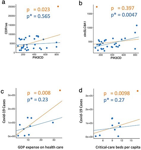
CUTIE identifies biologically impactful correlations in published studies. A, Putative FP correlation from Kristensen et al. (Figure 4A) and B, putative FN correlation. C and D, Putative FP correlations warranting further analysis as identified by CUTIE on the correlation coefficients and P values from Roy and Khalse, Table 2.
Reverse sign correlations and variable and sample diagnostics
On top of its ability to distinguish true and false correlations, CUTIE can also identify a previously not described scenario that results in a reversal of the correlation (Figure. 1D). CUTIE found 19 such cases in the gene expression data and 33 in the WHO data. Supplementary Figure 7 presents two specific examples: Supplementary Figure 7A shows a reverse sign correlation between ‘Imports Unit Value’ and ‘Agriculture Contribution to Economy,’ which changes from positive to negative upon the removal of a sample (the country Togo), whereas Supplementary Figure 7B presents a change from negative to positive correlation between ‘Number of Dentistry Personnel’ and ‘Trade Balance between Goods and Services’, with the influential point being the United States. Although the nature of the relation between these variables depends on specific research questions, it is important to note that without CUTIE they would have been incorrectly considered of opposite sign.
Further, CUTIE can also provide information on what samples or variables contribute most substantially to the set of FP or FN correlations. An example of this functionality is shown in Supplementary Figure 8. Here, sample number 192 (orange) contributes to a disproportionate number of FPs—this sample corresponds to the country United States (Supplementary Figure 8A). Examining the analogous plot for variables instead of samples (Supplementary Figure 8B), we find ‘Number of laboratory health workers’ contributes to the most number of FPs (83).
CUTIE works synergistically with data transformations
Oftentimes, data are transformed prior to correlation and other analyses to reduce the FDRs. For example, the variance stabilizing transformation (VST), part of the DESeq2 package [33, 34], improves homoskedasticity of count data. This approach has traditionally been applied to gene expression data, although it can be also used for microbiome data [35]. In addition, the centered log-ratio (CLR) has been a long-standing method originally proposed by Aitchison [36] to address the simplex constraint of compositional data and enables standard correlation analysis performed in Euclidian space to be applied to compositional data, such as in microbiome studies. Supplementary Figure 9 compares the results of CUTIE before and after CLR and VST transformations in two microbiome datasets (Supplementary Figure 9A and B) and one gene expression dataset (Supplementary Figure 9C; VST only, since the data is non-compositional). Although the proportion of FP and FN change before and after transformation, CUTIE is still able to identify substantial amounts of correlations driven by influential observations in both cases, suggesting that CUTIE works synergistically with these transformations and both can be used to reduce FDRs overall. In Supplementary Figure 9D–F, we show the Jaccard Index (number of correlations in the intersection divided by the number of correlations in the union) for each pair of categories (pre-transformation, CLR and VST) as applied to the three datasets above. In the first microbiome dataset (LungC, Supplementary Figure 9A), the Jaccard Indices are greatest for CLR-VST compared with pre-CLR and pre-VST. CLR and VST exhibit the greatest overlap in the FP and TP they identify; for the FP, the Jaccard Index 0.31, compared with 0.13 and 0.26 for the Pre-CLR and Pre-VST, respectively; and for the TP, 0.31 compared with 0.03 and 0.10 for pre-CLR and pre-VST in the TP. This is likely due to the nature of transformation applied to the data. Similar trends were observed for the PLOS microbiome dataset (Supplementary Figure 9B), with a CLR-VST Jaccard Index of 0.13 and 0.15 for FP and TP, respectively (Supplementary Figure 9E). In the gene expression dataset (Spatial, Supplementary Figure 9C), we observed a Jaccard Index of 0.58 among the TP and 0.18 for the FP (Supplementary Figure 9F). Importantly, based on these Jaccard Indices, a significant number of correlations not shared among all three methods, again suggesting that these approaches are orthogonal in how they reduce the FDR.
Discussion
Because correlation analysis is often the first step for more complex downstream approaches, such as network analysis or feature selection [4], it is fundamental to identify potentially misleading correlations. As shown in our simulations, CUTIE can effectively filter out FP and rescue FN correlations. Moreover, it outperforms current methods used to identify influential observations, such as Cook’s distance, DFFITS and DSR. This likely has to do with the default thresholds and lack of tuning with these other methods, as they have been repurposed to identify FPs and FNs, but were not originally designed to do so. With regards to non-parametric statistics such as Spearman and Kendall, we demonstrate that they exhibit reduced power to detect correlations as significant given a fixed Pearson correlation coefficient, and that in specific cases, these statistics still require CUTIE to avoid FPs. Although CUTIE cannot distinguish between correlations driven by influential observations and those which are not when they are of similar effect size (as seen in the simulations), these appear to be the least number. Importantly, CUTIE is still able to drastically reduce the number of those correlations, which would need to be further inspected. To help address this shortcoming, we implement a fold-value constraint on the summary statistic (P value or r value) that can be set by the user.
When assessing correlations classified by CUTIE as FP or FNs, it is important to distinguish between outliers versus high-leverage points. In traditional regression analysis, we define an outlier as a point whose independent (x-axis) variable value is within the observed range but exhibits an unusually deviant dependent (y-axis) variable value. In contrast, a high-leverage point is a sample whose ‘x’ and ‘y’ values are many deviations outside of the observed values in that dataset. Thus, it is difficult to conclude whether a high-leverage point is an outlier, or if we simply do not have sufficient data to characterize the behavior of variable ‘y’ with respect to ‘x’ when ‘x’ takes very large values. CUTIE does not make a distinction between outliers and high-leverage points in its analysis, as it makes no assumption about which variable is dependent and which is independent, but rather seeks to identify sets of correlations that warrant further examination, prioritizing correlations for which there is statistical support (TP and FN) above correlations that lack such support (FP and TN).
In drawing conclusions from real datasets, it is helpful to note that CUTIE serves as a tool to help prioritize correlations heuristically, i.e., to identify those correlations that are deemed poorly supported by the underlying data. Our results demonstrate that influential observations affect a significant number of correlations in real datasets, and that CUTIE can identify the contribution of these points to not only FPs, but also FN and reverse sign correlations. We show in a variety of domains, ranging from microbiome to gene expression to multiomic studies and health statistics, that CUTIE can detect FPs and FNs more effectively than other metrics. Additionally, we show a discordance between parametric and non-parametric statistics (i.e., Pearson versus Spearman and Kendall) in terms of the correlations identified as FP, further confirming our simulation results. Moreover, we find examples of reverse-sign correlations in the WHO dataset, which could not be detected via any previous approach. Identifying these correlations is critical, since otherwise an incorrect inference would be made on the direction of the relationship between two variables (such as ‘Number of Dentistry Personnel’ and ‘Trade Balance Between Goods and Services’). Interestingly, ‘Trade Balance between Goods and Services’ appears in 32 of the 33 reverse sign correlations tagged by CUTIE, suggesting that conclusions drawn from correlations involving this variable should be treated with caution.
To help identify samples and variables involved in a large number of correlations driven by influential observations, CUTIE can produce a plot showing the contribution of each sample and variable to the number of FPs and FNs characterized. The ability to identify and estimate the number of false correlations associated with samples or variables can help uncover systematic errors, e.g., incorrect calibration of measurements, contamination or other artifacts in an experimental setting. In the WHO dataset we observed that the United States contributes to more CUTIEs than any other sample, which might be expected to be an outlier due to the unique economic and developmental history of the United States and its transition to a service-based economy post-World War II [37, 38]. We also observed the variable ‘Number of laboratory health workers’ contributed to a disproportionate number of FPs, which is likely due to its skewness in distribution. Note that variables with more than 50 contributions to FPs do not include ‘Trade Balance between Goods and Services,’ which contributes to only 13 FPs. This suggests that both features of CUTIE—the ability to detect reverse sign correlations, and the ability to enumerate number of FPs or FNs per sample—are essential for assessing the validity of correlations.
Our meta-analysis of various omics studies detected influential observations across all domains, but microbiome data (and multiomic studies that involve microbiome data) tend to exhibit the lowest positive rates and false omission rates but the highest FDRs, which is likely due to the high skewness in microbiome data [39]. Although some methods have been developed to lower the number of false correlations in microbiome studies [4, 40, 41], these tools are used only in the context of compositional data analysis and can only address bacterial correlations. Moreover, we show that even using VST and CLR transformations on the data prior to correlation analysis, CUTIE can still identify correlations driven by influential observations, suggesting that CUTIE has a synergistic role with these methods. Importantly, other types of correlation analysis, including heatmaps and networks, are still generally performed using non-compositionality-aware statistics (such as Spearman) [5, 6, 23, 25–30], indicating that CUTIE fills in an important gap for robust data analysis.
Finally, we demonstrate that CUTIE not only identifies FPs and FNs broadly, but can also uncover cases in which key conclusions from published results would be impacted. In Kristensen et al. [26], we identified a FP (ciRS-7 [CDR1as] and PIK3CD), which the authors had mentioned and discussed as a bona fide correlation. We also found a FN correlation (circSLC8A1 and PIK3CD), which was missing from their results despite PIK3CD having been previously identified. Similarly, in the COVID-19 epidemiological study by Roy and Khalse [31], we identified two potentially misleading correlations, with important implications for any policy or decision making that might result from conclusions based on analysis not validated by CUTIE. Importantly, we show that these correlations can be present even among those with the strongest uncorrected P values (before applying CUTIE), which suggests that simply filtering by significance values would lower the power of the analysis and yet false correlations could be deemed of importance.
The final decision on whether a correlation represents a true association between variables cannot be assessed by any statistical approach alone. Rather than relying only on P value or r value to determine, which correlations are meaningful, CUTIE adds a layer of robustness via resampling to check for potential FPs, i.e., correlations that could potentially be misleading (either due to outliers, high-leverage points, or other reasons). Moreover, rather than discarding non-significant correlations—which may harbor significant amounts of FNs—we suggest reexamining this initially non-significant set can potentially uncover novel findings that would have been missed otherwise. In this manner, CUTIE aims to prioritize correlations and aid analysis by identifying correlations, samples and variables that merit further investigation.
Methods
CUTIE
Let (xi,k, xj,k) be the observations for samples k ∋ [1,2,…,n] and for all pairs of variables (Xi,Xj) ∋ X with a defined correlation θi,j (Pearson, Spearman, Kendall or otherwise). For each correlation (θi,j) that is significant at Pi,j < α, where Pi, is the P value of the correlation between (Xi,Xj) and α is the significance threshold, CUTIE then computes a new correlation statistic for each resampling where point k is removed, yielding Pi,j,k for k in [1,2,…,n]. If there exists a k such that Pi,j,k > α, that correlation is then flagged as a FP. All remaining correlations that were initially significant are considered to be TP. FDR, Bonferroni and Family-Wise Error Rate adjustments are available should the user wish to modify the threshold using multiple corrections.
In addition to its ability to detect TP and FP, CUTIE can also be applied to the set of initially non-significant correlations (Pi,j > α) and determine if a single point is causing an otherwise valid correlation to be non-significant. Let (xi,k, xj,k) be the observations for k in [1,2, … ,n] and for all pairs of variables (Xi,Xj) ∋ X with a defined correlation θi,. For each correlation that is ‘not’ significant, i.e., Pi,j > α, CUTIE then computes a new correlation statistic for each resampling, where the kth sample is removed, yielding Pi,j,k for k in [1,2, … ,n]. If there exists a k such that the P,j,k < α, then that correlation is flagged as a FN. All remaining correlations that were initially statistically non-significant are considered to be TNs.
Reverse sign correlations
In the process of computing each resampling, CUTIE also checks the sign of the resampled P value and flags correlations in which the sign of the correlation changes (from negative to positive or vice versa).
CUTIE using effect size
CUTIE can be adapted to use effect size (correlation coefficient) instead of P value as a decision boundary for classifying correlations when performing resampling. The procedure is identical to the one noted above with the following modifications: r is used instead of P, the α threshold is replaced by R (0.5 by default), and the direction of the inequality is reversed (i.e., a FP is where ri,j,k < R),
Influence metrics
Cook’s Distance, DFFITS and DSR were computed using statsmodels 0.12.1, with the thresholds drawn from default parameters, and documentation as well.
Simulated datasets
Three sets of simulated datasets were generated to test CUTIE’s performance. (i) TP and TN correlations were generated by drawing n points from a bivariate normal distribution with μ = [0,0] and Σ = ([1, r], [r, 1]). (ii) FP correlations consisting of n − 1 points drawn from an independent bivariate normal with μ = [0,0] and Σ = 2 × 2 identity matrix with an additional point added at (20, y), chosen arbitrarily to induce the desired correlation, where y was determined by iteration from eq with q ∋ [−4, −3.99, …, 10] until the lowest value of q was obtained that made the resultant correlation within 0.01 of the desired r. (iii) FN correlations consist of n − 1 points drawn from a bivariate normal distribution with μ = [0,0] and Σ = ([1, r],[r, 1]) and an additional point added at (−3,3), again chosen arbitrarily to induce the desired correlation. Negative correlations were not included as they are analogous to the positive correlations, i.e., any negative correlation can be obtained via rotation from the positive scatterplot. The value of r was iterated from 0 to 1 in step sizes of 0.01.
Power curves
To assess the accuracy of CUTIE on simulated data as a function of correlation strength, we compute the proportion of correlations classified as true (TP when assessing correlations of P < α, or FN if P > α). Each point in the line plots (e.g., in Figure 2A, middle panel) represents the fraction of 100 scatterplots at a particular correlation strength (r from 0 to 1) classified as true.
Fold-value change to address border cases
In using α as the sole criterion for classifying a correlation as TP versus FP (or TN versus FN) several of the correlations flagged as FP are border cases, in which the P value changes less than 1 order of magnitude, which can be enough to push that correlation into the FN/FP class. To adjust for this, we introduce an optional parameter fv (fold value), which imposes a requirement of Pk > fv * P in addition to Pk > α (where Pk is the resampled P value when a given sample k is removed and P is the original P value). CUTIE provides the distributions of the fold P value changes within FP’s and TP’s, should the user seek to define a particular threshold.
Key Points
Influential observations bias the significance of correlation analyses with both parametric and non-parametric measures.
Correlation analysis in large datasets requires an automated method for detecting influential observations where visual validation is not possible.
CUTIE identifies both FPs and, novelly, FNs and reverse sign correlations better than previously existing methods.
Supplementary Material
Kevin Bu is an MD/PhD candidate at the Icahn School of Medicine at Mount Sinai. His current research interests include the microbiome, statistics and machine learning.
David S. Wallach is a bioinformatician at the Icahn School of Medicine at Mount Sinai. He is interested in the proliferation of higher standards for code quality throughout the research community.
Zach Wilson is a software engineer and is currently finishing his master’s in computer science.
Nan Shen, PhD, is a data scientist at Viome Inc. She is currently investigating microbiome features for treatment development or early diagnosis of multiple diseases (e.g., T2D, colon cancer) via statistical methods or machine learning.
Leopoldo N. Segal, PhD, is an associate professor in the division of pulmonary and critical care medicine at NYU Langone health. His research focuses on the use of culture-independent techniques to uncover microbial host interactions in the lung.
Emilia Bagiella, PhD, is professor of Biostatistics in the Center for Biostatistics and the Department of Population Health Science and Policy at the Icahn School of Medicine at Mount Sinai.
Jose C. Clemente, PhD, is an associate professor at the Icahn School of Medicine at Mount Sinai. His lab develops computational and wetlab methods to characterize the microbiome.
Contributor Information
Kevin Bu, Department of Genetics and Data Science, Icahn School of Medicine at Mount Sinai. New York, NY, USA.
David S Wallach, Department of Genetics and Data Science, Icahn School of Medicine at Mount Sinai. New York, NY, USA.
Zach Wilson, Department of Genetics and Data Science, Icahn School of Medicine at Mount Sinai. New York, NY, USA.
Nan Shen, Department of Genetics and Data Science, Icahn School of Medicine at Mount Sinai. New York, NY, USA.
Leopoldo N Segal, Division of Pulmonary, Critical Care and Sleep Medicine, Department of Medicine, New York University School of Medicine, New York, NY, USA.
Emilia Bagiella, Department of Population Health Science and Policy, Icahn School of Medicine at Mount Sinai, New York, NY, USA.
Jose C Clemente, Department of Genetics and Data Science, Icahn School of Medicine at Mount Sinai. New York, NY, USA; Immunology Institute, Icahn School of Medicine at Mount Sinai. New York, NY, USA.
Code availability
CUTIE is available at https://github.com/clemente-lab/CUTIE. Accompanying data and scripts used to generate simulations, analyze real-world datasets and produce figures can be found at https://github.com/clemente-lab/cutie-analysis.
Authors’ contributions
K.B., E.B., and J.C. designed research, K.B. and J.C. performed research, J.C. and L.S. contributed data, K.B. analyzed data; K.B. and J.C. wrote the paper. All authors read and agreed to the final version of the manuscript.
Acknowledgments and Funding
This work was supported in part through the computational resources and staff expertise provided by Scientific Computing at the Icahn School of Medicine at Mount Sinai. Research reported in this paper was supported by the Office of Research Infrastructure of the National Institutes of Health under award number S10OD018522. The content is solely the responsibility of the authors and does not necessarily represent the official views of the National Institutes of Health.
Data availability
The data that support the findings of this study are available from the corresponding author upon reasonable request. Due to file size, data could not be stored in an online repository; however all real-world datasets were obtainable from the original papers.
References
- 1. McCue ME, McCoy AM. The scope of big data in one medicine: unprecedented opportunities and challenges. Front Vet Sci 2017;4:194. [DOI] [PMC free article] [PubMed] [Google Scholar]
- 2. Dix A, Vlaic S, Guthke R, et al. Use of systems biology to decipher host-pathogen interaction networks and predict biomarkers. Clin Microbiol Infect 2016;22(7):600–6. [DOI] [PubMed] [Google Scholar]
- 3. Mahanta P, Ahmed HA, Bhattacharyya DK, et al. FUMET: a fuzzy network module extraction technique for gene expression data. J Biosci 2014;39(3):351–64. [DOI] [PubMed] [Google Scholar]
- 4. Friedman J, Alm EJ. Inferring correlation networks from genomic survey data. PLoS Comput Biol 2012;8(9):e1002687. [DOI] [PMC free article] [PubMed] [Google Scholar]
- 5. Langfelder P, Horvath S. WGCNA: an R package for weighted correlation network analysis. BMC Bioinformatics 2008;9:559. [DOI] [PMC free article] [PubMed] [Google Scholar]
- 6. Song WM, Zhang B. Multiscale embedded gene co-expression network analysis. PLoS Comput Biol 2015;11(11):e1004574. [DOI] [PMC free article] [PubMed] [Google Scholar]
- 7. Caporaso JG, Kuczynski J, Stombaugh J, et al. QIIME allows analysis of high-throughput community sequencing data. Nat Methods 2010;7(5):335–6. [DOI] [PMC free article] [PubMed] [Google Scholar]
- 8. Bolyen E, Ressom HW, Wang A, et al. Reproducible, interactive, scalable and extensible microbiome data science using QIIME 2. Nat Biotechnol 2019;37(8):852–7. [DOI] [PMC free article] [PubMed] [Google Scholar]
- 9. Altman N, Krzywinski M. Analyzing outliers: influential or nuisance? Nat Methods 2016;13:281–2. [DOI] [PubMed] [Google Scholar]
- 10. Wilcox RR. Modern insights about Pearson’s correlation and least squares regression. Int J Assess Select 2008;9:195–205. [Google Scholar]
- 11. Anscombe FJ. Graphs in statistical analysis. Am Statist 1973;27(1):17–21. [Google Scholar]
- 12. Baty F, et al. Stability of gene contributions and identification of outliers in multivariate analysis of microarray data. BMC Bioinfor 2008;9:289. [DOI] [PMC free article] [PubMed] [Google Scholar]
- 13. George NI, Bowyer JF, Crabtree NM, et al. An iterative leave-one-out approach to outlier detection in RNA-Seq data. PLoS One 2015;10(6):e0125224. [DOI] [PMC free article] [PubMed] [Google Scholar]
- 14. Clarke R, Ressom HW, Wang A, et al. The properties of high-dimensional data spaces: implications for exploring gene and protein expression data. Nat Rev Cancer 2008;8(1):37–49. [DOI] [PMC free article] [PubMed] [Google Scholar]
- 15. Li H. Microbiome, metagenomics, and high-dimensional compositional data analysis. Annl Rev Stat Appl 2015;2(1):73–94. [Google Scholar]
- 16. Siegel S. Nonparametric statistics. Am Statist 1957;11(3):13–9. [Google Scholar]
- 17. Cook RD. Detection of influential observations in linear regression. Dent Tech 1977;19:15–8. [Google Scholar]
- 18. Cook RD, Weisberg S. Residuals and Influence in Regression. New York, NY: Chapman & Hall. 1982. [Google Scholar]
- 19. Cohen J. A power primer. Psychol Bull 1992;112(1):155–9. [DOI] [PubMed] [Google Scholar]
- 20. Segal LN, et al. Enrichment of the lung microbiome with oral taxa is associated with lung inflammation of a Th17 phenotype. Nat Microbiol 2016;1:16031. [DOI] [PMC free article] [PubMed] [Google Scholar]
- 21. Webster JA, et al. Genetic control of human brain transcript expression in Alzheimer disease. Am J Hum Gen 2009;84(4):445–58. [DOI] [PMC free article] [PubMed] [Google Scholar]
- 22. Reshef DN, et al. Detecting novel associations in large data sets. Science 2011;334(6062):1518–24. [DOI] [PMC free article] [PubMed] [Google Scholar]
- 23. Oh J, et al. Temporal stability of the human skin microbiome. Cell 2016;165(4):854–66. [DOI] [PMC free article] [PubMed] [Google Scholar]
- 24. Hoffmann C, et al. Archaea and fungi of the human gut microbiome: correlations with diet and bacterial residents. PLoS One 2013;8(6):e66019. [DOI] [PMC free article] [PubMed] [Google Scholar]
- 25. Vieira-Silva S, et al. Statin therapy is associated with lower prevalence of gut microbiota dysbiosis. Nature 2020;581(7808):310–5. [DOI] [PubMed] [Google Scholar]
- 26. Kristensen LS, et al. Spatial expression analyses of the putative oncogene ciRS-7 in cancer reshape the microRNA sponge theory. Nat Commun 2020;11(1):4551. [DOI] [PMC free article] [PubMed] [Google Scholar]
- 27. Lucas C, et al. Longitudinal analyses reveal immunological misfiring in severe COVID-19. Nature 2020;584(7821):463–9. [DOI] [PMC free article] [PubMed] [Google Scholar]
- 28. Zhang X, et al. Widespread protein lysine acetylation in gut microbiome and its alterations in patients with Crohn's disease. Nat Commun 2020;11(1):4120. [DOI] [PMC free article] [PubMed] [Google Scholar]
- 29. Franzosa EA, et al. Gut microbiome structure and metabolic activity in inflammatory bowel disease. Nat Microbiol 2019;4(2):293–305. [DOI] [PMC free article] [PubMed] [Google Scholar]
- 30. Polster SP, Sharma A, Tanes C, et al. Permissive microbiome characterizes human subjects with a neurovascular disease cavernous angioma. Nat Commun 2020;11(1):2659. [DOI] [PMC free article] [PubMed] [Google Scholar]
- 31. Roy S, Khalse M. Epidemiological determinants of COVID-19-related patient outcomes in different countries and plan of action: a retrospective analysis. Cureus 2020;12(6):e8440. [DOI] [PMC free article] [PubMed] [Google Scholar]
- 32. Lex A, Gehlenborg N, Strobelt H, et al. UpSet: visualization of intersecting sets. IEEE Trans Vis Comput Graph 2014;20(12):1983–92. [DOI] [PMC free article] [PubMed] [Google Scholar]
- 33. Love MI, Huber W, Anders S. Moderated estimation of fold change and dispersion for RNA-seq data with DESeq2. Genome Biol 2014;15(12):550. [DOI] [PMC free article] [PubMed] [Google Scholar]
- 34. Kaul A, Mandal S, Davidov O, et al. Analysis of microbiome data in the presence of excess zeros. Front Microbiol 2017;8:2114. [DOI] [PMC free article] [PubMed] [Google Scholar]
- 35. Badri M, et al. Shrinkage improves estimation of microbial associations under different normalization methods. bioRxiv 2020:406264. [DOI] [PMC free article] [PubMed] [Google Scholar]
- 36. Aitchison J. The statistical analysis of compositional data. J R Stat Soc B Methodol 1982;44(2):139–77. [Google Scholar]
- 37. Witt U, Gross C. The rise of the “service economy” in the second half of the twentieth century and its energetic contingencies. J Evolut Econ 2019;30(2):231–46. [Google Scholar]
- 38. Zakaria F. The Post-American World. W. W. Norton & Company, 2008, 292. [Google Scholar]
- 39. Weiss S, van Treuren W, Lozupone C, et al. Correlation detection strategies in microbial data sets vary widely in sensitivity and precision. ISME J 2016;10(7):1669–81. [DOI] [PMC free article] [PubMed] [Google Scholar]
- 40. Fang H, Huang C, Zhao H, et al. CCLasso: correlation inference for compositional data through Lasso. Bioinformatics 2015;31(19):3172–80. [DOI] [PMC free article] [PubMed] [Google Scholar]
- 41. Faust K, Sathirapongsasuti JF, Izard J, et al. Microbial co-occurrence relationships in the human microbiome. PLoS Comput Biol 2012;8(7):e1002606. [DOI] [PMC free article] [PubMed] [Google Scholar]
Associated Data
This section collects any data citations, data availability statements, or supplementary materials included in this article.
Supplementary Materials
Data Availability Statement
The data that support the findings of this study are available from the corresponding author upon reasonable request. Due to file size, data could not be stored in an online repository; however all real-world datasets were obtainable from the original papers.