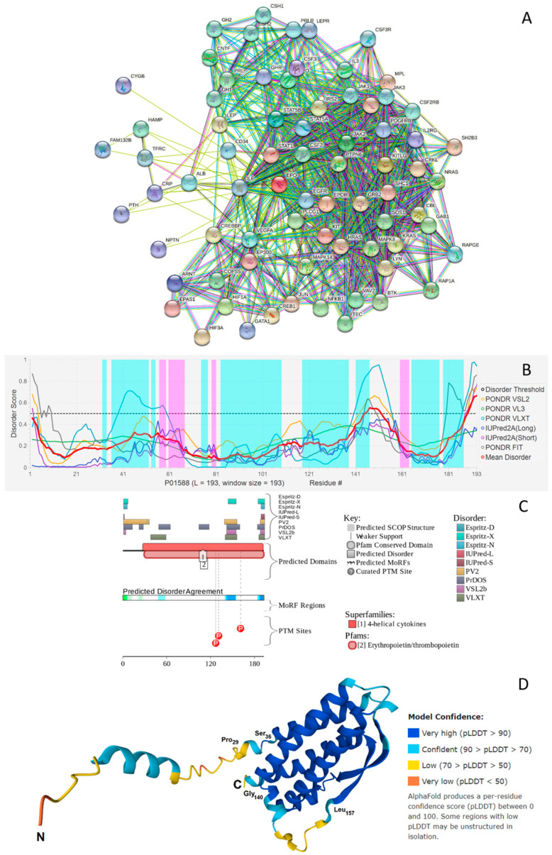
Figure 3.
(A) STRING-based analysis of the interactivity of the human EPO (UniProtKB-P01588) using the high confidence level of 0.7. STRING generates a network of expected associations based on the predicted and experimentally-validated information on the interaction partners of a protein of interest [66]. In the corresponding network, the nodes correspond to proteins, whereas the edges show predicted or known functional associations. Seven types of evidence are used to build the corresponding network, and are indicated by the differently colored lines: a green line represents neighborhood evidence; a red line—the presence of fusion evidence; a purple line—experimental evidence; a blue line—co-occurrence evidence; a light blue line—database evidence; a yellow line—text mining evidence; and a black line—co-expression evidence [66]. (B) Per-residue disorder profile of human EPO generated by the DiSpi web crawler that aggregates the results from PONDR® VLXT [67], PONDR® VL3 [68], PONDR® VLS2B [69], PONDR® FIT [70], IUPred2 (Short) and IUPred2 (Long) [71,72]. A threshold of ≥0.5 is used to identify disordered residues and regions in query proteins. Positions of α-helices and β-strands are shown as light cyan and pink areas, respectively. (C) Functional disorder profile generated for human EPO by the D2P2 platform (http://d2p2.pro/) (accessed on 29 December 2021) [73], which uses outputs of IUPred [71], PONDR® VLXT [67], PrDOS [74], PONDR® VSL2 [68,69], PV2 [73], and ESpritz [75] to generate disorder profile, where nine colored bars represent the location of disordered regions as predicted by these different disorder predictors. The blue-green-white bar in the middle of the D2P2 plot shows the predicted disorder agreement between nine disorder predictors, with blue and green parts corresponding to disordered regions by consensus. Above the disorder consensus bar are two lines with colored and numbered bars that show the positions of the predicted (mostly structured) SCOP domains [76,77] using the SUPERFAMILY predictor [78]. The red circles at the bottom of the plot show location of phosphorylation sites assigned using the outputs of the PhosphoSitePlus platform [79]. (D) Structure of the full-length human EPO modeled by AlphaFold [80].

