Figure 3.
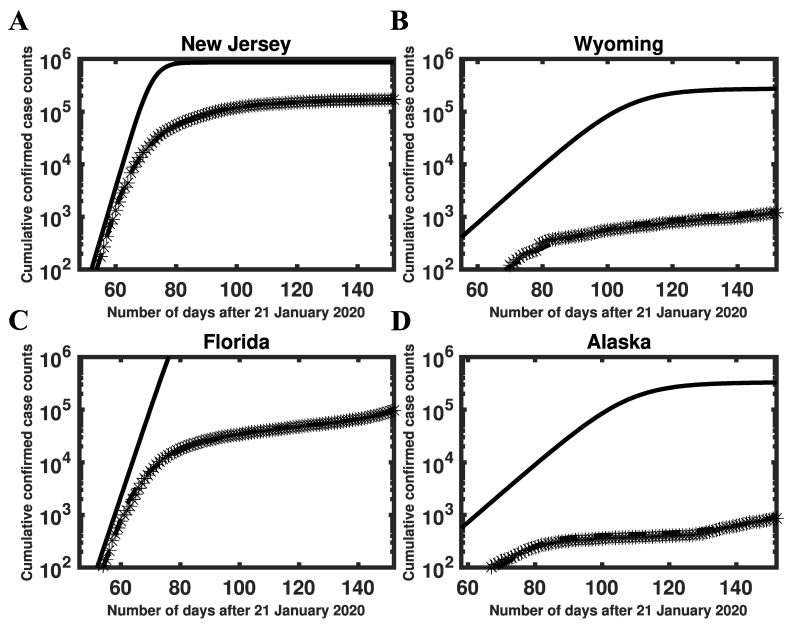
Consistency of model-derived estimates with empirical growth rates during initial exponential increase in disease incidence in (A) New Jersey, (B) Wyoming, (C) Florida, and (D) Alaska. In each panel, the initial slope of the solid curve corresponds to (calculated as described in Materials and Methods), the crosses indicate empirical cumulative case counts, and the broken line is the model prediction based on MAP estimates for adjustable parameters. The solid curve is derived from the reduced model (Equations (1)–(8) in the Supplementary Materials Text S1). This curve shows cumulative case counts had there not been any interventions to limit disease transmission. As can be seen, the initial slopes of the solid and broken curves are comparable. We selected for New Jersey and Wyoming and for Florida and Alaska. Among 35 states with , New Jersey had the largest inferred value (0.45) and Wyoming had the smallest inferred value (0.13). Among 15 states with , Florida had the largest inferred value of (0.39) and Alaska had the smallest inferred value of (0.13). It should be noted that, in contrast with Figure 1, the y-axis here indicates cumulative (vs. daily) number of cases on a logarithmic (vs. linear) scale.

