Abstract
We use data on deaths in New York City, Madrid, Stockholm, and other world cities as well as in various U.S. states and other regions and countries to estimate, quickly and with limited data, a standard epidemiological model of COVID-19. We allow for a time-varying contact rate in order to capture behavioral and policy-induced changes associated with social distancing. We simulate the model forward to consider possible scenarios for various countries, states, and cities, including the potential impact of herd immunity on re-opening.
1. Introduction
The sudden arrival of COVID-19 in the winter of 2020 highlighted the importance of estimating a standard epidemiological model of the epidemic quickly and with limited data. In this paper, we show how to tackle this challenge. We use data on deaths in New York City, Madrid, Stockholm, and other world cities as well as in various U.S. states, countries, and regions around the world during the first half of 2020 to estimate a SIRD model of COVID-19. Relative to existing frameworks, our contributions are:
-
•
We do not use data on cases or tests because of differential selection in testing in different cities, states, and countries. Instead we only use data on deaths.
-
•
We invert a standard SIRD epidemiological model and use the daily death series to recover a time-varying the basic reproduction number (i.e., the expected number of infections generated by one infection when all individuals are susceptible to infection) to capture changes in behavior and policy that occur at different times and with different intensities in different locations. In essence, we apply a Solow residual approach: we assume the model fits the data exactly and back out the implied values of that make it so.
-
•
We show how simulating our model after a location has reached a peak in the number of daily deaths results in very stable results going forward in time. In contrast, simulations of the future before a location reaches its peak are extremely noisy and sensitive to daily shocks.
-
•
For simulations of future outcomes, we allow for feedback from daily deaths, , to future behavior according to as suggested by Cochrane (2020). We estimate from data for each country. There is tremendous heterogeneity across countries, so this parameter is not well-identified in our data. We estimate an average value of about so that changes by 5% when daily deaths change by one and use this value in simulations of future outcomes.
-
•
Our models allow us to back out the percentage of people who were infectious at the end of our sample as well as those who were ever infected versus those still susceptible; therefore, we can estimate the extent to which herd immunity effects are large. Given the epidemiological situation in mid-May 2020, we find moderate effects in New York City, noticeable effects in Italy, Sweden, and Spain, and negligible effects in New York state outside of New York City and in places like California.
We study a standard model of COVID-19 using common tools in econometrics, and then we analyze its main quantitative implications in ways that resemble how economists study other dynamic models. Our exercise can help us understand where a simple SIRD model has difficulties fitting observed patterns in the data and points out avenues for improvement while maintaining the virtues of simplicity and parsimony.
In the interest of space, we will report a very short summary of our results, up to mid-May 2020. By the end of May, the first wave of the epidemic was over in many cities, regions, and countries. Later waves of the epidemic need, to be analyzed in more detail, using models with time-varying parameters, such as the one in Arias et al. (2021), and, consequently, much more powerful econometric techniques. Nonetheless, we have an online dashboard, https://web.stanford.edu/~chadj/Covid/Dashboard.html, that reports data extended until October 9, 2020 for around 100 cities, states, and countries.
2. Literature review
Much of the mathematical study of the spread of infectious diseases starts from the classic compartmental models of Kermack and McKendrick (1927) and Kermack and McKendrick (1932). These models divide the population into several different compartments (e.g., susceptible, infective, recovered, deceased,...) and specify how agents move across the separate compartments over time. The SIRD epidemic model that we analyze in this paper is one of the simplest of these compartmental models. Hethcote (2000) presents a useful overview of this class of models and some of their theoretical properties and Morton and Wickwire (1974) show how to apply optimal control methods to them.
The acute economic impact of the COVID-19 pandemic has generated a gigantic literature that we cannot review here except for pointing out a few papers that have particularly influenced our thinking (see Stock, 2020, and Avery et al., 2020, for two general surveys of how economists have addressed this topic).
First, economists have argued that many of the parameters controlling the move among compartments are not structural in the sense of Hurwicz (1962), but depend, instead, on individual decisions and policies. For example, the rate of contact that determines the number of new infections is a function of the endogenous labor supply and consumption choices of individuals. Hence, the rate of contact is amenable to being studied with standard decision theory models. See, for instance, Eichenbaum et al. (2021) and Farboodi et al. (2021). Also, the recovery and death rates are not just clinical parameters, but can be functions of policy decisions such as expanded hospital capacity or priorities regarding the allocation of scarce ICU resources. Similarly, the case fatality ratio, a key figure to assessing the severity of the epidemic, is a complex function of clinical factors (e.g., the severity of a virus) and demographic and selection-into-disease mechanisms, which are themselves partly the product of endogenous choices (Korolev, 2020).2 Our paper builds on these ideas by allowing the infection rates to be influenced by social distancing and by letting many parameters vary across countries, states, and cities, which can proxy for demographic and policy heterogeneity.
Second, economists have been concerned with the identification problems of compartmental models. Many of these models are unidentified or weakly identified, with many sets of parameters that fit the observed data so far equally well but have considerably different long-run consequences. Atkeson (2020) and Korolev (2021) document this argument more carefully. Our findings corroborate this result and highlight the need to develop alternative econometric approaches.
Third, some researchers have dropped the use of compartmental models completely. Instead, they have relied on time-series models from the econometric tradition. See, for instance, Li and Linton (2021) and Liu et al. (2021).
Let us close this section by pointing out that economists are pushing the study of compartmental models in a multitude of dimensions. Acemoglu et al. (2021), Alvarez et al. (2021), and Chari et al. (2020) characterize the optimal lockdown policy for a planner who wants to control the fatalities of a pandemic while minimizing the output costs of the lockdown. Berger et al. (2020) analyze the role of testing and case-dependent quarantines. Bodenstein et al. (2021) combine a compartmental model with a multisector dynamic general equilibrium model to capture key characteristics of the U.S. Input-Output Tables. Garriga et al. (2021), Hornstein (2020), and Toda (2020) study a variety of containment policies. More papers are appearing every day.
3. A SIRD model with social distancing
We follow standard notation in the literature. There is a constant population of people, each of whom may be in one of five states:
The states –in temporal order– are
| = Susceptible, | |
| = Infectious, | |
| = Resolving, | |
| = Dead, | |
| = ReCovered. |
A susceptible person contracts the disease by coming into “adequate” contact with an infectious person, assumed to occur at rate , where is a time-varying contact rate parameter. The starting value of , , reflects how the infection would progress if individuals behaved as they did before any news of the disease had arrived. We think of as capturing characteristics of the disease, fixed attributes of the region such as density, and basic customs in the region.
Over time, varies depending on how strong are the social distancing and hygienic practices that different locations adopt, either because of policy or simply because of voluntary changes in individual behavior. We will explain below how we recover from the data but, at this moment, we are not imposing any structure on its evolution.3
The total number of new infections at a point in time is . Infectiousness resolves at Poisson rate , so the average number of days a person is infectious is : e.g., if , a person is infectious on average for 5 days.
After the infectious period is over, a person is in the “Resolving” state, . A constant fraction, , of people exit this state each period, and the case is resolved in one of two ways:
| Death: | fraction , |
| Recovery: | fraction . |
In preliminary work, we found it important to have a model that distinguishes between the infectious and the recovering periods. This distinction was key to matching the data with biologically plausible parameter values when we were putting restrictions on the time path of . It appears that the infectious period lasts on average about 4 to 5 days while cases take a total of about 2 to 3 weeks or even longer to resolve (Bar-On et al., 2020).4 If one assumes people are infectious for this entire period, the model has trouble fitting the data.
The laws of motion related to the virus are then given by
| (1) |
| (2) |
| (3) |
| (4) |
| (5) |
We assume the initial stocks of deaths are set equal to zero. The initial stocks of infections and resolving cases, and , are parameters that we will estimate.
3.1. Basic properties of a standard SIRD model
Here we review the basic properties of this model when and the difference equations are replaced by differential equations (Hethcote, 2000). A convention in epidemiological modeling is to recycle notation and let denote the basic reproduction number, that is, the expected number of infections generated by the first ill person when :
| = | . | |||
| # of infections from one sick person | # of lengthy contacts per day | # of days contacts are infectious |
More generally, if , the disease spreads; otherwise, it declines quickly. One can see from this simple equation why is so natural: if people are infectious for 5 days and have lengthy contacts with even just two new people per day, for example, then .
The initial exponential growth rate of infections is . Another useful result concerns the long-run number of people who ever get infected (and therefore the fraction of these gives the long-run death rate). As , the total fraction of people ever infected, , solves (assuming )
In other words, with a constant , the long-run number of people ever infected is pinned down by ; the parameters and only affect the timing, holding constant. The long-run death rate is then , which also depends only on (and ).
This explains why modeling the changing associated with social distancing and better hygienic practices is so important. With a constant , the initial explosion rate of the disease implies a value for and then all the variables in the differential system are determined at that point. Instead, a changing permits the initial exponential growth rate of deaths to be different from the long-run properties of the system, which is the point of adopting behavioral changes in society.
4. Recovering and
It turns out that recovering , a latent variable, from the data is straightforward without resorting to any complex filtering device.
We adopt the following timing convention. is the stock of people who have died as of the end of date , so that is the number of people who died on date (daily deaths, in our estimating exercise).
We begin by using Eq. (4) to solve for various series involving and its differences in terms of daily deaths:
| (6) |
| (7) |
Next, we use (3) and the expressions we just derived for to solve for and its differences:
| (8) |
and applying the difference operator gives:
| (9) |
where .
Taking the ratio of (9) to (8) gives:
| (10) |
Now, we can go back to our original SIRD model in Eq. (2) and rewrite it as
Solve this equation for by using Eq. (10) above to get:
This is one of the key equations in recovering . Notice, however, that this equation depends on . But since we have an initial condition for , we can use the SIRD model to get the updating equation for and we will be done. From (1) and using (8) to substitute :
or
Now, we only need to collect the last two equations together:
| (11) |
and:
With these two equations, an observed time series for daily deaths, , and an initial condition , we iterate forward in time and recover and . Basically, we are using future deaths over the subsequent 3 days to tell us about today. While this means our estimates will be 3 days late (if we have death data for 30 days, we can only solve for for the first 27 days), we can still generate an informative estimate of .
We can perform many exercises with the recovered . We can, for instance, simulate the model forward using the most recent value of and gauge where a region is headed in terms of the infection. And we can correlate the with other observables to evaluate the effectiveness of certain government policies such as mandated lockdowns.
Note, also, that determines the basic reproduction number, under the prevailing social distancing and hygienic practices. We should be careful to distinguish this basic reproduction number from the effective reproduction number (i.e., the average number of new infections caused by a single infected individual at time ), which we will denote by . The latter considers the fraction of the population that is still susceptible. Since:
our procedure can also recover the effective reproduction number. This finding is interesting because this effective reproduction number is often reported by researchers due to the ease with which it can be estimated with standard statistical packages such as EpiEstim in R.
5. Estimation: Countries and states
Now, we take our model to the data. The following parameters are assumed to be primarily biological and, therefore, fixed over time and the same in all countries and regions:
-
•
: In the continuous-time version of this model, the average length of time a person is infectious is , so 5 days in our baseline. This choice is consistent with the evidence in Bar-On et al. (2020). We also consider (7 day duration). The fit slightly better in our earlier work with more restrictions on , but it was not particularly well identified.5
-
•
: In the continuous-time version of this model, the average length of time it takes for a case to resolve, after the infectious period ends, is . With , this period averages 10 days. Combined with the 5-day infectious period, this implies that the average case takes a total of 15 days to resolve. The implied exponential distribution includes a long tail that can be thought of as capturing the fact that some cases take longer to resolve.
-
•
: For simulations of future outcomes, we allow for feedback from daily deaths per million people, , to future behavior according to as suggested by Cochrane (2020). We estimate from data for each location . There is tremendous heterogeneity across locations in these estimates, so a common value is not well-identified in our data. We estimate an average value of about so that changes by 5% when daily deaths change by one. This is the value we use in simulations of future outcomes. More specifically, the mean value of in location-specific regressions is 0.066 and the median value is 0.045. However, the standard deviation of across locations is a very high 0.15. We report results with both –i.e., assuming no feedback so that the final value of that we estimate in the data is assumed to hold in the future– as well as with . The presence of feedback is very clear in our estimation and strikes us as helpful to incorporate, so our baseline results below assume .
-
•
: This parameter is crucial, and it would be great to have a precise estimate of it. Case fatality rates are not helpful, as we do not have a good measure of how many people are infected. Random testing for antibodies to detect how many people have ever been infected is quite informative about this parameter. We explain below how we use such data.
Seroepidemiological surveys The most comprehensive evidence from the early stages of the COVID-19 epidemic we are aware of comes from a seroepidemiological national survey undertaken by the Spanish government from April 27 to May 11, 2020, to measure the incidence of SARs-CoV-2 in Spain. The survey was large, with 60,983 valid responses from individuals stratified in two stages. Combining the results from this survey with the measured sensitivity and specificity of the test, we conclude that the mortality rate of SARs-CoV-2 in Spain was between 1% and 1.1%. Because many of the early deaths in the epidemic were linked with mismanagement of care at nursing homes in Madrid and Barcelona that could have been avoided, we pick 1% as our benchmark value.
Since mortality rates are affected by the demographic composition of the population (with COVID-19 mortality rates increasing sharply with age), we obtained data on age distributions across countries from the U.N. population division. We decomposed the Spanish mortality rate by age, given the age-specific measured incidence of infection rates, and applied those age-mortality rates to the population shares of each country. To control for differences in life expectancy (and, hence, for the possibility that the age-specific mortality rate of an 80-year-old individual in a high life-expectancy country is equivalent to the age-specific mortality rate of a 70-year-old individual in a low life-expectancy country), we applied a correction based on the ratio of the life expectancy of each country with respect to Spain’s life expectancy.
We found that, for most of the countries in our sample, the estimated mortality rate clusters around 1% (with or without the correction for life expectancy). For example, for the U.S., we found a death rate of 0.76% without correcting for life expectancy and 1.05% correcting for it. Therefore, and parsimoniously, we selected 1% as our baseline parameter value.
Other studies suggest similar values of . For instance, on April 23, 2020, Governor Andrew Cuomo announced preliminary results suggesting that 21% of New York City residents randomly tested from supermarkets and big-box stores had antibodies for COVID-19. According to the New York Department of Health (2020), it takes 3-4 weeks for these antibodies to form, so this suggests that around April 1, 21% of NYC residents were “ever infected.” This infection rate is consistent with back-of-the-envelope calculations of death rates of around 0.8%-1.2%. Thus, we will report robustness results using death rates of 0.8% and 1.2%.6
Data Our data are taken from the GitHub repository of Johns Hopkins University CSSE (2020), which reports cumulative death numbers daily for countries, states, counties, and provinces throughout the world. The exception is for the international cities/regions of Lombardy, London, Madrid, Stockholm, and Paris. We obtain data for these locations from the various national vital statistics agencies.
Our sample for the results reported in this paper goes from the start of the epidemic until May 19, 2020. By the end of May, the first wave of the epidemic was over in many countries. When deaths are close to zero, our procedure often delivers negative values of : for example, small random changes from 1 death to 2 deaths a day imply second and third differences of the daily deaths that the standard SIRD model cannot rationalize. Also, our simple approach would need to be enriched to account for the repeated waves that arrived after the summer of 2020. This was done in follow-up research by one of us in Arias et al. (2021). Nonetheless, our online dashboard reports data extended until October 9, 2020.
We manipulate the data in three important ways before feeding them into the model. First, on April 15, 2020, New York City added more than 3,500 deaths to its counts, increasing the total by more than 43%. We apply this same factor of proportionality (1.4325) to the deaths before April 15, 2020, to get a consistent time series for New York City. Second, The Economist (2020) reports that similar adjustments need to be made in other countries. In particular, vital statistics records in countries including Spain, Italy, England, France, and Sweden suggest that “excess deaths” relative to an average over past years exceed deaths officially attributed to COVID-19 by a large margin. Hence, we increase deaths in all non-New York City locations by 33% for all dates.7 Finally, there are pronounced “weekend effects” in the raw data: there are days, often on the weekend or on a holiday, in the middle of the pandemic when a country reports zero deaths, only to make up for this with a spike in deaths in subsequent days. We initially ran the model with the raw data, and the model works fine. However, applying a 5-day centered moving average to the data produces more stable results, so we make this final adjustment.
Guide to Graphs In the interest of space, we only report a small subset of our results. We invite the reader to check our detailed results on our online dashboard. In general, we will report cumulative deaths through the latest date, daily deaths (data and simulating forward), and cumulative deaths simulating forward. Data are shown as circles or bars, and simulations are solid lines. Each graph may have several lines, typically for one of two reasons. In some graphs, we show the simulations adding data from the last 7 days of our sample. This provides an intuitive assessment of how sensitive the simulations are to one or two recent observations. In other graphs, we show alternatives for baseline, “high,” and “low” values of certain parameters.
5.1. Baseline estimation results
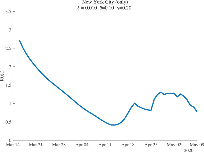
Figure 1 shows the estimates of for New York City. For the baseline parameter values, the estimates suggest that New York City began with , so that each infected person passed the disease to nearly three others at the start. This estimate agrees with other findings and it is particularly plausible for such a high-density metropolitan area as New York City.8 Social distancing is estimated to have reduced this value to below 0.5 by mid-April. After that, seems to fluctuate around 1.0.
Fig. 1.
New York City: Estimates of .
It is worth briefly reviewing the data that allow us to recover . As discussed in Section 4, we invert the SIRD model and use the death data to recover a time series for such that the model fits the death data exactly. This inversion reveals that can be recovered from the daily number of deaths (), the change in daily deaths (), and the change in the change in daily deaths ().
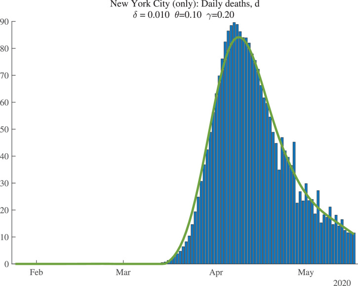
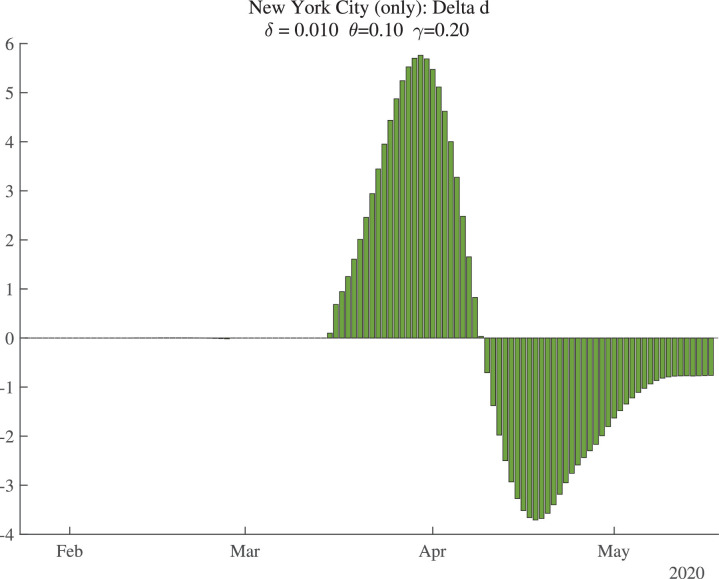
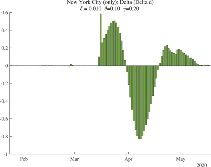
Figure 2 shows the data (bars) for daily deaths together with an HP filter of those data (with smoothing parameter 200), in a solid line. Figure 3 then shows the change in the HP-smoothed daily deaths, while Fig. 4 shows the double difference. It is these HP-filtered data that are used in the construction of in Fig. 1. Because the HP filter has problems at the end of the sample (e.g., there are fewer observations so noise becomes more important, and double differencing noise reduces precision), the latest estimate of we have for each location corresponds to May 9, 2020, even though our death data run through May 19, 2020: we lose 2 observations for the moving average, 3 observations for the double differencing, and then truncate by an additional 5 days to improve precision.
Fig. 2.
New York City: Daily Deaths and HP-Filtered Deaths.
Fig. 3.
New York City: Change in Smoothed Daily Deaths.
Fig. 4.
New York City: Change in Change in Smoothed Daily Deaths.
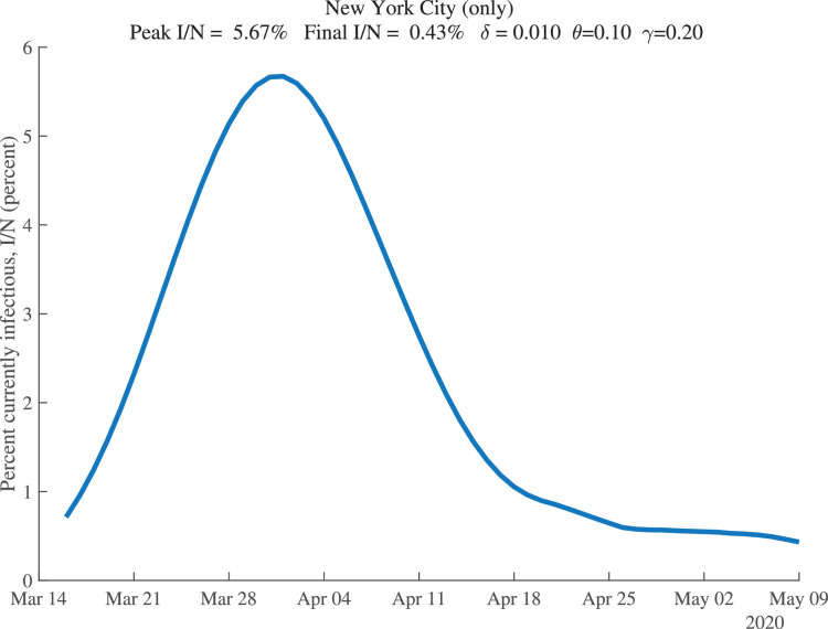
Our estimation also allows us to recover the fraction of the population that is estimated to be infectious at each date. These results are shown for New York City in Fig. 5 . For our baseline parameter values, this fraction peaks around April 1, 2020, at 5.7% of the population. By May 9, 2020, it is estimated to have declined to only 0.43% of the population.
Fig. 5.
New York City: Percent of the Population Infectious.
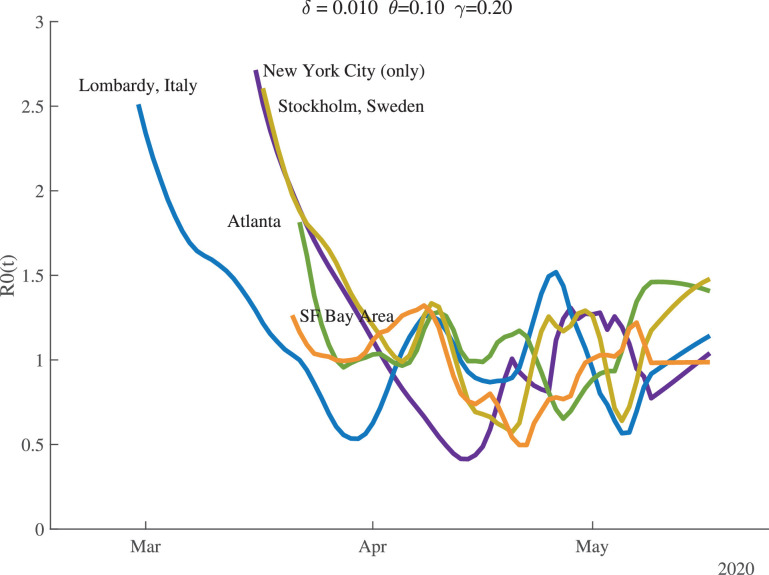
Figure 6 shows the time path of for several locations. There is substantial heterogeneity in the starting values, but they all fall and cluster around 1.0 once the pandemic is underway. By the end of our sample, the values of for Atlanta and Stockholm are noticeably greater than 1.0.
Fig. 6.
Estimates of .
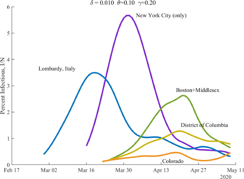
Figure 7 shows the time path of the percentage of the population that is currently infectious, , for several locations. The waves crest at different times for different locations, and the peak of infectiousness varies as well.
Fig. 7.
Percent of the Population Infectious.
Table 1 summarizes these and other results for a broader set of our locations. The full table, together with around 39 pages of graphs for each location, is reported on our dashboard. Now is a good time to make a couple of general remarks about our estimation. First, as the number of daily deaths declines at the end of a wave –say for Paris, Madrid, and Hubei in the table– the estimation of can become difficult and dominated by noise. In the extreme, for example, once total deaths are constant, our procedure gives . One sign of such problems is that “today’s” value of can fall to equal 0.20 –this is a lower bound that we impose on the estimation. When a location hits this lower bound, our routine ignores subsequent days of results because the model yields inconsistent result (e.g., negative new infectious). The notation “today” in the table refers to the last day for which we have results. Typically it is May 9, 2020, but in some cases it is earlier.
Table 1.
Summary of Results across Locations.
| Total (pm) | — — | % Infectious | Total (pm) | ||||
|---|---|---|---|---|---|---|---|
| Deaths, t | initial | today | today | peak | today | Deaths, t+30 | |
| NYC (only) | 2482 | 2.71 | 0.77 | 0.57 | 5.67% | 0.43% | 2650 |
| NYC (plus) | 2116 | 2.60 | 0.36 | 0.28 | 4.85% | 0.35% | 2238 |
| Lombardy, Italy | 2050 | 2.51 | 0.92 | 0.72 | 3.50% | 0.32% | 2236 |
| New York | 1451 | 2.62 | 0.68 | 0.57 | 3.23% | 0.36% | 1606 |
| Madrid, Spain | 1782 | 2.58 | 0.20 | 0.15 | 3.97% | 0.19% | 1841 |
| Detroit | 1691 | 2.43 | 0.50 | 0.41 | 2.88% | 0.32% | 1841 |
| New Jersey | 1551 | 2.61 | 1.11 | 0.91 | 2.44% | 0.87% | 2137 |
| Stockholm, SWE | 1499 | 2.61 | 1.17 | 0.97 | 2.44% | 0.73% | 2027 |
| Boston | 1198 | 2.12 | 0.72 | 0.62 | 2.63% | 0.65% | 1568 |
| Paris, France | 1003 | 2.39 | 0.20 | 0.01 | 1.99% | 0.17% | 1052 |
| Philadelphia | 885 | 2.46 | 0.88 | 0.78 | 1.68% | 0.72% | 1291 |
| Michigan | 809 | 2.35 | 0.69 | 0.62 | 1.37% | 0.25% | 932 |
| Spain | 786 | 2.41 | 0.53 | 0.49 | 1.59% | 0.12% | 844 |
| Chicago | 738 | 2.17 | 0.93 | 0.84 | 1.10% | 1.01% | 1144 |
| D.C. | 723 | 1.99 | 0.94 | 0.85 | 1.28% | 0.78% | 1105 |
| Italy | 702 | 2.22 | 1.01 | 0.93 | 1.07% | 0.15% | 808 |
| United Kingdom | 679 | 2.37 | 0.96 | 0.88 | 1.16% | 0.29% | 845 |
| France | 567 | 2.17 | 1.15 | 1.07 | 1.26% | 0.17% | 682 |
| Sweden | 486 | 2.07 | 0.90 | 0.84 | 0.75% | 0.39% | 661 |
| Pennsylvania | 476 | 2.06 | 0.84 | 0.78 | 0.89% | 0.38% | 673 |
| United States | 362 | 2.02 | 0.91 | 0.87 | 0.52% | 0.24% | 478 |
| NY excl. NYC | 264 | 1.98 | 1.10 | 1.06 | 0.39% | 0.39% | 456 |
| Miami | 275 | 1.83 | 0.68 | 0.66 | 0.49% | 0.23% | 354 |
| U.S. excl. NYC | 266 | 1.77 | 0.95 | 0.91 | 0.37% | 0.23% | 378 |
| Mississippi | 239 | 1.61 | 0.93 | 0.89 | 0.48% | 0.26% | 369 |
| Los Angeles | 192 | 1.62 | 1.01 | 0.98 | 0.31% | 0.20% | 294 |
| Minnesota | 193 | 1.54 | 0.83 | 0.80 | 0.36% | 0.25% | 291 |
| Atlanta | 183 | 1.81 | 1.46 | 1.42 | 0.24% | 0.18% | 378 |
| Iowa | 178 | 1.44 | 0.89 | 0.86 | 0.35% | 0.34% | 307 |
| Washington | 177 | 1.56 | 0.32 | 0.31 | 0.26% | 0.08% | 199 |
| Virginia | 170 | 1.91 | 0.80 | 0.77 | 0.40% | 0.16% | 230 |
| Germany | 127 | 1.66 | 0.20 | 0.18 | 0.21% | 0.04% | 135 |
| California | 110 | 1.45 | 1.04 | 1.02 | 0.16% | 0.13% | 174 |
| Brazil | 102 | 1.26 | 1.13 | 1.10 | 0.28% | 0.28% | 240 |
| Hubei, China | 101 | 1.40 | 0.20 | 0.01 | 0.23% | 0.08% | 102 |
| SF Bay Area | 77 | 1.26 | 0.98 | 0.97 | 0.12% | 0.04% | 97 |
| Mexico | 54 | 1.31 | 1.12 | 1.10 | 0.15% | 0.15% | 128 |
| Norway | 57 | 1.57 | 0.20 | 0.11 | 0.12% | 0.04% | 55 |
Next, we turn to some general comments about the results. First, notice that the initial values for range from around 1.5 or lower in places like Minnesota, California, Norway, and Mexico to high values of 2.5 or more in major cities throughout the world. Second, the fraction of the population that is infectious at the peak is greater than 2% in the hardest-hit areas, but only reaches a maximum of 5.7% in New York City. Third, the fraction that is infectious at the end of the sample is typically lower. It has fallen below 0.4% in New York City (plus), Lombardy, Madrid, Paris, and Detroit but is greater than 0.7% in places including New Jersey, Stockholm, Philadelphia, and Chicago. It is even lower –below 0.1%– in the SF Bay Area, Washington state, and Germany. Finally, there is enormous heterogeneity in cumulative deaths per million people (“Total (pm) Deaths” in the table), both at the end of the sample and in the forward simulation for 30 days in the future (t+30).
5.2. Baseline simulations
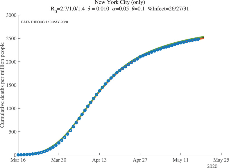
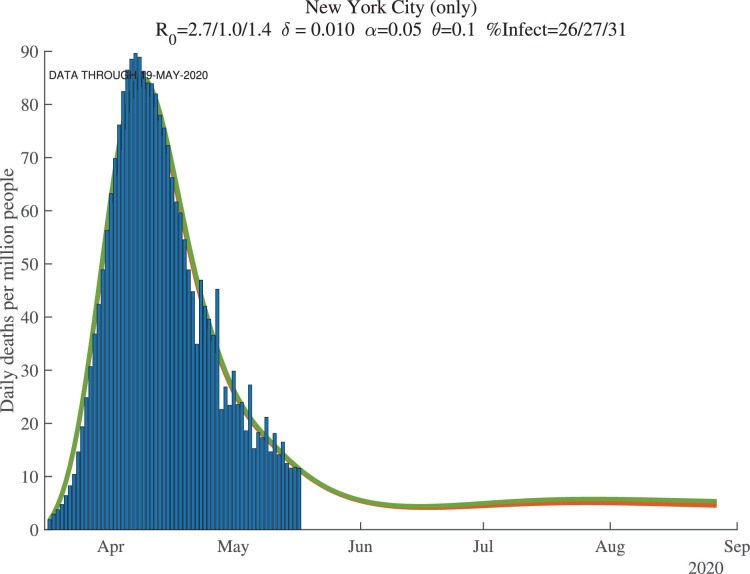
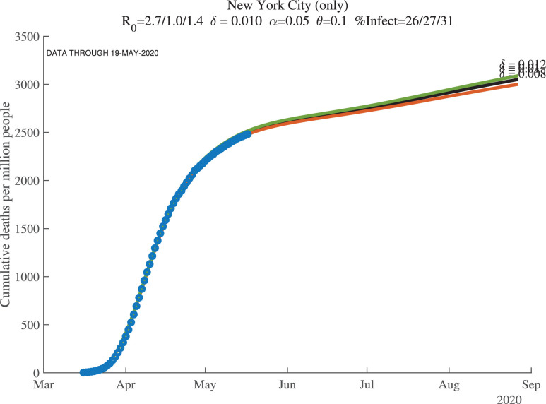
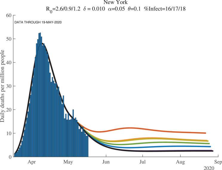
Figures 8, 9, and 10 show how the model fits the New York City data for three values of : 0.01, 0.008, and 0.012. The main lesson is that the model fits the data very well with each of these parameter values: our procedure just adjusts the number of infected people to account for the same observed deaths. For example, with , our model implies that this number for April 1, 2020, was 17%. This compares very well with the observation that –as of April 20, 2020– about 21% of New York City residents tested positive for antibodies of COVID-19 (New York Department of Health, 2020). Because antibodies only appear 3 to 4 weeks after infection, these antibody tests really tell us what the ever-infected rate was 3 to 4 weeks earlier.
Fig. 8.
New York City: Cumulative Deaths per Million People ().
Fig. 9.
New York City: Daily Deaths per Million People ().
Fig. 10.
New York City: Cumulative Deaths per Million (Future, ).
The supertitle lines for these three figures also report the “%Infected” at different dates. These are the percentage of people who are estimated to have ever been infected with the virus. For New York City, the numbers as of early May 2020 are 26% percent, and then in 30 days they are estimated to equal 27%, with a slightly higher value at the end of our simulation (the third number). We return in Section 7 to the implications of these high infection rates for herd immunity and re-opening. Our dashboard reports similar exercises for many other locations.
5.3. Seven days of simulations
When we simulate the model for many countries and regions, we find two results. First, once countries or regions reach the peak and deaths start to decline, the forecasts converge well. Second, however, before that happens, the forecasts are very noisy. This makes sense: we are trying to forecast 30 to 60 days into the future based on 3 to 4 weeks of data using a very nonlinear model.
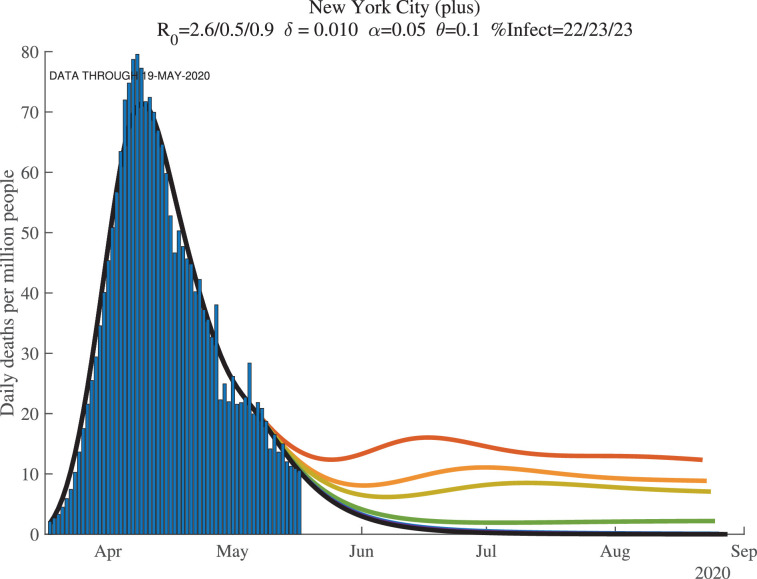
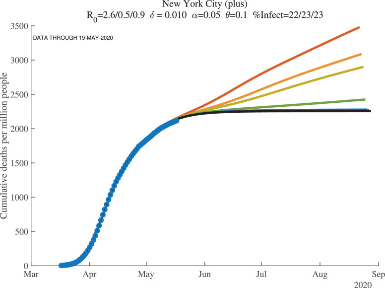
We illustrate these points with the next two figures, Figs. 11 and 12 , which show results at the end of our sample for New York City, now broadly defined to include the surrounding counties of Nassau, Rockland, Suffolk, and Westchester (which we call “New York City (plus)” in the graphs). In each figure, we see seven lines of forecasted daily and cumulative deaths. Each line corresponds to the forecast using one more day of observations. In both figures, the more recent observations push the forecast down (i.e., the top lines use fewer observations) and lowers its variance from day to day. This convergence of the forecast reflects how the first wave of COVID-19 was winding down in New York by late May 2020.
Fig. 11.
New York City (7 days): Daily Deaths per Million People.
Fig. 12.
New York City (7 days): Cumulative Deaths per Million (Future).
Recall the role of the feedback parameter. In the baseline simulation results, we assume where . This implies that if daily deaths rise, people adjust their behavior to reduce contacts, which reduces . Conversely, if daily deaths fall, people are more likely to go out and interact, which raises .
6. Problems with geographic aggregation
A point that is important to appreciate is that aggregating up from the city or county to the state and to the national level can be misleading. SIRD is a nonlinear model, so the results at the state level are not the same as the average of the results at the county level.
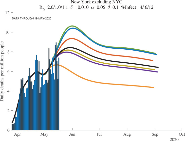
This point is easy to illustrate using data from New York. We report results for several different geographic regions. “New York City (plus)” includes New York City plus the four surrounding counties of Nassau, Rockland, Suffolk, and Westchester, with a total population of about 12 million. New York state is self-explanatory and has a population of about 20 million. And “New York excluding NYC” is the difference between these other two: New York state excluding the NYC (plus) area, with a population of about 8 million.
Now compare the results for these three regions, shown in Fig. 13, Fig. 14, Fig. 15 . The results in New York state as a whole are driven entirely by New York City. For example, imagine (counterfactually) that there were no deaths outside of New York City. In this hypothetical case, deaths per million for New York state would look exactly like deaths per million for New York City, except scaled down by a factor of 12/20. Because of the lower deaths per million, the model would behave slightly differently. And yet New York outside of New York City could look very different. In fact, as the deaths in New York City decline, a potential rise in deaths outside of New York City could cause the state death numbers to exhibit a flattening or even a second peak.
Fig. 13.
New York City (plus): Daily Deaths per Million People.
Fig. 14.
New York State: Daily Deaths per Million People.
Fig. 15.
New York excluding NYC: Daily Deaths per Million People.
Another version of this same kind of geographic aggregation bias seems likely to occur for the United States itself. To see this, imagine 50 states that sequentially pass through the peak of daily deaths. The U.S. national number can be driven by New York (City!) for the first several weeks, then by New Jersey and Michigan, and then by Massachusetts and Pennsylvania. The U.S. graph may show a rise and then a very flat profile of deaths that persists for a long time before declining, as new regions within the country suffer through their peaks sequentially.
7. Herd immunity and re-opening the economy
An important question at any stage of a pandemic is when to re-open the economy. The estimation we have conducted has something helpful to contribute to this point.
First, Table 2 reports the estimated fraction of the population that had ever been infected as of May 9, 2020, for different countries and regions. Numbers for three different values of are also reported, with the baseline case of in the center column. Two key things stand out in the table. First, consider the baseline. As we discussed above, we estimate that 26% of New York City had ever been infected by late May 2020.
Table 2.
Why Random Testing Would Be So Valuable.
| — Percent Ever Infected (today) — |
|||
|---|---|---|---|
| New York City (only) | 51 | 26 | 22 |
| New York City (plus) | 44 | 22 | 19 |
| Lombardy, Italy | 43 | 22 | 19 |
| New York | 31 | 16 | 13 |
| Madrid, Spain | 36 | 18 | 15 |
| Detroit | 36 | 18 | 15 |
| New Jersey | 37 | 19 | 16 |
| Stockholm, Sweden | 36 | 18 | 15 |
| Connecticut | 33 | 17 | 14 |
| Boston+Middlesex | 29 | 15 | 12 |
| Massachusetts | 29 | 15 | 12 |
| Paris, France | 21 | 11 | 9 |
| Philadelphia | 23 | 12 | 10 |
| Michigan | 18 | 9 | 8 |
| Spain | 17 | 8 | 7 |
| Chicago | 21 | 11 | 9 |
| District of Columbia | 20 | 10 | 8 |
| Italy | 15 | 8 | 7 |
| United Kingdom | 16 | 8 | 7 |
| France | 13 | 6 | 5 |
| Illinois | 13 | 7 | 6 |
| Sweden | 12 | 6 | 5 |
| Pennsylvania | 12 | 6 | 5 |
| United States | 9 | 5 | 4 |
| New York excluding NYC | 8 | 4 | 3 |
| Miami | 7 | 3 | 3 |
| U.S. excluding NYC | 7 | 4 | 3 |
| Ecuador | 6 | 3 | 3 |
| Los Angeles | 5 | 3 | 2 |
| Minnesota | 5 | 3 | 2 |
| Atlanta | 5 | 3 | 2 |
| Iowa | 6 | 3 | 2 |
| Florida | 3 | 2 | 1 |
| Germany | 3 | 1 | 1 |
| California | 3 | 2 | 1 |
| Brazil | 4 | 2 | 2 |
| Mexico | 2 | 1 | 1 |
| Norway | 1 | 1 | 0 |
In contrast, only 4% of people in New York state outside of New York City and only 2% of Californians have ever been infected. There is enormous heterogeneity in ever-infected rates. Where do these numbers come from? In our model, the fraction of those infected eventually die, with the timing determined by and , but essentially suggesting that deaths at time reflect infections from 15 days earlier. With an assumed death rate of , for each death, there are approximately 100 other people who have been infected. The large differences in the number of deaths per million in New York versus California then translate into these differences in infection rates. Interestingly, rates in Norway and South Korea are similarly very low, while ever-infected rates in Italy, Spain, and France are estimated to be around 6 to 8%.
The second point is that these numbers are –in an obvious way– very sensitive to the assumed value of . If you double the death rate, you (roughly) halve the ever-infected rate. If you halve the death rate, you (roughly) double the infected rate. And as we discuss in more detail next, in thinking about herd immunity and re-opening the economy, knowing the fraction ever-infected is crucial, at least under the important assumption that antibodies give rise to immunity for an extended period of time.
There is an important complementarity here. We would like the death rate to be low, not just because it means that fewer people die, but also because it means that lots of people will already have been infected. For example, if the true death rate is 5 in 1000 rather than 10 in 1000, it means that 51% of New Yorkers had already been infected and the herd immunity effects would be very strong. In this sense, the finding that only 21% of New York City was ever infected as of April 1, 2020, was doubly bad news: it pushes up the death rate and means we are far from herd immunity, even in the place with the largest number of infections.
As Atkeson (2020), Stock (2020), and others have emphasized, random testing would have been extremely helpful in identifying which of these cases was relevant. Moreover, the table suggests that it was much more important to test in New York City than in California. So few people were likely infected in California that it would have been very hard to distinguish statistically between the different death rates, whereas even a few thousand random tests would have been very informative in New York City. This is a crucial point to remember for future epidemics.
7.1. How far can we relax social distancing?
This brings us to the next reason why knowing the percentage ever infected would be so useful. The complement of this number is the percentage of the population that is still susceptible to the virus at any given moment in time. Call this fraction (or better might be but is so low that it makes no difference).9
Recall from the basic SIR model that the virus will die out as long as , that is, if is smaller than . The term is herd immunity. The fewer people who are susceptible and the more people who are recovered and hence immune, the less our random interactions result in infections. In particular, we can relax social distancing –increase and – to the critical value such that is just below one. That would mean that infected people infect fewer than one person on average, so herd immunity keeps the virus from re-surging.
Table 3 shows these calculations for one month from the end of our sample () given the baseline estimates from the model. For example, from the middle column, it is estimated that at , 78% of New York City (plus surrounding counties) would have still been susceptible. This means we could relax social distancing to the point where would rise to . This compares to the estimate for New York City at the end of the sample of 0.4 and the initial estimate of 2.6. In other words, New York City could move 41% ([1.3-0.4]/[2.6-0.4]) of the way back to normal and see no resurgence of the virus (Table 4 ).
Table 3.
Using Percent Susceptible to Estimate Herd Immunity, .
| Percent | (t+30) | Percent | |||
|---|---|---|---|---|---|
| Susceptible | with no | way back | |||
| t+30 | outbreak | to normal | |||
| New York City (only) | 2.7 | 0.8 | 73.5 | 1.4 | 30.3 |
| New York City (plus) | 2.6 | 0.4 | 77.5 | 1.3 | 41.5 |
| Lombardy, Italy | 2.5 | 0.9 | 77.5 | 1.3 | 23.4 |
| New York | 2.6 | 0.7 | 83.8 | 1.2 | 26.4 |
| Madrid, Spain | 2.6 | 0.2 | 81.5 | 1.2 | 43.2 |
| Detroit | 2.4 | 0.5 | 81.6 | 1.2 | 37.6 |
| New Jersey | 2.6 | 1.1 | 78.3 | 1.3 | 11.4 |
| Stockholm, Sweden | 2.6 | 1.2 | 78.3 | 1.3 | 7.2 |
| Boston+Middlesex | 2.1 | 0.7 | 84.9 | 1.2 | 32.9 |
| Massachusetts | 2.1 | 1.0 | 83.3 | 1.2 | 21.3 |
| Paris, France | 2.4 | 0.2 | 89.4 | 1.1 | 42.0 |
| Philadelphia | 2.5 | 0.9 | 87.2 | 1.1 | 17.0 |
| Michigan | 2.4 | 0.7 | 90.6 | 1.1 | 25.0 |
| Spain | 2.4 | 0.5 | 91.5 | 1.1 | 29.8 |
| Chicago | 2.2 | 0.9 | 87.0 | 1.1 | 18.0 |
| District of Columbia | 2.0 | 0.9 | 87.9 | 1.1 | 19.0 |
| Italy | 2.2 | 1.0 | 91.5 | 1.1 | 6.8 |
| United Kingdom | 2.4 | 1.0 | 91.0 | 1.1 | 10.0 |
| France | 2.2 | 1.1 | 91.9 | 1.1 | -6.0 |
| Illinois | 2.0 | 0.9 | 91.2 | 1.1 | 15.3 |
| Sweden | 2.1 | 0.9 | 92.7 | 1.1 | 15.2 |
| Pennsylvania | 2.1 | 0.8 | 93.0 | 1.1 | 19.5 |
| United States | 2.0 | 0.9 | 94.7 | 1.1 | 13.1 |
| New York excluding NYC | 2.0 | 1.1 | 92.8 | 1.1 | -2.3 |
| Miami | 1.8 | 0.7 | 96.3 | 1.0 | 31.0 |
| U.S. excluding NYC | 1.8 | 0.9 | 95.6 | 1.0 | 11.8 |
| Ecuador | 1.5 | 0.8 | 95.7 | 1.0 | 30.8 |
| Los Angeles | 1.6 | 1.0 | 96.2 | 1.0 | 5.4 |
| Minnesota | 1.5 | 0.8 | 96.7 | 1.0 | 28.7 |
| Atlanta | 1.8 | 1.5 | 86.2 | 1.2 | -84.9 |
| Iowa | 1.4 | 0.9 | 96.1 | 1.0 | 27.2 |
| Washington | 1.6 | 0.3 | 98.0 | 1.0 | 56.3 |
| Florida | 1.6 | 0.9 | 98.0 | 1.0 | 15.3 |
| Germany | 1.7 | 0.2 | 98.6 | 1.0 | 55.8 |
| California | 1.5 | 1.0 | 97.5 | 1.0 | -3.4 |
| Brazil | 1.3 | 1.1 | 95.0 | 1.1 | -54.7 |
| SF Bay Area | 1.3 | 1.0 | 98.8 | 1.0 | 10.3 |
| Mexico | 1.3 | 1.1 | 97.3 | 1.0 | -45.8 |
| Norway | 1.6 | 0.2 | 99.4 | 1.0 | 58.9 |
Table 4.
Herd Immunity with a Much Lower Death Rate, .
| Percent | (t+30) | Percent | |||
|---|---|---|---|---|---|
| Susceptible | with no | way back | |||
| t+30 | outbreak | to normal | |||
| New York City (only) | 2.7 | 1.6 | 46.6 | 2.1 | 51.1 |
| New York City (plus) | 2.6 | 0.7 | 56.1 | 1.8 | 56.6 |
| Lombardy, Italy | 2.5 | 1.5 | 54.4 | 1.8 | 30.6 |
| New York | 2.6 | 1.0 | 67.5 | 1.5 | 28.1 |
| Madrid, Spain | 2.6 | 0.3 | 64.1 | 1.6 | 55.9 |
| Detroit | 2.4 | 1.0 | 63.5 | 1.6 | 41.3 |
| New Jersey | 2.6 | 1.9 | 49.1 | 2.0 | 20.1 |
| Stockholm, Sweden | 2.6 | 1.8 | 52.1 | 1.9 | 11.6 |
| Boston+Middlesex | 2.1 | 1.4 | 61.8 | 1.6 | 33.7 |
| Massachusetts | 2.1 | 1.5 | 58.9 | 1.7 | 37.2 |
| Paris, France | 2.4 | 0.3 | 79.3 | 1.3 | 46.5 |
| Philadelphia | 2.5 | 1.3 | 66.9 | 1.5 | 13.2 |
| Michigan | 2.4 | 0.9 | 80.8 | 1.2 | 22.1 |
| Spain | 2.4 | 0.6 | 83.3 | 1.2 | 31.5 |
| Chicago | 2.2 | 1.1 | 71.3 | 1.4 | 30.1 |
| District of Columbia | 2.0 | 1.2 | 72.0 | 1.4 | 26.7 |
| Italy | 2.2 | 1.2 | 82.7 | 1.2 | 4.6 |
| United Kingdom | 2.4 | 1.2 | 80.8 | 1.2 | 7.2 |
| France | 2.2 | 1.2 | 84.3 | 1.2 | -5.7 |
| Illinois | 2.0 | 1.0 | 81.4 | 1.2 | 21.7 |
| Sweden | 2.1 | 1.0 | 84.6 | 1.2 | 16.1 |
| Pennsylvania | 2.1 | 1.1 | 83.4 | 1.2 | 12.5 |
| United States | 2.0 | 1.0 | 89.0 | 1.1 | 11.8 |
| New York excluding NYC | 2.0 | 1.1 | 87.7 | 1.1 | 6.7 |
| Miami | 1.8 | 0.8 | 92.4 | 1.1 | 29.8 |
| U.S. excluding NYC | 1.8 | 1.0 | 90.8 | 1.1 | 11.2 |
| Ecuador | 1.5 | 0.9 | 91.2 | 1.1 | 36.1 |
| Los Angeles | 1.6 | 1.0 | 92.4 | 1.1 | 6.7 |
| Minnesota | 1.5 | 0.9 | 93.1 | 1.1 | 28.5 |
| Atlanta | 1.8 | 1.4 | 87.5 | 1.1 | -77.7 |
| Iowa | 1.4 | 0.9 | 92.2 | 1.1 | 33.9 |
| Washington | 1.6 | 0.3 | 96.0 | 1.0 | 57.4 |
| Florida | 1.6 | 1.0 | 96.0 | 1.0 | 14.1 |
| Germany | 1.7 | 0.2 | 97.3 | 1.0 | 56.5 |
| California | 1.5 | 1.0 | 95.3 | 1.0 | 0.7 |
| Brazil | 1.3 | 1.1 | 92.5 | 1.1 | 4.4 |
| SF Bay Area | 1.3 | 1.0 | 97.7 | 1.0 | 11.0 |
| Mexico | 1.3 | 1.1 | 95.7 | 1.0 | -17.4 |
| Norway | 1.6 | 0.2 | 98.9 | 1.0 | 58.9 |
The rest of the state of New York, in contrast, is estimated to still have had 93% of the population susceptible a month from the end of our sample. So outside of the city, New York needed to maintain its at 1.1 –also its level at the end of our sample– to keep the virus from spreading. New York City and the rest of New York state needed different policies if the fraction of the population that remains susceptible was as different as these estimates imply.10
Places with values of could have relaxed somewhat and still have kept the virus in check. But the basic news from this table is that with a death rate of 1%, there was very little accumulated herd immunity and that our scope for relaxing social distancing was limited (as shown by the later waves of the epidemic).
Finally, note that the SIRD model has “momentum.” Even if an area has reached the threshold , we will continue to accumulate infections and deaths before the epidemic dies out fully. The number of these “overshoot” infections and deaths will depend on the number of infectious individuals when we reach . This observation is not a minor point. In a conventional SIRD model where gives you herd immunity at 60% of the population, if we reach too fast, we can end up with over 90% of the population ever infected, that is, with an extra 30% of infections over those required to achieve herd immunity.
This means that we want to reach the threshold or stay around it with very few infectious individuals to minimize “overshoot” infections. While setting up and solving an optimal control problem of the COVID-19 epidemic in the tradition of Morton and Wickwire (1974) to get to such an objective is beyond the scope of our paper, our empirical results can help to calibrate re-opening scenarios such as those quantitatively explored in Baqaee et al. (2020).
8. Conclusions
Our paper has presented a fast procedure to estimate a SIRD model with limited data. This exercise is particularly useful at the start of an epidemic, when a fast policy response is required and we cannot wait for months to implement more sophisticated econometric methods such as those in Arias et al. (2021).
Relative to the standard SIRD model in the literature, we include a time-varying , and therefore a time-varying . We invert the SIRD model to back out the daily values of that fit the death data. We see this as important for capturing behavioral changes by individuals in response to the pandemic as well as policy changes related to social distancing. We also include an additional “recovering” state that is consistent with the medical evidence that cases seem to be infectious for four to five days while taking a total of several weeks or more to resolve. These changes better connect the model to the epidemiology of the virus and are important in improving the model’s ability to fit the data. Finally, we follow Cochrane (2020) and include feedback between and daily deaths in modeling the future of the epidemic. We hope that our empirical estimates will prove useful to others in thinking about the possible path that COVID-19 may take at different locations and in analyzimg future epidemics.
More precisely, the case fatality ratio is not the average treatment effect on the treated (ATET), a more explicitly “causal” concept.
In a previous version of this paper, we assumed that decayed at an exponential rate, as in Chowell et al. (2016). We also tried alternative specifications, including discrete jumps at the time of the introduction of shelter-in-place orders. As we will see below, it turns out that we can dispense with those assumptions and be much more flexible in recovering from observables.
We can also consider the transition to the resolving compartment as reflecting, in part, quarantine measures. While some authors prefer to add a “quarantine” compartment, we did not find we needed it to account for the dynamics of the data.
Evidence from the second half of 2020 and 2021 suggests that 0.8%-1.0% is a realistic death rate for a country with the age structure of the U.S.. However, these death rates incorporate some of the advances in medical protocols for treating patients that appeared after our sample finished.
Katz and Sanger-Katz (2020) suggest that the excess deaths in New York City could be even larger than the already-adjusted numbers revealed so far: they report 20,900 excess deaths by April 26, 2020, compared to 16,673 in the official counts.
For instance, Sanche et al. (2020) estimate an even higher median value of 5.7 during the start of the epidemic in Wuhan.
Notice, however, that our very stylized SIRD model is silent about how you map concrete policy decisions (i.e., should we o should we not open non-essential businesses) into changes in .
Notice, also, that these computations assume that individuals stay within their territories, and do not move among them, mixing infection rates across areas.
Note that also incorporates choices of individuals. Therefore, it is not merely pinned down by clinical observations. If an individual experiences symptoms or suspects that she might be infectious, hence withdrawing herself from effective contacts with susceptible individuals, we can consider her case has resolved for the purposes of the dynamics of the model, even if she is still under a clinical condition.
References
- Acemoglu D., Chernozhukov V., Werning I., Whinston M.D. A multi-risk sir model with optimally targeted lockdown. Am. Econ. Rev. Insights. 2021 [Google Scholar]
- Alvarez F., Argente D., Lippi F. A simple planning problem for COVID-19 lock-down, testing, and tracing. Am. Econ. Rev. Insights. 2021;3(3):367–382. [Google Scholar]
- Arias J.E., Fernández-Villaverde J., Rubio Ramírez J., Shin M. Working Paper 28617. National Bureau of Economic Research; 2021. Bayesian Estimation of Epidemiological Models: Methods, Causality, and Policy Trade-Offs. [Google Scholar]
- Atkeson A. Working Paper 26965. National Bureau of Economic Research; 2020. How Deadly Is COVID-19? Understanding the Difficulties with Estimation of Its Fatality Rate. [Google Scholar]
- Avery C., Bossert W., Clark A., Ellison G., Ellison S.F. Working Paper 27007. National Bureau of Economic Research; 2020. Policy Implications of Models of the Spread of Coronavirus: Perspectives and Opportunities for Economists. [Google Scholar]
- Baqaee D., Farhi E., Mina M.J., Stock J.H. Policies for a second wave. Brookings Pap. Econ. Act. 2020:385–431. [Google Scholar]
- Bar-On Y.M., Flamholz A., Phillips R., Milo R. Technical Report. 2020. SARS-CoV-2 (COVID-19) by the Numbers. [DOI] [PMC free article] [PubMed] [Google Scholar]; https://elifesciences.org/articles/57309
- Berger D., Herkenhoff K., Huang C., Mongey S. Testing and reopening in an SEIR model. Rev. Econ. Dyn. 2020 [Google Scholar]
- Bodenstein M., Corsetti G., Guerrieri L. Social distancing and supply disruptions in a pandemic. Quant. Econ. 2021 doi: 10.3982/QE1618. [DOI] [PMC free article] [PubMed] [Google Scholar]
- Chari V., Kirpalani R., Phelan C. The hammer and the scalpel: on the economics of indiscriminate versus targeted isolation policies during pandemics. Rev. Econ. Dyn. 2020;42 doi: 10.1016/j.red.2020.11.004. [DOI] [Google Scholar]
- Chowell G., Viboud C., Simonsen L., Moghadas S.M. Characterizing the reproduction number of epidemics with early subexponential growth dynamics. J. R. Soc. Interface. 2016;13(123):20160659. doi: 10.1098/rsif.2016.0659. [DOI] [PMC free article] [PubMed] [Google Scholar]
- Cochrane J. The Grumpy Economist blog; 2020. An Sir Model with Behavior. [Google Scholar]; https://johnhcochrane.blogspot.com/
- Eichenbaum M.S., Rebelo S., Trabandt M. The Macroeconomics of Epidemics. Rev. Financ. Stud. 2021;34(11):5149–5187. [Google Scholar]
- Farboodi M., Jarosch G., Shimer R. Internal and external effects of social distancing in a pandemic. J. Econ. Theory. 2021;196 [Google Scholar]
- Garriga C., Manuelli R., Sanghi S. Technical Report. Federal Reserve Bank of St. Louis; 2021. Optimal Management of an Epidemic: An Application to COVID-19. A Progress Report. [Google Scholar]
- Hethcote H.W. The mathematics of infectious diseases. SIAM Rev. 2000;42(4):599–653. [Google Scholar]
- Hornstein A. Technical Report. Federal Reserve Bank of Richmond; 2020. Social Distancing, Quarantine, Contact Tracing, and Testing: Implications of an Augmented SEIR-Model. [Google Scholar]
- Hurwicz L. In: Logic, Methodology and Philosophy of Science. Nagel E., Suppes P., Tarski A., editors. vol. 44. Elsevier; 1962. On the structural form of interdependent systems; pp. 232–239. (Studies in Logic and the Foundations of Mathematics). [Google Scholar]
- Johns Hopkins University CSSE, 2020. 2019 novel coronavirus COVID-19 (2019-nCoV) data repository. Center for Systems Science and Engineering, https://github.com/CSSEGISandData/COVID-19.
- Katz J., Sanger-Katz M. The New York Times; 2020. N.Y.C. Deaths Reach 6 Times the Normal Level, Far More Than Coronavirus Count Suggests. [Google Scholar]; https://www.nytimes.com/interactive/2020/04/27/upshot/coronavirus-deaths-new-york-city.html
- Kermack W.O., McKendrick A.G. A contribution to the mathematical theory of epidemics, Part I. Proc. R. Soc. London Ser.A. 1927;115(772):700–721. [Google Scholar]
- Kermack W.O., McKendrick A.G. Contributions to the mathematical theory of epidemics. II – the problem of endemicity. Proc. R. Soc. London Ser.A. 1932;138(834):55–83. [Google Scholar]
- Korolev I. Technical Report. Binghamton University; 2020. What Does the Case Fatality Ratio Really Measure? [Google Scholar]
- Korolev I. Identification and Estimation of the SEIRD Epidemic Model for COVID-19. J. Econom. 2021;220(1):63–85. doi: 10.1016/j.jeconom.2020.07.038. [DOI] [PMC free article] [PubMed] [Google Scholar]
- Li S., Linton O. When will the COVID-19 pandemic peak? J. Econom. 2021;220(1):130–157. doi: 10.1016/j.jeconom.2020.07.049. [DOI] [PMC free article] [PubMed] [Google Scholar]
- Liu L., Moon H.R., Schorfheide F. Panel forecasts of country-level COVID-19 infections. J. Econom. 2021;220(1):2–22. doi: 10.1016/j.jeconom.2020.08.010. [DOI] [PMC free article] [PubMed] [Google Scholar]
- Morton R., Wickwire K.H. On the optimal control of a deterministic epidemic. Adv. Appl. Probab. 1974;6(4):622–635. [Google Scholar]
- New York Department of Health . Technical Report. 2020. The NYSDOH Wadsworth Center’s Assay for SARS-CoV-2 IgG. [Google Scholar]; https://coronavirus.health.ny.gov/system/files/documents/2020/04/updated-13102-nysdoh-wadsworth-centers-assay-for-sars-cov-2-igg_1.pdf
- Sanche S., Lin Y., Xu C., Romero-Severson E., Hengartner N., Ke R. High contagiousness and rapid spread of severe acute respiratory syndrome coronavirus 2. Emerg. Infect. Dis. 2020;26 doi: 10.3201/eid2607.200282. [DOI] [PMC free article] [PubMed] [Google Scholar]
- Stock J.H. Working Paper 26902. National Bureau of Economic Research; 2020. Data Gaps and the Policy Response to the Novel Coronavirus. [Google Scholar]
- The Economist, 2020. Tracking COVID-19 excess deaths across countrieshttps://www.economist.com/graphic-detail/2020/04/16/tracking-covid-19-excess-deaths-across-countries.
- Toda A.A. UCSD manuscript. 2020. Susceptible-Infected-Recovered (SIR) Dynamics of COVID-19 and Economic Impact. [Google Scholar]


