

Abstract
We develop a Bayesian inference framework to quantify uncertainties in epidemiological models. We use SEIJR and SIJR models involving populations of susceptible, exposed, infective, diagnosed, dead and recovered individuals to infer from Covid-19 data rate constants, as well as their variations in response to lockdown measures. To account for confinement, we distinguish two susceptible populations at different risk: confined and unconfined. We show that transmission and recovery rates within them vary in response to facts, and that the diagnose rate is quite low, which leads to large amounts of undiagnosed infective individuals. A key unknown to predict the evolution of the epidemic is the fraction of the population affected by the virus, including asymptomatic subjects. Our study tracks its time evolution with quantified uncertainty from available official data, limited, however, by the data quality. We exemplify the technique with data from Spain, country in which late drastic lockdowns were enforced for months during the first wave of the current pandemic. In late actions and in the absence of other measures, spread is delayed but not stopped unless a large enough fraction of the population is confined until the asymptomatic population is depleted. To some extent, confinement can be replaced by strong distancing through masks in adequate circumstances.
Keywords: SEIJR models, Covid-19, Numerical simulation, Bayesian inference, Uncertainty quantification
Introduction
Since the outbreak of the current Covid-19 pandemic [1], [2], Health Services worldwide report daily data about the status of the epidemic, which serve as a guide for the design of non-pharmaceutical interventions [3], [4]. An increasing number of mathematical studies assess the efficacy of different policies [4], [5], [6], [7], [8], [9]. Moreover, mathematical models and data analysis are employed to estimate relevant epidemiological parameters [4], [10], [11], [12], [13], [14] and to try to forecast the evolution [15], [16], [17], [18], [19], [20], [21]. While some of this research is based on direct data analysis [4], [13], machine learning techniques [15], [21] or empirical laws for different populations [9], the use of balance equations to predict population dynamics is a common approach.
After the pioneering work of Kermack and McKendrick [22], SIR type models have become a standard tool in epidemiological studies [23]. The specific structure of the selected models depends on the available information and on assumptions about the epidemic spread [24]. Basic SIR models involve populations of susceptible , infected , and recovered individuals, expecting immunity of the latter [8], [14], [17], [25]. SEIR variants distinguish also the individuals exposed to the virus , which may become infective [11], [19]. Immunity of the recovered is suppressed in SEIRS systems [18], [20]. During the 2002–04 SARS (Severe Acute Respiratory Syndrome) outbreak, these models were adapted to describe the SARS epidemic in different countries by singling out the diagnosed infective [10], [26], becoming SEIJR or SIJR models. Diagnosed individuals are isolated. The virus SARS-CoV-2 responsible for the illness Covid-19 belongs to the same family as the virus SARS-CoV, responsible for SARS. The epidemics triggered by them share some features, such as the role of asymptomatic individuals in superspread events, see [12] for a quantification of the fraction of asymptomatic population during Covid-19 spread following this approach. Here, we will study the effect of confinement measures on Covid-19 spread by distinguishing two susceptible SEIJR populations: confined and non confined.
To have a predictive value, we must fit the model parameters to available data. This can be done applying optimization or adjoint-based data assimilation techniques to reduce the difference between recorded data and model predictions for selected parameters [10], [14], for instance. However, data for epidemiological studies are subject to many sources of noise and uncertainty. In the case of the current Covid-19 pandemic, different countries, and regions within them, define the diagnosed, recovered and dead individuals they count in their official reports in different ways. The number of dead individuals may refer only to patients who die in hospitals or include also deaths at homes and care homes. Furthermore, the death of covid patients with previous health issues may be officially attributed to other causes. On the other hand, the number of diagnosed individuals may refer only to cases confirmed by a PCR (Polymerase chain reaction) test or include also positive antibody tests, or probable cases with compatible symptoms and clinical history. Moreover, the results of tests may arrive with a variable delay, which results in fluctuations and exclusions. Undated cases may not be counted at all. Tests repeated for the same individuals may be counted as different. Additionally, the number of tests performed varies largely over the weeks due to supply shortages and changes in local testing policies, and the accuracy of the tests employed may fluctuate, yielding false negatives or positives.
Uncertainty in the data propagates to any predictions based on them. Instead of fixing specific guesses for the model coefficients, it is convenient to explore approaches that quantify uncertainty [7], [8], [9], [12], [27]. Unlike most work which does not distinguish undocumented and documented infected individuals, here we follow the SEIJR approach and compare data to model predictions of diagnosed infected [10], [12], [26], including quarantine measures for them and taking into account the diagnose rate due to testing. We develop a general framework to infer SEIJR model coefficients from data with quantified uncertainty, taking into account confinement measures as they are sequentially enforced or lifted by means of two populations: confined and unconfined. This allows us to analyze variations in the model rates and in the distributions of the different populations a time grows as a result of the measures implemented, including undiagnosed infected individuals and asymptomatic individuals. We focus on the case of Spain during the first wave of the pandemic. SIR type models assume that the system is closed: the total population is constant. Spanish data from that period are singular because the borders were closed and the system was indeed isolated. Drastic late global lockdowns were enforced at the same time in the whole country, producing well differentiated periods in the data along a long time period, see Fig. 1. The situation is quite different from the German case, in which mild measures were implemented very early to curb the spread [8], the Italian case, where strong spatiotemporal differences between regions occurred [6], [17], and from studies of initial stages [11], [19]. Nevertheless, our methods apply to data for diagnosed, dead and recovered individuals from any other country. The key idea is introducing a susceptible subpopulation at lower risk, which might also be achieved by milder measures such as generalized distancing through masks instead of confinement in a closed system (no individuals enter or exit the system). In fact, in Spain, the epidemic remained controlled at the end of the first wave in spite of the fact that home confinement was released and replaced by the usage of masks in public transportation, indoor activities and also outdoors, while the system remained closed, see Fig. 8. Once the country borders were opened to worldwide tourism again, a new wave was triggered. The analysis of migration and spatial dynamics are relevant topics [6], [12], [16], still out of the scope of the present study.
Fig. 1.

(a) Daily counts of diagnosed, recovered and dead individuals (PCR confirmed) in Spain since February 25th, 2020, until May 22th, 2020 [28]. After an initial period of uncontrolled spread (Period 1), borders were closed, while all the population being able to work online, or not working in basic activities, was confined at home in the whole country (Period 2): education, administration, tourism, shopping, leisure activities... Lockdown was later extended to all non essential activities (Period 3). Only food and medical supplies, healthcare, security, essential transport and essential production remained active. Confinement was then released by stages, first some workers (Period 4), then the rest, while introducing recommendations for the use of masks and social distancing. (b) SEIJR based Bayesian inference and predictions for the total number of diagnosed individuals using counts from Period 1 (red), Periods 1–2 (green), Periods 1–2–3 (blue) and Periods 1–2–3–4 (magenta). For each of them, top colored triangles separate the inference from the prediction part of the simulations. True data are marked by yellow circles. Solid curves correspond to best fits, dashed curves and dotted curves to different types of sample averages. Shaded areas and dotted curves define uncertainty regions, see Section “Incorporating the effect of contention measures” for a discussion. (For interpretation of the references to color in this figure legend, the reader is referred to the web version of this article.)
Fig. 8.

True counts of diagnosed (asterisks) and dead (crosses) individuals versus predictions (solid lines) obtained solving the model up to the end of the first wave, with the parameters corresponding to obtained while fitting the model to the four previous periods.
The next sections are organized as follows. Section “SEIJR models for SARS and Covid-19 type epidemics” recalls the structure of SEIJR models. We intend to quantify uncertainty when fitting these models to data from the current Covid-19 pandemic. We use the SIJR simplification for the initial stage of the outbreak, before contention measures were taken, and compare to the full SEIJR results. SIJR predictions usually underestimate the total number of affected people. Section “Fitting the initial stages of the outbreak” explains how to obtain guesses of model parameters, which play the role of prior knowledge for the Bayesian studies in Section “Uncertainty quantification by Bayesian techniques”. Section “Uncertainty in the initial stage” analyzes the initial stage while Section “Incorporating the effect of contention measures” considers the effect of contention measures, with Spanish data. We adapt the SEIJR framework to study parameter uncertainty through the different stages, inferring also key magnitudes such as the time evolution of the number of asymptomatic and undiagnosed individuals affected by the virus, or the global number of affected people. In late interventions, and in the absence of other preventive measures, spread is delayed but not stopped unless a large enough fraction of the population is confined for a long enough time, until the number of asymptomatic and undiagnosed individuals is depleted. Once confinement is over, the usage of masks plays a similar role keeping a fraction of the population at a lower risk in a closed system. Section “Conclusions” summarizes our conclusions.
SEIJR models for SARS and Covid-19 type epidemics
SEIJR models involving populations of susceptible (S), exposed (E), infective (I), diagnosed (J), and recovered (R) individuals were proposed in [26] to study the spread of the 2002–04 SARS outbreak. Here, we will adapt them to describe contention measures for Covid-19. Considering two populations and of different susceptibility, the model takes the form:
| (1) |
where is the total population number, which remains constant. is the number of dead individuals. The exposed are a class of asymptomatic and possibly infectious individuals. The possibility of transmission from exposed individuals is represented by the parameter . They may progress to the infective state at a rate . The class is composed of symptomatic, infectious, and undiagnosed individuals. Infectious individuals become diagnosed at a rate . The recovery rate of the infective is , whereas the recovery rate of the diagnosed is . The recovered individuals keep track of the cumulative number of sick individuals who become healthy again. Diagnosed individuals are isolated from the rest. Their reduced impact on transmission is represented through a parameter . Mortality of infected and diagnosed individuals caused by the virus is denoted by . Finally, represents the transmission rate: how susceptible individuals become virus spreaders. Time is measured in days.
The model has to be complemented with initial conditions. This fact introduces an additional parameter to locate the time at which local spread started [10]. Other approaches assume the initial data unknown instead [8], in our case that choice would increase considerably the number of unknowns. Furthermore, we consider that the risk of infection for is lower than the risk for by a factor . The total population is initially partitioned as , , being the fraction of the susceptible population at a lower risk of infection. Risk might vary due to specific characteristics of the population (age, sex, genes) [26]. Here, variations will be due to confinement/protection measures enforced on part of the population.
Two constraints are usually imposed on the parameters: (1) and (2) [26]. Moreover, the following expression for the basic reproduction number [26] holds
The reproduction number represents the expected number of cases immediately originated by one case in a population where all individuals are susceptible to infection, that is, no other individuals are infected or immunized (naturally or through vaccination). Instead, the effective reproduction number is just the number of cases produced in the current state of a population.
This type of models reproduces crudely some characteristics observed in SARS epidemics, such as the emergence of symptomatic and asymptomatic individuals, superspread events and unequal susceptibility, for instance. We will use them here with data from the current Covid-19 epidemic. First guesses for some of the model parameters can be estimated from average observations, see Table 1. First guesses for two key parameters, and can be obtained from simplified SIJR approximations, as we explain in the next section.
Table 1.
SEIJR model parameters. Guesses from clinical observation when available [29].
| Par. | Definition | Guess |
|---|---|---|
| Transmission rate per day | ||
| Rate of progression to the infectious state per day | ||
| Rate of progression from infective to diagnosed per day | 1/5–1/6 (stats) | |
| Rate at which infectious individuals recover per day | ||
| Rate at which diagnosed individuals recover per day | 1/10–1/11 (stats) | |
| Covid-19 induced mortality per day | 1/10–1/11 (stats) | |
| Relative measure of isolation of diagnosed cases | 1/14 (practice) | |
| Relative measure of infectiousness for the exposed | ||
| Reduction in risk of Covid-19 infection for class | ||
| Time at which local spread starts | ||
| Fraction of the population at a lower risk |
Fitting the initial stages of the outbreak
The SEIJR models we have introduced assume that (1) spread takes place in a closed system, (2) the death rate is the same for everybody (death by other causes is neglected), (3) the recovered have immunity, (4) the diagnosed are isolated, and (5) time delays in responses are neglected. Assuming further that: (6) the exposed phase is neglected, (7) the susceptibility degree is not distinguished , , (8) the infected are a small fraction of the whole population, so that , we obtain a SIJR simplification [10]:
| (2) |
| (3) |
| (4) |
| (5) |
| (6) |
| (7) |
| (8) |
Here, is the total population number, which remains constant. SIJR models allow us to fit important parameters, such as the transmission rate and the onset of local spread , which determine the exponential growth in the initial stages. Their solutions admit analytic expressions, detailed in Appendix “Solutions of the SIJR model”. Thanks to that fact, they have been used to analyze the influence of isolation measures on the inflexion point, see [10] and references therein. Notice that sign balances in (3) govern the increase of the number of infected people.
In the SIJR model (2)–(8), we have to fit the parameters , , , , , , as well as , defined as the time at which . This can be done starting from educated guesses and optimizing a cost functional with respect to them. The clinical information collected during the current pandemic [29] yields tentative average values for the rates , , , , and for , collected in Table 1. We then seek to fit the remaining parameters by optimizing a cost. A popular choice is
| (9) |
where , , are cumulative numbers of diagnosed people for days and the cumulative variable solves , , with given by (3). This variable is in fact the total cumulative number of diagnosed individuals, obtained adding to the diagnosed recovered and the diagnosed dead , solutions of
| (10) |
This is an important distinction. Note that Eq. (4) discounts the diagnosed people who recover or die, thus tracks only the active diagnosed cases. In practice, only the diagnosed recovered , the diagnosed dead and the diagnosed active or total are recorded by Health Care Systems, since the contribution coming from undiagnosed infected cases is unknown.
SIJR models are adequate for these fittings because solutions admit explicit expressions which reduce numerical errors when dealing with exponentially growing solutions, see Appendix “Solutions of the SIJR model”. We will resort to the Levenberg–Marquardt–Fletcher algorithm [30] to optimize the costs.
The final values we obtain for and are days and 0.6262, starting the optimization from initial guesses and 0.6. This is consistent with the fact that deaths occurred as early as February 13 in Spain were proven to be caused by Covid-19. Notice that we are fitting a cumulative magnitude . Even if the fitting for is accurate, as Fig. 2 shows, the results worsen noticeably when we use these parameters to calculate , , and and compare with the data recorded for each of them.
Fig. 2.
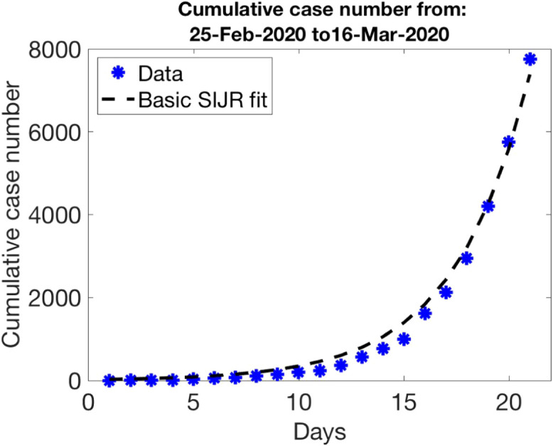
Parameter guess for the first period of data in Fig. 1 (free spread): , , , , , , .
We could improve the overall guess using these values as starting point for an algorithm optimizing the cost
| (11) |
with respect to all of the parameters, or resorting to more detailed cost functionals. However, our goal here is to quantify uncertainty in usual rough fits and predictions obtained with them. Therefore, we will use them as priors for the subsequent Bayesian studies.
Uncertainty quantification by Bayesian techniques
Bayes’ theorem describes the probability of an event, based on prior knowledge about it [31]. According to it, the posterior probability of observing a finite number of parameters given data would be
where is a conditional probability (the likelihood of observing data given parameters ), and represents our prior knowledge on the parameters . The normalization factor represents the probability of the data. It is also a marginal probability, which can be obtained integrating with respect to .
Let us fit our problem in this framework. The parameters are the model parameters, that is,
| (12) |
for the SIJR model or, for SEIJR,
| (13) |
Then, the prior distribution, the likelihood and the posterior distribution are defined as follows.
Prior distribution
For the prior distribution, we use a parameter guess as the mean of a multivariate normal distribution with a covariance matrix constructed from the deviations of each variable
| (14) |
where is the number of parameters. We choose a diagonal covariance matrix with elements , . In practice, we have to modify this proposal because our parameters are always positive and gaussians may produce negative values. Thus, we set
| (15) |
This will be our choice of prior distribution . We do not need to calculate the normalization factor for later use, since our sampling techniques do not require it.
Likelihood
For the conditional probability density we set
| (16) |
where , being the covariance matrix representing the noise in the data , and the observation operator. We assume additive Gaussian noise, i.e., the observations and true parameters would be related by
| (17) |
Here, the noise is distributed as a multivariate Gaussian with mean zero and covariance matrix .
In practice, the data available are daily cumulative counts of diagnosed individuals , diagnosed recovered and diagnosed dead , , see [28]. Putting the three blocks of data together we have
| (18) |
where are the active diagnosed, those who are neither dead nor recovered. Following [32], we define the observation operator as
| (19) |
where the dynamics of the diagnosed recovered and diagnosed dead are governed by (10) whereas the diagnosed individuals in which the infection is active are governed by (4) for SIJR (see Appendix “Solutions of the SIJR model” for analytic expressions) or (1) for SEIJR. In (16), we compare these observations to the data using the distance . To simplify, we consider the noise level for all observations to be uncorrelated, so that is a real diagonal matrix, , and set all the variances for the same magnitude equal to a constant , . Thus, , where is the number of data considered. Note that these cost functionals require more information than those based on total case counts: we distinguish diagnosed individuals who are dead, recovered and still sick, and compare with model predictions for them discarding the contribution of the undiagnosed, unlike [8], [10].
Posterior distribution
Combining (15) with (16) and neglecting normalization constants, the posterior density becomes, up to multiplicative constants,
| (20) |
By sampling this posterior distribution, we can visualize the uncertainty in the inference of parameters for a given data set. To do so, we will resort to Markov Chain Monte Carlo Sampling [33], [34]. Once we have a large collection of samples, we can extract information from the model (2)–(7) with quantified uncertainty, such as the global number of people who have been affected by the virus the last day of the period we are considering. In the next sections we exemplify the procedure for the different stages of the epidemic as observed in Fig. 1.
Uncertainty in the initial stage
The initial stage of the epidemic corresponds to spread in the absence of any contention measures, see data reproduced in Fig. 3(a)–(b). Our goal here is to first fit the coefficients of the models to such data with quantified uncertainty and then estimate a range of values for the total number of affected individuals at the end of the period, including exposed and undiagnosed infected individuals.
Fig. 3.

Initial stage (free spread): (a) counts of diagnosed and dead cases compared to SIJR solutions of (4), (10) for (solid) and (dashed), (b) same for counts of recovered and active cases, (c) SIJR simulations of the dynamics of diagnosed recovered, dead, active and total cases for (solid) and (dashed). Histograms representing (d) a discrete approximation to the probability distribution of parameters and (e) probabilities for the total number of people affected by the virus at the end of the period. The affected people are for and for . Sampling parameters , , , and acceptance parameter .
We use the guess obtained in Section “Fitting the initial stages of the outbreak” as a mean for the prior distribution (15), that is,
| (21) |
For the different rate parameters, the deviations will not be large. In the absence of a better insight we can take , , for instance. The first day of the outbreak is subject to the largest variance. We usually set . For the likelihood (16), we set (first days) with deviations and . We then sample the posterior distribution (20) by MCMC techniques [34]. Sampling is initialized with walkers drawn from the prior distribution, which generate chains mixed during steps depending on an acceptance parameter . Discarding the first samples produced (to account for the so-called burn in period), we use the remaining samples to draw histograms representing the marginal probabilities of the different model parameters, see Fig. 3(d). We set to be the sample with largest posterior probability and the mean of the parameter samples, see Table 2.
Table 2.
Values of and during the initial stage using the SIJR and SEIJR models.
| SIJR | SEIJR | SIJR | SEIJR | ||
|---|---|---|---|---|---|
| 7.3786 | 10.7869 | 8.3266 | 11.3098 | 12.3388 | |
| 0.5938 | 0.6223 | 0.5890 | 0.6078 | 0.6262 | |
| 0.0390 | 0.0370 | 0.0321 | 0.0349 | 0.0667 | |
| 0.0473 | 0.0452 | 0.0372 | 0.0417 | 0.1000 | |
| 0.0135 | 0.0129 | 0.0115 | 0.0117 | 0.1000 | |
| 0.2230 | 0.2051 | 0.2366 | 0.2161 | 0.2000 | |
| 0.1104 | 0.1138 | 0.0625 | 0.0694 | 0.0714 | |
| 0.4947 | 0.4975 | 0.5000 | |||
| 0.4966 | 0.4809 | 0.5000 | |||
| −2.1343 | −1.1836 | −119.2493 | |||
| −1.9204 | −1.0640 | −58.1152 |
Derived magnitudes can be visualized through histograms too, such as the final number of affected people in Fig. 3(e). It has been calculated solving Eqs. (2)–(8) with the samples as coefficients and computing at the final time, days. We have superimposed the predictions for and . Note that does not have a statistical meaning, it keeps track of a possible best fit to the data. On the other hand, represents some kind of average behavior. When the distributions under study are symmetric, it will be close to . Otherwise, it may depart from it. In our case, slight asymmetry is caused by discarding negative values. In principle, we could try to improve our estimate of the parameter values that maximize the likelihood by optimization procedures [33]. In practice, enforcing the positivity constraint while doing it may be problematic, and the best samples provide reasonable approximations for our purposes.
Panels (a)–(b) in Fig. 3 compare the observations that would be obtained with and to the original data. If we solve the SIJR model for a longer time, for instance, days more, we reach about diagnosed individuals, see panel (c), and about affected people in the absence of contention measures.
The number of people affected by the virus with a SIJR model does not consider exposed individuals . If we wish to estimate them, we need to use the SEIJR model. Fig. 4 summarizes some results, quite similar to those for SIJR except for the magnifying effect of including the exposed . The number of affected individuals increases considerably, however the variation in is small: for and for instead of and for SIJR, respectively. See Table 2 for a comparison of the parameter values for both models. Note the high transmission rate (about 0.6) and the low diagnosis rate (about 0.2). Most infected individuals are not detected. If we solve the SEIJR model for a longer time, for instance, days more, we reach about diagnosed individuals and affected people for and in the absence of contention measures.
Fig. 4.

Initial stage using the SEIJR model: Histograms representing (a) a discrete approximation to the probability distribution of some parameters and (b) the probability of different populations at the end of the period, including the total number of people affected by the virus at that time. The affected people are for (green dashed line) and for (red dot–dashed line). Data for diagnosed, dead, recovered and active cases are compared to solutions of (1), (10) for (solid) and (dashed) in (c). SEIJR predictions of the numbers of exposed, infective, recovered and dead for , including undiagnosed and asymptomatic individuals, are shown in (d) for the initial period and in (e) for a later time. Sampling parameters , , , and . (For interpretation of the references to color in this figure legend, the reader is referred to the web version of this article.)
In the next section we study the influence of contention measures on the subpopulations by means of the SEIJR model distinguishing two populations, one of which is confined.
Incorporating the effect of contention measures
To incorporate the effect of confinement we consider the SEIJR model with two populations (unconfined) and (confined). During the first period of free growth , we have . The different periods for the data shown in Fig. 1(a) are marked by variations in these populations as a result of confinement measures. In each th period , , we solve the SEIJR model (1) using as initial values the final values from the previous period at , for all the variables except for and :
-
•
Period 2: and are used as initial data for and , respectively.
-
•
Period 3: and are used as initial data for and , respectively.
-
•
Period 4: and are used as initial data for and , respectively.
Recall that in the first period, the initial values for all the variables are zero, except and . No parameter appears in the next periods, we set it equal to zero. Instead, we introduce to quantify the abrupt changes in the fraction of people confined at the start of each period. We assume that the transmission rate for is lower by a factor , that is, instead of , due to the reduction of contacts with other people. Due to possible interaction with already sick people or people still working outside at home, we cannot set it equal to zero.
We adapt the framework presented in Section “Uncertainty quantification by Bayesian techniques” assembling these periods as we explain next. To consider stages , , we multiply the number of parameters by . The first block of parameters is the standard one for the first period. The remaining blocks correspond each to one additional period, with replaced by . We keep the same initial guesses of the parameters used in Section “Uncertainty in the initial stage” as prior knowledge in all the periods, except for , which is set equal to , , respectively, an approximation of the population switches at the different stages. The deviations are kept equal to 0.1 for all, except , for which we set it equal to . As for the data, we keep the same deviations as in Section “Uncertainty in the initial stage” in all the periods, in the absence of better information.
Let us consider first the initial confinement period. Fig. 5(a) compares to data the evolution of the diagnosed subpopulations. Population dynamics is calculated solving the SEIJR model in two sequential steps, in and , using in each of them the parameter values obtained for that period and the initial data stipulated earlier. Panel (b) represents the solutions of the SEIRJ model including the contribution of undiagnosed and asymptomatic individuals. Panel (d) compares the distribution of some parameters in the two periods. The transmission rate increases slightly in the second period, while the diagnose rate remains low. These histograms are discretizations of the probability, so that the height of each bin is the number of samples in the bin divided by the total number and by the basis of the bins (which is the same for the histograms corresponding to the same parameters in this figure and the previous ones to allow for comparisons). Fig. 5(e) quantifies uncertainty in the total number of people affected by the virus after these two periods. If we keep the parameter values or up to time , growth slows down, but it does not stabilize, see Fig. 5(c).
Fig. 5.

First and second periods: (a) Data for diagnosed (asterisks), dead (crosses), recovered (triangles) and active (squares) cases, compared to solutions of (1), (10) for (solid) and (dashed), extended in (c) for a longer time. (b) SEIJR simulations of the numbers of exposed, infective, recovered and dead individuals for including the undiagnosed and asymptomatic. (d) Histograms comparing the distribution of some parameters in the two periods. (e) Histograms representing the probability of the status of different populations at the end. Vertical lines mark the values for (red dot–dashed line), (green dashed line), and the mean for all samples (black dotted line). Sampling parameters , , and . (For interpretation of the references to color in this figure legend, the reader is referred to the web version of this article.)
We incorporate next the third additional period in which an even larger fraction of the population is confined at home. The results are reproduced in Fig. 6. Finally, the growth trend moderates, also in predictions for longer times, see Fig. 1(b). Table 3 reports the mean values obtained after MCMC sampling, as well as the values corresponding to the best sample . As mentioned earlier, has not a statistical meaning. It represents a best fit whose coefficients may fluctuate a bit with the number of samples. Instead, conveys a statistical trend of the coefficients of the samples. Comparing the values of for , we remark an increase in in the second period. This fact is also observed in and the trend was already present in the histograms for in Fig. 5(d). According to the information available on the Spanish outbreak, and taking into account that infected people can take up to days to show symptoms, this might be a delayed reflection of crowd gatherings occurred at the end of the first period, or also, a result of the lack of protective equipment for overwhelmed health care and security workers. We also observe a reduction in the mean recovery rates for and in the second period, which may be reflection of the saturation of the health care system and the scarceness of medical resources during the second period. Notice that the diagnose rate is quite low. A large fraction of affected people remains undetected.
Fig. 6.

Same as Fig. 5(a) and (e) for three periods of increasing confinement. Note the decrease in the numbers of exposed and infected cases. Sampling parameters , , and .
Table 3.
Values of and for three periods using the SEIJR model, with , , , respectively. In the first row, the first columns represent , while the rest correspond to .
| 1st | 2nd | 3rd | 1st | 2nd | 3rd | |
|---|---|---|---|---|---|---|
| , | 12.3479 | 0.7202 | 0.2236 | 7.9770 | 0.8064 | 0.2527 |
| 0.6173 | 0.6902 | 0.5898 | 0.6894 | 0.7028 | 0.6796 | |
| 0.0741 | 0.0363 | 0.0446 | 0.0410 | 0.0290 | 0.0318 | |
| 0.1426 | 0.0437 | 0.0551 | 0.0532 | 0.0343 | 0.0461 | |
| 0.0696 | 0.0310 | 0.0131 | 0.0141 | 0.0180 | 0.0098 | |
| 0.1541 | 0.2148 | 0.2343 | 0.1791 | 0.1851 | 0.1022 | |
| 0.1056 | 0.1245 | 0.1031 | 0.1253 | 0.1800 | 0.0219 | |
| 0.4978 | 0.5301 | 0.5082 | 0.3872 | 0.7778 | 0.4234 | |
| 0.1139 | 0.0643 | 0.1845 | 0.0001 | |||
| 0.4984 | 0.5106 | 0.5251 | 0.5802 | 0.5703 | 0.5339 |
In a fourth period, a fraction of the population is released from confinement. The number of undiagnosed and exposed individuals is depleted and the spread of the epidemic is contained. Unlike before, the SEIJR solutions for still fit the data quite well, but the solutions for deviate from the data towards the solution for the prior , see Fig. 7(a). This reflects some kind of bimodality, with a collection of SEIJR solutions close to the prior while most of them remain close to the data as the model coefficients range through the sampled parameters. This may be a consequence of fixing prior guesses for the model parameters that worsen with time. Note that the predictions that would be obtained using the prior are rather poor, compared to true counts, as time grows. However, the predictions provided by fit the data quite well, even for later times, see Fig. 1(b).
Fig. 7.

Same as Fig. 6(a)–(b) for four periods. Additional dotted lines in the lower part of panel (a) represent solutions of (1), (10) for . The numbers of exposed , infected and active diagnosed individuals are depleted.
Note that as we add data from new periods, we are including more information in the analysis. The best coefficient values estimated for previous periods change slightly and we infer more moderate numbers of affected individuals, as compared with the previous studies done using less data. However, the same trends persist: increase of in the second period, while and decrease, decrease of and low diagnose rate . Very few tests were done during these periods. In fact, the usefulness of tests would be to increase the diagnose rate, augmenting the number of quarantined infected and asymptomatic individuals.
Fig. 1(b) provides a global view of our analysis. Shaded areas represent the total number of diagnosed cases obtained solving (1), (10) for the last 1000 sampled parameters in each of the four frameworks we have considered: red for Period 1, green for Periods 1–2, blue for Periods 1–2–3, magenta for Periods 1–2–3–4. Dotted lines represent the mean of the curves obtained for all the samples. Thicker lines represent the total number of diagnosed cases for (solid), (dashed) and (dash–dotted). Yellow circles represent the data: total counts of diagnosed people (dead, recovered and active). Colored triangles separate the ‘inference’ from the ‘prediction’ regions for each of them. At the back of the triangles, we have the inference region, corresponding to the data we use to infer the parameter values and the total number of affected people. At the front of the triangles, we use model solutions to predict the time evolution keeping the conditions of the last period considered in the inference studies. Taking no measures leads to the evolution represented in red. Confining people who are able to work online or do not work in basic activities results in the dynamics marked in green. Extending the confinement to all the population not working in strictly essential activities leads to the forecast painted in blue. Releasing this last fraction of the population results in the evolution represented in magenta. Notice that the solid magenta curve corresponding to agrees very well with the data past day (last day used to calculate it), whereas some magenta samples deviate considerably. This fact is reflected in the dotted averages, which define somehow a confidence region. After day the population was released from confinement by stages, and the use of masks was enforced, lowering the risk for the users. The country remained closed. The different predictions associated to the four inference studies we carried out are not only due to the confinement or the release of population fractions, but to the fact that we allow for variations in the model coefficients in the different periods to adapt them to additional amounts of data. The fact that the transmission coefficient decreases with time due to improved conditions is fundamental.
These studies are limited by the data quality. As mentioned earlier, the order of magnitude of the population counts in official records changes noticeably when only PCR confirmed cases are taken into account or also probable cases are included. In the Spanish outbreak, the number of probable cases may have been five times higher and the number of dead individuals twice as much. Repeating our previous studies scaling the data in that way, we find estimates about 2 million people, consistent with the official conclusions inferred from selected testing campaigns.
Finally, let us focus on the available data until the borders opened on July 2, 2020, after which the country was no longer closed. As said before, home confinement had been replaced by mask usage indoors and outdoors. Fig. 8 compares the predictions obtained for the period May 2 until July 15, 2020, with the parameters corresponding to obtained while fitting the model to the four previous periods. The number of total diagnosed people is well fitted. This suggests that masks were an effective tool to contain the spread. The number of dead people is overestimated, due to the fact that the official number of dead individuals was reduced by about 2000 people on May 25. We cannot compare our predictions with the official counts of recovered individuals because there were no longer updated in this period.
Conclusions
The attempt to devise mathematical models to study the progression of a pandemic faces the need to handle large uncertainty in the available data. We have developed a Bayesian framework to quantify uncertainty in the effects of lockdown measures through the coefficients of SEIJR and SIJR models for human-to-human transmission. A key idea is the introduction of two populations, one of which has a lower risk of infection than the other. Lower risk may be due to confinement, as it happens for the data we consider here, or to preventive measures, such as the use of masks. Therefore, our methodology is not constrained to lockdown measures.
These techniques allow us to calibrate important magnitudes to forecast the evolution of the epidemic, such as the variation in the total number of affected people (including asymptomatic individuals), and could be adapted to infer coefficients from data from any country. We show how enforcing measures that deplete the number of undiagnosed and asymptomatic individuals, while reducing the transmission rate, we can stop the spread. We have focused on the data available for Spain during the first wave, which shows well differentiated data periods according to the measures taken. Moreover, the borders of the country remained closed, so that the system was indeed closed, as assumed by SIR type models. We see that the model coefficients in each period vary with the circumstances. For instance, transmission rates may augment as a result of increased interaction and lack of protective measures and recovery rates may decrease as a result of scarceness of resources. The diagnose rate is low, resulting in large number of undiagnosed individuals. Performing more PCR tests would increase the diagnose rate, allowing to quarantine more infected and asymptomatic individuals.
An additional difficulty when applying this inference framework for large periods of time (months) is the fact that uncertainty in the observed data accumulates over time when using cumulative data. This poses the problem of selecting adequate variances for the analysis. In the absence of reliable information in that respect, we have kept them fixed. Calculations with daily data do not show significative differences in the observed trends in our case. Moreover, we have used official data for PCR confirmed patients only. The effect of adding probable cases, which may have been five times higher, would require further consideration.
SIR type models assume that recovered individuals have immunity. This may not be the case here, thus additional studies taking this factor into account would be advisable [18], [20]. Furthermore, standard SIR type models [12] are formulated for closed systems. Introducing spatial mobility [6], [12] is an important issue that should be a subject for future work. Moreover, imperfect implementation of contention measures leads to delays, which might be better described by differential-delay models [35]. We have focused on human-to-human transmission here. Coronaviruses originate in animals, such as bats, and arrive to humans through intermediate animal species which act as reservoirs for future waves [36], subject deserving further studies.
CRediT authorship contribution statement
Ana Carpio: Conceptualization, Supervision, Methodology, Analysis and Validation, Resources, Funding acquisition, Writing – original draft. Emile Pierret: Data curation, Visualization, Analysis and validation, Software development.
Declaration of Competing Interest
The authors declare that they have no known competing financial interests or personal relationships that could have appeared to influence the work reported in this paper.
Acknowledgments
This research has been partially supported by the FEDER /Ministerio de Ciencia, Innovación y Universidades - Agencia Estatal de Investigación grants No. MTM2017-84446-C2-1-R, PID2020-112796RB-C21 and ENS Paris Saclay program for student internships abroad. A. Carpio thanks G. Stadler for nice discussions.
Appendix: solutions of the SIJR model
Let us obtain explicit expressions for the solution of the (2)–(8) model. Consider the Eqs. (3)–(4) for and . Set , . The system matrix is
with eigenvalues
and eigenvectors:
The general solution is
We obtain the solutions for the initial value problem combining the solutions with initial data and . The coefficients for are
For
provide the solution to our problem.
Set
Then the number of infected people is
| (22) |
and the cumulative number of infected people such that , , is
| (23) |
The number of diagnosed people is
| (24) |
The cumulative number of diagnosed people is then the integral of this magnitude, starting from zero :
| (25) |
We can now integrate the equations for , and :
| (26) |
| (27) |
| (28) |
If we work with the diagnosed recovered and the diagnosed dead, we get
| (29) |
| (30) |
The formulas given here set . To use them with initial data at a generic we just replace by in the formulas obtained here.
References
- 1.Rothana H.A., Byrareddy S.N. The epidemiology and pathogenesis of coronavirus disease (covid-19) outbreak. J Autoimmun. 2020;109 doi: 10.1016/j.jaut.2020.102433. [DOI] [PMC free article] [PubMed] [Google Scholar]
- 2.Zhu N., Zhang D., Wang W., Li X., Yang B., Song J., Zhao X., Huang B., Shi W., Lu R., Niu P., Zhan F., Ma X., Wang D., Xu W., Wu G., Gao G.F., Tan W. A novel coronavirus from patients with pneumonia in China. N Engl J Med. 2020;382(8):727–733. doi: 10.1056/NEJMoa2001017. [DOI] [PMC free article] [PubMed] [Google Scholar]
- 3.Ferguson NM, Laydon D, Nedjati-Gilani G, et al. Impact of Non-Pharmaceutical Interventions (NPIs) to Reduce Covid-19 Mortality and Healthcare Demand. Imperial College Lond 2020; Report 9, 10.25561/77482. [DOI] [PMC free article] [PubMed]
- 4.Khailaie S., Mitra T., Bandyopadhyay A., Schips M., Mascheroni P., Vanella P., Lange B., Binder S., Meyer-Hermann M. Development of the reproduction number from coronavirus SARS-CoV-2 case data in Germany and implications for political measures. BMC Med. 2021;19:32. doi: 10.1186/s12916-020-01884-4. [DOI] [PMC free article] [PubMed] [Google Scholar]
- 5.Ambikapathy B., Krishnamurthy K. Mathematical modelling to assess the impact of lockdown on covid-19 transmission in India: Model development and validation. JMIR Public Health Surveillance. 2020;6(2) doi: 10.2196/19368. [DOI] [PMC free article] [PubMed] [Google Scholar]
- 6.Bouchnita A., Jebran A. A hybrid multi-scale model of covid-19 transmission dynamics to assess the potential of non-pharmaceutical interventions. Chaos Solitons Fractals. 2020;138 doi: 10.1016/j.chaos.2020.109941. [DOI] [PMC free article] [PubMed] [Google Scholar]
- 7.Brauner J.M., Mindermann S., Sharma M., Johnston D., Salvatier J., Gavenčiak T., Stephenson A.B., Leech G., Altman G., Mikulik V., Norman A.J., Monrad J.T., Besiroglu T., Ge H., Hartwick M.A., Teh Y.W., Chindelevitch L., Gal Y., Kulveit J. Inferring the effectiveness of government interventions against COVID-19. Science. 2021;371(6531):eabd9338. doi: 10.1126/science.abd9338. [DOI] [PMC free article] [PubMed] [Google Scholar]
- 8.Dehning J., Zierenberg J., Spitzner F.P., Wibral M., Neto J.P., Wilczek M., Priesemann V. Inferring change points in the spread of covid-19 reveals the effectiveness of interventions. Science. 2020;369(6500):eabb9789. doi: 10.1126/science.abb9789. [DOI] [PMC free article] [PubMed] [Google Scholar]
- 9.Flaxman S., Mishra S., Gandy A., Unwin H.J.T., Mellan T.A., Coupland H., Whittaker C., Zhu H., Berah T., Eaton J.W., Monod M., Imperial College Covid-19 Response Team, Ghani A.C., Donnelly C.A., Riley S.M., Vollmer M.A.C., Ferguson N.M., Okell L.C., Bhatt S. Estimating the effects of non-pharmaceutical interventions on covid-19 in Europe. Nature. 2020;584:257–281. doi: 10.1038/s41586-020-2405-7. [DOI] [PubMed] [Google Scholar]
- 10.Ding G., Chang L., Gong J., Wang L., Cheng K., Zhang D. SARS epidemical forecast research in mathematical model. Chin Sci Bull. 2004;49:2332–2338. doi: 10.1360/04we0073. [DOI] [PMC free article] [PubMed] [Google Scholar]
- 11.Kucharski A.J., Russell T.W., Diamond C., Liu Y., Edmunds J., Funk S., Eggo R.M. Early dynamics of transmission and control of covid-19: A mathematical modelling study. Lancet Infect Dis. 2020;20(5):553–558. doi: 10.1016/S1473-3099(20)30144-4. [DOI] [PMC free article] [PubMed] [Google Scholar]
- 12.Li R., Pei S., Chen B., Song Y., Zhang T., Yang W., Shaman J. Substantial undocumented infection facilitates the rapid dissemination of novel coronavirus (SARS-CoV2) Science. 2020;368(6490):489–493. doi: 10.1126/science.abb3221. [DOI] [PMC free article] [PubMed] [Google Scholar]
- 13.Nishiura H., Linton N.M., Akhmetzhanov A.R. Serial interval of novel coronavirus (covid-19) infections. Int J Infect Dis. 2020;93:284–286. doi: 10.1016/j.ijid.2020.02.060. [DOI] [PMC free article] [PubMed] [Google Scholar]
- 14.Sesterhenn J.L. 2020. Adjoint-based data assimilation of an epidemiology model for the covid-19 pandemic in 2020. [DOI] [Google Scholar]
- 15.Al-qaness M.A.A., Ewees A.A., Fan H., Aziz M.D.E. Optimization method for forecasting confirmed cases of covid-19 in China. J Clin Med. 2020;9(674) doi: 10.3390/jcm9030674. [DOI] [PMC free article] [PubMed] [Google Scholar]
- 16.Engbert R., Rabe M.M., Kliegl R., Reich S. Sequential data assimilation of the stochastic SEIR epidemic model for regional covid-19 dynamics. Bull Math Biol. 2021;83:1. doi: 10.1007/s11538-020-00834-8. [DOI] [PMC free article] [PubMed] [Google Scholar]
- 17.Ferrari L., Gerardi G., Manzi G., Micheletti A., Nicolussi F., Biganzoli E., Salini S. Modelling provincial covid-19 epidemic data in Italy using an adjusted time-dependent SIRD model. Int J Environ Res Public Health. 2021;18(12):6563. doi: 10.3390/ijerph18126563. [DOI] [PMC free article] [PubMed] [Google Scholar]
- 18.Kissler S.M., Tedijanto C., Goldstein E., Grad Y.H., Lipsitch M. Projecting the transmission dynamics of SARS-CoV-2 through the postpandemic period. Science. 2020;368(6493):860–868. doi: 10.1126/science.abb5793. [DOI] [PMC free article] [PubMed] [Google Scholar]
- 19.Kuniya J. Prediction of the epidemic peak of coronavirus disease in Japan. J Clin Med. 2020;9(789) doi: 10.3390/jcm9030789. [DOI] [PMC free article] [PubMed] [Google Scholar]
- 20.Ng K.Y., Gui M.M. Covid-19: Development of a robust mathematical model and simulation package with consideration for ageing population and time delay for control action and resusceptibility. Physica D. 2020:411–132599. doi: 10.1016/j.physd.2020.132599. [DOI] [PMC free article] [PubMed] [Google Scholar]
- 21.Tiwari S., Kumar S., Guleria K. Outbreak trends of coronavirus (covid-19) in India: A prediction. Disaster Med Public Health Prep. 2020;14(5):e33–e38. doi: 10.1017/dmp.2020.115. [DOI] [PMC free article] [PubMed] [Google Scholar]
- 22.Kermack W.O., McKendrick A.G. A contribution to the mathematical theory of epidemics. Proc R Soc London Ser A. 1927;115(772):700–721. [Google Scholar]
- 23.Diekmann O., Heesterbeek J.A.P. John Wiley and Sons; 2000. Mathematical Epidemiology of Infectious Diseases: Model Building, Analysis and Interpretation. [Google Scholar]
- 24.Huppert A., Katriel G. Mathematical modelling and prediction in infectious disease epidemiology. Clin Microbiol Infect. 2013;19(11):999–1005. doi: 10.1111/1469-0691.12308. [DOI] [PubMed] [Google Scholar]
- 25.Anderson R.M., May R.M. Population biology of infectious diseases: Part I. Nat. Publ. Group. 1979;280(5721):361–367. doi: 10.1038/280361a0. [DOI] [PubMed] [Google Scholar]
- 26.Chowell G, Fenimore PW, Castillo-Garsow MA, Castillo-Chavez C. SARS Outbreak in Ontario, Hong Kong and Singapore: The Role of Diagnosis and Isolation As a Control Mechanism. Los Alamos Unclassified Report LA-UR-(2003) 03-2653. [DOI] [PMC free article] [PubMed]
- 27.Capistran M.A., Christen J.A., Velasco-Hernandez J.X. Towards uncertainty quantification and inference in the stochastic SIR epidemic model. Math Biosci. 2011;24(2):250–259. doi: 10.1016/j.mbs.2012.08.005. [DOI] [PubMed] [Google Scholar]
- 28.Centro de Coordinación de Alertas y Emergencias Sanitarias, Ministerio de Sanidad, Gobierno de España; 2020. Enfermedad por el Coronavirus (Covid-19), Actualizaciones 30 - 135, 136 - 563. see https://www.sanidad.gob.es/profesionales/saludPublica/ccayes/alertas Actual/nCov/situacionActual.htm and also https://www.coronavirus-statistiques.com/stats-globale/coronavirus-number-of-cases/ [Google Scholar]
- 29.Análisis de los Casos de Covid-19 notificados a la RENAVE hasta el 10 de Mayo en España, Informe Covid-19 33, 29 de Mayo. Instituto de Salud Carlos III.
- 30.Fletcher R. Modified Marquardt Subroutine for Non-Linear Least Squares. Tech. Rep. 197213, 1971.
- 31.Kaipio J., Somersalo E. Springer Science & Business Media; 2006. Statistical and Computational Inverse Problems, Vol. 160. [Google Scholar]
- 32.Pierret E. Uncertainty Quantification in SARS Epidemics. Report for the ’Jacques Hadamard’ Master’s Research Internship. ENS Paris Saclay - UCM, 2020.
- 33.Carpio A., Iakunin S., Stadler G. BayesIan approach to inverse scattering with topological priors. Inverse Problems. 2020;36 [Google Scholar]
- 34.Foreman-Mackey D., Hogg D.W., Lang D., Goodman J. emcee: The MCMC hammer. Publ Astron Soc Pac. 2013;125(925) [Google Scholar]
- 35.Ruschel S., Pereira T., Yanchuk S., Young L.S. An SIQ delay differential equations model for disease control via isolation. J Math Biol. 2019;79:249–279. doi: 10.1007/s00285-019-01356-1. [DOI] [PubMed] [Google Scholar]
- 36.Chen T.M., Rui J., Wang Q.P., Zhao Z.Y., Cui J.A., Yin L. A mathematical model for simulating the phase-based transmissibility of a novel coronavirus. Infect Dis Poverty. 2020;9:24. doi: 10.1186/s40249-020-00640-3. [DOI] [PMC free article] [PubMed] [Google Scholar]