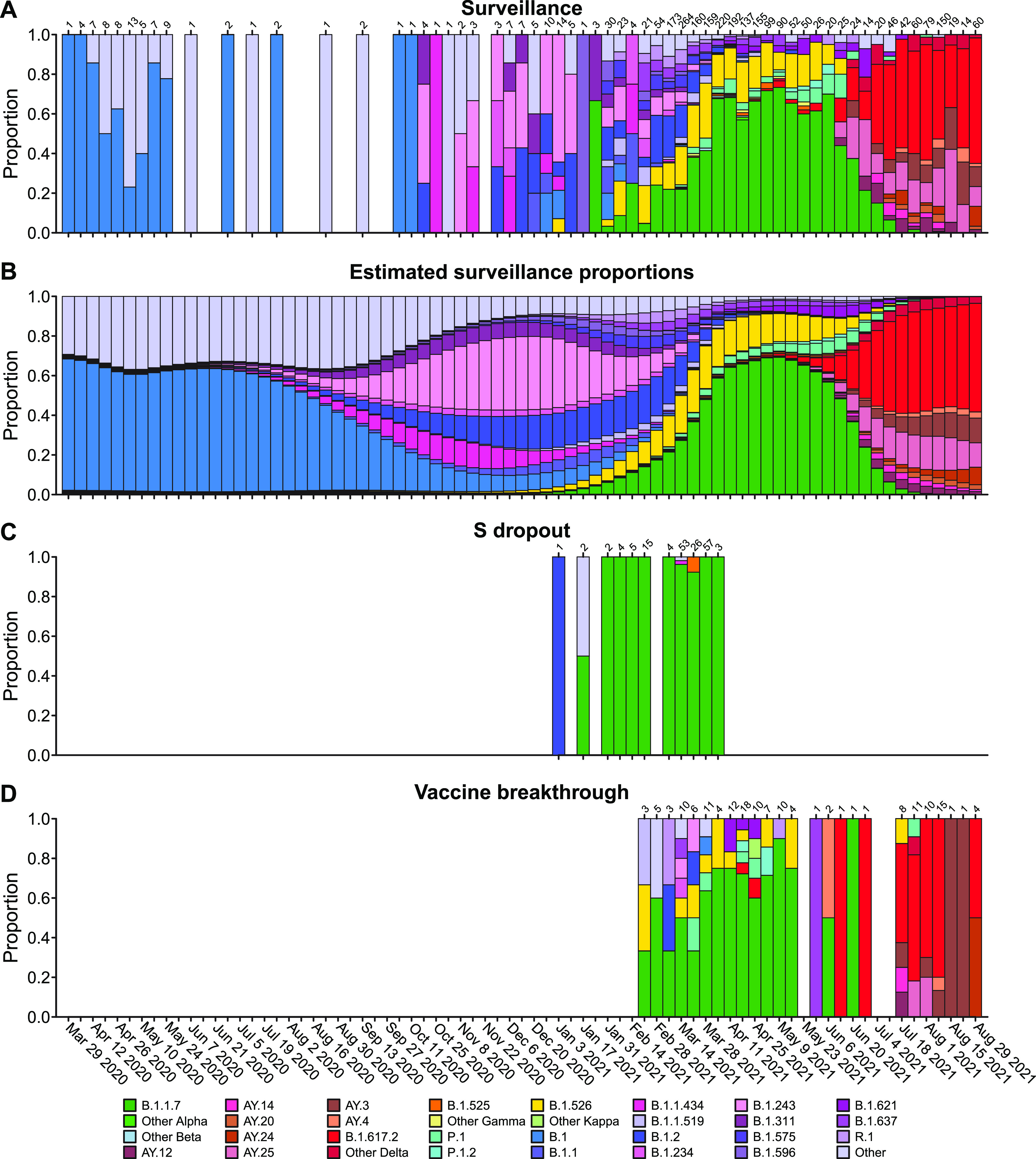
FIG 2.

Comparison of viral genome sequence data from surveillance samples (A, B) to spike target gene failures (C) and vaccine breakthrough samples (D). (A) Longitudinal stacked bar graph depicting the SARS-CoV-2 variants present in surveillance samples from the Delaware Valley, shown as the proportion of genomes classified as each variant lineage within each week. The numbers of genomes sampled each week are shown above the graph. Variants are colored according to the key at the bottom of the figure. (B) Markings are the same as in (A), but showing the proportions of variants estimated from the count data in (A) using Bayesian autoregressive moving average multinomial logistic regression. (C) Markings as in (A), but showing counts of spike target gene failures samples. (D) Markings as in (A), but showing the counts of vaccine breakthrough samples. Designation of lineages as variants of concern and variants being monitored is presented in Table S2. For vaccine breakthroughs, the time window compared was from the introduction of widespread vaccination (March 1, 2021) to the end of our sampling period (September 3, 2021).
