Abstract
Spatial transcriptomic technologies have been developed rapidly in recent years. The addition of spatial context to expression data holds the potential to revolutionize many fields in biology. However, the lack of computational tools remains a bottleneck that is preventing the broader utilization of these technologies. Recently, we have developed Giotto as a comprehensive, generally-applicable, and user-friendly toolbox for spatial transcriptomic data analysis and visualization. Giotto implements a rich set of algorithms to enable robust spatial data analysis. To help users get familiar with the Giotto environment and apply it effectively in analyzing new datasets, we will describe the detailed protocols for applying Giotto without any advanced programming skills.
Keywords: Spatial transcriptomics, software, single cell, cell-cell interaction, cell-type, deconvolution
Introduction
Multicellular organisms consist of diverse cell types that act concertedly to maintain the structure and function of tissues and organs. The anatomic structure of a tissue or organ is highly organized and often conserved across species, suggesting the spatial distribution of cell types may be essential for the maintenance of tissue functions. Disruption of the tissue microenvironment has been observed in numerous human diseases and its role in etiology is beginning to be recognized (Hanahan and Weinberg, 2011; Binnewies et al., 2018; Buckley et al., 2021; Bettcher et al., 2021). Recently, new technologies have rapidly emerged to dissect cellular composition while preserving spatial information. Collectively, these technologies are referred to as spatial transcriptomics and have been highlighted as the Method of the Year in 2020 by Nature Methods (Marx, 2021). Spatial transcriptomics has provided an unprecedented opportunity to dissect tissue microenvironment, elucidate cell-cell interaction mechanisms, and characterize heterogeneity among disease patients (Rao et al., 2021; Lewis et al., 2021; Longo et al., 2021). They have also been utilized by a number of consortia to create spatially resolved cell atlases in health and diseases (Regev et al., 2017; HuBMAP Consortium, 2019; Rozenblatt-Rosen et al., 2020; BRAIN Initiative Cell Census Network (BICCN), 2021).
Spatial transcriptomic analysis presents new challenges that require the development of novel computational tools (Dries et al., 2021a). On one hand, new methods are needed to address specific tasks, such as spatial pattern detection and cell-cell interaction identification. On the other hand, integrative tools are also needed to facilitate end-to-end data analysis by using state-of-the-art methods. To this end, we have developed a powerful software package, called Giotto, for comprehensive analysis and interactive visualization of spatial transcriptomic data (Dries et al., 2021b). In this paper, we describe the detailed protocols for using Giotto in various tasks, including 1) Getting Giotto set up for use; 2) Pre-processing; 3) Clustering and cell-type identification; 4) Cell-type enrichment and deconvolution analyses; 5) Spatial structure analysis tools; 6) Spatial domain detection by using a hidden Markov random field model; 7) Spatial proximity associated cell-cell interactions; and 8) Assembly of a registered 3D Giotto object from 2D slices. An accompanying github repository, including all the documented code used in this article and expanded R Markdown scripts, can also be found at https://github.com/drieslab/giotto_current_protocols. More information, tutorials and example datasets can be found on our Giotto website at https://rubd.github.io/Giotto_site/.
Data
Three main data types can be provided to the Giotto analysis pipeline. Two of these data types, a count matrix representing gene expression values and coordinates for the spatial locations, are required to run spatial transcriptomic analysis. This is sufficient to run all downstream analyses. Giotto can also be used to analyze scRNA-seq data, where only a gene expression matrix is needed, and the spatial location information is automatically filled by dummy values. In addition, a raw or processed image of the spatially profiled tissue can be provided. This image can then be used as a background and overlaid with the results obtained from the various spatial analyses to help interpret the results within the original tissue organization.
Expression count matrices should be provided to Giotto as shown in Figure 1, with genes as the row names and the spatial (cell) IDs as the column names. Spatial location data matrices (optional if running scRNA-seq data) should be provided as shown, with plotting coordinate X values in the first column, Y values in the second, and Z values (optional) in the third. An additional column for cell IDs can also be included. Of note, the expression (column-wise) and spatial data (row-wise) must be given in the same order, as demonstrated by how the spatial cell_ID column matches the column names of the expression matrix.
Figure 1:

An example of the input matrices for Giotto. a) Subset of dataset used in this analysis demonstrating the format necessary for the expression matrix. b) Subset of dataset used in this analysis demonstrating the format necessary for the spatial locations matrix.
In addition, images can be provided as an additional input that can provide helpful visual context when overlaid with information obtained from the spatial transcriptomic data. Any type of image (H&E, IF, FISH, etc) can be added and individually selected by name with each spatial plotting command in Giotto. They can be provided in any raster-based format, including .jpg, .png, or .tiff files.
To ensure that images and spatial locations are properly aligned it is typically required to multiply the y-values from the spatial locations by −1 as we did for this example (Figure 1b). This is due to differences between the coordinate system of an image and an R plotting canvas, where the (0,0) origin is typically top-left and bottom-left, respectively.
Protocols
To increase readability, names of commands, functions or parameters are formatted with a different font and light gray background, e.g., exampleFunction. The following protocols are all run in R/Rstudio, unless stated otherwise. Of note, additional questions for help or issues can be posted on our github issues page (https://github.com/RubD/Giotto/issues) and instructions on how to submit a GitHub issue for Giotto can be found at https://rubd.github.io/Giotto_site/articles/github_issues.html.
Basic Protocol 1: Getting Giotto set up for use
In this protocol, we explain the system and environment prerequisites necessary for Giotto installation as well as the creation of a Giotto object. Briefly, Giotto is an R package that can be downloaded and easily installed on most commonly used operating systems. The core of Giotto is an S4 object class (giotto). The created giotto objects facilitate the storage and analysis of spatial transcriptomic data. A giotto object contains multiple slots that can be broadly organized into three categories (Figure 2). The first category includes slots that store data input and general metadata, containing expression matrices (gene by cell) and corresponding data frames with information about the cells and genes. The second category of slots relates to where the cells are in physical space and what spatial neighborhoods they form. The images slot containing raw image data used to overlay outputs for concurrent visualization can also be found here. The third category is concerned with where the cells are in the expression space and analyses and abstract visualizations built thereupon.
Figure 2:
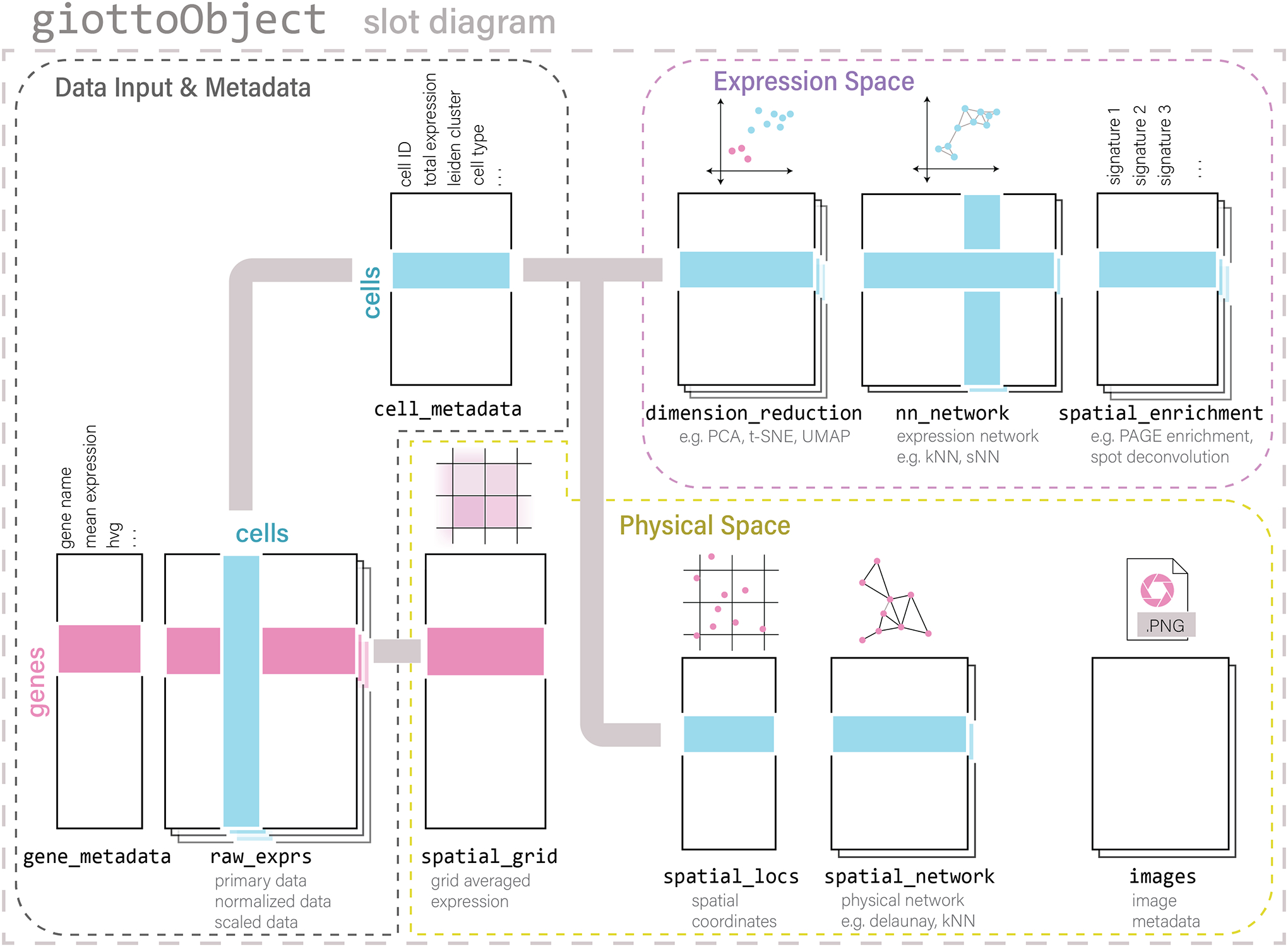
Schematic of the Giotto object and its core components that are used to create a spatial analysis framework.
Necessary Resources
Hardware Requirement
The minimum requirements to run the different protocols are:
4-core Intel or AMD processor (or equivalent)
4GB RAM (8+ recommended)
250GB free disk space
Operating Systems: Windows / Linux / Mac
Mac users will need to have a working version of Xcode, which can be installed with the following command in the terminal:
> xcode-select --install
Software
R (version ≥ 3.5.1); download and installation instructions: https://www.r-project.org/
Rstudio; download and installation instructions: https://www.rstudio.com/products/rstudio/download/. Rstudio is an integrated development environment (IDE) for R and it can be launched like any other application on your machine. We recommend this tool for novice R users.
Python (version ≥ 3.6); download and installation instructions https://www.python.org/downloads/
Fiji (version ≥ 2.3.0/1.53m); download and installation instructions https://imagej.net/software/fiji/downloads. Only required for supplemental protocol.
Files
The following protocols use data from (Ji et al., 2020), found under Gene Expression Omnibus (GEO): GSE144240. This study aims to characterize the cell type composition and architecture of human cutaneous squamous cell carcinoma and utilizes a number of high-throughput omics technologies, including single-cell RNA sequencing (scRNA-seq), whole exome sequencing (WES), and methods to detect transcripts or proteins in a spatially aware manner. Briefly, cancerous and normal skin samples were collected from 10 patients for scRNA-seq and prepared using the 10X Genomics Chromium platform. In parallel, select tissue areas were also used to create WES and spatial data, more specifically Spatial Transcriptomics (ST) and 10x Visium were applied on fresh-frozen subsets and multiplexed ion beam imaging (MIBI) was performed on formalin-fixed tissues. For the purpose of this protocol paper, we only used scRNA-seq (both normal and tumor) and ST data from slices of patient 2. Furthermore, slice 2 was used for all 2D-based analyses and visualizations, and this section is 10μm thick with individual spatial spots that are 110μm in diameter with a center-to-center distance of 150μm. For the 3D based analysis, we stacked all three spatial transcriptomic slices of patient 2.
Protocol steps and annotations
1. Installation
Giotto can be installed directly from GitHub (https://github.com/RubD/Giotto) using the following code. After installation, it is necessary to load the package in R.
install.packages(“remotes”)
remotes::install_github(“RubD/Giotto”)
library(Giotto)
2. Environment Setup
Giotto requires the installation of several Python packages to run all of the available analyses. When you run the command installGiottoEnvironment(), a miniconda environment that contains all the required python modules will be installed.
The following is a demonstration of how to install a miniconda environment with Giotto:
installGiottoEnvironment()
This command only needs to be run once and in subsequent R-sessions, Giotto will automatically detect the installed Giotto miniconda environment and use that unless instructed otherwise. For example, if you always choose to direct Giotto to your own preferred python path, you will need to manually install all the necessary packages with pip or anaconda:
pandas (1.1.5)
python-igraph (0.9.6)
networkx (2.6.3)
python-louvain (0.15)
leidenalg (0.8.7)
scikit-learn (0.24.2)
smfishHmrf
Due to differences in python module versions between your manual python environment and the Giotto miniconda environment, slight differences in the subsequent downstream spatial analyses might be observed. We have provided the current version numbers above, but in the event that anything has been updated, the exact module versions can be found on the help page of installGiottoEnvironment() using the command help(“installGiottoEnvironment”).
3. Downloading Dataset
Once you have installed the Giotto package you can simply download the data directly to your own preferred directory using the getSpatialDataset() function as illustrated below. The datasets can also be found on our GitHub (https://github.com/RubD/spatial-datasets/tree/master/data/2020_ST_SCC). This command is a convenience function that allows users to directly download a number of different datasets, obtained from various technologies, to test and learn to work with the different Giotto workflows. Here we assigned our data directory path to the variable data_dir. All necessary files can be directly accessed from that location as illustrated in our example code.
data_directory <- “~/ST_SCC_data”
save_directory <- “~/save_dir”
# Download data
getSpatialDataset(dataset = “ST_SCC”, directory = data_directory, method = “wget”)
4. Creating A Giotto Object
Before creating a Giotto object, we can create specific instructions for our Giotto analysis workflow. Although this step is optional, it allows to specify the default behavior of the Giotto pipeline, including which python path to use and how figures will be saved and displayed automatically. For example, by setting both show_plot and return_plot to FALSE and only directly saving the plots to your designated directory by setting save_plot to TRUE, we can eliminate long plotting times caused by large spatial datasets.
my_instructions <- createGiottoInstructions(save_plot = TRUE,
                                            show_plot = TRUE,
                                            return_plot = FALSE,
                                            save_dir = save_directory)
After your instructions are set up, you can proceed to creating your Giotto object. The only necessary input is a set of feature data, such as gene expression data, and spatial locations. An additional image may be provided as shown in the next step. Of note, scRNA-seq data can also be processed and analyzed with Giotto in which case you only need to provide the feature data.
my_giotto_object <- createGiottoObject(raw_exprs=paste0(data_directory,
                                                        “/P2_2_expression.csv”),
                                       spatial_locs=paste0(data_directory,
                                                        “/P2_2_spatial_locs.csv”),
                                       instructions=my_instructions)
Giotto has built-in functions to easily access slots such as cell or gene metadata with the functions pDataDT() and fDataDT(), respectively.
pDataDT(my_giotto_object)
fDataDT(my_giotto_object)
If there are one or multiple images to associate with spatial data, then you can load them in as a giottoImage object. For purposes of initializing the alignment of image to spatial data, you can point to the Giotto object which already contains your spatial locations with the gobject argument. GiottoImage(s) are then assigned to the Giotto object as a list.
my_giotto_image <- createGiottoImage(gobject = my_giotto_object,
                                     mg_object = paste0(data_directory,
                                                        “/P2_2_0.0625.jpg”))
my_giotto_object <- addGiottoImage(gobject = my_giotto_object,
                                   images = list(my_giotto_image))
If both expression and image data are available, it is often informative to overlay the information together in data visualization.
spatPlot2D(gobject = my_giotto_object,
           show_image = TRUE,
           point_alpha = 0.5)
However, as indicated in Figure 3a, the images and expression data may not align correctly without adjustment. Giotto provides the function updateGiottoImage() for alignment adjustment. By default, images are stretched to cover as much space as the spatial locations do, and this is often not enough since images tend to be larger than capture regions. Adjustments increase the scaling of the picture in terms of distance away from the largest or smallest x or y spatial location value (Figure 4). For datasets obtained through the commercially available Visium kit users can directly use the function createGiottoVisiumObject(), which will automatically extract all necessary information from the visium folder and rescale the image according to the Visium provided scaling factors.
Figure 3:

Spatial location data overlaid on a staining image of tissue (a) before and (b) after the Giotto image is scaled and updated.
Figure 4:
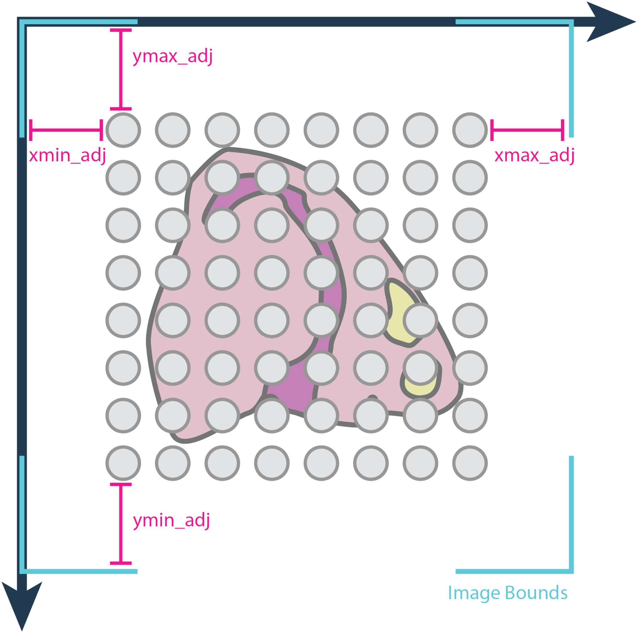
Spatial location data portrayed as gray spots are overlaid on a staining image of the tissue. By default, the image is stretched to cover as much space as the spatial extents, but if this is inaccurate, adjustment values can be used to adjust where the image bounds (in teal) should be.
Giotto also provides the functionality to automatically align the image properly if the user knows the scale factor of the image relative to the spatial locations. This will be demonstrated as an alternative in the associated R Markdown. For the purposes of this paper, we show how to adjust and scale the image manually with Giotto. The following code can be used to view the image after proper alignment (Figure 3b).
my_giotto_object <- updateGiottoImage(gobject = my_giotto_object,
                                      image_name = “image”,
                                      xmax_adj = 4857.2,
                                      xmin_adj = 3441.1,
                                      ymax_adj = 2146.7,
                                      ymin_adj = 5302.5)

spatPlot2D(gobject = my_giotto_object,
           show_image = TRUE,
           point_alpha = 0.5)
Basic Protocol 2: Pre-processing
The first pre-processing step we will discuss is filtering. Filtering input expression data is achieved through the removal of low-quality cells and/or lowly-expressed genes and is necessary to reduce data noise. Giotto implements gene filtering through expression thresholds and cell filtering based on the number of cells a given gene is detected in and the total number of genes detected per cell.
Following the filtering step, Giotto normalizes the filtered data for sequencing depth so that the results can be appropriately compared. Giotto offers a standard, but adaptable, method of normalization, which involves library size normalization and scaling, log transformation, and z-scoring by genes and/or cells. In addition, Giotto implements the normalization approach used in the osmFISH paper (Codeluppi et al., 2018). Next, gene and cell statistics can be generated. This may be useful for further exploratory data analysis (EDA) in combination with additional biological or study design information. For example, we can account for and reduce experimental artifacts or known technical factors, such as batch effects or the percentage of mitochondrial gene content within each cell.
Necessary Resources
See Basic Protocol 1
Protocol steps and annotations
1. Filtering
After creating your Giotto object, you can filter your expression data in several ways including expression threshold, minimum number of cells a gene is detected in, and minimum number of genes expressed per cell. To assess how many cells/spots or genes should be filtered out, the following function will create a visualization (Figure 5) demonstrating the number of observations that may be lost based on various filtering combinations.
Figure 5:
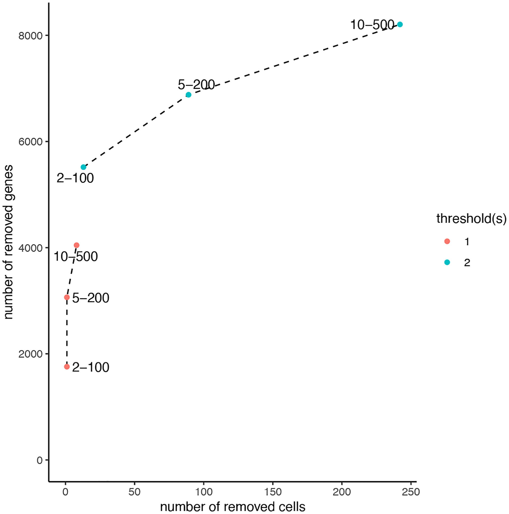
Effect of different choices of expression filtration combinations. The legend on the right-hand side denotes the minimum expression threshold, while each point on the plot represents the combinations of the minimum number of cells a gene is detected in and the minimum number of genes a cell detects. The x-axis demonstrates the number of cells that would be removed while the y-axis demonstrates the number of genes that would be removed.
filterCombinations(gobject = my_giotto_object,
                   expression_thresholds = c(1, 2),
                   gene_det_in_min_cells = c(2, 5, 10),
                   min_det_genes_per_cell = c(100, 200, 500))
Based on the above plot as well as printed output, you can select the appropriate combination and apply this choice to your Giotto object. The following function will filter out based on your selected parameters.
my_giotto_object <- filterGiotto(gobject = my_giotto_object,
                                 expression_threshold = 2,
                                 gene_det_in_min_cells = 2,
                                 min_det_genes_per_cell = 100)
2. Normalization
Following data filtration, we will apply our normalization steps. Out of the normalization options described in the introduction (standard and the method displayed by Codeluppi et al., 2018), we will use a standard method of normalization for this example. You can also choose whether you will scale genes or cells first, but the default, and the method we will use, is to scale genes first.
my_giotto_object <- normalizeGiotto(gobject = my_giotto_object,
                                    norm_methods = “standard”,
                                    scalefactor = 6000,
                                    scale_order = “first_genes”)
3. Statistics
You can also view some summary statistics of your data. Giotto offers the following insights.
Gene statistics:
nr_cells: number of cells the gene is detected in
per_cells: percentage of cells the gene is detected in
total_expr: total sum of gene expression in all cells
mean_expr: average gene expression in all cells
mean_expr_det: average gene expression in cells with detectable levels of the gene
Cell statistics:
nr_genes: how many genes are detected in the cell
perc_genes: percentage of genes detected per cell
total_expr: total sum of gene expression per cell
my_giotto_object <- addStatistics(gobject = my_giotto_object)
We can use the following code to view the summary statistics for gene metadata (Figure 6a) and cell metadata (Figure 6b), respectively.
Figure 6:

Summary statistics for gene metadata. a) A subset of the gene metadata data.frame contained in the Giotto object, which consists of the following: number of cells the gene is expressed, percentage of cells that express the gene, total gene expression, average gene expression, and average expression detected. b) A subset of the cell metadata data.frame contained in the Giotto object, which consists of the following: number of genes expressed in each cell, percentage of genes, and total gene expression per cell.
# view gene and cell stats respectively
head(fDataDT(my_giotto_object))
head(pDataDT(my_giotto_object))
To account for batch effects or technological covariates, you can use the function adjustGiottoMatrix().
For example, we can calculate the percentage of mitochondrial content per spot by using the following code.
mitochondrial_genes = grep(‘MT-’, my_giotto_object@gene_ID, value = T)
my_giotto_object = addGenesPerc(gobject = my_giotto_object,
                                genes = mitochondrial_genes, vector_name = ‘mito’)
We can also visualize both the number of genes per spot (Figure 7a) as well as the mitochondrial percentage per spot (Figure 7b).
Figure 7:
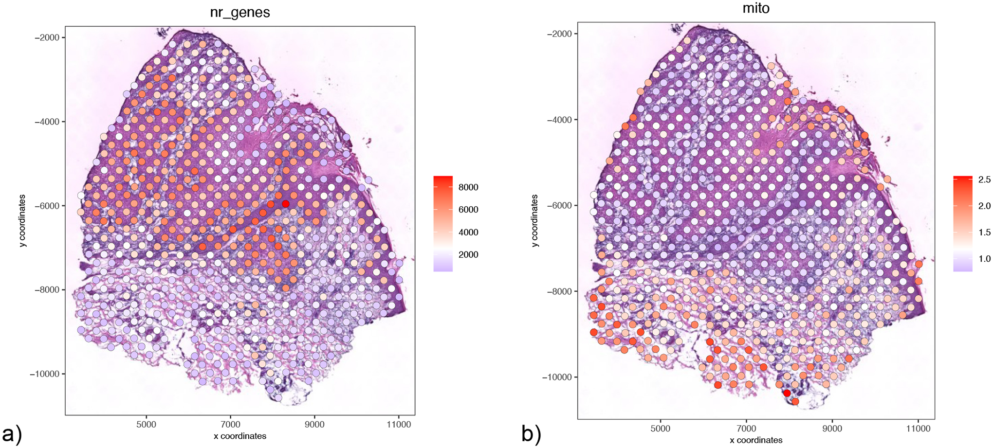
Visualization/exploration of potential technical confounding factors. a) Spatial plot representing number of genes per spot. b) Spatial plot representing mitochondrial percentage per spot.
# number of genes
spatPlot2D(gobject = my_giotto_object,
           show_image = TRUE,
           point_alpha = 1,
           point_size = 5,
           cell_color = ‘nr_genes’, color_as_factor = F)

# mitochondrial content percentage
spatPlot2D(gobject = my_giotto_object,
           show_image = TRUE,
           point_alpha = 1,
           point_size = 5,
           cell_color = ‘mito’, color_as_factor = F)
To adjust our matrix to account for these technical confounders, we can run the following code. The user can choose which expression slot to update, e.g., the ‘custom’ expression slot, which could then be selected and used in subsequent downstream analysis by specifying the expression_values parameter.
my_giotto_object <- adjustGiottoMatrix(gobject = my_giotto_object,
                                       covariate_columns = c(‘nr_genes’, ‘mito’),
                                       update_slot = ‘custom’)
Basic Protocol 3: Clustering and cell-type identification
In this protocol, we will discuss how unsupervised clustering analysis is implemented in Giotto to identify cell types and how those results can be utilized in downstream analyses. Before running a clustering analysis, it is typically advised to perform feature selection to retain the most informative genes in order to optimize the signal-to-noise ratio. This can be achieved by calculating highly variable genes (HVGs). Giotto currently implements two commonly used methods for HVG identification. The default method uses coefficients of variation (cov) groups. Genes are grouped into equal-sized bins (with a default of 20) and a cov for each gene is calculated and converted to a z-score per bin. Genes that have a z-score above the set threshold (default of 1.5) are considered as highly variable. The alternate method for identifying HVGs is using a Loess regression model, which predicts expected cov using log-normalized expression values. Genes that have significantly higher cov than predicted by the model are considered to be highly variable.
Due to the high dimensionality of spatial transcriptomic data, dimensionality reduction is a commonly used step to aid data analysis and visualization. Giotto implements a number of common approaches for dimensionality reduction. The simplest approach is principal component analysis (PCA), which is a linear projection of the data to directions associated with the highest variance. The results of which can be visualized through either a Scree (“elbow”) plot or a jackstraw plot to determine the number of significant principal components (Chung, 2020). On the other hand, the linear assumption underlying PCA is often too restricted and does not represent the full complexity of all cells. To overcome these limitations, more sophisticated dimensionality reduction methods have been developed to account for nonlinearity. Giotto implements two widely used nonlinear methods: t-distributed stochastic neighbor embedding (t-SNE) (van der Maaten and Hinton, 2008) and Uniform Manifold Approximation and Projection (UMAP) (Becht et al., 2018).
Following identification of HVGs and dimensionality reduction, we can begin the clustering process. Giotto implements four commonly used clustering algorithms: k-means, hierarchical clustering, (Traag et al., 2019) Louvain community detection (Blondel et al., 2008), and Leiden clustering (Traag et al., 2019). The latter two are graph-based methods and more routinely used in single-cell and spatial analyses. In order to apply these methods, a shared or k-nearest neighbor network is created in advance. This can be achieved by using either the pre-processed expression values or the outcome of dimensionality reduction analysis. For proper biological interpretation, manual identification is often needed to annotate cell types based on the clustering results. Sometimes this involves additional processing such as iterative clustering or merging of similar clusters.
To aid biological interpretation, it is important to identify marker genes that discriminate between different clusters/cell-types. Giotto implements three established algorithms to detect differentially expressed genes (DEGs). Scran (Lun et al., 2016) performs pairwise t-tests between each cluster and then combines and compares the results to determine which genes are statistically significantly upregulated. MAST (Finak et al., 2015) implements the hurdle model, which first identifies whether a gene is expressed, and if so, whether the expression level exceeds a defined “hurdle” value. The Gini-coefficient method (Jiang et al., 2016) ranks genes based on the Gini coefficient and selects the top genes, adjusted by background removal, as cell-type specific markers.
Necessary Resources
See Basic Protocol 1
Protocol steps and annotations
1. Feature Selection
Following pre-processing, we can start our clustering process with feature selection. We will use Giotto to calculate and visualize highly variable genes (HVGs). As mentioned above, Giotto has two available methods for identifying such genes: coefficient of variation (cov) groups and Loess regression. For this demonstration, we will use the cov groups method (also the default). Following analysis, Giotto displays a plot demonstrating the distribution of HVGs (Figure 8).
Figure 8:
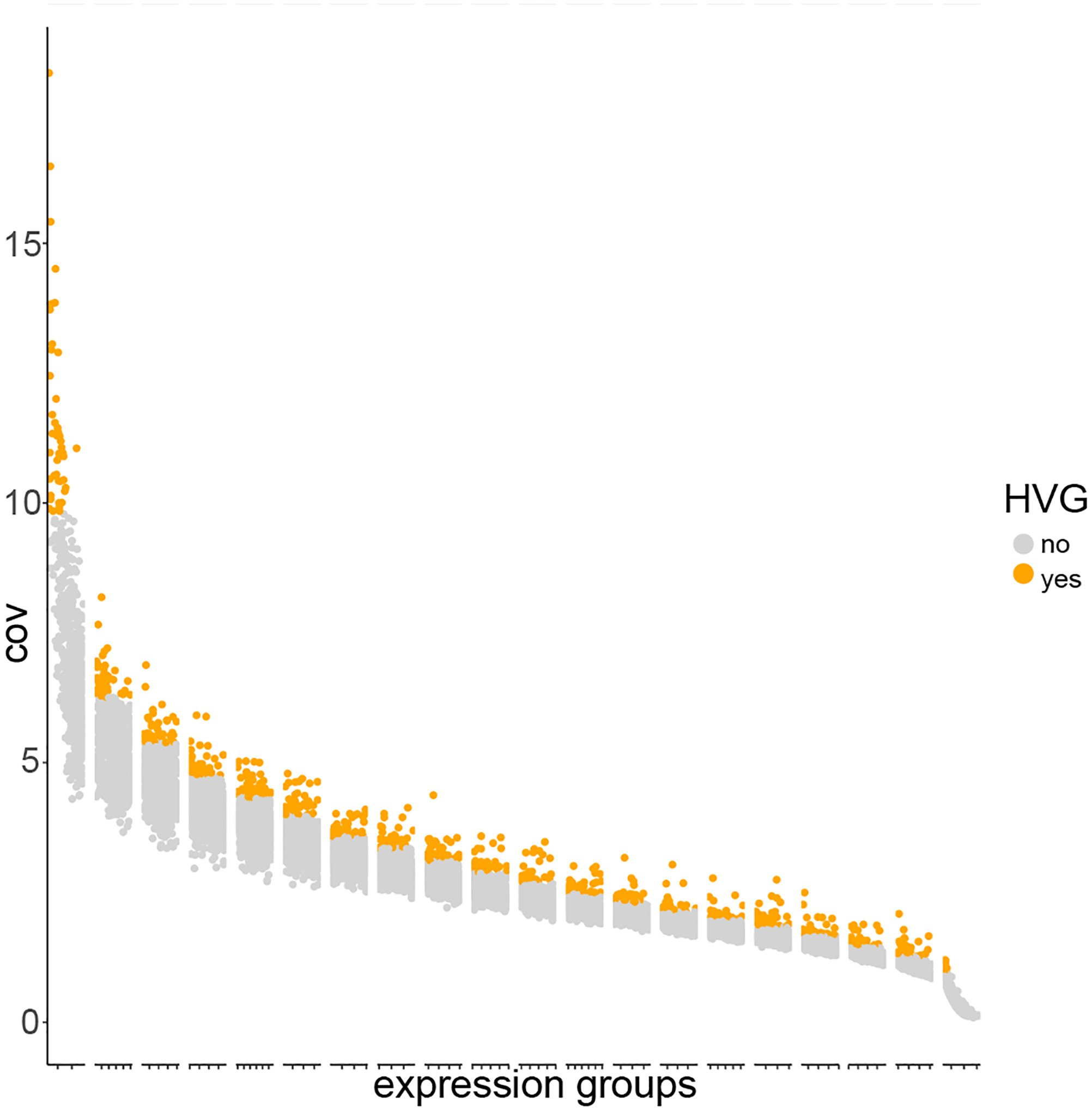
The distribution of HVGs across the binned groups. Each identified HVG is indicated by an orange dot.
my_giotto_object <- calculateHVG(gobject = my_giotto_object,
                                 expression_values = “normalized”,
                                 method = “cov_groups”,
                                 nr_expression_groups = 20,
                                 zscore_threshold = 1.5)
2. Dimensionality Reduction
Following HVG identification, we will run dimensionality reduction. First, we will run a linear analysis: principal component analysis (PCA). As you can see in the following code block, we have specified that we will use HVGs for this analysis.
my_giotto_object <- runPCA(gobject = my_giotto_object,
                           expression_values = “normalized”,
                           genes_to_use = “hvg”)
We can now visualize our data (Figure 9) following dimensionality reduction using the following code.
Figure 9:
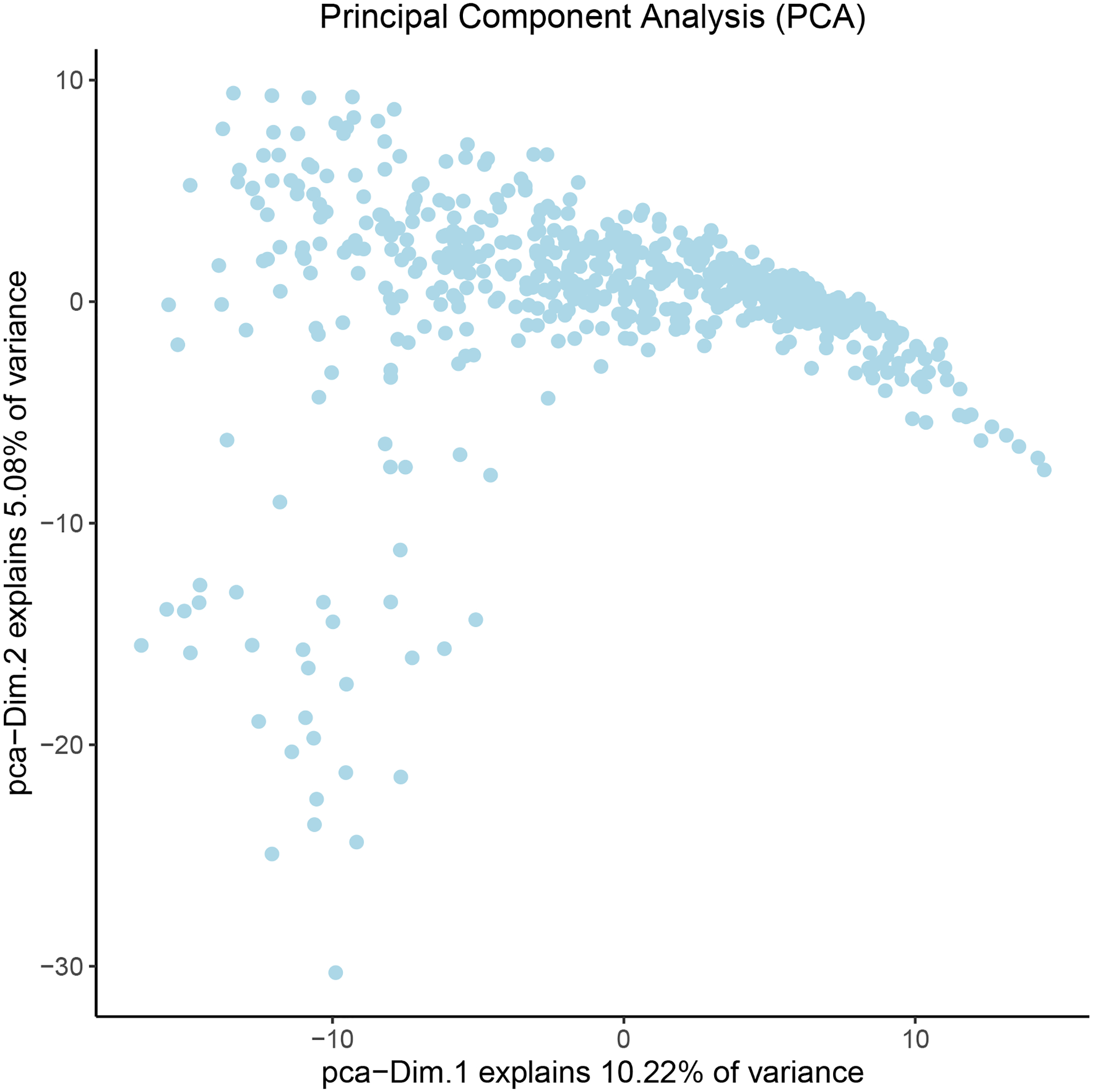
Visualization of the principal component analysis results. Each dot represents the reduced-dimension gene expression pattern associated with a ST data point. The top two dimensions are shown for visualization. The percentage of total variance explained by each dimension is indicated in the x- and y-axis labels.
plotPCA(gobject = my_giotto_object)
After PCA has been run, we can visualize our results with a Scree plot (Figure 10) to identify which principal components to use in downstream analyses.
Figure 10:
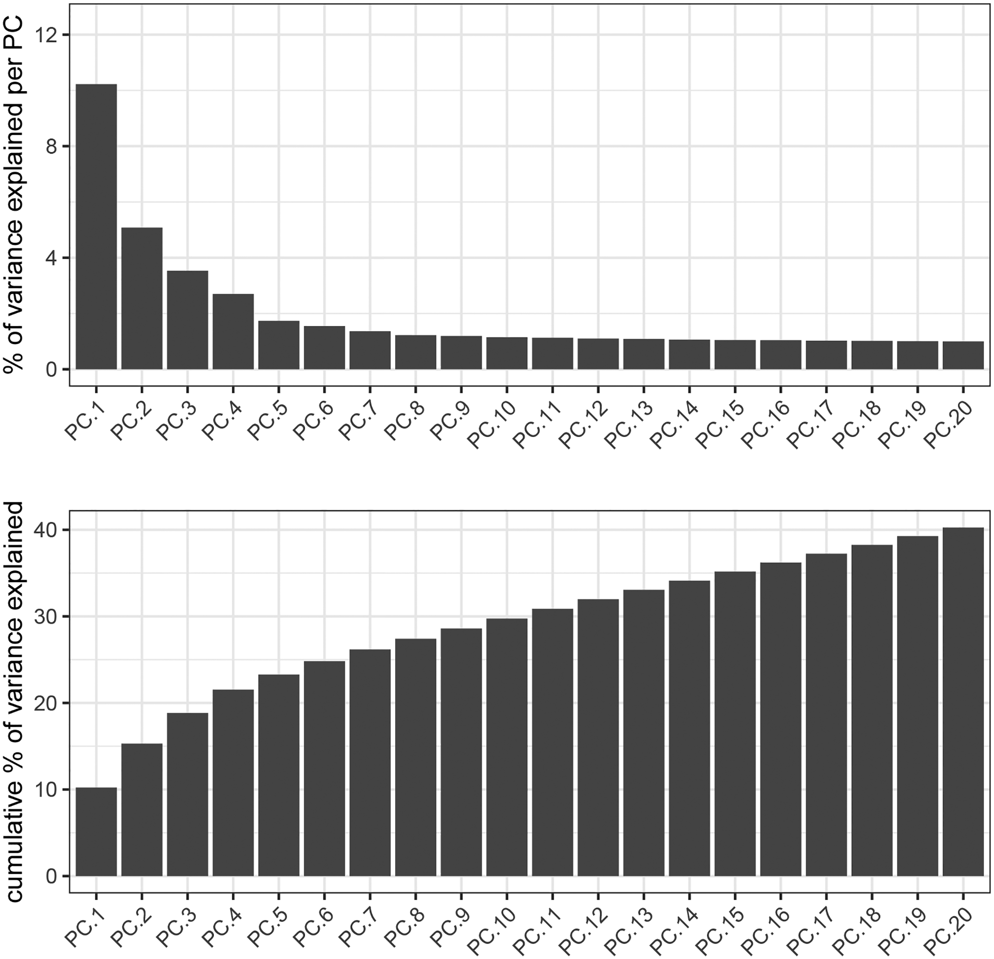
Scree plot demonstrating the amount of explained variance from each principal component. The top plot shows the individual percentage of explained variance, while the bottom plot shows the cumulative percentage of explained variance.
screePlot(gobject = my_giotto_object,
          expression_values = “normalized”,
          genes_to_use = “hvg”,
          ncp = 20,
          ylim = c(0, 12.5))
To use a less restrained method of dimensionality reduction, we can use a non-linear analysis. In this example, we will use Uniform Manifold Approximation Projection (UMAP). These results can be visualized with a scatter plot (Figure 11).
Figure 11:
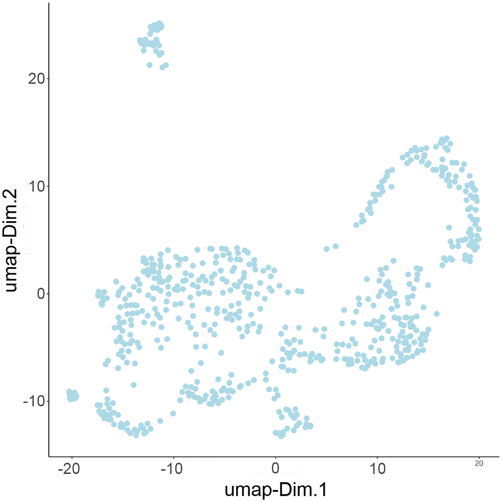
UMAP plot showing the results distributed across two dimensions.
My_giotto_object <- runUMAP(gobject = my_giotto_object,
                            dimensions_to_use = 1:10,
                            n_components = 2)
# to plot our umap:
plotUMAP(my_giotto_object)
Clustering
3. Creating a gene-expression-based nearest network:
Before running a clustering algorithm, we will create a nearest network based on gene expression similarities. For this example, we will be creating a shared nearest network (sNN).
my_giotto_object <- createNearestNetwork(gobject = my_giotto_object,
                                         dimensions_to_use = 1:10)
4. Clustering algorithms:
Now we can run our clustering analysis. For this example, we will use Leiden clustering with the sNN that we previously created.
my_giotto_object <- doLeidenCluster(gobject = my_giotto_object,
                                    name = “leiden_clus”)
To visualize our clustering results (Figure 12), we can run the following:
Figure 12:
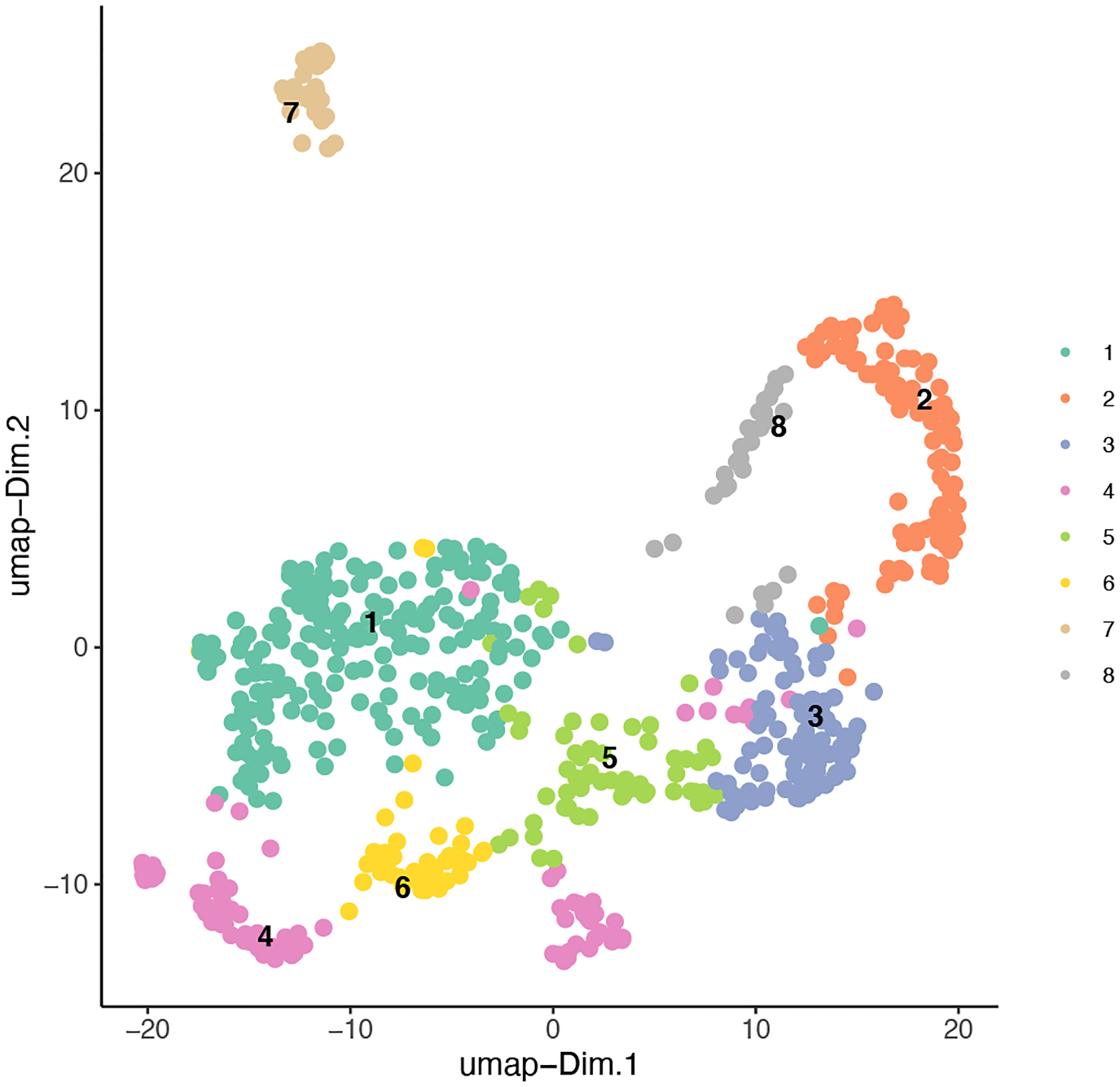
Clustering results combined with our UMAP plot to show the distinction between the identified classes across the two dimensions.
plotUMAP(gobject = my_giotto_object,
         cell_color = ‘leiden_clus’,
         point_size = 2)
5. Differentially Expressed Genes (DEGs):
Following clustering, we will interpret our results by finding differentially expressed genes (DEGs) between the identified Leiden clusters.
ST_scran_markers_subclusters = findMarkers_one_vs_all(gobject = my_giotto_object,
                                                   method = ‘scran’,
                                                   expression_values =‘normalized’,
                                                   cluster_column = ‘leiden_clus’)
Now we can use a heatmap (Figure 13) to visualize the correlation between the top selected marker genes and the identified Leiden clusters.
Figure 13:
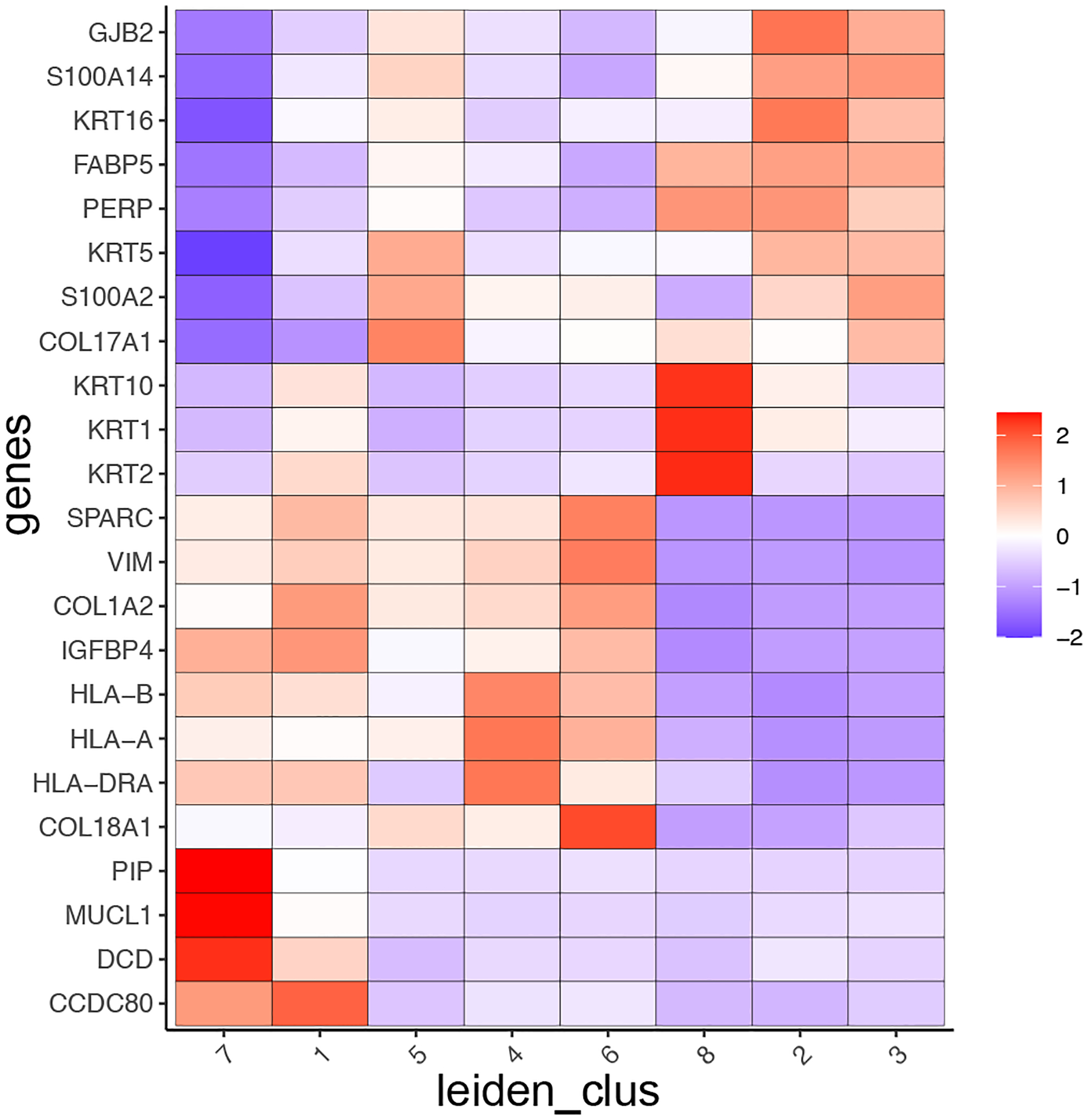
Heatmap demonstrating the correlation between selected marker genes and cell-type.
ST_top3genes = ST_scran_markers_subclusters[, head(.SD, 3), by = ‘cluster’]$genes

plotMetaDataHeatmap(gobject = my_giotto_object,
                    selected_genes = ST_top3genes,
                    metadata_cols = c(‘leiden_clus’))
This analysis indicates that several clusters show high expression for cell-type specific genes, such as genes from the Keratin family (e.g., KRT1, KRT2) or major histocompatibility complex (e.g., HLA-A, HLA-B), which correspond to epithelial and myeloid cell types, respectively. However, since each spot within a cluster is 110μm in diameter, it is likely that it covers multiple different cell types and that these results are skewed by the dominant cell type or very highly expressed genes within one cell type. To overcome this spot or cell annotation obstacle, we will integrate external scRNA-seq information (next Basic Protocol 4) to identify the present cell types more accurately within each spot at the single-cell level.
Basic Protocol 4: Cell-type enrichment and deconvolution analyses
In this protocol, we will provide an overview of Giotto’s functionalities to perform cell-type enrichment and deconvolution analyses by using external information from a matching single-cell RNA-seq data. For spatial transcriptomic datasets that do not have single-cell resolution, cell-type enrichment is a useful step to identify the spatial distribution of various cell types. Giotto implements three commonly used methods for cell-type enrichment. Parametric Analysis of Gene Set Enrichment (PAGE) calculates the z-score for gene sets based on fold changes and evaluates statistical significance based on the normal distribution assumption (Kim and Volsky, 2005). Rank enrichment creates a ranking-based statistic based on the degree of cell-type specificity. Hypergeometric enrichment utilizes the hypergeometric test to evaluate whether the expression levels of cell-type specific signature genes are high at each spatial location. A limitation of cell-type enrichment analysis is that it does not provide quantitative estimates of the relative proportion of different cell types at each location. This limitation is addressed by using cell-type deconvolution analysis. Giotto implements the SpatialDWLS algorithm (Dong and Yuan, 2021) for cell-type deconvolution, which combines cell-type enrichment analysis with a dampened weighted least squares (DWLS) algorithm (Tsoucas et al., 2019) previously developed for bulk RNAseq deconvolution from scRNA-seq data.
Necessary Resources
See Basic Protocol 1
Protocol steps and annotations
1. Implementation
To perform spatial cell-type enrichment or deconvolution, we will make use of the patient-matched scRNA-seq dataset. Here we already provide the processed data, which consist of the normalized count matrix, the identified cell type vector, and the associated marker genes per cell type cluster.
# normalized matrix
normalized_sc_matrix <- readRDS(paste0(data_directory,”/”, “normalized_sc_matrix.RDS”))

# cell type vector
cell_type_vector <- readRDS(paste0(data_directory,”/”, “cell_type_vector.RDS”))

# list of marker genes
sign_list <- readRDS(paste0(data_directory,”/”, “sign_list.RDS”))
Of note, these scRNA-seq results can be reproduced using Giotto or provided from another single-cell RNA-seq pipeline. More specifically, with Giotto this dataset can be processed by using the same steps as described above: normalization, dimensionality reduction, and clustering, in the same way as a spatial transcriptomic dataset, because none of these steps require spatial information. You would simply add the expression data file to the raw_exprs argument in createGiottoObject(), and dummy spatial locations will be created. For the exact code and more information on how this Giotto object was preprocessed, please see the attached R markdown (https://github.com/drieslab/giotto_current_protocols).
2. Cell-type Enrichment
We can now use the results from our previous clustering analyses to perform cell-type enrichment. Using our significant differentially expressed genes along with matched cell types found in the previous step, we can produce a signature matrix, which is binary.
# list of signature genes
PAGEsignMatrix <- makeSignMatrixPAGE(sign_names = names(sign_list),
                                      sign_list = sign_list)
After creating the above signature matrix, we can run Parametric Analysis of Gene set Enrichment (PAGE).
my_giotto_object <- runPAGEEnrich(gobject = my_giotto_object,
                                  sign_matrix = PAGEsignMatrix)
After the analysis is complete, we will visualize our results (Figure 14).
Figure 14:
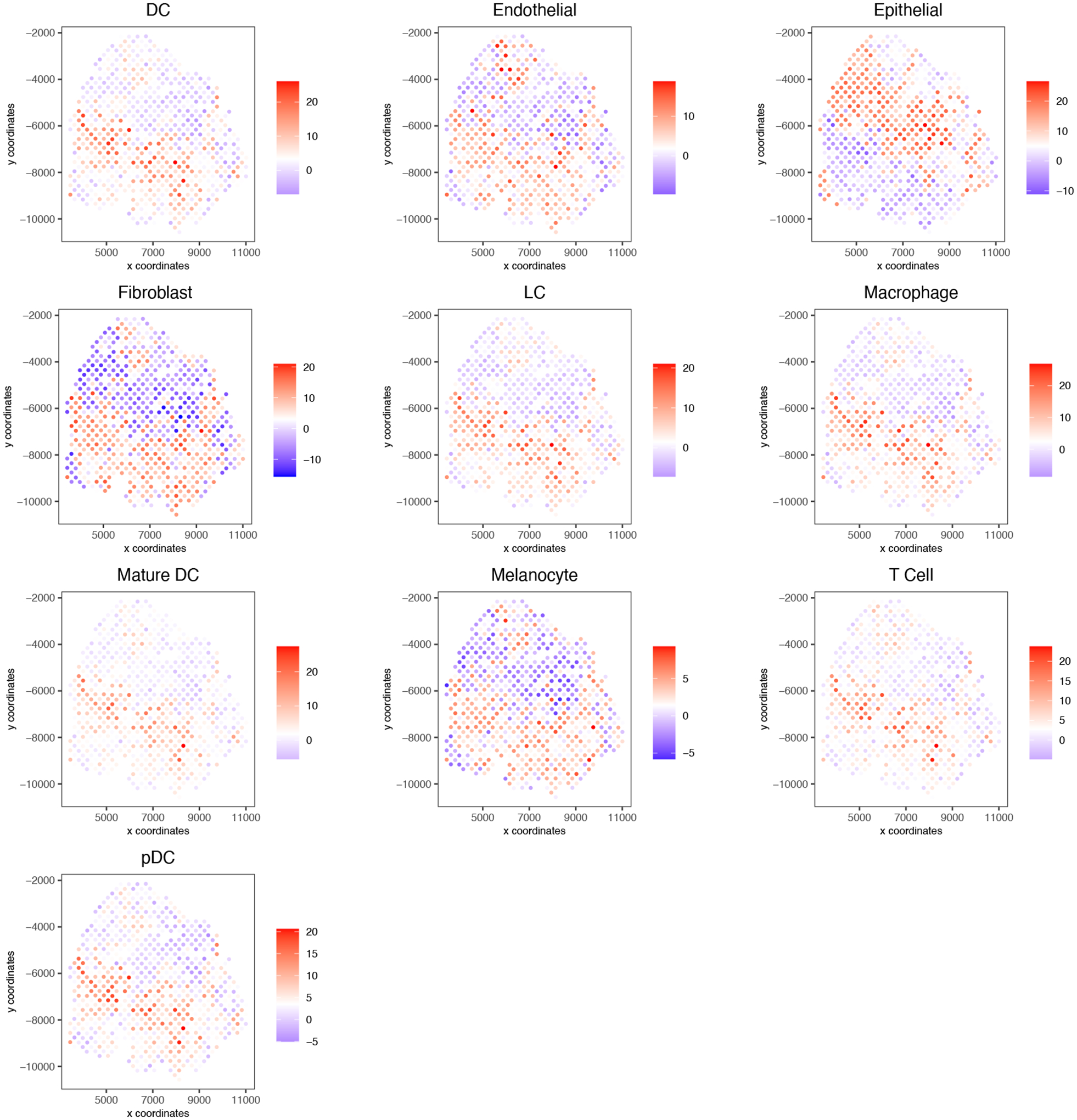
PAGE results demonstrating presence of cells at each spatial location.
cell_types_subset <- colnames(PAGEsignMatrix)
spatCellPlot(gobject = my_giotto_object,
             spat_enr_names = ‘PAGE’,
             cell_annotation_values = cell_types_subset,
             cow_n_col = 3, coord_fix_ratio = 1, point_size = 0.75,
             point_shape = “no_border”)
3. Spatial Cell-type Deconvolution
Next, we will perform spatial cell-type deconvolution using the spatialDWLS algorithm mentioned above. First, we will create a signature matrix specific to the spatialDWLS algorithms. The following function creates the signature matrix by calculating average gene expression for each signature gene in each cell/cell-type.
dwls_signature_matrix <- makeSignMatrixDWLSfromMatrix(matrix = normalized_sc_matrix,
                                                      sign_gene = unlist(sign_list),
                                                      cell_type_vector = cell_type_vector)
We will now use the signature matrix we created to run our spatialDWLS analysis.
my_giotto_object <- runDWLSDeconv(gobject = my_giotto_object,
                                  sign_matrix = dwls_signature_matrix)
We have also developed a function to easily visualize the proportions of cell-type per spot, shown by a spatial dot plot with pie charts at each of the locations. Below, we show the Giotto image of the sample slice with the spatialDWLS results overlaid (Figure 15). Each spot on the plot is a pie chart that represents the percentage of cell-types.
Figure 15:
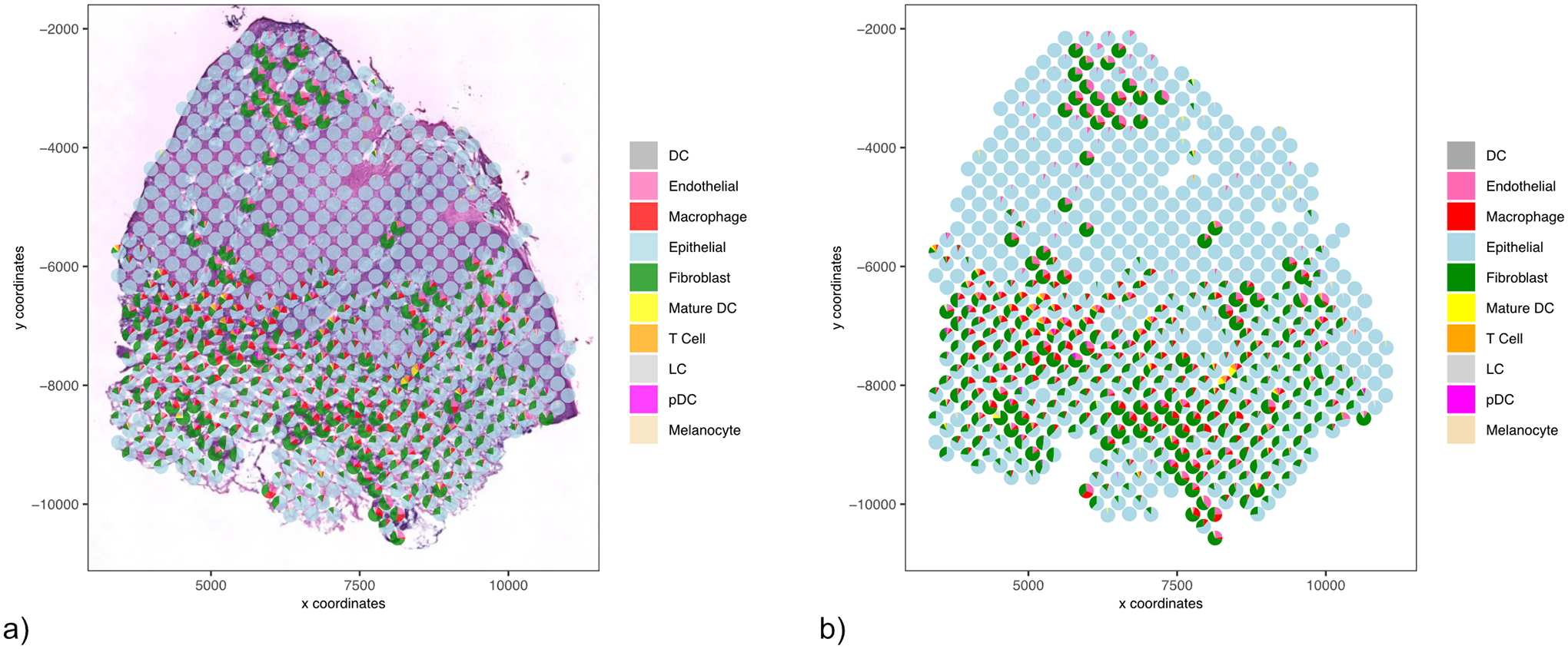
Results from the spatialDWLS analysis. Each pie chart demonstrates the cell-type percentage at each spot. a) overlaid on the H&E image b) pie charts displayed independently for easier interpretation.
colors <- c(‘darkgrey’, ‘hotpink’, ‘red’, ‘lightblue’, ‘green4’,
            ‘yellow’, ‘orange’, ‘lightgray’, ‘magenta’, ‘wheat’)
spatDeconvPlot(gobject = my_giotto_object,
               radius = 100,
               cell_color_code = colors,
               show_image = TRUE,
               return_plot = TRUE)
Basic Protocol 5: Spatial structure analysis tools
In this protocol, we will describe how to use Giotto to identify spatial relationships between cells and genes. Giotto provides a spatial network function based on the spatial proximity of cells. The default setting, a Delaunay network, utilizes a triangulation approach. Alternatively, the user can apply a k-nearest neighbor analysis by specifying the values of k (= number of neighbors) and search radius (= distance specific neighborhood). In addition, Giotto also implements a coarse-resolution representation of the data as a spatial grid, which can be useful for visualizing large-scale spatial structures. A spatial grid is created by subdividing the image fields into uniform squares, with user-defined resolution. The average gene expression profile within each square is reported.
Giotto also implements four methods for detecting spatial genes with coherent gene expression patterns, including Binary Spatial Extraction of Genes (binSpect) (Dries et al., 2021b), and three previously published methods: SpatialDE (Svensson et al., 2018), Trendsceek (Edsgärd et al., 2018), and SPARK (Sun et al., 2020). Further analysis can be done to group spatial genes into distinct modules based on spatial co-expression analysis. We found that the metagene corresponding to each module typically displays enhanced spatial patterns compared to individual genes.
Necessary Resources
See Basic Protocol 1
Protocol steps and annotations
1. Spatial Grid
To view a rough representation of the data, we will create and plot a spatial grid (Figure 16).
Figure 16:
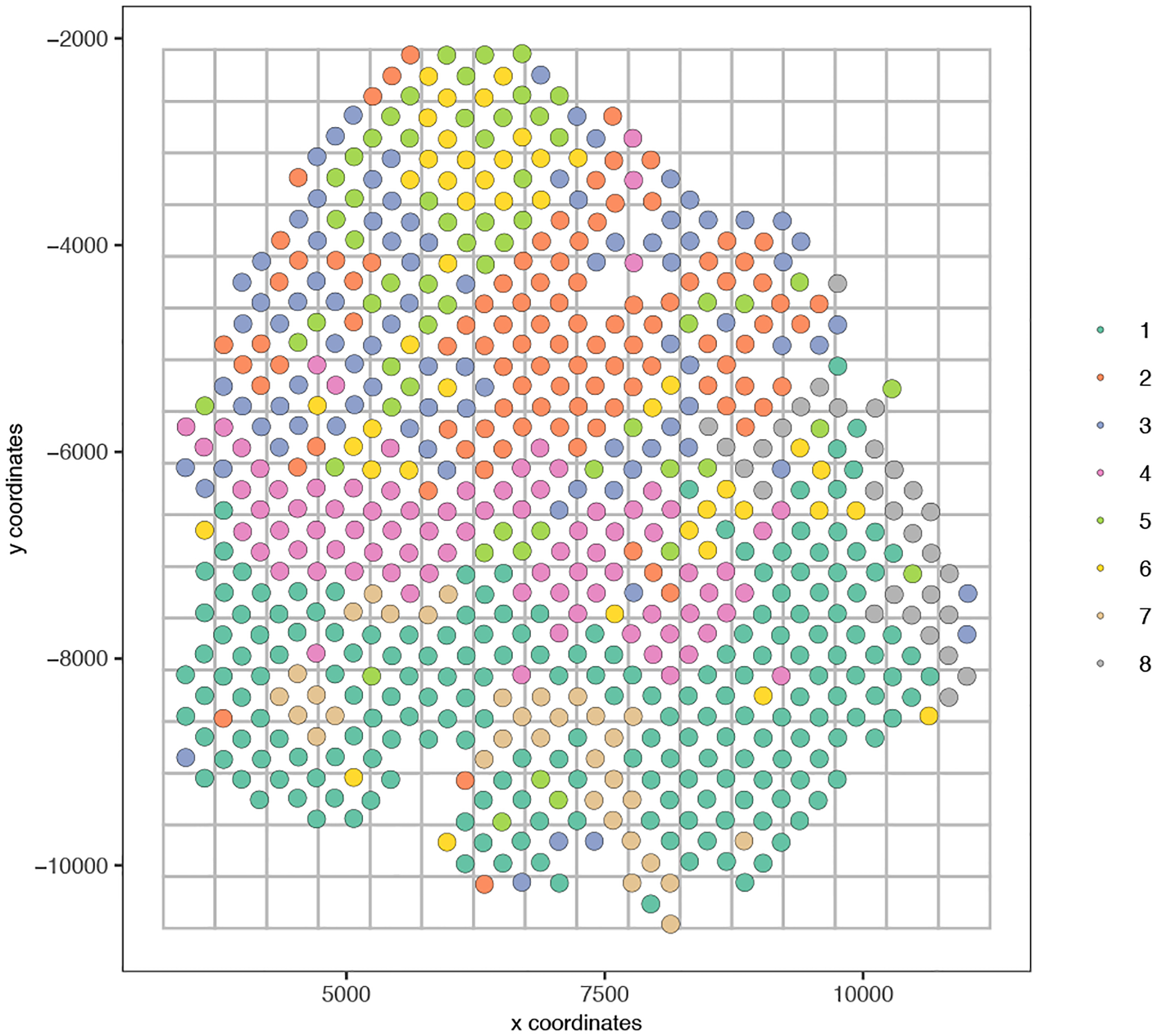
A spatial grid representing the average gene expression per box.
my_giotto_object <- createSpatialGrid(gobject = my_giotto_object,
                                      sdimx_stepsize = 500,
                                      sdimy_stepsize = 500,
                                      minimum_padding = 0)

# Visualize spatial grid
spatPlot(gobject = my_giotto_object,
         cell_color = ‘leiden_clus’,
         point_size = 4,
         show_grid = T,
         grid_color = ‘grey’,
         spatial_grid_name = ‘spatial_grid’)
2. Spatial Network
Prior to running spatial tissue composition, spatial gene expression analyses, as well as an HMRF analysis, we must create a spatial network, which provides spot resolution. In this example, we will use a Delaunay network. To assess network statistics for a Delaunay network, we can create the following plot (Figure 17).
Figure 17:
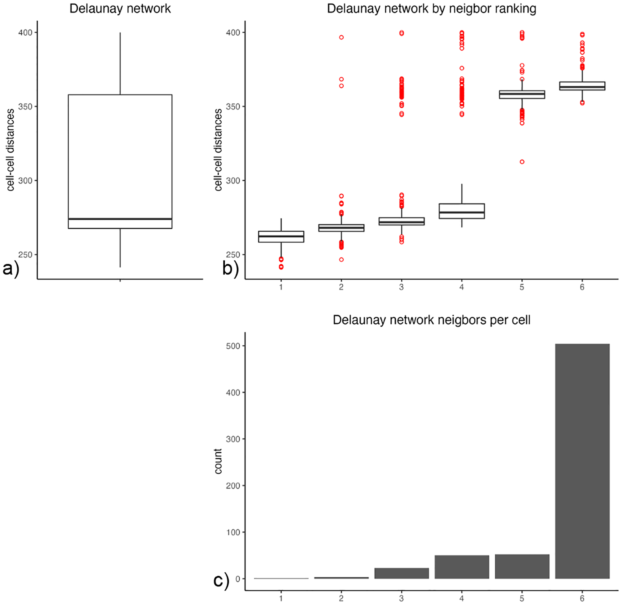
An overview of the network statistics for a Delaunay network. a) The distribution of cell-cell distances. b) The distribution of cell-cell distances based on neighbor ranking. c) The count of neighbors per cell.
plotStatDelaunayNetwork(gobject = my_giotto_object, maximum_distance = 400)
We can use the above plots to inform our parameter selection during network creation.
my_giotto_object <- createSpatialNetwork(gobject = my_giotto_object,
                                       minimum_k = 6,
                                       maximum_distance_delaunay = 350)
After creating the network, we will visualize our network (Figure 18a), with each spot labeled by cluster.
Figure 18:
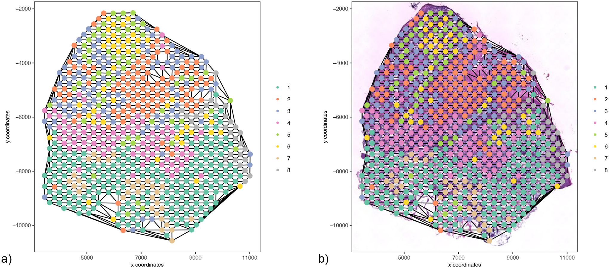
Visualization of the spatial network. a) A visual representation of a Delaunay network connecting each spot of our data. b) Delaunay network overlaid on an H&E stained image.
spatPlot(gobject = my_giotto_object,
         show_network = T,
         point_shape = “no_border”,
         network_color = ‘black’,
         spatial_network_name = ‘Delaunay_network’,
         point_size = 3,
         cell_color = “leiden_clus”,
         coord_fix_ratio = 1)
The results can be also overlaid with image information (Figure 18b).
3. Spatial Gene Expression Patterns
In the following example, we will use binSpect to analyze spatially coherent gene patterns. This analysis requires that a spatial network be created beforehand. The following function creates a matrix that displays each gene and its score as well as statistical significance (p-value).
binspect_k <- binSpect(gobject = my_giotto_object,
                       bin_method = “kmeans”,
                       expression_values = “normalized”,
                       spatial_network_name = “Delaunay_network”)
We can now visualize our results. We have chosen 4 interesting genes that have different patterns to visualize (Figure 19):
Figure 19:
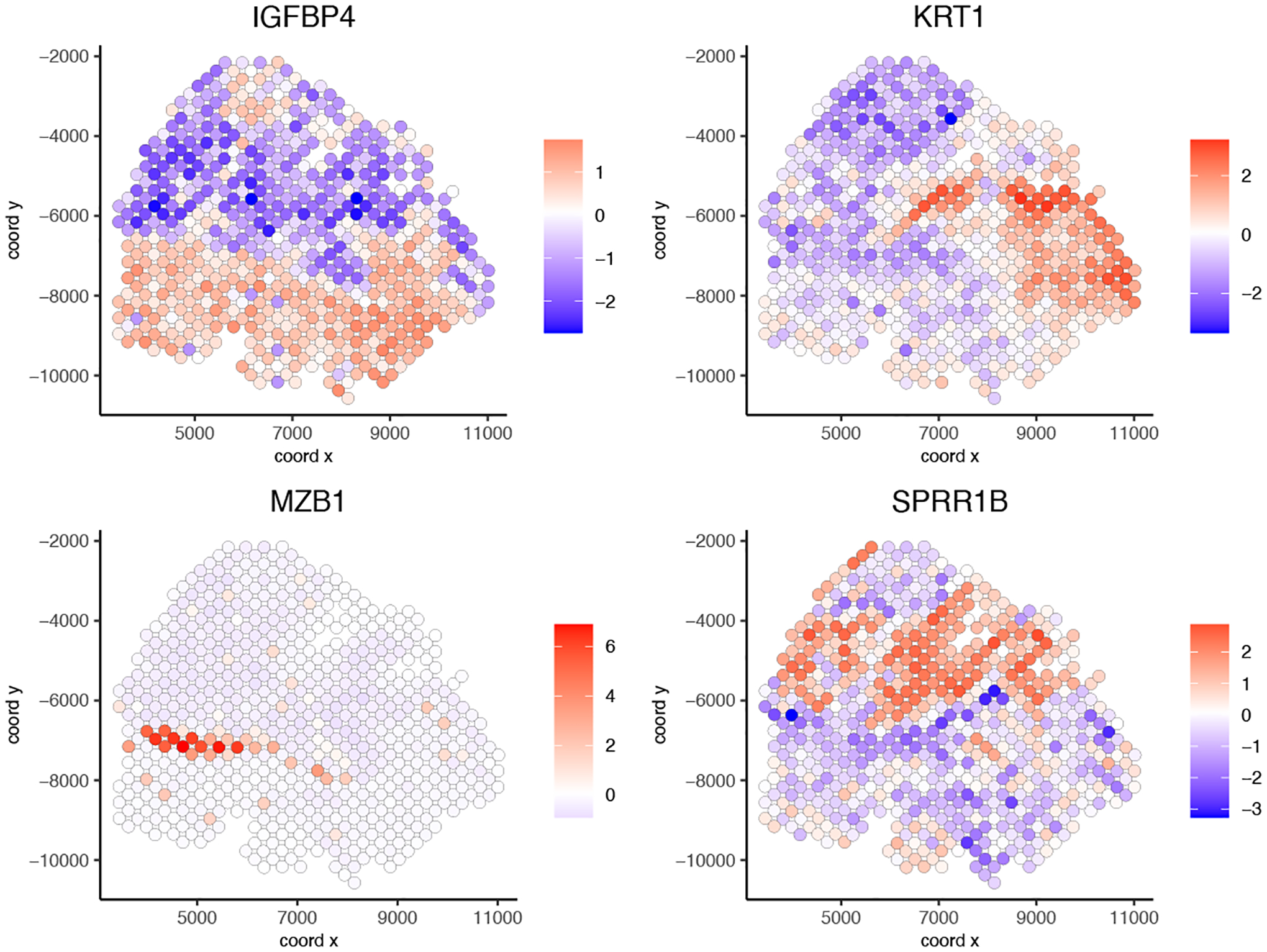
Spatial gene plots of 4 selected genes with different patterns.
interesting_genes = c(“IGFBP4”, “KRT1”, “MZB1”, “SPRR1B”)
spatGenePlot(gobject = my_giotto_object,
             expression_values = “scaled”,
             genes = interesting_genes,
             cow_n_col = 2,
             point_size = 2.5)
4. Spatial Gene Co-expression Modules
First, we will detect spatial correlation genes and calculate spatial correlation scores.
ext_spatial_genes = binspect_k[1:500]$genes
spat_cor_netw_DT = detectSpatialCorGenes(my_giotto_object,
                                         method = ‘network’,
                                         spatial_network_name = ‘Delaunay_network’,
                                         subset_genes = ext_spatial_genes)
Now, we can cluster and visualize the correlation scores using a heatmap (Figure 20).
Figure 20:
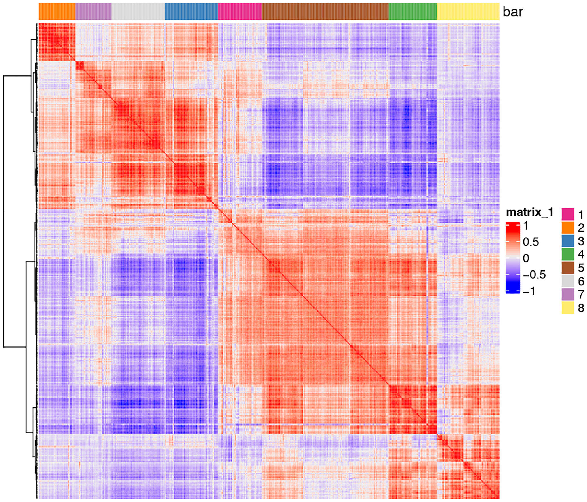
Heatmap representing spatial correlation genes.
spat_cor_netw_DT = clusterSpatialCorGenes(spat_cor_netw_DT,
                                          name = ‘spat_netw_clus’,
                                          k = 8)
heatmSpatialCorGenes(gobject = my_giotto_object,
                     spatCorObject = spat_cor_netw_DT,
                     use_clus_name = ‘spat_netw_clus’)
Now we can create metagenes from the cluster modules created in the previous step. Following analysis, we will plot metagenes per cluster (Figure 21).
Figure 21:
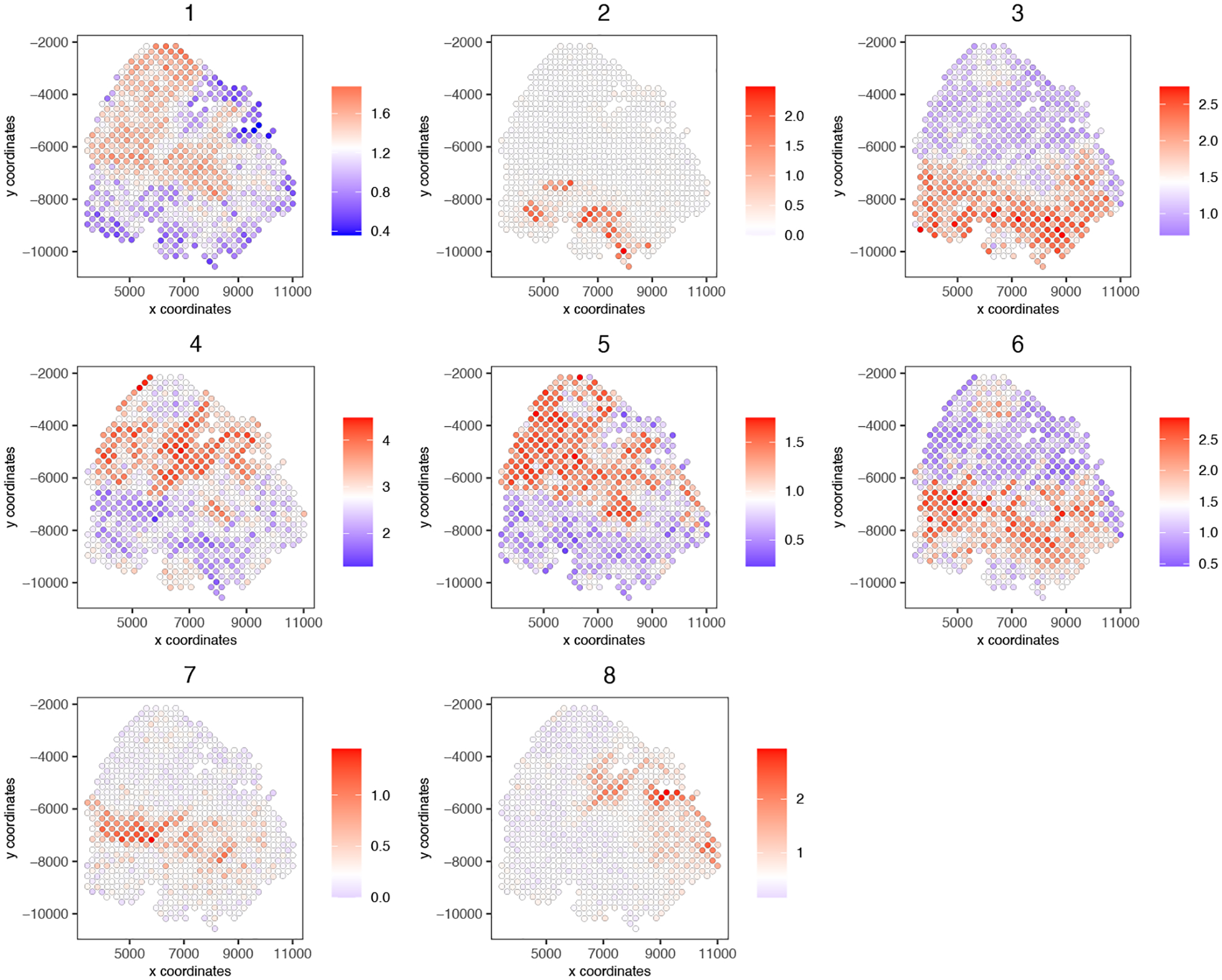
Spatial plot representing metagenes created from cluster modules.
cluster_genes_DT = showSpatialCorGenes(spat_cor_netw_DT,
                                       use_clus_name = ‘spat_netw_clus’,
                                       show_top_genes = 1)
top40_per_module = cluster_genes_DT[, head(.SD, 40), by = clus]

# 3. create metagenes from cluster modules and visualize
cluster_genes = top40_per_module$clus; names(cluster_genes) = top40_per_module$gene_ID

my_giotto_object = createMetagenes(my_giotto_object,
                                   gene_clusters = cluster_genes,
                                   name = ‘cluster_metagene’)
spatCellPlot(my_giotto_object,
             spat_enr_names = ‘cluster_metagene’,
             cell_annotation_values = as.character(c(1:8)),
             point_size = 1.5,
             cow_n_col = 3)
Basic Protocol 6: Spatial domain detection by using a hidden Markov random field model
Whereas the spatial patterns of individual genes can be identified by using the previous protocol, additional methods are needed to characterize the spatial organization of cell states defined by the combinatorial pattern of all genes. To this end, Giotto implements a hidden Markov random field (HMRF) (Zhu et al., 2018) to identify spatial coherent domains. A spatial domain may be formed by a cluster of cells from the same cell-type, but more generally consists of a mixture of cell-types that share similar expression patterns of spatial genes.
The protocols described above are standard in the sense that they require minimal information (gene expression matrix and spatial coordinates) and address the most common tasks. However, further analyses are needed to gain additional insights or to incorporate additional data information. In the following section, we present two support protocols as concrete examples.
Necessary Resources
See Basic Protocol 1
Protocol steps and annotations
1. Implementation
In addition to examining the spatial pattern of individual genes, Giotto also allows users to identify the spatial coherence at the cell state level. This is achieved through the use of a hidden Markov random field (HMRF), a method that assigns clustering by considering both the expression of the group of cells and that of its spatial neighbors. Unlike the previous methods of clustering which are performed purely on the expression space and then mapped onto spatial data, HMRF requires the use of a spatial network (either kNN or Delaunay).
We will be assuming the reader is continuing from after the generation of the Delaunay network shown in the previous section. Results can be viewed using viewHMRFresults2D() and the annotations can be added to the giotto object using addHMRF(). The following code generates new files, so we will first create a new directory and then run our HMRF analysis.
hmrf_folder <- paste0(path.expand(save_directory),’/’,’11_HMRF/’)
if(!file.exists(hmrf_folder)) dir.create(hmrf_folder, recursive = T)

# input is the top 40 genes per co-expression module
HMRF_spat_genes = doHMRF(gobject = my_giotto_object,
                         expression_values = “normalized”,
                         spatial_genes = names(cluster_genes),
                         spatial_network_name = “Delaunay_network”,
                         zscore = “none”,
                         k = 8,
                         betas = c(0,5,6),
                         output_folder = paste0(hmrf_folder, ‘/’, ‘HMRF_output2’))

## add HMRF of interest to giotto object
my_giotto_object = addHMRF(gobject = my_giotto_object,
                           HMRFoutput = HMRF_spat_genes,
                           k = 8, betas_to_add = c(0, 10, 15, 20),
                           hmrf_name = ‘HMRF’)
We can visualize our results over a spatial plot (Figure 22).
Figure 22:
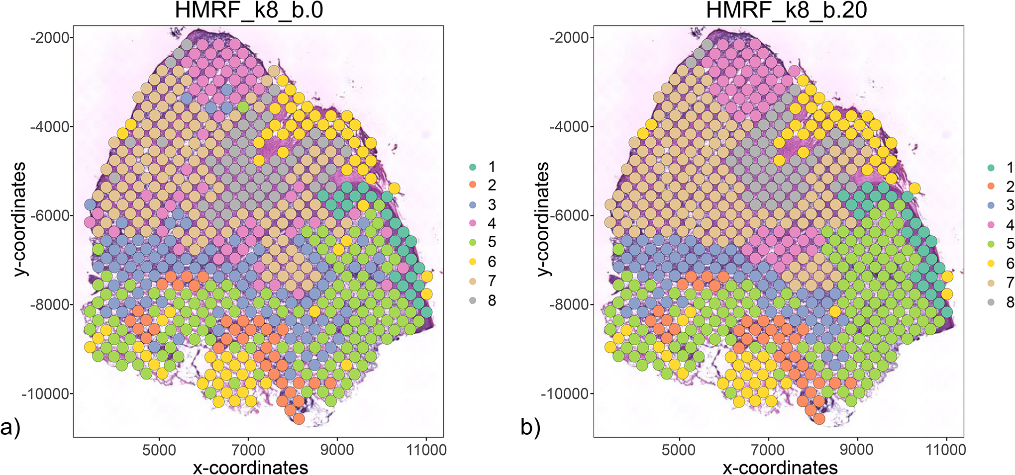
HMRF results with (a) beta = 0 and (b) beta = 20.
spatPlot2D(my_giotto_object,
           cell_color = ‘HMRF_k8_b.0’,
           show_image = TRUE,
           point_size = 4.75,
           coord_fix_ratio = 1)

spatPlot2D(my_giotto_object,
           cell_color = ‘HMRF_k8_b.20’,
           show_image = TRUE,
           point_size = 4.75,
           coord_fix_ratio = 1)
Support Protocol 1: Spatial proximity associated cell-cell interactions
In this support protocol, we will first assess spatial organization at the cellular level. Giotto can use the spatial network obtained in Basic Protocol 5 to calculate how frequent cell types, or other spatial annotations, are found in close proximity to each other. Visualization of these results is provided through barplot, network or heatmap representations. Next, we will demonstrate how the unique spatial domain organization of a tissue, as discussed in Basic Protocol 6, might (in)directly affect gene expression and signaling pathways Giotto introduces a number of complementary methods. First, Giotto identifies interaction-changed genes (ICG) by examining which genes are differentially expressed when a pair of cell types interact. In other words, these genes are up- or down-regulated in one cell type when in close spatial proximity to another cell type. Second, the results of individual ICGs can be combined to explore in an unbiased manner where a pair of genes are differentially expressed in two neighboring cell types. In this latter analysis, any identified gene pair does not necessarily need to be linked at the molecular level and the expression levels of both genes can be up-regulated, down-regulated, or unchanged. Finally, Giotto provides a method to identify ligand-receptor interactions between neighboring cells. More specifically, it uses known ligand-receptor pairs as proxies to examine how a pair of cells communicate when they are in close physical proximity, such that one cell expresses increased levels of the ligand and the other cell of the cognate receptor.
Necessary Resources
See Basic Protocol 1
Protocol steps and annotations
1. Cell Proximity Enrichment
We will run an analysis to assess how frequent two cell types are found in close spatial proximity by comparing the observed and expected cell-to-cell interactions within the created spatial network. Here we use the leiden clustering results as proxies for cell types for each ST spot.
cell_proximities = cellProximityEnrichment(gobject = my_giotto_object,
                                           cluster_column = ‘leiden_clus’,
                                           spatial_network_name = ‘Delaunay_network’,
                                           adjust_method = ‘fdr’,
                                           number_of_simulations = 1000)
Now we can visualize our cell-to-cell proximity results in a variety of ways, such as a barplot (Figure 23).
Figure 23:
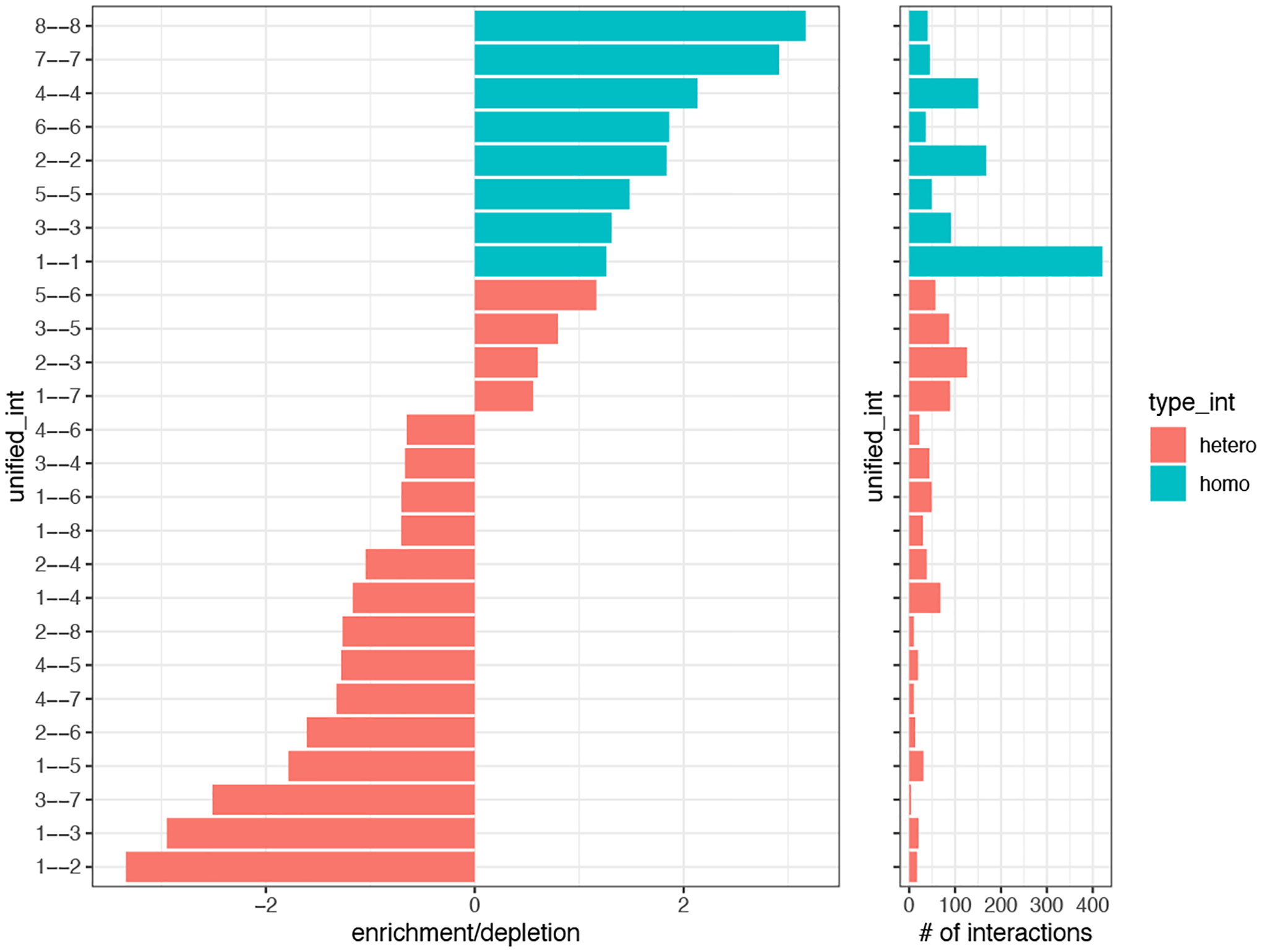
Barplot depicting the ratio of observed over expected frequencies of pairwise interacting clusters (left). Barplot showing the total number of interactions between each pair (right).
cellProximityBarplot(gobject = my_giotto_object,
                     CPscore = cell_proximities,
                     min_orig_ints = 3,
                     min_sim_ints = 3)
We can also show a cell-to-cell proximity network, including self-edges (Figure 24).
Figure 24:
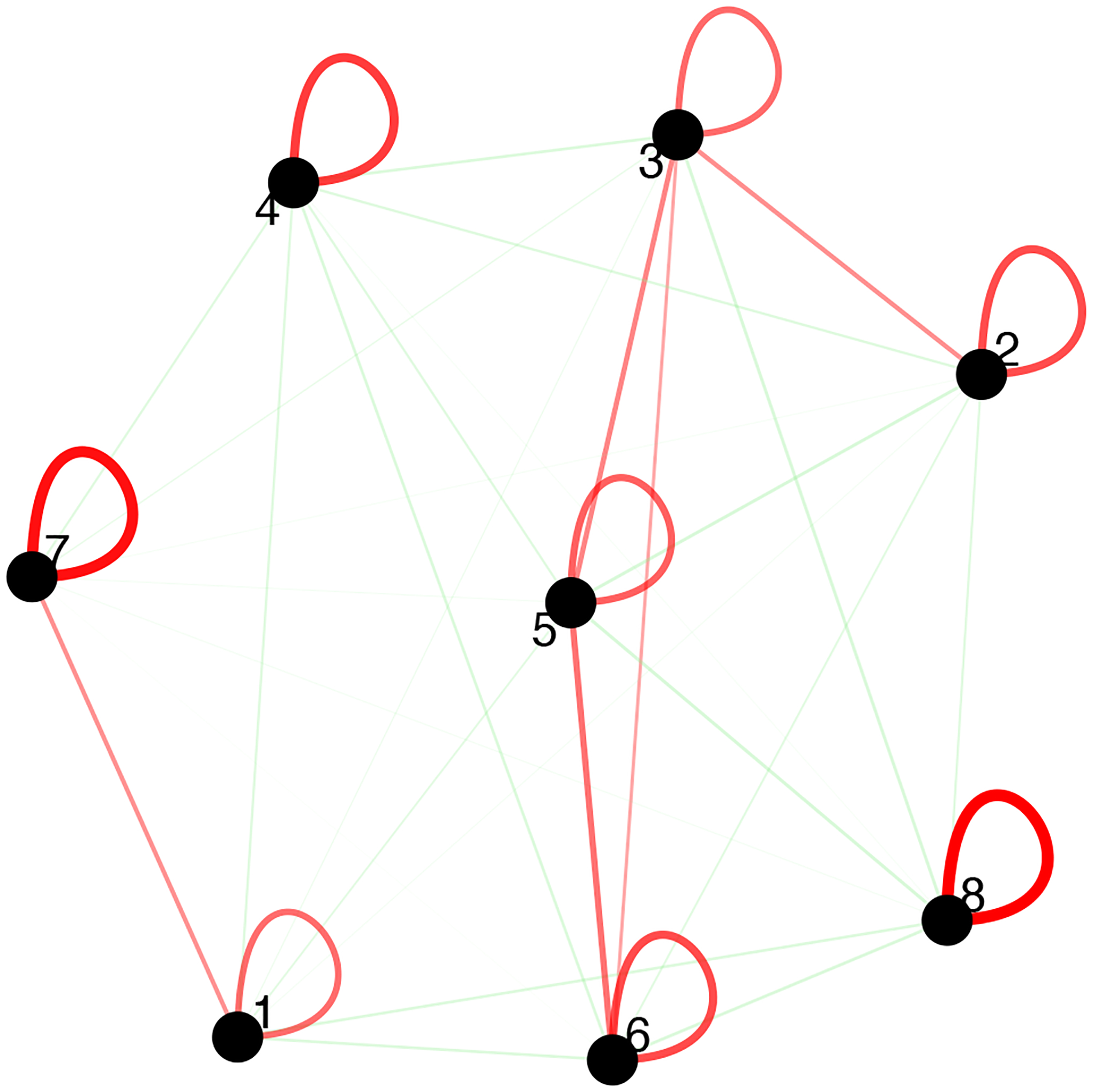
Visualization of the cell proximity network. Enriched or depleted interactions are depicted in red and green, respectively. Width of the edges indicates the strength of enrichment or depletion.
cellProximityNetwork(gobject = my_giotto_object,
                     CPscore = cell_proximities,
                     remove_self_edges = F,
                     self_loop_strength = 0.3,
                     only_show_enrichment_edges = F,
                     rescale_edge_weights = T,
                     node_size = 8,
                     edge_weight_range_depletion = c(1,2),
                     edge_weight_range_enrichment = c(2,5))
2. Interaction-Changed Genes (ICGs)
Next, we will assess the interaction-changed genes (ICGs) that are found to be differentially expressed when 2 spatial domains, identified in Basic Protocol 6, are in proximity. First, we find our ICGs and visualize how many ICGs are shared between neighbor cells (Figure 25).
Figure 25:
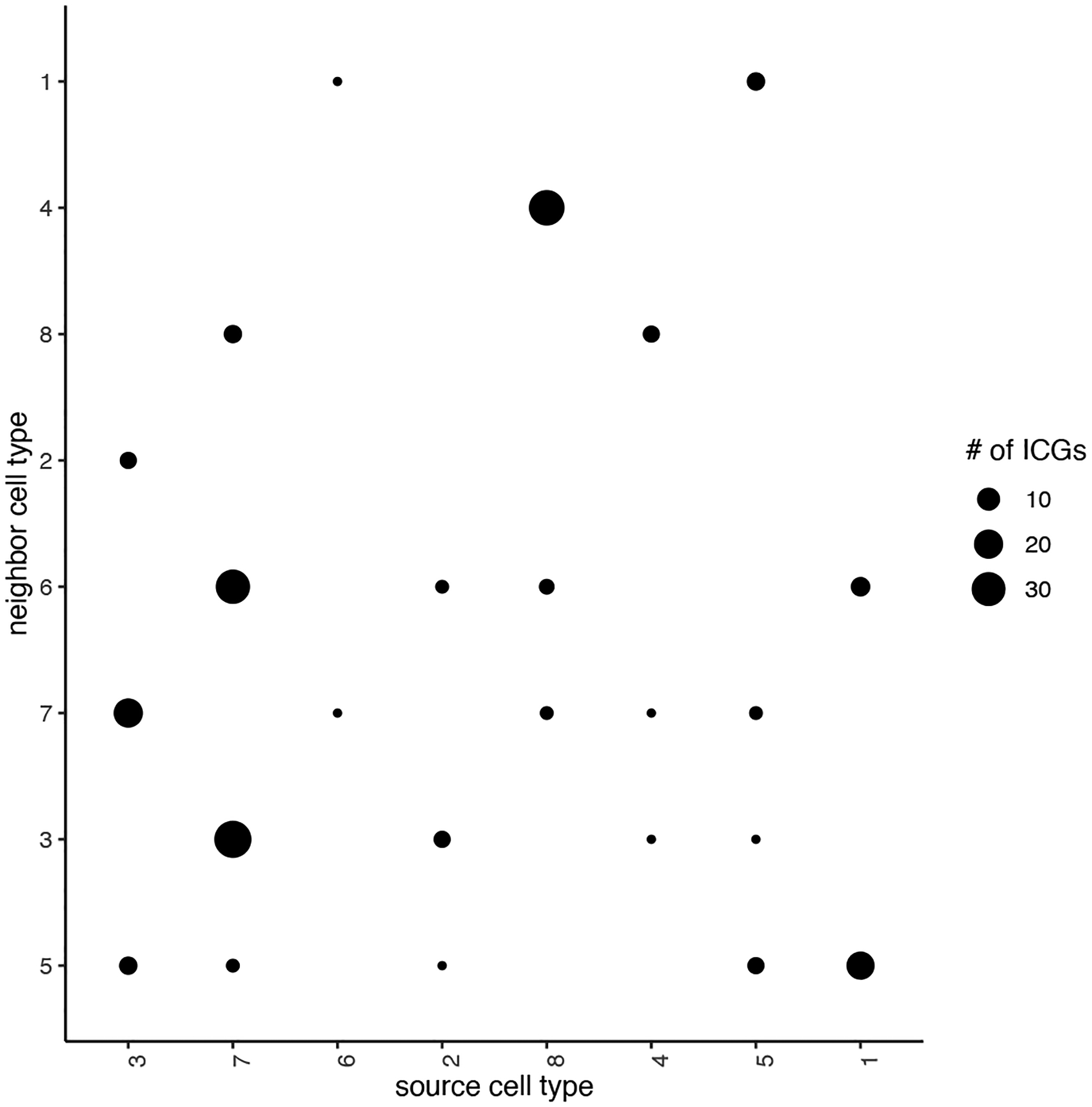
The total number of interaction changed genes (ICG). The corresponding spatial context is shown in the x- and y-axis.
## select top 25th highest expressing genes
gene_metadata = fDataDT(my_giotto_object)

high_expressed_genes = gene_metadata[mean_expr_det > quantile(gene_metadata$mean_expr_det)[4]]$gene_ID

## identify genes that are associated with proximity to other cell types
ICGscoresHighGenes = findInteractionChangedGenes(gobject = my_giotto_object,
                                                 selected_genes = high_expressed_genes,
                                                 spatial_network_name = ‘Delaunay_network’,
                                                 cluster_column = ‘HMRF_k8_b.20’,
                                                 diff_test = ‘permutation’,
                                                 adjust_method = ‘fdr’,
                                                 nr_permutations = 2000,
                                                 do_parallel = TRUE, cores = 4)
## visualize
plotCellProximityGenes(my_giotto_object,
                       cpgObject = ICGscoresHighGenes,
                       method = ‘dotplot’)
Now we can visualize a selected subset of our identified ICGs (Figure 26).
Figure 26:
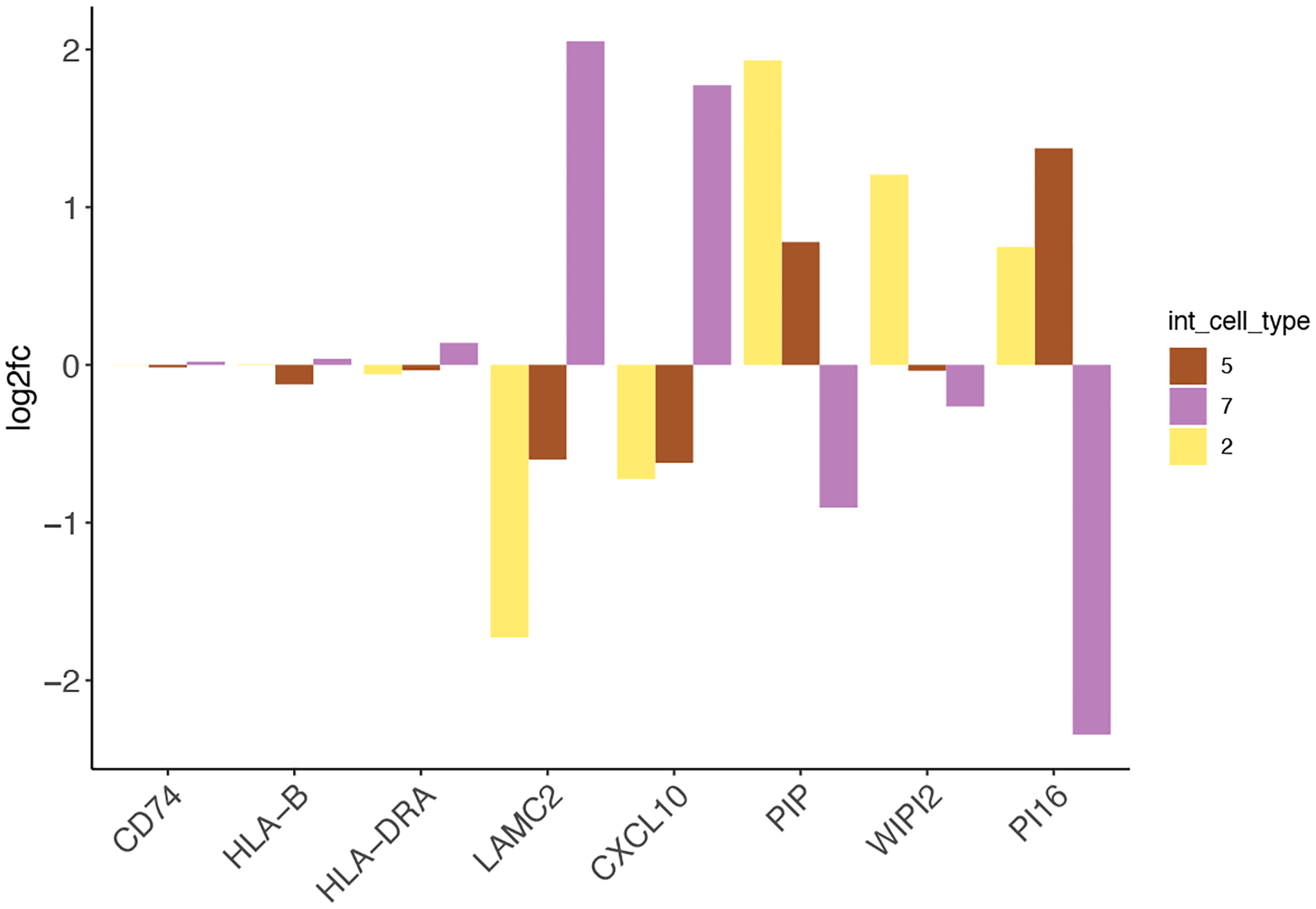
Examples of interaction changed genes identified by Giotto.
## filter genes
ICGscoresFilt = filterInteractionChangedGenes(ICGscoresHighGenes)

## visualize subset of interaction changed genes (ICGs)
ICGscoresFilt$CPGscores[type_int == ‘hetero’][cell_type == ‘3’]
ICG_genes = c(‘LAMC2’, ‘CXCL10’, ‘PIP’, ‘WIPI2’, ‘PI16’)
ICG_genes_types = c(‘7’, ‘7’, ‘2’, ‘2’, ‘5’)
names(ICG_genes) = ICG_genes_types

plotInteractionChangedGenes(gobject = my_giotto_object,
                            cpgObject = ICGscoresHighGenes,
                            source_type = ‘3’,
                            source_markers = c(‘CD74’, ‘HLA-B’, ‘HLA-DRA’),
                            ICG_genes = ICG_genes)
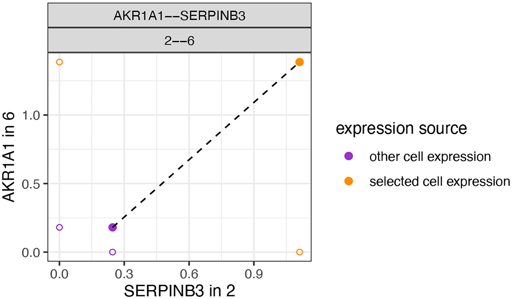
We can now also combine the ICGs and identify pairs of ICG in two interaction cell types. This provides a straightforward and unbiased manner to associate ICG in two directions. Here we highlight two examples. In the first example (Figure 27), when HMRF domain 2 and 6 are in proximity the gene AKR1A1 is upregulated in domain 6 while SERPINB3 is upregulated in domain 2.
Figure 27:

Depiction of a representative pair of identified ICGs from one-way analysis.
combo_ICGs = combineInteractionChangedGenes(cpgObject = ICGscoresHighGenes)

combo_ICGs$combCPGscores[type_int == ‘hetero’ & direction == ‘both_up’][p.adj_1 < 0.01 & p.adj_2 < 0.01 & abs(log2fc_1) > 1 & abs(log2fc_2) > 1]

# visualize
plotCombineInteractionChangedGenes(gobject = my_giotto_object,
                                   combCpgObject = combo_ICGs,
                                   selected_interactions = ‘2--6’,
                                   selected_gene_to_gene = c(‘AKR1A1--SERPINB3’))
In a second example (Figure 28) between interacting cells in HMRF domain 1 and 5, the gene changes are in opposite directions. Here OLA1 is upregulated in cells within domain 1 and MUCL1 is downregulated in cells within domain 5.
Figure 28:
Depiction of a representative pair of identified ICGs from two-way analysis.
plotCombineInteractionChangedGenes(gobject = my_giotto_object,
                                   combCpgObject = combo_ICGs,
                                   selected_interactions = ‘1--5’,
                                   selected_gene_to_gene = c(‘MUCL1--OLA1’))
3. Ligand-Receptor Signaling
We can also analyze ligand-receptor signaling in the context of our spatial domain data, as identified in Basic Protocol 6. The ligand-receptor dataset has already been imported and can be loaded here.
LR_data = data.table::fread(file = paste0(data_directory, ‘/’, ‘PairsLigRec.txt’))

LR_data[, ligand_det := ifelse(HPMR.Ligand %in% my_giotto_object@gene_ID, T, F)]
LR_data[, receptor_det := ifelse(HPMR.Receptor %in% my_giotto_object@gene_ID, T, F)]
LR_data_det = LR_data[ligand_det == T & receptor_det == T & Pair.Source == ‘known’]

select_ligands = LR_data_det$HPMR.Ligand
select_receptors = LR_data_det$HPMR.Receptor


spatial_all_scores = spatCellCellcom(my_giotto_object,
                                     spatial_network_name = ‘Delaunay_network’,
                                     cluster_column = ‘HMRF_k8_b.20’,
                                     random_iter = 1000,
                                     gene_set_1 = select_ligands,
                                     gene_set_2 = select_receptors,
                                     adjust_method = ‘fdr’,
                                     do_parallel = T,
                                     cores = 4,
                                     verbose = ‘none’)
Now we can select our top ligand-receptor pairs and visualize the results in a dotplot (Figure 29). This analysis illustrates how ligand-receptors pairs are used more or less frequently when cells from neighboring domains are found in proximity.
Figure 29:
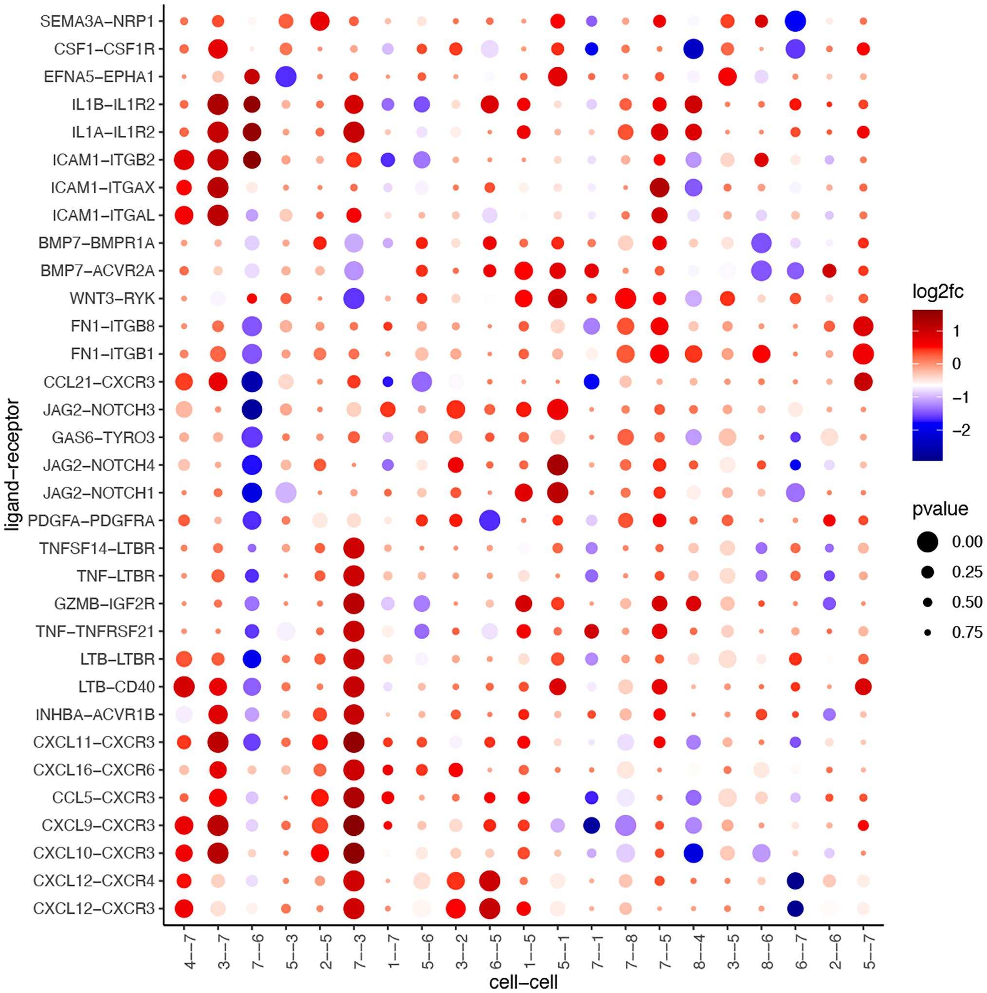
Ligand-receptor pairs (y-axis) that are detected by Giotto to exhibit differential cell-cell communication scores due to spatial cell-cell interactions (x-axis). The size of the dot is correlated with the adjusted p-value and the color indicates increased (red) or decreased (blue) activity.
selected_spat = spatial_all_scores[p.adj <= 0.1 & abs(log2fc) > 0.5 & lig_nr >= 3 & rec_nr >= 3]
data.table::setorder(selected_spat, -PI)

top_LR_ints = unique(selected_spat[order(-abs(PI))]$LR_comb)[1:33]
top_LR_cell_ints = unique(selected_spat[order(-abs(PI))]$LR_cell_comb)[1:33]

plotCCcomDotplot(gobject = my_giotto_object,
                 comScores = spatial_all_scores,
                 selected_LR = top_LR_ints,
                 selected_cell_LR = top_LR_cell_ints,
                 cluster_on = ‘PI’)
Support Protocol 2: Assembly of a registered 3D Giotto object from 2D slices
Many spatial transcriptomic methods can only generate 2D datasets, but it is possible to z-stack these 2D slices into a 3D dataset. In this support protocol, we will demonstrate how to combine 2D spatial transcriptomic data together into a single 3D dataset using Giotto and Fiji. 2D slices make spatial sense within their own planes, but when stacking them together, the data is often out of sync with each other due to differences in tissue placement on or across capture regions which, rather than the tissues, define the spatial frame of reference of spatial transcriptomic data. Thus, in order to faithfully represent the 3D information, it is necessary to first align all the 2D slices. Since it is difficult to use gene expression data alone as the ground truth for tissue alignment, image registration is performed based on the paired staining images (Figure 30). Using Fiji, this protocol performs “rigid” registration, meaning that the only transformations allowed when the program seeks for a good alignment across images are rotations and X and Y shifts. This method is fully technology agnostic, and the resulting rotations and translations performed on the images can then be mapped back onto the spatial locations in Giotto to bring them into sync (Figure 31).
Figure 30:
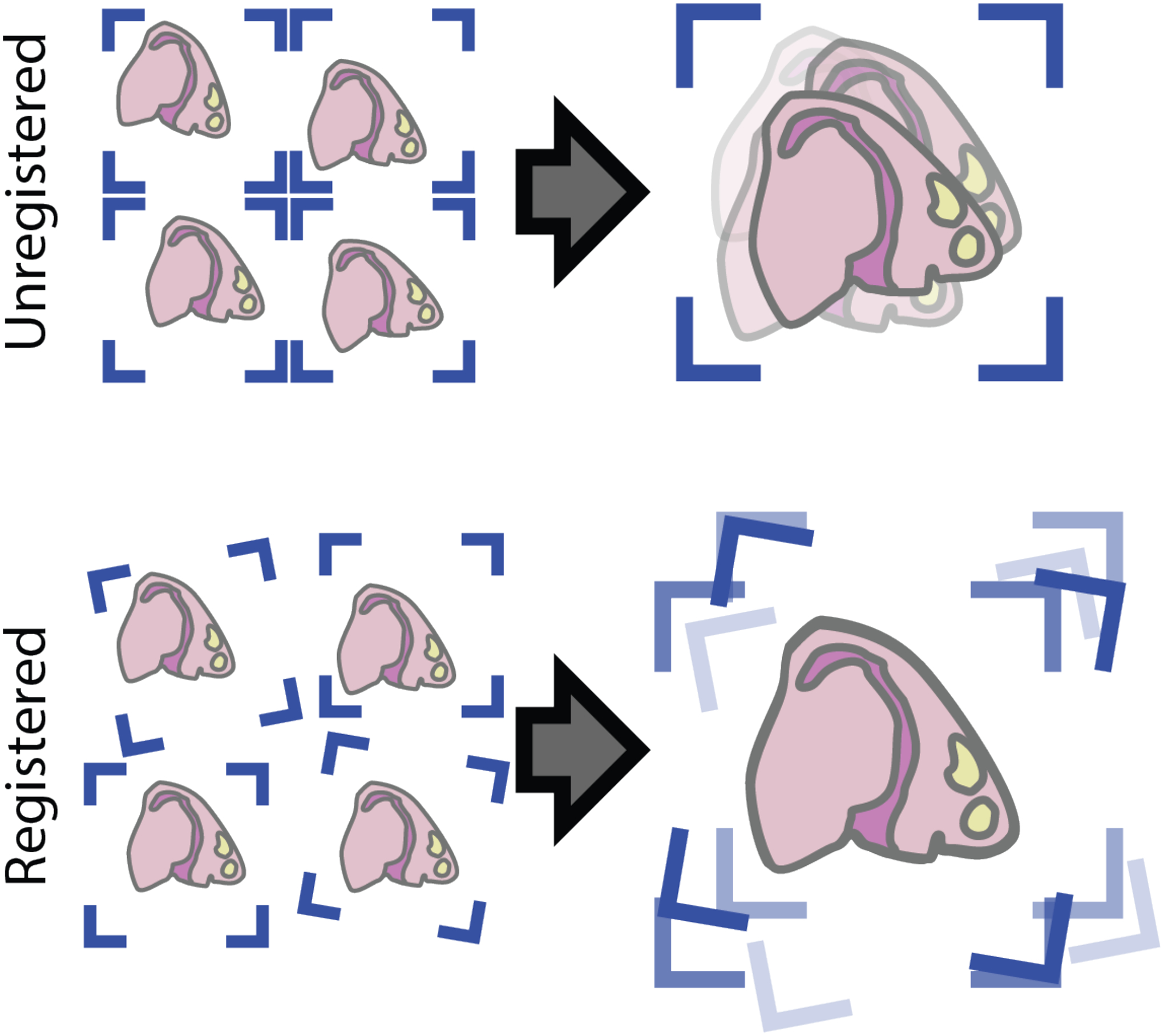
Stacking unregistered 2D datasets results in a 3D dataset where the tissue regions are out of sync with each other. Registering the data prior to combining resolves this issue.
Figure 31:
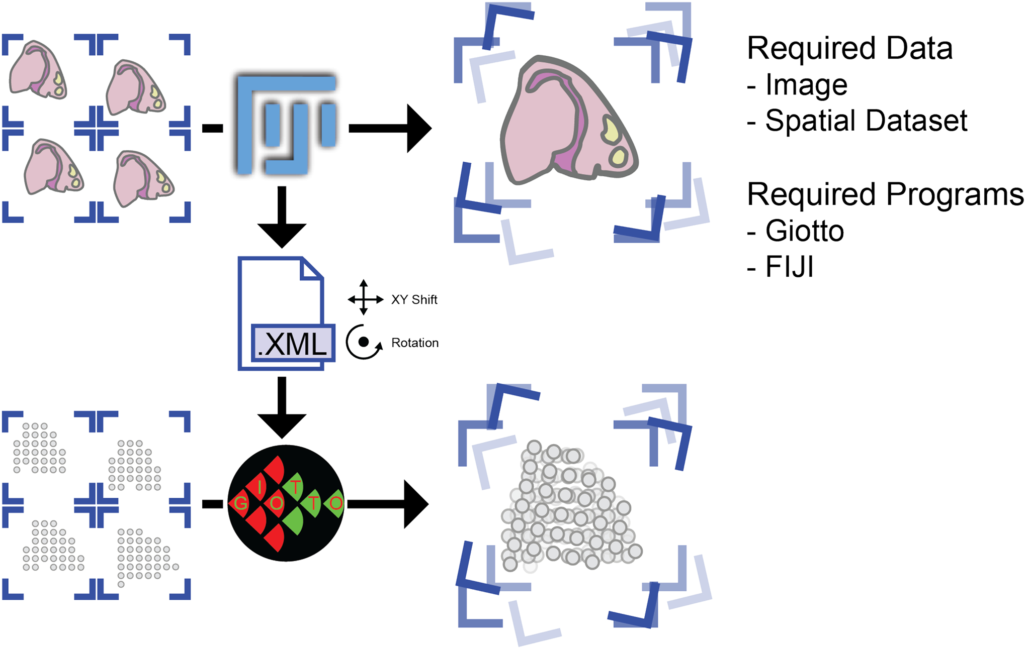
Overview of the image registration and 3D dataset assembly process.
This protocol will begin with using Fiji to perform image registration based on the 3 slices of spatial data from Patient 2 of the spatial transcriptomic dataset (Ji et al., 2020). The .xml transforms registration output will then be used in Giotto to create the 3D dataset.
Necessary Resources
See Basic Protocol 1
Protocol steps and annotations
Rigid Image Registration
1. Image preparation:
Image registration is done in Fiji (version 2.3.0+/1.53m+) to find the necessary spatial transformations before moving to Giotto. The first step is to scale down the staining image, if necessary, in order to both speed up the registration process and make it less RAM intensive. Image dimensions scaled down to around 2000×2000px to 4000×4000px are recommended. If image scaling is desired, all images must be scaled in exactly the same way while keeping the aspect ratio the same. The scaling factor used must also be kept note of.
To demonstrate functionality, in this example a scale factor of 0.25 was performed on all three images of this dataset and these can be found in the “quarter_size_images” subdirectory of the “imgReg” folder in the working directory after unzipping it.
The outputs for image registration should be placed in their own folders. Empty folders for the registered images and the spatial transformation .xml files are “aligned_images” and “transforms” respectively, also in the unzipped “imgReg” folder. There is an additional folder called “exampleXMLS” in the “transforms” folder that contains example. xmls for this dataset in case the reader would like to skip this portion of the protocol.
2. Image registration:
In Fiji, go to Plugins -> Registration -> Register Virtual Stack Slices (Figure 32). Find the directories for the source (quarter_size_images) and output (aligned_images) folders. Ensure that feature extraction is set to “Similarity” and that the registration model is set to “Rigid”. Also, ensure that “Save transforms” is checked.
Figure 32:
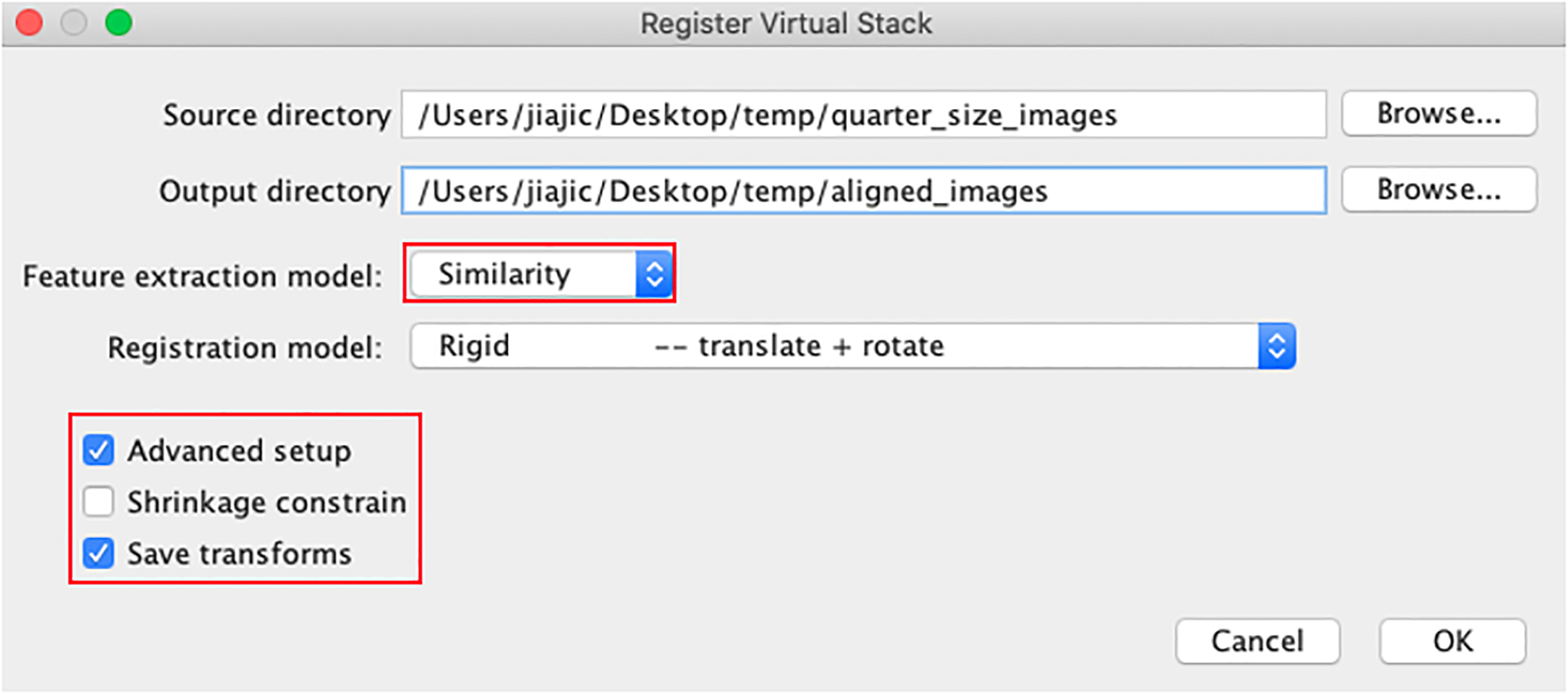
Image registration settings for the Register Virtual Stack Slices plugin in Fiji.
Upon pressing OK, a new window will appear asking for a directory in which to save the .xml transform files. Select the prepared folder (transforms) (Figure 33).
Figure 33:

Register Virtual Stack Slices save directory prompt window.
Next, a new window will appear asking for the target file to register all other images to. Navigate to the image of a section that has tissue representative of most of the other images and is as close to the middle of the stack as possible and open it as the target file. In this example, all images will be aligned according to the image for the patient 2 rep2 sample (Figure 34).
Figure 34:

Register Virtual Stack Slices registration target selection prompt window.
Another window labeled “Feature extraction” will then open as part of the advanced options checked earlier. Click okay on these settings.
Registration will then proceed, followed by the output directory being populated with the registered image and then updated once as the software performs a second pass to increase image bounds so that all images line up with each other afterwards. The image transformations performed will all be recorded in TrakEM2 format in .xml files that will appear in the transforms folder. If registration does not succeed, see the troubleshooting section.
3. Determine Micron to Pixel Scaling Factor
This process is different depending on the dataset due to differences in spatial transcriptomic methods and image magnifications and currently can only be done manually by measuring pixel distances between landmarks with known real-world distances. This can be done using Fiji by drawing a line, after which the distance will appear in the status bar (Figure 35).
Figure 35:

Fiji measuring tool can be used to measure pixel distances to determine a micron to pixel scaling factor. This is needed for accurate Z-axis spacing for the 3D dataset.
Pressing “M” on the keyboard will also save the values into a table.
4. Aligning 2D Slices
The remaining steps return to R and Giotto.
5. Loading spatial expression and registration data:
First, ensure that transform .xml files were outputted to the “transforms” folder. If the registration step was skipped, then please run the commented-out code to set xmlpaths by removing the preceding hash mark.
# Get filepaths
exprpaths <- list(paste0(data_directory, “/P2_1_expression.csv”),
                         paste0(data_directory, “/P2_2_expression.csv”),
                         paste0(data_directory, “/P2_3_expression.csv”))
spatpaths <- list(paste0(data_directory, “/P2_1_spatial_locs.csv”),
                         paste0(data_directory, “/P2_2_spatial_locs.csv”),
                         paste0(data_directory, “/P2_3_spatial_locs.csv”))
xmlpaths <- list(paste0(data_directory, “/imgReg/transforms/P2_1_0.25.xml”),
                        paste0(data_directory, “/imgReg/transforms/P2_2_0.25.xml”),
                        paste0(data_directory, “/imgReg/transforms/P2_3_0.25.xml”))

# Alternatively, use the given example .xml files by setting the following path:
# xmlpaths <- list.files(paste0(data_directory, “/imgReg/transforms/exampleXMLs”), full.names = TRUE)

# Read in data
xmls <- lapply(xmlpaths, readChar, nchar = 1000)
spatlocs <- lapply(spatpaths, read.csv)
exprCounts <- lapply(exprpaths, Giotto::readExprMatrix)
6. Setting Z-axis spacing:
For this dataset, each section was taken serially with a thickness of 10 microns. This value of 10 microns will then be multiplied by the ratio of microns to pixels which was calculated to be 1.8
z_vals <- c(0,10,20)
z_vals <- z_vals * 1.8
7. Creating 3D Giotto object:
A Giotto object with the spatial locations of all slices registered to each other is then generated. Required inputs, in order supplied in the example, are the list of expression count matrices, the list of unregistered spatial locations, the names of the columns in those spatial location matrices holding X and Y coordinate values, the scaling factor of images used in image registration relative to spatial locations, the list of transformation .xml files from image registration, and a vector of Z values to be used.
Note that all data provided in lists and in the vector of Z values must be in the same order by slice of origin.
my_giotto_object_3D <- createRegZStackGobject(expression_list = exprCounts,
                                              spatlocs_list = spatlocs,
                                              xvals = “pixel_x”,
                                              yvals = “pixel_y”,
                                              scalefactor = 0.25,
                                              transformXML = xmls,
                                              z_vals = z_vals)
8. Visualizing 3D data:
The 3D plot shows that all the slices’ spatial locations are now aligned together. The axis_scale argument takes either “cube” or “real” as input. “cube” displays the spatial locations with all axes scaled to the same length, making it easy to see any issues with alignment. “real” plots all axes to actual scale (Figure 36).
Figure 36:
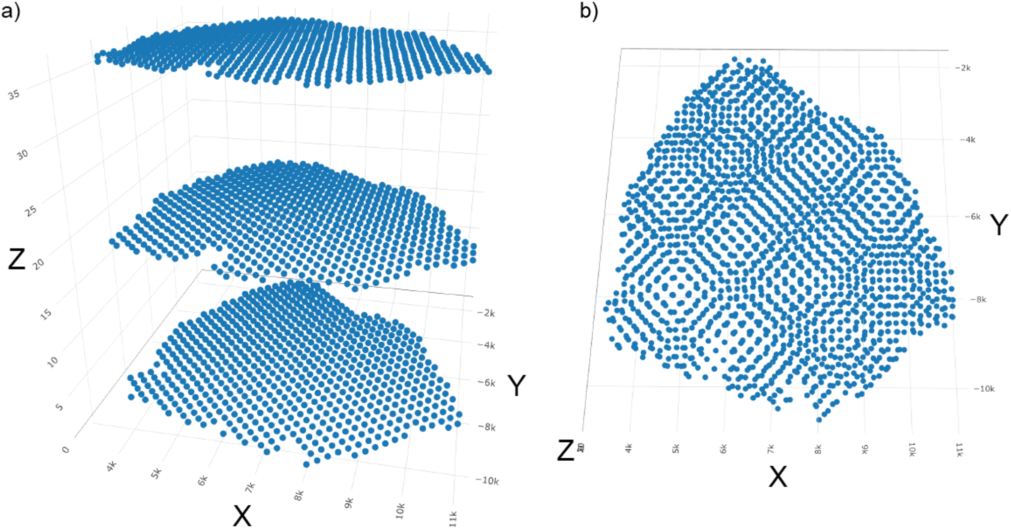
Visualization of the spatial locations of the final 3D Giotto object. a) axis_scale = “cube”; b) axis_scale = “real”.
spatPlot3D(gobject = my_giotto_object_3D,
           axis_scale = “cube”,
           point_size = 5)
spatPlot3D(gobject = my_giotto_object_3D,
           axis_scale = “real”,
           point_size = 5)
The 3D Giotto object can then be analyzed in the same ways as previously described. Loading in Leiden cluster annotations, (steps shown in the markdown) we can see that the clusters are aligned across 2D slices (Figure 37).
Figure 37:

Giotto objects with 3D data can be analyzed in the same way that 2D datasets are. They can also be plotted in either a) 3D or b) 2D depending on whether the 2D or 3D plotting command is used.
# Visualize 3D data with leiden clusters
my_colors = c(“#9442f2”,”#b6d326”,”#fa002a”,”#fa00d4”,”#013bb5”,
              “#666666”,”#017fd6”,”#50cfff”,”#cf8cff”,”#01d671”)
cellMetadata_3D <- readRDS(file = paste0(data_directory, “/imgReg/cellMetadata3D.rds”))
my_giotto_object_3D <- addCellMetadata(gobject = my_giotto_object_3D,
                                       new_metadata = cellMetadata_3D,
                                       by_column = “cell_ID”)

spatPlot3D(gobject = my_giotto_object_3D,
           axis_scale = “cube”,
           point_size = 5,
           cell_color_code = my_colors,
           cell_color = “leiden_clus”)

spatPlot2D(gobject = my_giotto_object_3D,
           point_size = 3.5,
           coord_fix_ratio = 1,
           cell_color_code = my_colors,
           cell_color = “leiden_clus”)
Troubleshooting
Table 1.
Troubleshooting
| Issue | Fix |
|---|---|
| Error in intI(j, n = x@Dim[2], dn[[2]], give.dn = FALSE) : invalid character indexing (When subsetting and reordering the expression matrix according to the spatial locations |
Ensure that every spatial location has a corresponding set of expression data. |
| Error: cannot coerce class “structure(“dgCMatrix”, package = “Matrix”)” to a data.frame |
Load the Matrix library first by running library(Matrix) |
|
Fiji returns: mpicbg.models.NotEnoughDataPointsException: 0 data points are not enough to estimate a 2d rigid model, at least 2 data points required… Not all images were registered and/or no .xml transform files were written |
After making sure that the image is not larger than roughly 4000×4000px, in the Feature extraction window, try increasing the feature descriptor size in increments of 1. |
|
Fiji returns: Could not open file after registration completes Registered images show up in output folder, but preview stack only shows a subset of images No .xml files were written |
Run Fiji as administrator (need to have admin rights on the machine) PC: Close Fiji, then right click the Fiji icon -> run as administrator MacOS: in terminal , run this line: sudo /Applications/Fiji.app/Contents/MacOS/ImageJ-macosx (or wherever else Fiji is installed) If still an issue, try the above fix of going to advanced options and increasing feature descriptor size in increments of 1. |
| Fiji does not display the registration settings screen and becomes unresponsive. May happen after another registration completes |
Force quit then restart Fiji |
Acknowledgements
The work was supported by the National Cancer Institute (UH3CA255134), the National Institute of Mental Health (RF1MH128970), and the National Institute of Aging (R01AG066028).
Footnotes
Conflict of Interest
The authors declare no conflicts of interests.
Data Availability
The data that supports the findings of this study are openly available in Github at https://github.com/RubD/spatial-datasets/tree/master/data/2020_ST_SCC.
References
- Becht E, McInnes L, Healy J, Dutertre C-A, Kwok IWH, Ng LG, Ginhoux F, and Newell EW 2018. Dimensionality reduction for visualizing single-cell data using UMAP. Nature biotechnology. Available at: 10.1038/nbt.4314. [DOI] [PubMed] [Google Scholar]
- Bettcher BM, Tansey MG, Dorothée G, and Heneka MT 2021. Peripheral and central immune system crosstalk in Alzheimer disease - a research prospectus. Nature reviews. Neurology 17:689–701. [DOI] [PMC free article] [PubMed] [Google Scholar]
- Binnewies M, Roberts EW, Kersten K, Chan V, Fearon DF, Merad M, Coussens LM, Gabrilovich DI, Ostrand-Rosenberg S, Hedrick CC, et al. 2018. Understanding the tumor immune microenvironment (TIME) for effective therapy. Nature medicine 24:541–550. [DOI] [PMC free article] [PubMed] [Google Scholar]
- Blondel VD, Guillaume J-L, Lambiotte R, and Lefebvre E 2008. Fast unfolding of communities in large networks. Journal of Statistical Mechanics: Theory and Experiment 2008:P10008. Available at: 10.1088/1742-5468/2008/10/p10008. [DOI] [Google Scholar]
- BRAIN Initiative Cell Census Network (BICCN) 2021. A multimodal cell census and atlas of the mammalian primary motor cortex. Nature 598:86–102. [DOI] [PMC free article] [PubMed] [Google Scholar]
- Buckley CD, Ospelt C, Gay S, and Midwood KS 2021. Location, location, location: how the tissue microenvironment affects inflammation in RA. Nature reviews. Rheumatology 17:195–212. [DOI] [PubMed] [Google Scholar]
- Chung NC 2020. Statistical significance of cluster membership for unsupervised evaluation of cell identities. Bioinformatics 36:3107–3114. [DOI] [PMC free article] [PubMed] [Google Scholar]
- Codeluppi S, Borm LE, Zeisel A, La Manno G, van Lunteren JA, Svensson CI, and Linnarsson S 2018. Spatial organization of the somatosensory cortex revealed by osmFISH. Nature methods 15:932–935. [DOI] [PubMed] [Google Scholar]
- Dong R, and Yuan G-C 2021. SpatialDWLS: accurate deconvolution of spatial transcriptomic data. Genome biology 22:145. [DOI] [PMC free article] [PubMed] [Google Scholar]
- Dries R, Chen J, Del Rossi N, Khan MM, Sistig A, and Yuan G-C 2021a. Advances in spatial transcriptomic data analysis. Genome research 31:1706–1718. [DOI] [PMC free article] [PubMed] [Google Scholar]
- Dries R, Zhu Q, Dong R, Eng C-HL, Li H, Liu K, Fu Y, Zhao T, Sarkar A, Bao F, et al. 2021b. Giotto: a toolbox for integrative analysis and visualization of spatial expression data. Genome biology 22:78. [DOI] [PMC free article] [PubMed] [Google Scholar]
- Edsgärd D, Johnsson P, and Sandberg R 2018. Identification of spatial expression trends in single-cell gene expression data. Nature methods 15:339–342. [DOI] [PMC free article] [PubMed] [Google Scholar]
- Finak G, McDavid A, Yajima M, Deng J, Gersuk V, Shalek AK, Slichter CK, Miller HW, McElrath MJ, Prlic M, et al. 2015. MAST: A flexible statistical framework for assessing transcriptional changes and characterizing heterogeneity in single-cell RNA-seq data. Bioinformatics. [DOI] [PMC free article] [PubMed] [Google Scholar]
- Hanahan D, and Weinberg RA 2011. Hallmarks of cancer: the next generation. Cell 144:646–674. [DOI] [PubMed] [Google Scholar]
- HuBMAP Consortium 2019. The human body at cellular resolution: the NIH Human Biomolecular Atlas Program. Nature 574:187–192. Available at: 10.1038/s41586-019-1629-x. [DOI] [PMC free article] [PubMed] [Google Scholar]
- Ji AL, Rubin AJ, Thrane K, Jiang S, Reynolds DL, Meyers RM, Guo MG, George BM, Mollbrink A, Bergenstråhle J, et al. 2020. Multimodal Analysis of Composition and Spatial Architecture in Human Squamous Cell Carcinoma. Cell 182:497–514.e22. [DOI] [PMC free article] [PubMed] [Google Scholar]
- Jiang L, Chen H, Pinello L, and Yuan G-C 2016. GiniClust: detecting rare cell types from single-cell gene expression data with Gini index. Genome biology 17:144. [DOI] [PMC free article] [PubMed] [Google Scholar]
- Kim S-Y, and Volsky DJ 2005. PAGE: parametric analysis of gene set enrichment. BMC bioinformatics 6:144. [DOI] [PMC free article] [PubMed] [Google Scholar]
- Lewis SM, Asselin-Labat M-L, Nguyen Q, Berthelet J, Tan X, Wimmer VC, Merino D, Rogers KL, and Naik SH 2021. Spatial omics and multiplexed imaging to explore cancer biology. Nature methods 18:997–1012. [DOI] [PubMed] [Google Scholar]
- Longo SK, Guo MG, Ji AL, and Khavari PA 2021. Integrating single-cell and spatial transcriptomics to elucidate intercellular tissue dynamics. Nature reviews. Genetics 22:627–644. [DOI] [PMC free article] [PubMed] [Google Scholar]
- Lun ATL, McCarthy DJ, and Marioni JC 2016. A step-by-step workflow for low-level analysis of single-cell RNA-seq data with Bioconductor. F1000Research 5:2122. [DOI] [PMC free article] [PubMed] [Google Scholar]
- van der Maaten L, and Hinton G 2008. Visualizing Data using t-SNE. Journal of machine learning research: JMLR 9:2579–2605. [Google Scholar]
- Marx V 2021. Method of the Year: spatially resolved transcriptomics. Nature Methods 18:9–14. Available at: 10.1038/s41592-020-01033-y. [DOI] [PubMed] [Google Scholar]
- Rao A, Barkley D, França GS, and Yanai I 2021. Exploring tissue architecture using spatial transcriptomics. Nature 596:211–220. [DOI] [PMC free article] [PubMed] [Google Scholar]
- Regev A, Teichmann SA, Lander ES, Amit I, Benoist C, Birney E, Bodenmiller B, Campbell P, Carninci P, Clatworthy M, et al. 2017. The Human Cell Atlas. eLife 6. Available at: 10.7554/eLife.27041. [DOI] [PMC free article] [PubMed] [Google Scholar]
- Rozenblatt-Rosen O, Regev A, Oberdoerffer P, Nawy T, Hupalowska A, Rood JE, Ashenberg O, Cerami E, Coffey RJ, Demir E, et al. 2020. The Human Tumor Atlas Network: Charting Tumor Transitions across Space and Time at Single-Cell Resolution. Cell 181:236–249. [DOI] [PMC free article] [PubMed] [Google Scholar]
- Sun S, Zhu J, and Zhou X 2020. Statistical analysis of spatial expression patterns for spatially resolved transcriptomic studies. Nature methods 17:193–200. [DOI] [PMC free article] [PubMed] [Google Scholar]
- Svensson V, Teichmann SA, and Stegle O 2018. SpatialDE: identification of spatially variable genes. Nature methods 15:343–346. [DOI] [PMC free article] [PubMed] [Google Scholar]
- Traag VA, Waltman L, and van Eck NJ 2019. From Louvain to Leiden: guaranteeing well-connected communities. Scientific reports 9:5233. [DOI] [PMC free article] [PubMed] [Google Scholar]
- Tsoucas D, Dong R, Chen H, Zhu Q, Guo G, and Yuan G-C 2019. Accurate estimation of cell-type composition from gene expression data. Nature communications 10:1–9. [DOI] [PMC free article] [PubMed] [Google Scholar]
- Zhu Q, Shah S, Dries R, Cai L, and Yuan G-C 2018. Identification of spatially associated subpopulations by combining scRNAseq and sequential fluorescence in situ hybridization data. Nature biotechnology. Available at: 10.1038/nbt.4260. [DOI] [PMC free article] [PubMed] [Google Scholar]
Associated Data
This section collects any data citations, data availability statements, or supplementary materials included in this article.
Data Availability Statement
The data that supports the findings of this study are openly available in Github at https://github.com/RubD/spatial-datasets/tree/master/data/2020_ST_SCC.


