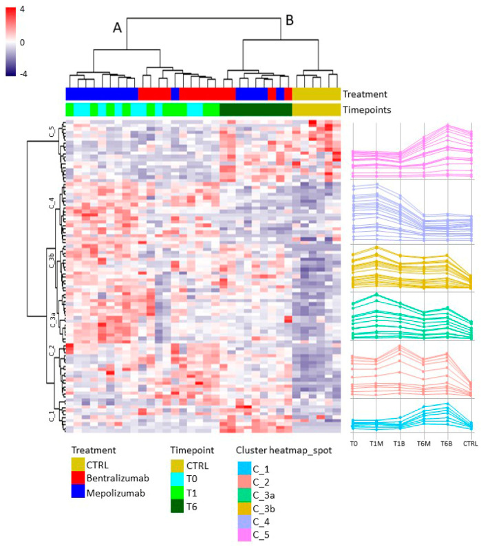
Figure 2.
Heatmap analysis performed on significant matched spots in all gels among the six conditions (T0-T1B-T1M-T6M-T6B-CTRL). Blue to red colors in the heatmap graph correspond to protein abundance, as reported by the legend. On the right, the line charts show the trend of abundance of the significant clustered spots.

