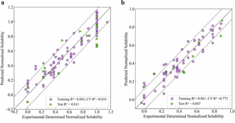
Figure 2.
Experimental versus projected solubility plots for QSAR regression models: A) Regression model for 111 mAbs in this study; B) Regression model for 75 mAbs in lower to moderate soluble region (Sol <1.0). Training sets are represented as purple circles and testing sets are represented as green triangles; Solid lines are identity lines; Dotted lines represents the RMSD values of corresponding testing set.
(Alt text): Scatter plots of predicted values versus experimental determined solubilities for two regression models. Both scatter plots show high correlation between x and y values indicating high predictability of the models.