Abstract
Motivation
The rapid development of scRNA-seq technologies enables us to explore the transcriptome at the cell level on a large scale. Recently, various computational methods have been developed to analyze the scRNAseq data, such as clustering and visualization. However, current visualization methods, including t-SNE and UMAP, are challenged by the limited accuracy of rendering the geometric relationship of populations with distinct functional states. Most visualization methods are unsupervised, leaving out information from the clustering results or given labels. This leads to the inaccurate depiction of the distances between the bona fide functional states. In particular, UMAP and t-SNE are not optimal to preserve the global geometric structure. They may result in a contradiction that clusters with near distance in the embedded dimensions are in fact further away in the original dimensions. Besides, UMAP and t-SNE cannot track the variance of clusters. Through the embedding of t-SNE and UMAP, the variance of a cluster is not only associated with the true variance but also is proportional to the sample size.
Results
We present supCPM, a robust supervised visualization method, which separates different clusters, preserves the global structure and tracks the cluster variance. Compared with six visualization methods using synthetic and real datasets, supCPM shows improved performance than other methods in preserving the global geometric structure and data variance. Overall, supCPM provides an enhanced visualization pipeline to assist the interpretation of functional transition and accurately depict population segregation.
Availability and implementation
The R package and source code are available at https://zenodo.org/record/5975977#.YgqR1PXMJjM.
Supplementary information
Supplementary data are available at Bioinformatics online.
1 Introduction
Single-cell RNA sequencing (scRNAseq) technology represents rapidly expanding opportunities to interrogate cellular functions at an unprecedented resolution (Macosko et al., 2015; Sandberg, 2014; Ziegenhain et al., 2017). In the meantime, numerous computational methods have been developed for scRNA-seq datasets among which clustering and visualization are the two most important and related procedures (Chen et al., 2019; Kiselev et al., 2019). Various kinds of clustering algorithms are introduced, such as PhenoGraph (Levine et al., 2015), Seurat (Hao et al., 2021), SC3 (Kiselev et al., 2017), scanpy (Wolf et al., 2018), CMDS (Little et al., 2018). As for visualization, a main challenge is due to the fact that the higher-dimensional body has a substantially larger capacity than what is visually effective on a 2D space. This frequently results in overlapping and crowding of the embedded data points, which is also known as crowding issue. To overcome this challenge, two non-linear methods, t-SNE and UMAP, were developed and have been widely adopted in the current scRNA-seq toolkits (Becht et al., 2019; Linderman et al., 2019; Zhou and Jin, 2020). These methods fit Gaussian distributions with heavy-tailed distributions, creating ‘repulsive forces’ to avoid the overlapping. However, due to the difficulty in controlling the strength of the force, these methods tend to overly stretch the data with unnecessary information loss. Specifically, t-SNE minimizes KL-divergence between Gaussian and t-distributions derived from the pairwise distances in the high and low dimensions, respectively (Maaten and Hinton, 2008). Although t-SNE is effective in in preserving the local structure, it cannot precisely render the global structure. For example, two points that are far apart in the original high-dimensional space may be close under the t-SNE coordinates or vice versa. With cross-entropy instead of KL-divergence, UMAP can preserve more large-scale structure compared with the t-SNE (Becht et al., 2019). Despite their popularity, UMAP and t-SNE have several known limitations (Wattenberg et al., 2016). As mentioned above, often times, the inter-cluster distances or the long-range distance, are not meaningful as the consequence of their adoption of the conditional probability. Two clusters close under UMAP or t-SNE coordinates maybe be far apart in the original dimensions, which introduces challenges in populations with transitional functional states. Furthermore, the variance of clusters in UMAP and t-SNE does not correlate with the actual variance. Instead, it is largely driven by the sample size.
A main thrust of the current scRNA-seq analysis pipeline is the clustering algorithms that can produce high-quality class labels, which are an untapped source of information to improve the current visualization methods. Therefore, we should use this piece of information to assist the visualization if possible. Because although visualization methods such t-SNE and UMAP also enforce formation of clusters, their ability to detect labels is suboptimal, since as visualization methods, they need to map the data to extremely low dimensions in which the clusters are less separated (Kiselev et al., 2017). For example, in the UMAP result of the RNAmix data of seven clusters (Fig. 1), a large portion of cell labels are incorrect while the classification accuracy by Seurat is 94.1%. This raises an important question: how to incorporate the almost perfect class labeling information returned by a pure clustering algorithm into the visualization result? In other words, what is the best way to design supervised visualization techniques?
Fig. 1.
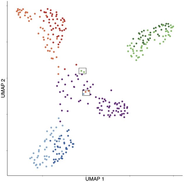
UMAP visualization for RNAmix data. Cells are colored according to labels from clustering algorithm in Seurat. Highlighted cells suggest the conflicting result between clustering and visualization methods
There are only a few supervised visualization algorithms available in the literature, such as supPCA (Barshan et al., 2011) and supUMAP (McInnes and Healy, 2018). However, supPCA is a linear method that is unsuitable for scRNAseq data where the transcriptome data is non-linear. Compared to the vanilla UMAP, supUMAP utilizes label information to debond ‘wrong’ neighbors that actually belong to different clusters. However, since the vanilla UMAP emphasizes much more on the formation of clusters than the preservation of geometry, it has similar advantages and disadvantages to clustering methods and hence adding label information to it has relatively small improvements on its result (see results in Section 3). We argue that it would be more beneficial to supervise the geometry-preserving visualization methods such as PCA, LLE (Roweis and Saul, 2000), MDS, etc., because those methods have complementary merits to clustering algorithms and combining them may give rise to an algorithm having the merits of both.
One major issue with these classical geometry-preserving methods is the aforementioned crowding issue. Recently, Wang and Zhang (2019) proposed a novel visualization algorithm, Capacity Preserved Mapping (CPM) to address it, therefore can better preserve the geometry. However, CPM alone does not enforce well-separated clusters to appear in the visualization, which sometimes cause it hard to digest. This drawback may be compensated using the known label information. In this article, we developed a supervised CPM (supCPM) algorithm which runs the vanilla CPM for the first phase and in the second phase optimizes the objective function with an extra supervised term. We demonstrate the superior performance of supCPM over other visualization algorithms on both synthetic and real datasets.
2 Materials and methods
2.1 Relative capacity
Suppose is the RNA-seq dataset with n cells and p genes. From manifold learning’s perspective, people commonly assume the high-dimensional data, xi, lives on a space with a small intrinsic dimension since genes are closely related with each other. The small intrinsic dimension assumption ensures that the data can be projected to a low dimension for visualization. More rigorously, we assume that each data point is independently drawn at random according to a sampling probability f from some underlying low-dimensional compact manifold living in the high-dimensional space . Suppose , the relative capacity of a radius-r neighborhood centered at x is defined as
where d is the pairwise distance defined on and is the indicator function. The relative capacity could be intuitively interpreted as the expected number of points in a neighborhood with radius r.
Further, the average capacity of the radius r neighbourhoods is
| (1) |
that is, the averaged relative capacity across all the locations. By the definition, it is easy to check that functions is a cumulative distribution, and we define
which is a density function, and called relative density.
2.2 Capacity adjusted distance
The average capacity defined above can be used to derive a mathematical explanation of the crowding issue. Explicitly, from a short calculation in Wang and Zhang (2019), we know that the average capacity for a Euclidean ball with radius r in is about , where B(0, r) is the Euclidean ball from which data is drawn, funiform means data is drawn from B(0, r) uniformly at random, and denotes the Euclidean metric. This is saying that the capacity of the radius r neighbourhoods measured under the Euclidean metric grows polynomially in r and the order of growth is equal to the dimension of the ball. As a result, if both the original and embedded data are measured under the Euclidean metric, because their dimensions do not match, the growth rates of their average capacities will not match, thus causing a redistribution, or more specifically, a crowding, of the data in the low-dimensional visualization.
Capacity preserved mapping aims to resolve this issue by redefining the metric used in the high-dimensional space so that capacities of the original and embedded spaces can match. Explicitly, the Capacity Adjusted Distance (CAD) is defined as Wang and Zhang (2019)
| (2) |
where is a user chosen distance (Euclidean, geodesic, diffusion, etc.), and m(r) is the intrinsic dimension of the data at scale r, which can be estimated from the data (Wang and Zhang, 2019). By matching , Wang and Zhang (2019) shown that under some mild condition, CAD is preservable under dimension reduction without introducing crowding. Namely, there exists a map P, such that , where is the embedded data manifold equipped with the Euclidean metric and the uniform sampling distribution. That is to say, the data density did not change during embedding [we refer the readers to Theorem 4.7 and Remark 4.10 in Wang and Zhang (2019) for more detailed derivations].
In practice, we slightly modify to ensure that the ranking of the pairwise distances under is consistent with that under the user input distance . Let be the set of all the pairwise distances of original data under in ascending order with . The modified Capacity Adjusted Distance is then defined recursively for as . Then is monotonously non-decreasing , meaning that larger distances are still larger after the capacity adjustment. Therefore, the relative distance is preserved.
2.3 Capacity preserved mapping
Let be the low-dimensional embedding coordinates for each cell and be the matrix representation. From scRNAseq dataset , we compute the modified capacity adjusted distance matrix . The pairwise distances in both high and embedding spaces are changed to probability distributions by taking a reciprocal (a small positive constant number is added to avoid taking the reciprocal of 0) followed by a normalization. One minimizes Kullback–Leibler (KL) divergence to obtain the embedding points
where,
| (3) |
A major difference from t-SNE is that the above probabilities qij and pij in CPM are not conditional probabilities, therefore reducing information loss (Wang and Zhang, 2019).
2.4 Supervised CPM
The ability of CPM to display global geometric information makes it a good complement of various clustering algorithms. This is the motivation of Supervised CPM, where we hope to integrate the label information into CPM without too much distortion of the preserved geometry.
In Supervised CPM, we propose to add a trace ratio term containing the label information to the original KL divergence objective of CPM
| (4) |
where w is a scalar turning parameter balancing the two terms, and is the label matrix defined as if ith and jth points have the same label and otherwise. The trace ratio is a measure of cluster separation (Jia et al., 2009; Liu et al., 2013). Specifically, the numerator of the ratio measures the inter-cluster distance and the denominator measures the intra-cluster distance, therefore maximizing the ratio means maximizing the cluster separation. When solving this non-convex optimization, we use the result of the vanilla CPM as an initial guess to avoid being trapped at local minimizers. Thus, (Equation 4) is a simple combination of two different objectives. To make sure the combination yields the merits of the two, we need to have the correct beliefs when the two objectives conflict. In general, we recommend to choose the smallest w with the ability for correct cell placements so that it will not distort the global geometric structure too much. Based on our numerical analyses, we recommend to set w = 0.7 and adjust its value according to the output. If the clusters are not well separated, we could increase the value of w, and vice versa.
Intuitively, increasing the weight of the first term will steer the minimizer towards having more geometric information, and increasing that of the second term will make the minimizer contain well-separated clusters but with possibly wrong locations and sizes. Because cluster membership is a global information, and with good clustering algorithms, this information is pretty accurate. Hence at large scales, we put more weight on the second term. In other words, we decrease the weights in the first term for large distances. This can be achieved by decreasing the power -1 in (Equation 3) to with d > 1:
| (5) |
One can think of the expression (Equation 3) as a degree-1 t-distribution, then (Equation 5) is a degree-d t-distribution where d > 1 is a customized parameter. The increased degree of freedom ensures larger pairwise distances are assigned smaller weights, reflecting our greater trust of the given labels at large scales. In addition, when the RNA sequencing data is very noisy, we observe that clusters tend to overlap under the Euclidean or the geodesic metric used in CPM, but remain separated under the shared nearest neighbors metric used in clustering algorithms such as PhenoGraph and Seurat. Hence in the extremely noisy situation, we propose to additionally modify the distances in (Equation 5) in such a way that the distances between inter-cluster pairs are magnified by a constant C . Magnifying the inter-cluster distances would prevent the clusters from overlapping even under the metric in CPM. We show in Supplementary Material that these proposed modifications together lead to the success of supCPM and removing any one of them would possibly cause visual deterioration.
As for the choice of distance, we recommend to use Euclidean distance for noisy dataset, and geodesic distance for clean dataset. The detailed steps are summarized in Algorithm 1.
Algorithm 1: supCPM.
Input: ; label vector: ; weight: w; degree of freedom: d; constant: C; Iteration times for CPM: M; Iteration for supervised phase: N; Output: Low-dimensional embedding:
1. Compute high-dimensional distance matrix D (Euclidean or geodesic distance) from , modified capacity adjusted distance , and the label matrix .
2. Multiply a constant on , such that , if
3.
4. Initialize a random low-dimensional embedding matrix Y
5. for m = 1: M do
Compute the gradient of
Update Y using gradient descent with momentum
6. for n = 1: N do
Compute the gradient
Update Y using gradient descent with momentum
2.5 Evaluation metrics
Following Kobak and Berens (2019), we use five metrics to evaluate the preservation of both geometry structure and cluster variance, and separation of clusters for quality comparison purpose.
KNC: The fraction of -Nearest neighbors of Cluster means in the high-dimensional data which are still preserved as the k-nearest cluster means in the embedding space, that is to say,
where and are the sets of k-nearest neighbors of the ith cluster mean in high and low dimensions respectively, and c is the number of clusters. KNC depicts the proportion of cluster centers preserved. Intuitively, it captures the mesoscopic structure and measures whether the relative positions of clusters are projected correctly.
KNN: The fraction of -Nearest Neighbor pairs in the high-dimensional data that are still k-nearest neighbor pairs in the embedding dimensions (Lee and Verleysen, 2009). Specifically, we define
where and are the sets of k-nearest neighbors of ith cell, and n is the sample size. KNN captures the local connectivity, or microscopic structure, preserved by the visualization methods.
CPD: Spearman Correlation between Pairwise Distances in the high and low dimensions, is defined as follows (Becht et al., 2019):
where and are the pairwise distance matrices in the low- and the high-dimensional space. creates a column vector from a matrix by stacking its columns. CPD provides an evaluation of the visualization methods in a global, macroscopic view.
CorV: Spearman Correlation between within-cluster total Variation in the high-dimensional space and those in the low. It measures the relative variation of each cluster preserved by dimensionality reduction methods. Suppose that X and Y are data matrices of high and low dimensions, respectively, and are vectors of variations of each cluster with is the coordinate matrix of the ith cluster. is defined similarly. CorV is then calculated by
Larger values of CorV means a better preservation of cluster radii.
CSM: Cluster Separation Measure (Xie and Beni, 1991), which is defined as
Here,
Si captures the dispersion within the cluster i and Mij is the distance between cluster i and cluster j. In our article, we choose
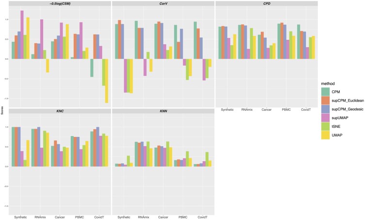
ci is the center of the ith cluster and cik is the kth component of ci. ni is the number of points in the ith cluster and p is the dimensionality of embedding points. In addition, yi is the embedding points of the ith cell. A smaller score of CSM indicates a better performance of cluster separation. To be consistent with other metrics and to plot all metrics together, we took the negative log transformation of CSM and rescaled its range in Figure 7.
Fig. 7.
Visualization methods comparison using five metrics
3 Results and conclusions
3.1 Synthetic dataset
Following the procedure in Kobak and Berens (2019), we simulated 3600 points from nine different multivariate Gaussian distributions in 50 dimensions. The data can be grouped into three main classes, and each class can further be separated into three sub-clusters. Data were sampled from Gaussian distributions with different covariance matrices, which were I, and for sub-clusters in the first, the second and the third classes, respectively, where I was the identity matrix. Points from different classes were then shifted by 20 in mutually orthogonal directions. Next, all points from each sub-cluster in the first class (n = 600 per type) were additionally shifted by 5 in mutually orthogonal directions; by 10 in the second class (n = 400 per type); and by 15 in the third (n = 200 per type). In addition, we made the directions differentiating sub-clusters orthogonal to the directions differentiating the three main classes. To explore the sample size effect among different methods, we specifically let sub-clusters with larger sample size had smaller variation. For comparison, we visualized the simulated data using Multidimentional Scaling (MDS), PCA, supPCA, t-SNE, UMAP, supUMAP, CPM and supCPM as shown in Figure 2.
Fig. 2.
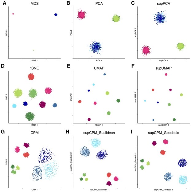
Visualization of Synthetic data. (a) MDS on cluster means. The size of point is proportion to the variance of cluster. (b) PCA. (c) supervised PCA. (d) t-SNE. (e) UMAP with cosine distance. (f) supUMAP with cosine distance. (g) CPM. (h) supCPM with Euclidean distance and w = 0.6. (i) supCPM with Geodesic distance and w = 0.7
In Figure 2a, MDS was applied on cluster means instead of individual data, and the size of the resulting six points was proportional to the true variance per cluster in the original data. The MDS results matched well with the global geometric structure of sub-clusters. In Figure 2b and c, PCA and supPCA captured the variance of clusters well, but clusters were indistinguishable because the sub-cluster directions are orthogonal to the first two PC directions. As shown in Figure 2(d–f), t-SNE, UMAP and supUMAP distorted the variance of clusters and showed that the three green sub-clusters have the largest variance. This is because the green sub-clusters had the largest number of points. The metric, CorV, in Figure 7 reflected the same observation. Apart from the issue of preserving variance, t-SNE and UMAP severely distorted the data geometry, with t-SNE exhibiting a worse performance as shown in Figure 2d and e. In contrast, CPM and supCPM showed desirable visualization results (Fig. 2g–i). Even though a small fraction of points in green clusters were mixed up, CPM successfully maintained the variance and geometry structure. Similarly, supCPM not only separated different clusters more effectively, but also kept the most of geometry and variance structures. In addition, the KNN metric also demonstrated that most of the local structure was also precisely rendered by supCPM. Finally, based on Figure 7, supCPM achieved high scores in all evaluation metrics, outperforming the current benchmarks.
3.2 scRNAseq dataset
3.2.1. Synthetic scRNAseq data
We used the synthetic scRNAseq, denoted as RNAmix, generated by Tian et al. (2019) that contained 340 ‘pseudo cells’. These ‘pseudo cells’ with various ratios of RNA contents extracted from three cell lines (H2228, H1975, HCC827) formed seven clusters with a triangle structure (Fig. 3a). Owing to the small sample size, we performed log-Normalization, scale and PCA on the data following the standard Seurat procedure (Hao et al., 2021). We then took the top 10 PCs as the input for both the shared nearest neighbor (SNN) modularity optimization-based clustering and the visualization methods in Seurat. The SNN method successfully grouped the cells into seven groups reflecting the true underlying structure with an error rate of 5.9%. Because in practice, we rarely know the true cluster labels, the resulting SNN estimated cluster labels were used as input for the three supervised visualization methods.
Fig. 3.
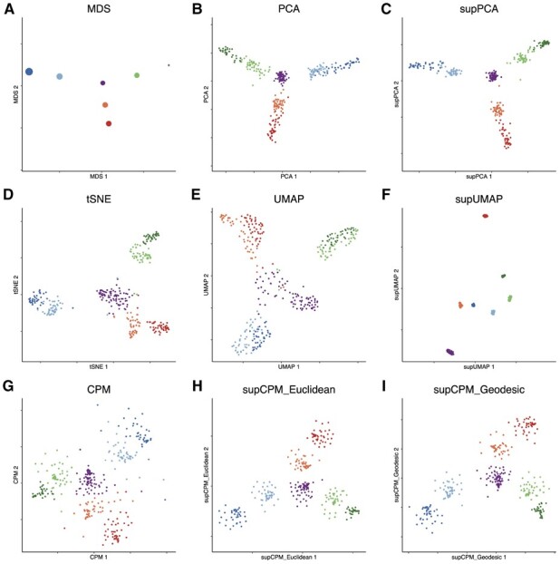
Visualization of RNAmix data. (a) MDS on the cluster means. The size of point is proportional to the variance of cluster (b) PCA. (c) supPCA. (d) t-SNE. (e) UMAP with cosine distance. (f) supUMAP with cosine distance. (g) CPM. (h) supCPM with Euclidean distance and w = 0.8. (i) supCPM with geodesic distance and w = 0.7
As the global structure of this dataset is linear, PCA and supPCA performed well in uncovering the triangular structure but failed to effectively separate the clusters as shown in Figure 3b and c. Figure 3d shows that t-SNE preserved some global structure, but the triangle structure was blurred. UMAP distorted the structure even further. In particular, in Figure 3e, it was challenging to ascertain the underlying affinity between the central purple cluster with the surrounding units. CPM produced a few floating points due to the high noise level of the dataset but captured the correct triangle structure. In contrast, by utilizing the cluster labels, supCPM forced those floating cells to be closer with other cells in the same cluster and hence generated better results reflecting the true variance and global structure than the other methods. Furthermore, supCPM respected the local structure at the same level as UMAP as summarized in Figure 7.
3.2.2. Cell line data
To evaluate the performance of supCPM in real datasets, we downloaded and analyzed the expression profiles of cancer cells lines generated by McFarland et al. (2020). The whole dataset contains cells from 24 cell lines treated with either Nutlin or vehicle control dimethyl sulfoxide (DMSO). For the ease of visualization, we chose eleven cell lines with 1224 cells under the DMSO treatment. The selected cell lines were originated from six of organs: RCC10RGB (Kidney), LNCAPCLONEFGC (Prostate), BICR31 (Upper Aerodigestive Tract 1), BICR6 (Upper Aerodigestive Tract 2), SQ1 (Lung 1), RERFLCAD1 (Lung 2), NCIH2347 (Lung 3), CCFSTTG1 (Nervous System 1), DKMG (Nervous System 2), RCM1 (Large Intestine 1), LS1034 (Large Intestine 2). We used Seurat SCTransformation to normalize and scale the data before applying PCA. The top 20 PCs were used for clustering to recover the underlying cell lines structure, which resulted an accuracy of 99.9%. We also annotate each cluster based on the known cell line labels.
Cell lines derived from the same organ tended to have similar expression profiles and hence should be plotted close to each other. This is indeed the case as in shown the MDS result (Fig. 4a). Among the rest of the methods, only CPM and supCPM displayed the cell lines correctly reflecting their origins, such as the Lung, large intestine, upper aerodigestive tracts and the nervous system. Also, we observed that the prostate cancer cells behave differently from the other cell lines, which was also captured by supCPM and CPM. Regarding to numerical metrics as in Figure 7, supCPM outperformed t-SNE and (sup-) UMAP in KNC, CPD and CorV. supCPM showed a comparable performance as UMAP on the local metric KNN. In sum, supCPM preserves substantially more global structure and variance than t-SNE and UMAP while keeping the local structure similar as UMAP.
Fig. 4.
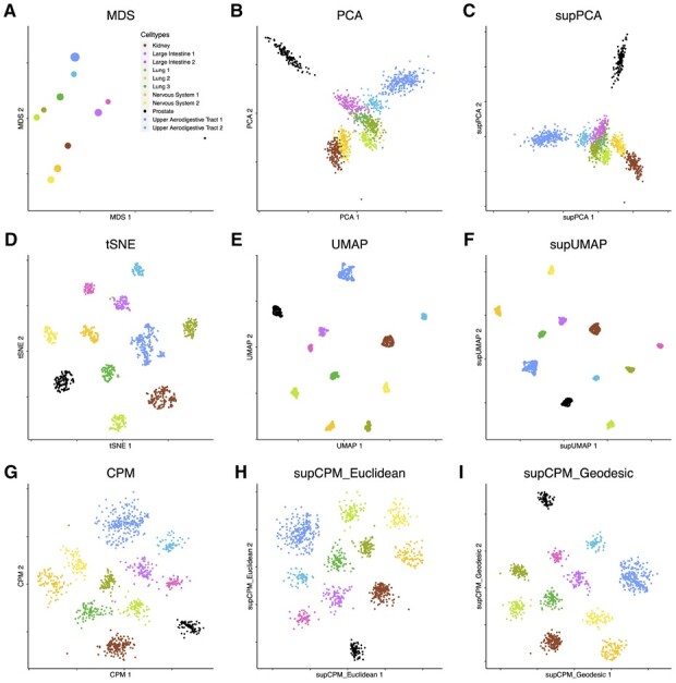
Visualization of 11 Cancer cell lines data. (a) MDS on cluster means. The size of point is proportional to the variance of cluster. (b) PCA. (c) supPCA. (d) t-SNE. (e) UMAP with cosine distance. (f) supUMAP with cosine distance. (g) CPM. (h) supCPM with Euclidean distance and w = 0.6. (i) supCPM with geodesic distance and w = 0.6
3.2.3. Human peripheral blood mononuclear cell data
In addition to cell line data, we next applied supCPM to 2700 human peripheral blood mononuclear cells (PBMC) data derived from a healthy donor, which was downloaded from the 10× Genomics website. Following the standard Seurat procedure, we clustered the cells into twelves groups and annotated them using predefined marker genes. Platelets do not have nuclei and are not considered true cells. They are cellular fragments with a greatly different gene expression profile from the other hematopoietic cellular subsets. Thus, platelets ought to be far away from the other cells as the result in Figure 5a. However, neither t-SNE nor UMAP revealed this information (Fig. 5d–f). In contrast, SupCPM successfully recapitulated this structure. In addition, dendritic cells (DC), CD14 Monocyte (Mono) and FcGR3AMono are myeloid cells and should differ from the lymphoid compartment. Results from supCPM clearly grouped the three myeloid subsets together, while the other methods have misleading results. In particular, UMAP placed B cells close to DC cells instead of other lymphoid lineage cells. As evidence of visualizing the true biologic relationships among clusters, we also focused on memory CD4 T cells and naive CD4 T cells. UMAP and t-SNE almost projected these cell types with the largest variation, while the truth showed in MDS was that these two types had very small variations. In contrast, supCPM successfully preserved the biologic relationship and projected the structure onto a 2D space. In sum, both visualization figures and evaluation metrics support that supCPM shows an unprecedented rigor in preserving the geometry and variance information of complex cellular architectures.
Fig. 5.
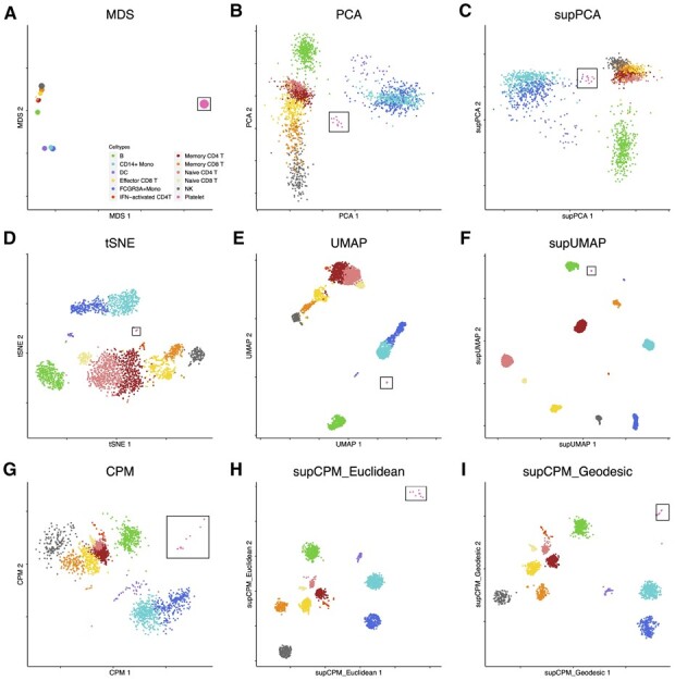
Visualization of PBMC data. (a) MDS on cluster means. The size of point is proportional to the variance of cluster. (b) PCA. (c) supPCA. (d) t-SNE. (e) UMAP with cosine distance. (f) supUMAP with cosine distance. (g) CPM. (h) supCPM with Euclidean distance and w = 0.9. (i) supCPM with geodesic distance and w = 0.9. Platelet cells are highlighted in a black box in figures
3.2.4. Visualization of T-cell subsets in the bronchoalveolar lavage fluid specimens from COVID-19 patients
To test the performance of supCPM in differentiating cellular subsets with continuous functional transitions and overlaps, we compared different visualization methods using datasets of bronchoalveolar lavage fluid immune cells from patients with COVID-19 (Liao et al., 2020). We developed a focused analysis on T cells because this population represents a highly dynamic model with continuous functional transitions and can be grouped into distinct subsets. This dataset contains 8028 T cells, and we annotated the clusters generated by Liao et al. (2020), using domain knowledge. In this real-world example, the utilization of tSNE or UMAP resulted in extensive misplacements as shown in Figure 6d and e. Although supUMAP reduced the misplacement events, it fails to clearly separate different functional subsets as shown in Figure 6f. Also, the inter-cluster distances were distorted and did not represent true biologic functional distance. For example, follicular helper T cells appeared to be the most distinctive cell type under the supUMAP framework, which was misaligned with the MDS result in fig:COVIDa. By incorporating the label information, supCPM correctly revealed the inter-cluster architecture as in Figure 6h and i. Notably, Figure 6i shows that there were additional substructures in the TimCD8IFN T cells. Using the default clustering algorithm in Seurat with the 2D embedding coordinates as inputs, we successfully identified these two sub-clusters (Supplementary Fig. S7). We found that sub-cluster 1 had significantly higher expression levels of EOMES and PDCD1 genes than sub-cluster 2, which indicates that sub-cluster 1 contained functionally more exhausted effector CD T cells although it was closely related to sub-cluster 2. This identification of substructure using supCPM shows that supCPM offers an unprecedented sensitivity and accuracy in detecting and visualizing functionally related yet distinct cell populations. The supCPM method integrates the strengths of the label information and visualization-assisted domain knowledge refinement to better reveal novel functional cellular subsets.
Fig. 6.
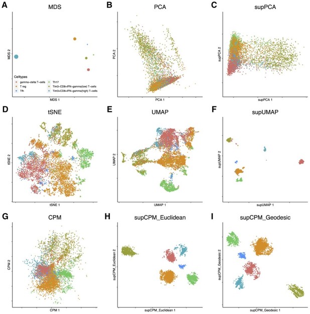
T cells in bronchial alveolar lavage fluid from COVID-19 patients were visualized using different methods. (a) MDS on cluster means. The size of point is proportional to the variance of cluster. (b) PCA. (c) supPCA. (d) t-SNE. (e) UMAP with cosine distance. (f) supUMAP with cosine distance. (g) CPM. (h) supCPM with Euclidean distance and w = 0.85. (i) supCPM with geodesic distance and w = 0.85
3.3 Interpretation of the five metric scores
In Table 1, Figure 7 and Supplementary Table S1, we evaluated the performances of different visualization methods using the five metrics introduced in Section 2.5. They are and . Among the five, KNC and KNN reflect the preservation of local geometry, reflects the preservation of global geometry, measures both local and global geometry (thus it is sometimes regarded as being more important than others), and reflects the cluster separation. Importantly, while for the first four, the larger score the better, for , a score greater than 0.4 is considered as enough, as 0.4 already indicates a clear cluster separation. A too large value of is both unnecessary and usually comes with a cost of under-performance in other metrics.
Table 1.
Metric performance summary
| First | Second | Third | |
|---|---|---|---|
| KNC | supCPM-Geodesic | supCPM-Euclidean | tSNE |
| CPD | supCPM-Euclidean | supCPM-Geodesic | UMAP |
| CorV | supCPM-Euclidean | supCPM-Geodesic | supUMAP |
| −log(CSM) | supUMAP | supCPM-Euclidean | supCPM-Geodesic |
| KNN | t-SNE | UMAP | supCPM-Geodesic |
When assessing a given visualization method, we recommend using the five metrics integrately, since succeeding in one (or even a subset of) metric(s) fails to guarantee good visualization results. For instance, if a method (such as PCA) is only rated highly in the four geometry-preserving metrics (i.e. ), but poorly rated in the cluster separation one [i.e. ], then the visualization would contain heavily overlapped clusters, preventing human eyes from detecting useful information from it. Likewise, if a method is well-rated in the clustering-related metrics including and while performing poorly in and , then it is likely a clustering-oriented visualization method which needs to be complemented by the geometry-preserving ones. Therefore, we believe that the advantage of supCPM lies in its relatively good performances across all five evaluation metrics, which ensures the resulting visualization to be more trustworthy, informative and user-friendly. Explicitly, Table 1 reports the top three algorithms in terms of the average performance rank across the five datasets (detailed results can be found in Supplementary Table S1). As we expected, supCPM performs the best in and . In terms of cluster separation measure, , supUMAP dominates other methods but has a suboptimal performance on other metrics. Also, Figures 2–6 have shown that supCPM can also successfully separate different clusters. As for the score, which describes the local structure preservation, supCPM is only slightly worse than UMAP. This is expected as the better preservation of global geometry comes with a price of losing some local information. In summary, supCPM has superior performances in (i) preserving cluster position, (ii) preserving global geometry, (iii) preserving cluster variation and (iv) separating different clusters.
4 Discussions
The rapidly expanding need to reveal the functional relationships at single-cell resolution poses important challenges to the current visualization tools, which do not always render the bona fide cluster segregation in a 2D space. Thus, a more accurate and functionally related single-cell profiling pipeline is in urgent need. In this study, we propose supCPM, a supervised visualization method, to visualize the true functional relationships between cell types by leveraging both geometry information and label information. The implementation of supCPM is timely because of the frequent inconsistency between the visualization and clustering results. Not only does supCPM integrate the label information, but it also substantially improves the visualization fidelity and shows superior performances over the current benchmarks. And surprisingly, even though supCPM preserves geometry globally, it still preserves local structure at the same level as UMAP. Another major limitation of UMAP and t-SNE is that both methods cannot preserve the variation of clusters. The variation of clusters is largely associated with the sample size rather than the true variation. supCPM alleviates the problem and makes the visualization more functionally relevant. To test the performance of supCPM, we compared it with six other visualizing algorithms and evaluated them by five metrics. Metric results together with the visualization figures substantiates the unprecedented rigor of supCPM in recovering the true variation, keeping both global and local structures and distinguishing different cell types.
Accurate interpretations of single-cell datasets depend on effective visualization. supCPM is an example of leveraging an extended array of information. There are additional possibilities to further improve the visualization algorithms. First, how to combine the intermediate structure of clustering algorithm could be a meaningful question. supCPM only takes the final labels and leaves other information out. For instance, the SNN graph produced during Phenograph clustering could provide more information for visualization, so that the visualization could be more consistent with the underlying clustering algorithm. Second, there is still other relevant information could be utilized. Tree structure indicating the affinity of cell types could be helpful for visualization. Tree structure showing which two clusters are closer to each other will help the visualization to keep global structure. It would be helpful to incorporate these information to increase the accuracy and interpretability. We only tested supCPM on datasets with discrete cell types. Processing the label information from complex scRNAseq datasets with continuous functional transition may be challenging. Continuous scRNAseq data often exhibits trajectories where functional overlaps occur. This real-world challenge could limit effectiveness of supCPM, because the second optimization part separates different clusters far apart. The solution to this problem entails a more delicate supervision method. And more difficultly, one could think of how to process the dataset with the mixture of both discrete and continuous cell types. Manual review of the functionally overlapping clusters with known gene matrices that inform distinct lineage subsets would be equally important. Overall, here we present a novel and rigorous new visualization algorithm, which shows accurate representation of underlying functional relationship and outperforms the current benchmarks.
Supplementary Material
Acknowledgements
The authors acknowledge Dr Leland McInnes for his feedback and explanations of UMAP, Dr Ali Ghodsi and Dr Elnaz Barshan for providing the code of supervised PCA and the anonymous reviewers for their constructive suggestions.
Funding
This work was supported in part by the National Institutes of Health [U01DE029255, R03DE027399, R01DE026728, R01DE030691]; and the National Science Foundation [DMS-1912906, BCS-1630982, CCF-1909523, IOS-2107215].
Conflict of Interest: none declared.
Data availability
Raw data of RNAmix are available at GEO under accession code GSE118767, and the processed data are available at https://github.com/LuyiTian/CellBench_data. The Cancer cell line data are available at https://figshare.com/s/139f64b495dea9d88c70. The PBMC dataset is available at 10x Genomics’s website https://support.10xgenomics.com/single-cell-gene-expression/datasets. The COVID dataset is available at https://github.com/zhangzlab/covid_balf.
Contributor Information
Zhiqian Zhai, Department of Computational Mathematics, Science and Engineering, Michigan State University, East Lansing, MI 48824, USA; Department of Statistics, University of California Los Angeles, Los Angeles, CA 90095, USA.
Yu L Lei, Department of Periodontics and Oral Medicine, University of Michigan School of Dentistry, Ann Arbor, MI 48109, USA; University of Michigan Rogel Cancer Center, Ann Arbor, MI 48109, USA.
Rongrong Wang, Department of Computational Mathematics, Science and Engineering, Michigan State University, East Lansing, MI 48824, USA; Department of Mathematics, Michigan State University, East Lansing, MI 48824, USA.
Yuying Xie, Department of Computational Mathematics, Science and Engineering, Michigan State University, East Lansing, MI 48824, USA; Department of Statistics and Probability, Michigan State University, East Lansing, MI 48824, USA.
References
- Barshan E. et al. (2011) Supervised principal component analysis: visualization, classification and regression on subspaces and submanifolds. Pattern Recognit., 44, 1357–1371. [Google Scholar]
- Becht E. et al. (2019) Dimensionality reduction for visualizing single-cell data using UMAP. Nat. Biotechnol., 37, 38–44. [DOI] [PubMed] [Google Scholar]
- Chen G. et al. (2019) Single-cell RNA-seq technologies and related computational data analysis. Front. Genet., 10, 317. [DOI] [PMC free article] [PubMed] [Google Scholar]
- Hao Y. et al. (2021) Integrated analysis of multimodal single-cell data. Cell, 184, 3573–3587. [DOI] [PMC free article] [PubMed]
- Jia Y. et al. (2009) Trace ratio problem revisited. IEEE Trans. Neural Networks, 20, 729–735. [DOI] [PubMed] [Google Scholar]
- Kiselev V.Y. et al. (2017) SC3: consensus clustering of single-cell RNA-seq data. Nat. Methods, 14, 483–486. [DOI] [PMC free article] [PubMed] [Google Scholar]
- Kiselev V.Y. et al. (2019) Challenges in unsupervised clustering of single-cell RNA-seq data. Nat. Rev. Genet., 20, 273–282. [DOI] [PubMed] [Google Scholar]
- Kobak D., Berens P. (2019) The art of using t-SNE for single-cell transcriptomics. Nat. Commun., 10, 5416. [DOI] [PMC free article] [PubMed] [Google Scholar]
- Lee J.A., Verleysen M. (2009) Quality assessment of dimensionality reduction: rank-based criteria. Neurocomputing, 72, 1431–1443. Advances in Machine Learning and Computational Intelligence. [Google Scholar]
- Levine J. et al. (2015) Data-driven phenotypic dissection of AML reveals progenitor-like cells that correlate with prognosis. Cell, 162, 184– 197. [DOI] [PMC free article] [PubMed] [Google Scholar]
- Liao M. et al. (2020) Single-cell landscape of bronchoalveolar immune cells in patients with covid-19. Nat. Med., 26, 842–844. [DOI] [PubMed] [Google Scholar]
- Linderman G.C. et al. (2019) Fast interpolation-based t-SNE for improved visualization of single-cell RNA-seq data. Nat. Methods, 16, 243–245. [DOI] [PMC free article] [PubMed] [Google Scholar]
- Little A. et al. (2018) An analysis of classical multidimensional scaling. arXiv preprint arXiv:1812.11954.
- Liu Y. et al. (2013) Efficient semi-supervised feature selection with noise insensitive trace ratio criterion. Neurocomputing, 105, 12–18. [Google Scholar]
- Maaten L.V.D., Hinton G. (2008) Visualizing data using t-SNE. J. Mach. Learn. Res., 9, 2579–2605. [Google Scholar]
- Macosko E.Z. et al. (2015) Highly parallel genome-wide expression profiling of individual cells using nanoliter droplets. Cell, 161, 1202–1214. [DOI] [PMC free article] [PubMed] [Google Scholar]
- McFarland J.M. et al. (2020) Multiplexed single-cell transcriptional response profiling to define cancer vulnerabilities and therapeutic mechanism of action. Nat. Commun., 11, 4296. [DOI] [PMC free article] [PubMed] [Google Scholar]
- McInnes L., Healy J. (2018) UMAP: uniform manifold approximation and projection for dimension reduction. arXiv preprint, page arXiv/1802.03426.
- Roweis S.T., Saul L.K. (2000) Nonlinear dimensionality reduction by locally linear embedding. Science, 290, 2323–2326. [DOI] [PubMed] [Google Scholar]
- Sandberg R. (2014) Entering the era of single-cell transcriptomics in biology and medicine. Nat. Methods, 11, 22–24. [DOI] [PubMed] [Google Scholar]
- Tian L. et al. (2019) Benchmarking single cell RNA-sequencing analysis pipelines using mixture control experiments. Nat. Methods, 16, 479–487. [DOI] [PubMed] [Google Scholar]
- Wang R., Zhang X. (2019) Capacity Preserving Mapping for High-dimensional Data Visualization. arXiv preprint, page arXiv:1909.13322.
- Wattenberg M. et al. (2016). How to use t-SNE effectively. Distill, 1, e2.
- Wolf F.A. et al. (2018) SCANPY: large-scale single-cell gene expression data analysis. Genome Biol., 19, 15. [DOI] [PMC free article] [PubMed] [Google Scholar]
- Xie X.L., Beni G. (1991) A validity measure for fuzzy clustering. IEEE Trans. Pattern Anal. Mach. Intell., 13, 841–847. [Google Scholar]
- Zhou B., Jin W. (2020) Visualization of single cell RNA-seq data using t-SNE in R. In: Stem Cell Transcriptional Networks. Springer, Humana, New York, NY, pp. 159–167. [DOI] [PubMed] [Google Scholar]
- Ziegenhain C. et al. (2017) Comparative analysis of single-cell RNA sequencing methods. Mol. Cell, 65, 631–643. [DOI] [PubMed] [Google Scholar]
Associated Data
This section collects any data citations, data availability statements, or supplementary materials included in this article.
Supplementary Materials
Data Availability Statement
Raw data of RNAmix are available at GEO under accession code GSE118767, and the processed data are available at https://github.com/LuyiTian/CellBench_data. The Cancer cell line data are available at https://figshare.com/s/139f64b495dea9d88c70. The PBMC dataset is available at 10x Genomics’s website https://support.10xgenomics.com/single-cell-gene-expression/datasets. The COVID dataset is available at https://github.com/zhangzlab/covid_balf.


