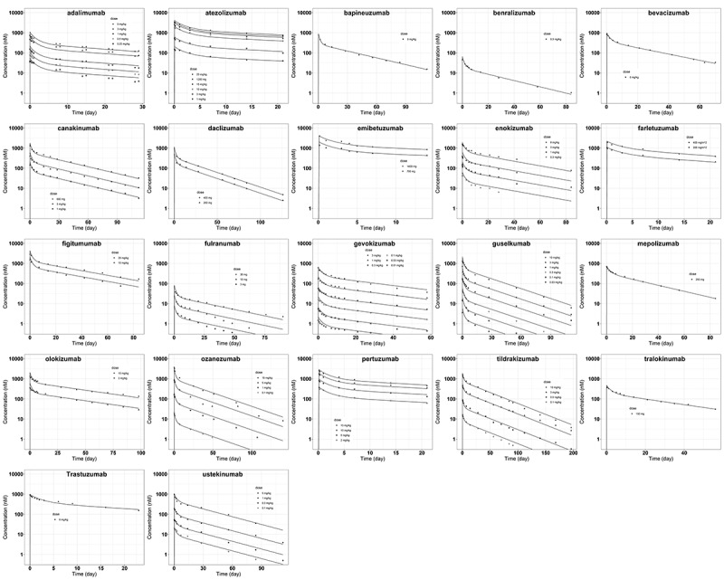
Figure 3.

Model predicted and observed antibody plasma concentration versus time profiles following intravenous delivery. The solid lines are model predictions. The symbols represent digitized data at different dose levels from literature (Table 1).
ALT Text: 22 scatter plots arranged into five rows, with different antibody names on the top of each plot. Within each plot there are dots of different shapes labeled as different doses. A solid line is plotted corresponding to dots of each dose, with good agreement. The x axis has a title of “Time (day)” and y axis is in log scale with a title of “Concentration (nM).”
