

Abstract
This work presents a novel methodology for systematically processing the time series that report the number of positive, recovered and deceased cases from a viral epidemic, such as Covid-19. The main objective is to unveil the evolution of the number of real infected people, and consequently to predict the peak of the epidemic and subsequent evolution. For this purpose, an original nonlinear model relating the raw data with the time-varying geometric ratio of infected people is elaborated, and a Kalman Filter is used to estimate the involved state variables. A hypothetical simulated case is used to show the adequacy and limitations of the proposed method. Then, several countries, including China, South Korea, Italy, Spain, U.K. and the USA, are tested to illustrate its behavior when real-life data are processed. The results obtained clearly show the beneficial effect of the severe lockdowns imposed by many countries worldwide, but also that the softer social distancing measures adopted afterwards have been almost always insufficient to prevent the subsequent virus waves.
Keywords: Nonlinear Kalman filtering, parameter estimation, Covid-19, geometric series
I. Introduction
Despite the spectacular medical advances of the 20th century, and the practical eradication of viral diseases that in the past caused great mortality (e.g., smallpox), modern societies are still very vulnerable to the sudden appearance of new viruses, such as the severe acute respiratory syndrome coronavirus 2 (SARS-CoV-2), cause of the coronavirus disease 2019 (Covid-19), for which there is still no vaccine. In addition, once a viral outbreak originates in a region of a country (in the case of the Covid-19, the Chinese region of Hubei, where the first reported case was dated on December 2019), the globalization of the economy and mass tourism spread it almost inevitably and quickly to the rest of the world.
In the absence of effective treatments, once a certain threshold has been passed, the main and almost sole remedy against the spread of the disease to the entire population is social distancing, the objective of which is to minimize the contact between people, and therefore morbidity [1]. In extreme cases, when the speed of propagation of the outbreak is very high, massive lockdowns of entire countries may be needed, which cannot last indefinitely owing to their drastic impact on the economic activity.
For this reason, all the agents involved (governments, international organizations, institutions, companies and individuals) have the greatest interest in knowing how the number of affected and deceased people will evolve over time, with a view, on the one hand, to verifying the beneficial effects of social distancing, and on the other to scheduling the already saturated health resources and taking the economic measures intended to mitigate as far as possible the devastating effects of an epidemic like that of Covid-19.
Scientists, engineers, economists, etc. are acquainted with several mathematical and statistical toolkits (recently renamed collectively as “data analytics”) for the treatment and filtering of time series, with a view to extracting useful information from the available data, uncertain by definition, such as trends, patterns, average values, expected variances, etc. In the specific case of a viral epidemic, such as that of Covid-19, there are basically two categories of models for processing the information:
-
1.
Models that try to characterize the “physical” reality explaining the observed data. In the case of a viral epidemic, these models [2], [3] consider, for example, what fraction of people are at work, in teaching or travelling, how long it takes for an infected person to manifest symptoms, what is the mortality rate according to age groups, etc. This type of modeling is widely used in engineering, because the dynamics of the underlying systems or devices are generally well characterized, through mathematical relationships obtained from the physical laws that govern them (such is the case, for example, of electrical networks or an artificial satellite).
-
2.Models that try to determine explanatory parameters or variables from a purely mathematical point of view (“black box” approach), without going into the causes or interactions between components that explain the resulting data. Given uncertain data, which enter the system regularly (in our case, every day), the aim is to characterize its temporal evolution by adjusting the parameters of a mathematical model, so that the differences between what is observed and what is estimated are minimized. Two variants can be considered in this category:
-
a)Mathematical models that do not assume a priori what the shape of the temporal evolution of the involved magnitudes will be, but rather use a state transition equation, which tries to capture the dynamics of the problem in question by relating the variables in an instant of time to the variables in the previous instant. In this case, it is a matter of determining how the coefficients that define this equation evolve over time. In the case of epidemics, among the most popular models are those derived from the SIR (Susceptible-Infected-Recovered) model, [4], such as the one used for example in [5] to analyze the evolution of Covid-19 in Italy. This model is also considered in [6], where the evolution of the epidemic is forecasted using a novel state filtering algorithm.
-
b)Mathematical models based on the assumption that the evolution of infected people, deceased, etc. obeys a predetermined curve (based on the experience of previous epidemics), whose coefficients are estimated based on the time series of reported data. For example, the evolution of the accumulated number of infected people can be satisfactorily approximated by means of a sigmoid curve, as assumed in [7], where the curve proposed by Gompertz [8] is used.
-
a)
The methodology proposed in this work belongs to the second category. As explained in the next section, we depart from the basic SIR model, by considering that the number of susceptible people, being large enough and changing relatively slowly, does not have to be explicitly considered in the model, but can be rather embedded in other equally significant parameters, such as the time-varying ratio of the geometric series characterizing the progression of affected people. Moreover, the proposed model explicitly distinguishes between people who have proved positive in a test, and people actually infectious, who are many more and for whom there is no reliable information available.
In this work, a Kalman filter (KF) is used to process both the assumed dynamic model and the information available throughout the outbreak. The KF, proposed for linear dynamic systems in the early 1960s, is considered one of the fundamental tools that allowed men to walk on the moon, as it was successfully used in guiding the Apollo program space missions [9]. This filter, which constitutes a generalization of the technique known as “recursive least squares”, estimates the maximum likelihood evolution (that is, the most statistically probable, according to the assumed uncertainties and the observed samples) of the state of a dynamic system, and can be generalized to the non-linear case, including situations where the model parameters are also to be estimated.
Reference [10] applies the KF for the estimation of the evolution of AIDS, while several recent studies related to the Covid-19 have arisen. In [11] the KF is used to deal with the estimation of the reproductive number of the virus. A shortterm prediction model is proposed in [12], where the time update equations of the estimator are used for future forecasts of the pandemic spread. ARIMA models are combined with a KF in [13] to track the evolution of the Covid-19 in Pakistan. Unlike in those references, where the parameters involved in the state estimation process are supposed to be known, in this work such assumptions are not required. This is the major distinguishing feature of the proposed methodology, compared to the state of the art, and the main contribution of the paper.
II. Proposed Model
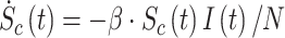
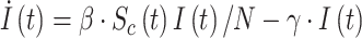
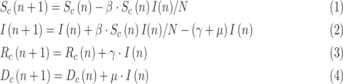
We start from the well-known and simple SIR model [4], mathematically described by:
 |
 |
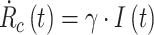 |
where  and
and  are, respectively, the cumulative or total susceptible and recovered people,
  represents the active infectious (not to be confused with cumulative infectious), β and γ are the transmission and recovery rates, and
  is the total population of the studied region, satisfying
 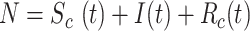 . Note that, in this compact model, the deceased cases are paradoxically included in
  (alternatively, they could be subtracted from
  ).
).
For practical purposes, the discrete counterparts obtained by numerical integration (forward Euler) are rather of interest. Moreover, as dead people are separately reported, they can be explicitly modeled, leading to a discrete-time SIRD (Susceptible-Infected-Recovered-Deceased) model, as used in [14]–[16]:
 |
where  is the elapsed time (in days) from a given origin,
  is the cumulative dead and
  is a mortality ratio.
The data publicly reported (available in references such as [17], [18]), typically comprise the following three items:
-
•
Fraction of infectious people who, subject to a test, yield a positive outcome. This considers the fact that there may be many more infected than those reported positives, as happens with a large number of asymptomatic people. The cumulative positives will be denoted

-
•
Fraction of recovered people who have been previously identified as positive. For simplicity of notation, the same symbol as in the basic SIR model,
 , will be used in the sequel, even though we are referring here to a subset of
  .
. -
•
Cumulative number of deceased,
 , which is assumed to be the same as in the SIRD model, even though the actual number of dead by the virus may differ from the reported figures.
Some sources directly provide the active positive cases,  defined as:
  Note that both
  and
and  tend to zero as
  increases sufficiently (end of the viral outbreak), while the remaining cumulative magnitudes asymptotically reach a maximum or steady-state value.
Epidemiologists use the so-called basic reproductive number,  (average number of people infected by a single infectious person during the infective period at the onset of the outbreak) to characterize whether and how fast an epidemic spreads at the very beginning. If
  > 1, then the epidemic will progress exponentially. As time elapses, though, the number of susceptible people decreases, either by the virus evolution itself or as a consequence of social distancing measures, and
  is replaced by the effective reproductive number,
  . In terms of SIRD coefficients,
  and
and  are given by:
 |
However, as thoroughly discussed in [19], the basic reproductive number  is not free from ambiguity and controversy. For instance, it is stated in [19] that “using
  as a threshold parameter for a population-level model could produce misleading estimates of the infectiousness of the pathogen, the severity of an outbreak, and the strength of the medical and/or behavioral interventions necessary for control.” Moreover, if
  is estimated from time series of reported data, as in [11], then there is no way, at least for a new virus such as Covid-19, to subsequently check or contrast the accuracy of the estimates. This probably explains the wide confidence intervals so far reported for
  values [20]. Similar arguments apply to
For this reason, instead of or in addition to  , we postulate in this work the use of a more intuitive and measurable index, related with the growth rate of the infected class, to duly and unambiguously characterize a viral epidemic. Let the daily evolution of the active infectious be expressed as a geometric time series:
 |
where  ) is the time-varying ratio of the series. Then the daily growth rate is obtained from:
 |
Clearly, as long as  )>1, the viral outbreak will continue its expansion, whereas the disease extinguishes when
  )<1. There is no ambiguity in using
  ) as a threshold, when referred to a whole population. Note however that, if (5) were expressed in terms of cumulative magnitudes, rather than daily or active cases, then
  ) would tend asymptotically to 1.
By direct comparison of (5) with (2), the following relation is obtained,
 |
or, in terms of  :
:
 |
Given  one still would have to guess the values of the parameters involved in the SIRD model (1)–(4), to obtain
  . We contend that there is no need to worry in the short term about
  , as
, as  suffices to duly track the epidemic evolution on a daily basis.
This work is aimed at estimating, from the daily reported data, the evolution of  and, as a consequence, the growth rate of the infectious people. Note that, if
  can be somehow estimated, then (1) becomes unnecessary. In our approach, the impact of susceptible people, a factor which varies smoothly, is also embedded into
  .
.
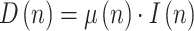
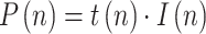
In order to take advantage of the reported numbers of positive, deceased, and recovered cases, the following relationships are considered, taking into account (3)–(4):
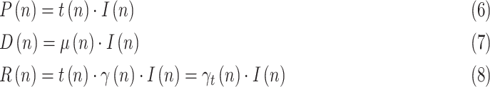 |
where  is a testing or reporting ratio that models the fraction of those infectious who are subject to tests and yield positive,
  is the daily increase in the number of deaths, and
 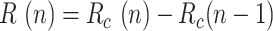 is the daily variation in the number of recovered cases.
From (7) at two consecutive instants, keeping (5) in mind:
 |
 |
and dividing:
 |
where 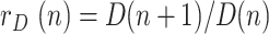 is the ratio of consecutive daily deaths and
 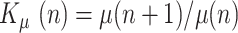 is in turn a ratio of consecutive mortality ratios.
Similarly, from (6) and (5):
 |
 |
and dividing:
 |
where 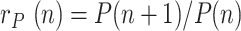 is the ratio of consecutive daily positives and
 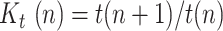 is a ratio of consecutive
  coefficients.
Finally, from (8) and (5):
 |
 |
and dividing:
 |
where 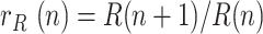 is the ratio of daily recovered cases and
 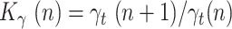 is a ratio of consecutive
  coefficients.
III. Kalman Filter Application and Implementation
From the above simple model, given by (9)–(11), a system of state equations can be formulated allowing the sequence  to be estimated by means of a non-linear KF, such as the Extended KF (EKF), Unscented KF (UKF) or Ensemble KF (EnKF) [9], [21]. This type of filter is capable of estimating the dynamic evolution of both parameters and state variables. Even though its maximum likelihood has only been proven for linear problems, it is applied successfully in nonlinear problems, such as the one in hand.
In our proposal, the state vector is composed of the infectious geometric ratio,  , not directly measured, and the gains
  ,
,  and
and  all of them initially assumed to evolve with a random walk. Therefore, the state vector is
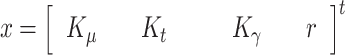 |
and the state transition equation:
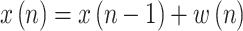 |
where 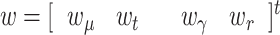 is a Gaussian noise vector with a covariance matrix Q(n), which accounts for model errors such as possible time lags not duly considered in the model.
The state is to be estimated with the help of a measurement vector, composed of  ,
,  and
and  , along with the pseudo-measurements of
 and
and  Thus, assuming that the coefficients
  ,
,  and
and  change slowly, their variation ratios can be considered to lie around the unity. Therefore, the measurement vector is,
 |
and the measurement equation,
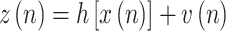 |
where  is a Gaussian noise vector that models the measurement error with a covariance matrix R(n), and the nonlinear measurement function is
 |
With this formulation, the EKF is able to deal properly with the non-linearity arising in the measurement equation, performing at each iteration a linear prediction step, followed by the non-linear correction step. So, the KF provides the sequence of states estimates  , whose last component, the estimate of
  , will be denoted as
The sequence  incorporates, in a statistically optimal fashion, the noisy information provided by raw data ratios, such as
  ,
,  or
or  , which results in a more reliable estimation than the raw data ratios themselves.
After several initial trials, an enhanced model has been finally implemented, considering two improvements:
-
1)The random walk in
 can be advantageously replaced, while keeping the linearity of the state equation, by a linear prediction based on the recent past history, e.g., Based on
  ,
,  and
and  . In this Case,

and
 |
where:
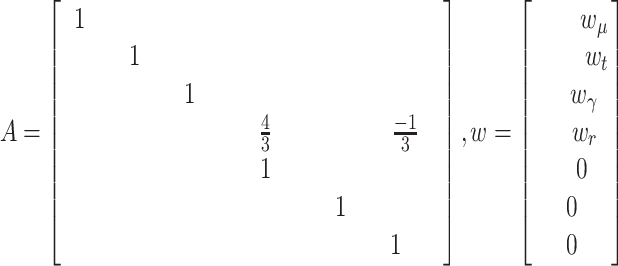 |
-
1)
The information available at instant
 can be used to improve previous estimations. For this purpose, the Rauch-Tung-Striebel (RTS) smoother [9], is implemented in two steps:
-
•
Forward pass performed with EKF.
-
•
Backward recursion smoother based on the linear state transition equation.
-
•
Regarding the tuning of the filter, the diagonal elements of  related to
  ,
,  and
and  are self-tuned according to the respective sample variances of the last available days of
  ,
,  and
and  . The terms related to the pseudo-measurements are set to
  to increase their weights. The diagonal elements of
  are set to constant values
 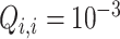 , according to the observed variance of
 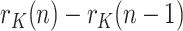 , except in the case of history variables, where
  . The initial values of
  and
and  , required by the filter, are not relevant as their effect quickly vanishes. The proposed values are:
  and history variables initialized to the mean of the raw ratios,
  gains initialized to 1, and
  initialized to an identity matrix.
Additionally, the results of the KF allow the estimation or prediction of two magnitudes of great interest:
-
1)
The day in the future when the infection peak will be reached,
 , which will occur when
  . For this purpose, the sequence
  can be fitted to a predetermined evolution in order to predict its future behavior from the past history. According to what can be observed empirically, we have fitted the sequence
  to a decreasing exponential, characteristic of first-order systems. It is worth stressing that, at this point, we are talking about the peak of infected, the peak of positives being a proxy for it.
 -
2)The estimated number of active infectious people,
 This magnitude can be computed from those infected at a given reference day,
  , as follows:
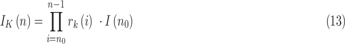
This means that, besides the errors of the sequence
 the uncertainty of
  inherits that of the initial guess
  . Therefore, as happens also with the SIR model, and in fact with any other model based on differential equations, precisely estimating
  based on the above expression requires that an accurate number of infectious people be known on a given day, which can be very challenging. For our results, we will obtain the initial guess from
  , for an assumed value of
  For instance,
  if we believe the first day there were 5 infectious people per reported positive.
IV. Simulation Results
In this section, the performance of the proposed implementation of the KF is tested on a set of simulated scenarios, where the SIR model described in Section II is considered for the propagation of a virtual virus.
While the total simulation time is 90 days, a lockdown is assumed to take place at day 15. This restrictive policy is aimed to completely stop non-essential public mobility, resulting in a quick reduction of the transmission rate,  (which is assumed to evolve exponentially, from an initial value 0.5 to 0.09) and, therefore, also of the ratio
  . The remaining simulation parameters are given in Table I.
TABLE I. Value of the Parameters in the Simulation.
| Parameter | Definition | Simulation value |
|---|---|---|

|
Mortality ratio | 0.004 |

|
Recovery rate | 0.1 |

|
Initial infectious | 1000 |

|
Total population | 47 Million |

|
Testing ratio | 0.2 |
In all simulated cases presented in the sequel, artificial Gaussian noise has been added to the measurements used by the KF algorithm in order to represent a more realistic scenario where the reported information presents inaccuracies.
A. Base Case
In the base case, the testing ratio,  , is assumed to remain constant (except for the noise). The time evolution of the estimated geometric ratio,
  , is represented in Fig. 1 along with the raw noisy measurements provided by the simulation and the actual value of
  . Note that the estimation provided by the KF is very close to the simulated value, giving evidence of the good performance of the proposed method. Fig. 2 shows the benefit attained from the incorporation of the smoothing filter mentioned above to the basic EKF algorithm, in terms of more damped oscillations.
Fig. 1.

Estimation of r(n) in the base case.
Fig. 2.

Estimation of r(n) with and without the smoother.
To compare the proposed KF implementation with other methods customarily employed as filters in these cases, Fig. 3 shows the estimated value of  along with the results provided by three moving-average filters respectively applied to each of the noisy measurements,
  ,
,  and
and  . As can be seen, the KF more closely tracks the evolution of
Fig. 3.

Comparison of the proposed method with moving average filters.
From the estimated  sequence, and the initial testing ratio,
  , an estimation is obtained for the evolution of infectious people, which is compared in Fig. 4 with the simulated value of
  and the reported positives. The maximum estimation error (around 4.5%) takes place, as expected, at the peak of the epidemic.
Fig. 4.

Estimation of the infectious people in the base case.
B. Error Assessment
Once the proposed estimation technique is validated in the base case, where only Gaussian noise is considered, the effect of different error sources is studied in the following scenarios.
-
•
Step in

An abrupt change is simulated in the testing ratio from
 0.2 to 0.3 at day 25, representing an increase in the availability of the tests (this has been observed in practice in several countries). Fig. 5 shows the estimation of
  , along with the simulated value and the measurements of the geometric ratios
  ,
,  and
and  . Note that the step in
  is observed as an impulse in the ratio
  , which is quite effectively filtered out by the proposed KF implementation.
Fig. 5.

Estimation of r(n) with a step on the testing ratio.
The estimation of  is represented in Fig. 6, where the actual simulated value is again very close to the estimated one, giving evidence of the good performance of the method in the presence of a step in the testing ratio.
-
•
Deviations in

Finally, the last scenario considered in this section shows how errors in the initial guess of the testing ratio,
 , with respect to the assumed value
  , affect the results. Given that the errors in this factor only affect the estimation of the infectious people,
  , the representation of the estimated
  is not repeated. Fig. 7 shows the estimation of
  for
for  and
and 
 error).
Fig. 6.

Estimation of the infectious people with a step on the testing ratio.
Fig. 7.

Estimation of the infectious people for a range of t(0) values.
The results in Fig. 7 clearly show the importance of having an accurate guess of the number of infectious at the onset of the outbreak, as this initial error propagates proportionally up to the peak. Note, however, that any epidemiological model, such as SIR, faces the same challenge.
V. Case Studies
In this section, the proposed KF-based estimation technique is applied to the real data reported by different countries. For convenience, the results have been divided in two subsections: 1) the first period, when massive and aggressive lockdowns occurred in most countries, denoted in the media as the “first wave” of the pandemic [22], and 2) the subsequent period, once the first lockdown was relaxed, characterized by one or more additional waves, usually interleaved with several de-escalation phases.
A. First Wave
A total of four countries have been considered in this period: China, South Korea, Spain and the U.K.. At the early stage of the pandemic, the information provided by these countries was sufficient to allow the application of the proposed methodology.
Figs. 8–15 represent the estimated sequence of the geometric ratio,  , and the number of infected people,
  for the four countries. The KF implementation is tuned as described in Section III for the covariance matrices
  and
and  , and the initial values of the vector
  and the covariance matrix
  . In order to estimate the number of infectious people,
  , according to (13), an initial value for the parameter
  is needed. In absence of a better clue,
  is considered in all cases, expect for Spain (see the discussion of this particular case below). The points for which
  (peak of the epidemic) are highlighted with a dot. The following remarks can be made from those results:
-
•
A different evolution of
 can be observed for the Asian countries (China and South Korea), where the effects of Covid-19 started earlier. Once the geometric ratio
  the trend for South Korea is to remain roughly constant throughout the considered period, whereas for China a certain rebound can be noticed after March 10.
 -
•
The estimation results obtained for Spain show an asymptotic trend towards
 0.95. A slight increase is observed in
  between April 10 and 15, probably influenced by a sudden increase in the number of tests.
Fig. 9.

Estimation of infectious people in China in the first period considered.
Fig. 10.

Estimation of r(n) in South-Korea in the first period considered.
Fig. 11.

Estimation of infectious people in South-Korea in the first period.
Fig. 12.

Estimation of r(n) in Spain in the first period considered.
Fig. 8.

Estimation of r(n) in China in the first period considered.
Fig. 15.

Estimation of infectious people in U.K. in the first period considered.
Regarding the parameter  , in the Spanish case we have taken into account the results of a massive seroprevalence test performed by the government in the first half of May [23], from which it was concluded that the total number of infected people was around 5.2% of the population (approximately 2.3 million people). In view of this valuable information, the initial value
  has been adjusted so that the cumulative number of infected people matches the result of the survey on the date it was released (May 13), leading to
  = 0.12. This provides the estimation of
  shown in Fig. 13, where a maximum value of the active infectious people of around 1.3 million can be noticed by mid-April. Fig. 16 represents the estimation of the cumulative infectious people for the Spanish territory, where the total number of infected people matches the results of the survey.
-
•
With the available information in mid-May, some countries had already left behind the peak of the epidemic (i.e.,
 ). For those cases (China, South-Korea and Spain), a rather accurate early forecasting of the epidemic evolution can be made, around 10 to 14 days before the peak, by fitting a decreasing exponential to a window of past estimated data. This prediction is shown with green dotted lines in Figs. 8–13.
 -
•
Regarding the U.K., where the peak of the number of infectious people had not been reached in the period considered (i.e.,
 ), an exponential fitting (made between around mid-April and early May) and the corresponding extrapolation is considered for this case. According to such fitting, the first peak should have taken place in the second half of May, provided the social distance measures were not relaxed.
Fig. 14.

Estimation of r(n) in U.K. in the first period considered.
Fig. 13.

Estimation of infectious people in Spain in the first period considered.
Fig. 16.

Estimation of cumulative infectious people in Spain.
Finally, Fig. 17 shows the evolution of the above-mentioned fitted exponential curves for different countries (Italy has been included in the representation in order to establish a more complete comparison), all of them represented from a common threshold  so that the corresponding time constants can be easily compared. In light of this representation, it can be noticed that the reduction of the geometric ratio is faster in China (just 13 days from
  to
to  ), possibly as a consequence of a more severe lockdown, followed by Spain and South Korea (between 25 and 27 days to reach
  , showing similar trends, and finally Italy (40 days to reach
  ).
).
Fig. 17.

Fitted geometric ratios from common threshold.
B. Subsequent Waves
As the pandemic evolves, it becomes more difficult to properly report on a regular basis all the information involved in the estimation of active positives. Many countries (notably Spain) stopped reporting the number of recovered people, probably owing to the remarkable increase in the number of asymptomatic positive cases, which never entered a hospital and hence never counted as recovered or dead. For this reason, it is not possible to accurately update the estimations of the geometric ratios of active positives,  for some of the countries considered in the early stages. Instead, Figs. 18–25 represent the estimated geometric ratio,
  and the number of active infectious people,
  for four countries (USA, Italy, India and Brazil), all of them specially affected by the pandemic and still reporting the information required by the proposed estimation technique.
Fig. 18.

Estimation of r(n) in USA in the second period considered.
Fig. 25.

Estimation of infectious people in Brazil in the second period considered.
Similar assumptions as in the previous section are made regarding the KF tuning. The following remarks can be made from the results presented in Figs. 18–25:
-
•The number of infectious people in the USA was on the verge of reaching a peak by the end of May (
 . However, Figs. 18 and 19 show that, afterwards,
  has remained somewhat around or above 1 until January 2021. This means that the outbreak has not been under full control for nearly a year, and that additional caution should be exercised before alleviating social distance measures.
Fig. 20.
 Estimation of r(n) in Italy in the second period considered.
Fig. 21.
 Estimation of infectious people in Italy in the second period considered.
Fig. 22.
 Estimation of r(n) in India in the second period considered.
Fig. 23.
 Estimation of infectious people in India in the second period considered.
Fig. 24.
 Estimation of r(n) in Brazil in the second period considered.
 -
•
In Italy, the effect of relaxing the social distance measures after the first wave can be easily noticed by an increase of the ratio
 from June to November 2020, leading to a second wave. A new reduction is apparent after mid-November, probably due to a reinforcement of the mobility constraints, which ended once again after the December holiday season.
 -
•
India suffered a remarkable peak in the number of infected people around October 2020. At the time of writing, an increasing trend in
 is observed, which means that the pandemic is still uncontrolled in this country and that a second wave cannot be discarded.
 -
•
As far as Brazil is concerned, the most noticeable difference when compared to other countries lies in the almost periodic oscillations of
 , the period being of about a week, which is probably due to the poor quality of the reported data. However, the overall trend in the number of infectious people is clearly rising from late-October.


Fig. 19.

Estimation of infectious people in USA in the second period considered.
VI. Conclusion
This work has addressed the problem of monitoring and tracking the evolution of a viral epidemic, such as Covid-19, through the application of signal processing techniques to the time series of data reported by governments and health agencies. Three main contributions can be pointed out: 1) the exclusive use of time-varying geometric ratios of daily data to track the disease, rather than the customary virus reproductive number ( ); 2) the development of a simple algebraic model relating the geometric ratio of infectious people,
  , with those of positives, reported and dead; 3) the application of a nonlinear KF, along with a smoothing technique, to estimate the evolution of
  By properly fitting the estimated values of
  to a decreasing exponential, an accurate prediction of the epidemic peak can be made, as early as two weeks before the peak actually takes place.
The proposed methodology has been satisfactorily tested on a simulated case, in the presence of Gaussian noise and other sources of uncertainty, the main one being the number of infectious people at the onset of the outbreak.
The estimation technique has also been applied to a pool of countries, and the results obtained are divided in two periods:
-
•
A first period, when most of the countries imposed a lockdown. Four territories are reported in this scenario, namely: China, South Korea, Spain, and the U.K.. The evolution of
 reflects in all cases the severity of the lockdown, allowing the first peak of the epidemic to be forecasted well in advance. In some cases, a slightly increasing trend is apparent in the evolution of this ratio once the lockdown is removed, suggesting that additional mobility restrictions might be necessary.
 -
•
For the countries that have continued reporting the required information, the estimation of
 is extended up to the moment of writing this manuscript, reflecting the panoply of post-lockdown measures taken by most of them, generally insufficient to prevent the appearance of the second and subsequent waves of the pandemic. In this case, four countries are reported: the USA, Italy, India and Brazil.
In light of the presented results, it can be concluded that the proposed methodology can effectively characterize, by means of the ratio  , the evolution of the virus spread, when adequate information of active positives, recovered and deceased people is available. This information on the state and dynamics of the epidemic can be used by the governing authorities in order to take the corresponding actions:
-
•
An increasing trend of the geometric ratio represents a virus spread which might turn out of control, especially when
 , leading to more restrictive policies.
 -
•
On the contrary, values of
 with decreasing trend indicate a situation where the severity of the social distancing measures can be alleviated.
As shown in the simulated scenario, the proposed methodology is not only suitable for the Covid-19, but also for other pandemics that can be characterized using the SIRD model, and for which the required information is available. Future work is aimed to the application of KF-based estimators to new models that can arise with less informative scenarios.
Funding Statement
The Miguel A. González-Cagigal thanks the financial support of the Spanish Ministry of Education and Professional Training under Grant FPU17/06380.
Contributor Information
Antonio Gómez-Expósito, Email: age@us.es.
Jose A. Rosendo-Macías, Email: rosendo@us.es.
Miguel A. González-Cagigal, Email: mgcagigal@us.es.
References
- [1].Rohman A. and Zaber M., “Lockdown vs. Social distancing: Need for effective communication,” Jakarta Post, 2020. [Online]. Available: https://www.thejakartapost.com/academia/2020/05/19/lockdown-vs-social-distancing-need-for-effective-communication.html
- [2].Pueyo T., “Coronavirus: Why you must act now,” 2020. [Online]. Available: https://medium.com/@tomaspueyo/coronavirus-act-today-or-people-will-die-f4d3d9cd99ca
- [3].Imperial College COVID-19 response team. “Impact of non-pharmaceutical interventions (NPIs) to reduce COVID-19 mortality and healthcare demand,” 2020. [Online]. Available: https://www.imperial.ac.uk/media/imperial-college/medicine/sph/ide/gida-fellowships/Imperial-College-COVID19-NPI-modelling-16-03-2020.pdf?referringSource=articleShare [DOI] [PMC free article] [PubMed]
- [4].Kermack W. O. and McKendrick A. G., “A contribution to the mathematical theory of epidemics,” Proc Roy. Soc Math Phys Eng Sci., vol. 115, no. 772, pp. 700–721, 1927. [Google Scholar]
- [5].Giordano G. et al. , “Modelling the COVID-19 epidemic and implementation of population-wide interventions in Italy,” Nat Med., vol. 26, pp. 855–860, 2020. doi: 10.1038/s41591-020-0883-7. [DOI] [PMC free article] [PubMed] [Google Scholar]
- [6].Huang W. and Provan G., “An Improved State Filter Algorithm for SIR Epidemic Forecasting,” Eur. Conf. Artif. Intell., vol. 285, 2016. doi: 10.3233/978-1-61499-672-9-524. [DOI] [Google Scholar]
- [7].Computational biology and complex systems (BIOCOMSC), UPC. “Analysis and prediction of COVID-19 for different regions and countries,” 2020. [Online]. Available: https://biocomsc.upc.edu/en/covid-19/daily-report
- [8].Madden L. V., “Quantification of disease progression,” Protection Ecol., vol. 2, pp. 159–176, 1980. [Google Scholar]
- [9].Simon D., “Optimal state estimation: Kalman, h infinity, and nonlinear approaches,” ISBN: 13978-0-471-70858-2.
- [10].Cazelles B. and Chau N. P., “Using the kalman filter and dynamic models to assess the changing HIV/AIDS epidemic,” Math. Biosci., vol. 140, no. 2, pp. 131–154, 1997. [DOI] [PubMed] [Google Scholar]
- [11].Rondon-Moreno C., Arroyo Marioli F., and Bullano F., “Tracking R of COVID-19: A New Real-time Estimation using the Kalman Filter,” Plos one, vol. 16, no. 1, 2020, doi: 10.1101/2020.04.19.20071886. [DOI] [PMC free article] [PubMed] [Google Scholar]
- [12].Singh D., Kumar S., Dixit P., and Bajpai M., “Kalman Filter Based Short Term Prediction Model for COVID-19 Spread, medRxiv, id. 2020.05.30.20117416, ” 2020. doi: 10.1101/2020.05.30.20117416. [DOI] [PMC free article] [PubMed]
- [13].Aslam M., “Using the kalman filter with arima for the COVID-19 pandemic dataset of pakistan,” Data Brief, vol. 31, Art. no. 105854, doi: 10.1016/j.dib.2020.105854. [DOI] [PMC free article] [PubMed] [Google Scholar]
- [14].Lin F., Muthuraman K., and Lawley M., “An optimal control theory approach to non-pharmaceutical interventions,” BMC Infect. Dis., vol. 10, no. 32, 2010. doi: 10.1186/1471-2334-10-32. [DOI] [PMC free article] [PubMed] [Google Scholar]
- [15].Osemwinyen A. and Diakhaby A., “Mathematical modelling of the transmission dynamics of ebola virus,” Appl. Comput. Math. (New York, NY, USA), vol. 4, pp. 313–320, 2015, doi: 10.11648/j.acm.20150404.19. [DOI] [Google Scholar]
- [16].Chatterjee S. et al. , “Studying the progress of COVID-19 outbreak in india using SIRD model,” Indian J Phys., 2020, doi: 10.1007/s12648-020-01766-8. [DOI] [PMC free article] [PubMed]
- [17].Worldometers.info, 2021. [Online]. Available: https://www.worldometers.info/coronavirus/country/spain/
- [18].Covid-19 data repository by the center for systems science and engineering (CSEE) at Johns Hopkins University. 2021. [Online]. Available: https://github.com/CSSEGISandData/COVID-19/tree/master/csse_covid_19_data/csse_covid_19_time_series
- [19].Li J., Blakeley D., and Smith R. J., “The failure of R0,” Comput. Math. Methods Med., 2011, doi: 10.1155/2011/527610. [DOI] [PMC free article] [PubMed] [Google Scholar]
- [20].Sanche S., Lin Y. T., Xu C., Romero-Severson E., Hengartner N., and Ke R., “High contagiousness and rapid spread of severe acute respiratory syndrome coronavirus 2,” Emerg. Infect. Dis., vol. 26, no. 7, pp. 1470–1477, Jul. 2020, doi: 10.3201/eid2607.200282. [DOI] [PMC free article] [PubMed] [Google Scholar]
- [21].Evensen G., “Sequential data assimilation with nonlinear quasi-geostrophic model using monte carlo methods to forecast error statistics,” J. Geophys. Res., vol. 99, no. C5, pp. 143–162, 1994. [Google Scholar]
- [22].Lockerd Maragakis L., “First and second waves of coronavirus, ”2020. [Online]. Available: https://www.hopkinsmedicine.org/health/conditions-and-diseases/coronavirus/first-and-second-waves-of-coronavirus
- [23].Viciosa M., “Estudio de seroprevalencia: un 5% de España, con indicios de haber pasado Covid-19,” 2020. [Online]. Available: https://www.newtral.es/estudio-de-seroprevalencia-un-5-de-espana-con-indicios-de-haber-pasado-covid-19/20200513/