Abstract
Excess mortality is the difference between expected and observed mortality in a given period and has emerged as a leading measure of the overall impact of the Covid-19 pandemic that is not biased by differences in testing or cause-of-death assignment. Spatially and temporally granular estimates of excess mortality are needed to understand which areas have been most impacted by the pandemic, evaluate exacerbating and mitigating factors, and inform response efforts, including allocating resources to affected communities. We estimated all-cause excess mortality for the United States from March 2020 through February 2022 by county and month using a Bayesian hierarchical model trained on data from 2015 to 2019. An estimated 1,159,580 excess deaths occurred during the first two years of the pandemic (first: 620,872; second: 538,708). Overall, excess mortality decreased in large metropolitan counties, but increased in nonmetro counties, between the first and second years of the pandemic. Despite the initial concentration of mortality in large metropolitan Northeast counties, beginning in February 2021, nonmetro South counties had the highest cumulative relative excess mortality. These results highlight the need for investments in rural health as the pandemic’s disproportionate impact on rural areas continues to grow.
Keywords: Covid-19, excess mortality, geographic inequalities, rural mortality, counties
Introduction
The Covid-19 pandemic has had a substantial impact on mortality in the United States, leading to declines in life expectancy rarely observed since the end of World War II.1,2 Estimates of excess mortality, which compare observed deaths to those expected in the absence of the pandemic, suggest that the true death toll of the pandemic is much larger than indicated by the official Covid-19 deaths alone.3–7 Deaths attributable to the pandemic may have been assigned to causes other than Covid-19 for several reasons. Lack of access to testing in the community, combined with the inconsistent use of post-mortem testing for suspected cases, likely resulted in a large share of undiagnosed Covid-19 infections and deaths, especially early in the pandemic.8–12 Additionally, persons with comorbid conditions may have had their cause of death assigned to the comorbid condition rather than to Covid-19.13 Finally, excess deaths not assigned to Covid-19 may also reflect deaths indirectly related to the pandemic, including deaths associated with reductions in access to health care, hospital avoidance due to fear of Covid-19 infection, increases in drug overdoses, and economic hardship leading to housing and food insecurity.14–20
For these reasons, it is beneficial to use excess mortality as a measure of the pandemic’s impact, particularly when examining geographic patterns in mortality. Estimates of excess mortality are more comparable spatially than Covid-19-assigned deaths alone, because states use different procedures to assign Covid-19 deaths and local death investigation systems may have different policies and resources that affect assignment of Covid-19 deaths.9,21 Furthermore, because many Covid-19 deaths were not assigned to Covid-19 early in the pandemic, excess mortality is likely to provide a more accurate measure of the pandemic’s impact for purposes of resource allocation and evaluating health disparities.7,22,23 Thus, continued tracking of excess mortality across time and space helps to clarify the total impact of the pandemic, identify where its impacts have been greatest, and implement the most appropriate policy responses.
Prior studies of excess mortality in the United States have primarily focused on national and state-level estimates,5,6 but estimating the full impact of the Covid-19 pandemic at the county-level is necessary to understand finer-grained geographic patterns of excess mortality. Although the prior study generated predictions of excess mortality for 1,470 county sets for all months of 2020 combined,4 to the best of our knowledge, there are no estimates of excess mortality at the county-month level across the first two years of the pandemic. Additionally, expanding these estimates to the second year of the pandemic is critical because the geographic impact of the pandemic has changed markedly since the first year due to changing national and state-level policies, the availability of vaccines, and the emergence of new variants.
In the present study, we employ a Bayesian hierarchical model to estimate all-cause excess mortality by month for 3,127 counties for the period from March 2020 to February 2022. In addition to generating county-month level estimates of excess mortality, we examine spatial patterning of these estimates across Census divisions and large metros, medium/small metros, and nonmetro areas between the first and second year of the pandemic.
Results
Across 3,127 counties in the U.S., 620,872 estimated excess deaths occurred during the first year of the pandemic (March 2020 to February 2021), and 538,708 estimated excess deaths occurred during the second year (March 2021 to February 2022). This equals a total of 1,159,580 excess deaths during the first two years of the pandemic.
Geographic Patterns in Relative Excess Mortality
Table 1 shows excess deaths and relative excess mortality across combinations of U.S. Census Divisions and metro-nonmetro areas during each pandemic year. In the entire United States, relative excess mortality decreased in large metros from 23% of expected deaths in the first year to 16% in the second year. Meanwhile, relative excess mortality in nonmetro areas increased from 20% in the first year to 23% in the second year. The decrease in relative excess mortality in large metro areas between the first and second year was particularly large in the Middle Atlantic (28% to 8%), New England (16% to 5%), and Pacific (26% to 16%) divisions. The increase in relative excess mortality in nonmetro areas was largest in the Pacific (7% to 21%), New England (5% to 13%), and Mountain (23% to 30%) divisions. The divisions that had the highest relative excess mortality in nonmetro areas during the second year were the South Atlantic (30%), Mountain (30%), West South Central (27%), and East South Central (26%) divisions.
Table 1.
Excess Mortality by U.S. Census Division and Metro-Nonmetro Areas, March 2020 - February 2022
| Excess Deaths | Relative Excess | |||||||
|---|---|---|---|---|---|---|---|---|
| Mar 2020 - Feb 2021 | Mar 2021 - Feb 2022 | Mar 2020 - Feb 2021 | Mar 2021 - Feb 2022 | |||||
| Median | Posterior Interval (90%) | Median | Posterior Interval (90%) | Median | Posterior Interval (90%) | Median | Posterior Interval (90%) | |
| East North Central | ||||||||
| Large Metro | 47,615 | (25,819 – 66,511) | 37,648 | (7,050 – 64,008) | 0.209 | (0.103 – 0.318) | 0.165 | (0.027 – 0.318) |
| Medium or Small Metro | 23,092 | (10,831 – 34,143) | 23,248 | (5,615 – 38,283) | 0.177 | (0.076 – 0.285) | 0.178 | (0.038 – 0.330) |
| Non Metro | 17,182 | (7,474 – 25,568) | 19,488 | (6,037 – 31,203) | 0.171 | (0.068 – 0.277) | 0.193 | (0.053 – 0.350) |
| Total | 87,754 | (44,296 – 126,019) | 80,454 | (18,795 – 133,211) | 0.191 | (0.088 – 0.299) | 0.175 | (0.036 – 0.327) |
| East South Central | ||||||||
| Large Metro | 11,855 | (6,462 – 16,539) | 12,395 | (4,718 – 18,980) | 0.212 | (0.105 – 0.322) | 0.220 | (0.074 – 0.381) |
| Medium or Small Metro | 15,704 | (8,465 – 22,191) | 17,256 | (6,610 – 26,259) | 0.204 | (0.100 – 0.314) | 0.222 | (0.075 – 0.382) |
| Non Metro | 18,450 | (10,921 – 24,947) | 20,188 | (9,416 – 29,267) | 0.237 | (0.128 – 0.349) | 0.258 | (0.106 – 0.423) |
| Total | 45,978 | (26,123 – 63,552) | 49,786 | (20,812 – 74,441) | 0.218 | (0.113 – 0.328) | 0.234 | (0.086 – 0.397) |
| Middle Atlantic | ||||||||
| Large Metro | 73,092 | (48,366 – 94,719) | 21,354 | (−13,410 – 51,515) | 0.283 | (0.171 – 0.400) | 0.083 | (−0.046 – 0.226) |
| Medium or Small Metro | 14,526 | (5,905 – 21,796) | 10,870 | (−1,407 – 21,203) | 0.163 | (0.061 – 0.267) | 0.122 | (−0.014 – 0.269) |
| Non Metro | 5,404 | (2,322 – 8,091) | 7,044 | (2,704 – 10,745) | 0.166 | (0.065 – 0.270) | 0.216 | (0.073 – 0.372) |
| Total | 92,990 | (56,440 – 124,749) | 39,390 | (−11,962 – 83,717) | 0.245 | (0.135 – 0.358) | 0.104 | (−0.028 – 0.249) |
| Mountain | ||||||||
| Large Metro | 22,560 | (14,456 – 29,674) | 21,603 | (9,756 – 31,528) | 0.267 | (0.156 – 0.384) | 0.254 | (0.101 – 0.419) |
| Medium or Small Metro | 15,580 | (8,494 – 21,839) | 17,856 | (7.726 – 26,423) | 0.210 | (0.104 – 0.321) | 0.237 | (0.091 – 0.397) |
| Non Metro | 8,460 | (4,968 – 11,627) | 11,242 | (5,892 – 15,570) | 0.225 | (0.121 – 0.337) | 0.296 | (0.136 – 0.462) |
| Total | 46,534 | (27,880 – 63,092) | 50,537 | (23,686 – 73,493) | 0.237 | (0.130 – 0.351) | 0.254 | (0.105 – 0.418) |
| New England | ||||||||
| Large Metro | 10,970 | (4,603 – 16,564) | 3,110 | (−6,025 – 10,822) | 0.164 | (0.063 – 0.270) | 0.046 | (−0.079 – 0.182) |
| Medium or Small Metro | 7,280 | (2,329 – 11,565) | 3,392 | (−3,746 – 9,343) | 0.141 | (0.041 – 0.245) | 0.065 | (−0.063 – 0.203) |
| Non Metro | 1,036 | (−827 – 2,702) | 2,488 | (−263 – 4,748) | 0.053 | (−0.038 – 0.150) | 0.125 | (−0.012 – 0.270) |
| Total | 19,206 | (6,157 – 30,859) | 8,981 | (−10,084 – 24,924) | 0.139 | (0.041 – 0.244) | 0.065 | (−0.064 – 0.203) |
| Pacific | ||||||||
| Large Metro | 63,256 | (39,598 – 83,818) | 38,569 | (4,950 – 66,796) | 0.257 | (0.147 – 0.372) | 0.157 | (0.018 – 0.308) |
| Medium or Small Metro | 17,046 | (6,465 – 26,432) | 20,888 | (5,751 – 33,902) | 0.152 | (0.053 – 0.257) | 0.185 | (0.045 – 0.340) |
| Non Metro | 2,070 | (−815 – 4,542) | 6,324 | (2,162 – 9,741) | 0.069 | (−0.025 – 0.165) | 0.209 | (0.063 – 0.362) |
| Total | 82,420 | (45,325 – 114,878) | 65,735 | (13,048 – 110,745) | 0.212 | (0.107 – 0.323) | 0.169 | (0.030 – 0.323) |
| South Atlantic | ||||||||
| Large Metro | 54,882 | (27,730 – 79,127) | 56,126 | (17,067 – 89,532) | 0.191 | (0.088 – 0.301) | 0.194 | (0.052 – 0.351) |
| Medium or Small Metro | 44,112 | (22,014 – 63,596) | 50,446 | (18,369 – 77,446) | 0.190 | (0.086 – 0.298) | 0.214 | (0.069 – 0.372) |
| Non Metro | 22,575 | (14,187 – 29,897) | 26,516 | (14,290 – 36,817) | 0.254 | (0.146 – 0.366) | 0.298 | (0.141 – 0.468) |
| Total | 121,399 | (64,366 – 172,700) | 132,882 | (50,027 – 203,515) | 0.200 | (0.097 – 0.310) | 0.217 | (0.072 – 0.375) |
| West North Central | ||||||||
| Large Metro | 11,422 | (5,277 – 16,749) | 9,900 | (1,024 – 17,369) | 0.178 | (0.075 – 0.284) | 0.153 | (0.014 – 0.304) |
| Medium or Small Metro | 10,810 | (4,780 – 15,986) | 9,114 | (620 – 16,292) | 0.174 | (0.070 – 0.280) | 0.146 | (0.009 – 0.294) |
| Non Metro | 12,152 | (5,188 – 18,648) | 11,184 | (1,279 – 19,777) | 0.163 | (0.064 – 0.275) | 0.150 | (0.015 – 0.301) |
| Total | 34,253 | (15,484 – 51,120) | 30,142 | (2,973 – 53,340) | 0.170 | (0.070 – 0.278) | 0.150 | (0.013 – 0.299) |
| West South Central | ||||||||
| Large Metro | 36,592 | (22,404 – 48,792) | 33,477 | (13,086 – 50,997) | 0.247 | (0.138 – 0.359) | 0.223 | (0.077 – 0.385) |
| Medium or Small Metro | 32,270 | (21,799 – 41,142) | 28,219 | (13,749 – 40,632) | 0.302 | (0.186 – 0.420) | 0.263 | (0.113 – 0.428) |
| Non Metro | 20,482 | (13,550 – 26,694) | 19,558 | (9,367 – 28,017) | 0.279 | (0.169 – 0.397) | 0.266 | (0.112 – 0.431) |
| Total | 89,258 | (57,879 – 116,753) | 81,377 | (36,448 – 119,338) | 0.272 | (0.161 – 0.388) | 0.246 | (0.097 – 0.408) |
| United States | ||||||||
| Large Metro | 332,306 | (196,288 – 451,610) | 233,418 | (39,476 – 400,509) | 0.231 | (0.125 – 0.342) | 0.162 | (0.024 – 0.314) |
| Medium or Small Metro | 180,034 | (91,465 – 259,254) | 181,067 | (54,096 – 290,287) | 0.192 | (0.089 – 0.302) | 0.192 | (0.051 – 0.348) |
| Non Metro | 107,666 | (57,214 – 152,520) | 123,794 | (51,623 – 186,085) | 0.201 | (0.098 – 0.311) | 0.231 | (0.085 – 0.392) |
| Total | 620,872 | (345,616 – 863,761) | 538,708 | (145,084 – 876,551) | 0.213 | (0.108 – 0.324) | 0.184 | (0.044 – 0.339) |
Notes: Relative excess is the ratio of excess deaths to expected deaths, indicating the proportion increase in observed deaths compared to expected deaths during a period.
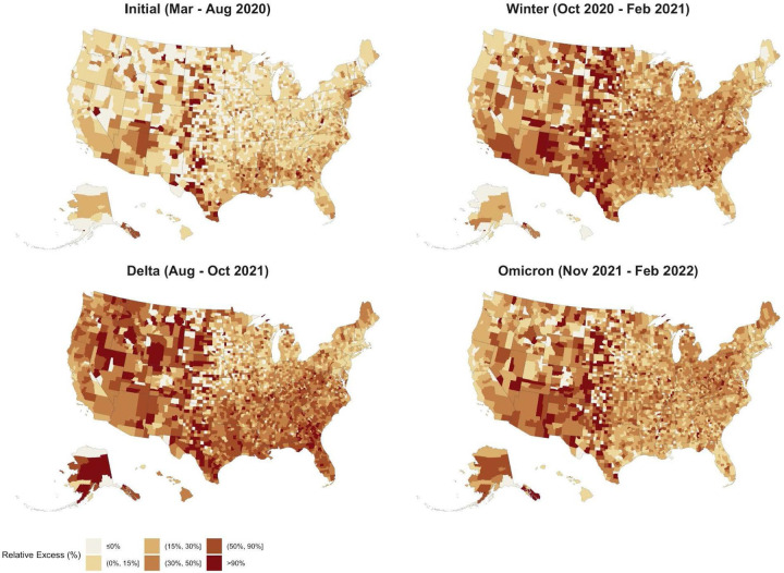
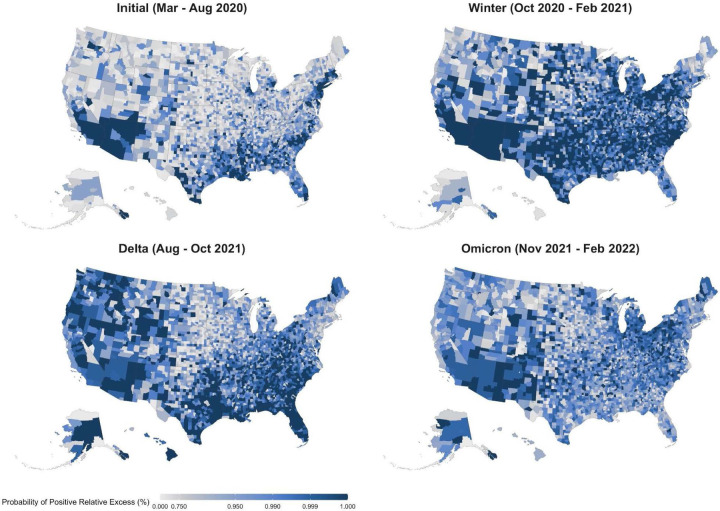
Figure 1 shows the evolution of relative excess mortality across four mortality peaks during the pandemic across U.S. counties. These maps show the extent of excess mortality and demonstrate how excess mortality shifted from coastal regions early in the pandemic into the rest of the country as the pandemic progressed. During the Delta peak, excess mortality became more concentrated in the South and Mountain West, while the spatial distribution of excess mortality during the Omicron peak was less geographically consistent. Figure 2 shows the probability of counties having any positive relative excess mortality across four mortality peaks during the pandemic, demonstrating that during each wave of the pandemic observed mortality fell above the range of values we would have expected in the absence of the COVID-19 pandemic.
Figure 1.
Relative Excess Mortality across U.S. Counties during 4 Mortality Peaks, March 2020 - February 2022
Notes: Each county in the map is colored according to its relative excess mortality (the ratio of excess deaths over expected deaths). Each of the four maps refers to one of the four peak periods of the pandemic, months of particularly high excess mortality. Category cutoffs are the 10th, 30th, 60th, 80th and 95th percentiles rounded to the nearest 5% relative excess.
Figure 2.
Probability of Positive Excess Mortality across U.S. Counties during 4 Mortality Peaks, March 2020 - February 2022
Notes: Each county in the map is colored according to the posterior probability that the observed death count is higher than the expected one. We highlight counties where the probability of positive excess mortality is higher than 0.75. The four maps refer to the four peak periods of the pandemic, months of particularly high excess mortality.
Temporal Trends in Relative Excess Mortality
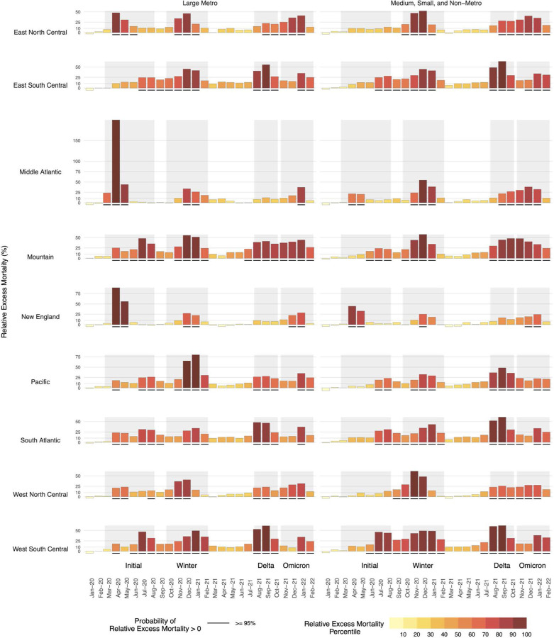
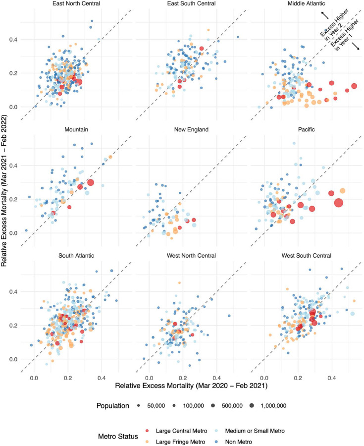
Throughout the pandemic, national trends in excess mortality reflect the aggregation of heterogeneous trends across disparate census regions and metro/nonmetro areas. To explore this pattern, Figure 3 shows temporal trends in relative excess mortality across combinations of U.S. Census division and metro-nonmetro categories. The initial peak in excess mortality nationally was mostly driven by high excess mortality in large metro areas within the Middle Atlantic region. In contrast, the Winter peak spared this region and affected counties across the metro-nonmetro continuum in other regions of the country. As the pandemic progressed, there was a higher degree of concordance in temporal patterns across regions, which was especially evident during Delta and Omicron. Figure 4 further illustrates differences in the geography of the pandemic between the first and second year by directly comparing relative excess mortality in the two years across divisions and metro-nonmetro areas. Large metro counties predominantly had greater relative excess mortality in the first year of the pandemic than they did in the second year. In contrast, nonmetro counties were more likely to have greater relative excess mortality in the second year as compared with the first year. This pattern is indicative of the emergence of a rural disadvantage in the second year of the pandemic.
Figure 3.
Temporal Trends in Relative Excess Mortality by Census Division and Metro-Nonmetro Status, March 2020 - February 2022
Notes: The large metro category includes large central metros and large fringe metros. All non large metro counties are classified as medium, small, and non-metro. The shaded intervals behind the bars separate the different waves of the COVID-19 pandemic as follow: Initial Wave (Mar 2020 - Aug 2020), Winter Peak (Oct 2020 - Feb 2021), Delta (Aug 2021 - Oct 2021), Omicron (Nov 2021 - Feb 2022). The height of each bar reflects excess deaths as a proportion of expected deaths. The color of the bars reflects each Division-month position (percentile) in the overall distribution of relative excess. Black, solid segments below the bars indicate units for which the posterior probability of positive excess mortality is above 95%.
Figure 4.
A Comparison of Relative Excess Mortality by Pandemic Year, March 2020 - February 2022
Notes: Each point in the graph represents a county and reflects its relative excess mortality from March 2020 to February 2021 (horizontal axis) and its relative excess mortality from March 2021 to February 2022 (vertical axis). We excluded counties with less than 30,000 residents to make the relationship between the two variables clearer. The 45 degrees line separates the plot into two parts. Points above the line saw higher mortality in the second year of the pandemic compared to the first one. Points falling below the line saw instead a decrease in mortality in the second year compared to the first.
Cumulative Trends in Relative Excess Mortality
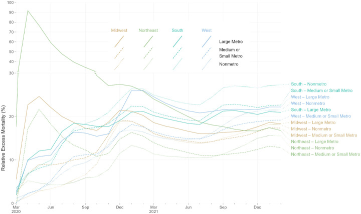
Figure 5 examines relative excess mortality in cumulative terms for combinations of Census Region and metropolitan status. In the initial months of the pandemic, large metro areas in the Northeast experienced exceptionally high relative excess mortality. However, by February 2021, cumulative relative excess mortality in the non-metro South had exceeded cumulative relative excess mortality in large metro areas in the Northeast. Cumulative relative excess mortality remained higher in the non-metro South than in any other region through the end of February 2022. By the end of February 2022, cumulative relative excess mortality was lower in metro and nonmetro areas in the Northeast than in metro and nonmetro areas in the South, West, and Midwest. The regions with the highest cumulative relative excess mortality at the end of February 2022 were nonmetro areas in the South, medium and small metro areas in the South, large metros in the West, nonmetro areas in the West, and large metros in the South.
Figure 5.
Rolling Cumulative Relative Excess Mortality by Census Region and Metro Category, March 2020 - February 2022
Notes: Each line represents the rolling cumulative excess mortality for one combination metropolitan/nonmetropolitan area categories and one census region. “Large Metro” includes large central and large fringe metropolitan areas. Each census region is represented by a different line color: light brown for Midwest, green for Northeast, aquamarine for South, and light blue for West. Each metropolitan category is represented by a different line type: solid for Large Metro, dashed for Medium or Small Metro, and dotted for Nonmetro. The y-axis for relative excess mortality above 30% is compressed vertically. Rolling cumulative relative excess mortality is calculated as the sum of excess deaths divided by the sum of expected deaths for all months from March, 2020, through a given month. For example, values for February, 2022, reflect total excess deaths for 24 months of the pandemic, from March, 2020, through February, 2022. Decreasing cumulative relative excess mortality indicates months with relative excess mortality below-average to date, for a given combination of census region and metro category. Increasing cumulative relative excess mortality indicates months with relative excess mortality above-average to date, for a given combination of census region and metro category.
County-Level Trends in Relative Excess Mortality
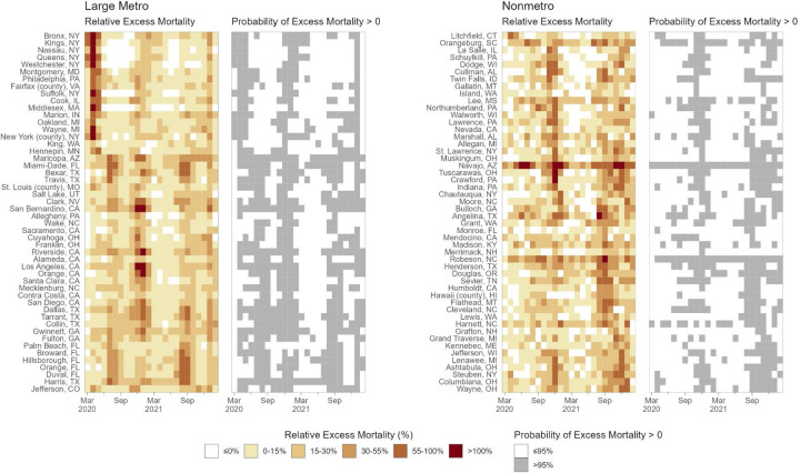
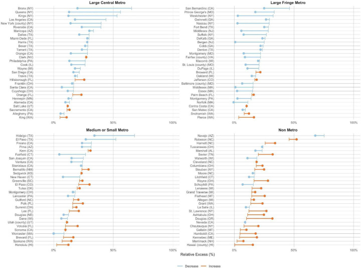
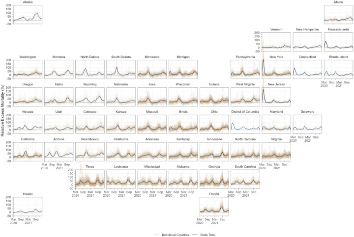
An emerging rural disadvantage is also visible when examining temporal trends for individual counties. Figure 6 shows temporal trends in relative excess mortality for the most populous counties among large metro and nonmetro counties. Among large metro counties, relative excess mortality was especially high in Northeastern counties in the early pandemic and in California counties during the Winter peak. In nonmetro counties, marked increases in mortality were observed during the second year of the pandemic, especially during the Delta peak. Figure 7 explores changes in excess mortality between the first and second year of the pandemic among the most populous counties in each metro-nonmetro category. In the most populous counties in large metro areas, substantial declines in excess mortality were observed between the first and second year. For counties in nonmetro areas, the opposite pattern was observed. These areas were generally spared in the first year, after which they experienced high mortality in the second year. Figure 8 displays temporal trends for each county alongside state trend lines. This figure reveals substantial variation in temporal trends in relative excess mortality across states along with substantial variation in relative excess mortality trends within states.
Figure 6.
Spatial-Temporal Trends in Relative Excess Mortality Among the Most Populous Counties by Metro-Nonmetro Category, March 2020 - February 2022
Notes: Each cell in the four heatmaps represents a county-month. In the shaded heatmaps colored from white to dark red, darker and redder colors indicate higher relative excess mortality. In the white-and-gray heatmaps, gray cells indicate county-months with a greater than 90% probability of positive excess mortality. Counties in each pair of heatmaps are the 50 most populous within two categories of metropolitan and nonmetropolitan areas. “Large Metro” includes large central and large fringe metropolitan areas. Within each pair of heatmaps, counties were sorted vertically based on the occurrence of the highest peak of excess deaths. Counties at the tops of the heatmaps thus had their month of highest relative excess earlier in the pandemic. In contrast, those at the bottom had their highest peak or relative excess later in the pandemic.
Figure 7.
Change in Relative Excess Mortality between the First and Second Pandemic Years In the Most Populous Counties by Metro-Nonmetro Category, March 2020 - February 2022
Notes: Each line in the four graphs represents a county. For each line, the vertical segment reflects relative excess in the first year of the pandemic (Mar 2020 - Feb 2021), while the dot indicates relative excess in the second year of the pandemic (Mar 2021 - Feb 2022). The color of the line distinguishes between counties that saw a decline in relative excess (blue lines), and those that saw an increase (orange lines). The 30 most populous counties were selected for each metro category.
Figure 8.
Temporal Trends in Relative Excess Mortality across Counties in Each State, March 2020 to February 2022
Notes: Each plot presents data for a different state, position in the figure reflects the approximate geographical position of each state within the US. State level monthly time series of relative excess are denoted by solid dark blue lines. Each light brown transparent line represents the monthly time series for one county in that state. Counties with greater than 15,000 population in all states in our sample are depicted.
Discussion
This study produced monthly estimates of excess mortality for 3,127 counties in the U.S. from March 2020 through February 2022, identifying 1,159,580 excess deaths during the first two years of the pandemic. Between the first and second year of the pandemic, relative excess mortality decreased in large metro areas and increased in nonmetro areas. The increases in mortality in nonmetro areas occurred most markedly during the Delta wave of the pandemic. By the end of February 2022, nonmetro and medium and small metro areas in the South had the highest cumulative relative excess mortality, surpassing large metro areas in the Northeast and other areas that were affected heavily in the early pandemic.
Prior studies of excess mortality have largely produced estimates for the year 2020,3–6,24 leaving patterns of excess mortality during 2021 and 2022 under-studied. The Center for Disease Control and Prevention (CDC) has reported an estimate of approximately 1.1 million excess deaths in the U.S. from March 2020 to February 2022, which is in line with our estimate.25
Generating estimates of excess mortality at the county-level has several potential benefits. First, because counties are the administrative unit for death investigation, excess mortality estimates have the potential to help identify counties where Covid-19 death rates differ from excess mortality rates and who might benefit from additional training in cause-of-death certification.26 Such estimates may also be valuable for informing local public health workers, community leaders, and residents of the true impact of the pandemic, thus potentially increasing vaccination and uptake of other protective measures.27 These estimates may also be used to target federal and state emergency resources, such as funeral assistance support from the Federal Emergency Management Agency (FEMA). Finally, estimating excess mortality at the county-level also enables analyses of social and structural factors affecting mortality associated with the pandemic, including across geographic dimensions like metropolitan status.
One major finding of this study is that the number of excess deaths in the second year of the pandemic was not substantially lower than the first year, which is noteworthy as vaccinations were available for much of 2021 and 2022. Despite the strong efficacy of vaccines, gaps in uptake likely contributed to high excess mortality in 2021 and 2022, which may persist into the future if these vaccination gaps are not closed. This finding may also reflect federal and state governments’ failure to invest in population-based strategies designed to protect the communities at greatest risk for Covid-19 death, such as financial support for family and medical leave, improved ventilation of schools and workplaces, and vaccine delivery programs organized in coordination with community partners.28
A second and related major finding of this study is that excess mortality moved substantially from large metro areas in the first year of the pandemic to nonmetro areas during the second year. One factor that likely contributed to this change is vaccination. In urban areas, 75% of people aged 5 years and older were vaccinated as of January 2022 compared to only 59% of people aged 5 years and older in rural areas.29,30 This rural-urban difference in vaccination rates has more than doubled since April 2021, suggesting that differences in vaccination rates across metro-nonmetro categories may be playing an increasingly important role in the rural mortality disadvantage observed in the second year of the pandemic. A prior study found that increases in Covid-19 mortality in nonmetro areas during the second year of the pandemic were largely driven by increases in mortality among non-Hispanic white populations.31 In line with this, a survey from 2021 found that white, older individuals who identified as Republican were the most vaccine hesitant population in the U.S..32 Another factor that may be contributing to high rural excess mortality is insufficient rural health infrastructure related to funding gaps and workforce shortages.33 This may have affected access to Covid-19 treatment, including oral antivirals and monoclonal antibody treatments.34 Another consideration is the high prevalence of comorbidities among rural residents that likely increased risk for severe Covid-19 outcomes.35 Each of these factors may have contributed to the rural mortality disadvantage observed in this study.
The study had several limitations. First, the study relied on publicly available data, which were subject to suppression of death counts fewer than 10 in a given county-month. We addressed this limitation by pooling information across different geographical levels through the use of hierarchical models and by taking advantage of the additional information provided by yearly death counts. However, our estimates remain uncertain in areas with small populations and few deaths. Second, our study examined all-cause mortality and did not explore differences in trends using cause-specific death rates. Assessing geographic and temporal differences in excess death rates by cause-of-death would allow for a deeper understanding of the mechanisms driving trends in excess mortality overall and is an important direction for future work. Third, we were not able to model age-specific excess mortality at the county-month level because of suppression in CDC public data. However, the number of excess deaths across all ages combined is an important metric of the impact of the pandemic in a given area even when its magnitude is partially explained by age distribution. Finally, the primary objective of the present study was to generate descriptive estimates of excess mortality for each county over the course of the pandemic. As such, we did not model the determinants of spatial-temporal variation in excess mortality. An important direction for future research will be to identify the key demographic, social, structural, and policy factors that contributed to differences in county excess mortality across time and space to gain insight into why some counties experienced much worse outcomes than others.
In conclusion, this study provides the first county-level estimates of excess mortality by month in the U.S. during the first two years of the pandemic (March 2020 to February 2022). It reveals that the burden of excess mortality has moved substantially from large metro areas in the first year to nonmetro areas in the second year, especially in the South. Future research should use the estimates generated here to examine the social and structural factors associated with excess mortality throughout the pandemic, counties where Covid-19 death rates differ significantly from excess death rates, and mechanisms contributing to rural health disparities during the pandemic.
Methods
Data
Monthly death counts at the county level were extracted from the CDC WONDER online tool. See Methods Supplement for further details about data extraction procedures. We extracted all-cause death counts from the Multiple Cause of Death database using the provisional counts for 2021 and 2022 and the final counts for 2015–2020. To convert the number of deaths into rates, we used publicly available yearly county-level population estimates from the Census Bureau (2010–202036 and 202137). To compute monthly rates, we assumed linear growth in population between each two time points. For the August 2021-February 2022 period, for which no population estimates are available, we projected county-level population by applying the county-specific average monthly growth rate for the period January 2018 - July 2021 (the most recent month for which Census Bureau estimates were available).
We harmonized county FIPS codes by reversing FIPS code changes implemented by the Census Bureau (code changes, merging of counties, or separation of counties) until we could ensure that FIPS code represented the same spatial units across all data sources.38 This harmonization procedure led to a total of 3,127 units. For exploration of the results of our model, we grouped counties into 4 metropolitan-nonmetropolitan categories (large central metro, large fringe metro, medium or small metro, and nonmetro) based on the 2013 NCHS Rural-Urban Classification Scheme for Counties.39 For simplicity of comparison, in some analyses, we reduced the 4 metropolitan-nonmetropolitan categories into 2 or 3 groups. We also grouped counties into 4 Census Bureau Regions (Northeast, Midwest, South, and West) and 9 Census Bureau Divisions (New England, Middle Atlantic, East North Central, West North Central, South Atlantic, East South Central, West South Central, Mountain, and Pacific). Finally, in some analyses, we stratified the Census Regions and Divisions by the metropolitan-nonmetropolitan categories, leading to more granular geographic units. See Methods Supplement for further details about the geographic classifications used in this study.
Within the two-year period, we identified four temporal peaks representing periods where Covid-19 mortality in the U.S. was heightened. We identified peaks as periods where excess death rates rose steeply and then steeply declined. Four peaks were identified: the initial wave (March to August 2020), the winter wave (October 2020 to February 2021), the delta wave (August to October 2021) and the omicron wave (November 2021 to February 2022).
Statistical Methods
To predict the monthly county-level number of deaths, we fit a Bayesian hierarchical model starting from the framework described in a prior paper22 and adapting it to our specific application. Let yts be the number of deaths in spatial unit s at time t. Let Pts be the population of spatial unit s at time t. We assume a Poisson distribution for the number of monthly deaths yts and model the risk rts of dying using the following specification:
where β0y is the year specific intercept given by β0y = β0 + εy, with β0 being the global intercept and an unstructured random effect representing the deviation of each year from the global intercept. The parameter τε indicates the precision of εt. We include fixed effects for each month and Census division to capture seasonal effects. The linear predictor also includes both a linear effect (captured by βTime) and non-linear effect f(·) of time (in months) since the start of the period (t = 1, 2, … with time 1 corresponding to January 2015). For the non-linear effect, we assume the following first-order autoregressive process (AR1) model:
We model county-level intercepts using the modified Besag, York and Mollie spatial model proposed by Riebler et al. (BYM2 model).40 This model is the sum of a spatially unstructured random effect, and spatially structured effects us.bs is defined as:
where and are standardized versions of us and vs to have variance equal to 1. The term 0 ≤ ϕ ≤ 1 is a mixing parameter which measures the proportion of the marginal variance explained by the spatially structured effect.
We specify minimally informative prior distributions for the fixed effects β0, the month-division specific intercepts Monthsm · Divisions m = 1, 2, …, 12, the linear time effect βTime, and the ϕ1 parameter for the AR1 process. For the hyperparameters of the BYM2 model, ϕ and τb, we adopt priors that tend to regularize inference while not providing too strong information, the so-called penalized complexity (PC) priors introduced by Simpson et al.41 In particular, for the standard deviation I select a prior so that Pr (σb > 1) = 0. 01, implying that it is unlikely to have a spatial relative risk higher than exp(2) (based solely on spatial or temporal variation. For ϕ we set Pr Pr (ϕ < 0. 5) = 0. 5 reflecting our lack of knowledge about which spatial component, the unstructured or structured, should dominate the spatial term bs. Finally, we also adopt PC priors for all the remaining standard deviations of random effects , , and such that for each hyperparameter Pr (σ > 1) = 0. 01.
We fit the models using the Integrated Nested Laplace Approximation (INLA) method, through the R-INLA software package.42 We train the model on the years 2015–2019. We experimented with a longer training window (2010–2019) but found no meaningful improvements in performance with respect to our final choice.
Suppressed Observations
Death counts less than 10 were censored in the public data used for analysis. Between 2015–2019, 1,312 distinct counties had at least one month of censored data, totaling 42,734 county-months. To address suppression of death counts below 10, we estimated censored death counts with a set of state-year specific censored Poisson models using monthly dummies to capture seasonality, and imputed the suppressed observations with the estimated counts. We exploited lower levels of censoring in year-level data to further adjust the total of imputed deaths by year and state to sum to the difference between the total of uncensored month-level deaths aggregated to the year level and the uncensored year total (obtained from a year-level data extract).
Model Validation
We performed a cross-validation procedure to evaluate the out-of-sample validity of the predictions generated by our methods. Using data for the years 2015–2019, we fit the proposed model multiple times on data from a random sample of states. After training the model on 2015 data and predicting 2016–2019 death counts, we then trained the model on 2015–2016 data and predicted 2017–2019 death counts, and so on. We assessed the agreement between the predicted and observed deaths in the year(s) excluded from the training data and average over the cross-validation results using the following metrics: a) the correlation between predicted and observed deaths and b) 90% coverage, defined as the probability that the observed deaths lie within the 90% credible interval estimated from the model. Results from this cross-validation procedure, stratified by metro category and Census region, are presented in Supplementary Table 1. All strata achieved correlation > .89 and 90% coverage > .90, with the vast majority > .95 and > .93, respectively. Sample output for the largest counties in each Census Division and Metro Category are provided in Supplementary Table 2.
This study used de-identified publicly available data and was exempted from review by the Boston University Medical Center Institutional Review Board. Programming code was developed using R, version 4.1.0 (R Project for Statistical Computing) and Python, version 3.7.13 (Python Software Foundation).
Supplementary Material
Acknowledgements
The authors would like to thank Robert Anderson and Farida Ahmad (National Center for Health Statistics) for providing assistance with the provisional mortality files and Marta Blangiardo (Department of Epidemiology and Biostatistics, School of Public Health, Imperial College London) for input on the statistical modeling. Additionally, the authors would like to thank Ahyoung Cho, Steele Myrick, Mikas Hansen, Sylvia Lutze, and Elif Coskun for technical and administrative support.
Funding Statement
The authors gratefully acknowledge financial support from the Robert Wood Johnson Foundation (77521), the National Institute on Aging (R01-AG060115-04 and R01-AG060115-04S1), the W.K. Kellogg Foundation, the Boston University Center for Emerging Infectious Diseases Policy and Research, and the Agency for Healthcare Research and Quality (T32HS013853). The content is solely the responsibility of the authors and does not necessarily represent the official views of the study sponsors.
Footnotes
Conflicts of Interest
The authors report that they have no conflicts of interests to disclose.
Data Availability
Data used in the study are publicly available from the US Centers for Disease Control and Prevention and US Census Bureau. Additional details about the data and programming code for replication can be accessed at the linked GitHub repository: https://github.com/The-Uncounted-Lab/county_month_excess_mortality_2020-2022
References
- 1.Andrasfay T. & Goldman N. Reductions in 2020 US life expectancy due to COVID-19 and the disproportionate impact on the Black and Latino populations. Proc. Natl. Acad. Sci. U. S. A. 118, (2021). [DOI] [PMC free article] [PubMed] [Google Scholar]
- 2.Woolf S. H., Masters R. K. & Aron L. Y. Effect of the covid-19 pandemic in 2020 on life expectancy across populations in the USA and other high income countries: simulations of provisional mortality data. BMJ 373, n1343 (2021). [DOI] [PMC free article] [PubMed] [Google Scholar]
- 3.Stokes A. C. et al. COVID-19 and excess mortality in the United States: A county-level analysis. PLoS Med. 18, e1003571 (2021). [DOI] [PMC free article] [PubMed] [Google Scholar]
- 4.Ackley C. A. et al. County-level estimates of excess mortality associated with COVID-19 in the United States. SSM - Population Health vol. 17 101021 Preprint at 10.1016/j.ssmph.2021.101021 (2022). [DOI] [PMC free article] [PubMed] [Google Scholar]
- 5.Rossen L. M., Branum A. M., Ahmad F. B., Sutton P. D. & Anderson R. N. Notes from the Field: Update on Excess Deaths Associated with the COVID-19 Pandemic - United States, January 26, 2020-February 27, 2021. MMWR Morb. Mortal. Wkly. Rep. 70, 570–571 (2021). [DOI] [PMC free article] [PubMed] [Google Scholar]
- 6.Woolf S. H., Chapman D. A., Sabo R. T. & Zimmerman E. B. Excess Deaths From COVID-19 and Other Causes in the US, March 1, 2020, to January 2, 2021. JAMA (2021) doi: 10.1001/jama.2021.5199. [DOI] [PMC free article] [PubMed] [Google Scholar]
- 7.Ruhm C. J. Excess Deaths in the United States During the First Year of COVID-19. NBER Working Paper (2021) doi: 10.3386/w29503. [DOI] [PMC free article] [PubMed] [Google Scholar]
- 8.Gill J. R. & DeJoseph M. E. The Importance of Proper Death Certification During the COVID-19 Pandemic. JAMA vol. 324 27 Preprint at 10.1001/jama.2020.9536 (2020). [DOI] [PubMed] [Google Scholar]
- 9.Iuliano A. D. et al. Estimating under-recognized COVID-19 deaths, United States, march 2020-may 2021 using an excess mortality modelling approach. Lancet Reg Health Am 1, 100019 (2021). [DOI] [PMC free article] [PubMed] [Google Scholar]
- 10.Zhang Y., Chang H. H., Iuliano A. D. & Reed C. Application of Bayesian spatial-temporal models for estimating unrecognized COVID-19 deaths in the United States. Spat Stat 100584 (2022) doi: 10.1016/j.spasta.2021.100584. [DOI] [PMC free article] [PubMed] [Google Scholar]
- 11.Mueller J. T. et al. Impacts of the COVID-19 pandemic on rural America. Proc. Natl. Acad. Sci. U. S. A. 118, (2020). [DOI] [PMC free article] [PubMed] [Google Scholar]
- 12.Chen Y.-H. et al. Excess natural-cause deaths in California by cause and setting: March 2020 through February 2021. PNAS Nexus gac079 (2022) doi: 10.1093/pnasnexus/pgac079. [DOI] [PMC free article] [PubMed] [Google Scholar]
- 13.Elezkurtaj S. et al. Causes of death and comorbidities in hospitalized patients with COVID-19. Sci. Rep. 11, 4263 (2021). [DOI] [PMC free article] [PubMed] [Google Scholar]
- 14.Zhang J. Hospital Avoidance and Unintended Deaths during the COVID-19 Pandemic. American Journal of Health Economics 7, 405–426 (2021). [Google Scholar]
- 15.Anderson K. E., McGinty E. E., Presskreischer R. & Barry C. L. Reports of Forgone Medical Care Among US Adults During the Initial Phase of the COVID-19 Pandemic. JAMA Network Open 4, e2034882 (2021). [DOI] [PMC free article] [PubMed] [Google Scholar]
- 16.Stokes A. C. et al. Association of Health Care Factors With Excess Deaths Not Assigned to COVID-19 in the US. JAMA Network Open 4, e2125287 (2021). [DOI] [PMC free article] [PubMed] [Google Scholar]
- 17.Volkow N. D. Collision of the COVID-19 and Addiction Epidemics. Ann. Intern. Med. 173, 61–62 (2020). [DOI] [PMC free article] [PubMed] [Google Scholar]
- 18.Dubey M. J. et al. COVID-19 and addiction. Diabetes Metab. Syndr. 14, 817–823 (2020). [DOI] [PMC free article] [PubMed] [Google Scholar]
- 19.Raifman J., Bor J. & Venkataramani A. Association Between Receipt of Unemployment Insurance and Food Insecurity Among People Who Lost Employment During the COVID-19 Pandemic in the United States. JAMA Netw Open 4, e2035884 (2021). [DOI] [PMC free article] [PubMed] [Google Scholar]
- 20.Sandoval-Olascoaga S., Venkataramani A. S. & Arcaya M. C. Eviction Moratoria Expiration and COVID-19 Infection Risk Across Strata of Health and Socioeconomic Status in the United States. JAMA Netw Open 4, e2129041 (2021). [DOI] [PMC free article] [PubMed] [Google Scholar]
- 21.Council of State and Territorial Epidemiologists. Interim Guidance for Public Health Surveillance Programs for Classification of Covid-19-associated Deaths among Covid-19 Cases. (2021).
- 22.Konstantinoudis G. et al. Regional excess mortality during the 2020 COVID-19 pandemic in five European countries. Nat. Commun. 13, 482 (2022). [DOI] [PMC free article] [PubMed] [Google Scholar]
- 23.Wang H. et al. Estimating excess mortality due to the COVID-19 pandemic: a systematic analysis of COVID-19-related mortality, 2020–21. Lancet 399, 1513–1536 (2022). [DOI] [PMC free article] [PubMed] [Google Scholar]
- 24.Weinberger D. M. et al. Estimation of Excess Deaths Associated With the COVID-19 Pandemic in the United States, March to May 2020. JAMA Intern. Med. 180, 1336–1344 (2020). [DOI] [PMC free article] [PubMed] [Google Scholar]
- 25.Excess Deaths Associated with COVID-19: Provisional Death Counts for Coronavirus Disease (COVID-19). Center for Disease Control and Prevention; https://www.cdc.gov/nchs/nvss/vsrr/covid19/excess_deaths.htm (2022). [Google Scholar]
- 26.Stokes A. C., Lundberg D. J., Bor J. & Bibbins-Domingo K. Excess Deaths During the COVID-19 Pandemic: Implications for US Death Investigation Systems. Am. J. Public Health 111, S53–S54 (2021). [DOI] [PMC free article] [PubMed] [Google Scholar]
- 27.Bilinski A., Emanuel E., Salomon J. A. & Venkataramani A. Better Late Than Never: Trends in COVID-19 Infection Rates, Risk Perceptions, and Behavioral Responses in the USA. J. Gen. Intern. Med. 36, 1825–1828 (2021). [DOI] [PMC free article] [PubMed] [Google Scholar]
- 28.Wrigley-Field E., Berry K. M., Stokes A. C. & Leider J. P. ‘Pandemic of the unvaccinated’? At midlife, white people are less vaccinated but still at less risk of Covid-19 mortality in Minnesota. medRxiv (2022) doi: 10.1101/2022.03.02.22271808. [DOI] [Google Scholar]
- 29.Saelee R. et al. Disparities in COVID-19 Vaccination Coverage Between Urban and Rural Counties - United States, December 14, 2020-January 31, 2022. MMWR Morb. Mortal. Wkly. Rep. 71, 335–340 (2022). [DOI] [PMC free article] [PubMed] [Google Scholar]
- 30.Murthy B. P. et al. Disparities in COVID-19 Vaccination Coverage Between Urban and Rural Counties - United States, December 14, 2020-April 10, 2021. MMWR Morb. Mortal. Wkly. Rep. 70, 759–764 (2021). [DOI] [PMC free article] [PubMed] [Google Scholar]
- 31.Lundberg D. J. et al. Geographic and Temporal Patterns in Covid-19 Mortality by Race and Ethnicity in the United States from March 2020 to February 2022. medRxiv (2022) doi: 10.1101/2022.07.20.22277872. [DOI] [Google Scholar]
- 32.Jackson C., Newall M., Diamond J., Duran J. & Rollason C. Americans divided over when to return to ‘normal’. Ipsos https://www.ipsos.com/en-us/news-polls/axios-ipsos-coronavirus-index (2022). [Google Scholar]
- 33.Dearinger A. T. COVID-19 Reveals Emerging Opportunities for Rural Public Health. Am. J. Public Health 110, 1277–1278 (2020). [DOI] [PMC free article] [PubMed] [Google Scholar]
- 34.Wood D. A., Aleem A. & Davis D. Providing Access To Monoclonal Antibody Treatment Of Coronavirus (COVID-19) Patients In Rural And Underserved Areas. in StatPearls (StatPearls Publishing, 2022). [PubMed] [Google Scholar]
- 35.Denslow S. et al. Rural-urban outcome differences associated with COVID-19 hospitalizations in North Carolina. PLoS One 17, e0271755 (2022). [DOI] [PMC free article] [PubMed] [Google Scholar]
- 36.Datasets: 2010–2020: Counties: Totals. U.S. Census Bureau; https://www2.census.gov/programs-surveys/popest/datasets/2010-2020/counties/totals/. [Google Scholar]
- 37.Datasets: 2020–2021: Counties: Totals. U.S. Census Bureau; https://www2.census.gov/programs-surveys/popest/datasets/2020-2021/counties/totals/. [Google Scholar]
- 38.US Census Bureau. Substantial Changes to Counties and County Equivalent Entities: 1970-Present. https://www.census.gov/programs-surveys/geography/technical-documentation/county-changes.2020.html.
- 39.U.S. Department of Agriculture, Economic Research Service. 2013 Rural-Urban Continuum Codes. https://www.ers.usda.gov/data-products/rural-urban-continuum-codes.aspx.
- 40.Riebler A., Sørbye S. H., Simpson D. & Rue H. An intuitive Bayesian spatial model for disease mapping that accounts for scaling. Stat. Methods Med. Res. 25, 1145–1165 (2016). [DOI] [PubMed] [Google Scholar]
- 41.Simpson D., Rue H., Riebler A., Martins T. G. & Sørbye S. H. Penalising Model Component Complexity: A Principled, Practical Approach to Constructing Priors. Statistical Science 32, 1–28 (2017). [Google Scholar]
- 42.Rue H., Martino S. & Chopin N. Approximate Bayesian inference for latent Gaussian models by using integrated nested Laplace approximations. J. R. Stat. Soc. Series B Stat. Methodol. 71, 319–392 (2009). [Google Scholar]
Associated Data
This section collects any data citations, data availability statements, or supplementary materials included in this article.
Supplementary Materials
Data Availability Statement
Data used in the study are publicly available from the US Centers for Disease Control and Prevention and US Census Bureau. Additional details about the data and programming code for replication can be accessed at the linked GitHub repository: https://github.com/The-Uncounted-Lab/county_month_excess_mortality_2020-2022


