Abstract
Behavior analysts sometimes consider various forms of data analysis when making clinical decisions and when attempting to illuminate interesting relations in existing datasets. For example, an ongoing plot of when problem behavior occurs across days and times can yield useful information regarding the function(s) of problem behavior. In a post-hoc analysis, a plot of within-session error patterns can reveal which variables may be contributing to faulty stimulus control. Such analyses can be burdensome to conduct manually (e.g., changing the color of individual data points based on error type), and more efficient methods (e.g., using conditional formatting in Microsoft Excel data tables) might not be conducive for producing publication-quality figures. In the present article, we provide an overview of how behavior analysts can use GraphPad Prism’s heat-map feature to efficiently populate fine-grained graphs of behavior with data points that are coded automatically (e.g., with categorical colors or gradients). Implications for clinical utility and research production are discussed.
Keywords: Graphing, GraphPad prism, Heat map, Visual analysis, Within-session analysis
A strength of behavior analysis is the ability to use single-case research designs to detect variables related to an individual’s responding. This allows behavior analysts to better tailor the intervention procedures and improve treatment outcomes. To detect such variables, behavior analysts sometimes change the level of analysis in their graphs (e.g., evaluating aggregated versus separate topographies of problem behavior during functional analysis [Derby et al., 2000], detecting systematically poorer tact performance with certain teaching images [Mitteer, Luczynski, et al., 2020]). For example, a scatter-and-line graph depicting the percentage of adult instructions with child compliance may reveal substantial variability during the child’s math class. By more closely examining compliance with specific tasks (e.g., visually depicting the child’s performance of addition, subtraction, multiplication, division across educational trials), the behavior analyst might identify that compliance occurs often with certain tasks (e.g., addition, subtraction) but less often with others (e.g., multiplication, division). This differentiation would result in variability in a coarse measure of compliance but an orderly pattern in responding when analyzed at a finer level.
These fine-grained analyses can facilitate better prediction and control of behavior by tailoring interventions to address variables undetected by more global measures of responding. Such practices align with the Behavior Analyst Certification Board’s (2014) Professional and Ethical Compliance Code for Behavior Analysts, which describes a behavior analyst’s responsibility to clients to (1) identify variables affecting behavior-change programs and (2) graphically display data in a manner that allows for behavior-change program development. However, creating fine-grained visual displays can be daunting for behavior analysts given limited training and resources. Even behavior analysts who have the expertise and resources to do so may struggle to determine the optimal method for creating these types of graphs, especially if they seek the graphical quality desired for publication. Indeed, up until recently, the authors of this article spent countless hours modifying data tables and painstakingly changing the color of each scatter-plot symbol to reflect the outcomes we sought to convey graphically in some of our publications. The purpose of the present article is to disseminate information on how behavior analysts can efficiently generate similar graphs using the heat-map function in GraphPad Prism.
GraphPad Prism is a premiere graphing and statistics program used often by behavior analysts as a primary graphing program (e.g., for both clinical and publication purposes) or as secondary graphing program (recreating Microsoft Excel graphs in Prism prior to publication; Haddock & Iwata, in press). In the last few years, researchers have published several tutorials to teach behavior analysts how to input data and graph single-case designs in Prism (Berkman et al., 2018; Mitteer et al., 2018; Mitteer, Greer, et al., 2020). Nevertheless, none of these tutorials describe the more recent addition of heat maps in Prism and how to use them.
A heat map is a visual grid of data “tiles” (i.e., rectangular or square data points) that allows for inspection of patterns across rows and columns of data by shading tiles with a gradient corresponding to a range of values (Wilkinson & Friendly, 2009). Heat maps have been used primarily in the natural sciences and are one of the most widely used graph types in biological science (Wilkinson & Friendly, 2009). Behavior analysts might find heat maps to be useful when constructing graphs for fine-grained analyses because inputting values into the data table produces a corresponding change in the heat-map shading and organization. Prism includes aesthetic features for heat maps, such as customizing gaps or lines between particular rows and columns and automatically highlighting missing or out-of-range data (e.g., marking the tile with an “X”). This makes heat maps particularly appealing when compared to using alternative graphs in Prism for the same purpose (e.g., manually altering each data point in a scatter plot, adding customized spacing in stacked-bar plots). Such automation may decrease the burden associated with creating fine-grained analysis graphs. In the section below, we provide an overview of how to use the heat-map feature to create three types of fine-grained-analysis graphs in GraphPad Prism. For each analysis type, we display an example in which we have reanalyzed published data. Then, we include a mock figure of what could be an appealing use of heat maps for that analysis type.
How to Use Heat Maps in GraphPad Prism 9
Tutorial Materials
Researchers have used video modeling to teach data-input and graphing skills in Prism to behavior technicians (Mitteer et al., 2018; Mitteer, Greer, et al., 2020) and graduate students (Berkman et al., 2018), which has resulted in participants creating publication-quality figures when expert reviewers evaluate their graphs (Mitteer et al., 2018). Written task analyses with corresponding screenshots (i.e., enhanced written instructions) have also taught Prism skills effectively, and participants have sometimes preferred the modality to video modeling (Berkman et al., 2018). Thus, we have included access to both training modalities in the current article. We uploaded all training materials to a data repository, with the files numbered as Supplementary-information 1–4. Please see Supplementary Information 1 and 2 in our repository (Mitteer & Greer, 2021; 10.5281/zenodo.4926480) for the 17-min 4K video model and 12-page enhanced written instructions, respectively.
Because readers will undoubtedly portray different data and change the layout of their heat maps relative to our examples, our training materials focus on teaching them how to use critical features of Prism heat maps rather than teaching them to design the specific figures shown in this manuscript. After viewing or reading these general teaching materials, we encourage readers to review the sections below, which describe a few ways behavior analysts can incorporate Prism heat maps into clinical and research activities. Please note that all heat maps presented in this article are grayscale, though color categories and gradients can be used in any of the heat maps.
Scatter Plots
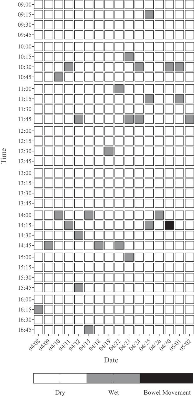
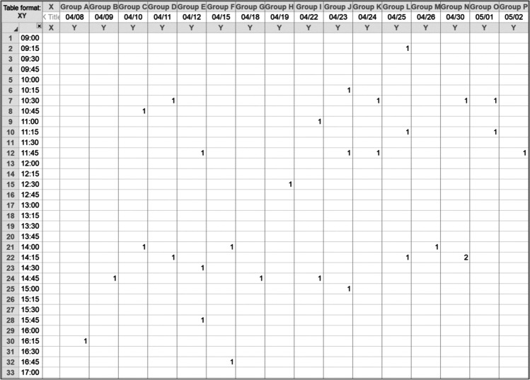
Behavior analysts may consider using scatter plots to determine potential relations from descriptive data prior to, or in conjunction with, an experimental analysis (Touchette et al., 1985). For example, by visually inspecting the prevalence of problem behavior across times of day or school activities, the behavior analyst may be able to hypothesize independent variables affecting problem behavior (e.g., lack of preferred activities during unstructured periods, degraded medication effects in the afternoon). Such a scatter plot can be seen in Fig. 1, which depicts a participant’s toileting behavior (e.g., urination, bowel movement) across days and times from Greer et al. (2016). Behavior analysts can create scatter plots easily with Prism’s heat maps by having tiles represent recording opportunities and then inputting values based upon categorical variables (see Fig. 2 for the respective data table). The reanalyzed data in Fig. 1 suggest that having the child sit on the toilet more frequently between the times of 10:30 and 11:45 a.m. and then again from 14:00 to 14:45 p.m. may facilitate toilet training.
Fig. 1.
Heat map of toileting behavior from Greer et al. (2016). Note. Scatter plot of a child’s toileting behavior during baseline from Greer et al. (2016), suggesting opportune times to arrange more frequent sits on the toilet
Fig. 2.
Data table used to create Fig. 1. Note. Blank cells indicate no toileting behavior (i.e., “dry” underwear or diaper), values of 1 denote urination, and values of 2 denote bowel movements
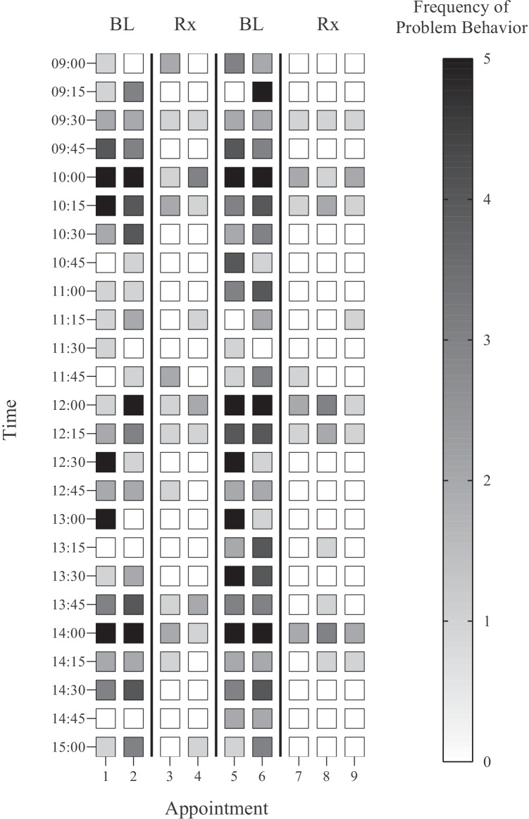
In addition to categorical values, one can also display a continuous variable as a gradient within the heat map. Figure 3 depicts a scatter plot of mock data one might collect prior to a conducting a functional analysis. This figure displays the frequency of problem behavior across appointments and times during baseline and medication trials. This graph was inspired by Kahng et al. (1998), who displayed problem behavior across days and times and shaded tiles according to categories of problem-behavior frequencies (e.g., one to two occurrences, three or more occurrences). Thus, one can see the changes in problem behavior frequency but also identify times of day (e.g., 10:00, 12:00, 14:00) in which problem behavior persists despite the use of medication, warranting further investigation.
Fig. 3.
Heat map of mock problem-behavior data. Note. Mock data for problem behavior across appointments and time during baseline (BL) and with medication trial (Rx)
Error Analyses
Heat maps may be useful for depicting error patterns in acquisition programs. As an example, Mitteer, Greer, et al. (2020) taught two registered behavior technicians to create single-case-design graphs in Prism. The authors assessed data-input and graphing skills separately within their own baseline and teaching conditions (e.g., input-only sessions) as well as during combined probes of inputting data and then graphing those data (input-plus-graphing sessions). The terminal goal was for participants to enter and graph data accurately in the combined probes without access to the video models for data input or graphing.
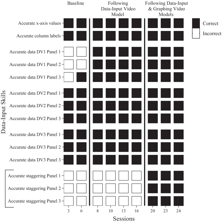
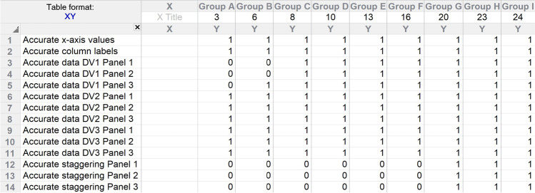
Figure 4 depicts an error analysis of data-input skills in a heat map, with Fig. 5 displaying the corresponding data table. This heat map displays performance during the combined probes only, which is why the session numbers along the x-axis are discontinuous. During Phase 2 (Following Data-Input Video Model), participants had learned how to enter data properly using a video model but had not yet experienced the video model for graphing. When probing data-input skills in the combined format during this phase, the final group of skills highlighted by a bracket (accurate staggering of data across columns) did not generalize to the combined probes, which required participants to graph those inputted data. In Phase 3 (Following Data-Input and Graphing Video Models), participants had experienced the video model for graphing in addition to the video model for data input. After learning graphing skills, the data-input skills then generalized to the combined probes, perhaps because the graphing video model taught participants how to manage the multiple data plots produced by the staggering of data across columns. This type of error analysis highlights which skills warrant additional consideration when revising teaching materials for future trainees or determining how best to present teaching materials (i.e., teaching input and graphing skills simultaneously).
Fig. 4.
Heat map of Myrtle’s data-input skills from Mitteer, Greer, et al. (2020). Note. This depicts Myrtle’s data-input performance during the combined-probe arrangement (i.e., inputting data correctly and then graphing those data) in baseline, after experiencing a video model for data-input only, and after experiencing both data-input and graphing trainings. The bracket highlights the critical skill of staggering data across data-table columns such that phase-changes are represented appropriately in the graph. DV = dependent variable
Fig. 5.
Data table used to create Fig. 4. Note. Values of 0 and 1 correspond to incorrect and correct responses, respectively
Likewise, behavior analysts could employ heat maps to depict an individual’s performance during matrix training. Matrix training is a teaching method that involves targeting a subset of responses during teaching (e.g., tacts of animals, tacts of actions) to produce a variety of novel combinations of those responses through recombinative generalization (e.g., Frampton et al., 2016). When developing a training matrix, the behavior analyst plots one of the response categories (e.g., type of animal) along the x-axis and the other response category (e.g., type of action) along the y-axis. Often, behavior analysts teach targets “along the diagonal,” meaning that they target the diagonally placed responses within the matrix that share no overlapping components to maximize the benefit of recombinative generalization (Frampton et al., 2016).
Figure 6 displays an example of how behavior analysts can portray matrix-training data using heat maps. These mock data depict tact performance across three probes in which a behavior analyst tested for all color-vehicle combinations. The first group of tiles displays potential response patterns after the behavior analyst taught the participant to tact a red car, with the participant tacting the red color of boats and planes correctly (as indicated by the gray shading) and the vehicle type of the yellow and blue cars correctly (as evident by the white shading). The “X” marks indicate that the participant did not tact any of the components correctly, such as for the yellow boat or blue plane. The second group of tiles depicts performance after additional teaching along the diagonal, where acquiring “yellow boat” improves performance related to that taught color and vehicle. Finally, the third group of tiles shows mastery of all color-vehicle combinations after teaching the third target along the diagonal (i.e., blue plane). Thus, the figure portrays how behavior analysts might detect response patterns (e.g., responses controlled by a mastered color versus mastered vehicle) within a heat map in a way that might be unobservable when tact data are portrayed as a line or bar graph.
Fig. 6.
Heat map of mock matrix-training data. Note. Example matrix-training data where each trio of columns reflects a generalization probe following diagonal teaching of red car, yellow boat, and blue plane, respectively. Tile color represents which response component(s) (i.e., color, vehicle, or both) the participant tacted correctly. “X” indicates an incorrect tact containing neither component
Post-Hoc Exploratory Analyses
In addition to informing clinical decision making before or during treatment, visual representation of fine-grained analyses can uncover unique relations in data, or better convey multiple levels of dependent measures, during post-hoc analyses. For example, Briggs et al. (2018) analyzed the prevalence of a form of treatment relapse known as resurgence (i.e., an increase in problem behavior when reinforcement conditions degrade for alternative behavior like an appropriate mand) when they thinned the availability of reinforcement for alternative behavior during functional communication training. The authors analyzed schedule-thinning steps as transitions from periods with greater availability of reinforcement for alternative responding (Condition A) to periods with lesser availability of reinforcement for alternative responding (Condition B), looking specifically for whether rates of problem behavior increased across such transitions.
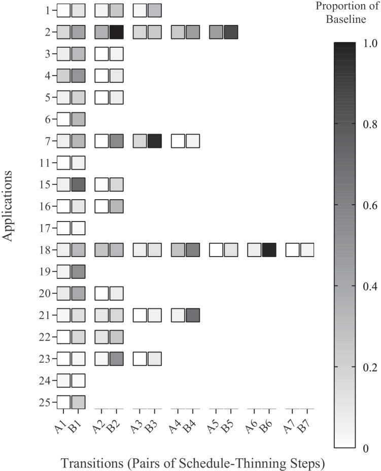
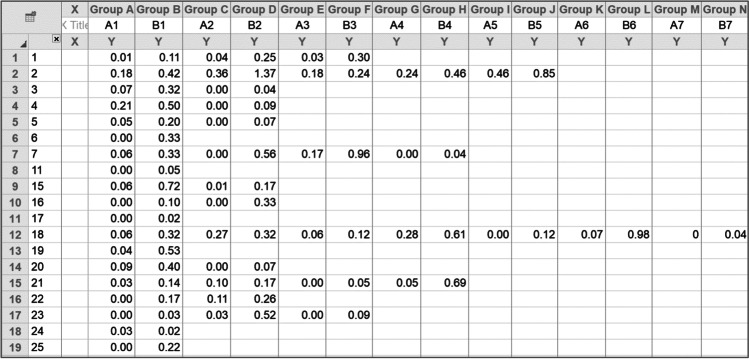
Figure 7 depicts a heat map of the transitions in which resurgence occurred (i.e., increased responding in Condition B relative to Condition A). See Supplementary Information 3 in our repository (Mitteer & Greer, 2021) for a version of the graph that showcases Prism’s ability to embed values from the data table in the heat-map tiles, which may be a useful feature for similar figures. Because some individuals may have higher rates of problem behavior during baseline relative to others, one can compute a proportion-of-baseline value by dividing response rates in Conditions A and B by the individual’s initial baseline response rate. Thus, values of 1 would represent a recovery of problem behavior to pre-treatment levels regardless of whether the participant had high or low rates of problem behavior in baseline. Figure 8 displays the data table for the proportion-of-baseline values that are depicted in Fig. 7, where darker tiles indicate greater resurgence of problem behavior. Although Prism does not support three-dimensional graphs (i.e., an x–y graph with a z-axis), the gradient changes across tiles along the x- and y-axes may portray similar information for three variables.1
Fig. 7.
Heat map of resurgence data from Briggs et al. (2018). Note. Analysis of 19 data sets with resurgence from Briggs et al. (2018). Each pair of transitions along the x-axis (e.g., A1, B1) reflects the average value prior to (Condition A) and after (Condition B) schedule thinning presented as a proportion of baseline (i.e., the average response rate during the condition divided by the average baseline response rate). Each y-axis value indicates one of the 25 applications of functional communication training
Fig. 8.
Data table used to create Fig. 7. Note. Data table displaying destructive behavior during schedule-thinning steps as proportion-of-baseline values. Entering the above values results in Prism shading the tiles automatically based on the range of values. Prism can also display the values within each tile as an optional feature
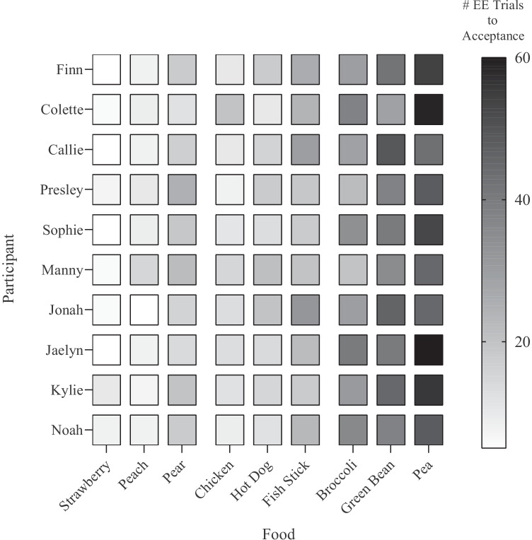
In pediatric feeding research, for example, it may be useful to display a grid of programmed foods (e.g., chicken, pears, green beans) across a large sample of participants. The behavior analyst could then shade the color of each food’s tile within the heat map according to resistance to escape extinction (e.g., gradient ranging from white [acceptance within five trials] to black [acceptance within 60 trials]). Doing so would allow for the visual inspection of change-resistant behavior both within- and across-participants, enabling the detection of consistently challenging foods, covariation between food types, as well as within-subject response patterns. An illustration of this approach is shown in Fig. 9. The ability to conduct such data analyses could inform treatment refinements for future participants, such as incorporating blending procedures for vegetables that tend to be correlated with higher resistance to escape extinction.
Fig. 9.
Heat map of mock food-acceptance data. Note. Mock data depicting differential resistance to escape extinction (EE) across food types. Prism shades each tile based upon the number of trials to acceptance entered in the data table
Concluding Remarks
The aim of this article was to describe potential uses for heat maps in behavior analysis while providing a general overview of how to create them in GraphPad Prism 9. Yet, despite Prism’s many strengths in generating these types of graphs, the software has some limitations worth noting. The main practical constraint our group has encountered when using heat maps is that Prism 9 does not allow for removal of specific heat-map cells or cell borders. This means that behavior analysts looking to create graphs like Fig. 7, in which certain heat-map tiles are removed from the graph, must use one of the following methods to remove unused tiles: (1) using Prism’s built-in feature to mark blank tiles with an “X,” (2) using white or another color to denote omitted data, or (3) covering empty tiles with drawn-in shapes (e.g., white boxes). The first option may be undesirable when trying to minimize ink use, which is a desirable feature of graphs (Mitteer et al., 2018). The second option could limit the behavior analyst if they wanted to use a color scheme similar to our mock figures (e.g., white to denote 0% or zero responses). The third option can be cumbersome, particularly if the behavior analyst updates the graph with new data intermittently, which might require continued adjustment of white boxes. Behavior analysts can submit feedback on these and other concerns through the company’s support page (e.g., submitting a feature request) or through their feedback-solicitation surveys, which may result in these limitations being resolved in future Prism updates.
Regardless of how important behavior analysts find the above limitation, the main barrier for many behavior analysts and organizations is likely Prism’s cost. As of December 2020, GraphPad offers personal monthly subscriptions for $40 (with two device activations) or annual subscriptions for students, academics, or professionals for $114, $174, or $276, respectively; the company also offers group subscriptions for 2–25 licenses ranging from $324–$2,900 and $528–$4,950 for academics and professionals, respectively. This cost can be challenging when considering that Prism lags behind Microsoft Excel in terms of some spreadsheet capabilities and in-cell calculations (Mitteer et al., 2018; Mitteer, Greer, et al., 2020). However, these limitations of Prism must also be judged in light of other user-friendly features (e.g., robust and intuitive statistical capabilities) the platform offers without the learning curve associated with other platforms (e.g., R and RStudio).
Indeed, Microsoft Excel can produce similar versions of the fine-grained analysis graphs we have described while offering other spreadsheet capabilities and statistical options. Because of this, we have included a formatted Excel spreadsheet in our repository as an example of how behavior analysts can achieve similar figures using Excel’s conditional-formatting feature (see Mitteer & Greer, 2021, Supplementary Information 4). The spreadsheet contains tabs with formatted data tables corresponding to Figs. 1, 4 and 7 along with embedded comments on how to create heat-map-like figures in Excel. However, as behavior analysts have noted in surveys about graphing practices (Haddock & Iwata, in press) and researchers have described in other papers (e.g., Mitteer et al., 2018), generating figures in Excel often requires extra workarounds to meet the production-quality desired by many behavior analysts. Although it took us only about 15 min to create each working version of Figs. 1, 4 and 7 in Excel (i.e., spreadsheets with conditional-formatting rules to color cells based upon their data), it required significantly more time to refine the spreadsheet to match the desirable aspects that one can automate in Prism (e.g., gaps between rows and columns, adding and formatting the legend).
Regardless of the software used to generate these types of figures, heat maps provide an alternative to traditional aggregated data graphs and may be helpful in identifying interesting behavioral patterns and potentially important independent variables. Recognizing that fine-grained analyses, though useful, can be challenging to incorporate amongst other competing client and professional responsibilities, we designed our training materials around procedures that can automate some aspects of the analysis for behavior analysts (i.e., color-coding important discrepancies in dependent measures, highlighting missing or outlier data). Nevertheless, future research might evaluate (1) the conditions under which these fine-grained analyses with heat maps yield novel findings above and beyond traditionally used aggregate graphs and (2) the efficacy of our provided training materials for behavior analysts learning to use heat maps effectively.
Acknowledgments
The authors thank Adam Briggs for his thoughtful comments related to the analysis of data from Briggs et al. (2018) and Kathryn Peterson for her guidance on potential data patterns in pediatric-feeding research.
Availability of Data and Material
All data generated or analyzed during this study are available at 10.5281/zenodo.4926480.
Funding
This work was supported by grants 2R01HD079113, 5R01HD083214, and 5R01HD093734 from the National Institute of Child Health and Human Development.
Declarations
Conflict of Interests
The authors have no conflicts of interest to declare that are relevant to the content of this article.
Footnotes
Behavior analysts interested in displaying data according to three or more variables might also consider Prism 9’s new bubble-plot feature. This graph type allows users to adjust the size and shading of symbols plotted to x- and y-axes according to categorical or continuous variables. For example, problem behavior levels could be plotted on the y-axis across transitions on the x-axis. Then, the size of the resurgence data points could represent the severity of problem behavior (e.g., average response force), and the color could represent the function of problem behavior (e.g., red for escape, green for tangible).
Publisher’s Note
Springer Nature remains neutral with regard to jurisdictional claims in published maps and institutional affiliations.
Change history
1/16/2022
Due to an error in production, this article was updated to include the correct image of Figure 5.
Change history
1/18/2022
A Correction to this paper has been published: 10.1007/s40617-022-00678-9
References
- Behavior Analyst Certification Board. (2014). Professional and ethical compliance code for behavior analysts. Retrieved March 3, 2021 from https://www.bacb.com/wp-content/uploads/2020/05/BACB-Compliance-Code-english_190318.pdf
- Berkman SJ, Roscoe EM, Bourret JC. Comparing self-directed methods for training staff to create graphs using GraphPad Prism. Journal of Applied Behavior Analysis. 2018;52(1):188–204. doi: 10.1002/jaba.522. [DOI] [PubMed] [Google Scholar]
- Briggs AM, Fisher WW, Greer BD, Kimball RT. Prevalence of resurgence of destructive behavior when thinning reinforcement schedules during functional communication training. Journal of Applied Behavior Analysis. 2018;51(3):620–633. doi: 10.1002/jaba.472. [DOI] [PMC free article] [PubMed] [Google Scholar]
- Derby KM, Hagopian L, Fisher WW, Richman D, Augustine M, Fahs A, Thompson R. Functional analysis of aberrant behavior through measurement of separate response topographies. Journal of Applied Behavior Analysis. 2000;33(1):113–117. doi: 10.1901/jaba.2000.33-113. [DOI] [PMC free article] [PubMed] [Google Scholar]
- Frampton SE, Wymer SC, Hansen B, Shillingsburg MA. The use of matrix training to promote generative language with children with autism. Journal of Applied Behavior Analysis. 2016;49(4):869–883. doi: 10.1002/jaba.340. [DOI] [PubMed] [Google Scholar]
- Greer BD, Neidert PL, Dozier CL. A component analysis of toilet-training procedures recommended for young children. Journal of Applied Behavior Analysis. 2016;49(1):69–84. doi: 10.1002/jaba.275. [DOI] [PubMed] [Google Scholar]
- Haddock, J. N., & Iwata, B. A. (in press). Software for graphing time-series data. Journal of Applied Behavior Analysis
- Kahng S, Iwata BA, Fischer SM, Page TJ, Treadwell KR, Williams DE, Smith RG. Temporal distributions of problem behavior based on scatter plot analysis. Journal of Applied Behavior Analysis. 1998;31(4):593–604. doi: 10.1901/jaba.1998.31-593. [DOI] [PMC free article] [PubMed] [Google Scholar]
- Mitteer, D. R., & Greer, B. D. (2021). Mitteer & Greer—Using GraphPad Prism's heat maps for fine-grained analyses (supplementary information) [Data set and training materials]. Zenodo. 10.5281/zenodo.4926480
- Mitteer DR, Greer BD, Fisher WW, Cohrs VL. Teaching behavior technicians to create publication-quality, single-case design graphs in GraphPad Prism 7. Journal of Applied Behavior Analysis. 2018;51(4):998–1010. doi: 10.1002/jaba.483. [DOI] [PMC free article] [PubMed] [Google Scholar]
- Mitteer DR, Greer BD, Randall KR, Briggs AM. Further evaluation of teaching behavior technicians to input data and graph using GraphPad Prism. Behavior Analysis: Research & Practice. 2020;20(2):81–93. doi: 10.1037/bar0000172. [DOI] [PMC free article] [PubMed] [Google Scholar]
- Mitteer DR, Luczynski KC, McKeown CA, Cohrs VL. A comparison of teaching tacts with and without background stimuli on acquisition and generality. Behavioral Interventions. 2020;35(1):3–24. doi: 10.1002/bin.1702. [DOI] [Google Scholar]
- Touchette PE, MacDonald RF, Langer SN. A scatter plot for identifying stimulus control of problem behavior. Journal of Applied Behavior Analysis. 1985;18(4):343–351. doi: 10.1901/jaba.1985.18-343. [DOI] [PMC free article] [PubMed] [Google Scholar]
- Wilkinson L, Friendly M. The history of the cluster heat map. The American Statistician. 2009;63(2):179–184. doi: 10.1198/tas.2009.0033. [DOI] [Google Scholar]
Associated Data
This section collects any data citations, data availability statements, or supplementary materials included in this article.
Data Availability Statement
All data generated or analyzed during this study are available at 10.5281/zenodo.4926480.


