Abstract
COVID-19 is responsible for the deaths of millions of people around the world. The scientific community has devoted its knowledge to finding ways that reduce the impact and understand the pandemic. In this work, the focus is on analyzing electronic health records for one of the largest public healthcare systems globally, the Brazilian public healthcare system called Sistema Único de Saúde (SUS). SUS collected more than 42 million flu records in a year of the pandemic and made this data publicly available. It is crucial, in this context, to apply analysis techniques that can lead to the optimization of the health care resources in SUS. We propose QDS-COVID, a visual analytics prototype for creating insights over SUS records. The prototype relies on a state-of-the-art datacube structure that supports slicing and dicing exploration of charts and Choropleth maps for all states and municipalities in Brazil. A set of analysis questions drives the development of the prototype and the construction of case studies that demonstrate the potential of the approach. The results include comparisons against other studies and feedback from a medical expert.
Keywords: COVID-19, Electronic healthcare records, Visual analytics
1. Introduction
The COVID-19 pandemic has caused the death of millions of people worldwide. In Brazil, the number of deaths surpassed 640,000 as of May 2022. Healthcare systems are essential in the fight against the pandemic, such as the Sistema Único de Saúde (SUS) [1], which corresponds to the Brazilian unified healthcare system. SUS made large amounts of health data publicly available. The data contains records of patient admissions in medical institutions in Brazil. Due to the COVID-19 pandemic, the Brazilian Ministry of Health implemented a platform for monitoring COVID-19 records. These records have an essential role in understanding the impacts of COVID-19 in Brazil, a country with continental proportions, a large population, and one of the countries hit the hardest by the pandemic.
The analysis of SUS data is challenging as it is composed of millions of electronic health records (EHRs), containing a broad spectrum of patient demographics, symptoms, and risk factors [2]. In this work, we propose QDS-COVID, a visual analytics system for the interactive exploration of millions of SUS records associated with COVID-19. The prototype relies on the computational power offered by the Quantile Datacube Structure (QDS) [3], which allows filtering in different data dimensions and creating charts combined with maps to show information for states and municipalities. Application scenarios of the prototype include highlighting findings drawn from the data, comparisons against studies over the same data, and feedback from a medical expert who used the prototype independently.
2. Related work
This section summarizes related work, including analytics systems for healthcare data. Since a big concern is the size of the SUS data, the review also includes data structures that support aggregate analytics and interactive exploration of big data. The section ends with recent efforts to analyze and visualize COVID-19 data.
2.1. Healthcare analytics systems
Visualization in healthcare has a broad range of applications designed for patients, doctors, companies, and public policies. Gotz and Borland [4] divides the range of applications into four primary focuses: (a) patient-centered point-of-care applications that provide information from a single patient to clinicians; (b) patient-facing applications that allow managing patient medical histories and treatments; (c) population management applications that devise suitable health programs; and (d) health outcomes that find risk factors over geographic regions. West et al. [5] and Plaisant et al. [6] explore Electronic Health Records (EHR) using visualization tools. They mention that the EHR size and complexity are the main challenges in finding meaningful patterns and analyzing data. Ola and Sedig have a sequence of papers that describe visualization techniques applied to EHRs. The first paper [7] discusses the visualization of multiple aspects in demographic, geographic, chronological, and summaries of healthcare data. The second work, HealthConfection [8], analyzes risk factors and causes of mortality. The third paper points out the importance of human-data interaction through visualization frameworks to understand healthcare data [9].
Several papers discuss the relationship between visual analytics and healthcare data [6], [10], [11], [12], [13]. VisOHC [14] visualizes individual conversation threads from Online Health Communities (OHCs) through histograms, word clouds, t-distributed Stochastic Neighbor Embedding (t-SNE) [15] to visualize similar threads, and the use of divergent/sequential colors for sentiment analysis. That study indicates that visual analytics help explore healthcare data and find patterns visually. Other techniques follow a server-side approach that processes large and complex healthcare datasets to explore, analyze, and understand data using Geovisual techniques [16]. In addition to processing and visualizing healthcare data, this approach emphasizes the strong relationship of healthcare data with socio-economic, demographic, and environmental data of spatial regions under analysis. Frequence [17] is a visualization tool to explore and understand patterns of temporal event sequences implementing a sequence mining algorithm to handle real-world data requirements (such as multiple levels of detail, temporal context, concurrency, etc.). Care Pathway Explorer [18] extracts and visualizes the EHRs of patients to obtain sequences of medical events like diagnoses and treatments to contrast the correlation with the patient’s outcome.
Big data analytics is also an essential issue for analyzing healthcare data [19], [20]. Wang et al. [19] conducted a study of big data applications in healthcare. Galleta et al. [20] present an architecture for remote patient monitoring using big data visualization services for healthcare systems. QDS-COVID complements these ideas by providing an infrastructure that supports the interactive visual exploration of millions of electronic health records (EHRs).
2.2. Data structures for aggregated analytics
A fundamental problem in modern visual data analysis is how to build data exploration environments that support the interactive exploration of large datasets. This problem has two opposing facets. From one side, the ever-growing complexity and size of datasets requires complex navigation and visual summarization capabilities. On the other hand, human perception and cognition pose a challenge on how long the data handling and rendering loop can last. Even minor delays on the scale of half a second can negatively impact the visual data exploration process [21]. As a result, there are limitations to the analysis that one can hope to perform interactively.
Business Intelligence (BI) is the ability to extract and prepare data to run queries (e.g., slicing, dicing, pivoting, and aggregation) and create management reports and data visualizations to present analytical results. Such BI systems can be hard to implement, frequently requiring months to complete and a large number of highly trained IT professionals. Healthcare systems often rely on efficient approaches for computing aggregated analytics. The seminal paper by Gray [22] introduces the concept of datacubes. A datacube is defined as the combination of all possible aggregations of attributes for a given relation and their summarized numerical metrics, e.g., count, maximum, average, etc.. Modern iterations of datacubes structures combine () the ability to query with instant results, () low memory usage, and () advanced data analysis and modeling techniques, leveraging the opportunities of interactive visualization tools of large datasets running in personal computers with mainstream specifications. A datacube does not replace a relational database but they are frequently used in conjunction to overcome the relational database performance limitations.
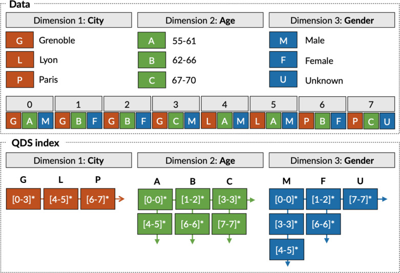
The first approach to connect visualization techniques and datacubes in an interactive fashion was imMens [23]. ImMens speed up computations in data aggregation operations using GPUs. Nanocubes [24] uses a hierarchical representation to encode pre-computed aggregations. The Hashedcubes [25] improves upon Nanocubes by providing a simpler data structure while also handling datasets that were an order of magnitude larger than the datasets supported by Nanocubes. The Quantile Datacubes Structure (QDS) [3] is an improved version of HashedCubes. QDS supports the storage of multi-dimensional data (spatial, temporal, and categorical) in arrays, following nested sorting in each dimension. QDS has a multi-level index that keeps, for each dimension, a list of intervals of array indexes (called pivots) that delimit a consecutive region in the array. Fig. 1 shows an example of a QDS structure for a dataset composed of three dimensions (city, age, and gender).
Fig. 1.
Example of the multi-level index implemented in QDS.
In QDS, aggregated values are not limited to averages as it can store distributions within different quantiles. For instance, instead of indexing the average of a numerical attribute, QDS stores its quantiles to support aggregation computations on the fly, such as the average, quantile, maximum, or minimum. Quantile query computation relies on a compressed representation of a distribution function based on a non-parametric distribution modeling technique called t-digest [26]. QDS stores such a representation as a payload that uses merging distribution functions to support on the fly aggregations. In this work, QDS is the chosen data structure for supporting data exploration.
2.3. Analysis and visualization of COVID-19 data
Understanding COVID-19 led to works that study the different facets of the data associated with the pandemic [2], [27]. Visualization techniques have been a fundamental part of this process with interactive dashboards [28], [29] since the early days of the pandemic. Other examples include the visualization of graphs such as the networks in contact tracing and fact-checking or simulation of the spread of cough particles [30]. A recent survey describes the several types of crisis visualizations used in COVID-19 data [31].
3. Design considerations of QDS-COVID
The experience of a previous project in collaboration with the Ministry of Health was essential for us to outline preliminary driving questions for exploring SUS data. In our earlier interactions, the technicians from the Ministry of Health outlined the main problems of analyzing SUS data: () evaluation of data quality and finding data inconsistencies; and (ii) the volume of the data, which made interactive exploration not possible. The only support available was for individual queries through web forms, thus limiting analysis and insights about the data. The addition of a window that could display the geographical borders of states and municipalities, assigning colors to regions on the map, was one of the main requests posed by the technicians. Due to privacy concerns, the prototype developed was only available for internal use in the Ministry of Health.
The availability of public COVID-19 data from the Ministry of Health made it possible to revisit the previous project in a short period. The system design explores EHRs that monitor the evolution of the pandemic and learn how different regions and demographic groups were affected by COVID-19. It follows a methodology for clinical data analysis that uses the visualization of patterns for supporting clinical decisions and creating insights into the healthcare data [32]. To support the exploration, the requirement questions were revised with the help of a medical expert with a master’s in computer science, an ideal background of an expert to help in the design of the analysis questions. One of the main issues raised by the medical expert was the need to understand the disease and how it relates to the patient’s conditions and symptoms in different parts of Brazil. A set of analysis questions were identified after interactions with the medical doctor. The resulting list of six questions (A1–A6) is as follows:
-
•
A1. Identify data inconsistencies or errors: Since the pandemic began, SUS modified the forms used to input COVID-19 data, leading to inconsistencies and errors in records through time. Identifying inconsistencies helps improve data acquisition protocols and data quality;
-
•
A2. Explore the geographical distribution of the health records: Due to Brazil’s continental proportions, climate characteristics, and ethnic distribution, it is expected that the pandemic is not going to be uniform across the country. The requirement is to identify how COVID-19 affects different states and municipalities;
-
•
A3. Explore the patient’s demographic background: Since the early stages of the pandemic, it was known that some demographic groups were more affected by COVID-19 than others, especially concerning age. The requirement is to support the analysis of the health records for different age groups.
-
•
A4. Explore patient’s existing conditions: One factor in COVID-19 mortality are prior health conditions. Cardiac diseases and diabetes are among the top risk factors for COVID-19. The requirement is to investigate which health conditions are affecting patients in Brazil;
-
•
A5. Explore symptoms reported by the patients: It is important to support the exploration of the variations of symptoms that patients have reported, such as cough, fever, headache, sore throat, and asymptomatic, among others, as well as how the symptoms manifest across the country;
-
•
A6. The analysis should be performed considering the temporal aspect of the data: The COVID-19 pandemic has been a complex temporal process, which presents different patterns over time. Therefore, the tool needs to allow the analyst to study particular periods such as months, seasons of the year, or specific intervals corresponding to pandemic waves.
To effectively support the analyses described above, the system has to satisfy the following three (P1–P3) technical requirements:
-
•
P1. Support interactive exploration of health records: To be effective, the system has to support interactive visualizations of a dataset containing tens to hundreds of millions of records. This requires an infrastructure that can answer queries with low latency and acceptable storage requirements;
-
•
P2. Support for slice and dice operations that filter scenarios in categorical, temporal, and spatial dimensions: The exploration has to enable the user to perform interactive filtering on the different dimensions of the data as well as summarize the data in different levels of detail such as states and cities;
-
•
P3. Web-browser interface: to support collaborative analysis over the web, the prototype must run from the browser.
4. Materials and methods
This section describes the dataset and pre-processing operations required to process the data in our system.
4.1. The COVID-19 SUS dataset
Due to the COVID-19 pandemic, the Brazilian Ministry of Health implemented a platform called e-SUS Notifica to report flu syndrome cases. It consists of publicly available records containing patient information, clinical and epidemiological data.1 Governmental entities validate and check the consistency of submissions to the platform. Data collection started in March 2020, the month of the first case of COVID-19 in Brazil. Data is available in a CSV format, with an individual file for each state in Brazil. Data for all the 26 states and the federal district were downloaded on April 1st, 2021. The raw dataset has 42.9 million records. Demographics and geographical boundaries of states and municipalities used in maps came from the Brazilian Institute of Geography and Statistics (IBGE).2
4.2. Data pre-processing
Data pre-processing involves exploring, cleaning, and treating data used in the QDS data structure. This is crucial since data are often subject to errors, such as ill-formatted fields, incomplete or inconsistent information, noise, and outliers. The reason for these errors involve several factors, such as the use of multiple versions of the systems that collect the data, lack of standards, lack of data consistency procedures, or lack of knowledge when entering data.
The cleaning process removes the outliers and selects fields (dimensions) related to the analysis tasks described in Section 3. When possible, dimensions are represented in categorical format, where values are discretized into a fixed number of categories. For example, data for spatial regions such as states and municipalities are stored as categorical dimensions. Categorical dimensions simplify the check for inconsistencies or lack of standardization, such as invalid data. Temporal and numerical dimensions are treated as strings since it simplifies checking the format used. In addition, data statistics (minimum, maximum, mean, median, quantiles, and number of nulls) are represented using graphs such as histograms and boxplots. These statistics help us choose the dimensions and identify data errors. The resulting dimensions are listed in Table 1. After pre-processing, the individual CSV files are combined into a single CSV file which is the input used to populate the QDS data structure.
Table 1.
Dimensions of the COVID-19 SUS dataset.
| Dimension | Patient data |
Epidemiological clinical data |
||||||||
|---|---|---|---|---|---|---|---|---|---|---|
| Health professional | Age | Sex | Symptoms date | Notification date | Conditions | Symptoms | Test status | Test type | Test result | |
| Type | Categorical | Categorical | Categorical | Temporal | Temporal | Categorical | Categorical | Categorical | Categorical | Categorical |
| N | 2 | 19 | 2 | – | – | 10 | 11 | 5 | 7 | 4 |
| Dimension | Case closure data |
Location data |
||
|---|---|---|---|---|
| Evolution | Final classification | IBGE state | IBGE municipality | |
| Type | Categorical | Categorical | Categorical | Categorical |
| N | 8 | 7 | 28 | 5603 |
4.3. QDS-COVID system architecture
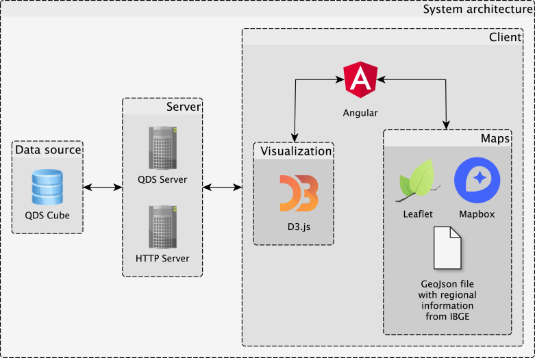
The design of the system is summarized in Fig. 2. QDS-COVID is implemented using a client–server architecture [33]. The server is responsible for supporting the data back-end and running an HTTP server to handle the web application. The client is responsible for providing interactive visualization capabilities to explore the data resulting from the queries to the back-end. It is important to note that the current version of the prototype was designed to address the requirements listed in Section 3. However, system design is flexible to accommodate new requirements such as addition of data or other visualizations. For example, treemaps were used in a related project to visualize a hierarchy of disease codes. Another example is the visualization of distribution functions of numeric attributes of the data. Both examples show that the prototype can be more sophisticated.
Fig. 2.
The client–server architecture of QDS-COVID. It uses the QDS data structure as the data back-end. The front-end provides different visualizations implemented as multiple coordinated views.
The prototype is currently available online.3 There is also a video demonstrating the system in action.4
4.3.1. Data back-end: QDS cubes
Since the pre-processed data has millions of multivariate and spatiotemporal records, there is a need for an efficient data handling solution that satisfies requirements P1 and P2. The QDS [3] was chosen to store the dataset since it provides the querying performance needed for interactive exploration under the storage budget of personal computers. QDS stores tabular data containing many records, each composed of fields that can describe spatial, numerical, categorical, and temporal data. To prepare the data for QDS, the dimensions of the cube need first to be defined. In the COVID-19 SUS dataset, two categorical dimensions may have more than one value for each record (patient conditions and symptoms). To compute aggregations for conditions or symptoms individually, it is necessary to create a separate record for each condition or symptom found. To simplify this process, three different cubes are used. The first cube contains only records (without symptoms or conditions). The other two cubes contain a single record for each condition or symptom. Although there are up to 13 possible conditions, 38 million of the 42 million records have no conditions. On the other hand, there are only 88K records with no symptoms and some with up to 10 symptoms. For this reason, the conditions cube is much smaller than the symptoms cube (Table 2).
Table 2.
Information stored in QDS cubes.
| Dataset | Objects | Memory | Time | Pivots | Schema |
|---|---|---|---|---|---|
| Records | 42.9M | 3.1GB | 8 min 17 s | 72.8M | health professional (2), sex (2), condition count (3), symptom count (5), test result (4), test status (5), test type (7), final classification (7), evolution (8), age (19), IBGE state (27), IBGE municipality (5603), start date of symptoms (temporal), notification date (temporal) |
| Symptoms | 94.3M | 6.8GB | 17 min 28 s | 159.8M | health professional (2), sex (2), symptom (11), test result (4), test status (5), test type (7), final classification (7), evolution (8), age (19), IBGE state (27), IBGE municipality (5603), start date of symptoms (temporal), notification date (temporal) |
| Conditions | 5M | 432MB | 1 min 16 s | 11M | health professional (2), sex (2), condition (10), test result (4), test status (5), test type (7), final classification (7), evolution (8), age (19), IBGE state (27), IBGE municipality (5603), start date of symptoms (temporal), notification date (temporal) |
4.3.2. Visual analytics interface
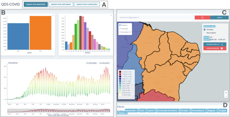
The visualization components in QDS-COVID are summarized in Fig. 3.Widely used visual representations such as bar charts, line charts, and maps are used to represent categorical, temporal, and spatial data, respectively. The QDS-COVID interface handles two spatial data types: latitude and longitude coordinates or municipalities and states. Components are implemented as coordinated views that can be interactively filtered on the dimensions of the data.
Fig. 3.
QDS-COVID interface components: (A) dataset selection, (B) charts, (C) map and statistics, and (D) filters.
5. Results
The QDS-COVID prototype is a tool for performing exploratory clinical data analysis of the COVID-19 data. The interactive visual interface with support to coordinate views and multiple filtering capabilities offers flexible ways to identify and explore interesting patterns and scenarios. This section illustrates scenarios that were discovered while using QDS-COVID. The analysis questions A1–A6 posed in Section 3 drove the exploration process. A video demonstrating the system in action is available.5 as well as the web-based prototype.6
Example 1 A1, A2 —
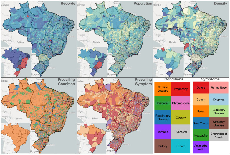
Fig. 4 illustrates the different ways to color-code the map of Brazil using the boundaries of the 26 states or the 5,602 municipalities. For simplicity, when referring to states in Brazil, their two-letter acronym is used. While Brazil is highly populated along the coast and in the southwest, the total records for COVID-19 were higher in the southern states (e.g., RS and SC). The density map uses dark shades of red to reveal outlier states such as SC and RR. While the density of records per population is 20.7% in Brazil, SC and RR have a density of 57.2% and 46.0%, respectively. The prevailing condition is cardiac disease, followed by diabetes. While, until August 2020, the prevailing symptoms were not in listed in the form and thus were classified as “others”, from September 2020 onwards, the most frequent symptoms were cough, fever, and headache.
Fig. 4.
States or municipalities can be color-coded by the total number of records, population, density (ratio of records by population), prevailing symptom, and prevailing condition.
There are situations that reveal limitations or inconsistencies in data. For example, the records map for PR shows fewer records (only 125K) than for states with a similar population count, such as RS, which has 3.8M records. Such a difference might be because the data does not include information from states or municipalities that use their own notification systems for COVID-19. While the percentage of records associated with female/male is slightly larger for females (51.79%,48.21%) when the entire country is considered, there are states with many more male records, such as SC (28.09%, 71.91%) and ES (0.04%,94.96%).
Example 2 A2 —
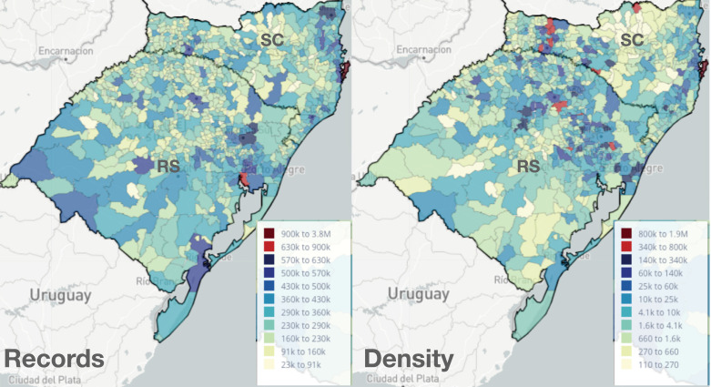
Comparing the maps with number of records (Fig. 5 left) and density (Fig. 5 right) one can also identify low populated areas with a high number of records (high-density value). We can see that RS has a large number of records in the center and southwest, while the density of records is higher towards the northeast.
Fig. 5.
Records and density maps for the states of RS and SC.
In SC, while the number of records is higher in the northeast, we observe municipalities with higher density in the west. The border between states has similar high-density values.
Example 3 A3 —
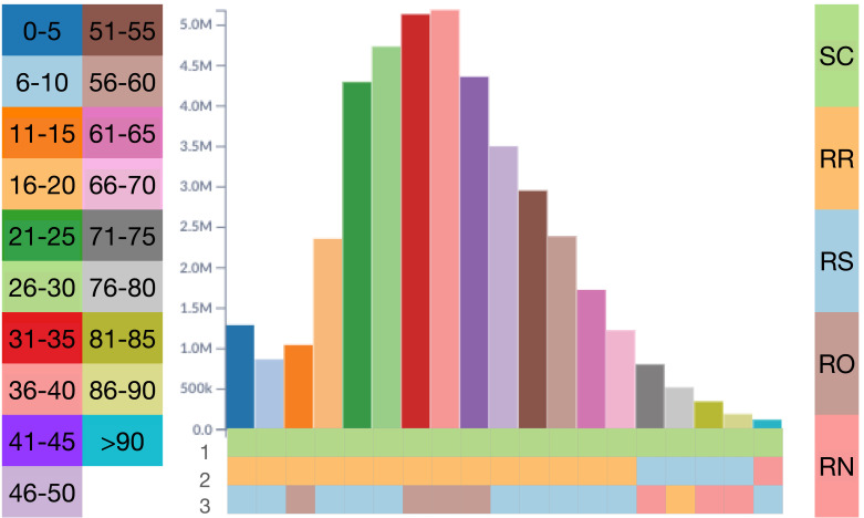
As observed in Example 1, SC and RR have high-density values for the entire period. In Fig. 6 the density changes when filtering the analysis for each of the 19 age groups and displaying the top three states in each group. SC is the leading state in all age groups, which stresses the impact of COVID-19 in this state. RR ranks in second place in all age groups until age 70. RS is the third most frequent state in this ranking, particularly in higher age groups. Both RS and SC have a large elderly population. RN and RO also appear in this ranking for older and younger age groups, respectively.
Fig. 6.
Top-3 states for each age group by density.
Example 4 A3, A4 —
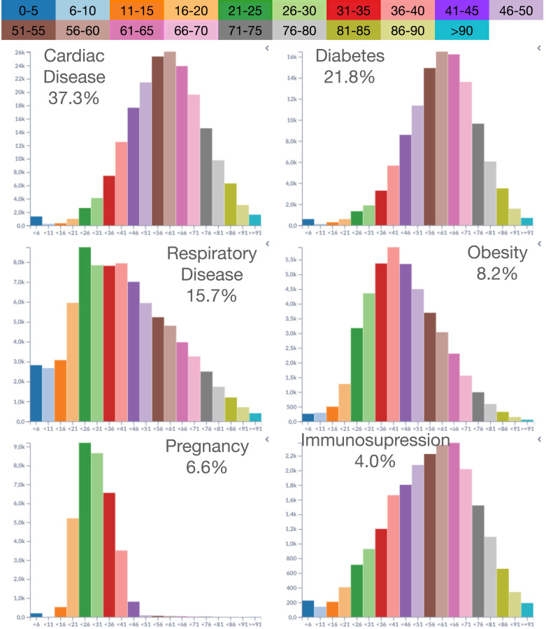
In this example, a comparison reveals the prevailing conditions against the different age groups. Fig. 7 shows the age-group histograms for each condition. Cardiac disease is the top condition and accounts for 37.8% of conditions. It has a nearly symmetric shape distribution, peaking at the 56–60 age group. Diabetes is the second most frequent condition, similar to cardiac diseases but slowly increasing until 50 years old. Respiratory diseases peak at the 21–25 age group, decreasing shape as age increases. Obesity has a steady and fast growth after 16 years old, reaching a peak at 36–40, and a slight decrease for the following age groups. Pregnancy, as expected, has a narrow distribution from 16 to 45 years old, with peaks around 21–25 and 26–30. Immunosuppression has a linear increase from 11 years old to 56–60, where it reaches a peak and starts to decrease at a faster pace for older age groups.
Fig. 7.
Age distribution for the top six conditions.
Example 5 A4, A6 —
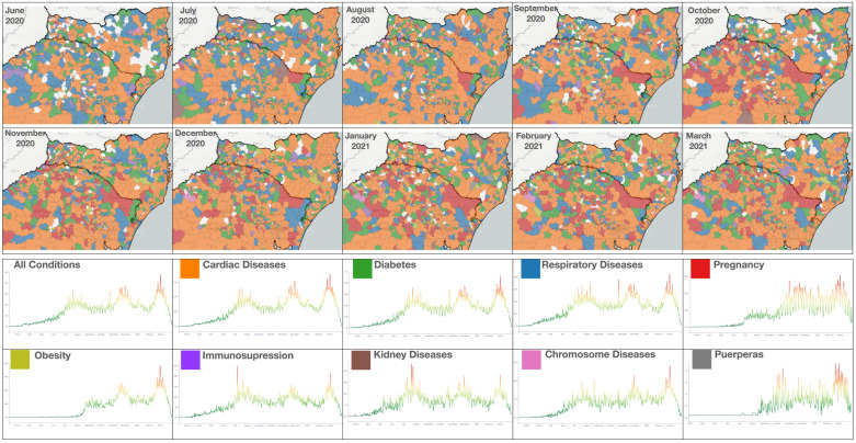
Fig. 8 displays the prevailing conditions from June 2020 to March 2021 on the border of RS and SC. Cardiac disease is consistently the top condition. There are, however, noticeable changes for the other conditions. To better illustrate the differences in time associated with conditions, the figure shows the timeline for each condition. Cardiac diseases, diabetes, and respiratory diseases are the top three conditions, and the timeline for each follows the overall distribution. Respiratory diseases were more prevailing from June to September, corresponding to the winter season. There is a peak in kidney diseases in July 2020. Pregnancy increases in the north of RS from September 2021 and keeps elevated until March 2021. Another condition to pay attention to is obesity. The obesity plot shows low values until August because it was not part of the form before. After August, obesity conditions reach high values in the wave by February/March 2021.
Fig. 8.
Monthly prevailing conditions for municipalities in RS and SC from June 2020 to March 2021: (top) map view with prevailing conditions for each municipality (bottom) timeline charts for each condition.
Example 6 A3, A4, A6 —
While exploring the municipalities on the border of RS and SC, some municipalities revealed short periods of intense record activity, such as Caxias do Sul (RS). Fig. 9 shows the records during two high record periods of 45 days in winter 2020 (3,401 records) and summer 2021 (3,128 records). The number of records in these two periods accounts for nearly 38% of all records in the entire year. The first observation is that the histogram of age groups changes in the summer, with fewer people in the age groups 51–90 but with more people from 16–50, with peaks in 36–40 and 21–25. Cardiac diseases are still the prevailing condition. Respiratory problems decrease in the summer, while there is an increase in conditions such as immunosuppression and obesity. The obesity condition calls for attention since it moved from not appearing to accounting for 10% of all conditions.
Fig. 9.
Records in Caxias do Sul (RS) for two periods of 45-days during the winter 2020 and summer 2021. The histograms reveal significant changes in the distribution of the age groups and prevailing conditions.
Example 7 A5, A6 —
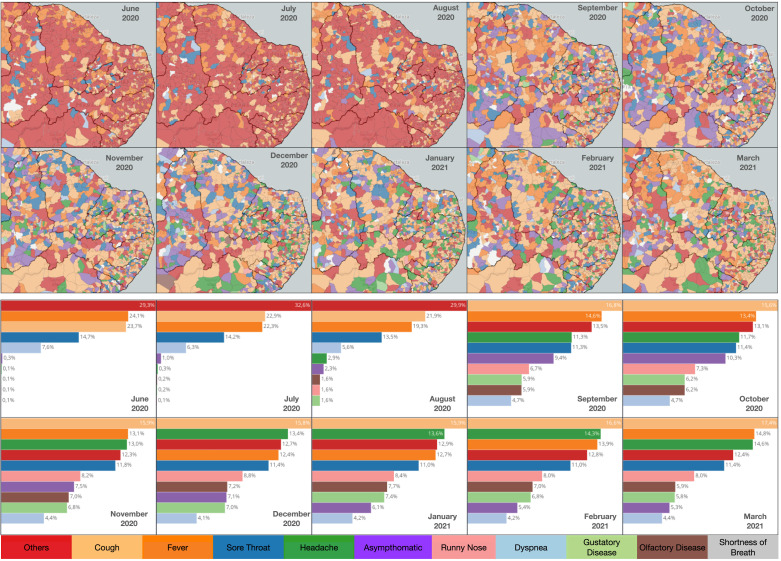
During the exploration process, the changes in symptoms were inspected throughout the year in different states of Brazil. For example, many states in the northeast of Brazil in October of 2020 had asymptomatic as the prevailing condition. To further remove patients who tested negative for COVID-19, a filter was defined to only select records with positive test results. Such a filter reduced the number of records overall, but the number of asymptomatic records remained large. Fig. 10 illustrates the changes in prevailing symptoms for several municipalities across northeast Brazil. From June to July 2020, the list of symptoms in the form had only five options (cough, fever, sore throat, dyspnea, and others). The form changed late in August to include additional symptoms (obesity, headache, runny nose, gustatory disease, olfactory disease, and shortness of breath), which caused a reduction in records associated with the others category from September. In particular, headaches made the top-3 symptom list from November until March 2021. The color difference in the maps illustrates a significant variability in the top symptoms across the different municipalities.
Fig. 10.
Monthly evolution of prevailing symptoms for patients who tested positive for COVID-19 in the northeast of Brazil.
6. Discussion
An intensive care physician evaluated the prototype with an M.Sc. in Computer Science. The use of maps to create quick insights by state or municipality was the preferred functionality. The density maps that show records by population were also necessary to compare different locations. The expert also reported findings using the tool independently, listed below.
SP has the most records, but SC is the state with the highest density of records. RR is the state with the most healthcare professionals with positive tests by population, followed by RO and RS. Patients submitted to a COVID-19 test had 64.5% negative and 35.5% positive results. In 2020, 5.39% of the positive tests were from healthcare professionals, while in 2021, it reduced to 2.11%. Since more than 50% of the outcomes is “N.A.”, we cannot compare mortality with other studies. In patients with positive tests, the top symptoms were cough (18.8%), fever (15.5%), and sore throat (12.1%); only 4.5% were asymptomatic. In patients with a negative COVID test, the top symptoms were cough (16.5%), sore throat (13.2%), and fever (11.3%), but 13.2% were asymptomatic.
The findings were also compared to existing studies. Lima et al. [34] presented an analysis for state capitals between March 1st and August 18th 2020. QDS-COVID reports 2.6M records, while they found 2.42M. There are also differences in the distribution by sex: QDS-COVID found 46.9% of records for women and 53.1% for men, while they found 55.1% and 44.0%, respectively. Considering the not available values (N.A) in the prototype, the results match their reported values. Escobar et al. [35] showed that in RO between 1st January and 20th August 2020, there were 184M records with 27.0% of positive tests. Using these filters in QDS-COVID, we found 195M records with 26.7% positive tests. Additionally, the results of death percentage by age groups are similar to the ones we obtained, despite in QDS-COVID having five year ranges and their work having ten year ranges. Marcolino et al. [36] presented clinical characteristics from hospitalized patients from March to September 2020. The most frequent conditions were hypertension (52.9%) (cardiac disease), diabetes (29.2%), and obesity (17.2%). QDS-COVID shows that the most reported conditions were cardiac diseases (37.9%), diabetes (24.5%), and respiratory diseases (17.8%).
7. Conclusion
In this work, we proposed QDS-COVID, a visual analytics prototype to analyze millions of healthcare records made publicly available in the Brazilian SUS. Interactive analysis of the SUS data is challenging due to its size and complexity. The performance requirements were satisfied using a datacube structure called QDS [3] that supports interactive queries requested by the user interface (despite the fragmentation of the dimensions with many values). The prototype supports interactive analysis over charts and maps for states and municipalities. The potential of the prototype was demonstrated with use cases that bring findings about COVID-19. Comparisons of results against other works were given, as well as feedback from a medical expert. Table 3 summarizes the main points of this work.
Table 3.
Summary points.
| Points already known: |
| The identification of spatiotemporal patterns of public healthcare records is important to support changes in public policies that improve the quality of healthcare systems such as the Brazilian SUS; |
| There is no publicly available system to analyze COVID-19 healthcare records of the Brazilian SUS; |
| There is a need to understand the patterns that describe how COVID-19 affects different regions of Brazil and how such patterns change throughout time. |
| Contributions: |
| QDSSUS, a publicly available web-based visual analytics prototype built upon a customized data structure that stores millions of records and supports interactive queries that allow interactive exploration of healthcare records; |
| Geographical exploration of millions of Brazilian SUS healthcare records related to COVID-19 organized by admission records and patient symptoms or conditions, with support to interactive filtering of different patient demographics; |
| The authors discovered evolution spatiotemporal patterns in different locations of Brazil along one year of COVID-19, such as the relation of patient age groups and their corresponding dominant conditions or symptoms. |
CRediT authorship contribution statement
Juan Carlos Carbajal Ipenza: Conceptualization, Methodology, Software, Investigation. Noemi Maritza Lapa Romero: Software, Visualization. Melina Loreto: Visualization, Investigation. Nivan Ferreira Júnior: Supervision, Writing – original draft. João Luiz Dihl Comba: Supervision, Visualization, Writing – original draft, Writing – review & editing, Project administration.
Declaration of Competing Interest
The authors declare the following financial interests/personal relationships which may be considered as potential competing interests: João Luiz Dihl Comba reports financial support was provided by Foundation for Research Support of Rio Grande do Sul State.
Acknowledgments
This study was financed in part by the Coordenação de Aperfeiçoamento de Pessoal de Nível Superior - Brasil (CAPES) - Finance Code 001, FAPERGS, Brazil 20/2551-0000254-3 and CNPq, Brazil 140313/2017-6.
Footnotes
References
- 1.Castro M.C., Massuda A., Almeida G., Menezes-Filho N.A., Andrade M.V., de Souza Noronha K.V.M., Rocha R., Macinko J., Hone T., Tasca R., Giovanella L., Malik A.M., Werneck H., Fachini L.A., Atun R. Brazil’S unified health system: the first 30 years and prospects for the future. Lancet. 2019;394(10195):345–356. doi: 10.1016/S0140-6736(19)31243-7. [DOI] [PubMed] [Google Scholar]
- 2.Poulos J., Zhu L., Shah A.D. Data gaps in electronic health record (EHR) systems: An audit of problem list completeness during the COVID-19 pandemic. Int. J. Med. Inf. 2021;150 doi: 10.1016/j.ijmedinf.2021.104452. [DOI] [PMC free article] [PubMed] [Google Scholar]
- 3.Pahins C.A.L., Ferreira N., Comba J. Real-time exploration of large spatiotemporal datasets based on order statistics. IEEE Trans. Vis. Comput. Graphics. 2019 doi: 10.1109/TVCG.2019.2914446. [DOI] [PubMed] [Google Scholar]
- 4.Gotz D., Borland D. Data-driven healthcare: Challenges and opportunities for interactive visualization. IEEE Comput. Graph. Appl. 2016;36(3):90–96. doi: 10.1109/MCG.2016.59. [DOI] [PubMed] [Google Scholar]
- 5.West V.L., Borland D., Hammond W.E. Innovative information visualization of electronic health record data: a systematic review. J. Am. Med. Inf. Assoc. 2014;22(2):330–339. doi: 10.1136/amiajnl-2014-002955. [DOI] [PMC free article] [PubMed] [Google Scholar]
- 6.Plaisant C., Monroe M., Meyer T., Shneiderman B. Big Data and Health Analytics. CRC Press; 2014. Interactive visualization; pp. 243–262. [Google Scholar]
- 7.Ola O., Sedig K. Beyond simple charts: Design of visualizations for big health data. Online J. Public Health Inf. 2016;8 doi: 10.5210/ojphi.v8i3.7100. [DOI] [PMC free article] [PubMed] [Google Scholar]
- 8.Ola O., Sedig K. Health literacy for the general public: Making a case for non-trivial visualizations. Informatics. 2017;4(4) [Google Scholar]
- 9.Ola O., Sedig K. Discourse with visual health data: Design of human-data interaction. Multimodal Technol. Interact. 2018;2(1) [Google Scholar]
- 10.Wu D.T.Y., Chen A.T., Manning J.D., Levy-Fix G., Backonja U., Borland D., Caban J.J., Dowding D.W., Hochheiser H., Kagan V., Kandaswamy S., Kumar M., Nunez A., Pan E., Gotz D. Evaluating visual analytics for health informatics applications: a systematic review from the American medical informatics association visual analytics working group task force on evaluation. J. Am. Med. Inf. Assoc. 2019;26(4):314–323. doi: 10.1093/jamia/ocy190. [DOI] [PMC free article] [PubMed] [Google Scholar]
- 11.Preim B., Lawonn K. Computer Graphics Forum. Wiley Online Library; 2019. A survey of visual analytics for public health. [Google Scholar]
- 12.Zahid A., Poulsen J.K., Sharma R., Wingreen S.C. A systematic review of emerging information technologies for sustainable data-centric health-care. Int. J. Med. Inf. 2021;149 doi: 10.1016/j.ijmedinf.2021.104420. [DOI] [PubMed] [Google Scholar]
- 13.Ko I., Chang H. Interactive data visualization based on conventional statistical findings for antihypertensive prescriptions using national health insurance claims data. Int. J. Med. Inf. 2018;116:1–8. doi: 10.1016/j.ijmedinf.2018.05.003. [DOI] [PubMed] [Google Scholar]
- 14.Kwon B.C., Kim S.H., Lee S., Choo J., Huh J., Yi J.S. VisOHC: Designing visual analytics for online health communities. IEEE Trans. Vis. Comput. Graphics. 2016;22(1):71–80. doi: 10.1109/TVCG.2015.2467555. [DOI] [PMC free article] [PubMed] [Google Scholar]
- 15.Van Der Maaten L., Hinton G. Visualizing data using t-SNE. J. Mach. Learn. Res. 2008;9:2579–2625. [Google Scholar]
- 16.Turdukulov U., Moncrieff S. Enabling geovisual analytics of health data using a server-side approach. Cartogr. Geogr. Inf. Sci. 2016;43(1):16–29. [Google Scholar]
- 17.A. Perer, F. Wang, Frequence: Interactive mining and visualization of temporal frequent event sequences, in: Proc. of International Conference on Intelligent User Interfaces, 2014, pp. 153–162.
- 18.Perer A., Wang F., Hu J. Mining and exploring care pathways from electronic medical records with visual analytics. J. Biomed. Inform. 2015;56:369–378. doi: 10.1016/j.jbi.2015.06.020. [DOI] [PubMed] [Google Scholar]
- 19.Wang Z., Cashman D., Li M., Li J., Berger M., Levine J.A., Chang R., Scheidegger C. 2018. NNCubes: Learned structures for visual data exploration. CoRR, arXiv:1808.08983. [Google Scholar]
- 20.Galletta A., Carnevale L., Bramanti A., Fazio M. An innovative methodology for big data visualization for telemedicine. IEEE Trans. Ind. Inf. 2019;15(1):490–497. [Google Scholar]
- 21.Liu Z., Heer J. The effects of interactive latency on exploratory visual analysis. IEEE Trans. Vis. Comput. Graphics. 2014;20(12):2122–2131. doi: 10.1109/TVCG.2014.2346452. [DOI] [PubMed] [Google Scholar]
- 22.Gray J., Chaudhuri S., Bosworth A., Layman A., Reichart D., Venkatrao M., Pellow F., Pirahesh H. Data cube: A relational aggregation operator generalizing group-by, cross-tab, and sub-totals. Data Min. Knowl. Discov. 1997;1(1):29–53. [Google Scholar]
- 23.Liu Z., Jiang B., Heer J. Proc. of Eurographics Conference on Visualization. Eurographics Association; 2013. imMens: Real-time visual querying of big data; pp. 421–430. [Google Scholar]
- 24.Lins L., Klosowski J.T., Scheidegger C. Nanocubes for real-time exploration of spatiotemporal datasets. IEEE Trans. Vis. Comput. Graphics. 2013;19(12):2456–2465. doi: 10.1109/TVCG.2013.179. [DOI] [PubMed] [Google Scholar]
- 25.Pahins C.A.L., Stephens S.A., Scheidegger C., Comba J.L.D. Hashedcubes: Simple, low memory, real-time visual exploration of big data. IEEE Trans. Vis. Comput. Graphics. 2017;23(1):671–680. doi: 10.1109/TVCG.2016.2598624. [DOI] [PubMed] [Google Scholar]
- 26.Dunning T., Ertl O. 2017. Computing extremely accurate quantiles using t-digests. https://github.com/tdunning/t-digest. (Accessed 18 July 2018) [Google Scholar]
- 27.Shah A.M., Yan X., Qayyum A., Naqvi R.A., Shah S.J. Mining topic and sentiment dynamics in physician rating websites during the early wave of the COVID-19 pandemic: Machine learning approach. Int. J. Med. Inf. 2021;149 doi: 10.1016/j.ijmedinf.2021.104434. [DOI] [PMC free article] [PubMed] [Google Scholar]
- 28.Dong E., Du H., Gardner L. 2020. An interactive web-based dashboard to track COVID-19 in real time. [DOI] [PMC free article] [PubMed] [Google Scholar]
- 29.Kennedy D., Seale A., Bausch D., Ritchie H., Roser M. 2020. How experts use data to identify emerging COVID-19 success stories. https://ourworldindata.org/identify-covid-exemplars. [Google Scholar]
- 30.Comba J.L.D. Data visualization for the understanding of COVID-19. Comput. Sci. Eng. 2020;22(6):81–86. [Google Scholar]
- 31.Zhang Y., Sun Y., Padilla L., Barua S., Bertini E., Parker A.G. Proc. Conference on Human Factors in Computing Systems. Association for Computing Machinery; New York, NY, USA: 2021. Mapping the landscape of COVID-19 crisis visualizations. (CHI ’21). [Google Scholar]
- 32.Miah S.J., Gammack J., Hasan N. Methodologies for designing healthcare analytics solutions: A literature analysis. Health Inf. J. 2020;26(4):2300–2314. doi: 10.1177/1460458219895386. PMID: 31876227. [DOI] [PubMed] [Google Scholar]
- 33.Shakirat Oluwatosin H. Client-server model. IOSR J. Comput. Eng. (IOSR-JCE) 2014;16(1):67–71. [Google Scholar]
- 34.Lima F.E.T., Albuquerque N.L.S.d., Florencio S.d.S.G., Fontenele M.G.M., Queiroz A.P.O., Lima G.A., Figueiredo L.M.d., Amorim S.M.C., Barbosa L.P. Time interval between onset of symptoms and COVID-19 testing in Brazilian state capitals, 2020. Epidemiologia E Serviços de Saúde. 2020;30 doi: 10.1590/S1679-4974202100010002. [DOI] [PubMed] [Google Scholar]
- 35.Escobar A.L., Rodriguez T.D.M., Monteiro J.C. Lethality and characteristics of deaths due to COVID-19 in Rondônia: an observational study. Epidemiologia E Serviços de Saúde. 2020;30 doi: 10.1590/S1679-49742021000100019. [DOI] [PubMed] [Google Scholar]
- 36.Marcolino M.S., Ziegelmann P.K., Souza-Silva M.V., Nascimento I., et al. Clinical characteristics and outcomes of patients hospitalized with COVID-19 in Brazil: Results from the Brazilian COVID-19 registry. Int. J. Infect. Dis. 2021;107:300–310. doi: 10.1016/j.ijid.2021.01.019. [DOI] [PMC free article] [PubMed] [Google Scholar]


