

Abstract
In this study, we introduce an application of a Cellular Automata (CA)-based system for monitoring and estimating the spread of epidemics in real world, considering the example of a Greek city. The proposed system combines cellular structure and graph representation to approach the connections among the area’s parts more realistically. The original design of the model is attributed to a classical SIR (Susceptible–Infected–Recovered) mathematical model. Aiming to upgrade the application’s effectiveness, we have enriched the model with parameters that advances its functionality to become self-adjusting and more efficient of approaching real situations. Thus, disease-related parameters have been introduced, while human interventions such as vaccination have been represented in algorithmic manner. The model incorporates actual geographical data (GIS, geographic information system) to upgrade its response. A methodology that allows the representation of any area with given population distribution and geographical data in a graph associated with the corresponding CA model for epidemic simulation has been developed. To validate the efficient operation of the proposed model and methodology of data display, the city of Eleftheroupoli, in Eastern Macedonia—Thrace, Greece, was selected as a testing platform (Eleftheroupoli, Kavala). Tests have been performed at both macroscopic and microscopic levels, and the results confirmed the successful operation of the system and verified the correctness of the proposed methodology.
Keywords: Cellular automata, Spread, Epidemics, Geographical information systems (GIS), Graph, Simulation, Real world, Cities
Introduction
Due to international travel and trade, some diseases can spread rapidly to many different parts of the world. The most well-known epidemic diseases spread through direct contact between the infected and those sensitive to the specific virus, e.g., measles, smallpox, influenza, tuberculosis, polio, COVID-19, HIV / AIDS, and sexually transmitted infections (STIs) such as syphilis. The severity of the health consequences of epidemic infectious diseases combined with their social impact makes study, prediction, and prevention necessary. Acute respiratory distress syndrome (SAR), for example, is recognized as an international threat, spreading rapidly over a short period (Meyer et al. 2021). Although the results remain theoretical and the practice remains to show how close they are to reality, the evolution of epidemiology science has already demonstrated that its contribution is excellent. There will always be unbalanced factors since, in a way it can be said that nature has its own rules, but simulations with actual data from older cases help in a more realistic approach.
Given that infectious diseases are a significant health problem, and therefore social, as has been extensively interpreted in case of COVID-19 epidemic, it is necessary to design efficient monitoring systems that could also estimate their spread to improve control strategies. The proposed approach for monitoring and evaluating the spread of epidemics bases its functionality on the computational tool of Cellular Automation (CA). CA are mathematical idealizations of natural systems, where space and time are discrete quantities and interactions are local. Interesting computational properties feature CA, such as mass parallelism, local interactions, and emerging computation (Karamani et al. 2021). Therefore, CA usually provide the operational framework for complex models that simulate physical systems. In the presented model, a graph accomplishes the communication needs among the structural units of the CA. We parameterized our model with features that characterize the nature of the disease and the respective population, also taking into human interventions such as the vaccination.
Furthermore, a methodology that allows the representation of any area with given population distribution and geographical data has been adequately developed. Thus, graphs are combined with a CA model that incorporates actual geographical data (GIS, geographic information system) to upgrade its response. In conjunction with the proposed model’s cellular structure, graphs provide a realistic representation of the connections between the study area parts. A real data based GIS validates the efficient operation of the proposed system. The model takes into account actual data regarding population characteristics associated with the virus under study. Moreover, two other factors affect the model’s response; the first one is commuting and translocation. Secondly, human interventions performed during exacerbation of the epidemic aiming to confine the spread of the disease, e.g., vaccination.
Related work
Modeling the spread of infectious diseases in different populations is essential in many ways. It has been a field of scientific and social interest. The study, design, and analysis of mathematical models to simulate this spread has a long history. A breakthrough in mathematical epidemiology took place in 1927 when Kermack and McKendrick introduced their now-famous model based on a system of ordinary differential equations to study the transmission of the plague in London from 1665 to 1666 (Kermack and McKendrick 1927). It is considered the first modern epidemiological model to appear in the scientific literature and laid the foundations for modern mathematical epidemiology. More specifically, it was the first model to include population segmentation; the model divided the population into different sections or categories and shaped the relationships between them. More specifically, the types were three—susceptible, infected, and those who have recovered.
Also, the “threshold theory” was formulated. It determines whether the disease is epidemic or not. Therefore, according to the threshold theorem, infectious individuals’ introduction into a community of susceptible individuals will not lead to an outbreak of the epidemic unless sensitive individuals’ density is above a certain critical density threshold. Besides, other types of individuals may be the exposed individuals, i.e., those infected with the virus but cannot transmit it or the people in quarantine, i.e., those who became infected and entered quarantine status without being diagnosed. There is also the diagnosed part of the population, etc. Usually, the models that divide individuals into different groups form three main categories taking into account the evolution of the groups’ situation: SIS, SIR and SEIR. In general, the letter S represents the fraction of susceptible individuals (those able to contract the disease). Letter E stands for a fraction of exposed individuals (those infected but are not yet infectious). Letter I signifies the fraction of infective individuals (those capable of transmitting the disease). Last but not least, letter R symbolizes the fraction of recovered individuals (those who have become immune). Note that the variables give the fraction of individuals—that is, .
The Kermack-McKendrick model is a SIR model. In a SIR disease, people who “leave” the infected area become immune, die, or are isolated. There is a period during which the infected person cannot transmit the disease for various essential infections. The person is then just exposed, and we have the SEIR model. Finally, several other variants exist, such as SIRS (SIR diseases with temporary immunity), SEIRS, SEIS, etc. From the Kermack-McKendrick model on-wards, several have appeared in the literature influenced by it. Most of them use differential equations. However, these models have significant disadvantages. They do not consider spatial factors such as population density or neglect the spread process’s local nature. Moreover, they do not include individuals’ variable sensitivity, they fail to reflect intricate infection patterns, and so on. Thus, they lead in some cases to unrealistic results, such as endemic patterns based on minimum population densities.
Various disadvantages of using differential equations in epidemiology overcome by selecting the computational tool of CA (Ahmed and Agiza 1998; Johansen 1996; Vlad et al. 1996; Zaharia et al. 1996; Kleczkowski et al. 1997; Maniatty et al. 1999; Jithesh 2021; Gwizdalla 2020; Pereira et al. 2021; Bouaine and Rachik 2018; Blavatska and Holovatch 2021; Monteiro et al. 2020). This approach ignores the local nature of the spread process, does not include variable susceptibility for individuals—potential carriers of the disease, and cannot easily handle the complex initial and marginal conditions that occur at the onset and spread of epidemics. The inability to manage complex boundary and initial conditions is a disadvantage that already known epidemic models cannot overcome. Some do not consider the spread process’s local nature and do not include population subjects’ variable sensitivity/vulnerability. In Sirakoulis et al. (2000), a model based on CA studies the effect of population movement and vaccination in the spread of infectious disease. Each cell represents a segment of the total population to be examined, which exists in three states: infected, immune, and susceptible to disease. As parts of the population accidentally move in the cellular lattice, the infection spreads. Two critical parameters that affect population movement in the spread of the epidemic are studied: the distance of the move and the traveling population’s percentage. Besides, the model extends to include the effect of vaccination on individual sections of the people. Assuming that the infection starts from a point in the center of the grid, concentric, almost perfect circles appear that represent the cell’s conditions, the so-called circular epidemic fronts. As the rate of the displaced population increases, the epidemic fronts lose their symmetry, and the transmission of the epidemic disease accelerates. Also, as the maximum distance and the percentage of passengers increase, epidemic fronts lose even more of their circular shape, and consequently, the spread is faster. Finally, a small part of the population’s vaccination helps reduce the spread of the epidemic near the vaccinated neighborhood. Treatment affects the round shape of the forehead and causing a slight abnormality in the development of the outbreak. The effect of immunization on the spread of the epidemic depends, as a rule, on the percentage of vaccinated. In the case of immunization of a small percentage, the outbreak’s range does not change dramatically.
In Fu and Milne (2003), the researchers present an epidemic model based on CA, trying to study how epidemics’ spread depends on environmental-geographical conditions. As mentioned in this paper, the expansion of the model will significantly contribute to the forecasting, understanding, and controlling of epidemic transmission behavior. The transition from one state to another (vulnerable, infected and healthy (having recovered from the disease)) is likely to take place, with probabilities defined by the characteristics of the specific conditions (Boccara and Cheong 1993; Boccara et al. 1994; Duryea et al. 1999). The model represents an area equally divided, including one particular population, i.e., different density and possibly additional agility and movement properties from one cell to another. The characteristics of each community are: capacity, total, infectious, susceptible, and recovered sub-population. The capacity of a cell acts as a mechanism that restricts the movement of people between cells. It prevents overcrowding inside a particular cell. Although this is not necessary, it is a simple way to encourage or mitigate individuals’ change. Besides, each cell inside is well mixed, i.e., all individuals will contact each other at each time step. The probability of movement determines the frequency with which individuals move from cell to cell. The model assumes that the population within is homogeneous. This parameter specifies whether it will be impossible for a person to step outside his cell, that is, to interact with people from other neighbors, depending on the corresponding capacity. The probability of spreading the infection between cells, what we would call inter-cellular, is determined by the “rate of transmission of infection between cells.” It is a function of the user’s fractional parameter and the vulnerable population at a given neighbourhood capacity.
The study in Chang examines two types of infection transmission with the help of CA. One has to do with diseases where people are immune to them (SIR model) and the other with the common cold where there is a short period of immunity, and after it is over, the subject is re-assigned to the group of sensitive individuals in the population (SIS model). The population is depicted in a network of cells, which may be in three states: susceptible, infected, and recovered. Sensitive people are not yet ill, but their neighbors may infect them. Infected people can transmit the disease to their neighbors. Those who have recovered are no longer contagious to their neighborhood. Also, the study presents the spread characteristics of the common flu. In that case, the population that heals may become sensitive again after some time. The probability, p, of transmitting the disease to a cell, and the possibility of recovery is adjusted appropriately. The conclusions drawn from the simulation are really interesting. With the increase in probability p, it is evident that a slight change in it can lead to a broader epidemic with a more significant number of people suffering from the disease. However, reducing the probability of recovery does not have such a substantial effect. This result concludes that a deadly pandemic depends more on how quickly the disease spreads and not on how quickly people will recover.
The mathematical epidemiological model in Fresnadillo et al. (2009), Martinez et al. (2012) divides the population into susceptible and infected (SIS). Infected people who have recovered return to the category of susceptible population because the disease is such that there is no immunity. Therefore, the person is again a candidate for illness. The model also represents the urban centres as the vertices of a graph G. If there is some connection (by car, train, plane, etc.) between two cities, the nodes connect with an edge. The following assumptions are adopted; each node’s population remains constant over time, i.e., no births or deaths happen. The disease can spread from an infected person to a vulnerable person only through direct physical contact. The population (sensitive and infected individuals) can move from one node to another and return to the origin node at each time step. A weighted graph models the area where the epidemic spreads. Each node matches a city, and the edge between two nodes represents the relationship between the respective cities.
del Rey et al. (2007, 2006) have simulated the spread of epidemics using cell-based automated models. In the study of Sirakoulis et al. (2000), the percentage of susceptible people determines the cell’s condition. The model is deterministic. Each cell represents a portion of the population instead of a single individual, as the proposed model attempts to study the spread over large areas. Each cell may have different people, different densities, and various properties in cell-to-cell or agility movements. Each cell’s state is a vector with three coordinates that determine sensitive, infected or recovered people at each time step. In the equations that describe this phenomenon’s evolution, specific parameters may represent movement, connection/communication, the infectivity of the disease, and vaccination. The study of Bo et al. (2009) deals with CAs design based on geographical entities to simulate diseases’ spread in the corresponding environments. The cells represent natural geographic areas, and the respective population appears into three categories: susceptible, infected, and those who have recovered.
Moreover, they are further subdivided into specific subcategories depending on the condition of the individual. Thus, the study of spread is related to local infection and a wider one (i.e., in the whole range of the area under consideration). Evolution rules take into consideration the strength of the infection. Thus, the period of illness appears to three phases: (1) incubation of the disease, i.e., when the person is already infected and can transmit but has no symptoms, (2) mainly infection when the person is symptomatic and can spread the virus and (3) latent state when the infected person is no longer able to propagate the disease but still has symptoms. The authors also point out the inherent weaknesses that, in their opinion, the differential equations in the epidemic study present. Such models assume that the population is homogeneous, and the probability of the interaction between individuals is equal. These assumptions are not realistic, and they disregard the local character that characterizes the evolution of the epidemics. They do not involve the different susceptibility to each individual’s disease, and they can not handle complex marginal and initial conditions. Besides, such models are non-dimensional, i.e., they can reflect the number of people of all categories only in time and not in space.
The classic CA model is simple for modeling dynamics in a geographical environment. It has some limitations regarding the shape of the cell, the form of the neighborhood, and the evolutionary rule, limiting its ability to simulate the real world. Some researchers have embedded theories and applications of geographic CA to overcome these disadvantages (Flache and Hegselmann 2001; Moreno et al. 2008). In addition to examining the epidemiological characteristics of infectious diseases (e.g., effective contact rate, recovery rate, infection rate rating), the proposed model examines the influence of transmission patterns on the spread of infectious diseases. It investigates two transmission patterns. One is the local transmission which contributes to the representation of local diffusion, and the other is the global (more extensive) infection, which can express the behavior of infectious diseases upon contact in complex networks (Wang 2002; Barthélemy et al. 2004; Shirley and Rushton 2005; Draief 2006).
A realistic scenario
The proposed SIR-type mathematical model bases its functionality on CA in graphs. Each cell includes a set of individuals that is a subset of the total population. Thus, it can represent a city, a neighborhood, a building block, or a building. We initially perform simulations based on the original model to validate its response and benchmark the proposed extended model’s output. Charts show the evolution of all three categories of the population. Let assume a geographical area that covers the spatial distribution of all individuals. We consider a large region in the northeastern Greek territory (Eastern Macedonia and part of Thrace) (Fig. 1). Under the 2011 national census, the last official one performed owing to the covid pandemic, the total population of 270,299 permanent residents in this region distributes among six major cities, as follows: 58,287 in Serres (SER), 44,823 in Drama (DRA), 56,122 in Xanthi (XAN), 50,990 in Komotini (KOM), 54,027 in Kavala (KAV), and 6,050 in Eleftheroupoli (ELE). We represent this status through a graph that includes six nodes (Fig. 2). They connect through edges, as depicted in Fig. 2.
Fig. 1.

The initial simulation’s geographical area (eastern Macedonia and part of Thrace, Greece)
Fig. 2.

The corresponding graph we use in the tests. It consists of six nodes, which represent six cities of northeastern Greece. The edges between the nodes indicate possible connections between the cities
The National Roadway of Serres—Drama (No. 12) connects Serres and the city of Drama. The National Roadway of Drama—Xanthi (No. 14) connects the city of Drama and Xanthi, whereas the Egnatia Odos International Motorway (E90) connects Xanthi and Komotini. The National Roadway of Kavala–Komotini (No. 2) directly connects Kavala to Komotini. Moreover, the Egnatia Odos International Motorway (E90) connects Kavala and Xanthi as well as Kavala and Eleftheroupoli. Finally, the National Roadway of Serres–Drama (No. 12) connects Serres and Eleftheroupoli to a certain point and then the two cities are connected through the provincial road network.
To understand the following results, we should clarify that letter u corresponds to a node. The recovery rate represents the fraction of the recovered people. The transmission rate represents the portion of people at node u that get infected by sick individuals that already exist at this node. Furthermore, the number of infected people in node u, during time step t, is affected by the interconnection among neighboring nodes; infected people that moved towards u or sensitive people (at a portion equal to that traveled to neighboring nodes and communicated with infected people at these nodes.
The array of weights–connections is formed based on the criteria that have been carefully chosen each time, depending on the communication type. For example, value 0 stands for no connection at all, 0.5 for a connection through the local road network, 0.75 for a connection through a national roadway. In contrast, value 1 indicates inter-connections with an avenue and a high-speed international motorway. Following this formula and taking into account the type of connections among six cities (Fig. 1), the following array is formed:
| 1 |
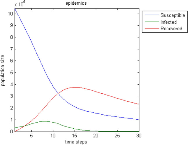
Figure 3 depicts the evolution of the three categories of the population over time. The results correspond to a period of 30-time steps.
Fig. 3.

The evolution of population categories in the original model over time
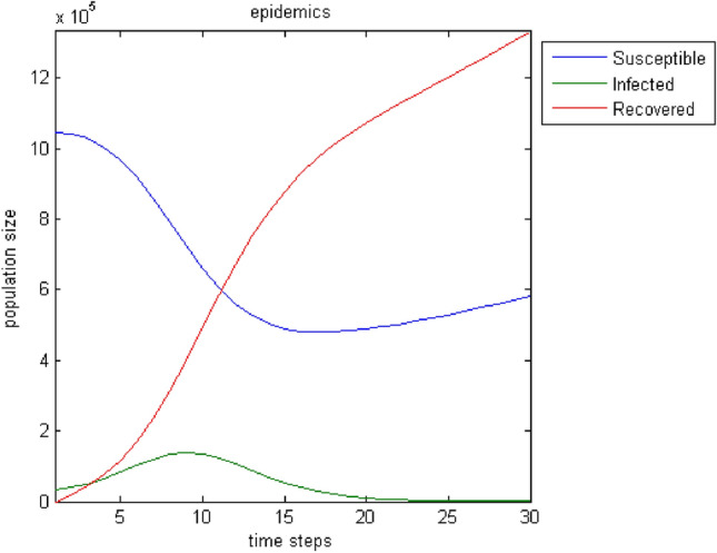
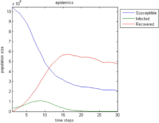
There is a logical evolution over time. The number of infected increases up to a point then decreases to zero. Accordingly, the susceptibles are reduced and pass into the state of the infected. When the cycle of infection is complete, it seems that not all susceptibles have become ill. For this reason, a state of balance between the sensitivity and those who have recovered shows off. Of course, the number of people who have grown up is increasing. It is noteworthy that this chart is almost identical to the basic one of Diekmann and Heesterbeek (2001). By changing some parameters, the infection of a more significant part or even the entire population of the sensitive can be achieved. Thus, in case that with , Fig. 4 depicts the response of the model. Similarly, in case that with , the model responds as shown in Fig. 5.
Fig. 4.

The evolution of the population groups by tuning parameters (p, r, ) so that most susceptible individuals become infected
Fig. 5.

The evolution of the population’s conditions by further changing the parameters () to make the whole population of susceptible people ill
A test to ascertain that the model reaches the basic realistic requirements is to monitor its course when there is no epidemic spread. In practice, this means that the transmission rate p is zero and that there is no possibility of communication between the nodes, i.e., there are no connections. So the weights will be zero. Figure 6 shows the results; the sensitive population remains stable, and there is a corresponding increase—a decrease of infected and those who recover (conversely in shape). This process only concerns the development at the node where the infection is supposed to occur initially and not the entire population of all nodes.
Fig. 6.

The three categories of the population with transmission rate, and no connection between the nodes
The next test attempts to enrich the model with parameters that influence the spread of epidemics and improve its output. Moreover, the incorporation of connections—weights among all nodes broadens the model’s realistic attributes because the user can introduce effects from distant regions. Furthermore, the birth rate, the death rate, and the migration rate enhance the parameterization options. Regarding immigration, we adopt the status that individuals can only leave the region under study. This assumption stems from the fact that it makes more sense when an epidemic plagues the population for people to move away in search of safer shelter away from disease risk. Figures 7, 8, 9, 10, 11, 12, 13 show the evolution of the population by taking into consideration the new parameters. These changes are random but signal the computer model’s adequacy in dealing with different spread and response conditions to the epidemic. The rest remain as they were initially, in Fig. 3. These additions help us to observe how population fluctuations affect the evolution of the three groups.
Fig. 7.
The evolution of the three groups over time after the introduction of three population-related parameters to the original model; birth rate: , death rate: , migration rate: . As expected, the whole population decreases. Individuals who “manage” to pass from the stage of susceptibility to that of the infected are fewer, and the disease declines faster
Fig. 8.
Birth rate: . Death rate: . Migration rate: . An increase of the population as well as of its three sub-groups is noticed
Fig. 9.
Birth rate: . Death rate: . Migration rate: . A smoother reduction of the group populations compared to the cases of Figs. 7 and 8 can be noticed
Fig. 10.

The evolution of the situations of the three categories of the population. Birth, death, and migration rates take random values from specific sets f values at each time step. The sets are respectively [0.02 0.03 0.04 0.05], [0.02 0.03 0.04] and [0.01 0.02]. The other parameters maintain the values of the case of Fig. 3. The curves lose their smoothness compared to those of the previous case. Choosing random values from a predefined set affects the process of spreading the epidemic over time
Fig. 11.

Similar to Fig. 10 with a change in the initial parameters according to the case shown in Fig. 3
Fig. 12.

Same case as in Fig. 10. Differences in points of the graphs of all three categories (more or less noticeable)
Fig. 13.

Similar to Fig. 11. The slope of the chart of the group of susceptible people is less steep. Infected tend to zero a little later than in Fig. 11. Also, there are some differences in the fluctuations of those who recovered
Note that the “new” parameters get a random value from a set of user-defined values at each time step. More specifically, birth, death, and migration rates take random values from specific value sets at each time step. The sets are respectively [0.02 0.03 0.04 0.05], [0.02 0.03 0.04] and [0.01 0.02]. Note also that the time steps do not represent specific time intervals. They are periods that may differ from each other. During such periods, the state of the cells—nodes of the graph changes. These periods’ duration is adjustable that is a significant advantage of CA, which facilitates the user to adapt her/his needs to the model. The values of the other parameters are different per test but remain constant throughout the 30-time steps.
Then another parameter is added that contributes to a better understanding of the spread of the infectious disease. It copes with the type of illness, and it is related to how easy it can strain the person. Therefore, it suggests the possibility of leading to death. It is based mainly on prior knowledge of the epidemic. In other words, it is a parameter that incorporates randomness since the disease can show different behavior compared to the past. With this addition, the model goes one step further by taking into account the disease’s properties, apart from population fluctuations. Fig. 14 shows the fluctuations of the three groups of individuals with morbidity rate . The rates of births, deaths, and migration are considered to remain constant between the intervals to and to . Then they change between to and to . The other parameters are as in the case of Fig. 3. In Fig. 15, we adjust the morbidity rate to 0.04, and the “initial” parameters remain as in the case of Fig. 5.
Fig. 14.
The fluctuations of the three groups of individuals with morbidity rate are shown. Also, the rates of births, deaths and migration, remain constant between the intervals to and to and then change between to and to . The population is declining
Fig. 15.

We adjust the morbidity rate to 0.04, and the “initial” parameters remain as in the case of Fig. 5. As expected, due to increased death and morbidity rates, the number of people that managed to keep themselves healthy is approaching zero in the last steps of time
Vaccination strongly affects the development of a disease. The term vaccine means administering a body of material containing attenuated pathogens (bacteria, viruses, etc., microorganisms). As a result, the body reacts by producing antibodies, which fight the disease agent once introduced alive but weakened. In this way, the organism either retains for a certain period the ability to produce antibodies (as, for example, happens with the common flu vaccine) or maintains it for life (for example, with measles). Vaccines, therefore, are used as a preventive means of combating infectious diseases. Simultaneously, in recent years, they have contributed significantly to their successful treatment or permanent disappearance of diseases, as happened with smallpox. In periods of an outbreak of infectious diseases, vaccination is observed, mainly of vulnerable groups—the elderly, children, people with relevant medical history. Thus part of the population acquires immunity. In the following, the model is enriched with the “vaccination” factor. Thus, we introduce the vaccination rate, i.e., the percentage of the susceptible population vaccinated each time step. In Fig. 16 the vaccination rate is with birth, death and migration rates constant throughout the simulation (, , —no morbidity rate) . The initial parameters remain constant, as in the case of Fig. 3. As observed, much fewer people are infected, the higher point of the infected curve is lower than in previous trials, and the disease weakens more quickly. Also, if we try to double the vaccination rate if the infected exceeds a limit set by the user, there is an outbreak of the epidemic. It will be shown as an even sharper reduction in the number of infected results. In practice, this trend indicates a faster inactivation of virus transmission. In Fig. 17, the initial parameters change, as in the case of Fig. 5. Although more people get sick in this trial, the disease’s spread stops almost up to half its value than zero vaccination value.
Fig. 16.

Vaccination rate is with birth, birth and migration rates constant throughout (, , —). Initial parameters are constant, as in the case of Fig. 3. Indeed, much fewer are infected, the higher point of the infected curve is lower than in previous trials, and the disease weakens more quickly
Fig. 17.

The initial parameters change, as in the case of Fig. 5. The spread of the disease stops in almost half of that without the addition of vaccination
Then, the effect of vaccination on the rates of births, deaths, and migration changing at each step is examined. The vaccination rate is (Fig. 18). Fewer people become infected, and the disease disappears earlier. This phenomenon becomes even more pronounced when more people become vaccinated per unit time. In Fig. 19, the vaccination rate increases to . The curve of susceptible individuals becomes steeper, they are much less infected, and the healthy individuals’ curve shows that healthy ones increase sharply. As expected, the epidemic stops spreading (already from the time step , i.e., very earlier than the previous corresponding patterns).
Fig. 18.

The effect of vaccination on the rates of births, deaths, and migration changes at each time step, while the rate of immunization is
Fig. 19.

The effect of vaccination with birth, death and migration rates changing at each step. The vaccination rate is . The epidemic stops spreading—already from the time step
Completing this section, the epidemic’s outcome and the three population groups’ course with all additional features are presented. This result is available in Fig. 20. The vaccination rate is , the morbidity rate , the transmission and recovery rates, and the movement rates are similar to the case shown in Fig. 3. Birth, death, and migration rates are changing, as in the case of Fig. 14. In other words, a combination of all the above examples for a more realistic representation of the spreading process is finally performed.
Fig. 20.

Evolution of the disease spread process. The vaccination rate is , the morbidity rate , the transmission and recovery rates, and the movement rates remain as shown in Fig. 2, and the birth, death, and migration rates change during simulation—as in the test of Fig. 14
So far, it is assumed that the spread of the disease started from a single point (node). The connections between the geographical areas remain the same (the 9-node graph with the specific contacts). Thus the corresponding topologies’ results can be compared and explanations for the understanding of the evolution of the model can be provided. However, Fig. 21 illustrates simulation results for a case with two infection sources, different connections, and more nodes. For example, it could refer to another geographical topology where the junctions represent parts of a city with varying densities of the population that communicate with different roads (small, medium, expressway), metro, city buses, etc. How to draw such a graph is determined by the user. Note that in all cases provided, the numbers are indicative but certify that the model works logically and shows acceptable behavior in different instances producing the expected results.
Fig. 21.

Evolution of the sections of the population under study. Variation of previous approaches with two outbreaks, more nodes, different connection weights
GIS data and the proposed model
One of the two building blocks of the model for monitoring the spread of epidemics is the graph. For the best possible approach to reality, the choice of nodes, how they connect, and the parameters that regulate the weights of the connections between them are fundamental. GIS (Geographical Information Systems) data is an essential source of real information for an area. Therefore, with proper use, they can be the tool that will contribute to creating a graph that will reflect the necessary elements to upgrade the epidemic monitoring model to a more realistic level.
A GIS system is a software, hardware, and data system designed to assist in handling, analyzing, and presenting information gathered in a geographic area (Longley et al. 2015). Simply put, a GIS system combines “layers” of information about a site to better understand that area. These systems efficiently manage geographic information. In recent years they have flourished because software companies can develop user-friendly versions through the graphical user interface (Seghir et al. 2018). Moreover, the creation and distribution of reliable digital data for such systems (digital maps) and the increased computing power of personal computers (desktop PCs) boosted GIS usage. Furthermore, the correlation of GIS systems with the monitoring systems of vehicles, networks, or other objects on earth, through satellites and telecommunications contributed to the widespread use of GIS. This kind of technology is available in scientific research, resource management, and development program design.
The data used in the present model is the layout of the building blocks, and therefore the streets, and the population distribution. For the building and road layout, we employed satellite photos from the free tool Google Maps to maximize the method’s effect in the specific scientific field. The population distribution derives from the official data available to the competent services (municipality, analytical services, etc.) through the population census. It is worth noting that the monitoring of the movement along the streets, buildings, or other public or private venues is not adequately covered. For a complete picture, it is necessary to take into account sociological factors. This goal requires good knowledge of the study area, i.e., additional research. The experience that residents may have from previous dangerous situations (e.g., earthquakes or other natural disasters) and the instructions/mandates of the disaster response plans of the Civil Protection Service affect their reaction to life-threatening situations accordingly. Possible evacuation exercises, the specific policies in the event of an epidemic, and even the quality and frequency of information provided about these contingencies are valuable data that cannot be considered negligible. The proposed methodology is applied to the town of Eleftheroupoli, in the Prefecture of Kavala, East Macedonia, Greece. In Eleftheroupoli, there are some places where many people gather on specific days for a few hours, such as, e.g., the downtown market and the football team fan club. Also, during the summer, some parks, schoolyards, open-air shops, etc., are full of people. On the contrary, during the other seasons are empty or almost empty. Besides, on certain days and seasons, different populations move to and from the city’s outskirts. They visit their villages—the town is the largest of the municipality or travel to Kavala, Drama / Serres, Thessaloniki, or they drive to the sea (in summer). Figure 22 shows the satellite photo of the area of the city of Eleftheroupoli, as captured on Google Maps. The building blocks and the streets are visible. Eleftheroupoli has been selected due to the knowledge of the aforementioned sociological data and the available data related to the qualitative and quantitative census of the population courtesy of the municipal authorities. According to the census of 2011, the population of the area is 6,050 permanent residents. In the tests that follow, 950 non-residents have been added to represent, on average, the people who move from their places to the town through the three entrances/exits of the city in a single day.
Fig. 22.

Satellite image of the study area (Eleftheroupoli, Kavala, East Macedonia, Greece) as captured on Google Maps
Graph and links design conditions
The rule for the graph design of the proposed monitoring model of the spread of epidemics has emerged with the help of previous studies on the development of methods for displaying GIS data in graphs (Palacio et al. 2003). Node x is that part of the road defined by the intersection of the road with other lanes at two points. For example, based on the satellite photo, Venizelou Street crosses Nikis str, Fr. Papachristidis str, the Americans str, etc. To adjust the weight coefficient of node-x (primary node), we use the number of people who pass by node-x during an average time and stay permanently (in their residence) or temporarily in buildings/venues that exist on the specific road. The weight coefficient is also affected by the number of people who use node-x during an intermediate time step to go to another street/building but stay on it for a short time. In essence, what contributes to the definition of the weighting factor are the so-called contribution nodes, i.e., residential buildings (permanent population), public buildings, and the number of people coming from adjacent areas. Corner buildings at junctions contribute only to the two roads that their facades touch exist. The weight coefficient that corresponds to the connection of the node-x and node-y equals a fraction with numerator the sum of the weights of the two nodes. The numerator’s value increases by a percentage value that depends on the road type (narrow or wide, single or two-way) and how often it is used (long or short, wide or narrow, traffic jam frequency, uphill-without slope). The numerator’s value is also affected by a factor representing a mass gathering place, such as meeting spot, main street, bazaar, theaters, music halls, town halls, churches, etc. The level process is helpful for a more detailed study and monitoring of the epidemic’s spread and more realistic results. The lowest level of research is the “building.” The area is divided by assigning each building to a contribution node. Figure 23 shows the lower level of study of a random but indicative area of the city under consideration.
Fig. 23.
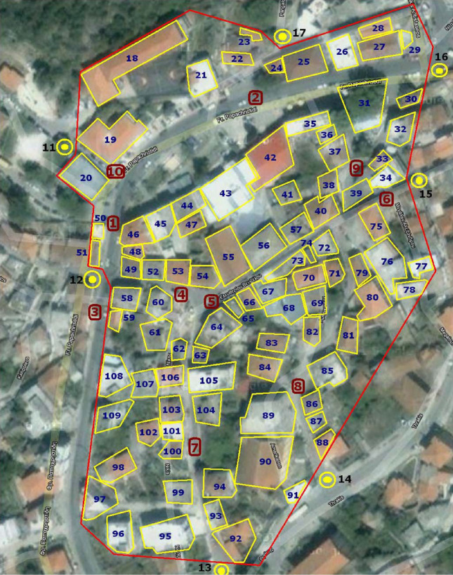
The lower level of study of a part of the area under study. Numbering: The primary nodes are colored red, the contribution nodes blue, and the node points with population from adjacent areas black
The primary (main) nodes are ten in total (numbered in red). Contribution nodes that are buildings (numbered in blue) affect the primary nodes. Like the part of the population that comes from adjacent areas using the entrance/exit roads and moves to the extent that the primary node represents (numbered in black on the map). Fig. 24 shows the graph resulting from Fig. 23.
Fig. 24.
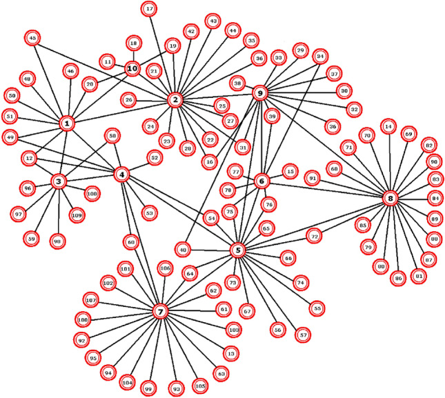
The graph resulting from Fig. 23. The primary nodes based on the proposed methodology are displayed in bold black and a larger font
At upper levels, the contribution nodes become groups of houses, building blocks, neighborhoods, parishes, more extensive parts of the area, cities, municipalities, prefectures, regions, etc. The selection of contribution and primary nodes depends on the study’s needs, the quality and quantity of data. Figures 25 and 26 show in two parts, a possible next level. At the lower level, it is noticed that the primary (or main) nodes are much more, whereas the contribution nodes are fewer. Additionally, we should know the extent to which the contribution nodes affect each road/main node they cross (e.g., to what degree node 56 contributes to 13, 16, 17, 18, and 19).
Fig. 25.
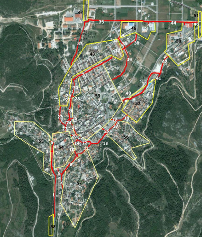
A possible next level of study (part a). There are 46 primary nodes and 12 contribution nodes
Fig. 26.

A possible next level of study (part b)
Simulation results
The first group of simulations concerns the lower level. According to official statistics, the number of people associated with it is 650 (between 600 and 700 according to official statistics). The connection weights are as follows:
| 2 |
| 3 |
In the simulation of Fig. 28, it is assumed that infected individuals exist only in the main nodes 2 and 6 (0.2 and 0.6 the infection rates, respectively). The values of the variables are as follows: time steps = 30, (percentage of sensitive individuals moved from node u to neighbors as a whole), (percentage of sensitive individuals moved from node u to v), (recovery rate), (transmission rate), (morbidity rate), (vaccination rate). Parameters (birth rate), (migration rate), (death rate) remain constant for time steps 2 to 5 and 20 to 25 (0.04, 0.04 and 0.02, respectively) while changing during time steps 6 to 19 and 26 to 30.
Fig. 28.

Simulation results with initially infected primary nodes 2 and 6
Figure 29 shows the simulation where the variables have the same values as before (Fig. 28), with only the parameters , , and changed.
Fig. 29.

Simulation results. As in Fig. 28 with changes in , and
Figure 30 presents results with a change in the vaccination rate, .
Fig. 30.

Simulation results. Vaccination rate increases
In the following simulations, the infection rate of node-2 increases to 0.6 (Fig. 31), the increases to 0.1 (Fig. 32), and the infected nodes change with infection rates of 0.3 for the first one, 0.6 for the second one and 0.4 for the tenth (Fig. 33). Variations occur randomly to demonstrate the method’s adequacy and the corresponding mathematical model in simulating the spread of epidemics in cities using accurate GIS data and taking into account configurable sociological variables and more. The primary nodes 2 and 10 may have fewer connections, but their connection weights are high.
Fig. 31.

Simulation results. The infection of node two rate increases to 0.6
Fig. 32.

Simulation results. The morbidity rate, , increases to 0.1
Fig. 33.

Simulation results for infection rates that change to 0.3 for node 1, 0.6 for node 2, and 0.4 for node 10, respectively
The results of the simulations are logical without deviating significantly from the initials. Increasing the rate of infection of the initial nodes, the corresponding evolution seems reasonable. The respective charts show that the recovery process takes longer, in combination with the fluctuations of the individuals. The same response emerges with the changes related to population changes (migration death rates, morbidity, births). The effect of the vaccine is remarkable, leading to the shortest course of the epidemic. The second group of simulations corresponds to scenarios for the graph of Fig. 27. This graph is considered as a possible upper level of graphs’ approach from the lowest one. The connection weights are as follows:
| 4 |
| 5 |
| 6 |
| 7 |
| 8 |
| 9 |
| 10 |
| 11 |
| 12 |
| 13 |
In Fig. 34 the only infected main node is the second (no. 2) with a rate of 0.6. The values of the variables are as follows: time steps = 30, , , , . Parameters , , remain constant for time steps 2 to 5 and 20 to 25 (0.04, 0.06 and 0.02, respectively), while changing during time steps 6 to 19 and 26 to 30.
Fig. 27.

Fig. 34.

Simulation results with only the primary node two initially infected
Figure 35 shows that the infected primary nodes become three (3) while in Fig. 36 ten (10). Finally, in Fig. 37, the increased to 0.2 due to the epidemic outbreak (based on the case of Fig. 35). These results also seem reasonable and do not differ significantly from the initial, general ones. Respectively, an increase of the infection (either of the rate or the number of the initial sources-nodes) results in a conscious evolution of the phenomenon as far as the duration of the spread concerns, and therefore of the recovery and the weakening of the spread—similarly, changes related to population parameters (migration death rates, morbidity, births). The effect of vaccination is observable here as well (highlighting its importance).
Fig. 35.

Simulation results with initially infected the primary nodes 2, 8, and 34 (with infection rates of 0.6, 0.5, and 0.8, respectively)
Fig. 36.

Simulation results. The infected nodes are 2, 4, 8, 34, 41, 42, 43, 44, 45 and 46 (at rates of 0.6, 0.3, 0.5, 0.8, 0.4, 0.3 , 0.9, 0.6, 0.8 and 0.5, in that order)
Fig. 37.

Simulation results that correspond to an increase in the vaccination rate of
Conclusions
In this study, we presented a model that examines the spread of epidemics in the population using CA with graphs. Taking inspiration from the literature review, we designed a model that meets the requirements for a realistic representation of the process of spreading infectious diseases with specific characteristics. The use of graphs allows us to interconnect neighboring nodes and remote ones (in proportion to the extended neighborhood of the computer model of CA), which communicate through roads, land and air transport, etc. So, in addition to the local, extensive interaction is available as well. Long-distance communication has a direct impact on how and how often an epidemic spreads. To the best of our knowledge, the long-range feature was underestimated or was not studied at all. The next step was to enrich the proposed model with elements that contribute to a more satisfactory reality approach. We introduced these features to gradually distinguish the differences from the previous level to the next and understand their contribution to the process.
On the one hand, we have parameters concerning the nature of the disease; transmission rate, recovery rate, disease morbidity. On the other hand, there are characteristics related to the population, such as movement rate, fluctuations during the spread of infection due to objective factors sometimes unrelated to the disease, such as birth rate, migration rate, and death rate. Some characteristics indicate human “interventions” aimed at preventing and reducing cases while the virus is on the rise, such as vaccination. The fluctuations of the three groups into which the population (susceptible, infected, and recovering) and the effect of immunization are apparent in the curves of the graphs obtained. There is a logical follow-up and identifying the results with the expected allows us to assess the usefulness and contribution of the proposed model in monitoring and predicting the spread of epidemics. Indeed, there is always room for change and additions to optimal performance in real life.
Furthermore, in the context of this study, we proposed a methodology for converting GIS data to graphs and aiming at user convenience. Thus, we considered accurate GIS data to complete the design and the development of a system to monitor and forecast the spread of epidemics with accurate data. GIS data is an essential source of real-world geographical information. It could contribute to an efficient approximation of reality. It is free (e.g., through the corresponding Google service) and almost accessible by anyone in many cases. Thus, GIS data could operate as a tool to upgrade the epidemic monitoring model to a more realistic level. The proposed model bases its functionality on a graph that is generated computationally by a CA grid. The proper selection of nodes, connections, and parameters that regulate the links’ weights significantly impact the model’s operation. We developed a methodology that, given a population distribution, allows the representation of any area in a graph associated with the corresponding CA model of epidemic simulation. The data used in the model are the layout of the building blocks, and therefore the streets, and population distribution. The nodes of the graph correspond to sections of roads. The model is configurable in terms of graph nodes and levels. Besides, it is gradual-modular, i.e., it starts from an initial level and follows a bottom-up approach, analyzing and synthesizing the available data, respectively. To research and certify the proposed model’s smooth and efficient operation and extend the data display methodology for this model, a city in the region of Eastern Macedonia—Thrace was selected as a test platform (Eleftheroupoli, Kavala). We performed tests at both macroscopic and microscopic levels. Based on the expected results, the model’s response confirmed its successful operation and verified the validity of the proposed methodology.
As a perspective, the proposed epidemic monitoring and forecasting system can serve as a low-cost tool that could incorporate real-time decision-making and protection systems in times of crisis. Furthermore, other GIS data parameters could be used-integrated in the model/methodology presented and further enriched. Besides, a future researcher could develop a fully customized GUI to upgrade the model’s user-friendly features and automate the use of requested GIS data by Google and other potential vendors.
Acknowledgements
The research is co-financed by Greece and the European Union (European Regional Development Fund) through the Operational Programme “Eastern Macedonia and Thrace” 2014-2020, in the context of project with contract No. AMP2-0016310.
Footnotes
Publisher's Note
Springer Nature remains neutral with regard to jurisdictional claims in published maps and institutional affiliations.
Contributor Information
Charilaos Kyriakou, Email: chkyriakou@ee.duth.gr.
Ioakeim G. Georgoudas, Email: igeorg@ee.duth.gr
Nick P. Papanikolaou, Email: npapanik@ee.duth.gr
Georgios Ch. Sirakoulis, Email: gsirak@ee.duth.gr
References
- Ahmed E, Agiza HN. On modeling epidemics Including latency, incubation and variable susceptibility. Physica A. 1998;253(1–4):347–352. doi: 10.1016/S0378-4371(97)00665-1. [DOI] [Google Scholar]
- Barthélemy M, Barrat A, Pastor-Satorras R, et al. Velocity and hierarchical spread of epidemic outbreaks in scale-free networks. Phys Rev Lett. 2004;92(1):178701. doi: 10.1103/PhysRevLett.92.178701. [DOI] [PubMed] [Google Scholar]
- Blavatska V, Holovatch Y. Spreading processes in post-epidemic environments. Physica A. 2021;573:125980. doi: 10.1016/j.physa.2021.125980. [DOI] [Google Scholar]
- Bo ZS, QuanYi H, DunJiang S. Simulation of the spread of infectious diseases in a geographical environment. Sci China Ser D-Earth Sci. 2009;52(4):550–561. doi: 10.1007/s11430-009-0044-9. [DOI] [PMC free article] [PubMed] [Google Scholar]
- Boccara N, Cheong K. Critical behaviour of a probabilistic automata network SIS model for the spread of an infectious disease in a population of moving individuals. J Phys A. 1993;26(5):3707–3717. doi: 10.1088/0305-4470/26/15/020. [DOI] [Google Scholar]
- Boccara N, Cheong K, Oram M. A probabilistic automata network epidemic model with births and deaths exhibiting cyclic behaviour. J Phys A. 1994;27:1585–1597. doi: 10.1088/0305-4470/27/5/022. [DOI] [Google Scholar]
- Bouaine A, Rachik M. Modeling the impact of immigration and climatic conditions on the epidemic spreading based on cellular automata approach. Eco Inform. 2018;46:36–44. doi: 10.1016/j.ecoinf.2018.05.004. [DOI] [Google Scholar]
- Chang S Cellular automata model for epidemics, report. http://csc.ucdavis.edu/~chaos/courses/nlp/Projects2008/SharonChang/Report.pdf
- del Rey A , Rodrıguez Sanchez G, Hoya White S (2006) A model based on cellular automata to simulate epidemic diseases. In: El Yacoubi S, Chopard B, Bandini S (eds) ACRI 2006, LNCS, vol 4173, pp 304–310
- del Rey AM, Rodrıguez Sanchez G, Hoya White S. Modeling epidemics using cellular automata. Appl Math Comput. 2007;186:193–202. doi: 10.1016/j.amc.2006.06.126. [DOI] [PMC free article] [PubMed] [Google Scholar]
- Diekmann O, Heesterbeek JAP. Mathematical epidemiology of infectious diseases: model building, analysis and interpretation. Int J Epidemiol. 2001;30(1):186. [Google Scholar]
- Draief M. Epidemic processes on complex networks: the effect of topology on the spread of epidemics. Physica A. 2006;363:120–131. doi: 10.1016/j.physa.2006.01.054. [DOI] [Google Scholar]
- Duryea M, Caraco T, Gardner G, Maniatty W, Szymanski BK. Population dispersion and equilibrium infection frequency in a spatial epidemic. Physica D. 1999;132(4):511–519. doi: 10.1016/S0167-2789(99)00059-7. [DOI] [Google Scholar]
- Flache A, Hegselmann R (2001) Do irregular grids make a difference? Relaxing the spatial regularity assumption in cellular models of social dynamics. JASSS 4(4)
- Fresnadillo MJ, Garcia E, García JE, Martin A, Rodriguez G, et al. A SIS epidemiological model based on cellular automata on graphs. In: Omatu S, et al., editors. Distributed computing, artificial intelligence, bioinformatics, soft computing, and ambient assisted living. IWANN 2009. Berlin, Heidelberg: Springer; 2009. [Google Scholar]
- Fu SC, Milne G (2003) Epidemic modelling using cellular automata. In: Abbass HA, Wiles J (eds) The Australian conference on artificial life ACAL (Canberra, ACT, Australia edn., vol N/A, UNSW Press, pp 43–57
- Gwizdalla T. Viral disease spreading in grouped population. Comput Methods Programs Biomed. 2020;197:105715. doi: 10.1016/j.cmpb.2020.105715. [DOI] [PMC free article] [PubMed] [Google Scholar]
- Jithesh PK. A model based on cellular automata for investigating the impact of lockdown, migration and vaccination on COVID-19 dynamics. Comput Methods Programs Biomed. 2021;211:106402. doi: 10.1016/j.cmpb.2021.106402. [DOI] [PMC free article] [PubMed] [Google Scholar]
- Johansen A. A simple model of recurrent epidemics. J Theor Biol. 1996;178(1):45–51. doi: 10.1006/jtbi.1996.0005. [DOI] [PubMed] [Google Scholar]
- Karamani R-E, Fyrigos I-A, Tsakalos K-A, Ntinas V, Tsompanas M-A, Sirakoulis C Ch. Memristive learning cellular automata for edge detection. Chaos Solit Fractals. 2021;145:110700. doi: 10.1016/j.chaos.2021.110700. [DOI] [Google Scholar]
- Kermack WO, McKendrick AG. A contribution to the mathematical theory of epidemics. Proc R Soc Lond. 1927;B115:700–721. [Google Scholar]
- Kleczkowski A, Gilligan CA, Bailey DJ. Scaling and spatial dynamics in plant-pathogen systems: from individuals to populations. Proc R Soc. 1997;B264:979–984. doi: 10.1098/rspb.1997.0135. [DOI] [Google Scholar]
- Longley PA, Goodchild MF, Maguire DJ, Rhind DW. Geographic information science and systems. 4. New York: Wiley; 2015. [Google Scholar]
- Maniatty W, Szymanski B, Caraco T (1999) High-performance computing tools for modeling evolution in epidemics. In: Proceedings of the 32nd annual Hawaii international conference on systems sciences, HICSS-32. Abstracts and CD-ROM of Full Papers
- Martinez MJF, Merino EG, Sanchez EG, Sanchez JEG, del Rey AM, Sanchez GR. A graph cellular automata model to study the spreading of an infectious disease. In: Batyrshin I, González Mendoza M, editors. Advances in artificial intelligence. MICAI 2012. Berlin, Heidelberg: Springer; 2012. [Google Scholar]
- Meyer NJ, Gattinoni L, Calfee CS. Acute respiratory distress syndrome. Lancet. 2021;398(10300):622–637. doi: 10.1016/S0140-6736(21)00439-6. [DOI] [PMC free article] [PubMed] [Google Scholar]
- Monteiro LHA, Gandini DM, Schimit PHT. The influence of immune individuals in disease spread evaluated by cellular automaton and genetic algorithm. Comput Method Programs Biomed. 2020;196:105707. doi: 10.1016/j.cmpb.2020.105707. [DOI] [PMC free article] [PubMed] [Google Scholar]
- Moreno N, Menard A, Marceau DJ. VecGCA: an vector-based geographic cellular automata model allowing geometric transformations of objects. Environ Plann B. 2008;35(4):647–665. doi: 10.1068/b33093. [DOI] [Google Scholar]
- Palacio MP, Sol D, Gonzalez J (2003) Graph-based knowledge representation for GIS data. In: Proceedings of the fourth Mexican international conference on computer science, 2003. ENC 2003, pp 117–124
- Pereira FH, Schimit PHT, Bezerra FE. A deep learning based surrogate model for the parameter identification problem in probabilistic cellular automaton epidemic models. Comput Methods Programs Biomed. 2021;205:106078. doi: 10.1016/j.cmpb.2021.106078. [DOI] [PubMed] [Google Scholar]
- Seghir A, Marcou O, El Yacoubi S. Shoreline evolution: GIS, remote sensing and cellular automata modelling. Nat Comput. 2018;17:569–583. doi: 10.1007/s11047-017-9638-x. [DOI] [Google Scholar]
- Shirley MDF, Rushton SP. The impacts of network topology on disease spread. Ecol Complex. 2005;2:287–299. doi: 10.1016/j.ecocom.2005.04.005. [DOI] [Google Scholar]
- Sirakoulis G Ch, Karafyllidis I, Thanailakis A. A cellular automaton model for the effects of population movement and vaccination on epidemic propagation movement and vaccination on epidemic propagation. Ecol Model. 2000;133:209–223. doi: 10.1016/S0304-3800(00)00294-5. [DOI] [Google Scholar]
- Vlad MO, Schonfisch B, Lacoursière C. Statistical-mechanical analogies for space-dependent epidemics. Physica A. 1996;229(3–4):365–401. doi: 10.1016/0378-4371(95)00401-7. [DOI] [Google Scholar]
- Wang XF. Complex networks: topology, dynamics and synchronisation. Int J Bifurcat Chaos. 2002;12:885–916. doi: 10.1142/S0218127402004802. [DOI] [Google Scholar]
- Zaharia CN, Cristea A, Simionescu I. The simultaneous utilisation of many techniques of the artificial intelligence in epidemics modelling. In: Bruzzone AG, Kerckhoffs, Chent EJH, editors. Proceedings of the eighth European simulation symposium simulation in industry. Belgium: SCS; 1996. pp. 142–146. [Google Scholar]
- Zandbergen PA. Advanced python scripting for ArcGIS pro. Redlands, CA: Esri Press; 2020. [Google Scholar]