Abstract
Background It would be useful to be able to assess the utility of predictive models of continuous values before clinical trials are performed.
Objective The aim of the study is to compare metrics to assess the potential clinical utility of models that produce continuous value forecasts.
Methods We ran a set of data assimilation forecast algorithms on time series of glucose measurements from neurological intensive care unit patients. We evaluated the forecasts using four sets of metrics: glucose root mean square (RMS) error, a set of metrics on a transformed glucose value, the estimated effect on clinical care based on an insulin guideline, and a glucose measurement error grid (Parkes grid). We assessed correlation among the metrics and created a set of factor models.
Results The metrics generally correlated with each other, but those that estimated the effect on clinical care correlated with others the least and were generally associated with their own independent factors. The other metrics appeared to separate into those that emphasized errors in low glucose versus errors in high glucose. The Parkes grid was well correlated with the transformed glucose but not the estimation of clinical care.
Discussion Our results indicate that we need to be careful before we assume that commonly used metrics like RMS error in raw glucose or even metrics like the Parkes grid that are designed to measure importance of differences will correlate well with actual effect on clinical care processes. A combination of metrics appeared to explain the most variance between cases. As prediction algorithms move into practice, it will be important to measure actual effects.
Keywords: metrics, predictive models, data assimilation, machine learning
Introduction
Using data assimilation and machine learning 1 2 combined with physiological glucose-insulin models, 3 4 we have built a glucose prediction system 5 that is tuned to a patient's own physiology. The glucose-insulin system is represented as a set of equations with physiological parameters that move relatively slowly over time like insulin resistance and patient states that move quickly in time like glucose level. We wish to compare different versions of the system for likely utility in aiding glucose therapy decisions. Pending actual development of a decision aid and deployment into clinical practice with a clinical trial, we seek metrics that are likely to reflect utility. Generic summary measures like root mean square (RMS) error are often used for continuous measures like glucose but do not necessarily capture clinical utility. For example, the clinical significance of the difference between blood glucose of 40 mg/dL and 60 mg/dL is much larger than between 240 mg/dL and 260 mg/dL; capturing this requires knowledge of physiology. Furthermore, commonly used summary measures often assume simple statistical distributions that may not be appropriate for medicine. 6
In this study, we enumerate several possible metrics for assessing goodness of the glucose predictions, pulling from several sources like clinical practice guidelines. In the absence of the gold standard (i.e., a clinical trial of actual utility), we run our prediction system on data from patients in our initial clinical area, the neurological intensive care unit, and we review the correlations among them. We report our approach in the hope that it can be extended to other biomedical areas.
Methods
Predictive Algorithm
We tested several evaluation metrics in the context of a predictive algorithm 5 that uses one data assimilation method, an ensemble Kalman filter, 7 paired with four mechanistic glucose-insulin models. This paper is not focused on evaluation of the specific data assimilation methods or physiologic models or their pairings but rather on an evaluation methodology for data assimilation-based forecasting methodology within the context of clinical biomedicine, and in particular, within the context of potential application of physiological forecasting within the context of clinical decision support. We therefore primarily describe the evaluation metrics in detail and provide a summary of the data assimilation methods and physiologic models with links to further detail.
Data assimilation 1 2 is a technique that optimizes the parameters of a mechanistic model by applying the model to a current physical state to make a prediction and then adjusts those parameters based on the difference between the prediction and the actual subsequent state. In this study, the model parameters can include insulin sensitivity, pancreatic β cell mass, and liver glucose production, the patient physical state can include the current glucose and insulin levels, and the model is a set of ordinary differential equations that predict the rate of change of the state based on the current state and the model parameters. If predicted glucose differs from the subsequent glucose that is actually observed, data assimilation adjusts the model parameters to tend toward better prediction. The corrections are applied iteratively and over time, and the parameters should move to optimal levels for that patient. We used four glucose models that varied in complexity from a simple exponential decay to two ultradian models of glucose-insulin physiology to a model that also included meal mechanics. In the first model, for any measured glucose away from the mean for that patient, the model has glucose decay exponentially toward the mean value. The ultradian models 3 represent glucose production and utilization and insulin secretion and elimination using up to six state variables and 30 parameters such that 100 to 150 minute glucose oscillations are properly modeled. The two ultradian versions differ in that the “long” one uses all the states and parameters and the “short” one uses just a subset. The meal model 4 explicitly includes nutrition in an expanded model with 12 state variables and 70 parameters.
Because the models are non-linear, we used an ensemble Kalman filter 7 to determine the corrections to parameters needed at each iteration. It differs from a simple Kalman filter in that instead of calculating the parameter changes, it estimates them using a distribution of data points to which it applies the non-linear model, seeing how it affects the distribution.
We ran each of the four models on nine patients. Some models did not converge for some patients, so nine patients with four models each resulted in 29 successful runs.
Data
We used glucose measurements from Columbia University Irving Medical Center derived from laboratory values and fingerstick glucose meters in the neurological intensive care unit. Approval was obtained from the Columbia University institutional review board.
Our selection process was as follows. We started with a base population of 852 patients from the neurological intensive care unit. Our initial screening criteria were patients with more than a 4-day intensive care unit length of stay with at least 20 glucose measurements per day, and we excluded patients with type 1 diabetes mellitus because the glucose models we used assume there is insulin production.
From this list, we selected patients at random. We reviewed the list to ensure we included patients both with and without exogenous insulin administration. Because we were focused on glycemic control in average patients under the stress of the neurological intensive care unit, we did not require or exclude type 2 diabetes mellitus, but left it to the random selection; in practice, no patients selected had type 2 diabetes mellitus.
We limited the study to nine patients because of the amount of work required to abstract all glucose measurement, insulin administration, feeding, and glucose infusion information for patients with prolonged lengths of stay. Further, running the multiple algorithms on each patient required manual adjustment of parameters.
The cohort is shown in Table 1 . Individually identifiable information has been removed and numeric values have noise added to them. Comorbidities were recorded but were withheld from the table to further protect patient privacy. Older patients had hypertension, congestive heart failure, or coronary artery disease, and one patient had mild renal insufficiency, but the comorbidities were otherwise uninformative.
Table 1. Participants a .
| Participant | Age group | Primary diagnosis | ICU length of stay (binned days) | Glucose coefficient of variation |
|---|---|---|---|---|
| 1 | 30–34 | Subarachnoid hemorrhage | 16–20 | 0.22 |
| 2 | 60–64 | Intraventricular hemorrhage | 11–15 | 0.13 |
| 3 | 60–64 | Subarachnoid hemorrhage | 16–20 | 0.23 |
| 4 | 20–24 | Epidural hematoma from trauma | 5–10 | 0.19 |
| 5 | 60–65 | Intracerebral hemorrhage | 11–15 | 0.22 |
| 6 | 20–24 | Autoimmune encephalitis | >20 | 0.25 |
| 7 | 40–45 | Subarachnoid hemorrhage | 16–20 | 0.21 |
| 8 | 30–34 | Subarachnoid hemorrhage | 5–10 | 0.22 |
| 9 | 40–44 | Subarachnoid hemorrhage | 16–20 | 0.33 |
We added noise to numeric values to assist in protecting patient privacy.
To better justify our selection of metrics below, we illustrate the challenge with several figures. Fig. 1 shows the distribution of blood glucose in laboratory tests and in fingerstick glucose meters at our medical center. Meters are higher on average because they tend to be used for patients with glucose intolerance or frank diabetes. Both distributions are clearly non-normal.
Fig. 1.
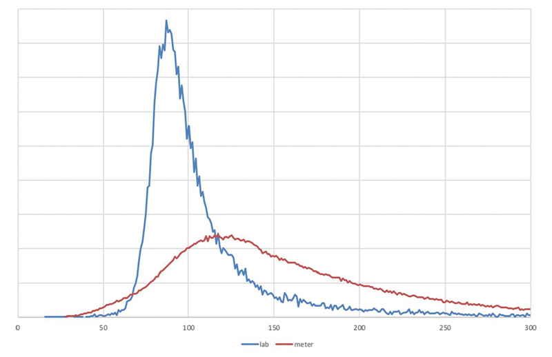
Distribution of glucose . Distribution of glucose levels in the Columbia University Irving Medical Center Database, showing laboratory values ( blue ) and portable glucose meter measurements ( red ).
Fig. 2A shows the finger stick glucose of a typical type 2 diabetes patient (we reparametrize to sequence time, simply numbering measurements instead of plotting actual time, based on our previous finding 8 that stationarity is improved and to simplify comparisons). Superimposed on the figure is a set of glucose predictions for that patient generated by our data-assimilation-based glucose forecaster, 5 9 which we use for illustration in this paper. In Fig. 2A , the predictions and actual values are well aligned. Fig. 2B shows a different patient and that patient's predictions; they are clearly misaligned early on, with predictions near zero at one point. The question we address in this paper is how to judge the relative value for predictions like these.
Fig. 2.

Glucose time series and predictions for two patients . Time series of glucose levels for two patients, comparing the true levels ( blue ) to the forecast levels ( red ).
Metrics
We took four general approaches for metrics (summarized in Table 2 ). Our first approach is a simple aggregation of the difference in glucose between the forecast and the measured values. A second approach is to transform glucose to a more clinically relevant scale such that differences anywhere in the scale are approximately linear with impact. A third approach is to assess how the forecast value and the measured value differ in what clinical care would have been given, and therefore what impact the difference might have had. A fourth use is a clinical impact grid intended for glucose meters.
Table 2. Metrics.
| Short name | Metric |
|---|---|
| Raw data | |
| RMS | Root mean square difference in glucose pairs |
| Based on g | |
| RMS (g)% | 100 × root mean square difference in g(glucose) pairs |
| Max cost% | 100 × max{ (difference in g pairs) × (rms distance in g from 0) } |
| Peak max% | 100 × (difference in peak g) × (peak g) |
| Peak min% | 100 × (difference in smallest g) × (smallest g) |
| Avg×10,000 | 10,000 × (difference in average g) × (larger distance of average g from 0) |
| Treatment-based | |
| Insulin | Maximum difference in insulin pairs |
| Bolus | Maximum difference in glucose bolus pairs |
| Hold | Difference in whether or not to hold insulin at any time point |
| Notify | Difference in whether or not to notify doctor at any time point |
| Parkes-based | |
| Avg Parkes% | 100 × average Parkes class |
| RMS Parkes% | 100 × root mean square Parkes (A = 0, B = 1, C = 2 D = 3, E = 4) |
| Max Parkes | Maximum Parkes class |
Root Mean Square Difference
For simple aggregation of the difference in glucose, we estimated the RMS of the simple difference in measured blood glucose level versus forecast level at each time point. This one is the most easily explained and understood and most commonly used. 10 It will tend to emphasize differences at high glucoses, missing the critical importance of hypoglycemia. The metric is generally used for verification 11 —showing that the model produces accurate forecasts—rather than utility, but we include it as it is a common metric and we wish to see its relation to metrics intended to better assess impact. (We also distinguish verification from validation, the latter testing if the model is acting as we expect, be it accurate or not.)
Transformed Glucose
We generated a glucose level transformation using the scale in Table 3 of approximate consequences of having a glucose at that level (set by the authors but also informed by case series 12 13 ), and assigned a very approximate cost impact changing by a factor of 10 at each level (dollar cost of insurance payout from death, intensive care unit stay, emergency department visit, office visit, change in dose at home). We found empirically that this scale resulted in too high a focus on extreme events, so we switched to a logarithm scale of cost. We then developed a transformation that would map from measured glucose approximately to the logarithm of cost at each level. We also considered logarithm of raw glucose, but rejected it because it overemphasized low glucose with little input about high glucose. The following formula for transformation,
Table 3. Blood glucose transformation.
| Glucose (mg/dL) | Clinical impact | Approximate cost impact | 0.1 × log(cost) | g |
|---|---|---|---|---|
| 0 | Death | 100,000 | 0.5 | −0.50 |
| 20 | Coma | 10,000 | 0.4 | −0.36 |
| 40 | Obvious symptoms | 1,000 | 0.3 | −0.25 |
| 65 | Symptoms start | 100 | 0.2 | −0.15 |
| 80 | Normal lower | 10 | 0.1 | −0.1 |
| 120 | Center | 1 | 0 | 0 |
| 180 | Target upper for DM | 10 | 0.1 | 0.1 |
| 250 | Symptoms start | 100 | 0.2 | 0.18 |
| 350 | Symptoms obvious | 1,000 | 0.3 | 0.24 |
| 600 | Coma | 10,000 | 0.4 | 0.33 |
| ∞ | Death | 100,000 | 0.5 | 0.50 |
 |
maps the glucose range of 0 to infinity to a range of −0.5 to 0.5, approximating the log cost but signed so that low glucose is negative. Given this transformation, we can calculate several aggregations (i.e., several loss functions): RMS difference in g (instead of raw glucose) over estimates; the maximum “cost” (not monetary but in terms of total impact), defined as the difference in g between the forecast and measured value times the distance from the center of the scale, 120; difference in highest g forecast to highest g measured to accommodate differences in timing; analogous difference in lowest g; and difference in mean g times the larger mean g (“mean cost”).
Insulin Administration Guideline
For changes in clinical care, we used an intensive care unit insulin administration guideline to judge difference between forecast and measurement. The guideline ( Fig. 3 ) specifies actions like insulin dose and timing and glucose boluses based on measured glucose and current insulin administration. We start the Fig. 3 algorithm with zero insulin and follow the treatment recommendations for the time series once using the forecast values and a second time using measured values. For example, based on the first glucose measurement, say 220, we set the initial insulin dose, in this case 2 units per hour. If the next measurement is 190, then we would decrease the rate to 1 unit per hour (because it matches the row for glucose 181 to 251 that is decreased by 21 to 49, which recommends to decrease the rate by 1 unit per hour). We do this both for the measured values and for the forecasted values. We then look at the difference in insulin dose (primary outcome) for the forecast versus measured value, as well as any change in emergency bolus of glucose, change in a hold order on insulin administration, and change in need to notify the physician. We select the largest difference in the time series.
Fig. 3.
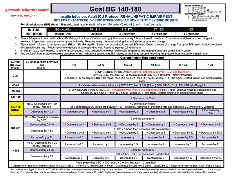
Insulin administration guideline. This guideline dictates insulin rate and other interventions based on new blood glucose measurements and the history of previous insulin doses. We used this guideline to estimate the effect that a difference in glucose level (actual vs. forecast) might have had on clinical care. (The figure is supplied only for illustration of the glucose algorithm. Any incorporation into practice must be done via appropriate local clinical confirmation and review. Image courtesy: NewYork-Presbyterian Hospital.)
Parkes Error Grid
We also use the Parkes error grid ( Fig. 4 ), 14 15 which was a teaching tool that was adapted for assessing the clinical accuracy of blood glucose meters. For every forecast versus measured pair, the grid assigns one of six categories of impact, denoted A to F and rated none too dangerous; we assign a number from 1 to 6. For this score, we aggregated the average Parkes error zone, the RMS Parkes error zone, and the maximum Parkes error zone, which indicates the highest potential clinical impact.
Fig. 4.
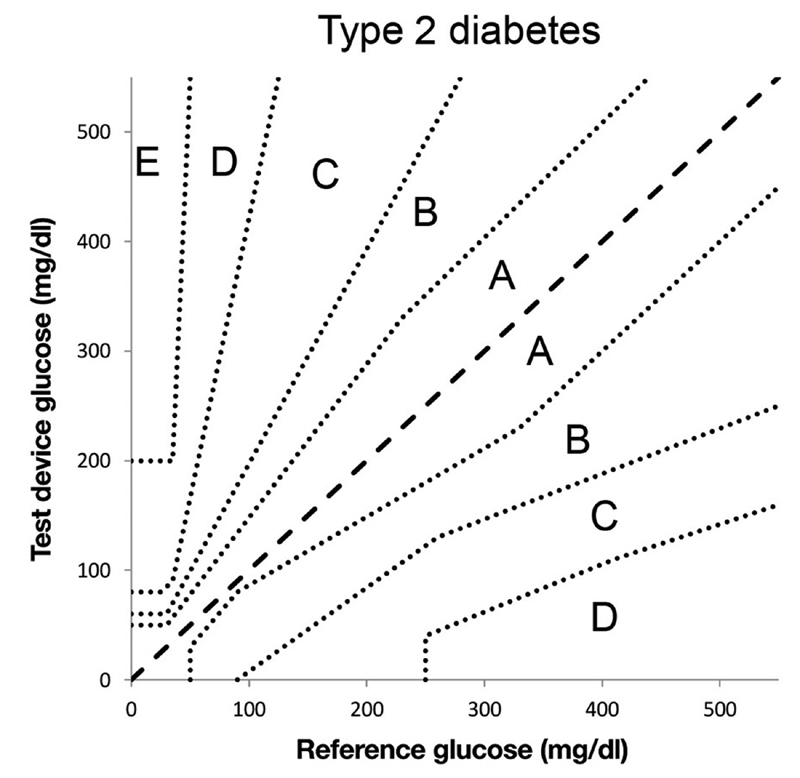
Parkes error grid . This grid assigns an error severity level from A to E (E high) based on the actual glucose level and the glucose level that is measured. We used forecasts in place of measurements. Image courtesy: Pfützner et al. 15
Evaluation
For our evaluation, we selected nine representative cases similar to those in Fig. 2A and B , each with a time series of glucose measurements, and we made predictions using each of four variations of our data assimilation method depending on what physiological model we used. For each set of predictions, we calculated the results of 13 metrics defined above and shown in Table 2 . Some metrics are scaled by 100 (“%”) or 10,000 to make them more readable. We do not have a gold standard measurement of utility, so we instead studied correlations among our metrics. We used pairwise linear correlation using the Pearson product–moment correlation coefficient between each pair of metrics.
We also performed a factor analysis using the “fa” function in the R statistical programming language (package “psych”). We used ordinary (unweighted) least squares to find the minimum residual (minres) solution, specifying one to five factors.
Results
Table 4 shows the results, with some rows missing where the method did not converge. The patients in Fig. 2 are bolded and marked with footnotes. All metrics are worse (higher implies more error) for Fig. 2B compared with Fig. 2A , other than the two metrics that were 0 in both. Of the two patients with less error, patients 2 and 4, we note that patient 4 was young and had a trauma-induced subdural hematoma and shorter length of stay, and patient 2 had an intraventricular hemorrhage but otherwise did not stand out as healthy. Those with subarachnoid hemorrhages tended to have higher errors.
Table 4. Main results.
| Subject | Model | RMS | RMS(g)% | Max cost% | Peak max% | Peak min% | Avg b 10,000 | Insulin | Bolus | Hold | Notify | Avg Parkes% | RMS Parkes% | Max Parkes |
|---|---|---|---|---|---|---|---|---|---|---|---|---|---|---|
| 1 | Meal | 31.34 | 5.76 | 4.27 | 0.96 | 2.09 | 0.28 | 4.5 | 50 | 0 | 1 | 17.4̀ | 44.82 | 2 |
| 1 | Exponential decay | 31.34 | 5.68 | 4.27 | 1.14 | 2.57 | 0.91 | 4.5 | 50 | 0 | 1 | 18.78 | 46.26 | 2 |
| 1 | Ultradian short | 44.99 | 10.53 | 15.67 | 0.65 | 7.90 | 8.06 | 4.5 | 100 | 0 | 0 | 27.35 | 61.01 | 2 |
| 1 | Ultradian long | 35.47 | 7.13 | 9.43 | 0.02 | 2.64 | 1.10 | 3.5 | 100 | 0 | 0 | 19.21 | 47.65 | 2 |
| 2 | Meal | 19.58 | 3.50 | 1.64 | 0.64 | 0.48 | 2.69 | 0.5 | 0 | 0 | 0 | 4.52 | 21.26 | 1 |
| 2 | Exponential decay | 19.58 | 3.50 | 1.49 | 0.67 | 0.57 | 3.79 | 0.5 | 0 | 0 | 0 | 3.95 | 19.89 | 1 |
| 2 | Ultradian short | 21.15 | 3.83 | 1.38 | 0.42 | 0.30 | 1.81 | 0.5 | 0 | 0 | 0 | 5.08 | 22.55 | 1 |
| 2 | Ultradian long | 21.05 | 3.83 | 1.81 | 0.27 | 0.02 | 1.88 | 0.5 | 0 | 0 | 0 | 5.08 | 22.55 | 1 |
| 3 | Meal | 64.03 | 6.19 | 15.87 | 11.03 | 1.98 | −1.74 | 4 | 0 | 0 | 1 | 15.42 | 44.52 | 3 |
| 3 | Exponential decay | 64.68 | 6.41 | 15.89 | 11.14 | 2.19 | −2.59 | 4 | 0 | 0 | 1 | 18.50 | 48.77 | 3 |
| 3 b | Ultradian long | 75.84 | 12.51 | 19.77 | 9.28 | 10.06 | 20.50 | 4 | 100 | 0 | 0 | 35.68 | 71.18 | 3 |
| 4 | Meal | 24.69 | 4.88 | 1.62 | 0.49 | 1.05 | −1.38 | 0.75 | 0 | 0 | 0 | 12.98 | 36.02 | 1 |
| 4 | Exponential decay | 23.76 | 4.64 | 1.40 | 0.74 | 1.22 | 0.15 | 0.75 | 0 | 0 | 0 | 11.45 | 33.84 | 1 |
| 4 | Ultradian short | 22.69 | 4.40 | 1.48 | 0.27 | 0.58 | −0.50 | 0.75 | 0 | 0 | 0 | 9.16 | 30.27 | 1 |
| 4 a | Ultradian long | 22.88 | 4.47 | 1.67 | 0.42 | 0.40 | −0.05 | 0.75 | 0 | 0 | 0 | 7.63 | 27.63 | 1 |
| 5 | Meal | 29.56 | 5.12 | 2.78 | 0.75 | 1.42 | 2.20 | 3.5 | 0 | 0 | 0 | 18.27 | 44.94 | 2 |
| 5 | Exponential decay | 31.19 | 5.39 | 2.89 | 1.05 | 1.52 | 3.15 | 3.5 | 0 | 0 | 0 | 13.46 | 39.22 | 2 |
| 5 | Ultradian long | 53.37 | 12.10 | 20.31 | 0.96 | 10.89 | 13.70 | 3.25 | 50 | 0 | 1 | 35.92 | 73.07 | 2 |
| 6 | Meal | 25.31 | 4.82 | 3.57 | 0.77 | 0.33 | −0.01 | 2 | 50 | 0 | 1 | 12.84 | 36.51 | 2 |
| 6 | Exponential decay | 24.51 | 4.65 | 3.40 | 1.64 | 0.95 | −0.14 | 2 | 50 | 0 | 1 | 11.60 | 34.78 | 2 |
| 6 | Ultradian short | 53.99 | 14.08 | 19.86 | 0.52 | 10.80 | 39.44 | 2 | 100 | 0 | 0 | 60.25 | 85.78 | 2 |
| 6 | Ultradian long | 32.99 | 6.55 | 7.92 | 1.94 | 3.63 | 0.16 | 4 | 100 | 0 | 0 | 20.00 | 45.81 | 2 |
| 7 | Meal | 35.47 | 6.28 | 7.25 | 1.63 | 4.49 | 1.21 | 2.5 | 50 | 0 | 1 | 18.32 | 47.05 | 3 |
| 7 | Exponential decay | 33.38 | 5.93 | 5.96 | 1.82 | 4.33 | −1.96 | 3 | 50 | 0 | 1 | 14.50 | 41.90 | 2 |
| 8 | Meal | 33.18 | 5.44 | 5.25 | 4.08 | 0.62 | −3.98 | 2 | 0 | 0 | 0 | 11.84 | 36.27 | 2 |
| 8 | Exponential decay | 32.89 | 5.31 | 5.64 | 4.27 | 0.59 | 0.48 | 2 | 0 | 0 | 0 | 13.82 | 38.90 | 2 |
| 8 | Ultradian short | 56.37 | 10.72 | 6.74 | 0.24 | 3.19 | 15.20 | 3 | 50 | 1 | 1 | 59.87 | 83.11 | 2 |
| 8 | Ultradian long | 45.03 | 8.99 | 6.98 | 1.49 | 4.94 | 11.10 | 2 | 100 | 0 | 1 | 36.84 | 62.83 | 2 |
| 9 | Meal | 53.84 | 8.47 | 20.70 | 3.79 | 0.60 | −1.28 | 12.5 | 100 | 1 | 1 | 30.45 | 64.97 | 3 |
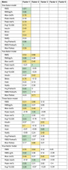
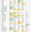
The correlation among the metrics is shown in Fig. 5 . In general, the RMS error of the raw or transformed glucose, g, and Parkes errors correlated fairly well with each other, but the treatment-based metrics were less well correlated with those. The factor analysis in Table 5 revealed more detail. The one-factor model reiterates the correlation result, that RMS error of the raw or g and Parkes errors carry the most variance. The two-factor model appears to split between metrics that emphasize low versus high glucose errors, with RMS of g, the peak difference in low glucose, average cost, and average and RMS Parkes error grouped for low values and peak of the difference in high glucose, RMS error of raw glucose, and maximum Parkes error in the high group. A third factor adds the treatment metrics, insulin change, and hold insulin, as its own factor. Additional factors separate insulin change from insulin hold and pull in notification of the clinician.
Fig. 5.
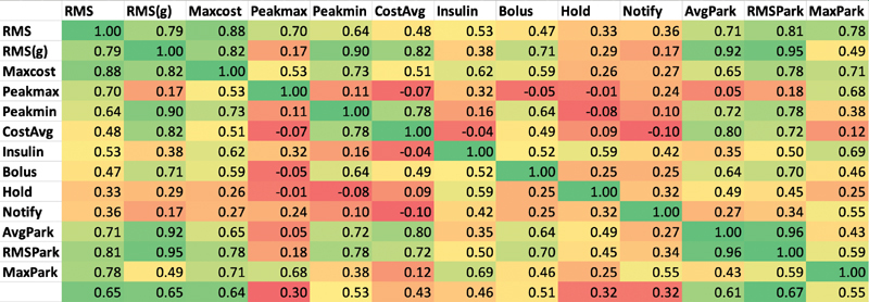
Correlation among the metrics . Pearson correlation coefficient among the metrics in Table 2 , colored on a scale from strong correlation (near 1) as green and poor or inverse correlation (0 and below) as red .
Table 5. Factor analysis.
|
Note: Factor loadings reshown. Loadings over 0.8 are green, and loadings 0.4 to 0.8 are yellow. Factors are sorted left to right by proportion of variance explained.
Discussion
Our results can be seen from two points of view. The first point of view is related to utility. Using the treatment guideline ( Fig. 3 ) as a surrogate for impact on clinical care, we find that all of its metrics (insulin, bolus, hold, notify) have only mediocre correlation with either the common metric, RMS error in raw glucose, or even RMS error of glucose that has been transformed to better track impact. Looking at the factors in Table 5 , the guideline-based measurements generally have significant loadings in their own factors separate from the RMS metrics. That is, they appear to deliver different information. Therefore, at least in this domain, commonly used metrics may not in fact correlate well with effects on clinical care.
The Parkes error grid metrics have better correlation with the RMS glucose error metrics, which is not surprising because it is an algorithm based on differences in glucose measurement, rescaled roughly by using five categories, A to E. In the factor analysis, when the model is given enough factors, the average Parkes and RMS Parkes metrics remain tightly linked to the RMS error of the transformed glucose and not to the guideline-based metrics. Therefore, the Parkes error grid, which is intended to show the importance of differences in glucose, may not be a good indicator of effects on clinical care.
The second point of view is related to explaining the variance between cases: how can we best separate cases without specifically worrying about effects on clinical care. Most of the metrics appeared to reflect gross features in the time series, such as comparing the metrics for the cases shown in Fig. 2A and B . Many of the metrics were well correlated. They grouped in a reasonable way, with the largest separation being in whether the errors appeared to be more on the low-glucose side or high-glucose side. The changes in treatment explained less variance than the more basic changes in glucose level, and they appeared to be poorly correlated with those basic changes, implying—as noted above—that they may supply useful orthogonal information. It appears that the simplest approach, RMS of difference in raw glucose, did correlate with the others, but that the transformed glucose, g, explained more variance. The combination of RMS of g, peak of the difference in high glucose, and insulin change may adequately cover the variance.
Our main limitation is that putting an algorithm like this into actual clinical practice and measuring differences in outcomes is an enormous undertaking and was out of scope for this study. Nevertheless, we believe that the actual guideline used in practice where the data were generated should cast a reasonable light on projected impact on the process of care. Second, our study was limited to nine patients from the neurological intensive care unit, and although that was sufficient to estimate the factor model and correlations, it limits the representativeness of our sample. We believe that our main messages—that is it important to explicitly evaluate evaluation metrics, that several glucose-related metrics can be enumerated, and that correlation and factor analysis can be used to assess the metrics in the absence of a gold standard—still hold and acknowledge that it would be useful to expand the clinical area beyond the neurological intensive care unit. Third, we assessed only one clinical area—glucose management—but it is a common and important one, and demonstration of a mismatch between common metrics and likely clinical care impact here at least raises the question for other areas. Fourth, we chose a particular insulin protocol for this study, shown in Fig. 3 , but protocols vary 16 and could lead to different results. Fifth, we focused on the glucose point estimate, but the predicted bounds around the estimate may be more important (e.g., the likelihood of severe hypoglycemia); the bounds would be worthy of further study.
In conclusion, our results indicate that we need to be careful before we assume that commonly used metrics like RMS error in raw glucose or even metrics like the Parkes error grid that are designed to measure importance of differences will correlate well with actual effect on clinical care processes. A combination of metrics appeared to explain the most variance between cases. As prediction algorithms move into practice, it will be important to measure actual effects.
Funding Statement
Funding This work was funded by grants from the National Institutes of Health R01 LM006910 “Discovering and applying knowledge in clinical databases” and R01 LM012734 “Mechanistic machine learning.”
Conflict of Interest None declared.
Authors' Contributions
All authors made substantial contributions to the conception and design of the work; drafted the work or revised it critically for important intellectual content; had final approval of the version to be published; and agreed to be accountable for all aspects of the work in ensuring that questions related to the accuracy or integrity of any part of the work are appropriately investigated and resolved.
References
- 1.Albers D J, Levine M E, Stuart A, Mamykina L, Gluckman B, Hripcsak G. Mechanistic machine learning: how data assimilation leverages physiologic knowledge using Bayesian inference to forecast the future, infer the present, and phenotype. J Am Med Inform Assoc. 2018;25(10):1392–1401. doi: 10.1093/jamia/ocy106. [DOI] [PMC free article] [PubMed] [Google Scholar]
- 2.Law K, Stuart A, Zygalakis K. New York, NY: Springer; 2015. Data Assimilation. [Google Scholar]
- 3.Sturis J, Polonsky K S, Mosekilde E, Van Cauter E.Computer model for mechanisms underlying ultradian oscillations of insulin and glucose Am J Physiol 1991260(5 Pt 1):E801–E809. [DOI] [PubMed] [Google Scholar]
- 4.Dalla Man C, Rizza R A, Cobelli C. Meal simulation model of the glucose-insulin system. IEEE Trans Biomed Eng. 2007;54(10):1740–1749. doi: 10.1109/TBME.2007.893506. [DOI] [PubMed] [Google Scholar]
- 5.Albers D J, Levine M, Gluckman B, Ginsberg H, Hripcsak G, Mamykina L. Personalized glucose forecasting for type 2 diabetes using data assimilation. PLOS Comput Biol. 2017;13(04):e1005232. doi: 10.1371/journal.pcbi.1005232. [DOI] [PMC free article] [PubMed] [Google Scholar]
- 6.Albers D J, Elhadad N, Claassen J, Perotte R, Goldstein A, Hripcsak G. Estimating summary statistics for electronic health record laboratory data for use in high-throughput phenotyping algorithms. J Biomed Inform. 2018;78:87–101. doi: 10.1016/j.jbi.2018.01.004. [DOI] [PMC free article] [PubMed] [Google Scholar]
- 7.Albers D J, Blancquart P-A, Levine M E, Seylabi E E, Stuart A. Ensemble Kalman methods with constraints. Inverse Probl. 2019;35(09):95007. doi: 10.1088/1361-6420/ab1c09. [DOI] [PMC free article] [PubMed] [Google Scholar]
- 8.Hripcsak G, Albers D J, Perotte A. Parameterizing time in electronic health record studies. J Am Med Inform Assoc. 2015;22(04):794–804. doi: 10.1093/jamia/ocu051. [DOI] [PMC free article] [PubMed] [Google Scholar]
- 9.Albers D J, Levine M E, Sirlanci M, Stuart A M.A simple modeling framework for prediction in the human glucose-insulin systemarXiv preprint arXiv:1910.14193 [DOI] [PMC free article] [PubMed]
- 10.Xiao C, Choi E, Sun J. Opportunities and challenges in developing deep learning models using electronic health records data: a systematic review. J Am Med Inform Assoc. 2018;25(10):1419–1428. doi: 10.1093/jamia/ocy068. [DOI] [PMC free article] [PubMed] [Google Scholar]
- 11.Jolliffe I T, Stephenson D B. Chichester, UK: John Wiley & Sons; 2012. Forecast Verification: A Practitioner's Guide in Atmospheric Science, 2nd ed. [Google Scholar]
- 12.Malouf R, Brust J CM. Hypoglycemia: causes, neurological manifestations, and outcome. Ann Neurol. 1985;17(05):421–430. doi: 10.1002/ana.410170502. [DOI] [PubMed] [Google Scholar]
- 13.Adeyinka A, Kondamudi N P. Treasure Island, FL: StatPearls Publishing; 2019. Hyperosmolar Hyperglycemic Nonketotic Coma (HHNC, Hyperosmolar Hyperglycemic Nonketotic Syndrome). StatPearls. [Google Scholar]
- 14.Parkes J L, Slatin S L, Pardo S, Ginsberg B H. A new consensus error grid to evaluate the clinical significance of inaccuracies in the measurement of blood glucose. Diabetes Care. 2000;23(08):1143–1148. doi: 10.2337/diacare.23.8.1143. [DOI] [PubMed] [Google Scholar]
- 15.Pfützner A, Klonoff D C, Pardo S, Parkes J L. Technical aspects of the Parkes error grid. J Diabetes Sci Technol. 2013;7(05):1275–1281. doi: 10.1177/193229681300700517. [DOI] [PMC free article] [PubMed] [Google Scholar]
- 16.Wilson M, Weinreb J, Hoo G W. Intensive insulin therapy in critical care: a review of 12 protocols. Diabetes Care. 2007;30(04):1005–1011. doi: 10.2337/dc06-1964. [DOI] [PubMed] [Google Scholar]


