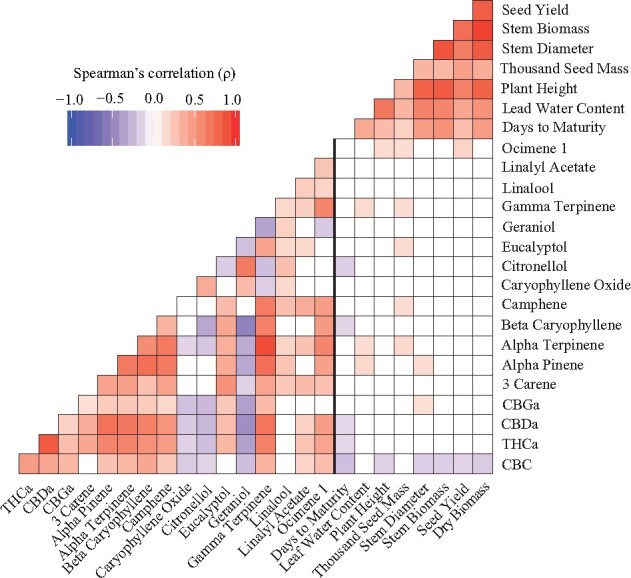
Figure 1.

Trait correlations of measured phenotypes. Correlation plot depicting Spearman’s rank correlation coefficient (ρ), between measured phenotypes in F2 population. Red colors indicate positive correlations while blue colors indicate negative correlations. The vertical bolded black line separates biochemical from agronomic traits. Only significant correlations (P < 0.05) are shown.
