

Abstract
On Jan 22, 2020, a day after the USA reported its first COVID-19 case, the Johns Hopkins University Center for Systems Science and Engineering (JHU CSSE) launched the first global real-time coronavirus surveillance system: the JHU CSSE COVID-19 Dashboard. As of June 1, 2022, the dashboard has served the global audience for more than 30 consecutive months, totalling over 226 billion feature layer requests and 3·6 billion page views. The highest daily record was set on March 29, 2020, with more than 4·6 billion requests and over 69 million views. This Personal View reveals the fundamental technical details of the entire data system underlying the dashboard, including data collection, data fusion logic, data curation and sharing, anomaly detection, data corrections, and the human resources required to support such an effort. The Personal View also covers the challenges, ranging from data visualisation to reporting standardisation. The details presented here help develop a framework for future, large-scale public health-related data collection and reporting.
Introduction
SARS-CoV-2, the causative virus of COVID-19, emerged in late 2019, in the Hubei Province of China.1, 2, 3 The outbreak quickly spread throughout the country and the first international case was confirmed on January 13, in Thailand.4, 5 On Jan 30, 2020, the first case of person-to-person transmission in the USA was confirmed.6 That same day, WHO declared 2019-nCoV a Public Health Emergency of International Concern.7 As of June 1, 2022, over 2 years later, SARS-CoV-2 has infected over 530 million people across every continent and contributed to the deaths of at least 6·2 million people, both of which are underestimations.8, 9
On Jan 22, 2020, the Johns Hopkins University Center for Systems Science and Engineering (JHU CSSE) COVID-19 Dashboard was presented to collect and provide publicly available, real-time data on the pandemic.10 The dashboard has since become the de facto database for global spread of the virus, providing a hub for the public, scientists, and policy makers alike to understand the spread of SARS-CoV-2. The dashboard has received over 226 billion requests for data hosted in feature layers and 3·6 billion page views as of June 1, 2022. The cumulative and daily feature requests and page views on the dashboard between inception and June 1, 2022, is illustrated in figure 1 .
Figure 1.

Johns Hopkins University Center for Systems Science and Engineering Dashboard usage and milestones, including the number of requests and views
Requests refer to the number of times a visitor interacts with the dashboard system, such as clicking on a specific country.11 Views refer to the number of times the dashboard, either desktop or mobile versions, is loaded on the visitor's end. Global COVID-19 cases and deaths in dashed lines are reference plots. (A, B) Total usage from Jan 21, 2020, to June 1, 2022. (C, D) Daily usage before June 15, 2020. Daily cases and daily deaths are smoothed by 7-day moving average.
The dashboard has strived to provide accurate and consistent reporting through a complex system that ensures data accuracy, transparency, and integrity. The complete pipeline is illustrated in figure 2 , and each step of the pipeline is detailed in sections to follow. In this Personal View, the system supporting the dashboard is presented alongside case studies demonstrating the difficulties encountered in reporting these data in a consistent fashion. We hope that sharing our experience will improve collection, reporting, and modelling efforts during future pandemics and ultimately inform policy solutions to reduce morbidity and mortality.
Figure 2.
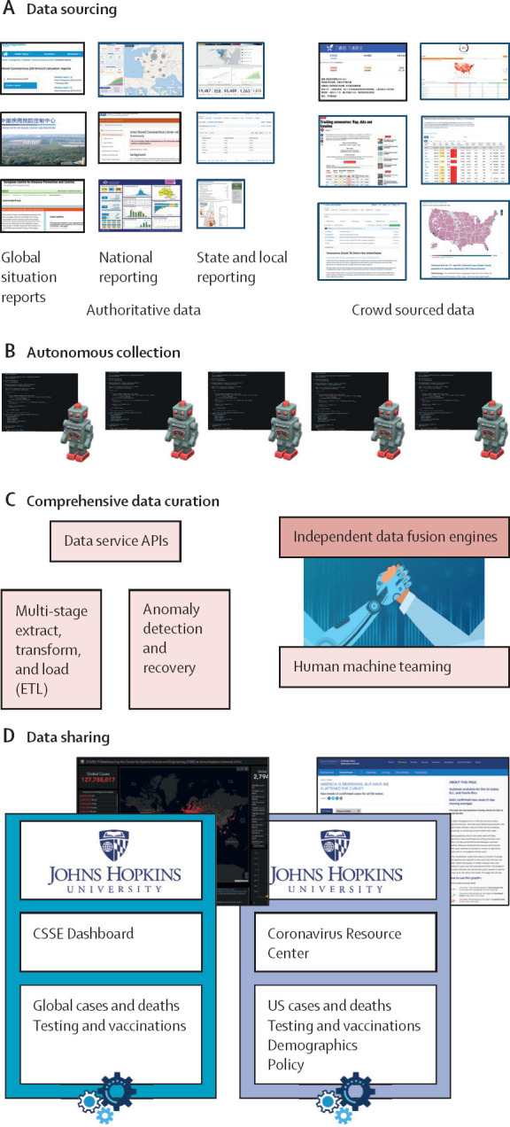
Graphical summary of the Johns Hopkins University Center for Systems Science and Engineering Dashboard data pipeline
The pipeline can be separated into four main steps. (A) Data sourcing describes the identification and validation of trusted, open-source data sources. (B) Autonomous collection uses web scraping algorithms to collect raw data from open-source data sources. (C) Comprehensive data curation passes the data through several quality control mechanisms including an in-house designed anomaly detection service. Data fusion services curate the cleaned data into a single production database. (D) Data sharing is the publication of production data into our online data products.
Dashboard overview
The JHU CSSE COVID-19 Dashboard refers to both the ArcGIS visualisation and the GitHub repository that provides access to the data underlying the visualisation. The dashboard provides data based on the date of report rather than the date of event, and in this way functions as a snapshot of the cumulative reported data up until that date.
The visualisation is built on the ArcGIS Dashboard, which enables users to present geospatial information with a variety of widgets. The layout of the dashboard has evolved over time to accommodate changing data availability (figure 3 ). Initially, the dashboard only displayed cases, deaths, and recoveries. Later it included other indicators such as case-fatality ratio and testing, hospitalisation, and vaccination data. Eventually, daily and weekly time series plots were added, while recoveries, active cases, testing, and hospitalisation data were removed due to inadequate sourcing. The map uses the point feature to represent the location of data, with the relative point size indicating magnitude. As the pandemic has progressed, this scale has repeatedly been readjusted as totals increased beyond our estimates of appropriate upper bounds. Three administrative point levels are designated: level 0, which represents countries, regions, or sovereignty; level 1, which represents provinces, states, or dependency; level 3, which represents counties. Admin level 2 data are only available for the USA, but a continually growing set of countries have admin level 1 data available. In total, data are collected and reported for over 3500-point locations using more than 400 sources. Most points on the map are based on geographical centroids, and none are representative of a spatial scale finer than a county.
Figure 3.

Evolution of the dashboard visualisation
(A) Initially, our efforts were focused on the spread of cases in China. (B) As the virus spread globally, the default view was expanded to include the entire world. (C) In the most current version, vaccination data has been added and the time series has been adjusted from daily to weekly bars.
Approximately 8–10 full-time equivalents are required to maintain the current products, composed primarily of data scientists and software engineers. This team also includes some public health, geographical information system, and infectious disease modelling experts all under the guidance of one project manager and one technical lead. The entire data system was developed from scratch and runs entirely on-premises. Although the underlying software to collect and process the data was custom designed and built, we rely on partner industry tools for system management. Specifically, all of our data products are hosted on GitHub.com, and custom Slack commands and Amazon Web Service cloud servers allow our team to interact with and approve data within the anomaly detection system.
Data sourcing
In line with our commitment to open data, the data displayed on the dashboard have solely come from publicly accessible sources referenced in a version-controlled README file on our repository. A complete list of data sources as of June 1, 2022 is given in the appendix (pp 2–9). At project initiation, data for China were sourced from the China Centers for Disease Control and Prevention and the website DXY.cn, an online information-sharing platform for Chinese medical practitioners. As the virus spread internationally, data were manually sourced and validated from a mix of official and aggregate sources, including 1Point3Acres, BNO news, Worldometers.info, local news reporting, and social media posts from governments and health authorities. Eventually, governments and health authorities established public bodies for reporting epidemic data within their jurisdictions, which replaced ad hoc sourcing as they became available.
In addition to the growing set of jurisdiction-specific public sources, our sources still include other aggregation efforts. For non-US locations publishing non-machine-readable formats, the WHO COVID-19 Dashboard and Worldometers are used. Data published by the US Centers for Disease Control and Prevention (CDC) or the US Department of Health and Human Services are used for specific metrics that are no longer published by the primary source or when primary sources reduce reporting to less than or equal to once per week. Thus, as the quality and availability of data sources has evolved throughout the pandemic, the mapping of sources to point to locations represented on the map has also changed.
Data sourcing is more encompassing than simply identifying whether particular metrics are reported on an authoritative source; it includes the need to understand the definitions used for specific metrics, the frequency of reporting, and the suitability of the source for manual or automated data collection. Further challenges result from divergence between national reporting and authoritative aggregation sources (eg, WHO reporting for Mauritius includes probable cases, whereas Mauritian Health Ministry reporting does not).
Autonomous data collection
The JHU CSSE COVID-19 Dashboard collects data using custom-built web and data scraping techniques and manual data collection processes. These approaches obtain targeted information hosted on websites; in our case, epidemiological data primarily from government health websites. Our first attempt to automate data scraping was deployed in the middle of February, 2020, on DXY.cn for China. Since then, individual data scraping algorithms have been designed for more than 400 sources. These scrapers require extensive ongoing maintenance and must be updated following even minor modification to the data structure and reporting on the host website. Our system notifies our team of developers if a scraper fails to collect the expected information, prompting maintenance. These automated methods fetch data from every source every half hour, from which the data hosted on the dashboard is updated hourly. A further technical description of data scraping is available in the appendix (pp 10–12).
Comprehensive data curation
Following collection, data are curated and processed to minimise the likelihood that anomalous source data populates our data products. Data collection agents asynchronously extract targeted data from the sources into a raw data store. Here, data irregularities in the raw data, such as language translation, spelling errors, missing values, and improper entries are transformed, and formatted into a curated dataset by an automated system. Curated data are loaded into a production data store used for developing data products and analysis.
The system consists of data fusion services that use the production data store and a configurable set of rules to generate data products. Before data products are reported, they go through an anomaly detection service to detect potentially anomalous data. The data fusion and anomaly detection systems are two substantial and necessary innovations in the design of this system.
Fusion logic
The dashboard architecture consists of hundreds of data sources and allows for data redundancy, where a single data point can have data provided from multiple sources. Data fusion services use a configurable set of rules (ie, logic) established by stakeholders and subject-matter experts to establish which data to source for customised data products. These configurable sets of rules specify the location, data type to be fused, and sources to be fused through extract-transform-load processes. For example, the fusion logic will compare total cases (data type) published for Baltimore, MD, USA (location) by county and state public health departments (sources) and propagate the most up-to-date cases to the data products. This method is particularly helpful when sources are on varying update times or frequencies.
The fusion system ensures that in the case of asynchronous update schedules for two sources serving one location, the dashboard will always reflect the data of the timeliest source. Commonly, our data reflects the maximum value between sources. The anomaly detection services mitigate the risk of overreporting when defaulting to a maximum value.
Anomaly detection
The anomaly detection service is crucial to the data curation process. In our case, anomalies describe successfully scraped data that greatly deviate from expectations. These inaccuracies can arise either through internal scraper issues (scraped data differs from source), a source publication error, or substantial changes to the source reporting posture. Our automated system uses a combination of historical data and dynamic thresholds to flag potential anomalies. Production data are compared with the most recent published data to identify the relative and absolute difference. If these differences exceed configured thresholds, which vary by location and over time, the anomaly detection service notifies the team of developers of a potential error in the data. The alert and notification initiate a quality control process, and mandatory manual reviews are performed to establish data accuracy. During review, the detection service prevents the anomalous data point from propagating to the live data products and the data from the most previous update cycle is held constant. If the anomaly is determined to be accurate, the reported data are manually confirmed and successfully propagated to the data product and stored. Through this quality control mechanism, source data entry errors rarely propagate to the dashboard.
Data sharing
We view open data, including both current and historical data, as an essential component of the effort to provide publicly available, real-time data on the pandemic.12 As such, the dashboard allows access to all data underlying the widgets and visualisation.
Early in the pandemic, our data sharing relied on the web-based spreadsheet program Google Sheets. This program offered both a running tally of the current outbreak and a historical record of all changes made to the document that allowed users to write comments, offering an informal forum for reporting data issues. The Sheet consisted of multiple time series tables with rows for different countries and regions and a daily case report that was used to update the time series files. Unfortunately, Google Sheets had issues described below that challenged our commitment to open data, motivating a shift in hosting. Google Sheets has limits on the number of users that can simultaneously view a document, which was quickly surpassed. Second, Google Sheets did not allow for easy download or sharing of data. After considering alternatives, the database was moved to GitHub, which offered the scalability for open data access, easily downloadable content, and autonomy that maintained the goals of the dashboard effort. To ease the transition for our active user base, the data structure from Google Sheets was preserved and remains our active structure. GitHub also provides other elements that support data transparency: README files listing sources and data modifications, access to historical versions of files, and a forum for raising data issues and posting announcements.
Challenges
Through day-to-day management of the JHU CSSE COVID-19 Dashboard, we have encountered numerous issues that have affected our ability to collect, present, and store accurate and timely data. These problems can take the form of one-off reporting mistakes by a source, untransparent or unclear practices from a source, or systemic issues identified across multiple sources. Below, we describe a selection of issues we have encountered, primarily stemming from data management decisions of single sources, and case studies of systemic issues that exist across sources. By highlighting and discussing the consequences of these decisions, we hope public health agencies and leaders will adapt their approaches for reporting data to improve the quality of real-time epidemiological data. Other extended examples are available in the appendix (pp 13–16).
Ambiguous and inconsistent parameter definitions
To accurately assess the epidemic situation across geographical space, locations need to follow the same, or similar, set of standards for collecting, defining, and reporting data. The dashboard initially reported three variables—cases, deaths, and recoveries—which have each had variance in their interpretations and definitions between locations. The addition of vaccination data has similarly had standardisation challenges.
Cases
Globally, confirmed cases of COVID-19 are defined as being positive by PCR test. Variance within the reporting of the results of PCR tests can occur and, for the purposes of measuring the change in cases over time, positive tests are commonly tagged either for their date of (public) report or date of sample collection. By the definition of the US CDC, which has evolved during the pandemic, probable cases can be identified from a combination of antigen testing, clinical criteria, or with epidemiological evidence, or a combination of these.13, 14 However, the criteria used to define probable cases is inconsistent globally.15, 16 To the best of our ability, case data are restricted to include only confirmed and probable cases as defined by the US CDC based on the case definitions published by individual sources.
Deaths
As with case data, our reported death data includes confirmed and probable deaths. However, the date assigned to a COVID-19 death can vary substantially by location and time. Deaths can either be tagged as the date that the death occurred, when the death certificate was issued, or when the death was reported publicly. Additionally, although death data have generally been viewed as closer to the ground truth of viral harm, disparate definitions for probable and non-laboratory confirmed deaths exist across locations without clear transparency. Similar to cases, the US CDC definitions for deaths are applied to global sources as closely as possible.
Recoveries
The initial definition provided by WHO for classifying a patient as recovered from COVID-19 was two negative PCR tests at least 24 h apart.17 This requirement was impractical, spurning regions to develop independently derived algorithmic methods based on patients accessing care, or time since diagnosis or symptom onset, or both.15 These non-standard definitions led to substantial diversity in recovery data between locations, and challenged their use for data-driven policy. For this reason, the dashboard stopped reporting recovered data (or active cases) on Aug 2, 2021.
Vaccination
Vaccination data were first added to the dashboard on May 11, 2021. These data are limited by the use of unclear or disparate definitions, as described by other aggregation efforts.18 For example, doses administered beyond a full series (eg, three doses of the mRNA-1273 [Moderna] vaccine) have been described as both additional and booster doses. As booster doses have become standard, the original designations of partially vaccinated and fully vaccinated are no longer suitable. Finally, how to properly report administration of heterologous vaccines is unclear. For these reasons and others, the dashboard solely reports total doses administered for all locations.
For all the above parameters, a globally agreed on, standardised set of definitions would have greatly increased the quality of the data, and enabled a more accurate understanding of SARS-CoV-2 spread between locations and over time.
Inaccessible reporting methods
One of the primary challenges in compiling this dataset has been the absence of standardisation and support for machine-readable data. These issues ranged from public health entities using inaccessible formats, such as infographics and business intelligence reporting frontends, to sources sharing information only through narratives, social media posts, or press conferences.
Semi-structured or unstructured reporting, either on social media, press releases, or press conferences, is a common problematic method due to its unsuitability for web scraping. For example, the most consistent source of pandemic data in Kosovo is the Kosovo National Institute of Public Health Facebook. Unfortunately, these posts are provided in a semi-structured story-based form, with data tables and graphs embedded as images. Narrative reporting requires the development of bespoke natural language processing algorithms, which is not scalable and further complicated by reports in multiple languages.
Business intelligence tools can lock data behind inaccessible facades, meaning that automated downloads of information from the page do not provide meaningful data and more advanced techniques need to be developed. An example is Arizona's COVID-19 Data Dashboard (appendix p 2). The components of the interactive dashboard are rendered as images that prevent automated access to the raw data. Thus, collecting Arizona's COVID-19 data requires manual collection.
Addressing these challenges has been a process that is highly reliant on both the source and the nature of how the data are presented. At times, machine learning pipelines have been developed to parse data into a readable format, and this approach has been successfully deployed for locations publishing structured PDF files. In other instances, aggregators that turn unreadable data into machine-readable formats have been identified and validated for inclusion in our data pipeline. Finally, if no machine-readable sources are identified, the team defaults to manual updates, which are time-consuming and unsustainable. An automated screenshot tool has been developed to limit the risk of human data entry errors for manually tracked locations and to provide data validation. This tool, currently deployed for US and manually collected sources only, takes a screenshot of the source dashboard with every scraper run or manual collection and stores it in an internally accessible database.
Unstable reporting practices (metrics and frequency)
Few institutions, particularly at local or regional levels, had the infrastructure to publicly report epidemiological data in a structured format before the COVID-19 pandemic. As institutions developed systems on the fly, these evolved as new guidance was given by national agencies or staffing and new technology was made available (or removed). When making these changes, many institutions created inconsistencies in their own reporting structure or methodology. As US national guidelines shifted, states progressively altered their approach to reporting probable cases. As these changes have generally become more inclusive, they have been coincident with large spikes in case or death data that misrepresent the epidemiological situation.
The anomaly detection service has served as a warning for these shifting case definitions, provided the change resulted in substantial increases or decreases in case, death, or recovery data. When locations have released large numbers of probable cases or deaths in a single day, we are able to detect these changes for review before they propagate to the data product. When large data dumps occur, our practice is to contact the respective health agencies and try and obtain reasoning for or a back distribution of the data. After contact has been made, we post either a large, artificial spike or newly back distributed data, and explanations for anomalies reported or the alterations to our data are documented on the GitHub README file. The README file as of June 1, 2022, is available in the appendix (pp 17–61).
As the pandemic has progressed, reporting entities have shifted their standards for reporting frequency. Although almost all locations began with daily reporting, this has slowly been replaced by decreased frequencies: weekdays only, fewer than fives times a week, or even only ad hoc. Less frequent reporting reduces data utility for modelling and policy making as trends are less clear. As our data include metrics based on the date of report, less frequent reporting results in artificial spikes in data following a period of no reporting. This effect is particularly exacerbated when different administrative levels have diverse reporting schedules, as is seen for the USA. To assist users, we track the irregular update schedules of locations scraped in a README file on our repository. Finally, several entities have ended their reporting for specific metrics; for example, the Florida Department of Health ended publication of county-level deaths in early June, 2021. In these instances, we have diverted our sourcing to alternative locations.
Conclusion
The JHU CSSE COVID-19 Dashboard provides an accessible means of viewing the global dynamics of COVID-19; feeds the visualisations and projects of hundreds of governments, private, and academic efforts; and serves as a historical record of the pandemic. Crucially, the dashboard relied entirely on publicly available data; thus, the quality of the data product generated is dependent on the accessibility, quality, and timeliness of the data available. The dashboard had diverse challenges associated with the varied approaches of different sources and required the development of several quality-control systems. By sharing information about these systems and challenges, developers might strengthen their own data quality and data providers can understand how their decision making affects data aggregation projects and general data accessibility needs. Furthermore, this project relied heavily on expertise from computer scientists and systems engineers, and these skillsets should be heavily invested in by public health institutions. Finally, the financial support for the dashboard was primarily institutional and philanthropic, highlighting the crucial role played by academic and philanthropic organisations in informing and advancing worldwide public health practice.
Declaration of interests
We declare no competing interests.
Acknowledgments
Acknowledgments
The authors greatly appreciate the financial support of Bloomberg Philanthropies, the Stavros Niarchos Foundation, and the National Science Foundation award 2028604. The funders had no role in the study described or implementation of the JHU CSSE COVID-19 Dashboard. The authors acknowledge and thank Sean Breyer, Paul Dodd from Esri Inc., Redlands CA, USA, and the broader Environmental Systems Research Institute team for their assistance in launching and managing the dashboard.
Contributors
ED and LMG were responsible for conceptualisation of the dashboard. JR, ED, TDG, AK, RL, TKN, BG, EB, SP, DZ, RCM, MRB, HD, FG, FA, JW, SC and LMG contributed to the methodology. ED, TDG, AK, TKN, BG, EB, SP, DZ, HD, FG, and FA developed the software. RCM, MRB, JW, and SC were responsible for resources. JR, ED, TKN, BG, EB, SP, DZ, HD, FG, and FA performed data curation. The original draft was written by JR and ED, all authors were involved with reviewing and editing. JR, ED, TDG, AK, and LMG were responsible for visualisation. TDG, AK, and LMG supervised the study.
Supplementary Material
References
- 1.Zhou P, Yang XL, Wang XG, et al. A pneumonia outbreak associated with a new coronavirus of probable bat origin. Nature. 2020;579:270–273. doi: 10.1038/s41586-020-2012-7. [DOI] [PMC free article] [PubMed] [Google Scholar]
- 2.Wu F, Zhao S, Yu B, et al. A new coronavirus associated with human respiratory disease in China. Nature. 2020;579:265–269. doi: 10.1038/s41586-020-2008-3. [DOI] [PMC free article] [PubMed] [Google Scholar]
- 3.Zhu N, Zhang D, Wang W, et al. A novel coronavirus from patients with pneumonia in China, 2019. N Engl J Med. 2020;382:727–733. doi: 10.1056/NEJMoa2001017. [DOI] [PMC free article] [PubMed] [Google Scholar]
- 4.Tian H, Liu Y, Li Y, et al. An investigation of transmission control measures during the first 50 days of the COVID-19 epidemic in China. Science. 2020;368:638–642. doi: 10.1126/science.abb6105. [DOI] [PMC free article] [PubMed] [Google Scholar]
- 5.WHO WHO statement on novel coronavirus in Thailand. 2020. https://www.who.int/news/item/13-01-2020-who-statement-on-novel-coronavirus-in-thailand
- 6.Ghinai I, McPherson TD, Hunter JC, et al. First known person-to-person transmission of severe acute respiratory syndrome coronavirus 2 (SARS-CoV-2) in the USA. Lancet. 2020;395:1137–1144. doi: 10.1016/S0140-6736(20)30607-3. [DOI] [PMC free article] [PubMed] [Google Scholar]
- 7.WHO Statement on the second meeting of the international health regulations (2005) emergency committee regarding the outbreak of novel coronavirus (2019-nCoV) 2020. https://www.who.int/news/item/30-01-2020-statement-on-the-second-meeting-of-the-international-health-regulations-(2005)-emergency-committee-regarding-the-outbreak-of-novel-coronavirus-(2019-ncov)
- 8.Irons NJ, Raftery AE. Estimating SARS-CoV-2 infections from deaths, confirmed cases, tests, and random surveys. Proc Natl Acad Sci USA. 2021;118 doi: 10.1073/pnas.2103272118. [DOI] [PMC free article] [PubMed] [Google Scholar]
- 9.WHO The true death toll of COVID-19: estimating global excess mortality. 2021. https://www.who.int/data/stories/the-true-death-toll-of-covid-19-estimating-global-excess-mortality
- 10.Dong E, Du H, Gardner L. An interactive web-based dashboard to track COVID-19 in real time. Lancet Infect Dis. 2020;20:533–534. doi: 10.1016/S1473-3099(20)30120-1. [DOI] [PMC free article] [PubMed] [Google Scholar]
- 11.Environmental Systems Research Institute Item details. 2022. https://doc.arcgis.com/en/arcgis-online/manage-data/item-details.htm
- 12.Gardner L, Ratcliff J, Dong E, Katz A. A need for open public data standards and sharing in light of COVID-19. Lancet Infect Dis. 2021;21:e80. doi: 10.1016/S1473-3099(20)30635-6. [DOI] [PMC free article] [PubMed] [Google Scholar]
- 13.US Centers for Disease Control and Prevention Coronavirus disease 2019 (COVID-19) 2020 interim case definition, approved August 5, 2020. 2020. https://ndc.services.cdc.gov/case-definitions/coronavirus-disease-2019-2020-08-05/
- 14.US Centers for Disease Control and Prevention Coronavirus disease 2019 (COVID-19) 2021 case definition. 2021. https://ndc.services.cdc.gov/case-definitions/coronavirus-disease-2019-2021/
- 15.Peralta-Santos A. Assessment of COVID-19 surveillance case definitions and data reporting in the European Union. 2020. https://www.europarl.europa.eu/RegData/etudes/BRIE/2020/652725/IPOL_BRI(2020)652725_EN.pdf
- 16.WHO WHO COVID-19 case definition. 2020. https://www.who.int/publications-detail-redirect/WHO-2019-nCoV-Surveillance_Case_Definition-2020.2
- 17.WHO Laboratory testing of human suspected cases of novel coronavirus (nCoV) infection: interim guidance 10 January 2020. 2020. https://apps.who.int/iris/bitstream/handle/10665/330374/WHO-2019-nCoV-laboratory-2020.1-eng.pdf
- 18.Mathieu E, Ritchie H, Ortiz-Ospina E, et al. A global database of COVID-19 vaccinations. Nat Hum Behav. 2021;5:947–953. doi: 10.1038/s41562-021-01122-8. [DOI] [PubMed] [Google Scholar]
Associated Data
This section collects any data citations, data availability statements, or supplementary materials included in this article.