

Abstract
Purpose
Hospital readmission prediction uses historical patient visit data to train machine learning models to predict risk of patients being readmitted after the discharge. Data used to train models, such as patient demographics, disease types, localized distributions etc., play significant roles in the model performance. To date, many methods exist for hospital readmission prediction, but answers to some important questions still remain open. For example, how will demographics, such as gender, age, geographic, impact on readmission prediction? Do patients suffering from different diseases vary significantly in their readmission rates? What are the nationwide hospital admission data characteristics? and how do hospital speciality, ownership, and locations impact on their readmission rates? In this study, we carry systematic investigations to answer the above questions, and propose a predictive modeling framework to predict disease-specific 30-day hospital readmission.
Methods
We first implement statistics analysis by using National Readmission Databases (NRD) with over 15 million hospital visits. After that, we create features and disease-specific readmission datasets. An ensemble learning framework is proposed to conduct hospital readmission prediction and Friedman test and Nemenyi post-hoc test is used to validate our proposed method.
Results
Using National Readmission Databases (NRD), with over 15 million hospital visits, as our testbed, we summarize nationwide patient admission data statistics, in related to demographic, disease types, and hospital factors. We use feature engineering to design 526 representative features to model each patient visit. Our studies found that readmission rates vary significantly from diseases to diseases. For six diseases studied in our research, their readmission rates vary from 1.832 (Pneumonia) to 8.761% (Diabetes). Using random sampling and voting approaches, our study shows that soft voting outperforms hard voting on majority results, especially for AUC and balanced accuracy which are the main measures for imbalanced data. Random under sampling using 1.1:1 for negative:positive ratio achieves the best performance for AUC, balanced accuracy, and F1-score.
Conclusion
This paper carries out systematic studies to understand US nationwide hospital readmission data statistics, and further designs a machine learning framework for disease-specific 30-day hospital readmission prediction. Our study shows that hospital readmission rates vary significantly with respect to different disease types, gender, age groups, any other factors. Gradient boosting achieves the best performance for disease specific hospital readmission prediction.
Keywords: Nationwide readmissions database (NRD), Disease-specific hospital readmission prediction, Classification, Ensemble learning
Introduction
Hospital readmission is a process or episode when a patient discharged from a hospital is readmitted within a specific time interval, say 30 or 90 days, since the previous discharge [1]. With annual costs reaching $41.3 billion for patients readmitted within 30 days after discharge, readmission is one of the costliest episodes to treat in the United States [2]. The large annual costs not only imply unsatisfactory hospital quality, but also hinder resources available for other attention-required government programs and erode US industrial competitiveness [3]. To minimize the negative impact of high readmission rate, since 2012, a Hospital Readmissions Reduction Program (HRRP) has been developed by Centers for Medicare & Medicaid Services (CMS) aiming to improve the quality of patient care and reduce healthcare expenditures by imposing fines on hospitals with higher readmission rates than expected rate [4]. Hospitals across the US are under scrutiny of this program and have increased the investment in order to enhance their discharge process, resulting in the drop of readmission rate from 21.5 to 17.5%, from 2007 to 2015 [5]. Despite of this encouraging drop, the expenses on developing an effective discharge procedure including better medication prescription, patient education, discharge follow-up and so on is extremely high and time consuming [6]. Development of readmission risk analysis tools has increased dramatically for accurate identification of high-risk patients. Nevertheless, the complexity of in-patient care and discharge process hinders the progress of building high-sensitivity and precise risk models, which stimulates growing research focusing on finding potential patterns of readmission and aiming to prevent avoidable readmissions.
Hospital readmission prediction
Machine learning, supervised learning in particular, has the unique strength to learn patterns from historical data for prediction. Accordingly, many methods have been proposed to train predictive models to assess readmission risk of individual patients, using their past visit records combined with other information [7–9]. For example, logistic regression is a commonly used model, due to its simplicity and transparency for prediction. In addition, studies also propose to use more advanced models, such as support vector machines and neural networks, for readmission analysis [10, 11]. Our previous study [1] has systematically reviewed major research challenges for hospital readmission.
While many methods exist for hospital readmission prediction, existing research has fallen short in addressing some major questions in the field. (1) First of all, for each type of disease, their causes are different, leading to variance in disease characteristics. Such distinctions can further result in patient admission, in-hospital treatment and discharge gap, reflected by unique patient features for each disease. How will demographic information, such as gender, age, geographic, impact on readmission prediction? Do patients suffering from different diseases vary significantly in their readmission? Many methods are available for prediction, but no existing research has provided clear answer to the above questions. (2) Secondly, readmission prediction is a compound outcome of many factors, including patient, disease, care providers etc. Many methods are trained by using data collected from local regions or other sources, but there is no nationwide hospital admission data statistics to show how readmission rates vary with respect to factors beyond patient themselves, such as hospital ownership, speciality, payment types, and household incomes of served areas etc. (3) Thirdly, hospital readmission prediction is essentially data driven, where features and samples are the key to ensure model performance. While many methods have been using a wide variety of patient treatment data, such as patient blood tests, nutritional factors [12], treatment etc, the data privacy and the Health Insurance Portability and Accountability Act (HIPAA) [13] limit sensitive features to be used in general readmission prediction setting. Creating features strictly complying to the HIPAA and privacy regulation, and also effective and informative for learning, is crucial for hospital readmission prediction.
The above observations motivated our research to study nationwide hospital admission data statistics and design effective ways for disease-specific 30-day hospital readmission prediction. We use National Readmission Databases (NRD), with over 15 million hospital visits, as our testbed, and report national scale hospital admission statistics, including readmission rate differences with respect to different demographic and hospital factors, such as gender, age, payment type, hospital profile, and disease types. After that, we create six disease specific readmission tasks for Cancer, Heart disease, Chronic obstructive pulmonary disease (COPD), Diabetes, Pneumonia, and Stroke. Random under sampling and ensemble learning, including hard-voting and soft-voting, are used to train models for disease-specific readmission prediction.
Contribution
The main contribution of our work, compared to existing research in the field, is fourfold.
Answers to important questions
With over 15 million hospital visits in national readmission databases (NRD), we are able to carry out data statistics analysis and conclude answers for several important questions regarding hospital readmission. To find out the impact from demographics on hospital readmission, we explored the readmission percentage between gender and various age groups, from which an apparent readmission difference between male and female can be observed with male having higher readmission rate than female. Also, patients aged over 56 usually have larger risk to be readmitted into hospital. The second aspect we conclude is that patients suffering from diseases vary significantly regarding to their readmission rates. For example, patients with heart diseases have much more readmission rate than patients with pneumonia. As for hospital, private-owned non-profit hospitals discharged much more patients than government-owned hospitals and private-own hospitals.
Nationwide admission data statistics
Using National Readmission Databases (NRD), with over 15 million hospital visits, as our testbed, we summarize nationwide patient admission data statistics, in related to demographic, disease types, and hospital factors. By separating patient visits into different cohorts, our study directly answers how demographic, socioeconomic, and diseases are reflected in the readmission. The data statistics can not only be useful for designing features for readmission prediction, but are also useful for policy and other purposes. For example, our study found that, even in the same disease group, patients with low incomes do not go/return to the hospital as the same as populations with higher incomes. These observations can help design policy to help patients vulnerable to high readmission risk in specific geographic locations or service areas.
Feature engineering for readmission prediction
In order to design HIPAA compliant features to characterize patients, diseases, and hospitals, we use feature engineering to design 526 representative features to model each patient visit. The six demographic features, ten admission and discharge features, 498 clinical features, three disease features, and nine hospital features are fully compliant with the HIPAA standard to support disease-specific readmission prediction.
Disease specific readmission prediction
Our studies found that readmission rates vary significantly from diseases to diseases. For six diseases studied in our research, their readmission rates vary from 1.832 (Pneumonia) to 8.761% (Diabetes). The high variance makes it inaccurate to use one model for all prediction. In addition, the readmission visits are a small portion of the patient visits, presenting a data imbalance issue for learning. Accordingly, we propose to use random under sampling, combined with hard-voting and soft-voting based ensemble leaning. By training different ensemble models using disease specific datasets, and comparing their performance using Friedman test and Nemenyi post-hoc test, our study shows the most accurate models for disease-specific readmission prediction.
US nationwide admission data statistics
US national readmission databases overview
Due to HIPAA regulations [13], patient data cannot be shared between researches. This creates a barrier for researchers to obtain hospital data for research study and designs. Nationwide Readmission Databases (NRD) provide an alternative public data source for readmission analysis, using all cause national scale patient level data. The NRD databases were first created by the Agency for Medical Research and Quality (AHRQ) in 2015 to provide data support for the analysis of national readmission rates and further improve the quality of medical care. AHRQ belongs to the “Health Care Cost and Utilization Project (HCUP)” family, which provides a collection of longitudinal healthcare databases combined with professional data analysis tools to promote the improvement of healthcare-related policies. The NRD database contains clinical and non-clinical elements and collects about 18 million unweighted discharges each year with more than 100 clinical and non-clinical variables per hospitalization. NRD is a unique and powerful database designed to support various types of analysis of national readmission rates for all payers and uninsured. The database addresses a huge gap in healthcare data: the lack of nationally representative information on hospital readmission rates for all age groups [14].
NRD database descriptions
The NRD database has three major tables, each includes information about patient, hospital, and disease, respectively. Each row of the core table represents a hospital visit, and table has 103 fields, including admission, diagnose, and discharge information. The 103 fields in the table can be separated into three main categories: Demographics, Admission and Discharge information, and Clinical information [15]. Patients’ privacy are protected with de-identified KEY_NRD element and the dates related to their in-patient treatment are replaced by sequential numbers. For clinical information, ICD-10-CM code is applied for medical diagnoses (the next subsection details the ICD diagnose code descriptions).
The hospital table in the NRD databases includes information about hospitals involved in the core table. The hospitals are across the whole country, with different types of ownership and teaching status, such as non-profit, government owned, or for-profit hospitals. In addition, hospitals are also categorized based on their bed sizes which reflect the scale/capacity of the hospital.
The disease severity table in the NRD databases includes diseases associated to each hospital visits. The disease information is based on the main reason of each admission. In addition, the risk of mortality and severity of illness are also encoded in the disease severity table. The code in the disease severity table is based on APRDRG (All Patients Refined Diagnosis Related Groups) code associated to each visit.
ICD diagnose code
In the NRD database, the diagnose and treatment with respect to each hospital visit are recorded using ICD-10-CM (International Classification of Diseases) code. The standardized coding allow stakeholders, including physicians, hospitals, and care givers, to classify and code all diagnoses, symptoms and procedures, with details necessary for diagnostic specificity and morbidity classification. For each visit, a number of ICD-10-CM and ICD-10-PCS (procedure coding system) codes are recorded to represent diagnose and procedures carried out during patient’s visit. ICD-10-CM is the Clinical Modification of World Health Organization’s International Classification of Diseases (ICD) 10 version and it is used for medical diagnoses. An example of the ICD-10-CM code structure is shown in Fig. 1. In order to sufficiently serve health care needs, U.S. made the transition from ICD-9-CM to ICD-10-CM codes [16].
Fig. 1.
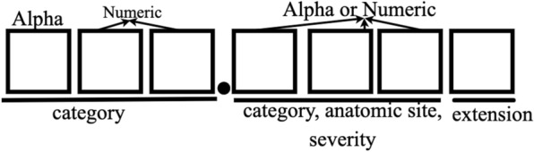
ICD-10-CM code structure. For example, S06.0X1A code means “Concussion with loss of consciousness of 30 minutes or less, initial encounter”
As shown in Table 1, ICD-10-CM codes are very different from ICD-9-CM codes with nearly 5 times as many diagnoses codes as in ICD-9-CM and it has alphanumeric categories instead of numeric ones. ICD-10-CM code sets provide more precise identification and conditions tracking by including laterality, severity, and complexity of disease conditions [16, 17]. The ICD-10-CM code specification has 21 chapters and it has a much longer index and tabular list. It uses an indented format for both the index and tabular list. Categories, subcategories, and codes are contained in the tabular list [18, 19]. ICD-10-CM codes can consist of up to 7 characters with the seventh digit extensions representing visit encounter or sequela for injuries and external causes compared to five digits in ICD-9-CM codes. Figure 1 shows the meanings of the seven characters: characters 1–3 indicate the category of diagnoses, characters 4–6 indicate etiology, anatomic site, severity, or other clinical detail, and character 7 is the extension. All ICD-10-CM codes begin with one of the alphas and they are not case sensitive. Although in the original version, alpha U was excluded, CDC released COVID-19-guidelines from April 1 2020 to September 30 2020 in which U07.1 is used to defined a positive COVID-19 test result, or a presumptive positive COVID-19 test result [20].
Table 1.
Comparison between ICD-9-CM and ICD-10-CM Diagnosis Code Sets
| ICD-9-CM | ICD-10-CM |
|---|---|
| 14,025 codes | 69,823 codes |
| 3–5 characters | 3–7 characters |
| First character is alpha or numeric | First character is alpha, second character is numeric |
| Characters 2–5 are numeric | Characters 3–7 can be alpha or numeric |
| Decimal placed after the first three characters | Decimal placed after the first three characters |
| Lacks detail and laterality | Very specific and has laterality |
Readmission label
In the NRD database, the core table only records each hospital visits (from admission to discharge). There is no readmission label associated to the visits. Therefore, we need to derive label to determine whether a visit is a readmission visit or not. For this purpose, we need to leverage NRD_DaysToEvent (a timing variable specifies a number of days from a random “start date” to the current admission) and LOS (Length of stay) two fields in each record.
Each hospital visit record in NRD is kept in de-identified format in order to comply to the HIPAA regulations. As a result, not only patient’s name is represented using NRD-VisitLink, the exact admission/discharge date are also adjusted using a specific random number for each patient. For each patient, a random “start date” is first selected. The admission time (NRD_DaysToEvent) of the patient is then calculated by using difference from the “start date” to the admission day. Starting from 2009, Centers for Medicare & Medicaid has been reporting each hospital’s 30-day risk-standardized readmission rate (RSRR) across the U.S to measure unplanned readmissions that happen within 30 days of discharge from patients’ admission, which has formed a 30-day readmission rule as a standard for hospital evaluation [21]. Thus, in our research, we use 30-day criterion for readmission labeling. For two visits ( and ), if the interval between admission and discharge is less than 30 days, then visit will be labeled as readmission [15]. One example to label patient visit is demonstrated in Table 2, in which the patient has three visits in total. The time interval between two visit is calculated as the second NRD_DaysToEvent minus the first NRD_DaysToEvent and minus the LOS. For visit 2 and visit 1, the result is , which is less than 30 days, therefore, we label the first visit as 1, indicating that this is a readmission visit. For visit 3 and visit 2, their difference is , so visit 2 is labelled as 0, meaning not a readmission. Visit 3 is also labelled as 0 because there is no more records showing the patient returning to the hospital after the third visit.
Table 2.
Example to label patient visit
| Patient Visitlink | Visit | NRD_Days ToEvent | LOS (days) | Readmission label |
|---|---|---|---|---|
| 863245 | 1 | 1034 | 3 | 1 |
| 863245 | 2 | 1053 | 2 | 0 |
| 863245 | 3 | 1097 | 4 | 0 |
By using the above labeling approach, if two consecutive visits are within the defined interval (30-days in our setting), the first visit is labeled as the readmission visit. We do not label the second visit as readmission because we want to predict the possibility of a patient returning back to the hospital after being discharged from the current visit. By doing so, we can implement the hospital readmission prediction at the time of patient discharge.
NRD data statistics
Demographics related statics
Table 3 reports the NRD patient admission statistics. The total number of readmission in NRD is 17,197,683 in which the effective admissions is 15,722,444 excluding outliers. The number of effective admissions does not equal to the number of unique patients, because each patient has a unique NRD-VisitLin (global ID) and some patients will return back to the hospitals for multiple times. Table 3 shows that about 80% of patients only have a single visit, so readmissions happen to the rest 20% of patients. In Fig. 2, we further report the readmission percentages between gender and different age groups. Combining Table 3 and Fig. 2, we can find that although female patients are the majority part of hospital visits, the readmission rates of male population exceed that of female across all the age groups, especially for age group [18, 35], where the readmission rate of male is more than twice the rate of female.
Table 3.
A summary of NRD patient admission
| Categories | Number (%) |
|---|---|
| Effective admission total | 15,722,444 |
| 30-Day readmission | 1,834,786 (11.67%) |
| Not 30-day readmission | 13,887,658 (88.33%) |
| Unique patient total | 11,691,620 |
| Patient with single visit | 9,335,277 (79.85%) |
| Patient with multiple visits | 2,356,343 (20.15%) |
| Patient visit total | 15,722,444 |
| Male patient visits | 6,630,005 (42.17%) |
| Female patient visits | 9,092,439 (57.83%) |
Fig. 2.
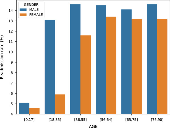
Gender readmission rate difference with respect to different age groups
The NRD databases have three main payment types, Medicare, Medicaid, and Private insurance, which cover 43.40%, 21.80%, and 28.08% of payments in the database, respectively. In Fig. 3, we report the readmission rates comparison between different payment groups. The results show that the top two highest readmission rates are from the Medicare and Medicaid patients, respectively. Figure 2 shows that the readmission rates increase for older age groups, this partially explains why Fig. 3 medicare and medicaid patients have higher readmission rates than patients from other payment groups.
Fig. 3.
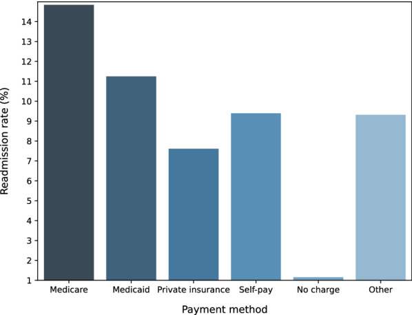
Readmission rate comparison with respect to different payment methods
Hospital related statistics
NRD hospital table includes information, such as ownership and teaching status, from about 2355 hospitals across the US. In our analysis, we categorize hospitals based on their bed size and ownership. Hospital bed size are presented as numbers 1 to 3, indicating small, medium, and large respectively (this number indicates the capacity of the hospital). Figure 4 reports the total admissions/discharges in 2016 from hospitals under different ownership. The results show that private-owned non-profit hospitals discharged much more patients than government-owned hospitals and private-own hospitals. Overall, as the hospital capacity increase (from 1 to 3), the mean admission/discharge numbers also increase. This is quite understandable because large capacity hospitals can accommodate more patient visits. In order to validate whether hospital ownership plays any significant roles in readmission, we report the readmission rates of different types of hospitals on admissions with five and more days during the visits. The results in Fig. 5 show that despite of the large difference in the total discharge, only a small variance is observed when comparing the percentage of admissions with Length of Stay (LOS) 5 days.
Fig. 4.
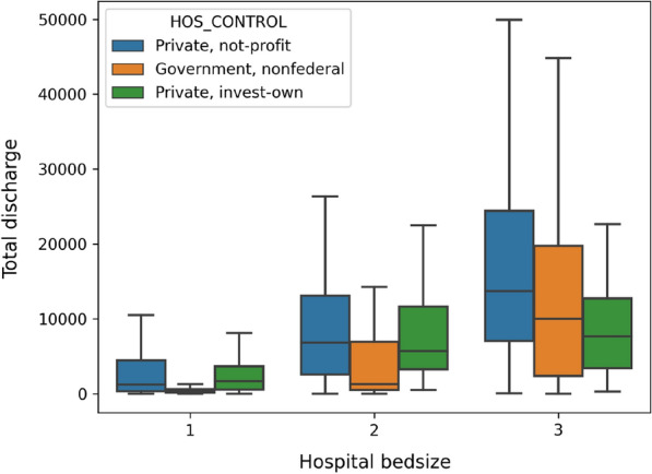
Total annual hospital discharge
Fig. 5.
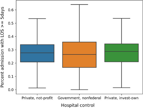
Percentage of admission with LOS 5 days
In order to understand whether hospital ownership and capacity introduce significant variance to the diagnose and procedures carried out during the patient visits, we report the average number of ICD-10-CM codes and ICD-10-PCS codes for each visit in Figs. 6 and 7, respectively. The results show that, in general, patients admitted to non-federal government-owned hospitals have less amount of averaged ICD-10-CM/PCS codes for their in-patient treatment, compared with patients admitted to private-owned not-profit hospitals and private-owned investment hospitals. Meanwhile, hospital bed size (or capacity) also play significant roles, especially in terms of the ICD-10-PCS. The results show an explicit rising trend, as the bed size increases for all kinds of hospitals. This is possibly because that large scale hospitals frequently accommodate patients with more complicated (or severe) disease conditions, and therefore more diagnoses and procedures are carried out on those patients.
Fig. 6.
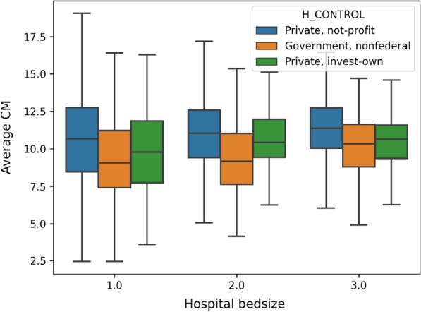
Average number of ICD-10-CM codes in each visit
Fig. 7.
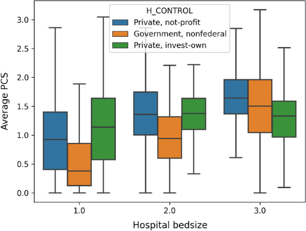
Average number of ICD-10-PCS codes in each visit
Disease related statistics
Disease and the level of severity are the two important factors associated to readmission. The disease severity table in the NRD database records the illness measurement of each patient in the core table, where each row is the description of patient’s classification according to their admission reason, risk of mortality and severity of illness. One major disease is identified for each admission. The coding is based on the APRDRG (All Patients Refined Diagnosis Related Groups) code.
In order to understand the readmission difference between different disease specific patient cohorts, we comparatively study top leading disease to death as well as the top diseases for admission. There are 320 APRDRG code in total and 38% patients are diagnosed as “Moderate loss of function”. We extracted the top 10 most frequent reasons for hospital admission based on the APRDRG code for each visit. In addition, we also report the top seven leading diseases to death according to CDC [22] to analyse the readmission rate and revisit rate. Tables 4 and 5 report the statistics of top 10 APRDRG coded diseases/reasons and top seven leading disease of death, respectively.
Table 4.
Readmission distributions for the top 10 APRDRG in NRD
| Admission reason | Readmission rate (%) | Revisit rate (%) |
|---|---|---|
| Vaginal delivery | 0.048 | 0.168 |
| Septicemia & disseminated infections | 3.983 | 9.184 |
| Neonate birthwt > 2499 g, normal newborn or neonate w other problem | 0.848 | 0.847 |
| Cesarean delivery | 0.013 | 0.062 |
| Heart disease | 8.696 | 19.500 |
| Knee joint replacement | 0.392 | 5.775 |
| Other pneumonia | 1.800 | 4.654 |
| Chronic obstructive pulmonary disease(COPD) | 6.990 | 16.684 |
| Hip joint replacement | 1.088 | 5.222 |
| Cardiac arrhythmia & conduction disorders | 3.662 | 7.868 |
Table 5.
Readmission distributions for the top seven leading diseases of death
| Leading diseases | Readmission rate (%) | Revisit rate (%) |
|---|---|---|
| Heart disease | 8.092 | 17.873 |
| Stroke | 2.448 | 3.770 |
| Pneumonia | 1.832 | 4.738 |
| COPD | 6.990 | 16.684 |
| Cancer | 6.823 | 12.275 |
| Diabetes | 8.761 | 14.372 |
| Nephritis & nephrosis | 7.019 | 10.595 |
The results from Tables 4 and 5 show that readmission rates of patients suffering from different diseases vary significantly in their readmission rates. For example, vaginal delivery and cesarean delivery are the two APRDRG coded top reasons for admissions, but these visits have very small readmission rates. For the top seven leading diseases to death, their readmission rates also vary significantly, where diabetes have the highest readmission rates (8.761%) and pneumonia has the lowest readmission rates (1.832%). Overall, readmission rates and revisit rates for leading diseases to death are much higher than the 10 most common admissions. This is due to the nature of the diseases and their complications.
In order to study the readmission rate variance with respect to socioeconomic factors, we report the readmission rates of the seven leading diseases of death with respect to the family incomes, which are coded by ZIP 1 to Zip 4 meaning low to high incomes. Readmission rates for four ZIP code areas categorized by the estimated median household income of residents in the patient’s residence for the seven leading disease are shown in Fig. 8. The results show that area gap can be observed explicitly: for every disease, readmission rates for patients from lower income families (ZIP 1 and ZIP 2) are higher than those from high-income families (ZIP 3 and ZIP 4). Table 6 summarizes factors of interest analyzed in this paper as for demographic, hospital and disease respectively.
Fig. 8.
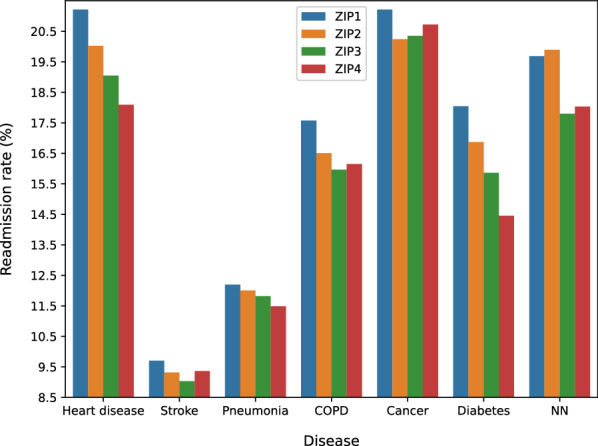
Readmission rate for leading diseases of death with respect median household incomes (ZIP 1 to 4 denotes an increasing level of incomes)
Table 6.
Factors of interest analyzed in NRD database
| Aspect | Factors of interest |
|---|---|
| Demographic | Gender; age; payment (insurance) |
| Hospital | Bed size; ownership |
| Disease | Disease type; ZIP code (household income) |
Disease specific hospital readmission prediction
Based on the nationwide hospital admission data statistics, we design five types of features, demographics features, admission and discharge features, clinical features, disease features, and hospital features, and use ensemble learning, combined with under random sampling, for disease specific readmission prediction.
Feature engineering
Table 7 lists five types of features created using feature engineering to capture patient, disease, and hospital information. In the following, we briefly describe each type of features, and explain why they were chosen for readmission prediction.
Table 7.
Features created for disease specific hospital readmission prediction
| Feature type | Feature | Description | Feature size and domain |
|---|---|---|---|
| Demographics feature | AGE | Patient’s age | |
| FEMALE | Patient’s gender (binary, ‘1’ is female) | ||
| PAY1 | Payment method | ||
| PL_NCHS | Patient’s location (based on NCHS Urban-Rural Code | ||
| ZIPINC_QRL | Estimated median house income in the patient’s zip code | ||
| RESIDENT | Patient’s location (‘1’: the patient is from same state as hospital) | ||
| Admission and discharge feature | AWEEKEND | Admission Day (‘1’: the admission day is a weekend) | |
| MONTH | Patient’s discharge month | ||
| QUARTER | Patient’s discharge quarter | ||
| DISPUNIFORM | Disposition of patients | ||
| LOS | Length of the hospital stay | ||
| ELECTIVE | Binary, ‘1’ represents elective admission | ||
| REHAB | Binary, ’1’ is rehab transfer | ||
| WEIGHT | Weight to discharges in AHA universe | ||
| CHARGES | Patient’s inpatient total charges | ||
| 1st VISIT | Binary,’1’ means the first hospital visit | ||
| Clinical feature | CCSR Code | Clinical categories | |
| Disease feature | APR−DRG | Patient admission reason | |
| RISK | The mortality risk | ||
| SEVERITY | The severity of illness | ||
| Hospital feature | BEDSIZE | Hospital bed size | |
| CONTROL | Hospital ownership | ||
| URU | Hospital urban−rural designation | ||
| AVE_CHARGE | Average charge amount per patient visit of the hospital | ||
| AVE_CM | Average number of ICD-CM per patient visit of the hospital | ||
| AVE_PCS | Average number of ICD-PCS per patient visit of the hospital | ||
| PER_LOS | Percentage admission with LOS larger than 5 days | ||
| DIS/UNI | Sample discharges/Universe discharges in NRD_STRATUM | ||
| DIS/BED | Total hospital discharges/num bed size of hospital |
Demographics features
Demographic is a combination of population demography and socioeconomic information, which includes patient gender, age, average income of the community, patient medical record and so on. A generalization of a specific geography’s population can be concluded based on a sampling of people in that geography and profoundly affect how important decisions are made. In medical institution, statistical results obtained from the patient allow for the identification of a future patient and the categorization, such analysis will enhance the development of high pertinence medical policy.
Admission and discharge features
Informative materials about patient in-hospital activities can be obtained from admission and discharge information. There are time-related message indicating the exact time of the patient admission and length of stay (LOS) for treatment, admission nature-related information such as whether the patient was hospitalized through emergency or not and so on. This kind of information offers a comprehensive view of the procedures a patient received from the healthcare providers, how patient’s condition improve, and whether the treatment is adequate and effective to prevent readmission.
Clinical features
Clinical features are used to characterize diagnoses and treatments patient received during the hospital visit. Because each patient’s medical condition varies and there are tens of thousands of subcategory disease types, medical treatments, procedures etc., finding good clinical features to represent patients is a significant challenge,
An essential challenge of using ICD-10-CM codes as clinical features to represent patients is that the total number of unique ICD-10-CM codes is very large (about 70,000), making it ineffective and computationally expensive for learning. Accordingly, we employ ICD-CCSR transformation [15] to convert ICD-CM code to CCSR code. CCSR stands for Clinical Classification Software Refined, which is used to aggregate ICD-10-CM/PCS codes into clinically meaningful categories. Figure 9 shows CCSR code structure, where the first three letters mean the body system category and the last three numbers are CCSR categories numeric sequence of individual CCSR category starting at “001” within each body system [23]. In the code assignment, each CCSR code is designed to match to at least one or multiple ICD-10-CM code categories. Table 8 shows an example of many-to-one CCSR mapping, where multiple ICD-10-CM codes, corresponding to “displaced fracture of shaft of left clavicle”, are mapped into one CCSR code [23]. The alphabetic correspondence between ICD-10-CM code and CCSR code is listed in Table 9, where the alphabetic conversion follows defined rules, and the numeric part also follows the user guide [23]. In Fig. 10a and b, we report the ICD-10-CM code distributions for Pneumonia disease and the mapped CCSR code distributions. In the figure, the y-axis shows the logarithm of the code frequency sorted in a descending order, and the index of the corresponding code is shown in the x-axis. For ICD-10-CM codes, the log scale of the code frequency still follows a negative exponential function, meaning that ICD-10-CM code frequency follows an exponential to the power of exponential decay, and a few ICD-10-CM codes have very high frequency. The converted CCSR code frequency follows an exponential decay (so the logarithm function is close to a linear line). The ICD-10-CM to CCSR conversion not only preserves similar node frequency patterns, but also reduces the clinical feature dimension in our experiments from about 70,000 to around 498 as shown in “Feature size and domain” in Clinical Feature in Table 7. As a result, the clinically meaningful categories, with respect to each disease, are provided to detail diagnoses and treatments implemented during patient in-hospital visit.
Fig. 9.
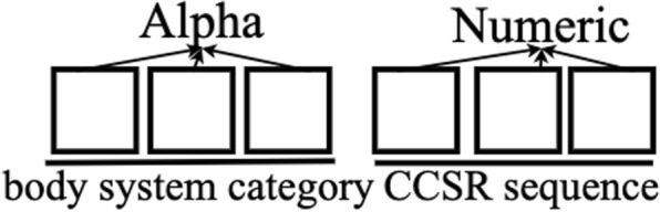
CCSR (Clinical Classification Software Refined) code structure. For example, INJ008 code indicates Traumatic brain injury (TBI); concussion, initial encounter
Table 8.
An example of ICD-10-CM to CCSR mapping
| ICD-10-CM code | ICD-10-CM code description | CCSR category | CCSR description |
|---|---|---|---|
| S42022D | Displaced fracture of shaft of left clavicle, subsequent encounter for fracture with routine healing | INJ041 | Fracture of the upper limb; subsequent encounter |
| S42022G | Displaced fracture of shaft of left clavicle, subsequent encounter for fracture with delayed healing | INJ041 | Fracture of the upper limb, subsequent encounter |
| S42022K | Displaced fracture of shaft of left clavicle, subsequent encounter for fracture with nonunion | INJ041 | Fracture of the upper limb, subsequent encounter |
| S42022P | Displaced fracture of shaft of left clavicle, subsequent encounter for fracture with malunion | INJ041 | Fracture of the upper limb, subsequent encounter |
Table 9.
Correspondence between ICD-10-CM and CCSR Categories by Body System
| ICD-10-CM | Body system description | CCSR |
|---|---|---|
| A, B | Infectious and parasitic diseases | INF |
| C | Neoplasma | NEO |
| D | Neoplasms, blood,blood-forming organs | BLD |
| E | Endocrine, nutritional, metabolic | END |
| F | Mental and behavioral disorders | MBD |
| G | Nervous system | NVS |
| H | Eye and adnexa, ear and mastoid process | EYE/EAR |
| I | Circulatory system | CIR |
| J | Respiratory system | RSP |
| K | Digestive system | DIG |
| L | Skin and subcutaneous tissue | SKN |
| M | Musculoskeletal and connective tissue | MUS |
| N | Genitourinary system | GEN |
| O | Pregnancy, childbirth and the puerperium | PRG |
| P | Certain conditions originating in the perinatal period | PNL |
| Q | Congenital malformations, deformations and chromosomal abnormalities | MAL |
| R | Symptoms, signs and abnormal clinical and lab findings | SYM |
| S/T | Injury, poisoning, certain other consequences of external causes | INJ |
| U | no codes listed, will be used for emergency code additions | |
| V, W, | External causes of morbidity (home- | EXT |
| X, Y | care will only have to code how patient was hurt; other settings will also code where injury occurred, what activity patient was doing) | |
| Z | Factors influencing health status and contact with health services (similar to current “V-codes”) | FAC |
Fig. 10.

a Distributions of ICD-10-CM code of all Pneumonia disease patient visits. The x-axis denotes the ICD-10-CM codes ranked in a descending order according to their frequency. The y-axis denotes the frequency of each code in log scale. b Distributions of CCSR codes converted from ICD-10-CM codes in a. The x-axis shows the CCSR code ranked in a descending order according to their frequency. The y-axis denotes the frequency in log-scale
Disease features
In addition to the CCSR code specified clinical features, three disease-level features are also added. The first feature is called APR−DRG, which represents the patient admission reason. Because a disease may include multiple subgroups, we select all APR-DRG codes related to one disease, and then use a numeral number to encode the feature value. Table 10 lists the APR-DRG codes selected for all six diseases in our study. For example, “Heart Disease” has six sub-groups (each has one APR-DRG code). We then use six integers, 10, 11, 12, 13, 14, 15, to encode them. By doing so, we are encoding APR-DRG codes as numerical values within similar range, allowing some learning algorithms, such as logistic regression to better leverage the code value.
Table 10.
APR-DRG codes selected for the six studied diseases
| Disease | Components | APR-DRG | Feature |
|---|---|---|---|
| Heart &/lung transplant | 2 | 10 | |
| Major cardiothoracic repair of heart anomaly | 160 | 11 | |
| Heart | Cardiac defibrillator & heart assist implant | 161 | 12 |
| Disease | Permanent cardiac pacemaker implant w AMI, heart failure or shock | 170 | 13 |
| Perm cardiac pacemaker implant w/o AMI, heart failure or shock | 171 | 14 | |
| Heart failure | 194 | 15 | |
| Nervous system malignancy | 41 | 20 | |
| Respiratory malignancy | 136 | 21 | |
| Digestive malignancy | 240 | 22 | |
| Malignancy of hepatobiliary system & pancreas | 281 | 23 | |
| Cancer | Musculoskeletal malignancy & pathol fracture d/t muscskel malig | 343 | 24 |
| Kidney & urinary tract malignancy | 461 | 25 | |
| Malignancy, male reproductive system | 500 | 26 | |
| Uterine & adnexa procedures for ovarian & adnexal malignancy | 511 | 27 | |
| Female reproductive system malignancy | 530 | 28 | |
| Intracranial hemorrhage | 44 | 44 | |
| Stroke | CVA & precerebral occlusion w infarct | 45 | 45 |
| Nonspecific CVA & precerebral occlusion w/o infarct | 46 | 46 | |
| Pneumonia | Bronchiolitis & RSV pneumonia | 138 | 138 |
| Other pneumonia | 139 | 139 | |
| Diabetes | Diabetes | 420 | 420 |
| COPD | COPD | 130 | 30 |
RISK is the second extracted disease-level feature representing the risk of patient mortality. There are five different levels (0 to 4) indicating patient’s likelihood of dying where level 4 mortality means the highest risk. The last feature is SEVERITY standing for the severity of illness and the degree of loss of function. Similar to RISK, degree zero to extreme severity is represented by number 0 to 4.
Hospital features
Hospital features are created to characterize hospital ownership, bed size (capacity), locations, and patient body admitted to the hospitals. For example, hospital bed size tells us the hospital scale, the ownership represents the control of the hospital, and the geographic locations of the hospitals specify the patient demographic. In addition to simple statistics, we also create several statistics features, such as the average charge amount and the average number of ICD-CM codes for each visit. For feature DIS/UNI, the universe discharge is the total number of inpatient discharges in the universe of American Hospital Association (AHA) excluding non-rehabilitation and Long-Term Acute Care Hospitals (LTAC) for the stratum. These features provide specific understanding of patient in-hospital treatment in order to discover the effect of different treatment provided by hospitals towards hospitalized patients’ recovery.
Prediction framework
Six disease-specific datasets are extracted (we focus on the leading diseases of death as given in Table 5), including cancer, heart disease, chronic obstructive pulmonary disease (COPD), diabetes, pneumonia, and stroke. All six datasets are imbalanced due to the nature of the readmission [15]. In the six datasets, the ratios of non-readmission visits (negative samples) to readmission visits (positive samples) all exceed 10 (with the largest value 53). This imbalanced distribution causes the machine learning model to be more biased towards majority (negative) samples, which in our case, non-readmission samples and causes poor classification of minority (positive) classes. As a result, the model will give a high false negative value, which means a patient is not considered that he will be readmitted to the hospital but actually he is. Such classification performance will not only hinder the application of machine learning models but also will not be able to detect potential illness in advance, which goes against our intent, because one of the reasons AI models are applied to healthcare is to anticipate potential risks, to prevent patients suffering from pain, to reduce the burden on patients and the burden on the healthcare system [24].
In order to tackle the class imbalance, Random Under Sampling (RUS) is applied to balance the ratio between positive and negative samples. RUS is employed to generate various versions of relatively balanced training sets, in which positive samples have a higher percentage than the original dataset. During this process, the sampling radio applied to the data is critical, and will impact on the algorithm performance. In addition, RUS changes the sample distributions, and inevitably introduces bias to the training data. In order to address the above challenges, we propose to employ three solutions as follows:
Sampling Ratios We will employ different sampling ratios to the random under sampling to balance the positive vs. negative samples, valid the algorithm performance, and choose the best sampling ratios for readmission prediction.
Ensembles We will carry out random under sampling for multiple times on the training data. The classifiers trained from each copy of the sampled data are combined to form an ensemble for prediction. This will alleviate the bias and improve the overall performance.
Soft vs. hard voting We will validate two ways to combine classifiers trained from random under sampled data, hard voting vs. soft voting. Assume denotes a trained classifier in a classifier ensemble , Eq. (1) defines the binary prediction of the classifier on a test instance x, where define the class distribution (i.e., conditional probability) of the classifier predicting instance x to class c. Hard voting predicts the final class label with the most agreed votes by summing the predictions for each class label from models, as shown in Eq. (2), where returns 1 if classifier predicts instance x to be class c, or 0 otherwise. Soft voting, defined in Eq. (3), summarizes the predicted class probabilities for each class from models and predict the classes with the largest summed probability.
| 1 |
| 2 |
| 3 |
The detailed algorithm procedures for disease-specific hospital readmission prediction are listed in Algorithm 1.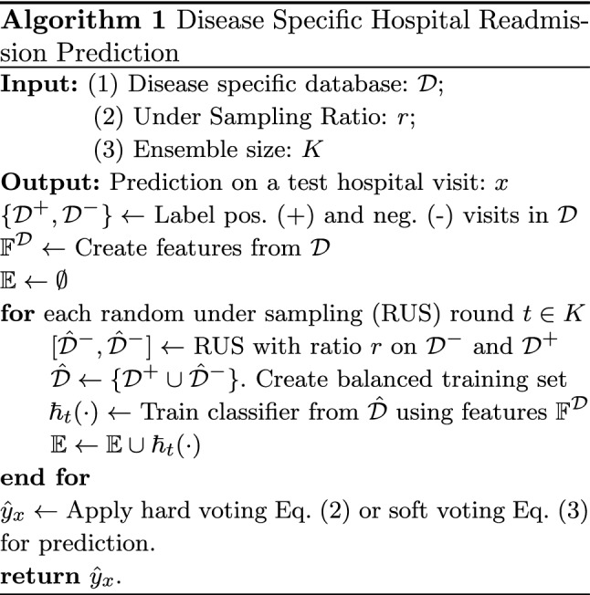
Experiments
Experimental settings
We create six disease-specific readmission datasets from NRD databases (2016 version). The datasets and their simple statistics are reported in Table 11. Using feature engineering approaches, we created 526 features for each instance (which represents a hospital visit). The list of features are summarized in in Table 7. Among all features, AGE, TOTAL CHARGES, and AVE_CHARGE are normalized to range [0, 1] by dividing each value by the maximum value in the column.
Table 11.
Total sample number and sample ratio in six disease datasets
| Datasets | Total sample number | Negative:positive sample ratio |
|---|---|---|
| COPD | 327,269 | 10.88 |
| Heart disease | 582,058 | 10.16 |
| Cancer | 171,495 | 12.3 |
| Diabetes | 183,726 | 10.4 |
| Pneumonia | 358,001 | 7.38 |
| Stroke | 273,395 | 45 |
In order to evaluate the performance between different random under sampling ratios and different voting approaches, including hard voting vs. soft voting, for disease-specific readmission prediction, we will need to repeat experiments for a large number of times. Therefore, for three large datasets (COPD, Heart Disease, and Pneumonia), we randomly sample 300,000 records from each of them, and use the sampled datasets to validate the parameter settings. For the remaining experiments, the whole datasets are used for each disease.
All experiments use 10-fold cross validation. For each fold, RUS is applied to the training data, using different sampling ratios, where the ratios between negative vs. positive classes vary from 0.5:1, 0.7:1, 0.8:1, 0.9:1, 1:1, 1.1:1, 1.2:1, 1.5:1, 2:1, 3:1, 4:1, to 5:1. Instead of using 1:1 balanced sampling, like most existing methods do, we intentionally vary the class ratios to a large range, to study how will class distributions impact on the readmission prediction results.
Four learning algorithms are used in the experiments, including Decision Tree, Random Forest with 500 trees, Logistic Regression. and Gradient Boosting.
Performance metrics and statistical test
Four performance metrics, Accuracy, Balance Accuracy, F1-score, and AUC, are used in our experiments. The purpose of using other three measures, in addition to accuracy, is to take class imbalance into consideration for validation.
We use Friedman test [25] to validate statistical difference between four models trained on the six datasets. For each measurement, the classifiers are ranked according to their performance in a descending order. The classifier with the best score is ranked as 1 and the one with the lowest is ranked as 4. Two classifiers present the same measurement performance score are ranked with the average rank.
Assume that denotes the average rank of a classifier j and is the rank of classifier j on dataset i, Eq. (4) defines the average ranking.
| 4 |
The average rankings of the algorithms are compared by the Friedman test. The Friedman statistic is defined as as shown in Eq. (5) where N means the number of datasets and k is the number of classifiers. After the calculation of the Friedamn test statistic, the value is used to calculate the p-value, and decide whether the null-hypothesis is valid, where the null-hypothesis states that all algorithms are equal, meaning there is no statistical difference between their ranking .
| 5 |
A Nemenyi post-hoc test will be performed for performance pairwise comparisons if the null-hypothesis is rejected. Critical difference (CD) is used to determine the classifiers’ average ranking difference and Eq. (6), in which is the Studentized range statistic divided by [25]. In this study, with four classifiers and 0.05, 2.569, therefore, 1.9148. The performance difference between classifiers is plotted using CD diagrams (detailed in the experiments).
| 6 |
Results
Hard voting vs. soft voting results
Figure 11 compare the performance between hard voting and soft voting, with respect to four measurements, Accuracy, F1-socre, AUC, and Balanced Accuracy, on all six disease specific datasets. For each plot, the axis and axis represent the measurement values of a classifier, trained using one sampling ratio and using soft voting vs. hard voting, respectively, on all six datasets. Because there are 12 different sampling ratios (from 0.5:1 to 5:1), four classifiers, and six disease datasets, each plot has 12 4 6=288 points. Points below the line are those performing better with soft voting and points above the line means hard voting outperforming soft voting. The head-to-head comparison plots allow us to directly compare soft voting vs. hard voting on all experimental settings and benchmark data. The Accuracy comparisons in Fig. 11a show that the number of data points above and below the line are 167 and 121, respectively, meaning hard voting achieves better performance than soft voting, but majority of achievements are from using Decision Tree classifier. There is no obvious performance difference between soft voting vs. hard voting with respect to other three classifiers, Gradient Boosting classifier, Logistic Regression, and Random Forest classifier, in terms of accuracy. Ensemble models are know to benefit from unstable base classifiers, such as decision trees. Since decision trees are much more unstable than other three classifiers, the results in Fig. 11a confirm that using decision trees combined with hard voting can boost the classification accuracy.
Fig. 11.

Hard voting vs. soft voting performance on all six disease-specific datasets and 12 sampling ratios. Points are color coded by different classifiers, and shape coded by different datasets. Points above diagonal lines denote hard voting outperforming soft voting, and vice versa
The AUC value comparisons in Fig. 11c show that majority points (217 points) are below the line, and additional 68 points are right located on the line (points on the line mean that soft voting and hard voting deliver the same prediction performance). There are only three points that hard voting outperforms soft voting in terms of AUC values. In addition, the point color in Fig. 11c also show that decision trees using soft voting and hard voting have similar performance, whereas there is a significant AUC performance gain using soft voting for gradient boosting, logistic regression, and random forest. AUC is calculated by using posterior probability values of the ensemble classifier on a given test instance. Hard voting uses 0/1 frequency count to calculates final posterior probability of the ensemble, whereas soft voting uses average of the base classifier’s posterior probability as the ensemble classifier’s posterior probability. This observation shows that for 0/1 loss based measures, such as accuracy, hard voting may outperform soft voting, whereas for continuously loss based measures, soft voting frequently outperforms hard voting.
For F1-score and balance accuracy in Fig. 11b and d, the performance of soft voting and hard voting do not differ significantly. For F1-score, there are 137 points below the line, 14 less than that above the line. For balanced accuracy, 173 points are below the line, 58 points more than points above the line. Because soft voting shows better performance majority of times, and for imbalanced datasets, AUC and balanced accuracy are more objective measures, we choose soft voting in all remaining experiments.
Imbalanced learning results
Figure 12 reports the performance of all four classifiers on six disease specific datasets, using soft voting and different sampling ratios. Each plot in Fig. 12 reports performance measure (-axis) of four classifiers on six datasets (so there are 4 × 6 = 24 curves in each plot), by using different sampling ratios (-axis).
Fig. 12.

Performance comparisons using soft voting and different sampling ratios. Points are color coded by different datasets, and shape coded by different classifiers. Each curve denote one classifier’s performance on a specific dataset, using different sampling ratios
In the accuracy measure plot in Fig. 12a, the larger the sampling ratio, the higher the classification accuracy each classifier achieves. This partially demonstrates the class imbalance challenge. Because sampling ratio denotes the ratio between negative vs. positive samples, the larger the sampling ratio (e.g. 5:1), the more negative samples the training set has (the ratio in the original datasets are all more than 10:1, as show in Table 5). Figure 12a shows that as negative samples gradually dominate training set, the trained classifier intends to classify more samples to be negative, in order to achieve a higher accuracy. The higher accuracy, however, does not assure useful classification results, as shown in F1-score, AUC, and balance accuracy, where all three plots show a downward/decreasing trend, after sampling ratios pass certain ratio values.
Because plots in Fig. 12 are color coded by different datasets, and shape coded by different classifiers, this helps understand the performance trend of each classifiers. Overall, decision trees have the worst performance in terms of all four measures. Random forest, Logistic regression and Gradient boosting are comparable with relatively small value variance, and gradient boosting shows relative better performance among the three classifiers. When comparing results of all six disease types, Diabetes (red-colored) receive best prediction results in terms of all four performance measures. While diabetes also have the highest readmission rates among all six disease types (meaning less severe class imbalance), stroke (green-colored) has the second lowest readmission rate (Pneumonia has the lowest readmission rate). The AUC and balanced accuracy in Fig. 12c and d show that they both receive the best and second best prediction results. This observation indicates that the prediction results are not directly tied to the class imbalance rate. Our sampling and ensemble learning framework is effective to tackle the class imbalance. Meanwhile, the readmission prediction performance of each disease critically depends on the nature and characteristics of the diseases.
Overall, the aforementioned observations for the four measures lead to the conclusion that sampling ratio 1.1:1 presents the best performance of all classifiers on the six disease datasets. Therefore, we use 1.1:1 sampling ratio in the remaining experiments.
Readmission prediction results and statistical analysis
Table 12 reports the hospital readmission prediction results using all samples in Table 11, including four classifiers’ average performances on the six disease specific datasets. The bold-text denotes the best result for each measure-disease combination. Overall, the results show that gradient boosting achieves the best performance.
Table 12.
Readmission prediction performance comparisons using all samples (using soft voting and 1.1:1 sampling ratio)
| Measure | Disease | Decision tree | Random forest | Logistic regression | Gradient boosting |
|---|---|---|---|---|---|
| Accuracy | COPD | 0.4659 | 0.7301 | 0.7317 | 0.7300 |
| Cancer | 0.5260 | 0.7509 | 0.7670 | 0.7536 | |
| Diabetes | 0.6898 | 0.8163 | 0.8249 | 0.8070 | |
| Heart Disease | 0.4631 | 0.6983 | 0.7194 | 0.7025 | |
| Pneumonia | 0.5705 | 0.6964 | 0.7262 | 0.7192 | |
| Stroke | 0.6261 | 0.8318 | 0.8244 | 0.8263 | |
| F1 score | COPD | 0.1791 | 0.2414 | 0.2376 | 0.2415 |
| Cancer | 0.1866 | 0.2700 | 0.2841 | 0.2814 | |
| Diabetes | 0.3173 | 0.4201 | 0.4119 | 0.4152 | |
| Heart Disease | 0.1889 | 0.2350 | 0.2209 | 0.2370 | |
| Pneumonia | 0.2941 | 0.3607 | 0.3585 | 0.3648 | |
| Stroke | 0.0828 | 0.1574 | 0.1482 | 0.1558 | |
| AUC | COPD | 0.5957 | 0.6767 | 0.6604 | 0.6793 |
| Cancer | 0.6568 | 0.7527 | 0.7596 | 0.7692 | |
| Diabetes | 0.8113 | 0.8753 | 0.8543 | 0.8758 | |
| Heart Disease | 0.5958 | 0.6732 | 0.6406 | 0.6768 | |
| Pneumonia | 0.6919 | 0.7678 | 0.7542 | 0.7645 | |
| Stroke | 0.7594 | 0.8597 | 0.8484 | 0.8667 | |
| Balanced Accuracy | COPD | 0.5687 | 0.6303 | 0.6250 | 0.6304 |
| Cancer | 0.6176 | 0.6882 | 0.6979 | 0.7030 | |
| Diabetes | 0.7500 | 0.7906 | 0.7682 | 0.7956 | |
| Heart Disease | 0.5691 | 0.6168 | 0.5954 | 0.6184 | |
| Pneumonia | 0.6481 | 0.7057 | 0.6894 | 0.7003 | |
| Stroke | 0.7023 | 0.7808 | 0.7672 | 0.7852 |
Bold-text denotes best performance on each measure-disease combination (i.e. each row)
In order to fully understand the four classifiers’ performance, we carry out Friedman test for each measure, and report the critical difference diagram plots in Fig. 13. For all measures, we use , the and p values corresponding to each measure are reported as (, p) value pair underneath each plot. For ease of comparisons, in each plot, a horizontal bar is used to group classifiers that are not significantly different, meaning that their average ranks do not differ by CD).
Fig. 13.

Critical difference diagram of classifiers on the six disease specific hospital readmission prediction tasks (Based on results from Table 12). All plots use . The two numerical numbers inside the parentheses denote the and p values for each plot, i.e., (, p). Classifiers not significantly different, (i.e. their average ranks do not differ by CD), are grouped together with a horizontal bar
Figure 13 shows that for all four measures, the largest p value is 0.0129 (which corresponds to the F1-score). Because all p values are less than 0.05, the null-hypothesis (which states that all algorithms are equal and there is no statistical difference between their ranking) is rejected. This concludes that there is a statistical difference between different methods in terms of their performance ranking. Meanwhile, the value shows the spread of the classifier performance. The higher the value, the larger the variance of all classifiers (with respect to the current measure) is. For AUC and balanced accuracy (which are the two measures most frequently used to assess classifier performance under class imbalance), the gradient boosting outperforms, random forest and logistic regression, with random forest outperforming logistic regression, in terms of their mean rankings. Also, although these three classifiers have different mean rankings, their performance are not statistically different. In summary, the critical difference diagrams in Fig. 13 concludes that gradient boosting achieves the best average ranking among all models, whereas decision tree has the lowest ranking.
Conclusion
This paper carries out systematic studies to understand data statistics for United States nationwide hospital admission, and further designs a machine learning framework for disease-specific 30-day hospital readmission prediction. We argued that although many methods exist for hospital readmission prediction, answers to some key questions, such as demographic, disease, and hospital characteristics with respect to admissions, still remain open. Accordingly, we employed national readmission databases (NRD), with over 15 million hospital visits, to carry out data statistics analysis. We identified factors related to three key party of the hospital remissions: patient, disease, and hospitals, and reported national scale hospital admission statistic. Based on the data statistics, we created 526 features with five major types, including demographics features, admission and discharge features, clinical features, disease features, and hospital features. We collected six disease specific readmission datasets, which reflect the top six leading diseases of death.
By using random under sampling and ensemble learning, combined with soft vs. hard voting and four types of machine learning methods, including gradient boosting, decision tree, logistic regress, and random forests, our experiments validate three major type of settings: (1) hard voting vs. soft voting, (2) random under sampling, and (3) disease specific readmission prediction. Experiments and statistical test results show that soft voting outperforms hard voting on majority results, especially for AUC and balanced accuracy which are the main measures for imbalanced data. Random under sampling using 1.1:1 for negative:positive ratio achieves the best performance for AUC, balanced accuracy, and F1-score. Gradient boosting achieves the best performance for disease specific hospital readmission prediction, and decision trees have the worst performance.
Acknowledgements
This work was supported by the U.S. National Science Foundation under Grant Nos. IIS-1763452 and IIS-2027339.
Footnotes
Publisher's Note
Springer Nature remains neutral with regard to jurisdictional claims in published maps and institutional affiliations.
Contributor Information
Shuwen Wang, Email: swang2020@fau.edu.
Xingquan Zhu, Email: xzhu3@fau.edu.
References
- 1.Wang S, Zhu X. Predictive modeling of hospital readmission: challenges and solutions. IEEE/ACM Trans Comput Biol Bioinform. 2021 doi: 10.1109/TCBB.2021.3089682. [DOI] [PubMed] [Google Scholar]
- 2.Hines AL, Barrett ML, Jiang HJ, Steiner CA. Conditions with the largest number of adult hospital readmissions by payer, 2011: statistical brief# 172. Healthcare Cost and Utilization Project (HCUP) Statistical Briefs; 2014. [PubMed]
- 3.Berwick D, Hackbarth A. Eliminating waste in US health care. JAMA. 2012;307(14):1513–1516. doi: 10.1001/jama.2012.362. [DOI] [PubMed] [Google Scholar]
- 4.Centers for Medicare & Medicaid Services, Hospital readmissions reduction program (hrrp). [DOI] [PMC free article] [PubMed]
- 5.Zuckerman R, Sheingold S, Orav E, Ruhter J, Epstein A. Readmissions, observation, and the hospital readmissions reduction program. N Engl J Med. 2016;374(16):1543–1551. doi: 10.1056/NEJMsa1513024. [DOI] [PubMed] [Google Scholar]
- 6.Mahmoudi E, Kamdar N, Kim N, Gonzales G, Singh K, Waljee A. Use of electronic medical records in development and validation of risk prediction models of hospital readmission: systematic review. BMJ. 2020;369:m958. doi: 10.1136/bmj.m958. [DOI] [PMC free article] [PubMed] [Google Scholar]
- 7.Yang C, Delcher C, Shenkman E, Ranka S. Predicting 30-day all-cause readmissions from hospital inpatient discharge data. 2016 IEEE 18th International Conference on e-Health Networking, Applications and Services (Healthcom), pp. 1–6, 2016.
- 8.He D, Mathews S, Kalloo A, Hutfless S. Mining high dimensional claims data to predict early hospital readmissions. J Am Med Inf Assoc JAMIA. 2013;21:272–279. doi: 10.1136/amiajnl-2013-002151. [DOI] [PMC free article] [PubMed] [Google Scholar]
- 9.Min X, Yu B, Wang F. Predictive modeling of the hospital readmission risk from patients’ claims data using machine learning: a case study on copd. Sci Rep. 2019;9:2362. doi: 10.1038/s41598-019-39071-y. [DOI] [PMC free article] [PubMed] [Google Scholar]
- 10.Caruana R, Lou Y, Gehrke J, Koch P, Sturm M, Elhadad N. Intelligible models for healthcare: Predicting pneumonia risk and hospital 30-day readmission. Proceedings of the 21th ACM SIGKDD international conference on knowledge discovery and data mining, pp. 1721–1730, 2015.
- 11.Roy BS, Teredesai A, Zolfaghar K, Liu R, Hazel D, Newman S, Marinez A. Dynamic hierarchical classification for patient risk-of-readmission. ACM Knowledge Discovery and Data Mining, pp. 1691–1700, 2015.
- 12.Cruz P, Soares B, da Silva J, et al. Clinical and nutritional predictors of hospital readmission within 30 days. Eur J Clin Nutr. 2021;76(2):244–250. doi: 10.1038/s41430-021-00937-y. [DOI] [PubMed] [Google Scholar]
- 13.Centers for Disease Control and Prevention, “Health insurance portability and accountability act of 1996 (hipaa)” .
- 14.Agency for Healthcare Research and Quality, “Overview of the nationwide readmissions database (nrd)” .
- 15.Wang S, Elkin ME, Zhu X. Imbalanced learning for hospital readmission prediction using national readmission database. In 2020 IEEE International Conference on Knowledge Graph (ICKG), pp. 116–122, 2020.
- 16.Centers for Disease Control and Prevention, “International classification of diseases (icd-10-cm/pcs) transition—background” .
- 17.Health Network Solutions, “Understanding the icd-10 code structure” .
- 18.Barta A, McNeill GC, Meli PL, Wall KE, Zeisset AM. ICD-10-cm primer. J AHIMA. 2008;79(5):64–66. [PubMed] [Google Scholar]
- 19.Centers for Medicare and Medicaid Services, “ICD-10-cm official guidelines for coding and reporting” . [PubMed]
- 20.Centers for Disease Control and Prevention, “ICD-10-cm official coding and reporting guidelines” .
- 21.Krumholz HM, Merrill AR, Schone EM, Schreiner GC, Chen J, Bradley EH, Wang Y, Wang Y, Lin Z, Straube BM, et al. Patterns of hospital performance in acute myocardial infarction and heart failure 30-day mortality and readmission. Circulation. 2009;2(5):407–413. doi: 10.1161/CIRCOUTCOMES.109.883256. [DOI] [PubMed] [Google Scholar]
- 22.Centers for Disease Control and Prevention, “Leading causes of death” .
- 23.Agency for Healthcare Research and Quality Healthcare Cost and Utilization Project (HCUP), “User guide:clinical classifications software refined (CCSR) version 2019.1”.
- 24.Borofsky S, George AK, Gaur S, Bernardo M, Greer MD, Mertan FV, Taffel M, Moreno V, Merino MJ, Wood BJ, et al. What are we missing? False-negative cancers at multiparametric MR imaging of the prostate. Radiology. 2018;286(1):186. doi: 10.1148/radiol.2017152877. [DOI] [PMC free article] [PubMed] [Google Scholar]
- 25.Demsar J. Statistical comparisons of classifiers over multiple data sets. J Mach Learn Res. 2006;7:1–30. [Google Scholar]