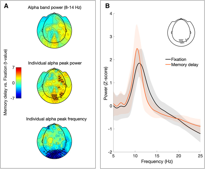
Figure 2.
Sensor level analysis. A, Topographic plots depicting the t values from the condition comparison (memory delay vs fixation) in α band power (top), individual α peak power (middle), and individual α peak frequency (bottom). Significant differences (p < 0.05 after FDR correction) are marked with asterisks. B, Mean power spectrum for fixation (black graph) and memory delay (orange) of sensors showing significant changes in individual α peak power and frequency (shaded area depicts SD across subjects; sensors included in spectra indicated in inset).

