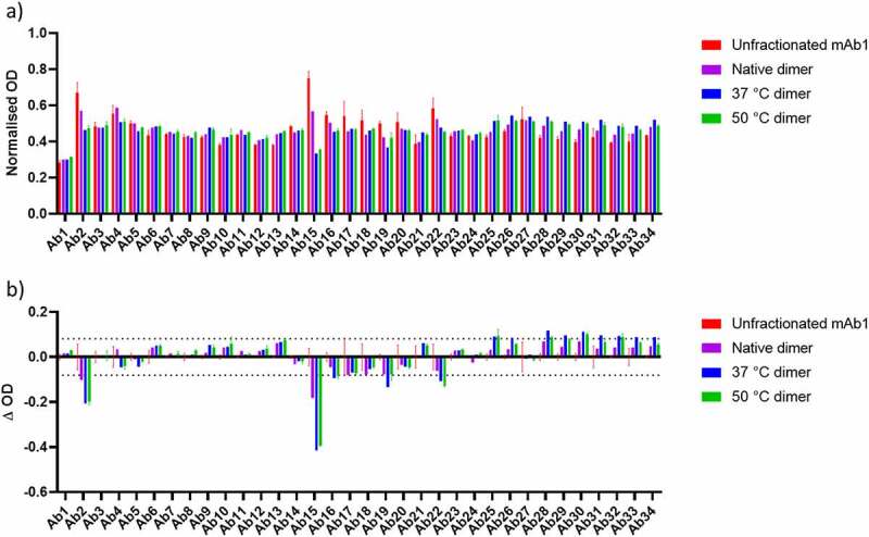
Figure 4.

a) Normalized PCA ELISA signal for Unfractionated mAb1, native dimer, 37°C dimer and 50°C dimer. Higher signals demonstrate stronger binding to the ELISA plate. b) Difference plot of the data shown in A), for native dimer, 37°C dimer and 50°C dimer with unfractionated mAb1 subtracted. An increase in signal represents an increase in exposure of a given region, whereas a decrease in signal represents burying of a given region, relative to unfractionated mAb1. Dashed lines correspond to largest standard deviation for unfractionated mAb1 which were used as a threshold for defining the significance of a change.
