

Abstract
Purpose
This study proposes to identify potential liver patients based on the results of a liver function test performed during a health screening to search for signs of liver disease. It is critical to detect a liver patient at an early stage in order to treat them effectively. A liver function test's level of specific enzymes and proteins in the blood is evaluated to determine if a patient has liver disease.
Methods
According to a review of the literature, general practitioners (GPs) rarely investigate any anomalies in liver function tests to the level indicated by national standards. The authors have used data pre-processing in this work. The collection has 30691 records with 11 attributes. The classification model is utilized to construct an effective prediction system to aid general practitioners in identifying a liver patient using data mining.
Results
The collected results indicate that both the Naïve Bayes and C4.5 Decision Tree models give accurate predictions. However, given the C4.5 model offers more accurate predictions than the Naïve Bayes model, it can be assumed that the C4.5 model is superior for this research. Consequently, the liver patient prediction system will be developed using the rules given by the C4.5 Decision Tree model in order to predict the patient class. The training set, suggested data mining with a classification model achieved 99.36% accuracy and on the testing set, 98.40% accuracy. On the training set, the enhanced accuracy relative to the current system was 29.5, while on the test set, it was 28.73. In compared to state-of-the-art models, the proposed approach yields satisfactory outcomes.
Conclusion
The proposed technique offers a variety of data visualization and user interface options, and this type of platform can be used as an early diagnosis tool for liver-related disorders in the healthcare sector. This study suggests a machine learning-based technique for predicting liver disease. The framework includes a user interface via which healthcare providers can enter patient information.
Keywords: Liver disease, Data mining, Classification model, Healthcare
Introduction
Around 2 million people die per year worldwide from liver disease, with the total number of fatalities highest in South Asia and East Asia & Pacific [1]. According to the latest World Health Organization data published in 2018, liver disease mortality in Malaysia hit 2480, accounting for 1.76% of all deaths. Malaysia is ranked 125th in the world in terms of liver disease deaths. Therefore, proper analysis of data obtained from routine blood tests which includes liver function tests should be conducted. According to The Centres for Disease Control and Prevention (2021), some individuals hospitalized with Covid-19 were classified as liver patients based on the components in their blood. Recent research [2] found that general practitioners (GPs) rarely investigate any irregularities in the liver function test to the extent recommended by national standards. According to a study [3] some GPs are not confident in interpreting results of the liver function tests despite dealing with it on a regular basis. The ability of GPs to identify those patients with liver disease will benefit the medical sector, enabling them to assist in actual liver patient treatments by avoiding referring non-liver patients to a hepatologist, thus freeing more time for this specialist to treat liver patients.
This work aims to develop a working system that allows general practitioners to identify a liver patient. The Liver Disease Patient Dataset from Kaggle containing 30,691 records is evaluated to predict the possibility of a liver patient. This work focuses on constructing the classification model to identify liver patients. One of the most significant techniques in data mining is classification algorithms, which are used to build classification models from a dataset [24, 25]. The Naïve Bayes algorithm and the Decision Tree algorithm is used to evaluate the model's performance. The major contributions of the proposed work are given below.
To discover hidden knowledge and patterns from the liver disease patient dataset: Investigating current data is important as the knowledge and patterns discovered act as a base for this project. The data used to train the model has to be clean with no noise in order to express the result with a higher accuracy. This objective is fulfilled using the Liver Disease Patient Dataset that is obtained from Kaggle.
To build a classification model for predicting the possibility of liver patients: A classification model is developed using the RStudio software to determine the target class, with the possibilities set to ‘Liver Patient' and ‘Non-Liver Patient’. Classification algorithms, which are used to construct classification models from a dataset are one of the most important approaches in data mining. To evaluate the model's performance, the Naïve Bayes algorithm and the Decision Tree algorithm will be implemented.
To develop an effective prediction system to identify liver patients: A working prototype is developed using programming languages such as PHP, JavaScript and HTML to aid general practitioners in identifying a liver patient and if they should be referred to a hepatologist.
To perform suitable testing to ensure the effectiveness of the proposed system: Suitable testing to ensure the effectiveness of the proposed system is important in order to ensure that the system fits its required specifications and functions. This final phase aid in identifying the defects in the system. The system can be regarded to be performing efficiently if the testing works true to form.
The rest of the sections of the paper are organized as follows. Section 2 presents the literature survey of liver diseases, Sect. 3 includes the details of the proposed methodology, Sect. 4 includes a description of the dataset, Results, and discussions in Sect. 5 and finally, conclusion is included in Sect. 6.
Literature survey
Study on data mining in the healthcare industry
In healthcare informatics, major breakthroughs in information technology have resulted in an excessive increase of data. Employing data mining techniques to extract unknown and valuable knowledge from massive amounts of data is a significant approach. Healthcare data mining has a lot of potential for uncovering hidden patterns in the medical domain. Data mining is associated to Artificial Intelligence, Machine Learning and Big Data technologies, all of which comprise analysing, interpreting and storing enormous amounts of data.
Data mining approaches have been utilized to investigate and uncover patterns and relationships in healthcare data since the mid-1990s. Data mining was a major topic among healthcare researchers in the 1990s and early 2000s, as it showed potential in the application of predictive algorithms to help simulate the healthcare system and enhance the delivery of healthcare services [4].
To analyse data and discover useful information, data mining employs a variety of techniques such as classification, clustering, and rule mining. Forecasting future outcomes of diseases based on previous data collected from similar diseases and disease diagnosis based on patient data are two of the most prominent current implementations of data mining in the healthcare sector [5].
Benefits of data mining in healthcare
The healthcare industry benefits from health data research by boosting the efficiency of patient management operations. As the volume of data is so large, it should be used as an advantage to deliver the right treatments and to provide patients with personalized care [6]. The result of data mining technologies is that they aid healthcare organizations by enabling them to classify individuals with similar illnesses or health conditions so that they can receive appropriate treatment. Having availability to vast amounts of historical data allows healthcare organizations to aid clinicians in diagnosing complex cases. According to USF Health, data mining can be employed in the healthcare industry to reduce costs by improving efficiencies, enhancing patient quality of life, and most importantly, save lives.
Challenges of data mining in healthcare
The challenges with the reliability of healthcare data and the constraints of predictive modelling are causing data mining efforts to fail. As Big Data has gained interest in recent years, involvement in the implementation of data mining techniques and methods to analyze healthcare data has emerged [28–31]. According to research [4], data mining in healthcare are facing limitations such as medical data reliability, data sharing across healthcare organizations, and improper modelling leading to untrue predictions.
Data mining approaches have already been proved to be effective in eliciting previously untapped relevant insights from huge medical datasets. This section highlights previous research that employs classification analysis for a variety of objectives in the healthcare field. In the medical sector, classification tasks have been performed for a variety of motives.
Research [7] was conducted to see how accurately data mining algorithms estimate the possibility of disease recurrence among patients based on specified parameters. The study examines the effectiveness of several clustering and classification algorithms, and it is revealed that classification algorithms outperform clustering methods in predicting outcomes. The decision tree and SVM are the best predictors on the holdout sample, with an accuracy of 81%, whereas fuzzy c-means have the lowest accuracy of 37% among the algorithms employed in this study.
The major goal of data mining approaches for disease diagnosis is to achieve the best results in terms of prediction efficiency and accuracy. A study [8] has been conducted to evaluate the accuracy of different data mining algorithms for various diseases from multiple research studies. For heart disease prediction, Decision Tree and Genetic Algorithm Feature Reduction has the best accuracy of 99.2% among various data mining algorithms. Although KNN algorithm is simple to use, it has provided a low accuracy of 61.39%, which makes prediction difficult. For breast cancer diseases, the study found that Neural Network has the highest accuracy of 98.09%. For lung cancer, The Enhanced KNN algorithm has the best accuracy of 97%, while J4.8 has the highest accuracy of 99.87% for diabetes mellitus diagnosis when utilizing the Weka tool. Artificial neural network (ANN) has the highest accuracy for skin diseases, at 97.17%.
Based on a study paper [9], a machine learning model was built to predict fatty liver disease (FLD). Classification techniques such as Random Forest, Naïve Bayes, ANN, and logistic regression were used for prediction. Random Forest has the best accuracy of 87.48%, followed by Naïve Bayes with 82.65%.
Recent study [10] aims to find relevant traits and data mining approaches that can help forecast cardiovascular disease more accurately. Prediction models were built using various combinations of features and seven classification techniques, which are the KNN, Decision Tree, Naïve Bayes, Logistic Regression, SVM, Neural Network, and Vote (a hybrid technique with Naïve Bayes and Logistic Regression). The heart disease prediction model was constructed employing major features and the best-performing data mining technique, Vote, with an accuracy of 87.4%, according to the findings of the research.
According to research [11], current technological breakthroughs were used to construct prediction models for breast cancer survival. The prediction models were developed using three common data mining algorithms which are Naïve Bayes, RBF Network, and J48. These classification techniques were chosen by the authors because they are frequently used in research and have the ability to deliver valuable outcomes. Furthermore, these techniques can generate classification models in a variety of ways, increasing the likelihoods of obtaining a prediction model with high classification accuracy. In the pre-processing stage, the instances with missing values were omitted from the dataset in order to create a fresh dataset. The WEKA version 3.6.9 tool was used in this study to evaluate the performance of data mining techniques deployed to a medical dataset. The measurements of model performance are discussed which serve as the foundation for comparing the efficiency and accuracy of different methodologies. The Naïve Bayes model was shown to be the most accurate predictor on the holdout sample, with 97.36% accuracy, followed by RBF Network with 96.77% accuracy and J48 with 93.41% accuracy.
A study [12] focuses on a clinical decision support system that uses classification approaches to forecast disease. For a supervised classification model, the system employs Decision Tree and KNN. Ultimately, the proposed system analyses and compares the accuracy of C4.5 and KNN, finding that the C4.5 Decision Tree has a greater accuracy of 90.43% than the KNN, which has an accuracy of 76.96% based on the research.
Methodology
Naïve bayes
Naïve Bayes is a probabilistic machine learning method based on the Bayes Theorem that is used to classify a wide range of data [13]. The term ‘naïve’ is adopted since it assumes that the model's features are independent of one another. A Naïve Bayes classifier, in simplistic words, contends that the availability of one feature in a class has no bearing on the presence of any other feature. The Naïve Bayes algorithm is simple to construct and is especially useful for huge data sets. Due to its simplicity, Naïve Bayes is proven to outperform even the most sophisticated classification frameworks.
The Bayes Theorem is a basic formula for calculating conditional probabilities. A computation of the probability of an event arising given the occurrence of another event is known as conditional probability [14]. The Bayes Theorem enables the calculation of posterior probability P(A|B) from P(A), P(B), and P(B|A). A mathematical equation for Bayes theorem is shown in Fig. 1.
Fig. 1.

Bayes Theorem equation
Based on the Bayes Theorem equation above, P(A|B) is the posterior probability of class (target) given predictor (attribute) that represents the degree to which it is believed that the model accurately describes the situation from the available data. P(A) is the prior probability of class that describes the degree to which it is believed that the model accurately describes reality based on prior information. P(B|A) is the likelihood that is the probability of the predictor given class to describe how well the model predicts the data. P(B) is the prior probability of predictor and is also known as the normalizing constant that makes the posterior density integrate to one.
The core Naïve Bayes assumption is that each feature contributes equally and independently to the prediction.
Decision tree
Decision tree is one of the simplest and widely used data mining algorithm for developing classification systems based on multiple variables or establishing prediction models [26]. The purpose of employing a decision tree is to create a training model that applies basic decision rules generated from historical data to forecast the class of a target variable [15]. A decision tree can easily be converted into a set of rules by tracing from the root node to the leaf nodes one by one.
A decision tree is a structure of nodes that includes a root, branches, and leaf nodes, Fig. 2. Each internal node indicates an attribute analysis, each division symbolises the outcome of an evaluation, and each leaf node represents a class label. The root node is the tree's most important node. A population is divided into branch-like segments that form an inverted tree, which is then sorted down from the root to a leaf node, with the leaf node indicating the classification of the record. Each node in the tree represents a test case for some parameter, with each branch descending from the node corresponding to the test case's possible solutions. This algorithm can handle huge, complex datasets without imposing a complex parametric framework. Decision trees have a wide spectrum of implementation due to their simplicity of analysis and precision across many data types [16].
Fig. 2.
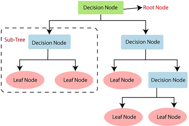
Decision Tree Structure
In order to build a classification model, there are two main measures to perform, see Fig. 3. The first step is training. This is where various algorithms are utilized to develop a classifier by allowing the model to learn from the available training data. The model must be trained in order to accurately anticipate outcomes. The types of classification algorithms to use may include Logistic Regression, Naïve Bayes, Decision Tree, Random Forest, Support Vector Machine, Stochastic Gradient Descent or K-Nearest Neighbours [17]. The next step is testing. This is where the model is employed to predict class labels by testing it on test data, which evaluates the classification rules' reliability.
Fig. 3.

Construction of Classification Model
The Fig. 4 shows five subsystems of the liver patient prediction project. The five subsystems represent the data preparation, data interpretation, data modelling, knowledge implementation and knowledge presentation.
Fig. 4.

Functional Decomposition Diagram of proposed system
A rich picture is the representation of a subject that depicts the key aspects and interactions that must be addressed while representing a particular situation, see Fig. 5. To generate a rich picture, any strategy can be employed, and it can be used in any context, irrespective of the problem's complexity or initial level of comprehension. It is made up of images, text, symbols, and icons that are all utilised to graphically depict the situation. It is termed a rich image because it depicts the intricacy and depth of a subject. It can be used at the start of collaborative planning to gain a better understanding of the system, or throughout the process to measure the performance and track changes [18].
Fig. 5.

Rich Picture Diagram of proposed system
Based on the rich picture diagram, the data requires preparation, interpretation and modelling in order to develop the classification model. The classification model is used to perform analysis from the details that are obtained based on user input and the knowledge is implemented to the web interface. The user is able to register or login to the system, view website information, enter patient details and view the prediction result that is displayed. The database is used to validate the user and store records from the prediction system.
The prediction system to classify possible liver patients is developed using programming languages such as PHP, JavaScript and HTML, Figs. 6, 7, 8, and 9. From the results obtained, it is derived that both Naïve Bayes and C4.5 Decision Tree models produce high accuracy in predictions. However, since the C4.5 model has predicted more accurately than the Naïve Bayes model, it can be implied that it is better between the both models for this project. Hence, the liver patient prediction system will be built based on the rules generated from the C4.5 Decision Tree model to forecast the class of patients.
Fig. 6.

Homepage
Fig. 7.

Liver Function Test Page
Fig. 8.

Check Prediction Page (1)
Fig. 9.

Check Prediction Page (2)
At the homepage of the Liver Patient Prediction System, users can read about the importance of the liver, see Fig. 6. In the menu bar, the user can select the ‘Liver Function Test’ link or ‘Check Prediction’ link to be navigated to the respective pages. Users can click the ‘Logout’ icon on the top right corner of the page to exit the system.
At the liver function test page, users can read about the liver function test criteria that will be required by the prediction system in order to display the prediction results, see Fig. 7. The user can click on the ‘Home’ link or ‘Check Prediction’ link in the menu bar to be navigated to the respective pages. Users can click the ‘Logout’ icon on the top right corner of the page to exit the system.
At the check prediction page, users will be able check if patients are possible liver patients, see Figs. 8 and 9. From the liver function test results, the user will need to key in the patient’s name, IC number, email address, contact number, age, gender, total bilirubin, direct bilirubin, ALP, ALT, AST, total protein, albumin and the A/G ratio. Then, the user is required to click on the ‘Add Record’ button and the prediction result will be displayed by the system. If any of the input fields are empty, an alert message will be displayed to the user. If a record with a particular IC number already exists, the user has to delete the previous record before adding a new record to prevent redundant records of the same patient. The user can also click on the ‘Reset’ button to reset the page before entering another patient’s detail. The user can click on the ‘Home’ link or ‘Liver Function Test’ link in the menu bar to be navigated to the respective pages. Users can click the ‘Logout’ icon on the top right corner of the page to exit the system.
Dataset description
There are 30,691 records with 11 attributes in the dataset. The following shows the attributes of the dataset, along with its description and the variable names that will be assigned to each attribute respectively. A detailed information of the features of the dataset is shown in Table 1.
Table 1.
Attributes of Liver Disease Patient Dataset
| No. | Attribute Name | Attribute Description | Variable Name |
|---|---|---|---|
| 1. | Age of the patient | The patient’s age in years | age |
| 2. | Gender of the patient |
The patient’s gender: -Male -Female |
gender |
| 3. | Total Bilirubin | The patient’s total bilirubin test result | total Bilirubin |
| 4. | Direct Bilirubin | The patient’s direct bilirubin test result | direct Bilirubin |
| 5. | Alkphos Alkaline Phosphatase | The Alkaline Phosphatase (ALP) test result of a patient | ALP |
| 6. | Sgpt Alanine Aminotransferase | The Alanine Aminotransferase (ALT) test result of a patient. ALT can also be identified as SGPT | ALT |
| 7. | Sgot Aspartate Aminotransferase |
The Aspartate Aminotransferase (AST) test result of a patient. AST can also be identified as SGOT |
AST |
| 8. | Total Proteins | The total protein test result of a patient | total Proteins |
| 9. | ALB Albumin | The albumin test result of a patient | albumin |
| 10. | A/G Ratio Albumin and Globulin Ratio | The albumin-to-globulin ratio of a patient | ratio |
| 11. | Result |
Diagnosis of Liver Patient: -1: Liver Patient -2: Non-Liver Patient |
Result |
Results and discussions
Firstly, the experiments presents information for hidden knowledge and patterns from the Liver Disease Patient Dataset from Kaggle using the RStudio software. The author carry out data pre-processing in order to prepare quality data for building the classification model. Then, the author evaluate the model performance using the Naïve Bayes algorithm and C4.5 Decision Tree algorithm. A prediction system for general practitioners to identify liver patients is developed using programming languages such as PHP, JavaScript and HTML.
A total of 10 packages are used from the RStudio library to carry out the analysis, see Fig. 10. In order to read these packages from the library, it has to be installed first using the install.packages() function. The ggplot2 package includes functions for generating intricate charts from the data in a data frame. New tools for visualizing missing values are included in the VIM package [19]. The dplyr package is used to perform common data manipulation actions such as selecting specific fields, ordering data, inserting or removing columns, and combining data [20]. The splitstackshape package is used to reshape datasets that will be used for the sampling method. The naivebayes package is used to fit the Naive Bayes model in which predictors are considered to be independent within each class label. The RWeka package employs a Java-based set of machine learning algorithms for data mining activities. The sjplot, vcd and hexbin packages include techniques for visualizing data. The partykit package is used to construct and describe tree-structured classification and regression models.
Fig. 10.
Packages from RStudio Library
Import dataset
The read.csv() function is used to import the dataset in the form of a data frame, see Fig. 11. The path to the csv file is listed.
Fig. 11.

Import csv file
The figure shows the dataset that has been successfully imported into the RStudio software, see Fig. 12. The str() function shows the total number of observations, the number of variables, the variable names, its data types and its values.
Fig. 12.

View imported file
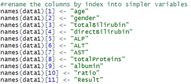
The columns are renamed into simpler and shorter terms to make it easier to perform analysis on the data, see Fig. 13. This process is done by assigning new variable names to the columns by index. For example, variable at index 1 which was $Age.of.the.patient is changed to $age.
Fig. 13.
Rename the variables
The figure shows that the variable names have been successfully changed, see Fig. 14. These variables can be used to carry out further analysis on the dataset.
Fig. 14.

View changed variable names
Data cleaning
Data cleaning is the process of finding and eliminating or replacing incorrect data from a dataset. This method assures high-quality data processing and reduces the potential of incorrect or misleading findings. The dataset is cleaned to ensure that it is consistent as well as free of noise and errors. Duplicates, null values, outliers, and missing values are handled accordingly to complete the cleaning process.
Remove duplicate rows
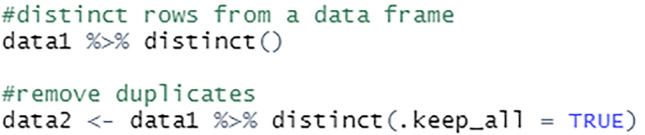
The duplicate data is removed from the dataset to prevent redundancy using the distinct() function, see Fig. 15. The R base unique() function can also be used for the same purpose. A total of 19,368 distinct records from this dataset will be used for further pre-processing steps.
Fig. 15.
Remove duplicates
Handling null values
The null values in the dataset are changed to NA to ensure that the analysis is done effectively to facilitate further study, see Fig. 16. These NA values will then be handled accordingly as relevant to the project.
Fig. 16.

Replace null values with NA
Handling outliers
Outlier values can reveal erroneous data or instances where a concept is not relevant. As a result, before this data can be used to develop prediction models, they must be properly handled, see Fig. 17. For this project, outliers below the minimum bench value are replaced with the first quantile values, while outliers above the maximum bench value are replaced with the third quantile values.
Fig. 17.
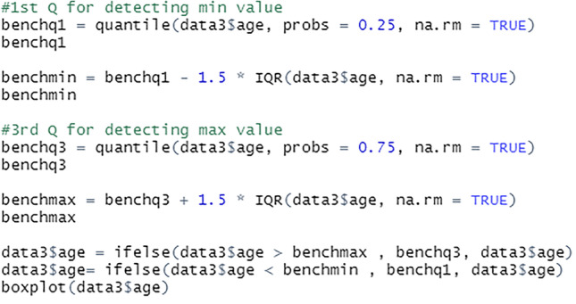
Replace outliers
The median of the bottom half, 25% of the dataset is the first quantile. The median of the top half, 75% of the dataset is the third quantile. The na.rm = TRUE indicates that the NA values are removed before the quantiles are calculated. The rows with the NA values are retained in the data frame but excluded from the calculations.
Handling missing values
The data is then examined for missing values, see Fig. 18.
Fig. 18.

Identify missing values
The R function sapply() accepts the data frame as input and returns a vector as output. Using the sum(is.na(x)) command, the missing values from the dataset is searched and displayed.
The Fig. 19 shows the total number of missing values for each field in the dataset. The missing values are then handled accordingly.
Fig. 19.

View missing values per attribute
The aggr() function is used to calculate and plot the total number of missing values for each variable. The yellow colour is used to represent the missing data, see Figs. 20 and 21.
Fig. 20.

Represent plot using VIM package
Fig. 21.

Visualize plot of missing values
Since the age field has only one missing value, the row is removed from the dataset, see Fig. 22. The missing rows from the gender field are also removed as it would not be suitable to impute it with either Male or Female.
Fig. 22.

Script to remove rows with missing values
The missing values from total bilirubin, direct bilirubin, ALP, ALT, AST, total protein, albumin and A/G ratio fields are imputed with the median value of the attributes, see Fig. 23. This approach retains maximum instances by substituting the missing data with a value calculated from other available information.
Fig. 23.

Script to impute missing values with median
The Fig. 24 shows that there are no missing values in the dataset after the cleaning process is complete.
Fig. 24.

View missing values after cleaning
Data sampling
Samples are created to generate inferences about populations. Data sampling is a statistical analysis technique that involves selecting, modifying, and evaluating a sample subset of data in order to uncover patterns and trends in a larger data collection.
The class label of the dataset which is the Result field is analysed before selecting a suitable sampling method for the data.
Based on the Figs. 25, 26, it can be implied that the dataset is imbalanced. An imbalanced dataset indicates that there are substantial differences to the distribution of the classes. An algorithm which is trained on an imbalanced data will be biased towards a particular class. Hence, this has to be handled to ensure that the model is trained unbiasedly.
Fig. 25.
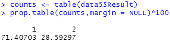
Percentage of each target class label
Fig. 26.
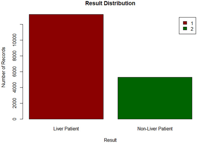
Bar chart of target class
Stratified sampling
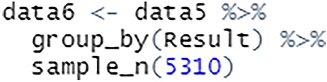
For this project, the data is sampled using stratified sampling. This process is done by dividing a population into similar subgroups called strata [21]. This sampling method is used to ensure that different subgroups in a population are equally represented. There are three methods to allocate a sample size in stratified sampling, which are equal allocation, proportional allocation and optimal allocation. The method that has been selected for this analysis is the equal allocation, where the number of sampling units selected from each stratum is equal.
There are two ways this process could be implemented in R. It is necessary to use the set.seed() function that specifies the starting number for generating a sequence of random numbers, ensuring that the same result is obtained each time the script is executed. A total of 10,620 records are sampled from this sampling technique, with 5310 records from each subgroup to ensure that the maximum possible data is used to train the model.
When using the splitstackshape package, the stratified() function requires the specification of dataset, the stratifying column, and the number of data to be selected from each subgroup of the column, see Fig. 27.
Fig. 27.

Stratified sampling using splitstackshape package
To use the dplyr package for stratified sampling, a grouped table is created using group_by() and the number of observations required is specified using sample_n(), see Fig. 28.
Fig. 28.
Stratified sampling using dplyr package
After carrying out the sampling process, the equal percentage of target class labels show that the dataset is now balanced, see Figs. 29 and 30. This will enable the model to train on equal instances of liver patients and non-liver patients.
Fig. 29.
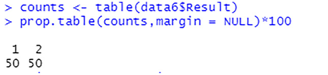
Percentage of each target class label after sampling
Fig. 30.
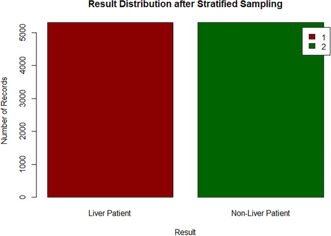
Bar chart of target class after sampling
Correlation analysis
Correlation analysis aids in determining the nature and degree of a relationship, that can then be used to make decisions for further actions. The correlation among attributes from the dataset are analysed to evaluate the association among them using the cor.test() function. The following shows the results obtained for each test. A correlation among attributes is shown in Table 2 and Table 3.
Table 2.
Correlation among attributes (1)
| Total Bilirubin | Direct Bilirubin | ALP | ALT | AST | |
|---|---|---|---|---|---|
| Age | 0.0029 | 0.0031 | -0.0001 | -0.0028 | -0.0072 |
| Total Bilirubin | - | 0.9364 | 0.2736 | 0.3636 | 0.4203 |
| Direct Bilirubin | - | - | 0.2760 | 0.3532 | 0.4216 |
| ALP | - | - | - | 0.3458 | 0.2903 |
| ALT | - | - | - | - | 0.6475 |
Table 3.
Correlation among attributes (2)
| Total Protein | Albumin | A/G Ratio | |
|---|---|---|---|
| Age | -0.0051 | -0.0113 | -0.0048 |
| Total Bilirubin | -0.0622 | -0.2516 | -0.2908 |
| Direct Bilirubin | -0.0503 | -0.2498 | -0.3003 |
| ALP | 0.0358 | -0.1193 | -0.2520 |
| ALT | -0.0137 | -0.0373 | -0.0702 |
| AST | -0.0747 | -0.1460 | -0.1661 |
| Total Protein | - | 0.7687 | 0.2749 |
| Albumin | - | - | 0.7507 |
According to the Tables 2 and 3, the total bilirubin and direct bilirubin attributes have an extremely strong relationship among each other. The total protein and albumin attributes, as well as the A/G ratio and albumin attributes are also strongly correlated. The ALT and AST attributes are moderately correlated. The higher the absolute value of correlation, the stronger the association is. Tests with correlation values between 0.3 and 0.5 indicate a weak association among the attributes, whereas correlation values below 0.3 imply an extremely weak or no relationship between the attributes.
Data visualization
The graphical illustration of data is known as data visualization. It is the process of transforming large datasets into graphs, charts, and other visuals that makes it easier to discover fresh insights regarding the information represented in the data.
Density plot
The dispersion of a variable in a dataset is illustrated using density plots. It displays the values in a particular field as equally binned distributions on a graph. Due to this, the plots remain consistent across bins and are unaffected by the number of bins selected, resulting in a clearer distribution shape. A density plot's peak shows where values are concentrated over the interval [22], see Fig. 31. The range of values in the dataset is represented by the horizontal axis of the plot. The Kernel Density Estimate of a variable is represented by the vertical axis of the plot, which is regarded as a probability differential. It represents the probability that a given data value will be in the range of area under the curve.
Fig. 31.

Script to visualize a density plot
The density plot shows that the age field is slightly left skewed, see Fig. 32. This type of distribution is also called the negative skewed distribution. It indicates that the median value is higher than the mean value. The peak of the curve is slightly towards the right of the plot as most of the values are located there. Most patients are almost towards the age of 50 and have the density estimate of 0.024.
Fig. 32.

Density plot for age
The density plot shows that the total bilirubin attribute is right skewed, see Fig. 33. This type of distribution is also called the positive skewed distribution. It shows that the mean of the data is greater than the median. The curve is highest towards the left of the distribution as that is where most of the values are located. Most patients have a total bilirubin value of less than 1 that shows the density estimate above 1.25.
Fig. 33.

Density plot for total bilirubin
The density plot shows that the direct bilirubin field is right skewed, see Fig. 34. The mean value is higher than the median value in this case. The peak of the curve is towards the left of the density plot. Majority of the patients have a direct bilirubin value lower than 0.5 with a density estimate higher than 2.5.
Fig. 34.

Density plot for direct bilirubin
The density plot shows that the ALP attribute is right skewed, see Fig. 35. The median value is therefore lower than the mean value. The curve is highest towards the left of the density plot as most of the values are located there. Most patients have ALP value of almost 200 with the density estimation of 0.00875.
Fig. 35.

Density plot for ALP
The density plot shows that the ALT field has a right skew, see Fig. 36. This implies that the mean is higher than the median for this field. The curve is highest towards the left of the density plot as that is where most of the values are located. Majority of the patients have ALT value below 30 with the density estimation above 0.025.
Fig. 36.

Density plot for ALT
The density plot shows that the AST attribute is right skewed, see Fig. 37. This implies the mean being greater than the median. The peak of the plot is towards the left as most of the values are located in that area. Most patients have AST value close to 25 at a density estimation of 0.0225.
Fig. 37.

Density plot for AST
The density plot shows that the total protein field is left skewed, see Fig. 38. This indicates that the median is greater than the mean. The curve of the density plot is highest towards the right of the plot. Majority patients have total protein value of 7 with a density estimation of above 0.4.
Fig. 38.

Density plot for total protein
The density plot of the albumin field shows a normal distribution curve, see Fig. 39. The peak of the plot is towards the centre of the distribution as that is where most of the values are located. The albumin density curve has no skew, which shows that the mean is equal to the median. Most patients have albumin value slightly above 3 and a density estimation of slightly above 0.6.
Fig. 39.

Density plot for albumin
sjPlot
sjPlot is a visualization package that allows for charting and table output functionalities. The stacked bar chart is used to visualize the data, see Fig. 40. The percentage and number of records for the predictor fields in the dataset is analysed based on the class attribute using the charts.
Fig. 40.

Script to visualize a stacked bar chart
From this plot, for each age value in the dataset, there are instances from both target class subgroups, see Fig. 41. This shows that the patients of every age group have the likelihood of being a liver patient. However, there is a record of a patient that is 89 years of age who is a non-liver patient in this dataset.
Fig. 41.

Stacked bar chat for age and Result
From Fig. 42, it is shown that records between liver patients and non-liver patients for both the gender groups are nearly equal in the dataset.
Fig. 42.

Stacked bar chat for gender and Result
From Fig. 43, majority of the records for total bilirubin value 2.1 and above are of 100% liver patients. The total bilirubin value 0.4 also shows 100% liver patient records. However, for value 5.3 of total bilirubin, 100% of the records are of non-liver patients.
Fig. 43.

Stacked bar chat for total bilirubin and Result
From Fig. 44, patients with the direct bilirubin value of 1.5 and above have a higher possibility of being a liver patient. However, for value 2.3 of direct bilirubin, only 44.6% of the records are liver patients whereas 55.4% of the records are non-liver patients.
Fig. 44.

Stacked bar chat for direct bilirubin and Result
From Fig. 45, patients with total protein value 4, 4.1, 4.4, 4.7 and 8.6 to 8.9 have a percentage of 100% being a liver patient. For patients with total protein value 3.7 and 3.9, the plot shows 100% being a non-liver patient. The other values have instances from both target class subgroups.
Fig. 45.

Stacked bar chat for total protein and Result
From Fig. 46, there are instances from both target class subgroups for each albumin value, except for values 0.9, 1, 1.5, 5.5 that are 100% liver patients, and value 5 for 100% non-liver patient.
Fig. 46.

Stacked bar chat for albumin and Result
Develop classification model
A classification model develops relationships between the values of predictors and the values of target during the training process. Various classification algorithms use different ways to discover relationships. These connections are developed within a model that may then be applied to a new data with unknown class assignments. The models are evaluated by comparing predicted values to known target values in a test set. Two classification algorithms will be applied to evaluate the model’s performance, which are the Naive Bayes algorithm and the C4.5 Decision Tree algorithm.
Prepare data
Due to the inability of certain models to handle string attributes, the gender field is converted to factor. Factors are variables used to categorise and store data in an integer vector. In R, a factor contains both string and numeric data values as levels. Each gender category is assigned to a level. Then, using the factor() function, the gender field is changed to factor, see Fig. 47.
Fig. 47.

Convert gender to factor
The target class field, which is the Result attribute is also converted to factor in order to fit into the model. This step is necessary to avoid the class attribute being interpreted as a numerical, see Fig. 48.
Fig. 48.

Convert Result to factor
The Fig. 49 above shows the gender attribute and Result attribute has been successfully converted to factor, with 2 levels each.
Fig. 49.

View data frame
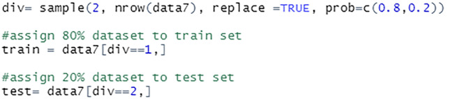
Next, the data is split into the train set and test set, see Fig. 50. The data is separated into 80:20 ratios for this project. The training size is 80% of the total data, whereas the testing size is 20%. The train set will be used to fit the model, while the test set will be utilised to evaluate predictions. There are a total of 8500 records in the train set and 2120 records in the test set.
Fig. 50.
Split data into train set and test set
Naïve bayes
The Bayes Theorem and the premise of predictor independence underlie the Naïve Bayes classification technique. The Naive Bayes model is simple to build and is particularly useful for large datasets. Due to its simplicity, Naïve Bayes is acknowledged to outperform even the most complex classification techniques.
The model is trained using the train set. The general naïve_bayes() function detects the class of each feature in the dataset and assumes a possible different distribution for each feature, see Fig. 51.
Fig. 51.

Train model using naïve bayes classifier
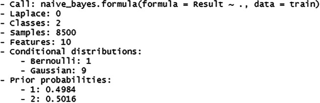
The Fig. 52 above shows the summary of the constructed model which includes the number of classes, sample records, features, conditional distribution of the features and the prior probabilities of the class label. The prior probability values show that both the class labels have equal probability of occurring before new data is fed to the model.
Fig. 52.
Summary of the naïve bayes model
Next, prediction is carried out using the train set, see Fig. 53. The predict() function is used for the model to predict the Result field based on the input data from the train set. The cross-tabulation among the prediction and reference is analysed. Then, the results from the cross tabulation are summarised to find the percentage of correct prediction. The accuracy of the model is also checked using the test set.
Fig. 53.
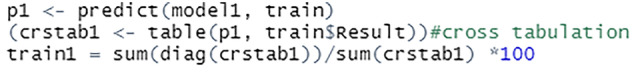
Check accuracy of naïve bayes model
The percentage of correct predictions on the train set is 69.86%, see Fig. 54. The percentage of correct predictions on the test set is 69.67%
Fig. 54.
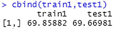
Prediction accuracy on train set and test set
C4.5 decision tree
The C4.5 approach builds a decision tree to maximise information acquisition and is an extension of the ID3 algorithm. The C4.5 algorithm is used as a Decision Tree Classifier in data mining [27]. It can be employed to generate decisions based on a sample data [23]. This algorithm can be used on both discrete and continuous data.
The model is trained using the train set. The J48 classifier is an algorithm to construct a decision tree that is generated by C4.5 in the Weka data mining tool, see Fig. 55.
Fig. 55.

Train model using J48 classifier
The Fig. 56 shows the summary of the constructed model along with a generated confusion matrix.
Fig. 56.
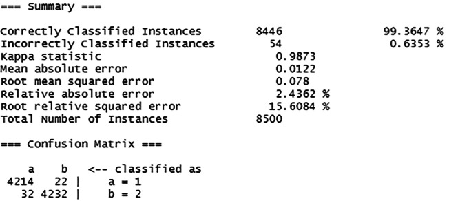
Summary of the C4.5 model
Then, the train set is used to make prediction, see Fig. 57. The cross-tabulation results generated are summarised to show the percentage of correct prediction. The accuracy of the model is also checked using the test set.
Fig. 57.
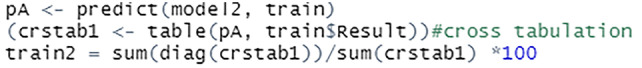
Check accuracy of C4.5 model
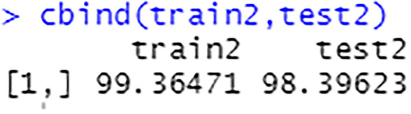
The percentage of correct predictions on the train set is 99.36%, see Fig. 58. The percentage of correct predictions on the test set is 98.40%.
Fig. 58.
Prediction accuracy on train set and test set
Conclusion
This work proposes a machine learning-based approach for liver disease prediction. The framework provides a user interface for healthcare professionals to input patient information. After, the model checks for liver disease, and detailed information on the classification is shown to the user through the user interface. The model shows 99.36% accuracy in training and 98.40% accuracy in testing. It performed better than the existing Naïve Bayes-based approach for liver disease prediction. Overall, the detailed experiments in this work show that the proposed model is robust and it can be used as a tool for early diagnosis of liver disease at healthcare centers.
Footnotes
The order of author details in the title page of the manuscript as same as in the submission step.
Publisher's Note
Springer Nature remains neutral with regard to jurisdictional claims in published maps and institutional affiliations.
Contributor Information
Shubashini Rathina Velu, Email: svelu@pmu.edu.sa.
Vinayakumar Ravi, Email: vravi@pmu.edu.sa, Email: vinayakumarr77@gmail.com.
Kayalvily Tabianan, Email: kayalvily.tabianan@newinti.edu.my.
References
- 1.Asrani S, Devarbhavi H, Eaton J, Kamath P. Burden of liver diseases in the world. J Hepatol. 2019;70(1):151–171. doi: 10.1016/j.jhep.2018.09.014. [DOI] [PubMed] [Google Scholar]
- 2.Macpherson I, Nobes J, Dow E, Furrie E, Miller M, Robinson E, Dillon J. Intelligent Liver Function Testing: Working Smarter to Improve Patient Outcomes in Liver Disease. The Journal of Applied Laboratory Medicine. 2020;5(5):1090–1100. doi: 10.1093/jalm/jfaa109. [DOI] [PubMed] [Google Scholar]
- 3.Standing H, Jarvis H, Orr J, Exley C, Hudson M, Kaner E, Hanratty B. GPs’ experiences and perceptions of early detection of liver disease: a qualitative study in primary care. Br J Gen Pract. 2018;68(676):e743–e749. doi: 10.3399/bjgp18X699377. [DOI] [PMC free article] [PubMed] [Google Scholar]
- 4.Househ, M. and Aldosari, B., 2017. The Hazards of Data Mining in Healthcare. [online] PubMed. Available at: https://pubmed.ncbi.nlm.nih.gov/28679892/. Accessed 14 October 2021. [PubMed]
- 5.Ahmed P, K. Analysis of Data Mining Tools for Disease Prediction. J Pharm Sci Res. 2017;9(10):1886–1888. [Google Scholar]
- 6.Rakesh Kumar, S., Gayathri, N., Muthuramalingam, S., Balamurugan, B., Ramesh, C. and Nallakaruppan, M., 2019. Medical Big Data Mining and Processing in e-Healthcare. Internet of Things in Biomedical Engineering, pp.323–339.
- 7.Ojha U, Goel S. 2017 7th International Conference on Cloud Computing, Data Science and Engineering - Confluence 2017;527–530.
- 8.Almarabeh H, Amer F, E. A Study of Data Mining Techniques Accuracy for Healthcare. International Journal of Computer Applications. 2017;168(3):12–17. doi: 10.5120/ijca2017914338. [DOI] [Google Scholar]
- 9.Wu C, Yeh W, Hsu W, Islam M, Nguyen P, Poly T, Wang Y, Yang H, (Jack) Li, Y., Prediction of fatty liver disease using machine learning algorithms. Comput Methods Programs Biomed. 2019;170:23–29. doi: 10.1016/j.cmpb.2018.12.032. [DOI] [PubMed] [Google Scholar]
- 10.Amin M, Chiam Y, Varathan K. Identification of significant features and data mining techniques in predicting heart disease. Telematics Inform. 2019;36:82–93. doi: 10.1016/j.tele.2018.11.007. [DOI] [Google Scholar]
- 11.Chaurasia V, Pal S, Tiwari B. Prediction of Benign and Malignant Breast Cancer Using Data Mining Techniques. SSRN Electron J. 2018;12(2):119–126. [Google Scholar]
- 12.Hashi EK, Zaman MS, Hasan MR. An expert clinical decision support system to predict disease using classification techniques. In 2017 International conference on electrical, computer and communication engineering (ECCE) (pp. 396-400).
- 13.Prabhakaran, S., 2018. How Naive Bayes Algorithm Works? | ML+. [online] Machine Learning Plus. Available at: https://www.machinelearningplus.com/predictive-modeling/how-naive-bayes-algorithm-works-with-example-and-full-code/#6whatislaplacecorrection. Accessed 19 October 2021.
- 14.Chauhan N. Naïve Bayes Algorithm: Everything you need to know - KDnuggets. [online] KDnuggets. 2020. Available at: https://www.kdnuggets.com/2020/06/naive-bayes-algorithm-everything.html. Accessed 19 October 2021.
- 15.Chauhan N. Decision Tree Algorithm, Explained - KDnuggets. [online] KDnuggets. 2020. Available at: https://www.kdnuggets.com/2020/01/decision-tree-algorithm-explained.html. Accessed 20 October 2021.
- 16.Mrva J, Neupauer Š, Hudec L, Ševcech J, Kapec P. Decision Support in Medical Data Using 3D Decision Tree Visualisation. E-Health and Bioengineering Conference (EHB) 2019;2019:1–4. [Google Scholar]
- 17.Garg R. 7 Types of Classification Algorithms. [online] Analytics India Magazine. 2018. Available at: https://analyticsindiamag.com/7-types-classification-algorithms/. Accessed 15 October 2021.
- 18.Pain A. Rich Pictures | SSWM. [online] Sswm.info. 2020. Available at: https://sswm.info/train-trainers/facilitation/rich-pictures. Accessed 12 November 2021.
- 19.Templ M, Kowarik A, Alfons A, de Cillia G, Rannetbauer W. VIM: Visualization and Imputation of Missing Values. [online] Cran.r-project.org. 2021. Available at: https://cran.r-project.org/web/packages/VIM/VIM.pdf. Accessed 17 January 2022.
- 20.Bhalla D. dplyr Tutorial : Data Manipulation (50 Examples). [online] ListenData. 2016. Available at: https://www.listendata.com/2016/08/dplyr-tutorial.html. Accessed 17 January 2022.
- 21.The Economic Times. What is Stratified Sampling? Definition of Stratified Sampling, Stratified Sampling Meaning - The Economic Times. 2021. [online] Available at: <https://economictimes.indiatimes.com/definition/stratified-sampling. Accessed 22 January 2022.
- 22.Analyttica Datalab. Density Plots. [online] Medium. 2019. Available at: https://medium.com/@analyttica/density-plots-8b2600b87db1. Accessed 27 January 2022.
- 23.Saha S. What is the C4.5 algorithm and how does it work?. [online] Medium. 2018. Available at: https://towardsdatascience.com/what-is-the-c4-5-algorithm-and-how-does-it-work-2b971a9e7db0. Accessed 4 February 2022.
- 24.USF Health. Data Mining In Healthcare: Purpose, Benefits, and Applications. 2017. [online] Available at: https://www.usfhealthonline.com/resources/key-concepts/data-mining-in-healthcare/. Accessed 14 October 2021.
- 25.Fuchs K. Machine Learning: Classification Models. [online] Medium. 2017. Available at: https://medium.com/fuzz/machine-learning-classification-models-3040f71e2529. Accessed 15 October 2021.
- 26.Taha Jijo B, Abdulazeez A. Classification Based on Decision Tree Algorithm for Machine Learning. Journal of Applied Science and Technology Trends. 2021;2(01):20–28. doi: 10.38094/jastt20165. [DOI] [Google Scholar]
- 27.Razali N, Mustapha A, Wahab M, Mostafa S, Rostam S. A Data Mining Approach to Prediction of Liver Diseases. J Phys: Conf Ser. 2020;1529:032002. [Google Scholar]
- 28.Kandati DR, Gadekallu TR. Genetic Clustered Federated Learning for COVID-19 Detection. Electronics. 2022;11(17):2714. doi: 10.3390/electronics11172714. [DOI] [Google Scholar]
- 29.Rehman MU, Shafique A, Ghadi YY, Boulila W, Jan SU, Gadekallu TR, Driss M, Ahmad J . A Novel Chaos-Based Privacy-Preserving Deep Learning Model for Cancer Diagnosis. IEEE Trans Network Sci Eng. 2022.
- 30.Yang Y, Wang W, Yin Z, Xu R, Zhou X, Kumar N, Alazab M, Gadekallu TR. Mixed Game-based AoI Optimization for Combating COVID-19 with AI Bots. IEEE J Selected Areas Comm. 2022.
- 31.Pandya S, Gadekallu TR, Reddy PK, Wang W, Alazab M.InfusedHeart: A novel knowledge-infused learning framework for diagnosis of cardiovascular events. IEEE Trans Comp Soc Sys. 2022.