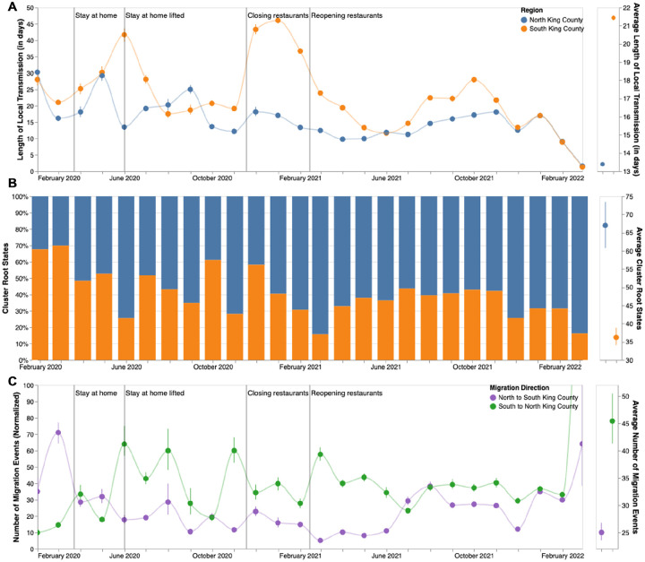
Figure 4: Within and Inter-Regional Dynamics in King County inferred from pathogen genomes and relevant covariates.
A. Persistence time (in days) of local transmission chains over time in both regions of King County. Accompanying graph showing persistence times averaged over the entire time period for both regions with error bars denoting 95% CIs. B. Inferred reconstruction of ancestral state for each transmission cluster over time. Blue denotes initial introduction in North King County and orange denotes initial introduction in South King County. Average values are normalized to 100% over time. Accompanying graph showing inferred introductions averaged over the entire time period for both regions with error bars denoting 95% CIs. C. Number of migration events from North to South King County (purple) and from South to North King County (green) over time. Bands denote 95% CI. Accompanying figure shows number of migration events between the two regions averaged over the entire time period with error bars denoting 95% CIs.

