

Abstract
Purpose
The purpose was to compare systematically the legibility of a font without serifs (Helvetica) and one with serifs (Times New Roman).
Methods
Three paragraphs that were equal in the number of words, syllables, characters, difficulty and reading length were printed at equal size, with equal spacing between the lines and equal layout (paperback style), in either the sans serif typeface Helvetica Neue T1 55 Roman (Adobe) or the serif typeface Times New Roman PS Roman (Adobe). They were also printed in newspaper format in the serif font. The paragraphs were presented in random order (Latin square design) to 36 participants between 18 and 38 years of age (wearing their best‐corrected visual acuity). Reading duration was measured with a stopwatch. Reading time, reading speed and the number of reading errors were compared.
Results
For the paperback layout, no significant difference in reading time (p = 0.50) or reading speed (p = 0.56) was found between the two fonts. The correlation between the two fonts was high for both reading time and speed (r = 0.93). The mean number of reading errors was the same (0.31 ± 0.58 errors/text) for both fonts. There was a significant difference in reading time and speed between the paperback and the newspaper layout.
Conclusion
The legibility of Helvetica and Times New Roman is similar when investigated under equivalent conditions. Thus, these two font types can be used as interchangeable standard typefaces.
Keywords: Helvetica, legibility of font types, reading performance, reading speed, Times New Roman
Key points.
The present study contributes to the question of whether Times New Roman and Helvetica, which represent font types with or without serifs that have been typographically optimised, differ in legibility.
Randomly presenting a set of three equalised paragraphs in paperback layout printed in Times New Roman or Helvetica revealed no differences in legibility between the two fonts.
The study shows and discusses why Times New Roman and Helvetica can be assumed to be comparable for reading tests employing long paragraphs.
INTRODUCTION
Recently, the International Organization for Standardization (ISO) became interested in establishing a standard for reading charts, because modern reading charts have become a well‐accepted tool for the investigation of functional near vision. 1 , 2 , 3 , 4 With regard to the efforts of the ISO to establish such an internationally accepted standard, there are open questions that still have to be answered. One such question relates to the legibility of font types, namely is there a relevant difference in legibility between common sans serif font types and font types with serifs, such as Helvetica and Times New Roman?
It is widely assumed that printed texts in serif font type provide better legibility. 5 , 6 However, research concerning reading performance has not unequivocally confirmed this typographic hypothesis. 7 , 8 , 9 , 10 , 11 Arditi and Cho have investigated the effects of three different sizes of serifs presented with various inter‐letter spacing, using fonts that differed only in the presence or absence of serifs. 7 Only a ‘tiny’ increase in legibility in favour of serifs was found at the threshold of reading acuity. However, the legibility enhancement was not as great as expected when the spacing between the letters was increased. Thus, the authors concluded that it is possible that the serifs had some detrimental effect that partially cancelled the beneficial effect of increasing the spacing 7 (and personal communication). Morris et al. 8 found a notably faster reading speed at small letter sizes (40 pixels) for the sans serif version of two fonts that had been developed to differ mainly in terms of the absence or presence of serifs, but could not find a difference with bigger letters of 160 pixels. In a study by Akhmadeeva et al., 9 participants read silently text paragraphs printed in 12 point Cyrillic PT font either with or without serifs for 1 min, but no significant difference in reading speed was found.
Fonts with or without serifs, such as Times New Roman and Helvetica, differ also in the heights of their lower‐ and upper case letters, the thickness of their stems, lengths of ascenders and descenders, character widths and the ratios of thin to thick stroke widths. 8 In a number of studies, various fonts have been compared in patients with age‐related maculopathy (AMD) and participants with healthy eyes. Mansfield et al. measured the influence of font types on reading performance in both normal and low vision subjects. 12 They compared two font types with serifs: (a) the proportionally spaced Times Roman (three lines and 60 characters per sentence) and (b) the fixed‐space font type Courier (four lines and 56 characters per sentence). They found a small advantage of Courier over Times Roman in terms of reading acuity, critical print size (CPS) and reading speed for low‐vision patients. In participants with normal vision, Times Roman was read slightly faster. 12 However, the reading acuity obtained with Times Roman was lower than that obtained with the Courier typeface. In people with mild to moderate vision loss, Rubin et al. 10 compared the reading speed achieved with four different typefaces: Foundry Form Sans, Helvetica, Tiresias PC font and Times New Roman. Initially, they found that the reading speed obtained with the Tiresias PC font was about 8 words per minute (wpm) faster than that of the other three fonts. However, since fonts of the same nominal point size were not equivalent in their actual letter size, this advantage of Tiresias PC was eliminated when the horizontally and vertically occupied space of the letters was adjusted. 10 Xiong et al. 11 have compared five different fonts in order to determine whether there is an advantage associated with two new font types that have been developed for patients with maculopathy. In their study, Helvetica and Times Roman were also compared. However, no significant difference in reading speed between these two font types was seen in patients with maculopathy, in age‐matched controls with healthy eyes or 15 young participants.
Comparing the legibility of different font types requires a more complex study design and may also require graphical assistance because the letter sizes of different font types, when given in point size, represent the height of the metal body (body height) on which a typeface's character is mounted, and not the size of the character itself. Thus, letters of different font types will not be of the same size (x‐height) when nothing is stipulated except the same point size. In order to achieve the best possible comparability, we have now equalised the x‐heights of the font types by using a digital microscopic measuring device normally used for cell biology (NIS Elements, Nikon, microscope.healthcare.nikon.com) and graphically modifying the x‐heights accordingly. We also equalised the text width and the spacing between the letters and lines.
In addition, bias caused by pre‐existing significant differences between long text paragraphs has to be avoided, since such differences have been found to occur between long paragraphs even when the paragraphs have been designed to be as equal as possible. 13 , 14 Therefore, for the present study, we used a sequence of three paragraphs (short stories) for which it has been statistically verified in 60 participants that the paragraphs do not differ significantly from each other in terms of reading speed and difficulty. 13 These paragraphs, in German, have been developed to be equivalent in terms of sentence construction as well as in the number, length and position of the words. Words with the same numbers of syllables were in exactly the same positions within the text. In addition, a Latin square design was used for randomisation.
These equalised test materials were used in the present study to compare the legibility of two widely used font types, Helvetica and Times New Roman, which represent a typeface without and with serifs, respectively.
METHODS
Participants
The study population consisted of 36 persons from 18 to 38 years of age (mean: 27.5 ± 5.74 years; 26 women, 10 men). All of the participants had to be native speakers of German and were recruited either during a routine check‐up in the outpatient facility of the corresponding author (WR) or by the staff of the University Hospital St. Polten of the Karl Landsteiner University for Medical Sciences (BD). All participants had to have a best‐corrected distance visual acuity of 0.0 logMAR or better and a reading acuity of 0.0 logRAD or better in each eye. None of the patients had a disease or received any medication that could influence the results of the study. Individuals were invited to participate in the study, and all who agreed gave informed consent. All study procedures adhered to the Declaration of Helsinki for research involving human subjects. The study protocol was reviewed by the ethics commission of Karl Landsteiner Private University for Medicine.
Test material
In a prior study, we had statistically selected two sequences of three paragraphs as well as eight pairs of paragraphs, none of which were statistically significantly different in terms of difficulty and reading length (reading speed). 13 A sequence of three paragraphs, composed of paragraphs 2, 5 and 7, was used for the present study (referred to here as paragraphs A, B and C). These paragraphs in German have been developed to be equivalent in terms of sentence construction as well as in the number, length and position of the words. Words with the same numbers of syllables were in identical positions within the text. All paragraphs had 111 words, 179 syllables and 660 characters (710 characters, including spaces). Each paragraph consisted of 48 one‐syllable words, 48 two‐syllable words and 15 three‐syllable words. Each of the three paragraphs told a short story of differing content.
The test material was custom made by a graphic designer (Figure 1). For our comparison of serif and sans serif typefaces, we used Times New Roman PS Roman (Adobe; adobe.com) as the typeface with serifs and Helvetica Neue (T1) Roman (Adobe; adobe.com) as the sans serif typeface. Paragraphs were printed in both typefaces on single DIN A5 pages either in the layout of a paperback book (block alignment, line width 105 mm) or, for the Times New Roman font only, also in the layout of a newspaper column (block alignment, line width 48 mm). The x‐height of the print sizes was adjusted, with the help of a graphic designer, after measurement with a microscopic measuring device (NIS Elements, microscope.healthcare.nikon.com/). The x‐height for the paperback layout was adjusted to that of a paperback book with a line width of 105 mm and was equal to 1.57 mm for both the Times New Roman (9.55 point) and Helvetica (8.25 point) fonts. For the newspaper layout in Times New Roman, the x‐height was adjusted to that of newspaper columns with a line width of 48 mm and was equal to 1.74 mm (10.55 point). The space between lines (bottom of the lines) was kept constant at 4.04 mm for all layouts.
FIGURE 1.
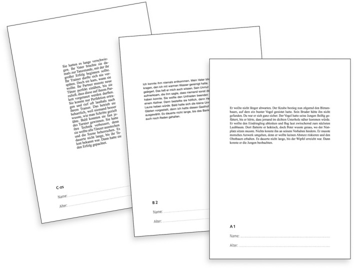
Test sheets: The paragraphs were printed on DIN A5 pages. Three text paragraphs were used: A, B and C. A‐sz, B‐sz and C‐sz were printed in newspaper layout with Times New Roman (sz = Satzspiegel Zeitung); Texts A1, B1 and C1 were printed in paperback layout in Times New Roman; A2, B2 and C2 were printed in paperback layout in Helvetica.
Randomisation
Randomisation was performed using a Latin‐square design to ensure that each paragraph was read the same number of times in paperback layout in both the Times New Roman and Helvetica fonts and in newspaper layout (Times New Roman only). Since the main purpose was to determine whether there was a difference in reading speed or number of errors between the serif and sans serif typefaces, the newspaper layout, which was printed only in Times New Roman, was always read as the last paragraph. To ensure that in this study design, every paragraph was read the same number of times in each position and typeface, 12 different paragraph sequences were necessary. Each sequence of the three paragraphs, printed on a single DIN A5 page (180 grain, high‐resolution paper), was put into an envelope (a single envelope contained all three paragraphs: (a) one paragraph in Times New Roman paperback layout, (b) one paragraph in Helvetica paperback layout and (c) one paragraph in Times New Roman newspaper layout). Thus, 36 envelopes were used for the present study (3 × 12 sequences). The 36 envelopes were presented to the participants in a box, and the participants were asked to take out any envelope they wanted. Envelopes were not used twice.
Reading performance
Tests were performed binocularly. The luminance was 90–100 cd/m2. Participants were asked to read aloud as quickly and accurately as possible. They were further instructed to read to the end before correcting any reading errors. Measurements of reading time were performed with a stopwatch by considering the initial pre‐movements of the lips at the vocal onset (pre‐phonetic strain) as the starting point. 13 , 15 , 16 The end of the sentence was determined to be reached when the participant stopped reading. Reading speed in words per minute (wpm) was calculated on the basis of the number of words (111 per sentence) and reading time (accuracy: 0.01 s; reading speed = 111 × 60/reading time). Errors were counted even when they were corrected immediately. 13 , 15 , 16
Statistics
Statistical analyses were performed using SPSS for Windows software (version 21.0, IBM, ibm.com). The data showed a fairly symmetric unimodal distribution. The assumption of a normal distribution for the mean, as required for the t‐test, was justified (Kolmogorov–Smirnov test). The cut‐off level for statistical significance was set at a p value < 0.05 (two‐tailed, paired).
Ethics statement
Ethical approval was provided by the ethics commission of Karl Landsteiner University of Health Sciences, Karl Landsteiner Medical University, Krems, Austria, from September 2021 for this study (EK Nr: 1021/2021).
RESULTS
Means and standard deviations of reading time, reading speed and reading errors for the paperback layout (Helvetica and Times New Roman) and the newspaper layout (Times New Roman) are presented in Table 1, and the analyses of the differences in reading speed between the two versions printed in the paperback layout are shown in a Bland–Altman plot in Figure 2. For the paperback layout, no significant difference in reading time (p = 0.50) or reading speed (p = 0.56) was found between the Times New Roman PS Roman (Adobe) font with serifs and the sans serif font Helvetica Neue (T1) Roman (Adobe). The correlation between the two fonts was high for both reading time and speed (r = 0.94). The mean number of reading errors was exactly the same (0.31 ± 0.58 errors/text) for both fonts. Thus, the legibility of these font types was the same when investigated under equal conditions such as line widths, letter size (x‐height) and the distance between the lines.
TABLE 1.
Means and standard deviations (SD) for reading time, reading speed (words per minute – wpm) and reading errors for the paperback layouts (Helvetica and Times New Roman) and the newspaper layout (Times New Roman)
| Reading time (s) | Reading speed (wpm) | Reading errors | ||||
|---|---|---|---|---|---|---|
| Mean | SD | Mean | SD | Mean | SD | |
| Helvetica Paperback | 37.30 | 5.30 | 182.25 | 26.77 | 0.31 | 0.57 |
| Times Roman Paperback | 37.48 | 5.39 | 181.36 | 26.06 | 0.31 | 0.57 |
| Times Roman Newspaper | 38.51 | 5.58 | 176.76 | 26.80 | 0.39 | 0.54 |
FIGURE 2.
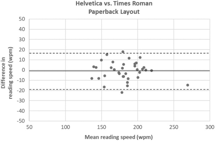
Plot of the difference between the two versions printed in paperback layout (Helvetica vs. Times New Roman). The reading speed in words per min (wpm) plotted against the mean (Bland–Altman analysis; n = 36). Bland–Altman analysis revealed high agreement between the two versions.
There was a significant difference in speed between each of the fonts in the paperback book layout and the newspaper column in Times New Roman (Helvetica paperback vs. newspaper layout: p = 0.004; Times New Roman paperback vs. newspaper: p = 0.02), but the correlations between both the Times New Roman and Helvetica fonts in paperback layout and the Times New Roman font newspaper layout were high (r = 0.88 and 0.99 for reading time and 0.91 and 0.91 for reading speed, respectively). Analyses of the differences in reading speed between the two versions in the paperback layout and the newspaper layout are shown in Figure 3a,b. No significant differences were seen between any of the three text paragraphs (short story A vs. B: p = 0.61, A vs. C: p = 0.97 and C vs. B: p = 0.65; 36 measurements each).
FIGURE 3.
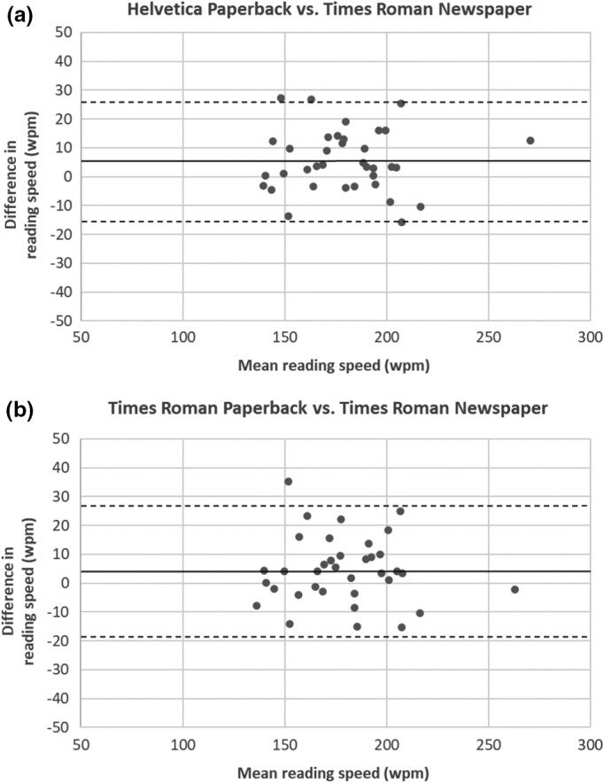
(a, b) Plots of the difference between the two versions printed in paperback layout and the newspaper layout in Times New Roman. (a) Helvetica paperback versus Times New Roman newspaper; (b) Times New Roman paperback versus Times New Roman newspaper). The reading speed in words per min (wpm) plotted against the mean. Bland–Altman analysis (n = 36) revealed high agreement, although the differences were significant.
DISCUSSION
In this sample of participants with normal vision, we did not find any significant difference in reading speed or number of reading errors between the sans serif Helvetica font and a serif Times New Roman font when participants read text presented in paperback book format. The two typefaces when presented in paperback layout were read significantly faster than the same Times New Roman font in newspaper layout, which was printed with a bigger x‐height.
Whether fonts with serifs are more legible than sans serif fonts remains an open question. 7 , 8 , 9 , 10 , 11 For a text presented on a screen, it is widely believed that sans serif fonts are advantageous because they avoid the blurred serifs that result from limited screen resolution, whereas font types with serifs are supposed to provide better legibility for printed text. For printed correspondence, however, both serif and sans serif typefaces are increasingly being used. Nevertheless, the readability of typefaces depends on many of their attributes. Accordingly, when developing a serif or a sans serif pair of fonts for comparative studies on readability, it is not possible to simply cut the serifs off or take a sans serif font and add serifs. 8 Thus, Bigelow and Holmes 8 designed an intermediate style of typeface for the study of Morris et al. 8 in which the letters fit slightly more tightly than in traditional serifed designs, but slightly more loosely than for traditional sans serif designs. In addition, the modulation of thick to thin lines of letters was less than that of traditional serifed designs, but greater than that of common sans serif designs. 8 However, fonts that have been designed exclusively as serif or sans serif fonts and optimised for readability, such as Times Roman and Helvetica, also differ in other typographical aspects. For example, in Times Roman, the overshoots of round letters (the extent to which the baseline and mean line are exceeded) are greater than those in Helvetica. Times Roman and Helvetica also differ in the heights of their lower‐ and upper case letters, the thickness of the stems, lengths of ascenders and descenders, character widths and the ratios of thin to thick stroke widths. 8
The two typefaces used in the present study were equalised in terms of x‐height, spacing and text widths by means of microscopic measurements that were adjusted accordingly in the text layout, with the assistance of a graphic designer. In order to avoid potential bias caused by existing significant differences between the text passages, we used three paragraphs that have been shown to exhibit no significant differences in reading speed or difficulty. 13 In addition, we believe that the randomisation used in the present study provided the best‐attainable comparability, which was necessary to investigate the differences in legibility between fonts. We also did a power calculation, which was set to a power of 80%, calculated with a Cohen's d = 0.51 and an alpha of 5%. Cohen's d was estimated according to a previous study. 13 These statistical calculations meant that for the present study, with 36 participants, the results were significantly different when the mean difference was between 4 and 5 wpm, which represented < 0.25% of the standard deviation. Thus, we believe that our data represent clinically reasonable results concerning potential differences in reading speed, reading time and the number of reading errors between the two font types.
Xiong et al. 11 did not find a difference in reading speed, CPS or reading acuity between Helvetica and Times Roman when they presented short sentences in geometrically decreasing print size on a tablet screen to patients with maculopathy, age‐matched controls with healthy eyes and young participants. Similarly, Rubin et al. 10 found no difference in reading speed between Helvetica and Times New Roman in patients with mild to moderate vision loss. Thus, both of these studies are in agreement with our results and together, these studies seem to indicate that Helvetica and Times Roman produce comparable results in persons with vision loss as well as those with normal vision.
In the present study, the newspaper text was read significantly more slowly, even though the newspaper layout was adjusted to the print size of newspapers, and thus printed in a larger font size than the paperback layouts. It is not unlikely that the differences we saw here in reading speed and number of errors were a result of the word divisions (several) that became necessary because of the smaller text width, since Xiong et al. 11 did not find such differences with their short three‐line sentences presented without word divisions. Our results seem to suggest that word divisions slow down the reading speed, which would lead to a recommendation that word divisions in test items of reading charts should be avoided, particularly when smaller text widths are used. Regarding the newspaper layout, we should mention that the calculation of sample size for comparing the fonts might not have been optimised for comparing the two layouts. Therefore, the significant differences we saw between the paperback and the newspaper layout should be considered with some caution until they have been verified in a separate follow‐up study.
In the present study, we did not find a significant difference in the reading speed or number of reading errors between the serif Times New Roman font and the sans serif Helvetica font. However, previous studies that investigated the effects of serifs by using fonts differing only in the absence or presence of serifs have produced equivocal results. Akhmadeeva et al. 9 did not find a difference in legibility between the serif and sans serif versions of the 12‐point Cyrillic PT font. Arditi and Cho 7 found a ‘tiny’ difference in favour of serifs, only at the threshold of reading acuity. But when the spacing between the letters was increased, the enhancement was not as high as expected. Arditi and Cho concluded that a better separation of the letters by serifs seems to be reduced by other aspects of the font design. 7 Morris et al. investigated font effects by means of Rapid Serial Visual Presentation (RSVP). 8 , 17 , 18 The two versions of the Lucida font used in their study had been developed by one of the authors to differ mainly in terms of the presence or absence of serifs. The 27 participants read aloud serially presented single words resembling sentences which were presented on a screen in a darkened room at a distance of 4 m. Two font sizes were presented (40 pixels and 160 pixels, which correspond to 4‐point and 16‐point for a test distance of 40 cm, respectively). This study showed a notably faster reading speed for the 40‐pixel sans serif Lucida font over the 40‐pixel Lucida version with serifs. For letter sizes of 160 pixels, this effect could not be found. 8
Just as Xiong et al. 11 did not find a significant difference between Helvetica and Times Roman for reading acuity and reading speed, we did not find a significant difference in reading acuity or reading speed in our earlier study involving participants with healthy eyes who read RADNER Reading Charts printed in Times New Roman and Helvetica that had been equalised in print size. 19 The RADNER Reading Charts use single sentences consisting of a main clause/relative clause construction. However, in geometrically progressing reading charts, longer paragraphs can also be used. 1 This raises the possibility that the length of the test items (sentences, paragraphs) might cause a difference in readability between Times New Roman and Helvetica. Since no geometrically progressing reading charts using long paragraphs were available in which the fonts could be exchanged and equalised in terms of print size, we used a set of three paragraphs of 111 words each, which had been shown statistically to be equal in reading length and difficulty, 13 and we equated the x‐height to 1.57 mm in the main arm of the study. However, we cannot be certain that our results can be generalised beyond this specific print size, as we had previously shown for single sentences. 19 For calibrating visual acuity results obtained with distance acuity charts using optotypes other than the Landolt ring in a psychophysical study, ISO/TR 19498:2015 and the standard of the International Council of Ophthalmology (ICO) 20 allow a difference in mean visual acuity of 0.05 log units to mention a set of optotypes comparable with Landolt rings. Since reading acuity and reading speed obtained with the RADNER Reading Charts were found to be equal or highly similar for Times New Roman and Helvetica in our previous study, 19 it seems reasonable to assume that the limits given in ISO/TR 19498:2015 and the ICO standard 20 for the comparability of optotypes will also be met by paragraphs of about the same length as those used in the present study, when such paragraphs are applied to comparisons of Times New Roman and Helvetica in reading charts.
In many studies, reading performance has been investigated by having the participants read the test material aloud, which has been shown to provide reliable results for assessing reading speed, reading errors and reading acuity. Because test paragraphs on reading charts are shorter than those used in the present study, it cannot be excluded that, for longer test paragraphs, a ceiling effect (due to articulation limits) can mask small differences in reading speed between the fonts. In our study, the test paragraphs in serif or sans serif fonts were presented in random order, and we did not get the impression that any of our participants was at his/her articulation limit. In addition, Akhmadeeva et al. 9 examined 238 participants with normal vision who were randomly selected for one of two groups: reading the text in either the serif or the sans serif font. Participants read the text silently and were asked to mark the point achieved after 1 min. There was no significant difference in the number of words read per minute between the two groups, also indicating that an articulation limit does not seem to interfere with the results in normally sighted participants.
Our results show that the use of Helvetica versus Times New Roman does not affect the legibility of text paragraphs, as measured by reading speed or the number of reading errors. When they are equal in terms of layout, x‐height and line widths, both typefaces are likely to represent interchangeable standard typefaces that can be used as norms.
AUTHOR CONTRIBUTIONS
Barbara Daxer: Conceptualization (equal); data curation (equal); formal analysis (equal); investigation (equal); methodology (equal); writing – original draft (equal); writing – review and editing (equal). Wolfgang Radner: Conceptualization (equal); formal analysis (equal); investigation (equal); methodology (lead); supervision (lead); visualization (equal); writing – original draft (equal); writing – review and editing (equal). Michael Radner: Conceptualization (equal); formal analysis (equal); investigation (equal); methodology (equal); writing – original draft (equal); writing – review and editing (equal). Thomas Benesch: Conceptualization (equal); data curation (equal); formal analysis (equal); visualization (equal). Armin Ettl: Conceptualization (equal); formal analysis (equal); methodology (equal); visualization (equal).
CONFLICT OF INTEREST
W. Radner receives royalties for the Radner Reading Charts.
ACKNOWLEDGEMENTS
We would like to thank Dr. Deborah McClellan for editorial assistance.
Daxer B, Radner W, Radner M , Benesch T & Ettl A. Towards a standardisation of reading charts: Font effects on reading performance—Times New Roman with serifs versus the sans serif font Helvetica. Ophthalmic Physiol Opt. 2022;42:1180–1186. 10.1111/opo.13039
REFERENCES
- 1. Radner W. Reading charts in ophthalmology. Graefes Arch Clin Exp Ophthalmol. 2017;255:1465–82. [DOI] [PMC free article] [PubMed] [Google Scholar]
- 2. Radner W. Standardization of reading charts: a review of recent developments. Optom Vis Sci. 2019;96:768–79. [DOI] [PubMed] [Google Scholar]
- 3. Legge G. Psychophysics of reading in normal and low vision. Mahwah, New York & London: Lawrence Erlbaum Associates; 2007. [Google Scholar]
- 4. Bailey I, Lovie J. The design and use of a new near‐vision chart. Am J Optom Physiol Opt. 1980;57:378–87. [DOI] [PubMed] [Google Scholar]
- 5. McLean R. The Thames and Hudson manual of typography. Vol. 1. London: Thames and Hudson Ltd; 1980. [Google Scholar]
- 6. Rubinstein R. Digital typography: an introduction to type and composition for computer system design. Boston: Addison Wesley; 1988. [Google Scholar]
- 7. Arditi A, Cho J. Serifs and font legibility. Vision Res. 2005;45:2926–33. [DOI] [PMC free article] [PubMed] [Google Scholar]
- 8. Morris R, Aquilante K, Yager D, Bigelow C. P‐13: serifs slow RSVP reading at very small sizes, but don't matter at large sizes. SID Symposium Digest of Technical Papers. 2002;33:244–7. [Google Scholar]
- 9. Akhmadeeva L, Tukhvatullin I, Veytsman B. Do serifs help in printed text? An experiment with Cyrillic readers. Vision Res. 2012;65:21–4. [DOI] [PubMed] [Google Scholar]
- 10. Rubin GS, Feely M, Perera S, Ekstrom E, Williamson E. The effect of font and line width on reading speed in people with mild to moderate vision loss. Ophthalmic Physiol Opt. 2006;26:545–54. [DOI] [PubMed] [Google Scholar]
- 11. Xiong Y, Lorsung E, Mansfield J, Bigelow C, Legge G. Font designed for macular degeneration: impact on reading. Invest Ophthalmol Vis Sci. 2018;59:4182–9. [DOI] [PMC free article] [PubMed] [Google Scholar]
- 12. Mansfield J, Legge G, Bane M. Psychophysics of reading. XV: font effects in normal and low vision. Invest Ophthalmol Vis Sci. 1996;37:1492–501. [PubMed] [Google Scholar]
- 13. Radner W, Radner S, Diendorfer G. A new principle for the standardization of long paragraphs for reading speed analysis. Graefes Arch Clin Exp Ophthalmol. 2016;254:177–84. [DOI] [PubMed] [Google Scholar]
- 14. Brusse T, van Nispen R, Klerkx E, Knol D, van Rens G. Comparison of reading performance tests concerning difficulty of sentences and paragraphs and their reliability. Ophthalmic Physiol Opt. 2015;35:324–35. [DOI] [PubMed] [Google Scholar]
- 15. Radner W, Willinger U, Obermayer W, Mudrich C, Velikay‐Parel M, Eisenwort B. A new reading chart for simultaneous determination of reading vision and reading speed. Klin Monbl Augenheilkd. 1998;213:174–81. [DOI] [PubMed] [Google Scholar]
- 16. Radner W, Obermayer W, Richter‐Mueksch S, Willinger U, Velikay‐Parel M, Eisenwort B. The validity and reliability of short German sentences for measuring reading speed. Graefes Arch Clin Exp Ophthalmol. 2002;240:461–7. [DOI] [PubMed] [Google Scholar]
- 17. Gilbert L. Speed of processing visual stimuli and its relation to reading. J Educ Psychol. 1959;55:8–14. [Google Scholar]
- 18. Gilbert L. Saccadic movements as a factor in visual perception in reading. J Educ Psychol. 1959;55:15–9. [Google Scholar]
- 19. Radner W, Radner M, Daxer B, Benesch T, Ettl A. Font effects on reading parameters: comparing Radner reading charts printed in Helvetica and Times Roman. Graefes Arch Clin Exp Ophthalmol. 2022. 10.1007/s00417-022-05665-y [DOI] [PMC free article] [PubMed] [Google Scholar]
- 20. Colenbrander A. Consilium Ophthalmologicum Universale visual functions committee, visual acuity measurement standard. Ital J Ophthalmol. 1988;11:5–19. [Google Scholar]