Abstract
Transparency is increasingly promoted to instill trust in nonrandomized studies using real‐world data. Graphics and data visualizations support transparency by aiding communication and understanding, and can inform study design and analysis decisions. However, other than graphical representation of a study design and flow diagrams (e.g., a Consolidated Standards of Reporting Trials [CONSORT] like diagram), specific standards on how to maximize validity and transparency with visualization are needed. This paper provides guidance on how to use visualizations throughout the life cycle of a pharmacoepidemiology study—from initial study design to final report—to facilitate rationalized and transparent decision‐making about study design and implementation, and clear communication of study findings. Our intent is to help researchers align their practices with current consensus statements on transparency.
Keywords: data visualizations, graphs, pharmacoepidemiology
Key points.
Graphics and data visualizations can support transparency and confidence in real‐world evidence by clearly communicating various aspects in protocol development, implementation, and results dissemination.
This paper provides guidance on using visualizations throughout the life cycle of a comparative pharmacoepidemiology study.
Traditional examples, such as directed acyclic graphs and forest plots, as well as lesser known data visualizations and the future role of interactive visualization are discussed.
Recommendations for the visualization of results are provided.
1. INTRODUCTION
The generation of real‐world evidence (RWE) for regulatory, payer, and clinical decision‐making constitutes a series of complex choices surrounding methodology and interpretation. Increasing promotion of transparency is intended to instill trust in nonrandomized studies using real‐world data. 1 , 2 , 3 Effective graphics and data visualizations support transparency by demystifying decisions about study design choices and interpretation of findings. A precise graph tells a story. 4 Good figures are intuitive, reader‐friendly and illuminating.
Although the title of the classic 1984 Weiner article “How to display data badly,” is tongue‐in‐cheek, the sincere purpose is to promote good graphics, those which “display data accurately and clearly.” 5 Weiner classifies distinct purposes for data visualization including (among others): data exploration where the data contain a message that visualization can help uncover; communication to illustrate a finding for ease of understanding by others; and decoration to enliven what might otherwise be dull content.
We share the goal of accurate and clear display of data visualization in pharmacoepidemiology research, but we believe good visualization extends beyond reporting results. Visualizations can aid communication during the entire study lifecycle, and reduce the risks of using data inappropriately, implementing a poor study design, misinterpreting results, and losing the reader's attention. Visualization and graphical representation facilitate reproducibility and transparency, enabling trust by clearly communicating operational decisions, rationale, and study findings.
A number of well‐accepted pharmacoepidemiology guidelines, templates and tools exist that, used together, facilitate the planning, conduct, interpretation and transparency of research. 6 , 7 , 8 , 9 , 10 However, specific standards on how to make and document decisions with visualizations are needed.
This paper aims to provide guidance on how to use visualizations throughout the life cycle of a pharmacoepidemiology study, from initial study design to final report, to facilitate rapid, evidence‐based and transparent decision‐making (and therefore, credible RWE generation) (Figure 1). Our paper aligns with existing recommendations for transparent reporting of the conduct and reporting of pharmacoepidemiologic studies. While we focus on comparative hypothesis testing pharmacoepidemiology studies designed to facilitate a causal conclusion about the effects of a therapeutic product, many of these visualization tools can aid descriptive analyses and other types of studies (e.g., refer to Schachterle et al., Aakjær et al., and Zhou et al.). 11 , 12 , 13
FIGURE 1.
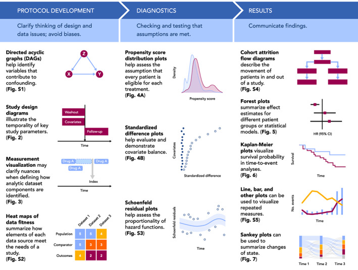
Visualizations throughout the life cycle of a pharmacoepidemiology study. Visualizations included in Figure 1 are simple illustrative examples of visualizations included in the paper and Appendix S1.
2. PROTOCOL DEVELOPMENT
For studies that use real world data to evaluate the causal effect of treatments, development of a protocol is an iterative process. Visualization at the protocol development stage can be used to help clarify thinking about design and data issues, avoid biases, and assist protocol reviewers in quickly grasping decisions made. In this section, we will discuss three visualization frameworks that can facilitate rationalized and transparent decision‐making in protocol development: causal structures, graphical depiction of study design, and identifying fit‐for‐purpose data (i.e., data reliability and relevancy which are defined by FDA as “data accuracy, completeness, provenance, and traceability” and “the availability of key data elements [exposure, outcome, covariates] and sufficient numbers of representative patients of study,” respectively).
2.1. Visualizing causal structures
In the absence of randomization, identifying variables that contribute to confounding and require measurement and control is key to valid study design, as well as assessing data fitness (i.e., systematically assessing whether data are fit for a particular purpose/research question). Visualization of the hypothesized causal relationships for the primary treatment‐comparator‐outcome objective—and often for other key relationships specified in secondary objectives—helps the researcher identify variables that should be controlled (e.g., a common cause of treatment and outcome) and those that should not (e.g., a mediating variable). Directed acyclic graphs (DAGs) are visualizations of these theorized causal relationships with rules about which variables should be controlled. 14 , 15 , 16 These graphs allow researchers to distinguish the relationships between the exposure, outcome, and potential confounders, intermediate causes, and colliders. For example, to conceptualize the causal structure of prenatal selective serotonin reuptake inhibitor (SSRI) medication (exposure) and attention deficit/hyperactivity disorder (ADHD) (outcome), Wood et al. 17 identified potential confounders warranting conditioning, such as “other psychiatric illness” (Figure S1A). The authors also identified other factors including gestational age (mediator) and live birth (collider) to avoid introducing bias by inadvertently controlling for these factors. In DAG construction, variable identification and potential relationship with the treatment and outcome are typically based on literature review and input from clinical subject‐matter experts. One limitation of the DAGs is the potentially subjective and speculative identification of variables based on background knowledge. In a systematic review of DAGs, Tennant et al. also observed variability, including oversimplification, of DAG reporting in the literature. Despite this, DAG construction is an important first step and following these rules enables identification of the minimally sufficient set of covariates, avoids model overfitting, and targets the assessment of whether a particular dataset is fit‐for‐purpose. While these diagrams can be quite complicated (e.g., see Reference [18]; Figure S1B) this critical step can be simplified by using tools such as DAGitty (http://www.dagitty.net), a free web‐ or R‐based tool for creating and analyzing causal diagrams.
2.2. Visualizing study design
The role of time in a pharmacoepidemiology study is most clearly communicated through visualization. Following the target trial framework, 19 database studies are carried out as closely as possible to a randomized trial, with the index date (i.e., “time zero”) defined by treatment initiation rather than set by a randomized intervention. As such, clear definitions of time zero, patient history, and follow‐up are critical to understanding the database study design, and visualization can greatly improve understanding of these concepts. Visualization can also clarify the relationship between calendar time and patient event time, which is time relative to a specific event, such as the first prescription of a drug of interest (Figure 2A). Importantly, visualizing the study design and aligning patient eligibility and treatment initiation to the start of follow‐up avoids introducing biases, such as immortal time bias. 20
FIGURE 2.
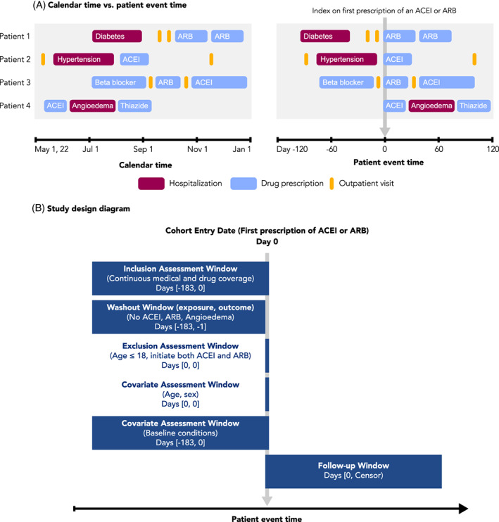
Calendar time, patient event time, and study design diagrams. A, Patient events for four different patients are visualized, arranged according to calendar time (left) or patient event time (right). Patient event time is defined relative to an index date, in this case the first prescription of an ACE‐inhibitor (ACEI) or angiotensin receptor blocker (ARB). Events recorded as spanning intervals of time (e.g., hospitalizations and drug prescriptions) are represented as boxes, while events recorded in a single moment of time (e.g., outpatient visits) are represented as lines. B, An example study design diagram. Source: Adapted from www.repeatinitiative.org/projects.html
2.2.1. Visualizing time anchors and time windows with study design diagrams
A recent framework for graphical depiction of study design summarizes the temporality of key study parameters implemented to create an analytic dataset anchored on patient event time. 21 , 22 This graphical framework defines several types of study time anchors. Base anchors are defined in calendar time and describe the source database. Primary anchors are defined in patient event time and are used to specify time zero and other key anchor points. Second order anchors, such as windows to measure inclusion–exclusion, covariates, washout or follow up are defined relative to the primary anchor(s).
The study design diagram is intended to be read from top to bottom, showing the sequence of actions taken to create the analytic study population (Figure 2B). A vertical gray arrow is used to represent time zero, the point at which the study entry defining criterion is met and the patient enters the cohort. The size and location of the horizontal bars visually show the assessment windows for inclusion–exclusion criteria, covariates and follow up relative to time zero. In addition to the visual representation, bracketed numbers within each bar specify the exact window length. Schneeweiss et al. provide examples of diagrams using different study designs, which are available in the appendices of their article. 21 This graphical framework for study design has recently been expanded to include visual representation of data observability – an issue that is particularly salient for studies that make use of EHR data within a fragmented healthcare system. 22 Open‐source PowerPoint templates 21 and an R shiny application can be used to develop study design diagrams for protocols and publications.
2.2.2. Visualizing study measurements
Measurement is the identification of specific events, dates, or other values of interest in a longitudinal dataset in order to generate time anchors, covariates, outcomes, and other components of an analytic dataset. Although measurements require precise definitions in order to preserve transparency and reproducibility, textual definitions of measurements are often ambiguous or do not consider nuances of the underlying data. For example, a time anchor measurement defined as “follow‐up starting after the first usage of an ACE‐inhibitor” is ambiguous, as it is unclear if follow‐up starts on the first or last or other day relative to the use of a drug, and it is unclear if “usage” refers to a single dispensing of a drug or a complete course of treatment including multiple dispensings. Furthermore, if a “course of treatment” is being measured, it is unclear how that is defined, such as with respect to how overlapping drug dispensings or gaps between drug dispensings are handled. To gain insight into improving measurement definitions, it can be helpful to visualize case examples of patient events and how measurement is applied to those cases. For example, visualizing how time anchor measurement aligns against drug usage patterns in the data highlights the need to more explicitly define the choice of which day to anchor on (Figure 3).
FIGURE 3.
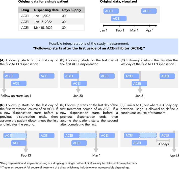
Measurement visualization. Definitions of study measurements such as time anchors may be made ambiguous by insufficiently detailed textual descriptions or may be complicated by nuances of underlying data. For example, consider the definition “Follow‐up starts after the first use of an ACE‐inhibitor (ACE‐I).” Such a definition is ambiguous because “after the first usage” is not well‐defined, as shown here. Furthermore, periods of drug usage recorded in the data may overlap in time or have gaps between them, requiring the researcher to make assumptions about how a drug is used by a patient. Examples of this are shown here, depicting drug data for a single patient and how different interpretations of the follow‐up start date may be applied to it. Illustration of case examples of patient data and how a measurement definition accommodates them can help the researcher be more precise and take into account data nuances during protocol development
2.3. Visualizing data fitness
Rationalizing a chosen data source for a given comparative observational study is crucial to ensure actual and perceived objectivity. Visualization can help stakeholders understand the researcher's decision‐making process, and why a particular data source meets or does not meet the needs of the study. In September 2021, the FDA issued draft guidance on assessing real‐world data for regulatory decision‐making which discusses considerations for using data derived from existing electronic health records and administrative claims data, including data reliability and data relevance. 23 Assessing whether the data are fit‐for‐purpose is contextual and contingent on the study's research question. 23 Following the steps laid out in Gatto et al. 24 for identifying fit‐for‐purpose data, a CONSORT‐like diagram 25 , 26 can show considered data sources, those included/excluded based on pre‐specified criteria (evaluated without assessing associations among treatments and outcomes of interest), and those chosen for more detailed feasibility assessment.
To summarize the assessment findings, a heat map can demonstrate how each dataset performed on key study elements and visually communicate the datasets' fitness‐for‐purpose or lack thereof. 24 The heat map is made by ranking each element assessed for each data source using colors to indicate if the data, for example, “fully meets”, “partially meets,” or “does not meet” the needs of the study (Figure S2). A quick visual scan then allows the reader to see where “fully meets” assessments are concentrated, and judge if a data source is sufficiently fit. A table containing the underlying information can be supplied for further detail.
3. IMPLEMENTATION: DIAGNOSTICS
The implementation stage of a study can be segmented into diagnostic and inferential phases. The diagnostic phase refers to the checks performed to evaluate key assumptions and fitness of the proposed study design, while the inferential phase refers to the conduct of planned analyses following locking of the dataset and protocol. Visualizations of diagnostic checks can help researchers refine study design decisions prior to conducting any inferential analysis and demonstrate the fitness of the design to stakeholders. This section provides examples of graphical diagnostic checks to evaluate these assumptions, as well as assumptions underlying statistical models.
3.1. Visualizations to check positivity and confounder balance in studies of causal effects
The positivity assumption—the assumption that each person under study is eligible for each treatment of interest—requires that there be a non‐zero probability of treatment receipt within all confounder strata. 27 , 28 , 29 , 30 One practical way to check this assumption across the range of confounders is to inspect propensity score distributions by treatment group; propensity scores close to zero or one suggest possible violations or near violations of positivity (Figure 4A). Trimming (excluding) patients with nonoverlapping propensity scores in the tails of the distribution helps address violations of the positivity assumption. Trimming of patients with extreme propensity scores would be prespecified in the protocol and transparently reported. For example, in a study of mortality and corticosteroid versus non‐corticosteroid use among hospitalized COVID‐19 patients, this check of positivity was pre‐specified in the protocol and performed before implementing any inferential analysis (study protocol is available on ClinicalTrials.gov, NCT04926571).
FIGURE 4.
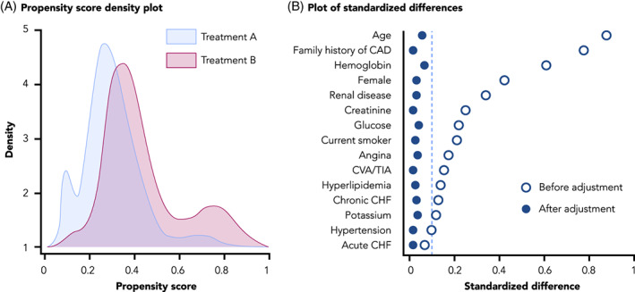
Visualizations to assess for positivity and confounder balance. A, A propensity score density plot, adapted from Webster‐Clark et al. 25 B, A plot of standardized differences, adapted from Austin PC 27
The conditional exchangeability assumption requires that, conditional on confounders, the counterfactual outcome risk in treated individuals, had they not received the treatment, would have been the same as the outcome risk in the untreated/comparator group and vice versa. In other words, potential outcomes and treatment status are independent conditional on the confounders. A typical check of this assumption is the examination, after weighting, matching or other methods, of absolute standardized differences between treatment groups in the distribution of potential confounding variables measured at baseline. As a rule of thumb, an absolute standardized mean difference of 0.1 or less suggests adequate balance between comparison groups. 31 Residual imbalance may indicate that confounding control and/or model specification is insufficient. Plotting standardized differences is a useful visualization tool to evaluate and demonstrate covariate balance (Figure 4B). Additional visualizations may be used to assess the robustness of confounding control. Tarzare et al. 32 summarize helpful visualization tools when using high‐dimensional propensity score (HdPS), which use automated methods to select covariates. Rassen et al. 33 suggest sequentially plotting treatment effect estimates with increasing number of empirically identified variables controlled to determine if controlling more variables helped with confounding control or if a parsimonious model was equally effective.
3.2. Visualizations to check statistical assumptions
Depending on the statistical methods employed, the model's assumptions and goodness‐of‐fit can be graphically displayed. For example, the Cox proportional hazard regression model used for time‐to‐event data requires that the hazard functions for different groups are proportional over time. Testing for proportionality is often based on visual inspections of Schoenfeld's residuals (Figure S3). 34 , 35 Violation of the proportional hazard assumptions will lead to invalid inference (i.e., the standard errors will be incorrect). This limitation can be addressed by computing confidence intervals using bootstrapping techniques. 36 As with any analytic diagnostics, whether for models or other statistical approaches, reporting these visual diagnostics helps the investigator to justify their final choices.
4. RESULTS DISSEMINATION
Pharmacoepidemiology reporting standards mainly focus on the textual information required in study reports and manuscripts. 7 , 9 , 10 , 37 Tables are foundational since interpretation and decision‐making require exact numerical estimates and confidence intervals. However, representing results graphically can convey distinct ideas or patterns, facilitating quicker comprehension by readers. Results readily lend themselves to both tabular and visual presentation. In this section, we discuss common practices for creating these visualizations. We also provide general recommendations and considerations for developing such reporting visuals (Table S1).
4.1. Cohort attrition: Flow diagrams
A core element of most reporting guidelines, flow diagrams are used to describe cohort attrition, which is the movement of patients in and out of the study (Figure S4). 9 , 25 , 26 , 38 , 39 , 40 These diagrams are intended to convey the total number of patients included in the study, the number of patients removed at each exclusion step, the number of patients lost to follow‐up, and the final number of patients available for analysis, with information reported separately for each treatment arm as applicable. This information is a key element supporting study transparency, as it can help reveal potential sources of bias or generalizability limitations.
4.2. Effect estimates: Forest plots
Forest plots are used to illustrate effect estimates (e.g., odds ratios, hazard ratios, or mean differences) when more than one estimate is being reported. This allows effect estimates derived from different cohorts, subgroups, or statistical models to be visualized and compared in a single plot. Core elements of these plots include point estimates and their confidence intervals, and a vertical reference line indicating null effect (Figure 5). Ratio results should be plotted on a log scale so that, for example, risk ratios of 0.5 and 2.0 (half and double the risk, respectively) appear at an equal distance from the null.
FIGURE 5.
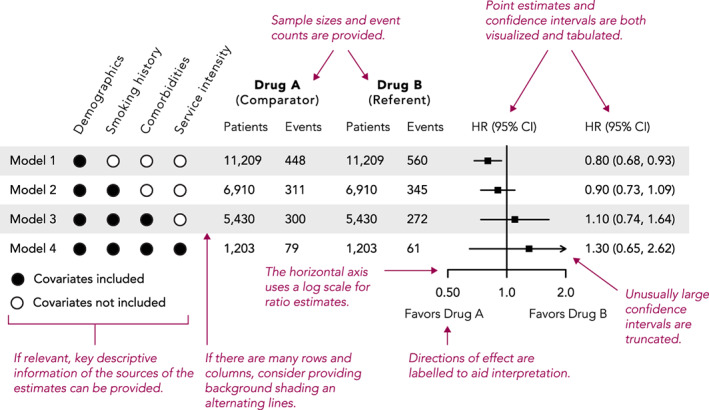
Example and recommendations for forest plots
4.3. Time‐to‐event analysis: Kaplan–Meier plots
Kaplan–Meier plots are used to visualize time‐to‐event analyses, where the event is the outcome of interest such as death, disease occurrence, or disease recovery. The vertical axis of these plots typically shows either survival probability (with curves starting at 1 and descending as time progresses) or its converse, the cumulative incidence (with curves starting at 0 and ascending), while the horizontal axis shows time (Figure 6A). In general, including zero on axes helps ground the reader in the magnitude of the effect being plotted; however, in survival plots of rare outcomes, including zero may mask differences of effect between the groups (since most values will be close to the maximum of 100%) (Figure 6B). In such cases, it may be preferable to plot cumulative incidence, or include both a survival plot with zero (to indicate the rarity of the outcome) and a “zoomed in” plot clearly showing any difference between the survival curves.
FIGURE 6.
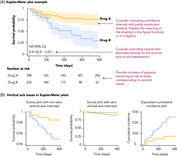
Example and recommendations for Kaplan–Meier plots
A limitation of Kaplan–Meier curves is that they can only depict unadjusted survival probabilities. Alternatively, survival probabilities can be derived and plotted from an adjusted Cox Proportional Hazards Model. This approach requires specifying values for all the covariates used in the model. Therefore, the shape of the survival curves will be a function of the values assigned to each of the covariates. Methods such as the corrected group prognosis method have been developed to address this limitation. 41
4.4. Repeated measures: Line charts and bar charts
Pharmacoepidemiology studies may include outcomes of repeated measures, such as lab values or numerical disease scores measured at different points in time. As such data naturally capture trends over time, they lend themselves well to visualization through multiple chart options, including line charts, bar charts, box plots, or spaghetti plots (Figure S5A). Although such plots are generally straight‐forward, consideration must be given to issues such as representing multiple dimensions in a single plot, or dealing with overlapping plot elements (Figure S5B).
4.5. Changes of state: Sankey diagrams
Changes of the state of a patient over time, such as medication switching, disease stage progression, or movement through treatment pathways, can be visualized using Sankey diagrams. 42 These diagrams involve nodes arranged along the vertical axis, and another dimension (typically study time or a designation of a phase, such as line of therapy) arranged on the horizontal axis, with node height proportional to the number of patients at that node, and flows that depict state transition probabilities (Figure 7). State transition probabilities should be estimated using appropriate methods for censored data to account for disenrollment and other forms of censoring. Given the highly combinatorial nature of these types of analyses, Sankey plots can be an efficient way to represent data that otherwise might be difficult to interpret in tabular format. Sunburst diagrams can also represent some of the same information, with an inner ring showing the first phase and outer rings showing consecutively later phases but are less common.
FIGURE 7.
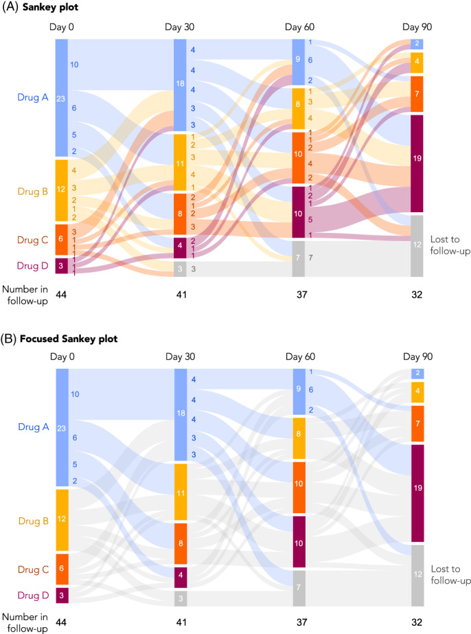
Sankey plots. A, An example of a Sankey plot, with colors representing transitions between all groups. B, The same plot but simplified, where colors are used only to highlight specific transitions of interest. In this case, transitions from Drug A to any other drug are highlighted. Other options to focus the presentation are also possible, such as highlighting transitions to higher lines of therapy (e.g., Drug A to B, B to C, A to C, etc.)
5. FUTURE OF VISUALIZATION
5.1. Animated and interactive visualizations
In recent years, there has been rapid development and dissemination of easy‐to‐use tools for creating web‐based, interactive visualizations and tables. These technologies allow a tremendous amount of information to be displayed and efficiently explored. Interactive output can be created by most modern statistical analysis systems, including open‐source software such as R.
There are many potentially valuable applications of these technologies in pharmacoepidemiology. For example, many comparative effectiveness studies involve multiple treatment contrasts, different cohorts, multiple outcomes, many subgroups of interest, and associated sensitivity analyses. Each analysis may involve estimation of cumulative incidence functions in addition to the previously mentioned diagnostics, such as inverse probability of treatment weighted table 1 information, and propensity score histograms. Frequently these results end up being included in online supplementary material or discussed in the paper but not presented. However, interactive data visualization tools can allow the user to easily browse a large volume of results from the many combinations of analyses that are performed. For example, in a negative control outcome study of lipid‐lowering therapies, 43 results from multiple outcomes, cohorts, and subgroups are easily explored using simple interactive graphs and tables. 44 Similarly, the Observational Health Data Science Initiative has created R packages to allow results from pharmacoepidemiologic studies to be explored via R/Shiny applications. 45 In addition, the US FDA Sentinel Initiative will be releasing Sentinel Views, a dashboard with interactive visualizations, to help increase transparency and aid interpretation of post‐marketing safety data (https://views.sentinelsystem.org).
It is also becoming increasingly feasible to create a wide range of animated visualizations. These can be used to help convey movement and dynamism. Animation can also help a presenter tell a story to communicate findings. For example, in a classic TED Talk, animations were used to effectively convey information about country‐level changes in health and economic development from 1960 to the present day. 46
6. CONSIDERATIONS
6.1. Cautionary considerations
Pharmacoepidemiology visualizations—whether traditional static or more novel interactive visuals—seek to explain the why and how a given study was performed, aid interpretation of results, and provide full transparency to support RWE credibility. However, unintended adverse consequences may result from graphics for several reasons. First, the best way to display multidimensional data in a clear and unambiguous manner may not always be obvious. Developing visualizations is often an iterative process; trying various techniques and soliciting feedback are important to ensure the reader will accurately interpret the visual as intended by the authors. Poorly constructed graphs can inadvertently confuse or mislead the reader. Overly complicated diagrams run the risk of subjective interpretation. Second, with interactivity, the use of the visualization may require careful consideration of how the user can interface with the tool to ensure visualization does not lead to varied interpretation. Third, while well‐crafted, easy‐to‐interpret visualizations can aid in transparency, a potential pitfall is critical information loss from attempts to simplify the graphs for readability; researchers must ensure visualizations appropriately balance reader‐friendliness with the amount of information needed for correct interpretation. Lastly, certain visualizations may require a reader to fully understand underlying assumptions to accurately interpret complex information; the researcher must be careful to articulate these assumptions.
6.2. General style recommendations
While some choices in plot design, such as whether to include 0 on graph axes, are purely functional, in general, a focus on design can improve a figure's visual appeal, attract and retain reader interest, and communicate ideas more clearly (Figure 8 and Figure S6). 47 , 48 The default graphical output provided by SAS, R, and Excel tends to be lackluster and seen as “unformatted,” so adjusting colors, weights and fills, and text is often time well‐spent. Inspiration for visually compelling content can be found in many sources, such as medical journals with dedicated graphics departments like the New England Journal of Medicine and JAMA, more general publications like The Economist, or digital publications like FiveThirtyEight or the online New York Times.
FIGURE 8.
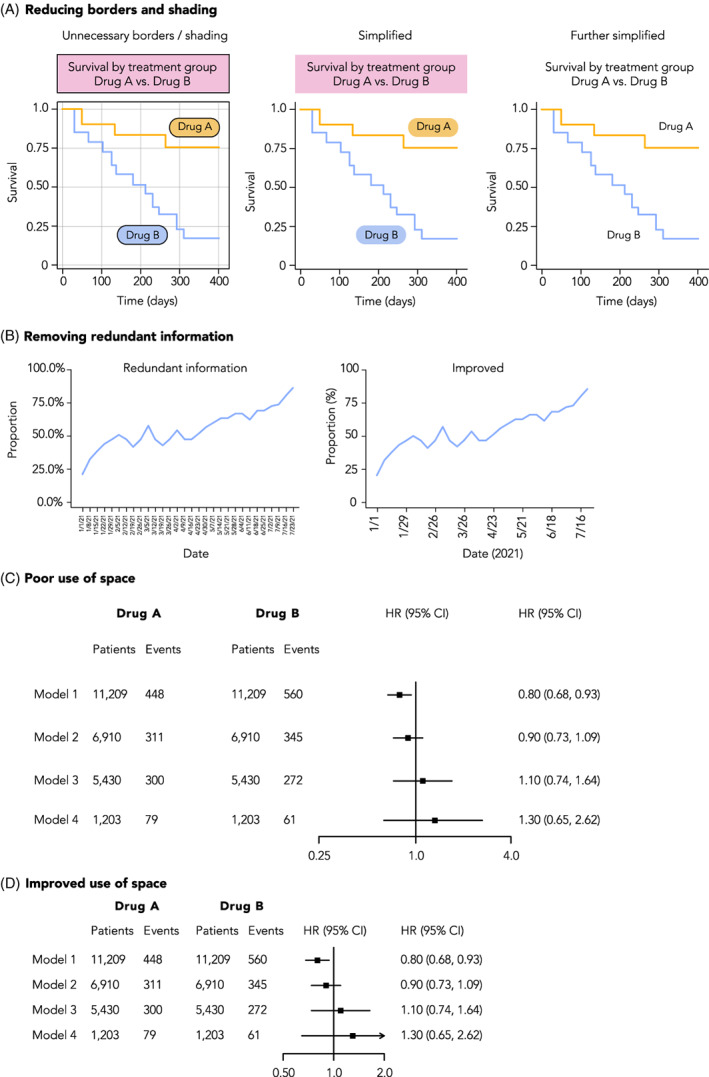
Improving the visual style of figures. A, Plots can be Simplified by removing design elements that do not contribute to understanding of the data, such as superfluous shading or line borders, as shown here. B, Redundant information should be removed from plots, such as repeated percentage signs on axis labels, or over‐abundant tick mark labels. C, Careful consideration should be given to the use of space in a plot. In this example of a forest plot, there is an over‐abundant amount of spacing between rows, columns, and the scale of the X‐axis on the forest plot. D, An example of the same plot but with improved use of space
7. CONCLUSION
Increased use of visualizations can improve the efficiency and understanding of non‐randomized pharmacoepidemiology study design and results by clinicians, treatment guideline committees, regulators, industry, and payers. We have described a series of visualizations that serve decision‐making and transparency throughout the study lifecycle, focused on study design, study implementation, analytic strategy, study population, and findings and aligned with current consensus statements on transparency. 1 , 2 , 3 , 6 , 10 , 49
ETHICS STATEMENT
The authors state that no ethical approval was needed.
CONFLICT OF INTEREST
Dr. Gatto, Ms. Mattox and Dr. Rassen are employees of Aetion, Inc., with stock options or existing equity. Dr. Gatto also owns stock in Pfizer Inc. Dr. Wang receives salary support as PI for investigator‐initiated grants to Brigham and Women's Hospital from Novartis, Johnson & Johnson, and Boehringer Ingelheim and is a consultant to Aetion for unrelated work. She is also PI on grants from the National Institute of Aging, Laura and John Arnold Foundation and the FDA Sentinel Initiative. She co‐directs the REPEAT Initiative, a non‐profit program with projects focused on increasing transparency and reproducibility of database studies. Dr. Murk is a contractor of and owns shares in Aetion, Inc., a technology company that provides analytic software and services to the healthcare industry. Dr. Brookhart serves on scientific advisory committees for Amgen, Astellas/Seagen, Atara Biotherapeutics, Brigham and Women's Hospital, Gilead, Kite, NIDDK, and Vertex; he receives consulting fees and owns equity in Target RWE. Dr. Bate is a full‐time employee of GSK and holds stock and stock options at Pfizer and GSK. Dr. Schneeweiss is participating in investigator‐initiated grants to the Brigham and Women's Hospital from Boehringer Ingelheim and UCB unrelated to the topic of this study. He is a consultant to Aetion Inc., a software manufacturer of which he owns equity. He is an advisor to Temedica GmbH, a patient‐oriented data generation company. His interests were declared, reviewed, and approved by the Brigham and Women's Hospital in accordance with their institutional compliance policies.
Supporting information
Appendix S1: Supporting information.
ACKNOWLEDGMENT
The authors thank the peer‐reviewers and ISPE member reviewers who provided thoughtful comments to an earlier version of the manuscript.
Gatto NM, Wang SV, Murk W, et al. Visualizations throughout pharmacoepidemiology study planning, implementation, and reporting. Pharmacoepidemiol Drug Saf. 2022;31(11):1140‐1152. doi: 10.1002/pds.5529
This work was presented at the 36th International Conference on Pharmacoepidemiology & Therapeutic Risk Management (ICPE) All Access 2020 Virtual Event.
Funding information International Society of Pharmacoepidemiology (ISPE)
REFERENCES
- 1. Orsini LS, Berger M, Crown W, et al. Improving transparency to build trust in real‐world secondary data studies for hypothesis testing—why, what, and how: recommendations and a road map from the real‐world evidence transparency initiative. Value Health. 2020;23(9):1128‐1136. doi: 10.1016/j.jval.2020.04.002 [DOI] [PubMed] [Google Scholar]
- 2. Wang SV, Schneeweiss S, Berger ML, et al. Reporting to improve reproducibility and facilitate validity assessment for healthcare database studies V1.0. Pharmacoepidemiol Drug Saf. 2017;26(9):1018‐1032. doi: 10.1002/pds.4295 [DOI] [PMC free article] [PubMed] [Google Scholar]
- 3. Wang SV, Pinheiro S, Hua W, et al. STaRT‐RWE: structured template for planning and reporting on the implementation of real world evidence studies. BMJ. 2021;372:m4856. doi: 10.1136/bmj.m4856 [DOI] [PMC free article] [PubMed] [Google Scholar]
- 4. Boers M. Designing effective graphs to get your message across. Ann Rheum Dis. 2018;77(6):833‐839. doi: 10.1136/annrheumdis-2018-213396 [DOI] [PubMed] [Google Scholar]
- 5. Wainer H. How to display data badly. Am Stat. 1984;38(2):137‐147. doi: 10.1080/00031305.1984.10483186 [DOI] [Google Scholar]
- 6. Public Policy Committee, International Society of Pharmacoepidemiology . Guidelines for good pharmacoepidemiology practice (GPP): guidelines for good pharmacoepidemiology practice. Pharmacoepidemiol Drug Saf. 2016;25(1):2‐10. doi: 10.1002/pds.3891 [DOI] [PubMed] [Google Scholar]
- 7. Benchimol EI, Smeeth L, Guttmann A, et al. The reporting of studies conducted using observational routinely‐collected health data (RECORD) statement. PLoS Med. 2015;12(10):e1001885. doi: 10.1371/journal.pmed.1001885 [DOI] [PMC free article] [PubMed] [Google Scholar]
- 8. Vandenbroucke JP, von Elm E, Altman DG, et al. Strengthening the reporting of observational studies in epidemiology (STROBE): explanation and elaboration. PLoS Med. 2007;4(10):e297. doi: 10.1371/journal.pmed.0040297 [DOI] [PMC free article] [PubMed] [Google Scholar]
- 9. Vandenbroucke JP, von Elm E, Altman DG, et al. Strengthening the reporting of observational studies in epidemiology (STROBE): explanation and elaboration. Epidemiology. 2007;18(6):805‐835. doi: 10.1097/EDE.0b013e3181577511 [DOI] [PubMed] [Google Scholar]
- 10. Langan SM, Schmidt SA, Wing K, et al. The reporting of studies conducted using observational routinely collected health data statement for pharmacoepidemiology (RECORD‐PE). BMJ. 2018;363:k3532. doi: 10.1136/bmj.k3532 [DOI] [PMC free article] [PubMed] [Google Scholar]
- 11. Schachterle SE, Hurley S, Liu Q, Petronis KR, Bate A. An implementation and visualization of the tree‐based scan statistic for safety event monitoring in longitudinal electronic health data. Drug Saf. 2019;42(6):727‐741. doi: 10.1007/s40264-018-00784-0 [DOI] [PubMed] [Google Scholar]
- 12. Aakjær M, De Bruin ML, Kulahci M, Andersen M. Surveillance of antidepressant safety (SADS): active signal detection of serious medical events following SSRI and SNRI initiation using big healthcare data. Drug Saf. 2021;44(11):1215‐1230. doi: 10.1007/s40264-021-01110-x [DOI] [PMC free article] [PubMed] [Google Scholar]
- 13. Zhou X, Murugesan S, Bhullar H, et al. An evaluation of the THIN database in the OMOP common data model for active drug safety surveillance. Drug Saf. 2013;36(2):119‐134. doi: 10.1007/s40264-012-0009-3 [DOI] [PubMed] [Google Scholar]
- 14. Tennant PWG, Murray EJ, Arnold KF, et al. Use of directed acyclic graphs (DAGs) to identify confounders in applied health research: review and recommendations. Int J Epidemiol. 2021;50(2):620‐632. doi: 10.1093/ije/dyaa213 [DOI] [PMC free article] [PubMed] [Google Scholar]
- 15. Hernan MA, Cole SR. Invited commentary: causal diagrams and measurement bias. Am J Epidemiol. 2009;170(8):959‐962. doi: 10.1093/aje/kwp293 [DOI] [PMC free article] [PubMed] [Google Scholar]
- 16. Sauer B, VanderWeele TJ. Use of Directed Acyclic Graphs. Agency for Healthcare Research and Quality (US); 2013. https://www.ncbi.nlm.nih.gov/books/NBK126189/. Accessed August 9, 2022.
- 17. Wood ME, Lapane KL, Gelder MMHJ, Rai D, Nordeng HME. Making fair comparisons in pregnancy medication safety studies: an overview of advanced methods for confounding control. Pharmacoepidemiol Drug Saf. 2018;27(2):140‐147. doi: 10.1002/pds.4336 [DOI] [PMC free article] [PubMed] [Google Scholar]
- 18. Fowler AJ, Wan YI, Carenzo L, Haines RW. COVID‐19 phenotypes and potential harm of conventional treatments: how to prove the hypothesis. Am J Respir Crit Care Med. 2020;202(4):619‐621. doi: 10.1164/rccm.202004-1293LE [DOI] [PMC free article] [PubMed] [Google Scholar]
- 19. Hernán MA, Robins JM. Using big data to emulate a target trial when a randomized trial is not available: table 1. Am J Epidemiol. 2016;183(8):758‐764. doi: 10.1093/aje/kwv254 [DOI] [PMC free article] [PubMed] [Google Scholar]
- 20. Hernán MA, Sauer BC, Hernández‐Díaz S, Platt R, Shrier I. Specifying a target trial prevents immortal time bias and other self‐inflicted injuries in observational analyses. J Clin Epidemiol. 2016;79:70‐75. doi: 10.1016/j.jclinepi.2016.04.014 [DOI] [PMC free article] [PubMed] [Google Scholar]
- 21. Schneeweiss S, Rassen JA, Brown JS, et al. Graphical depiction of longitudinal study designs in health care databases. Ann Intern Med. 2019;170(6):398. doi: 10.7326/M18-3079 [DOI] [PubMed] [Google Scholar]
- 22. Wang SV, Schneeweiss S. A framework for visualizing study designs and data observability in electronic health Record data. Clin Epidemiol. 2022;14:601‐608. doi: 10.2147/CLEP.S358583 [DOI] [PMC free article] [PubMed] [Google Scholar]
- 23. United States Food and Drug Administration (FDA) . Real‐world data: assessing electronic health records and medical claims data to support regulatory decision making for drug and biological products. Draft Guid Ind. 2021. Accessed August 9, 2022. https://www.fda.gov/media/152503/download [DOI] [PMC free article] [PubMed] [Google Scholar]
- 24. Gatto NM, Campbell UB, Rubinstein E, et al. The structured process to identify fit‐for‐purpose data: a data feasibility assessment framework. Clin Pharmacol Ther. 2022;111(1):122‐134. doi: 10.1002/cpt.2466 [DOI] [PMC free article] [PubMed] [Google Scholar]
- 25. Moher D. The CONSORT statement: revised recommendations for improving the quality of reports of parallel‐group randomized trials. JAMA. 2001;285(15):1987. doi: 10.1001/jama.285.15.1987 [DOI] [PubMed] [Google Scholar]
- 26. Schulz KF. CONSORT 2010 statement: updated guidelines for reporting parallel group randomized trials. Ann Intern Med. 2010;152(11):726. doi: 10.7326/0003-4819-152-11-201006010-00232 [DOI] [PubMed] [Google Scholar]
- 27. Westreich D, Cole SR. Invited commentary: positivity in practice. Am J Epidemiol. 2010;171(6):674‐677. doi: 10.1093/aje/kwp436 [DOI] [PMC free article] [PubMed] [Google Scholar]
- 28. Petersen ML, Porter KE, Gruber S, Wang Y, van der Laan MJ. Diagnosing and responding to violations in the positivity assumption. Stat Methods Med Res. 2012;21(1):31‐54. doi: 10.1177/0962280210386207 [DOI] [PMC free article] [PubMed] [Google Scholar]
- 29. Webster‐Clark M, Stürmer T, Wang T, et al. Using propensity scores to estimate effects of treatment initiation decisions: state of the science. Stat Med. 2021;40(7):1718‐1735. doi: 10.1002/sim.8866 [DOI] [PubMed] [Google Scholar]
- 30. Hernán M, Robins J. Causal Inference: What If (the Book). Miguel Hernan's Faculty Website; 2012. https://www.hsph.harvard.edu/miguel-hernan/causal-inference-book/. Accessed August 9, 2022.
- 31. Austin PC. Balance diagnostics for comparing the distribution of baseline covariates between treatment groups in propensity‐score matched samples. Stat Med. 2009;28(25):3083‐3107. doi: 10.1002/sim.3697 [DOI] [PMC free article] [PubMed] [Google Scholar]
- 32. Tazare J, Wyss R, Franklin JM, et al. Transparency of high‐dimensional propensity score analyses: guidance for diagnostics and reporting. Pharmacoepidemiol Drug Saf. 2022;31(4):411‐423. doi: 10.1002/pds.5412 [DOI] [PMC free article] [PubMed] [Google Scholar]
- 33. Rassen JA, Glynn RJ, Brookhart MA, Schneeweiss S. Covariate selection in high‐dimensional propensity score analyses of treatment effects in small samples. Am J Epidemiol. 2011;173(12):1404‐1413. doi: 10.1093/aje/kwr001 [DOI] [PMC free article] [PubMed] [Google Scholar]
- 34. Bradburn MJ, Clark TG, Love SB, Altman DG. Survival analysis part III: multivariate data analysis—choosing a model and assessing its adequacy and fit. Br J Cancer. 2003;89(4):605‐611. doi: 10.1038/sj.bjc.6601120 [DOI] [PMC free article] [PubMed] [Google Scholar]
- 35. Hess KR. Graphical methods for assessing violations of the proportional hazards assumption in cox regression. Stat Med. 1995;14(15):1707‐1723. doi: 10.1002/sim.4780141510 [DOI] [PubMed] [Google Scholar]
- 36. Stensrud MJ, Hernán MA. Why test for proportional hazards? JAMA. 2020;323(14):1401‐1402. doi: 10.1001/jama.2020.1267 [DOI] [PMC free article] [PubMed] [Google Scholar]
- 37. ENCePP . European network of centres for pharmacoepidemiology and pharmacovigilance. ENCePP Guide on Methodological Standards in Pharmacoepidemiology; 2022. https://www.encepp.eu/standards_and_guidances/methodologicalGuide.shtml. Accessed August 9, 2022.
- 38. Altman DG. The revised CONSORT statement for reporting randomized trials: explanation and elaboration. Ann Intern Med. 2001;134(8):663. doi: 10.7326/0003-4819-134-8-200104170-00012 [DOI] [PubMed] [Google Scholar]
- 39. Moher D, Hopewell S, Schulz KF, et al. CONSORT 2010 explanation and elaboration: updated guidelines for reporting parallel group randomised trials. J Clin Epidemiol. 2010;63(8):e1‐e37. doi: 10.1016/j.jclinepi.2010.03.004 [DOI] [PubMed] [Google Scholar]
- 40. Pocock SJ, Travison TG, Wruck LM. Figures in clinical trial reports: current practice & scope for improvement. Trials. 2007;8(1):36. doi: 10.1186/1745-6215-8-36 [DOI] [PMC free article] [PubMed] [Google Scholar]
- 41. Nieto FJ, Coresh J. Adjusting survival curves for confounders: a review and a new method. Am J Epidemiol. 1996;143(10):1059‐1068. doi: 10.1093/oxfordjournals.aje.a008670 [DOI] [PubMed] [Google Scholar]
- 42. Otto E, Culakova E, Meng S, et al. Overview of Sankey flow diagrams: focusing on symptom trajectories in older adults with advanced cancer. J Geriatr Oncol. 2022;13(5):742‐746. doi: 10.1016/j.jgo.2021.12.017 [DOI] [PMC free article] [PubMed] [Google Scholar]
- 43. Levintow SN, Orroth KK, Breskin A, et al. Use of negative control outcomes to assess the comparability of patients initiating lipid‐lowering therapies. Pharmacoepidemiol Drug Saf. 2022;31(4):383‐392. doi: 10.1002/pds.5396 [DOI] [PubMed] [Google Scholar]
- 44. NoviSci . Repatha negative control outcome study; 2022. https://docs.novisci.com/repatha-negative-control/#/reports/61f30a2e9e3ac66a83d5ea43/view. Accessed August 9, 2022.
- 45. Lane JCE, Weaver J, Kostka K, et al. Risk of hydroxychloroquine alone and in combination with azithromycin in the treatment of rheumatoid arthritis: a multinational, retrospective study. Lancet Rheumatol. 2020;2(11):e698‐e711. doi: 10.1016/S2665-9913(20)30276-9 [DOI] [PMC free article] [PubMed] [Google Scholar]
- 46. The Best Stats You've Ever Seen; 2006. https://www.ted.com/talks/hans_rosling_the_best_stats_you_ve_ever_seen. Accessed August 9, 2022.
- 47. Tafte E. The Visual Display of Quantitative Information. Graphic Press; 1983. [Google Scholar]
- 48. Duke SP, Bancken F, Crowe B, Soukup M, Botsis T, Forshee R. Seeing is believing: good graphic design principles for medical research. Stat Med. 2015;34(22):3040‐3059. doi: 10.1002/sim.6549 [DOI] [PubMed] [Google Scholar]
- 49. Berger ML, Sox H, Willke RJ, et al. Good practices for real‐world data studies of treatment and/or comparative effectiveness: recommendations from the joint ISPOR‐ISPE special task force on real‐world evidence in health care decision making. Pharmacoepidemiol Drug Saf. 2017;26(9):1033‐1039. doi: 10.1002/pds.4297 [DOI] [PMC free article] [PubMed] [Google Scholar]
Associated Data
This section collects any data citations, data availability statements, or supplementary materials included in this article.
Supplementary Materials
Appendix S1: Supporting information.


